Existing components
MediaWiki community:
- WVUI: ToggleButton
- WiKit: ToggleButton
Wikimedia Design Style Guide links:
Figma:
Acceptance criteria (or Done)
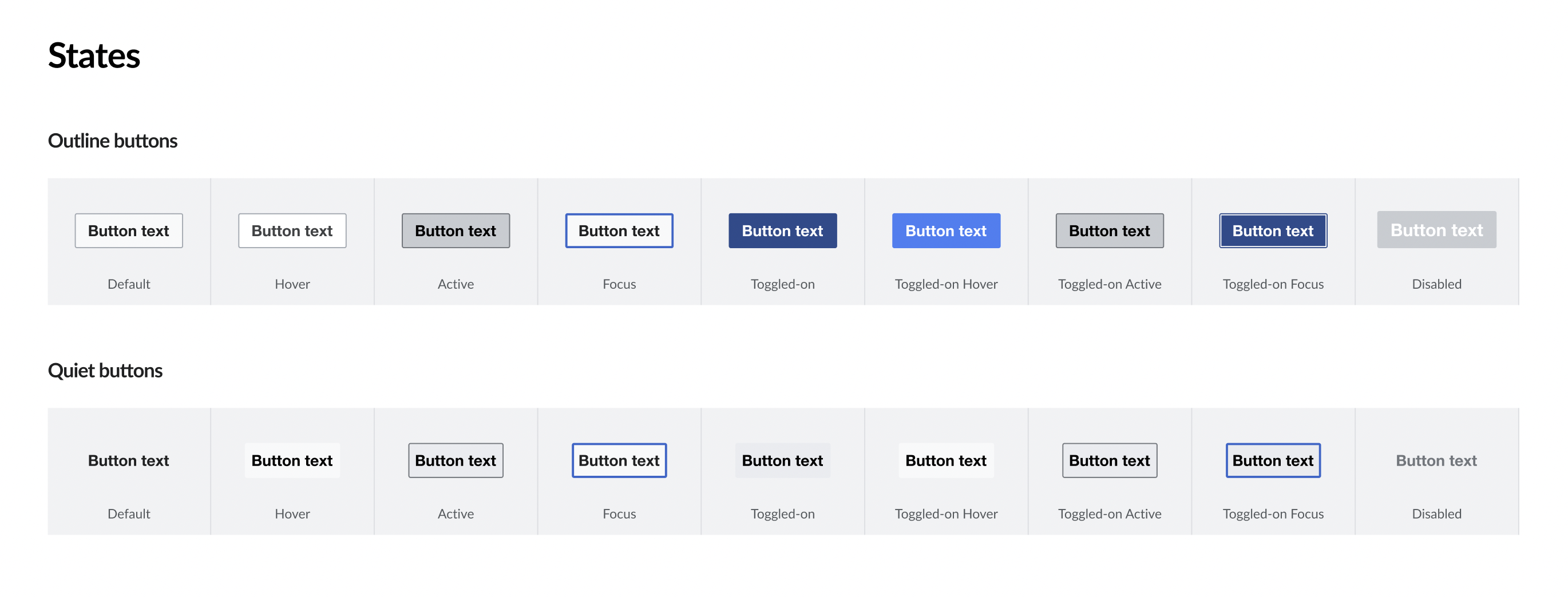
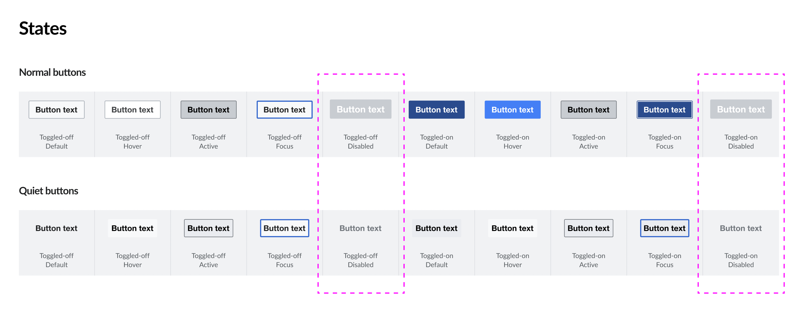
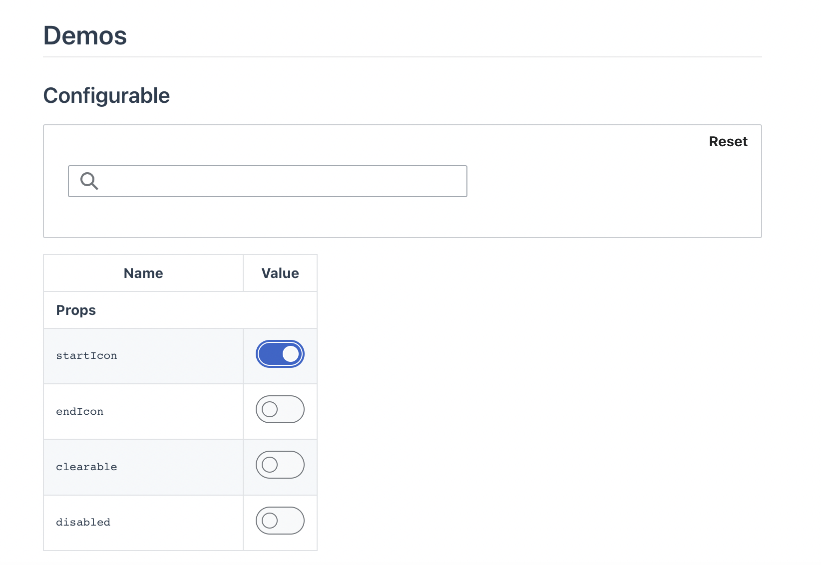
Design
- Button variants
- Normal button
- Quiet button
- Add the following missing states
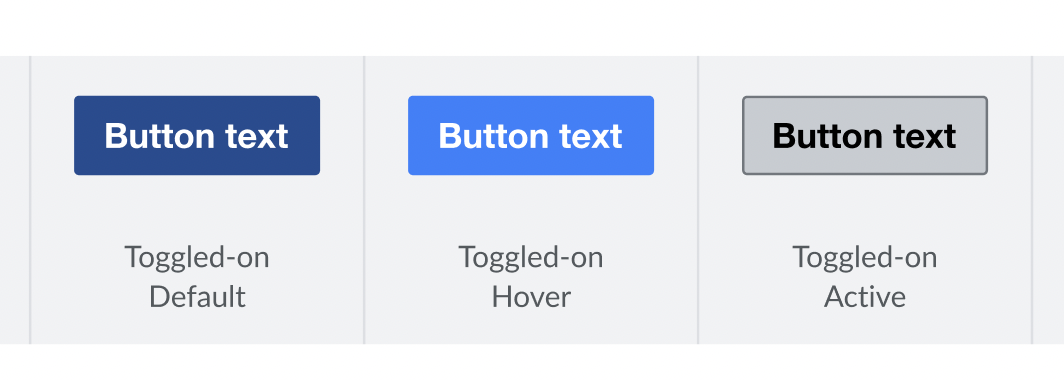
- Toggled-on hover
- Toggled-on active
- Publish the component in the Figma library (added ToggleButton in the new Codex library created in T306874)
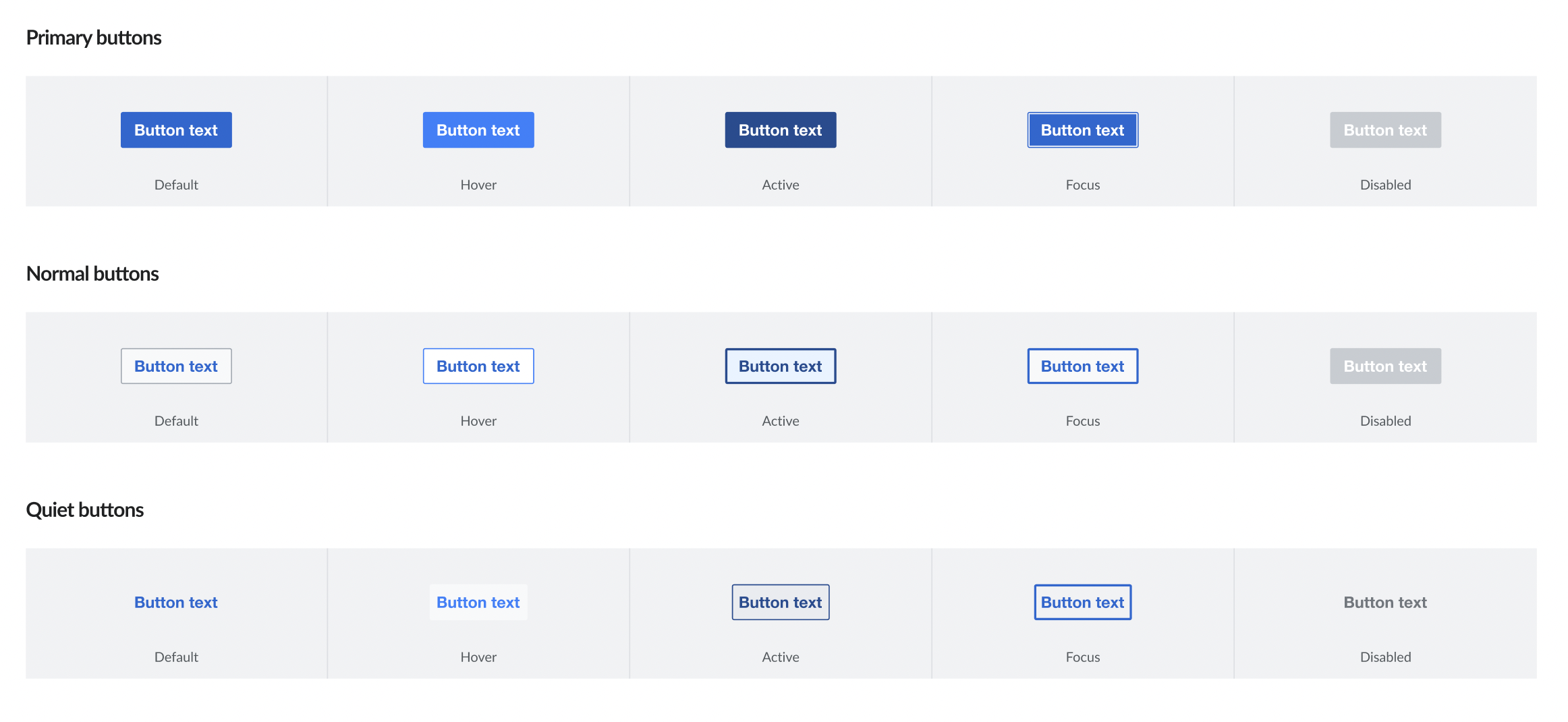
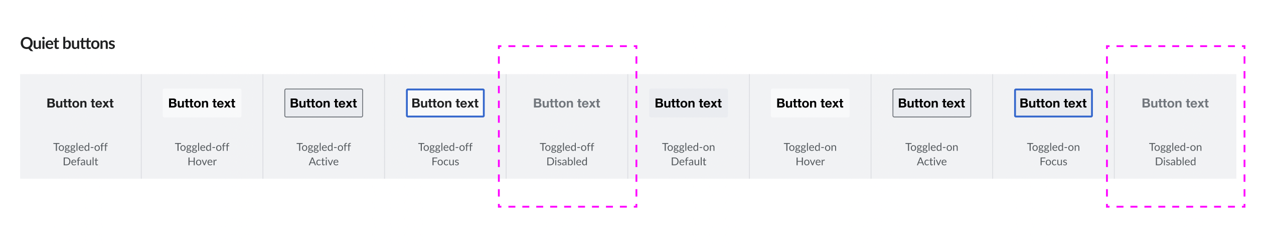
Codex
- Button variants
- Normal button
- Quiet button
- Add the following missing states (for both normal an quiet variants)
- Toggled-on hover
- Toggled-on active
Design Review (view details here)
- Update normal buttons states:
- Add toggled-on-hover and toggled-on-active
- Update disabled toggled-on with the same styles than disabled toggle-off
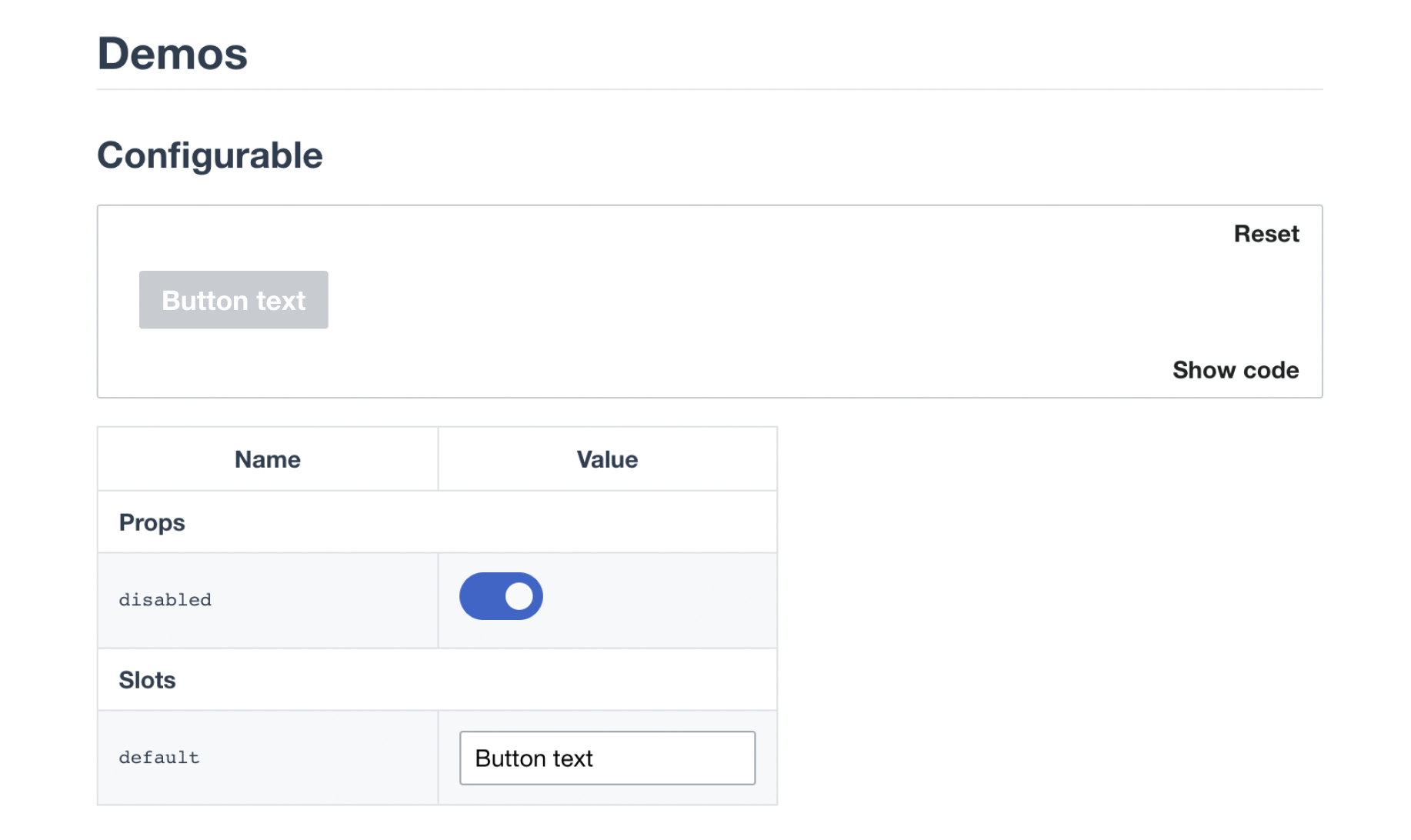
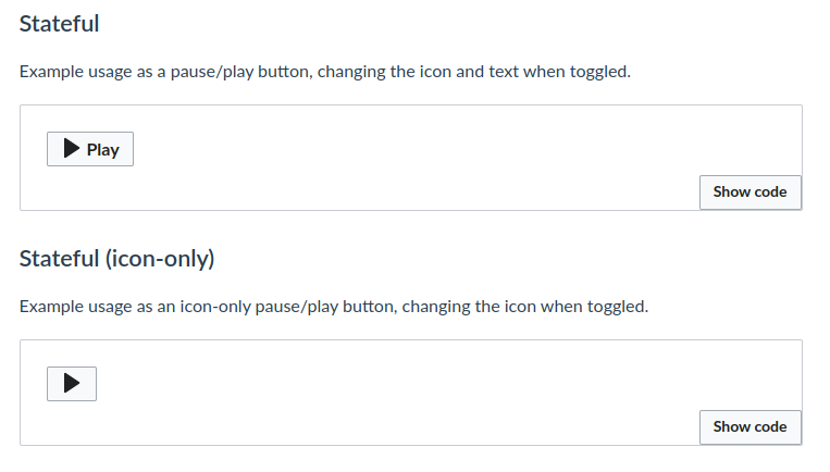
- The following button variants are missing in the stateful demo (we will show them in the stateful demo until the icons can be configured in the configurable demo):
- With icon (Icon + Text)
- Only Icon