Page MenuHomePhabricator

docs: Improve the design of configurable component demos
Open, LowestPublic

Assigned To
None
Authored By
AnneT
Nov 10 2021, 8:33 PM
Referenced Files
F35859150: Captura de Pantalla 2022-12-12 a las 11.51.07.png
Dec 12 2022, 10:56 AM
F35859155: Captura de Pantalla 2022-12-12 a las 11.53.17.png
Dec 12 2022, 10:56 AM
F35632162: image.png
Oct 26 2022, 4:28 PM
F35505973: image.png
Sep 1 2022, 8:51 PM
F34749076: image.png
Nov 15 2021, 7:48 PM
F34749080: image.png
Nov 15 2021, 7:48 PM
F34749078: image.png
Nov 15 2021, 7:48 PM
F34741222: Screen Shot 2021-11-10 at 3.23.47 PM.png
Nov 10 2021, 8:33 PM

Description

Summary

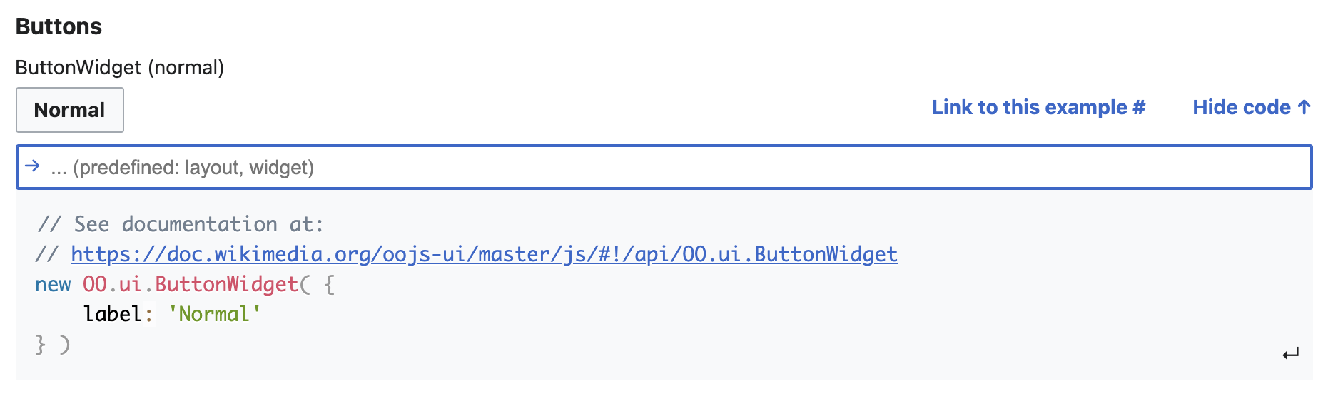
As part of T293135, we added configurable component demos that will update on the fly when the reader changes prop or slot values:

image.png (1×1 px, 90 KB)

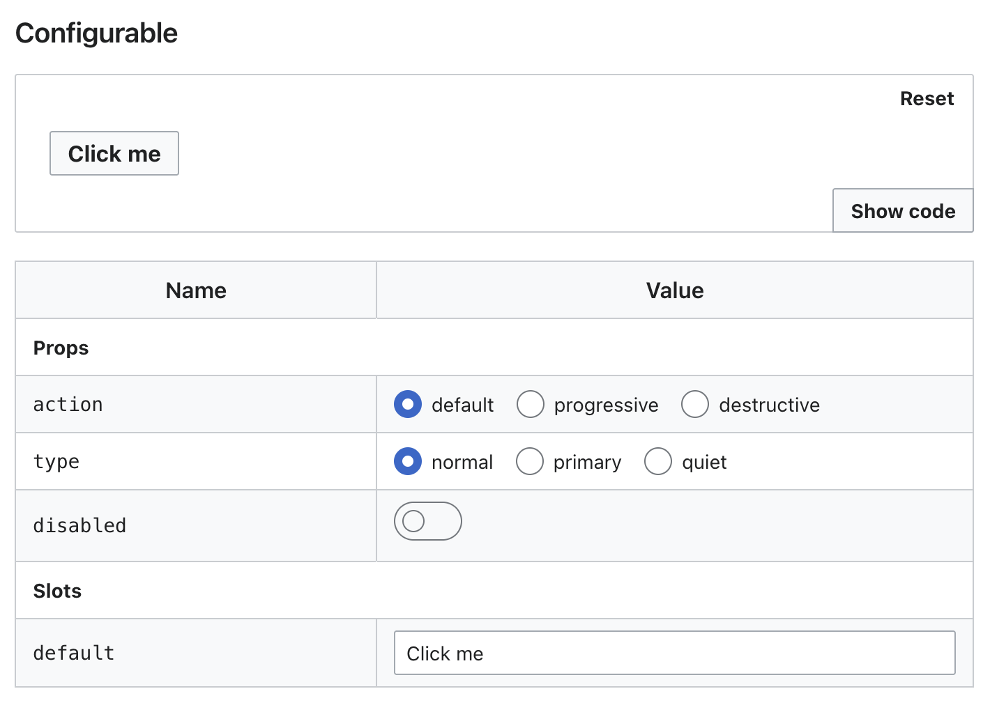
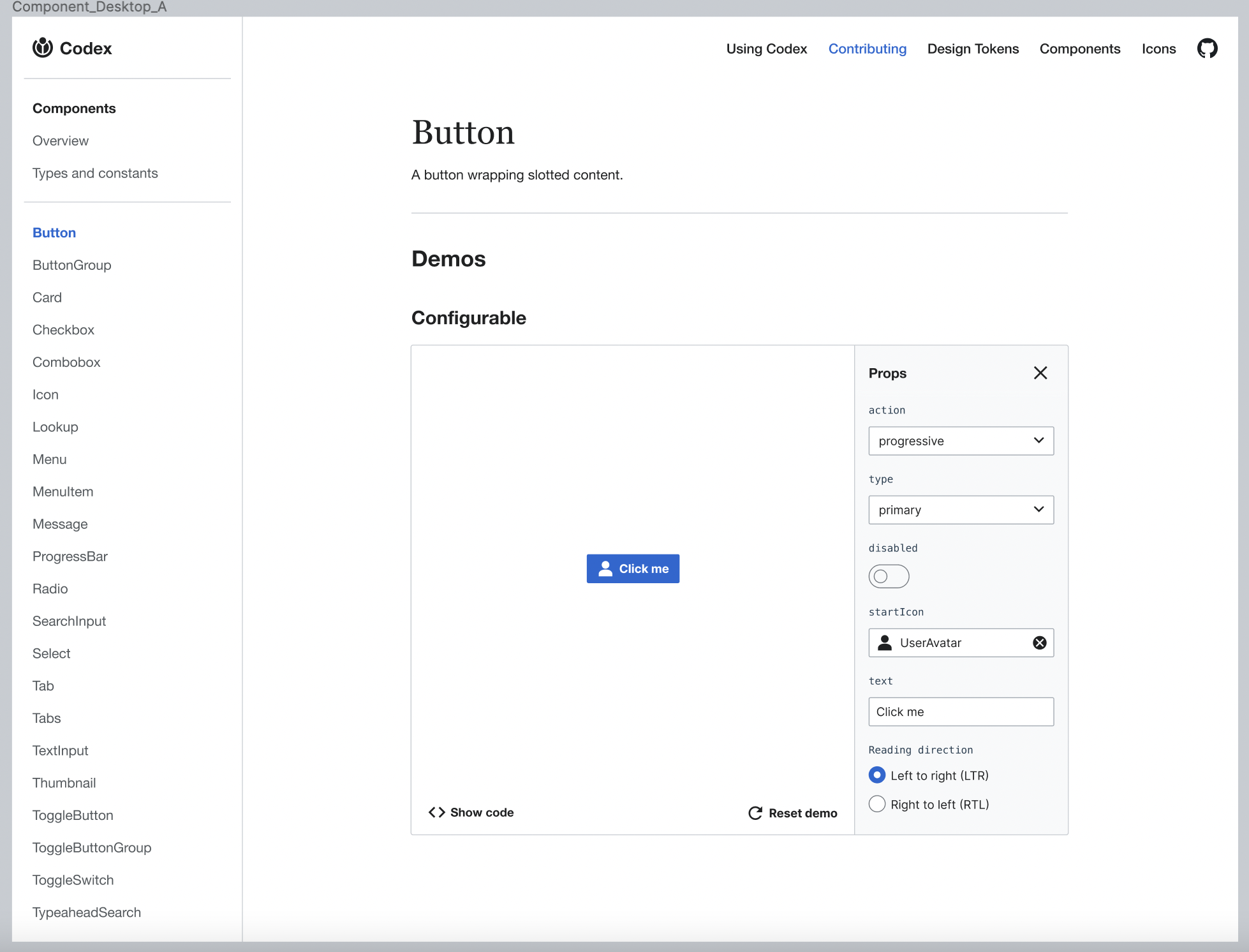
This system was built to be functional, but the design could be improved. We'd also like to move the language switcher from the header to individual demos.

User stories

As a designer of features within the MediaWiki ecosystem, I would like to be able to experiment with a live, configurable version of a Codex component that I want to use in a design.

As a developer of features within the MediaWiki ecosystem, I would like to be able to experiment with a live, configurable version of a Codex component that I want to use in my code, and be able to copy and paste a code sample with the props and attributes I need.

Proposal

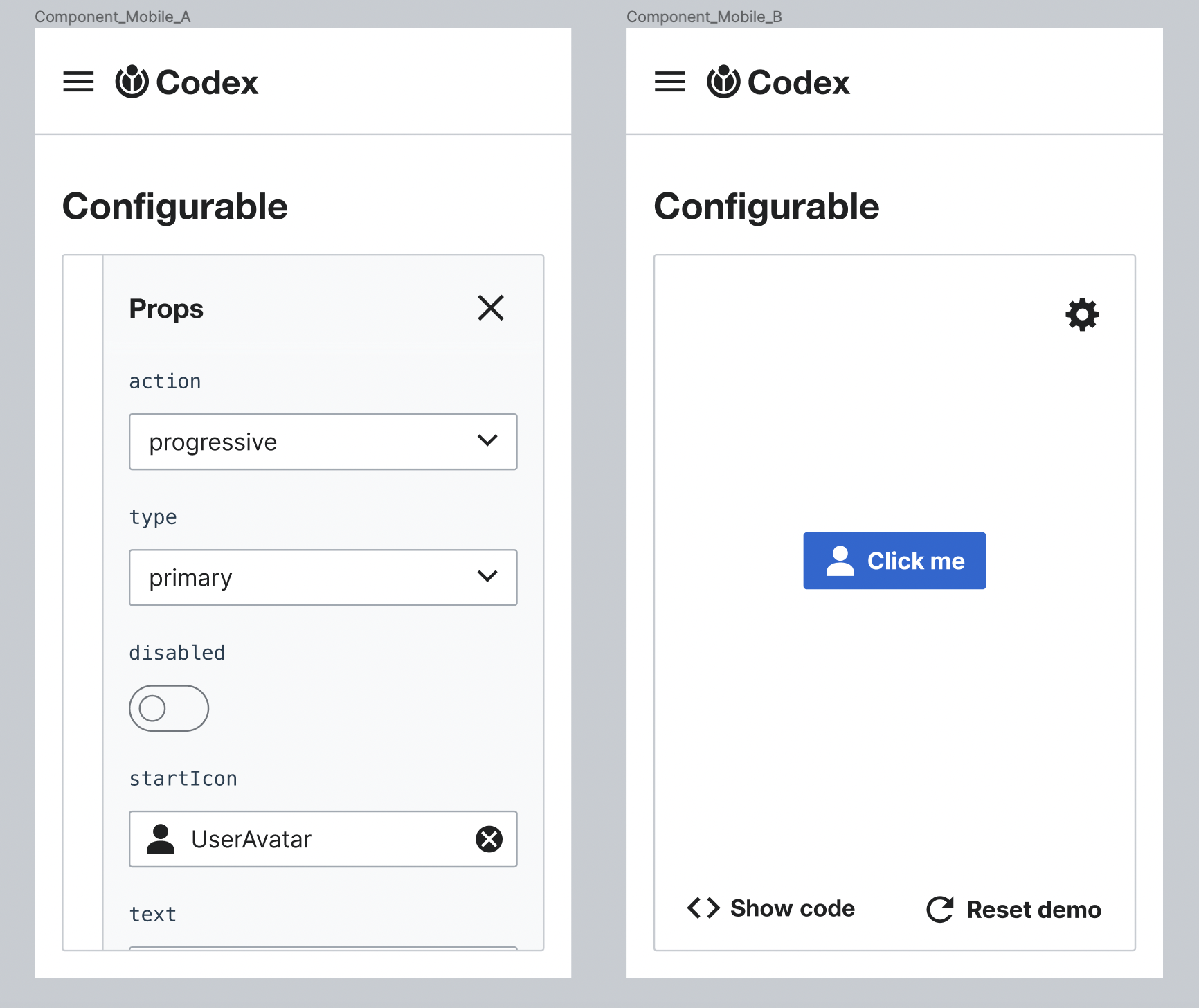
Configurable properties will be added in a gray panel inside the demo box. This panel will be collapsable and the user will be able to show/hide it according to the need of each case. Also in mobile it will be collapsable so the user can easily hide the properties panel to view the component.

Acceptance criteria

  • Configurable demos are updated to match the new designs

Event Timeline

For one, this is great progress. Also I like the idea of changing to toggle switches, as long as the update is dynamic.
From a usability perspective it would make sense for the show and hide code to be either quiet toggle buttons (not yet part of Codex) or to stay as quiet buttons with an additional icon.

Are there any other questions that you'd like to have discussed right now?

I like those ideas for the show code/hide code button! I think the last thing here is layout: right now the controls look a bit disconnected from the demo, in my opinion, and could be better visually paired with it. But it's going to get more complicated once we add the show code/hide code button and the actual code sample into the mix.

In comparison, OOUI has come to these interaction elements:

image.png (192×1 px, 22 KB)
image.png (552×1 px, 84 KB)

We could also consider adding an icon to the toggle label and take inspiration of VE:

image.png (76×420 px, 3 KB)

Doing so would put stronger visual focus there though, and the focus should maybe be more on the demoed component itself than on the show code toggle.

AnneT renamed this task from Design configurable component demos to Improve the design of configurable component demos.Sep 1 2022, 8:51 PM
AnneT updated the task description. (Show Details)
Volker_E renamed this task from Improve the design of configurable component demos to docs: Improve the design of configurable component demos.Sep 21 2022, 10:43 PM
Volker_E added a project: Documentation.
Volker_E removed a subscriber: iamjessklein.