Existing Components
MediaWiki Community:
External Libraries
Wikimedia Design Style Guide Links
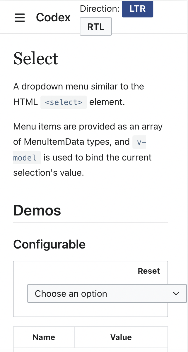
Figma
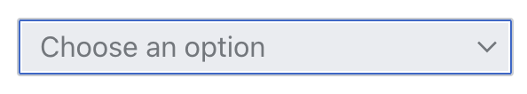
Native HTML equivalent
Implementation notes
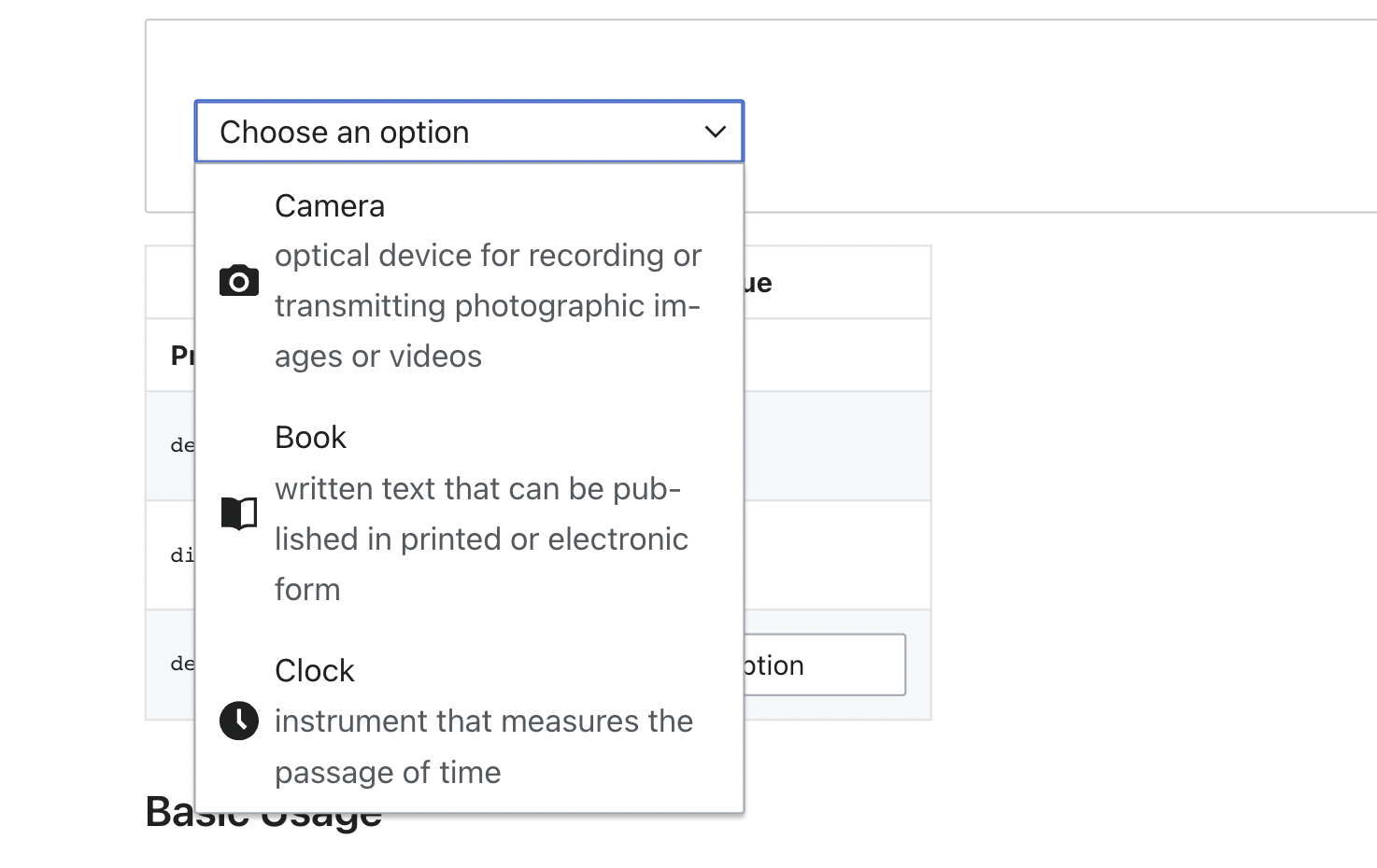
- This component implies the creation of some related "menu" and "option" or "item" components that appear when the select/dropdown is expanded
- The inner components should be re-usable in other similar contexts (autocomplete input, "comboboxes", buttons with dropdown indicators, etc)
Previous implementations have often expected some kind of rich items property representing data for the various options, but are we better off using <slots> to do this?- Usage with v-model should be typical; users should be able to bind the active item as a v-model value from the parent
- Should support the same accessibility behaviors as the native <select> element
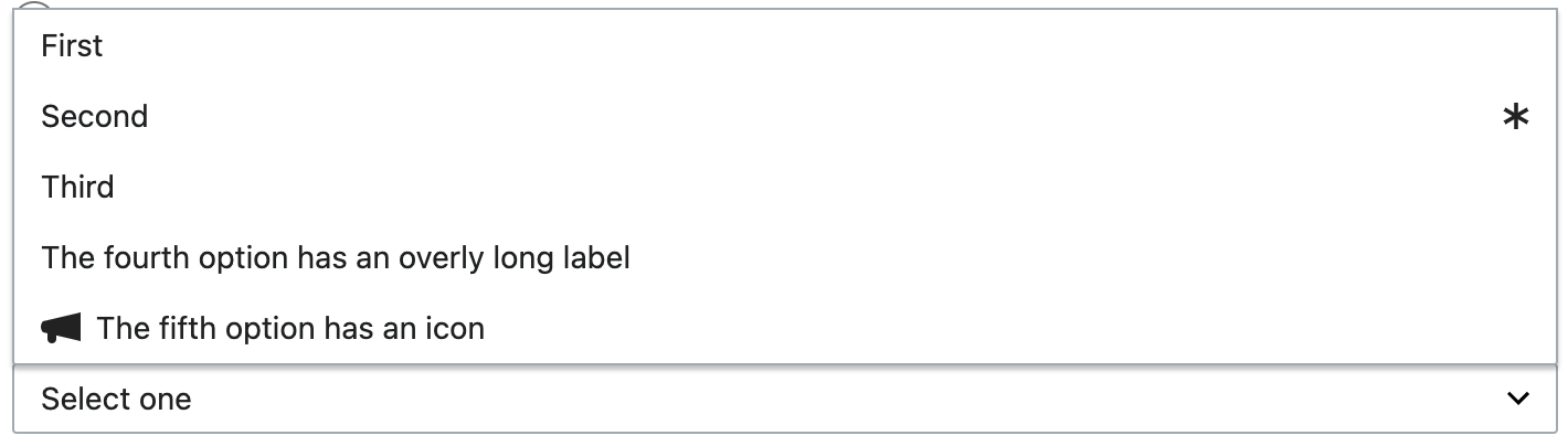
- Properties this component needs to support potentially include: label, disabled, icon, and
some kind of error-handling prop A re-usable clickOutside composition function may need to be introduced here
UX Questions
One question that has come up during code review is: should this component allow the user to unset a previously set value, either in all cases or on a case-by-case basis?
Consider the following use-case: search filters in Commons MediaSearch.
The MediaSearch UI provides a series of search filter dropdowns that users can set to narrow their results by file type, image size, license, etc. The default label of these filters also doubles as the label for the entire dropdown: "File Type", "Image Size", "Community Assessment", etc.
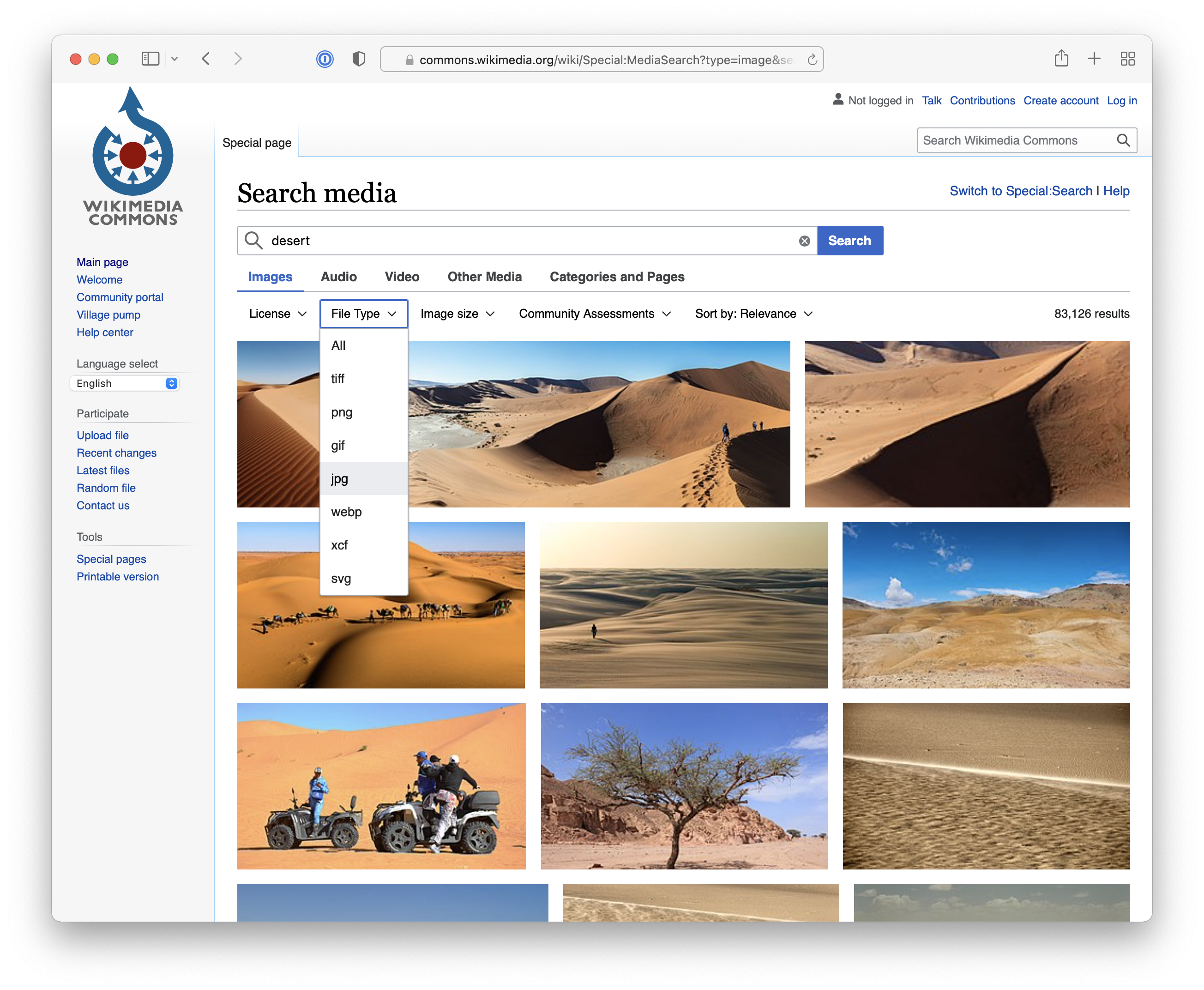
Choosing an option within the dropdown closes the menu and sets the label to the currently-chosen value, as expected.
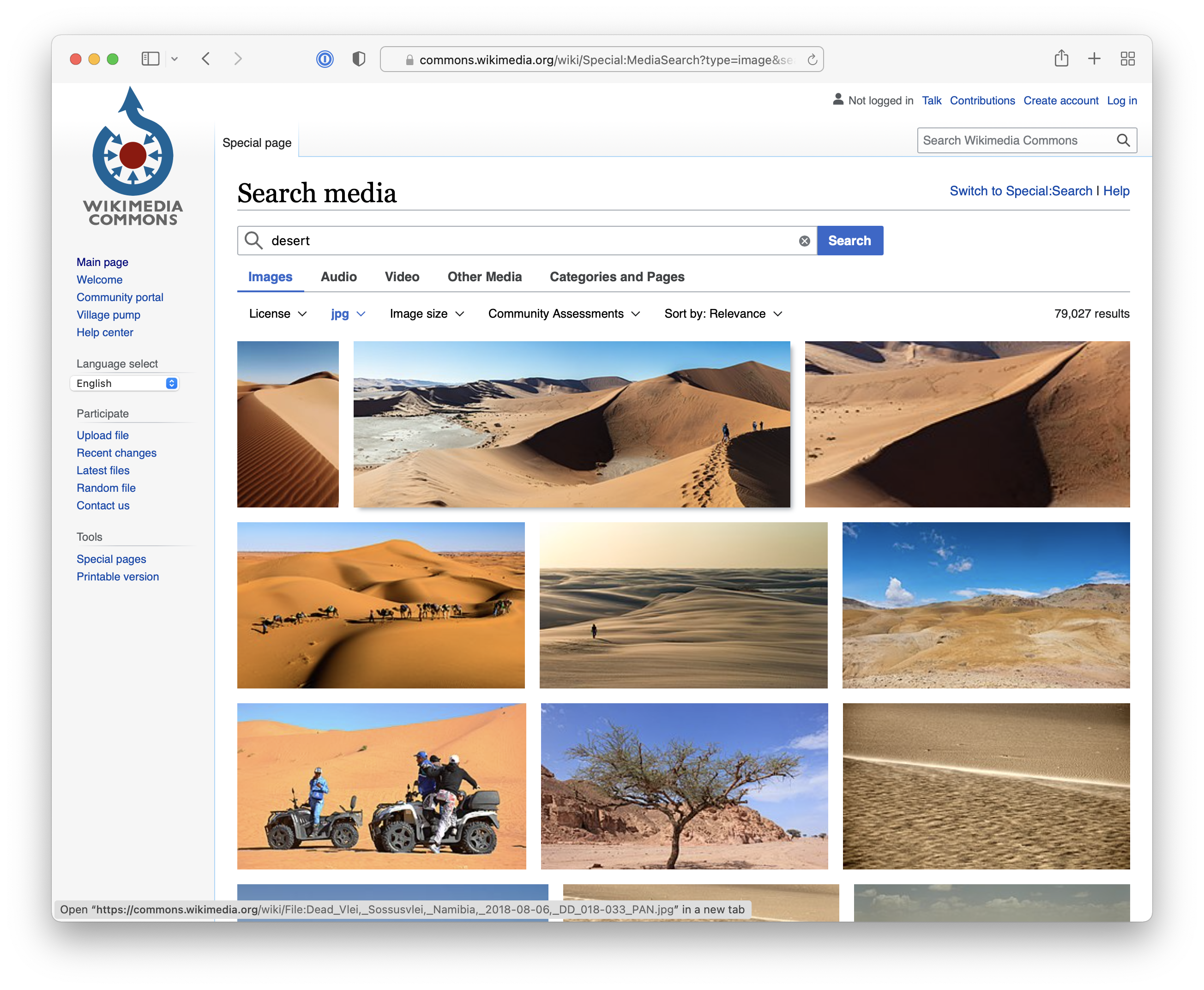
However, the user also needs a way to un-set these values so that they can get back to the full set of search results. The MediaSearch UI does this by providing an initial option within each menu that is labeled "All". When this option is clicked, the menu closes as before but "All" is never displayed as the label of the collapsed menu (the way "JPEG" was previously). Instead the default label for the dropdown is shown. Similarly, when the menu is expanded, the "All" option is never styled in a way to indicate that it has been selected. It is treated differently from the other options and is a little bit sneaky.
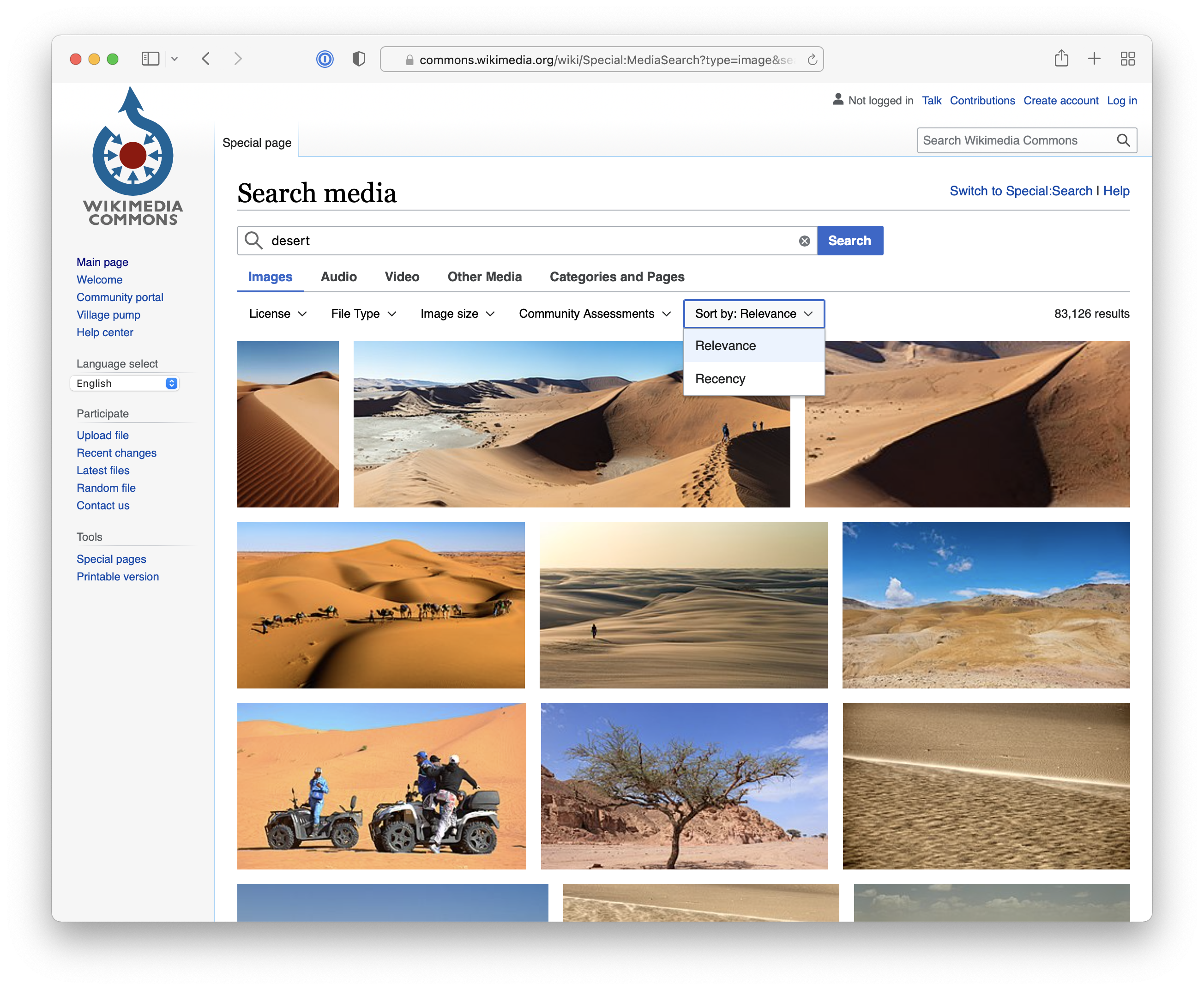
All of the filter dropdowns in MediaSearch exhibit this behavior. But there is another dropdown at the end of the set that breaks the pattern: the dropdown that controls sort order. Unlike with filters, where "no selection" is a valid choice that the user may want to get back to, when it comes to sorting the choice is strictly binary: either sort by relevance OR sort by recency. There is no "sort by nothing". One of the two options must always be selected, and the menu actually shows "relevance" as pre-selected when the user opens the menu for the first time.
I think it would be good for us to have clear answers for the following questions:
- Should dropdown menus allow a selection to be unset? Should they all do this or should it be opt-in (per-dropdown)?
- How should the user unset the value? Should there be an option within the value that corresponds to "no selection"?
- Should the "no selection" option be treated the same as other options (gets the selection styles when chosen, replaces the initial default label), or does it require special treatment?
- Should the user be able to unset a menu by clicking the selected option again (either instead of the above approach or in addition to it)?
The MediaSearch example is one way this could be handled but I don't necessarily think we should follow that here. However I do think similar use cases will come up elsewhere and we'll need a way to handle them.
Prior discussion for WVUI here: T280712: Add basic select list (dropdown) component to WVUI
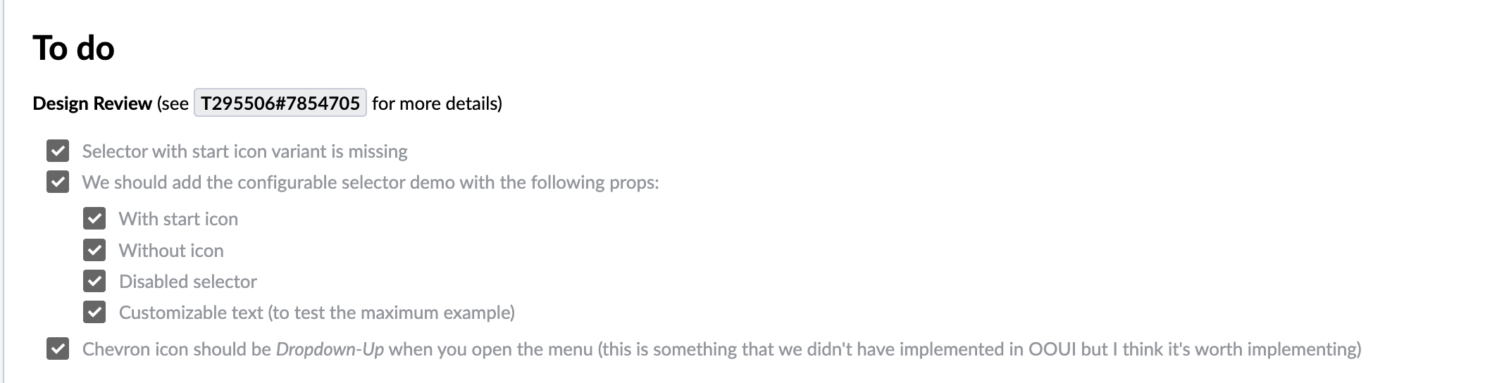
To do
Design Review (see T295506#7854705 for more details)
- Selector with start icon variant is missing
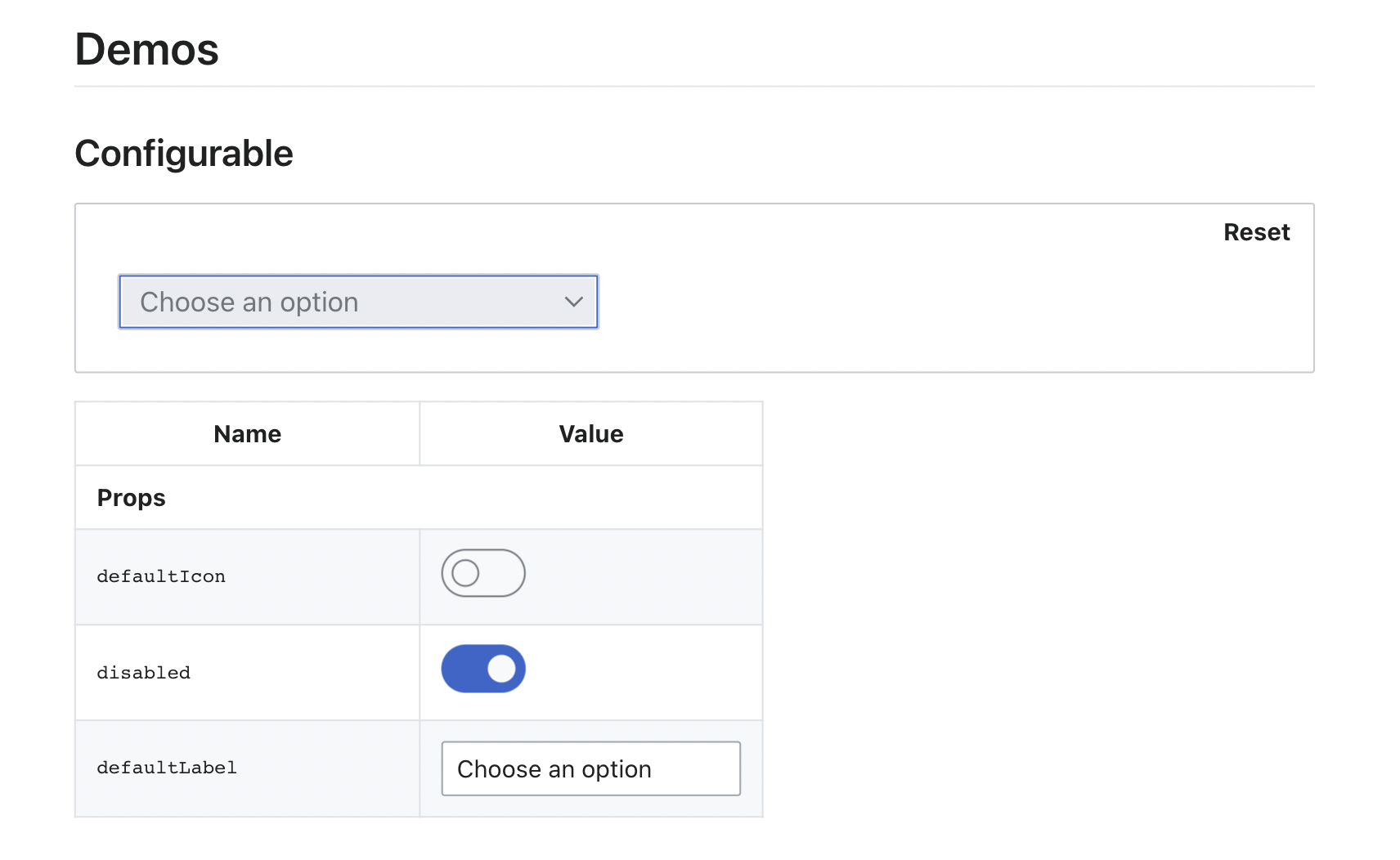
- We should add the configurable selector demo with the following props:
- With start icon
- Without icon
- Disabled selector
- Customizable text (to test the maximum example)
-
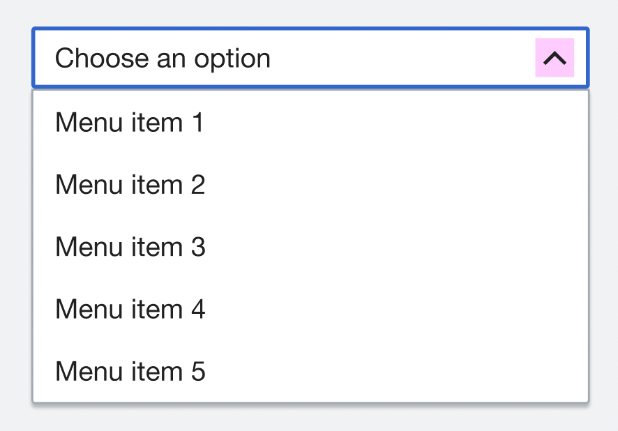
Chevron icon should be Dropdown-Up when you open the menu (this is something that we didn't have implemented in OOUI but I think it's worth implementing)We finally won't implement the rotation for the dropdown icon (more details here) - Disabled state: delete clickable action and focus outline (details here)
- On small screens (less than 380px screens on mobile) the component sticks out the demo box