Page MenuHomePhabricator

First-Run Experience: Make "Preferences" affordance more obviously clickable
Closed, ResolvedPublic

Description

This task represents the work involved with iterating on the design of the Preferences affordance within the Automatic Topic Subscription first-run experience (T262103) to make it more obviously clickable.

User Story

As someone who is seeing the Automatic Topic Subscription first-run experience, I want to know what to do to visit "preferences", so that I can adjust my notification settings.

Approach

Borrowed from the ideas @Esanders and @Ryasmeen shared in Slack.

  • Approach #1: Adjust the affordance's language to make it more action-oriented
    • E.g. Change the language from Preferences --> Edit Preferences.
  • Approach #2: Add a frame to surround the Preferences affordance
  • Approach #3: Change the color the Preferences text
    • E.g. Change the affordance's text color from black to blue.

Mockup

Mockup to be posted here once an ===Approach is decided upon.

Done

  • An ===Approach for making the Preferences affordance more obviously clickable is decided upon
  • A design is posted to the ===Mockup section for the ===Approach that is decided upon
  • The ===Mockup is implemented

Event Timeline

ppelberg renamed this task from Make "Preferences" more obviously clickable within first-run experience to First-Run Experience: Make "Preferences" affordance more obviously clickable.Nov 18 2021, 1:19 AM
ppelberg removed Whatamidoing-WMF as the assignee of this task.
ppelberg created this task.

Next steps

  • @iamjessklein to review ===Approaches and comment which – if any – she thinks we should move forward with

I mocked up all the approaches and D (which would be to treating more like community tech did for the watchlist time period but I think B. is the way to go because:

  1. We want to teach contributors about the page so we wouldn't want option D where it's embedded.
  2. We want it to feel like a link more than an action.

In B, I changed the copy to "Edit preferences" and the button to quiet progressive.

button explorations.png (968×4 px, 116 KB)

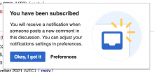
Just for ease-of-comparison, here's the current appearance:

image.png (888×1 px, 297 KB)

Going to move forward with "B."

Going to move forward with "B."

Sounds good to me.

I mocked up all the approaches and D (which would be to treating more like community tech did for the watchlist time period but I think B. is the way to go because:

  1. We want to teach contributors about the page so we wouldn't want option D where it's embedded.
  2. We want it to feel like a link more than an action.

In B, I changed the copy to "Edit preferences" and the button to quiet progressive.

button explorations.png (968×4 px, 116 KB)

I agree with @iamjessklein on this to go for Option B and make it a link rather than a button. I assume, this approach would also avoid button text/label overflow when it's translated in some other languages?

Change 747640 had a related patch set uploaded (by Bartosz Dziewoński; author: Bartosz Dziewoński):

[mediawiki/extensions/DiscussionTools@master] Make preferences button in auto-subscription popup more obviously clickable

https://gerrit.wikimedia.org/r/747640

matmarex subscribed.

I assume, this approach would also avoid button text/label overflow when it's translated in some other languages?

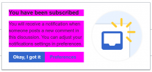
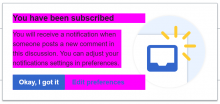
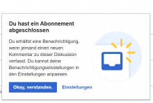
Yes, I had to change how the text is laid out to fit "Edit preferences" on one line (it is now allowed to overlap the image slightly), which will also affect other languages. We shouldn't count on that though (users might use different fonts and text sizes), and everything is flexible so the dialog still looks okay with longer text.

Just to illustrate, I highlighted in pink the areas where the text is laid out:

BeforeAfter
image.png (435×919 px, 40 KB)

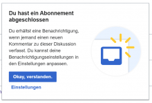
Example screenshot of the German translation, which has longer text:

BeforeAfter
image.png (629×927 px, 51 KB)

Change 747640 merged by jenkins-bot:

[mediawiki/extensions/DiscussionTools@master] Make preferences button in auto-subscription popup more obviously clickable

https://gerrit.wikimedia.org/r/747640

Test wiki created on Patch demo by JKlein (WMF) using patch(es) linked to this task:

https://patchdemo.wmflabs.org/wikis/899efc408d/w/

I assume, this approach would also avoid button text/label overflow when it's translated in some other languages?

Yes, I had to change how the text is laid out to fit "Edit preferences" on one line (it is now allowed to overlap the image slightly), which will also affect other languages. We shouldn't count on that though (users might use different fonts and text sizes), and everything is flexible so the dialog still looks okay with longer text.

Just to illustrate, I highlighted in pink the areas where the text is laid out:

BeforeAfter
image.png (435×919 px, 40 KB)

Example screenshot of the German translation, which has longer text:

BeforeAfter
image.png (629×927 px, 51 KB)

Thanks @matmarex for the tweaks.

Thanks I think the change works well. Nice catch @Ryasmeen and @matmarex

Test wiki on Patch demo by JKlein (WMF) using patch(es) linked to this task was deleted:

https://patchdemo.wmflabs.org/wikis/899efc408d/w/