Page MenuHomePhabricator

[wmf.9-regression] oo-ui-image-error icon placed too close to the difficulty level label
Closed, ResolvedPublic

Description

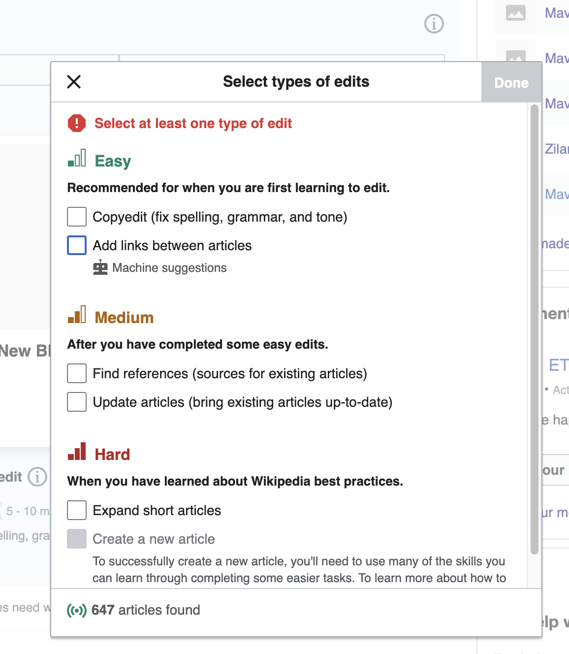
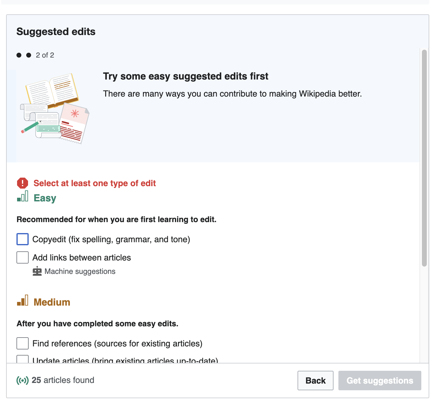
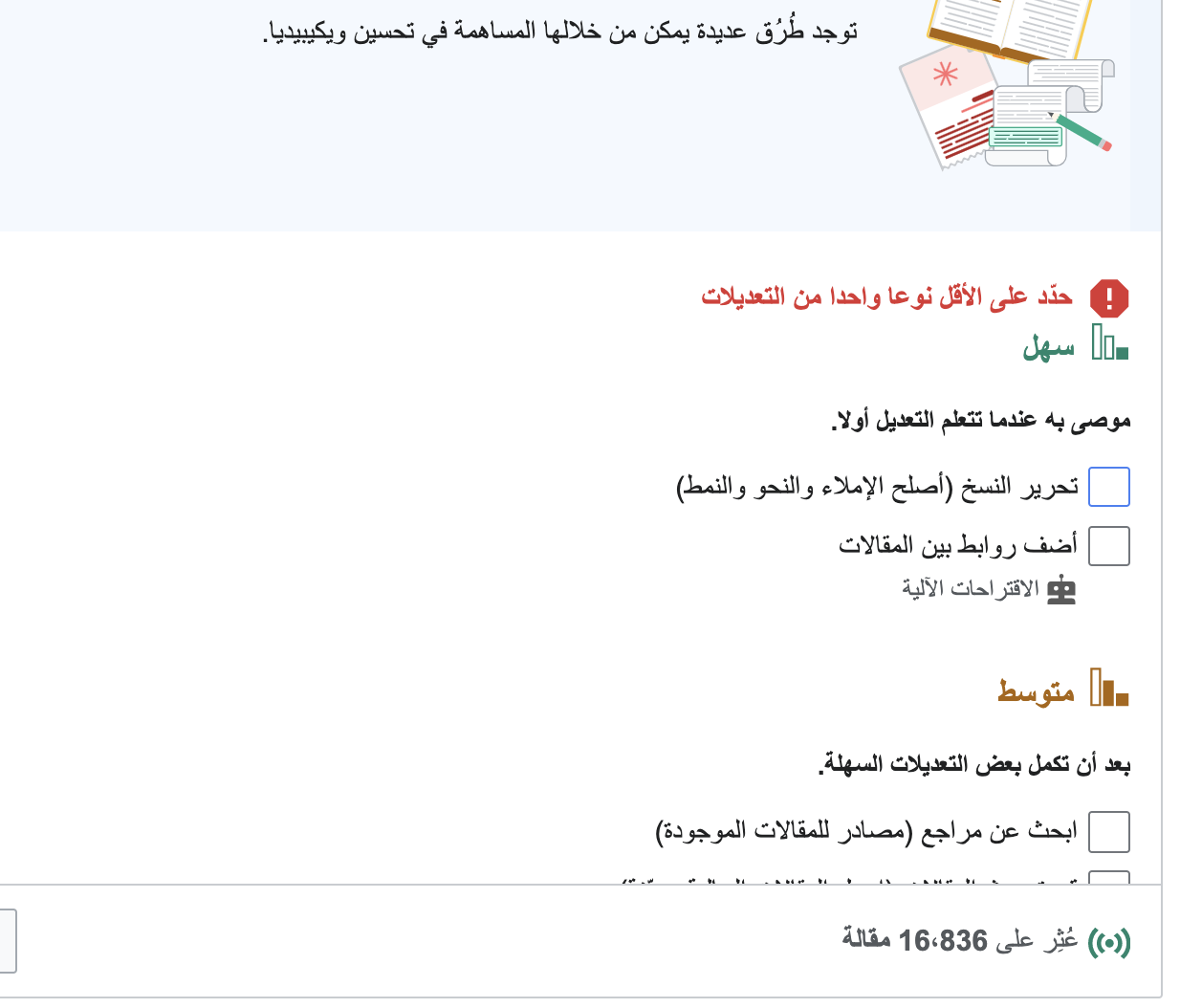
  1. On Special:Homepage go Select types of edits filter.
  2. Deselect all filters - the warning message "Select at least one type of edit" will appear with the icon placed too close to the header "Easy":
Screen Shot 2021-11-29 at 2.06.46 PM.png (1×1 px, 200 KB)
Screen Shot 2021-11-29 at 2.07.36 PM.png (1×776 px, 166 KB)
Screen Shot 2021-11-29 at 2.04.53 PM.png (1×1 px, 133 KB)

Spec: https://www.figma.com/file/Pgo6fPGaDDiqXWGfMI8oiF/Growth---features?node-id=901%3A81158

Event Timeline

Restricted Application added a subscriber: Aklapper. · View Herald Transcript

Hi @Etonkovidova, do you have a screenshot of what this error state used to look like before (or even better, the specifications)? I can't find the spec for this particular state and I don't see anything in the change history for this particular file.

Hi @Etonkovidova, do you have a screenshot of what this error state used to look like before (or even better, the specifications)? I can't find the spec for this particular state and I don't see anything in the change history for this particular file.

@mewoph - you're right, probably I shouldn't file it as a regression. I don't have the before screenshots. And also I couldn't find the specs on Figma.

Pinging @RHo for the input on whether it's a regression issue and, if so, should it be addressed or not.

Hiya, I believe it is either a regression or oversight that should be fixed as it is definitely too close – as compared to the spacing in this initial version mock https://wikimedia.invisionapp.com/console/share/FUTVMSLV24X/383484896.
I've recreated the intended spacing (16px) for the Figma spec here in case that helps:
https://www.figma.com/file/Pgo6fPGaDDiqXWGfMI8oiF/Growth---features?node-id=901%3A81158

Change 743139 had a related patch set uploaded (by Sergio Gimeno; author: Sergio Gimeno):

[mediawiki/extensions/GrowthExperiments@master] Suggested edits: increase vertical spacing for error message label

https://gerrit.wikimedia.org/r/743139

Test wiki created on Patch demo by KHarlan (WMF) using patch(es) linked to this task:

https://patchdemo.wmflabs.org/wikis/fa0dd7365a/w/

I couldn't tell if it was a regression or not, if it was one it was from more than 2 months ago. I pushed a patch for it.

Change 743139 merged by jenkins-bot:

[mediawiki/extensions/GrowthExperiments@master] Suggested edits: increase vertical spacing for error message label

https://gerrit.wikimedia.org/r/743139

Test wiki on Patch demo by KHarlan (WMF) using patch(es) linked to this task was deleted:

https://patchdemo.wmflabs.org/wikis/fa0dd7365a/w/