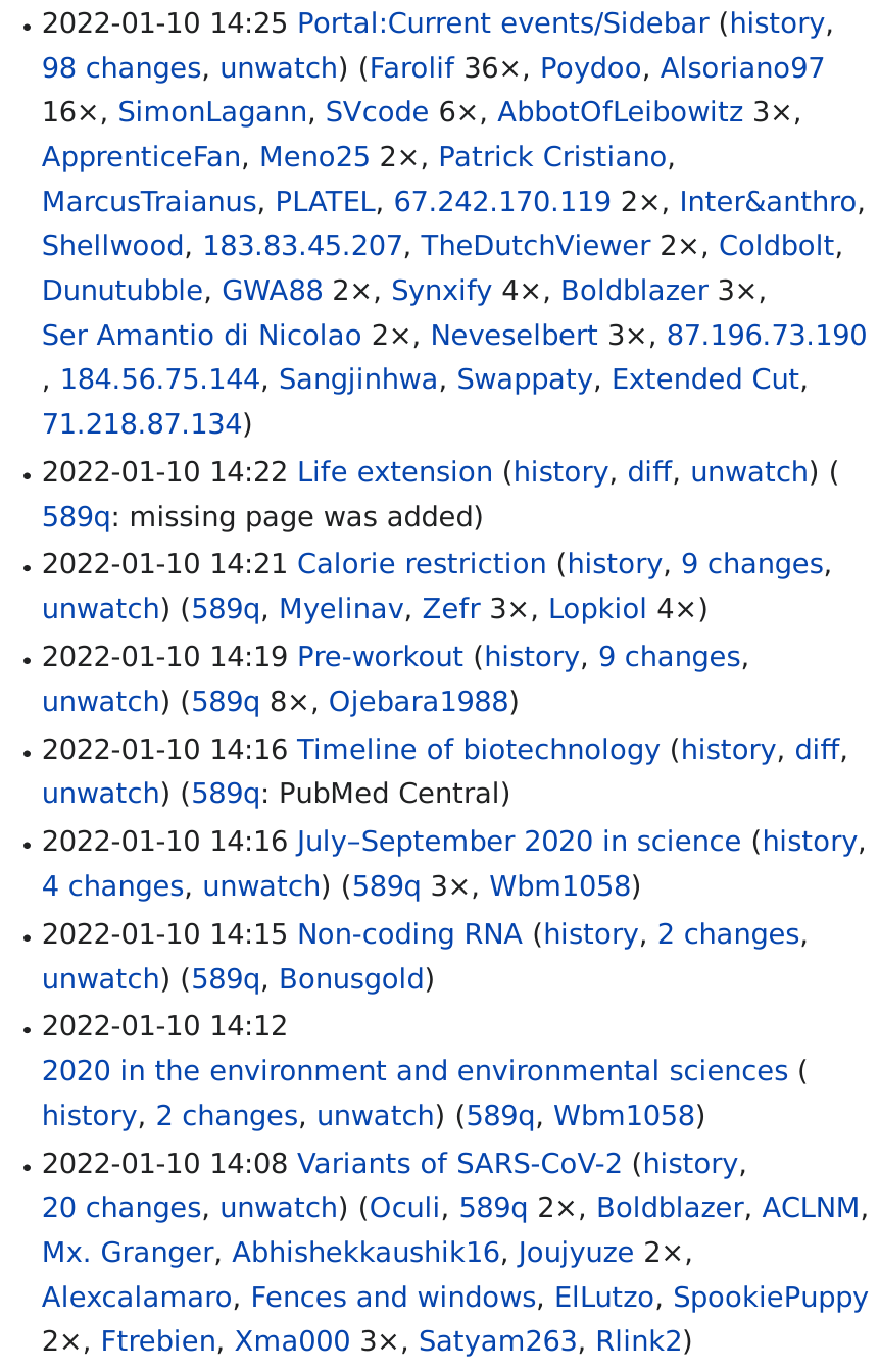
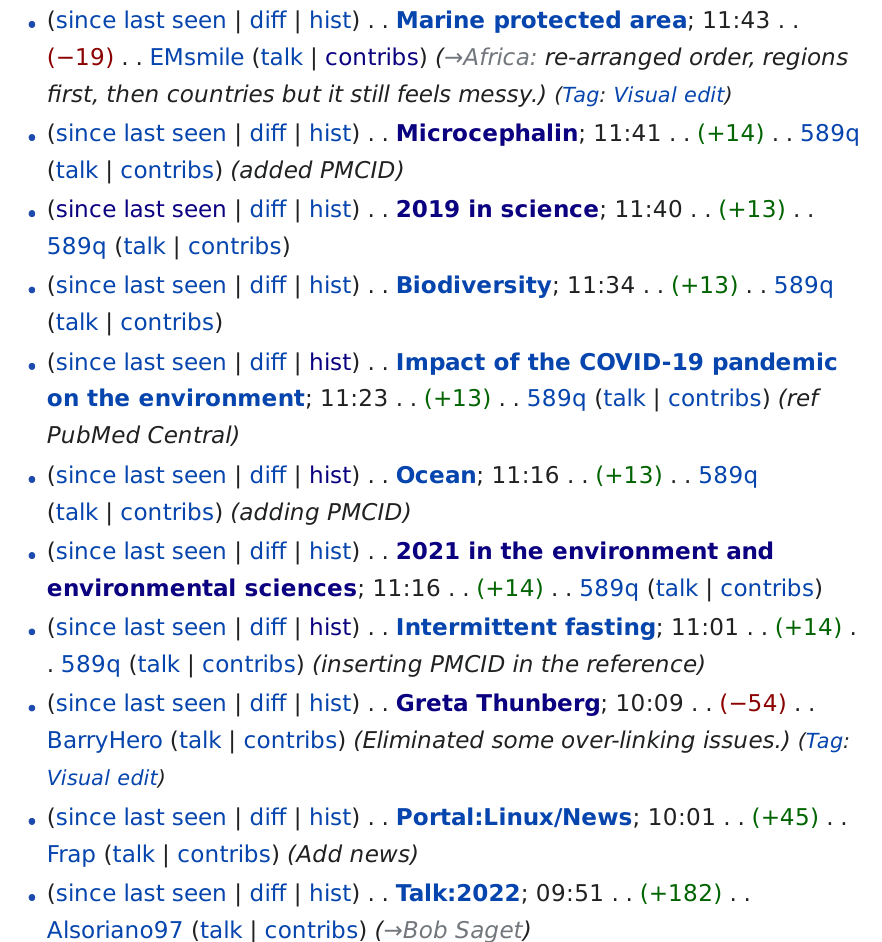
Here is a comparison between the Wikipedia Watchlist enhanced with a button, "since last seen", via a gadget and the Global Watchlist:
| GlobalWatchlist | Added button |
 |  |
 | < this screenshot makes it clearer (the panel being visible in the middle of the page was a bug of the screenshot-taker, it wasn't actually visible there. It shows the configured settings so it may be useful.) |
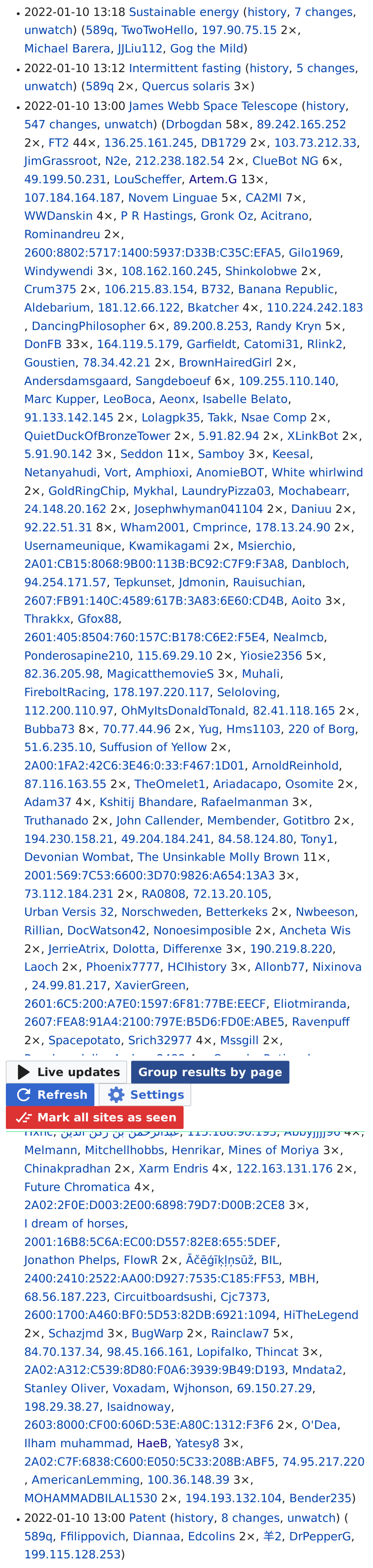
Problems with the Global Watchlist include that it's often a sea of blue, does not style article titles in any different way and entries often take much space (see the Webb Space Telescope in the second screenshot: all the usernames of the article's editors).
These problems make this Watchlist very hard to use and far worse than the original Wikipedia Watchlist. However, these problems seem to be relatively easy to solve and once that's done it would really be a great (and overdue) improvement over the current WP Watchlist. (So thanks for developing it – it could be really useful!)
Could you please add a few options to change what's being displayed and how (and change the default view)? Enabling the user to...
- hide or show the timestamps on the left
- make article-titles bold
- hide the list of recent editors next to article titles
There could also be other, new things one could display there instead of a list of editors, such as edit summaries along with the + or - of added or removed text. Such extra info could be collapsed by default and one could exclude bots from the edits displayed there. However, this would be separate issue/s and only relevant once this issue has been solved.