Page MenuHomePhabricator

Create designs for talk pages side panel in the article
Closed, DuplicatePublic

Assigned To
Authored By
scblr
Jan 12 2022, 10:31 AM
Referenced Files
F35339665: Screenshot_20220726-143352.png
Jul 26 2022, 12:35 PM
F35339662: Screenshot_20220726-142919.png
Jul 26 2022, 12:35 PM
F35339660: Screenshot_20220726-142919 copy.png
Jul 26 2022, 12:35 PM
F35330031: Screenshot_20220722-110750.png
Jul 22 2022, 9:12 AM
F35330019: Screenshot_20220722-105846.png
Jul 22 2022, 9:12 AM
F35330012: Screenshot_20220722-105311.png
Jul 22 2022, 9:12 AM
F35330009: Talk pages redesign.png
Jul 22 2022, 9:12 AM
F35330005: Screenshot_20220722-104659.png
Jul 22 2022, 9:12 AM

Description

Background

From T297625:

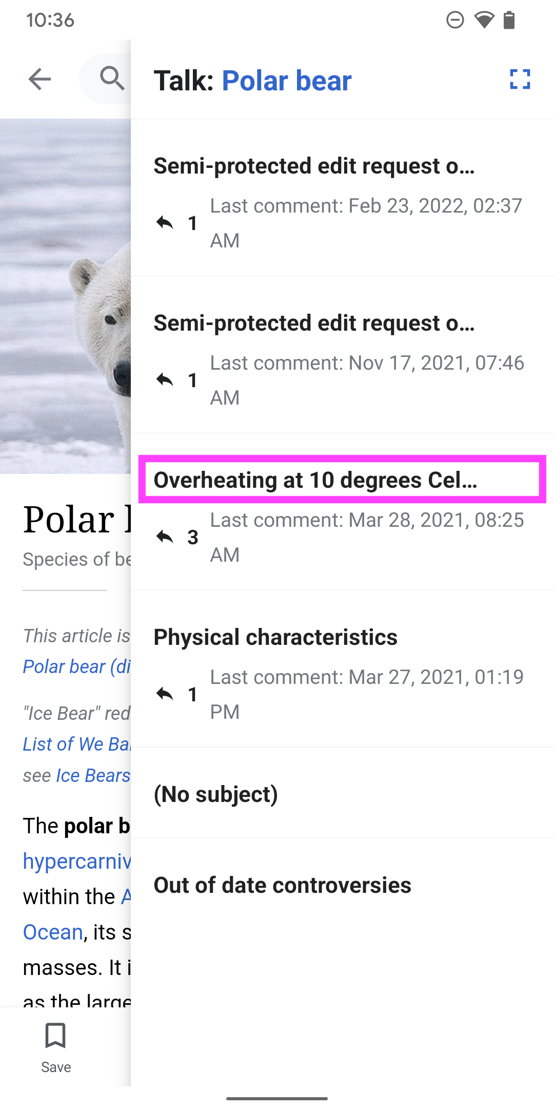
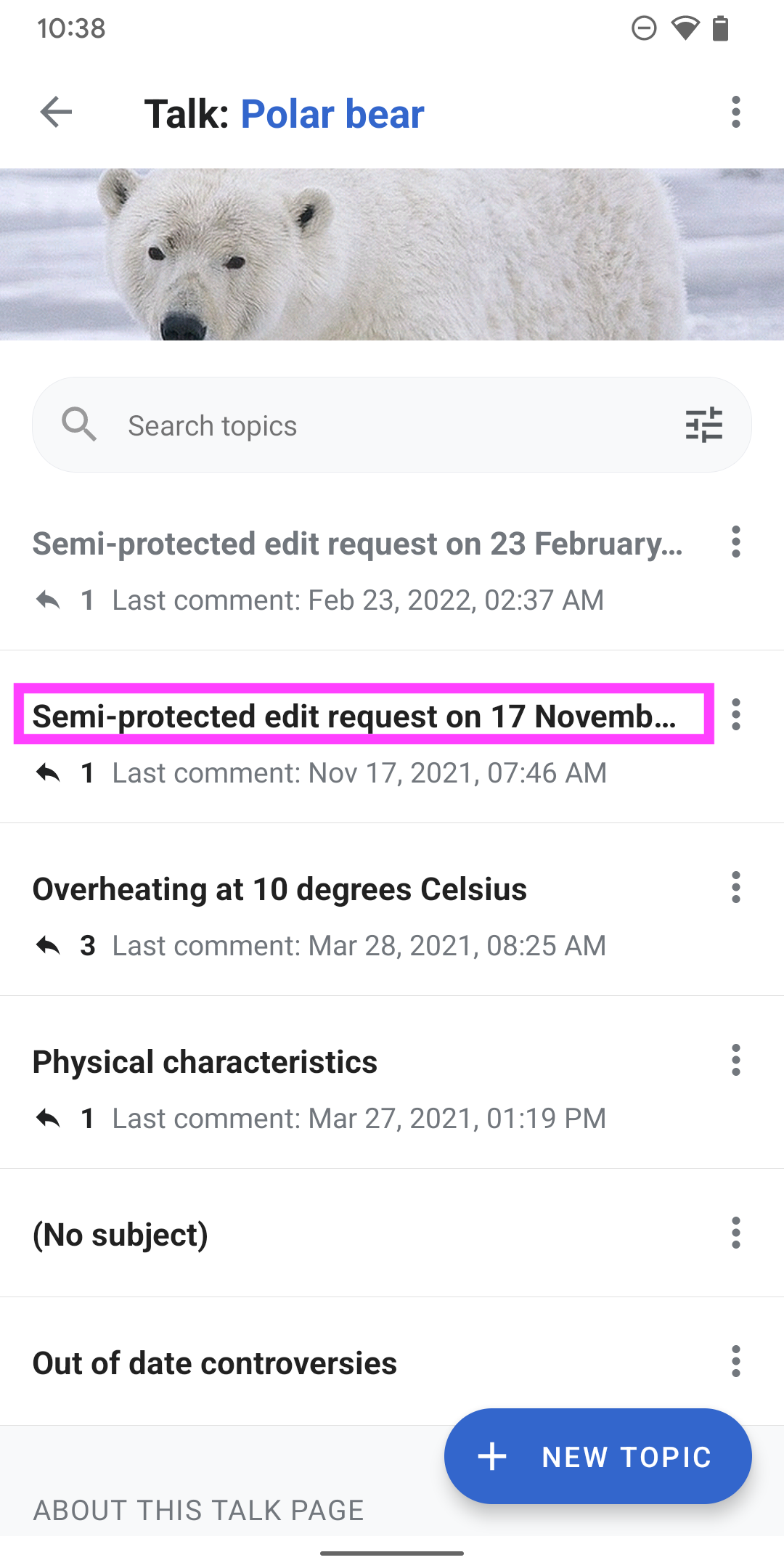
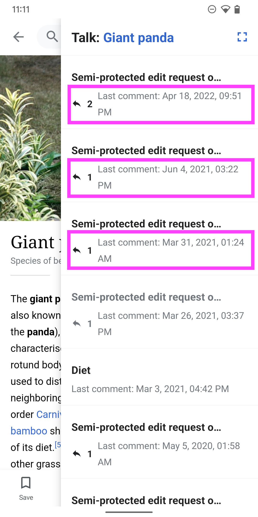
We learned from user testing, as well as research performed by the Editing team that it would be helpful for users to see talk page content in context of an article.

User story

When reading the article, I want to read the article’s discussion topics without having to leave the article, so that I can decide to contribute to the article or start a new discussion.

The task
  • Create high fidelity mocks and interaction definitions for a talk pages side panel.
  • Include way to access the entire talk pages view

For more details, check out the parent task: T297625
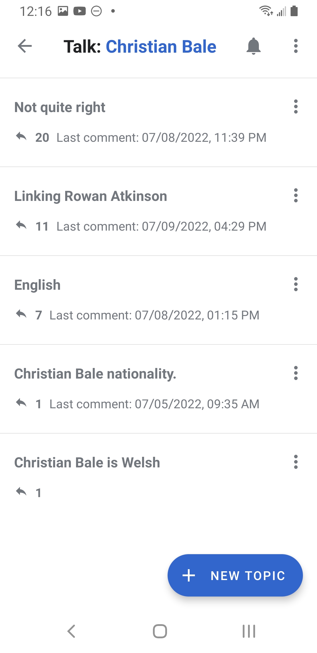
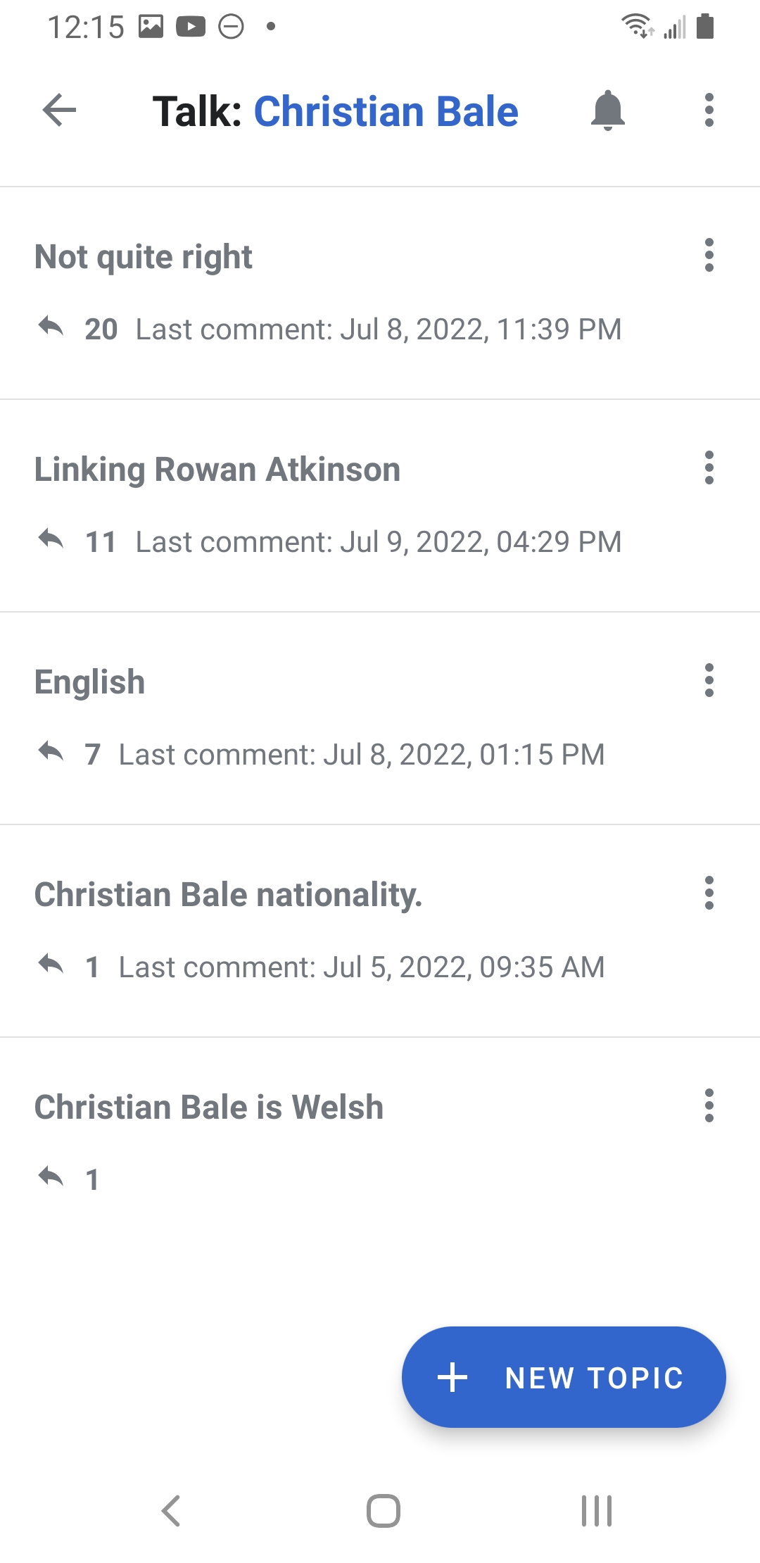
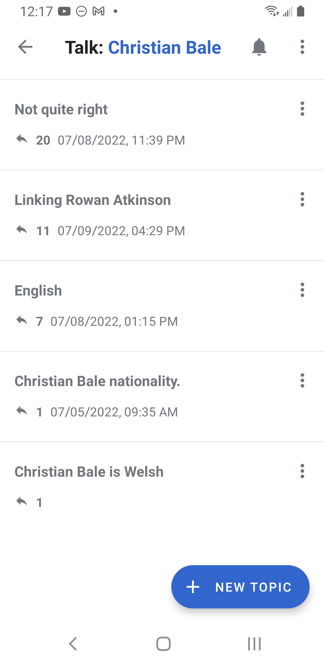
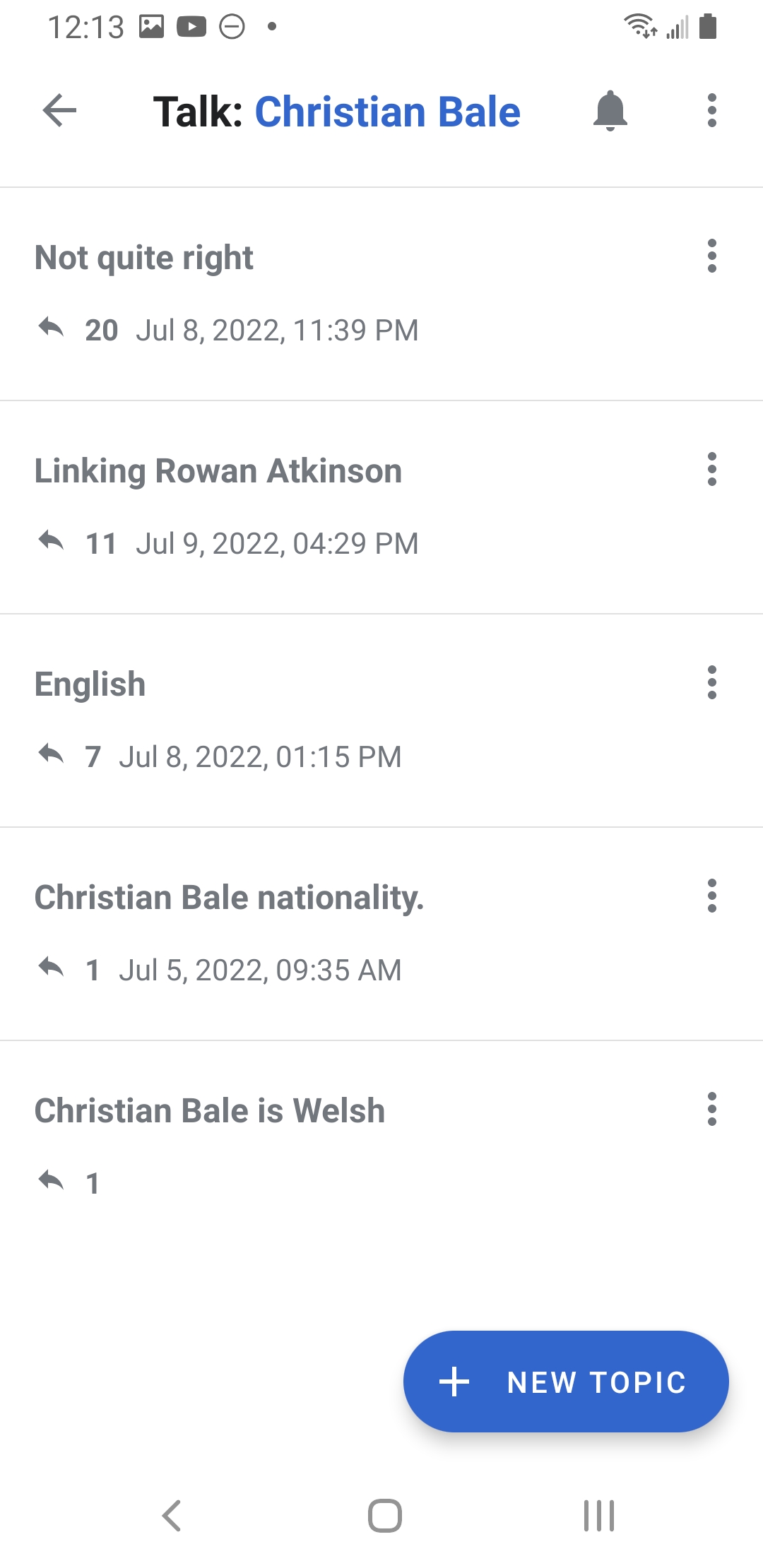
Designs (Figma)
Talk pages side panel.png (1×720 px, 511 KB)
Talk pages side panel-1.png (1×720 px, 211 KB)
Talk pages side panel-2.png (1×720 px, 218 KB)
Screenshot_20220118-191619.png (2×1 px, 100 KB)
(outdated)
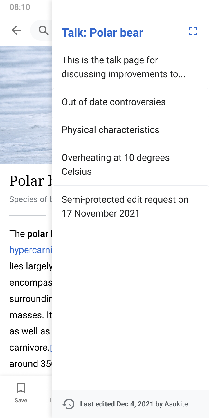
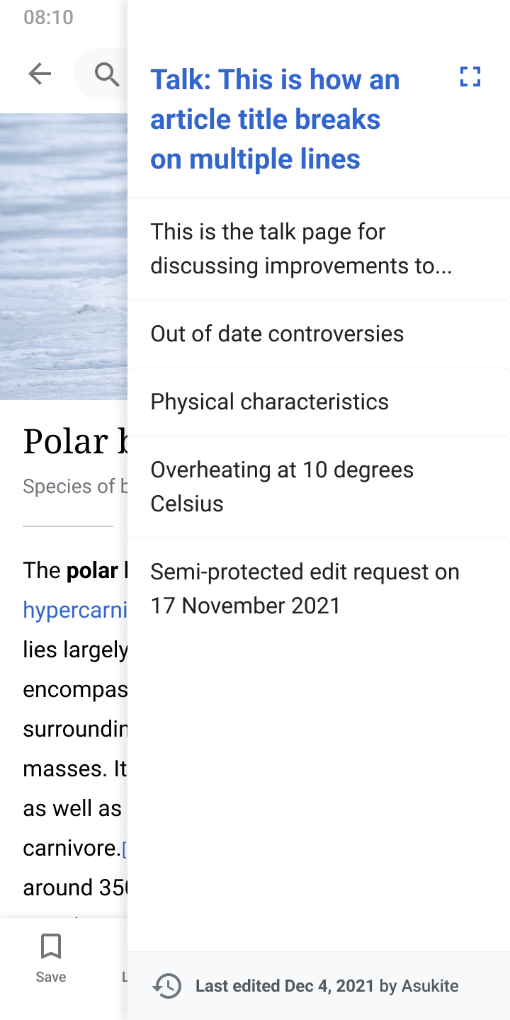
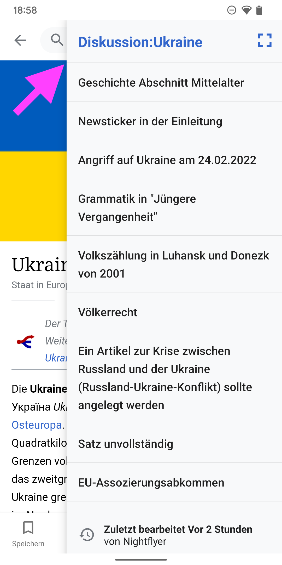
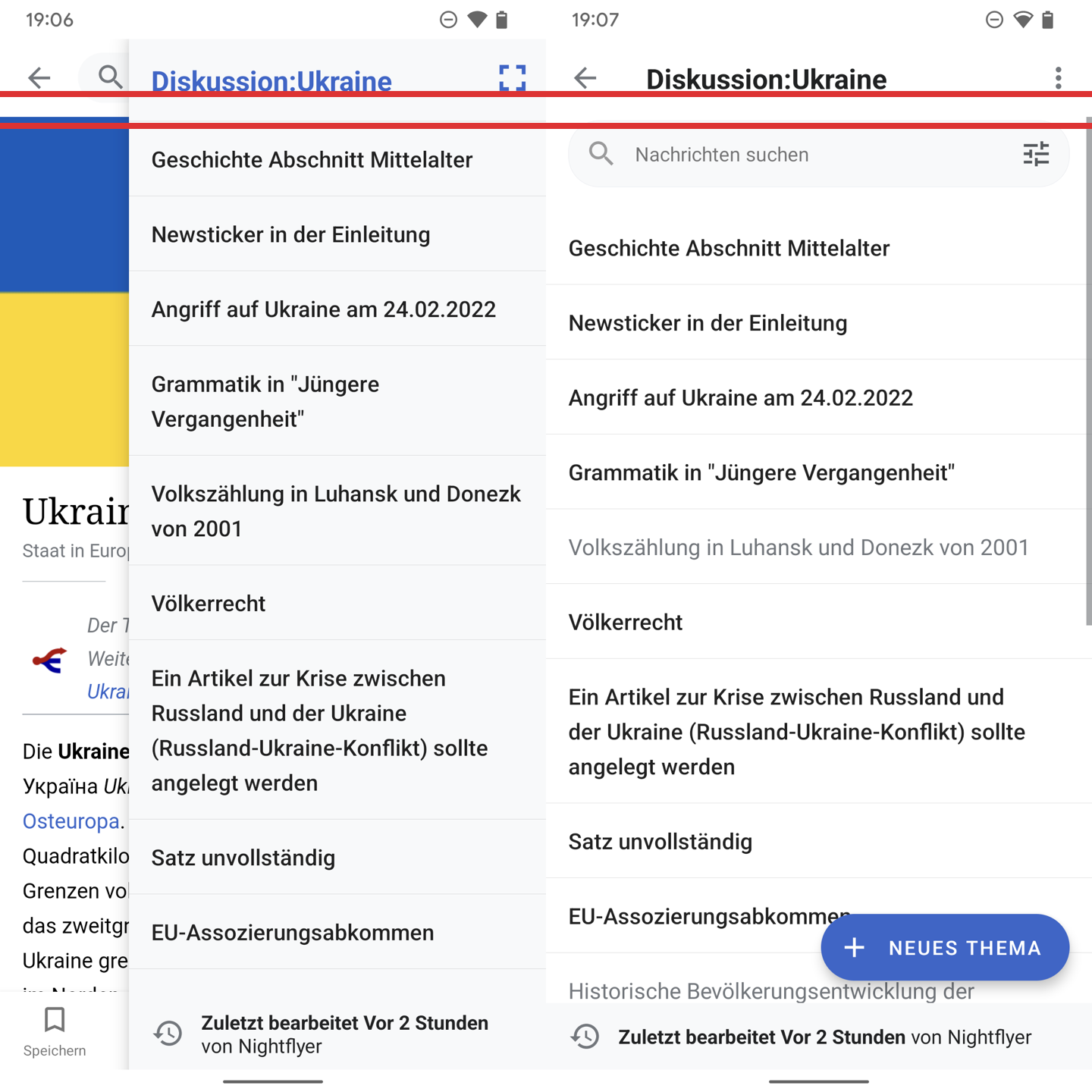
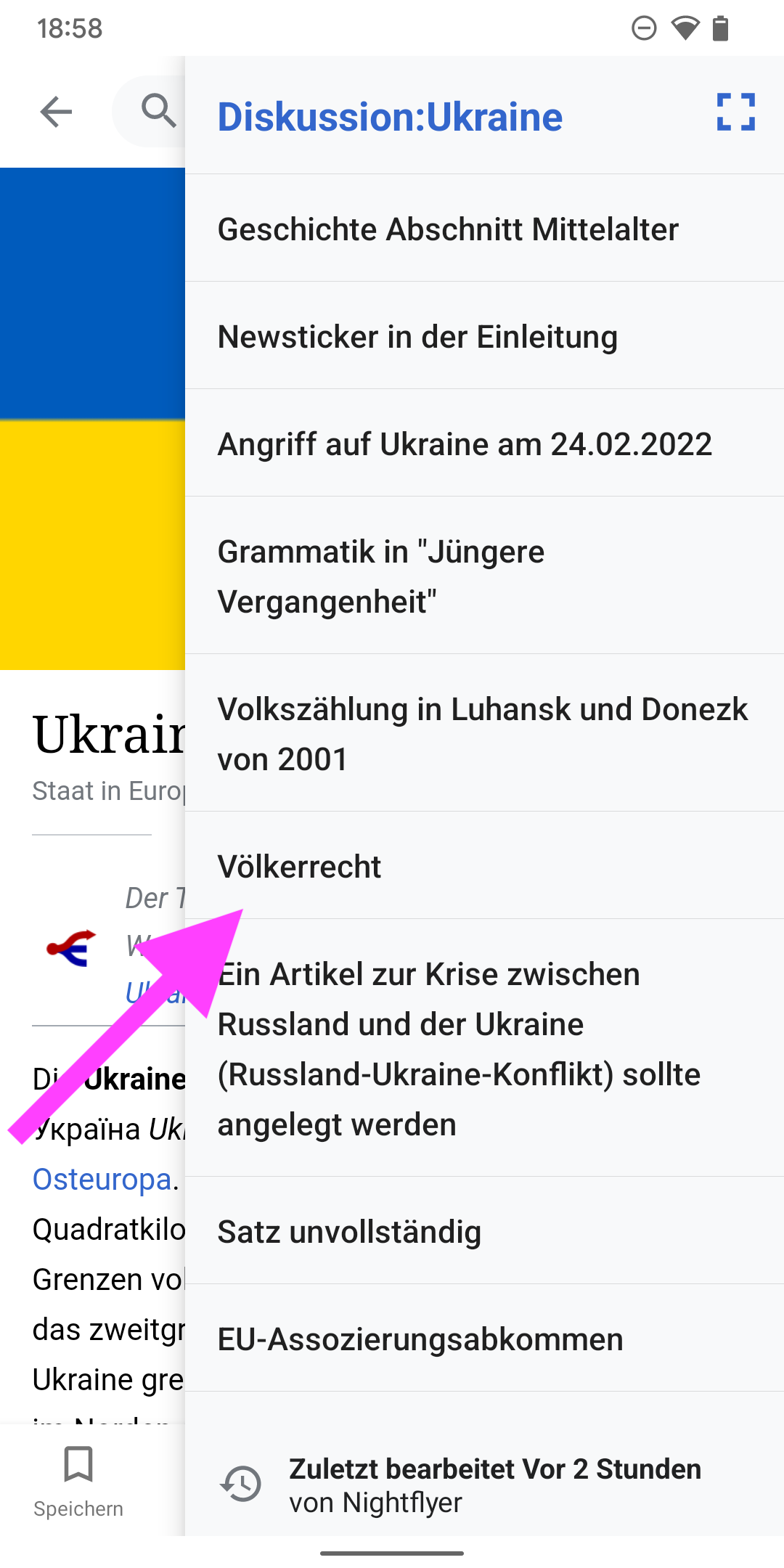
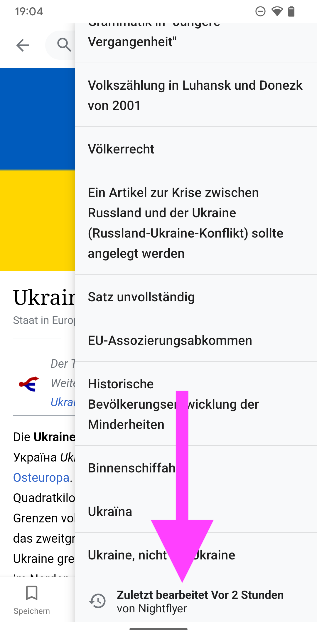
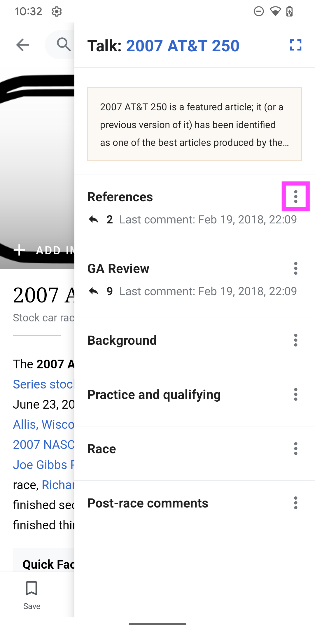
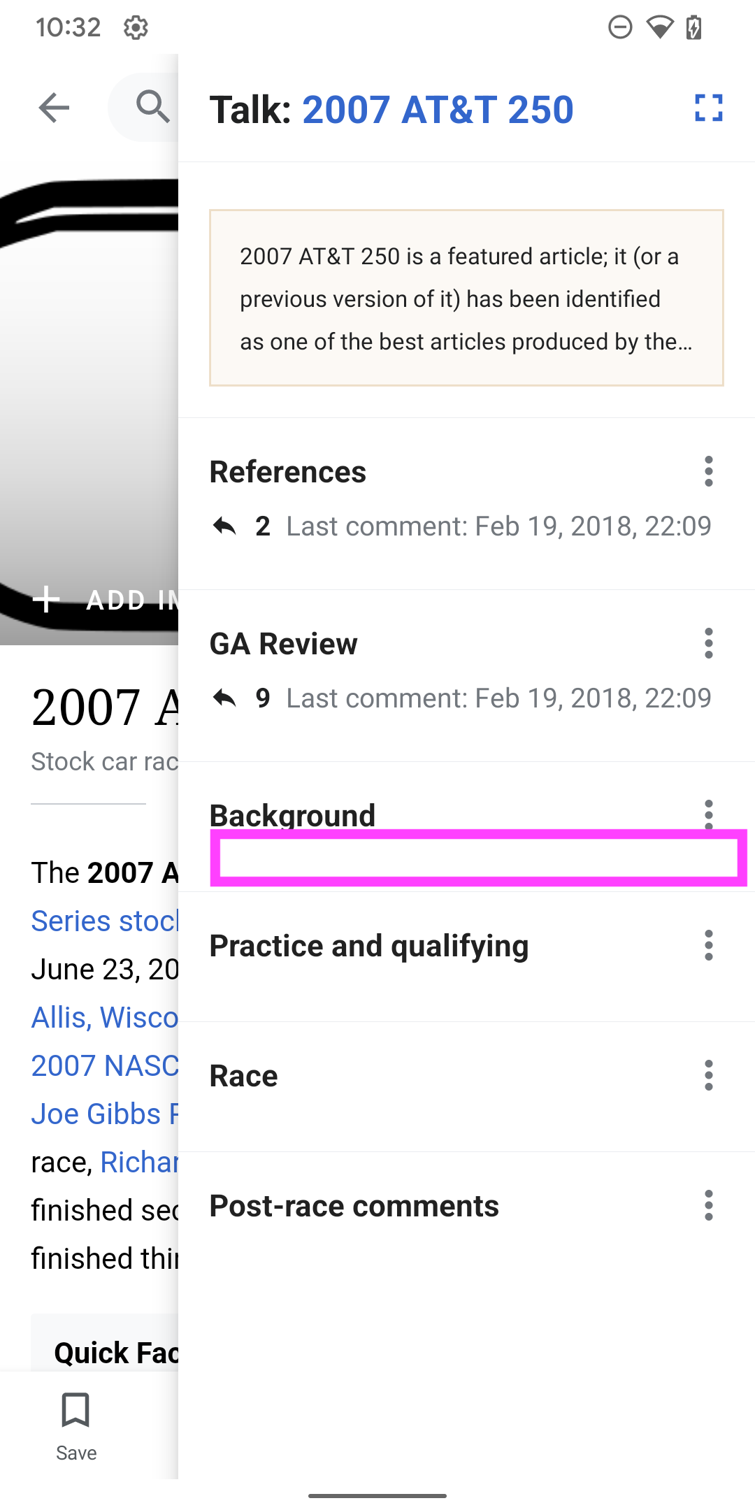
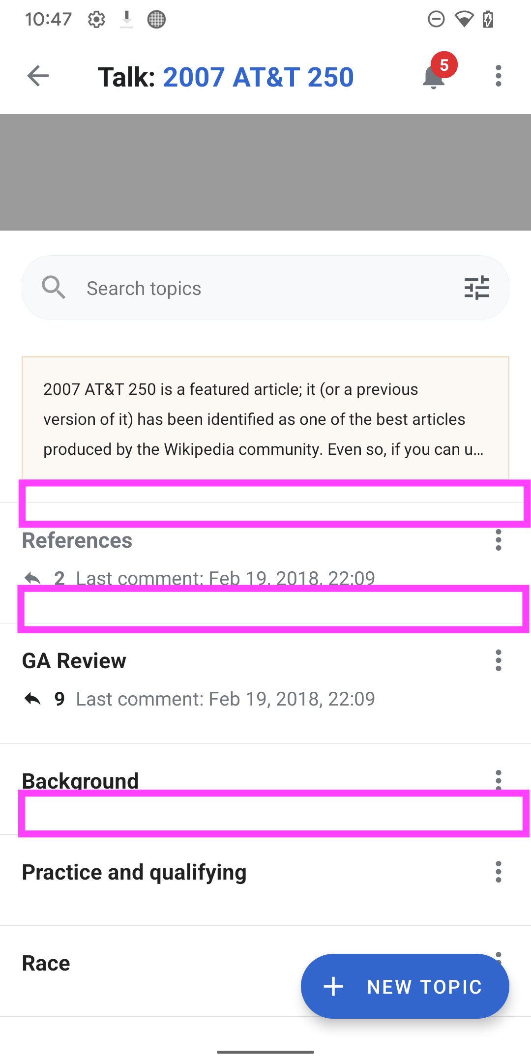
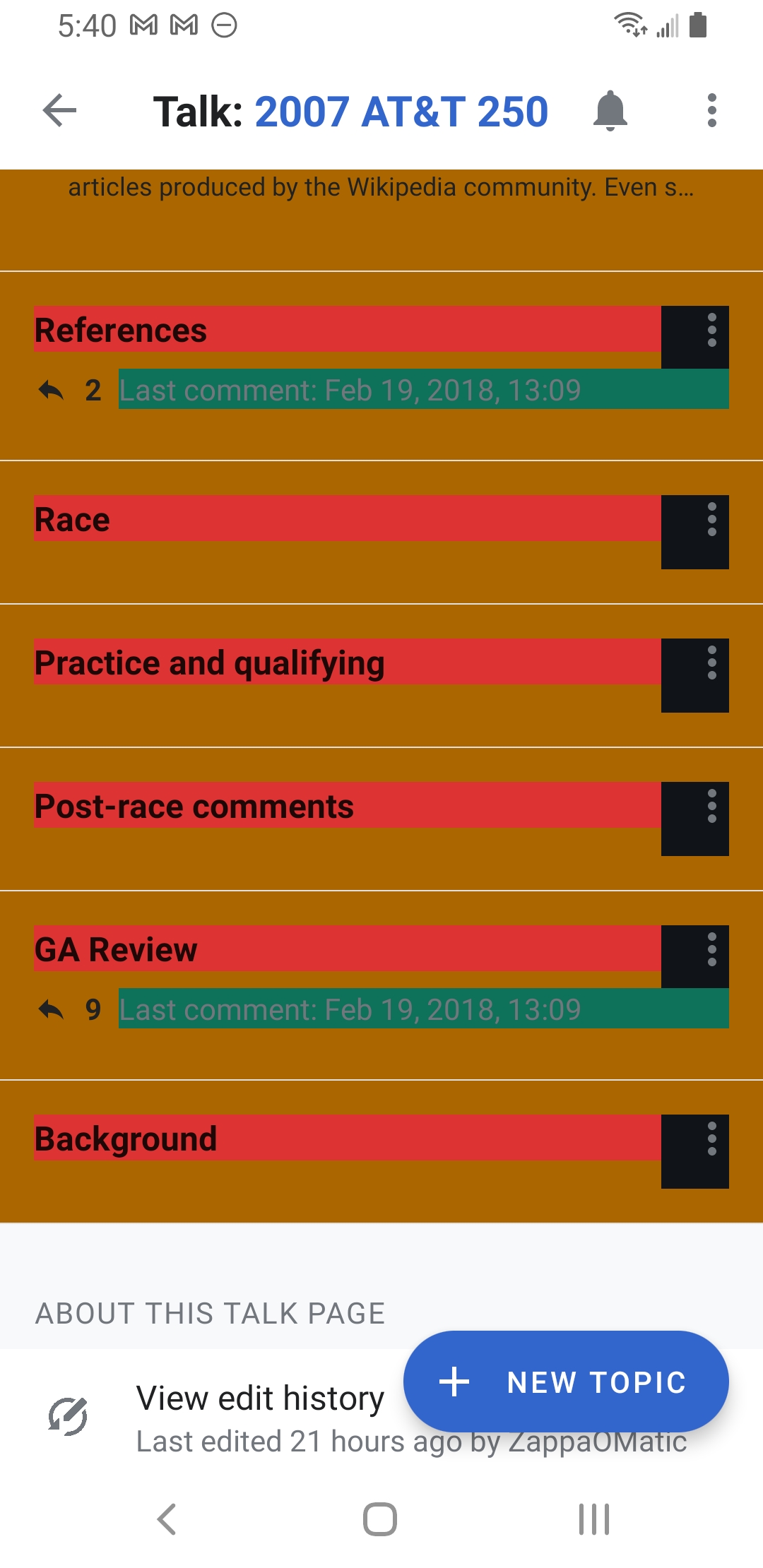
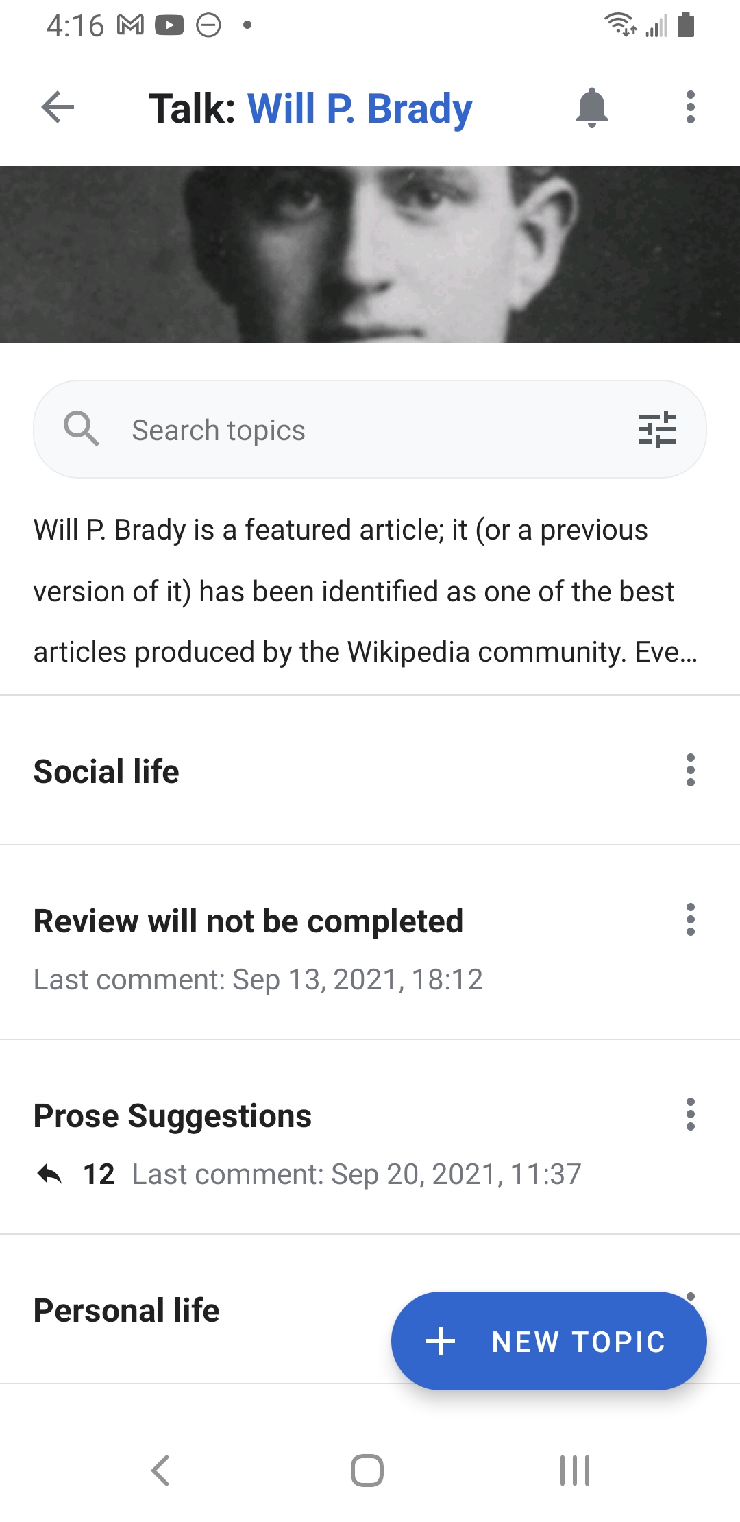
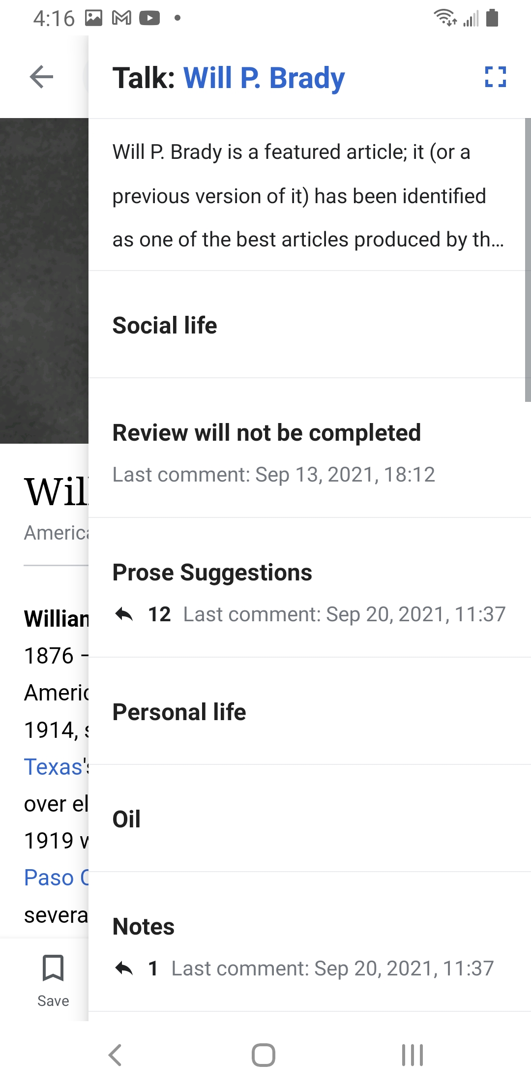
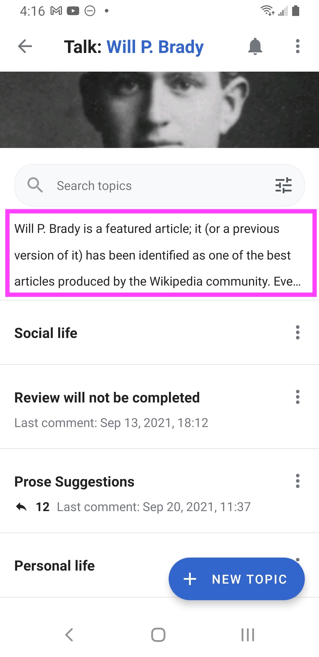
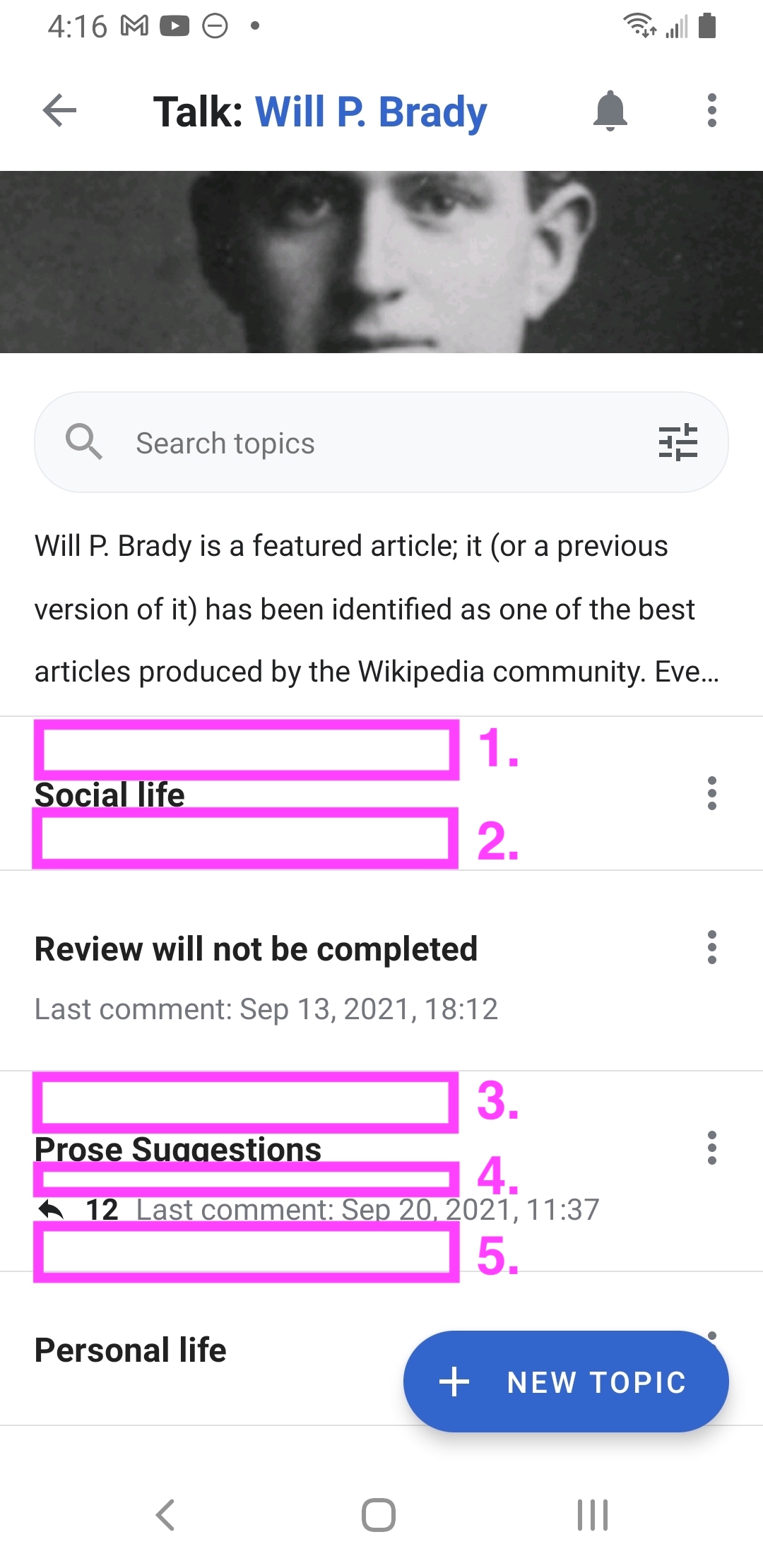
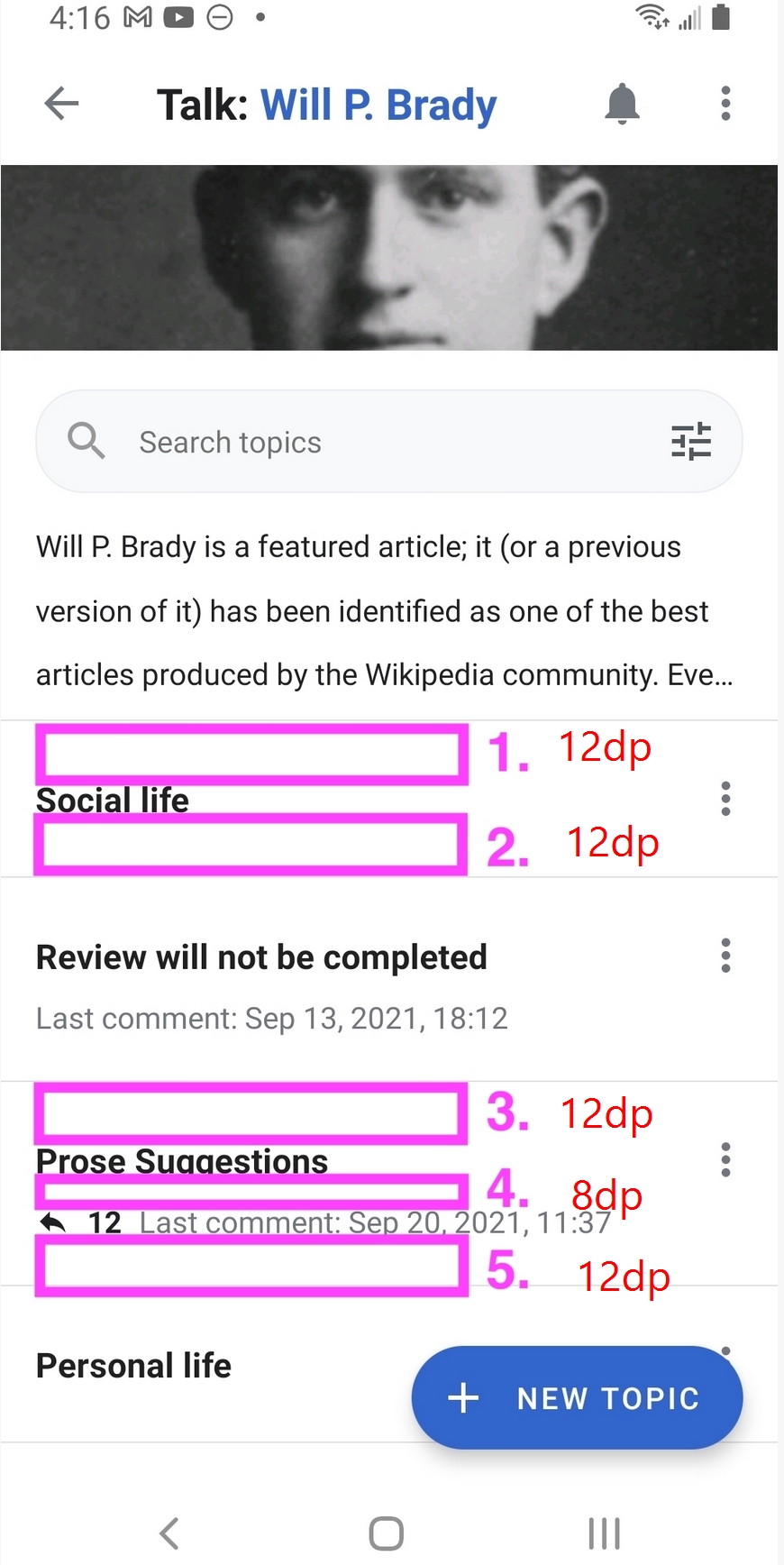
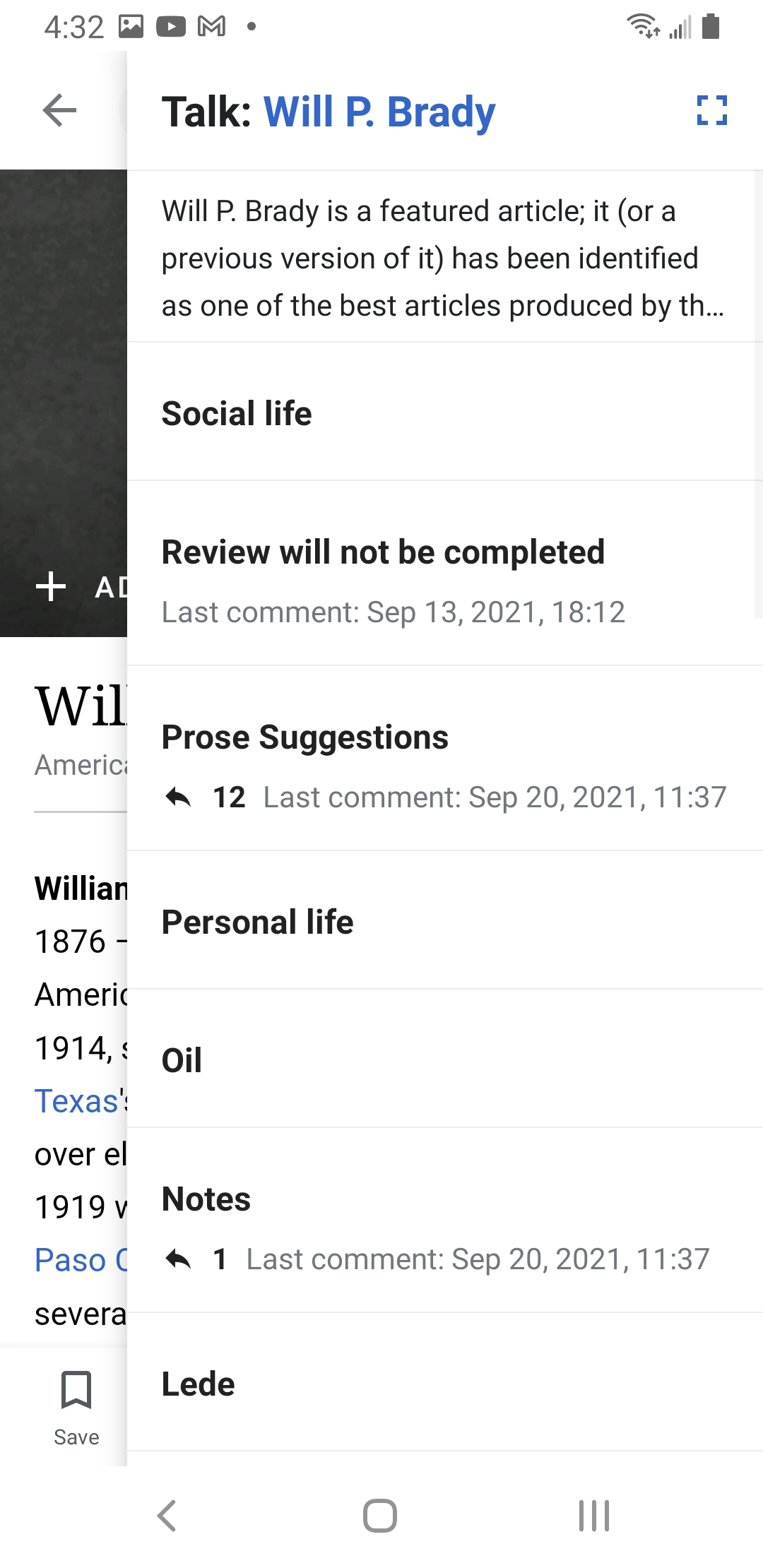
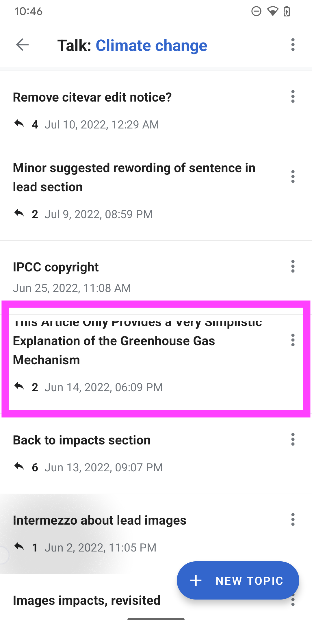
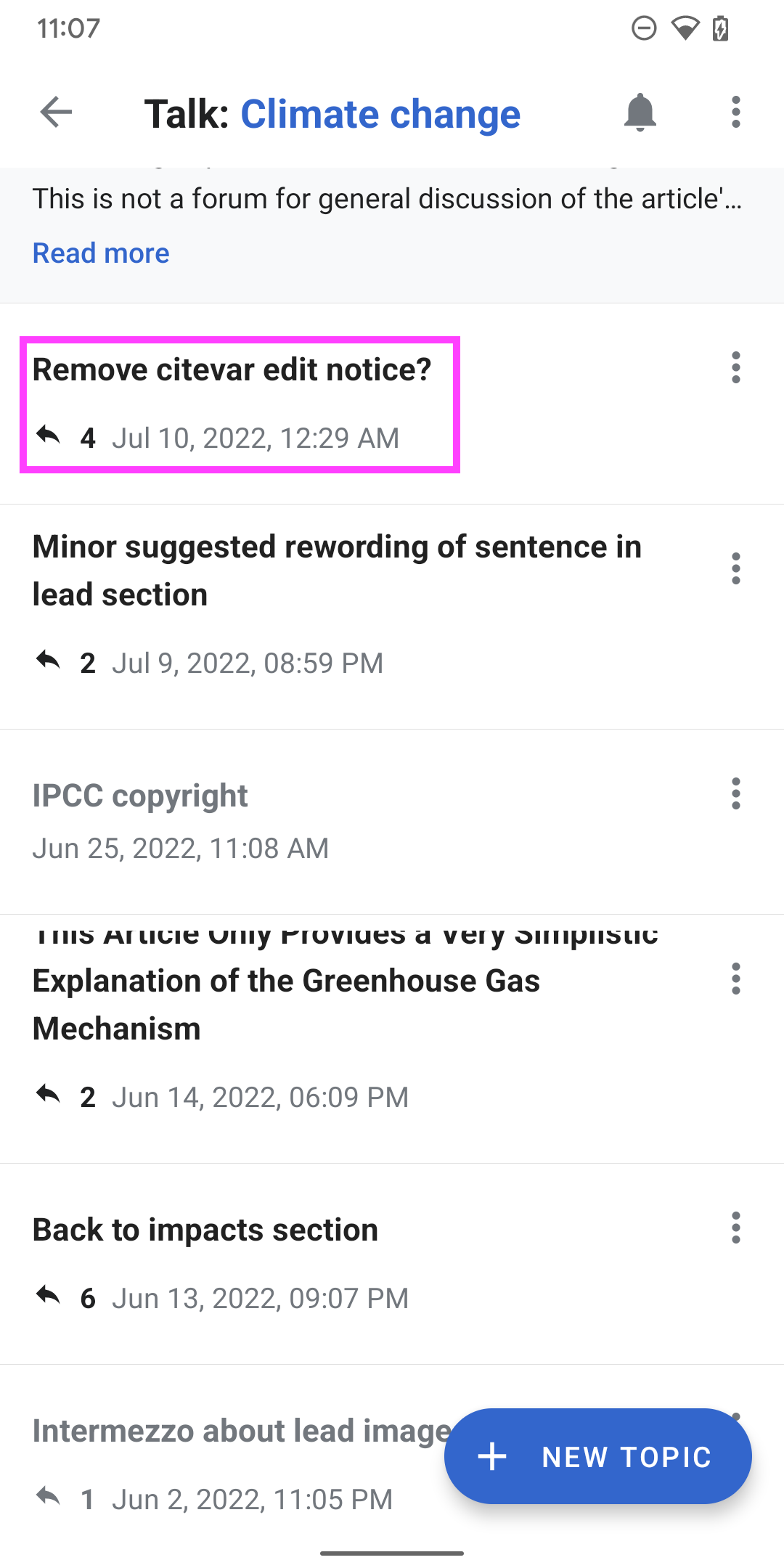
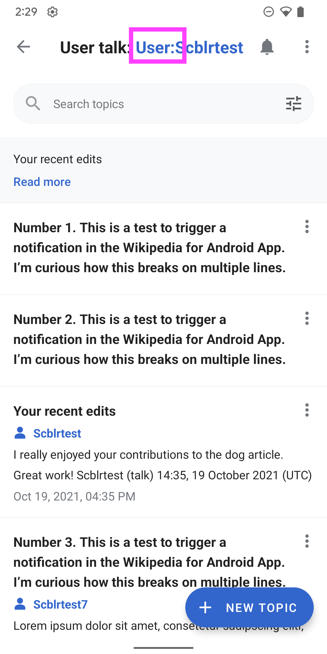
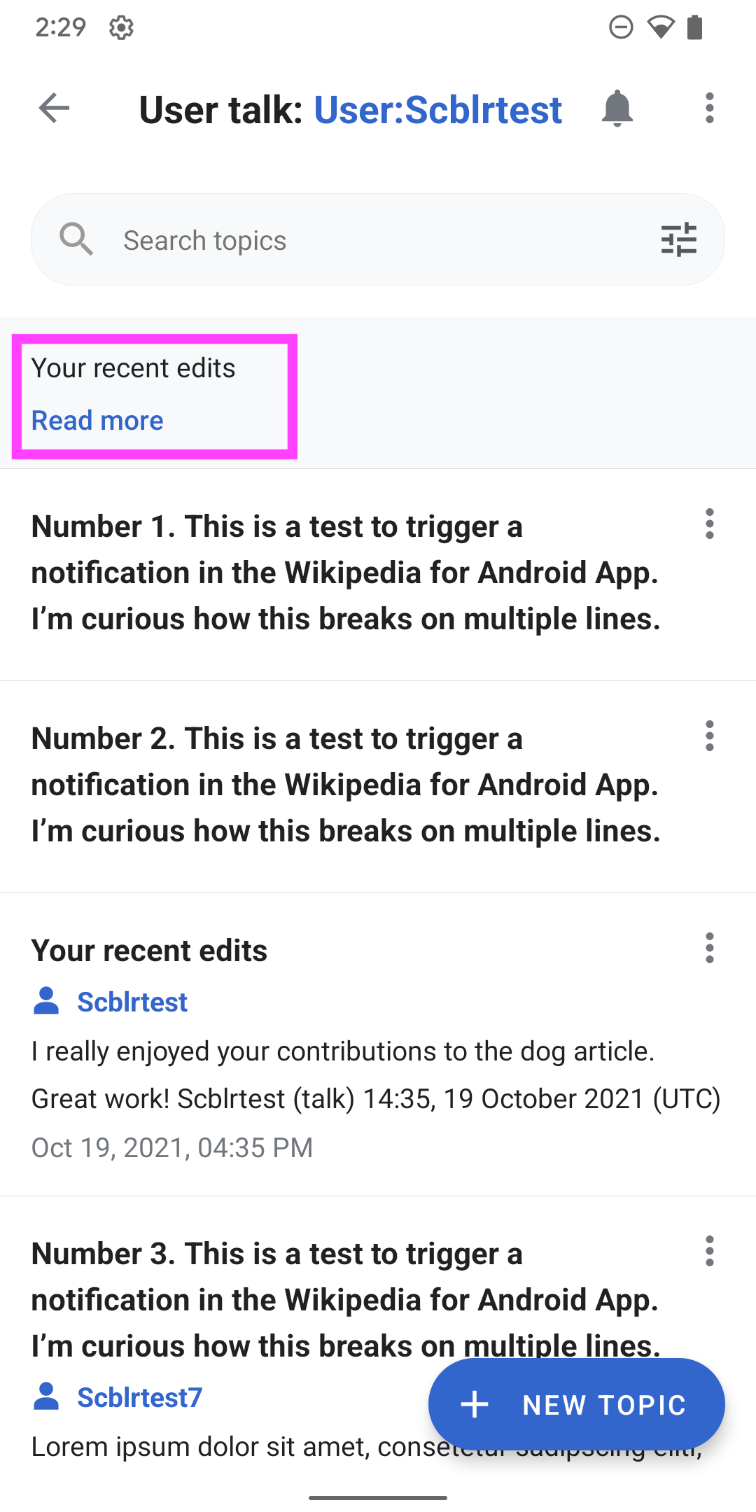
  • Accessing the article talk page button next to the article title opens up a side panel
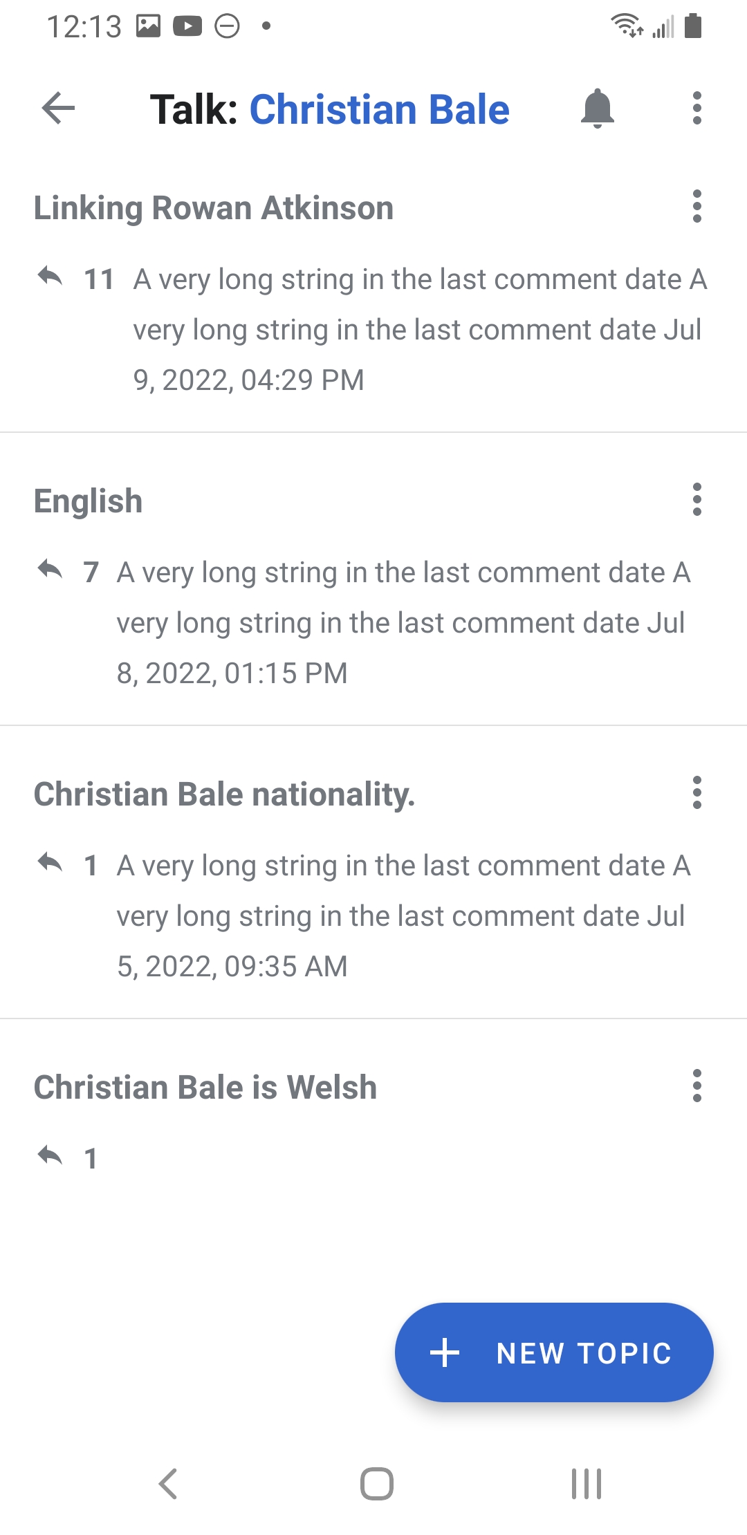
  • Talk page subjects take users directly to the details view of a subject (full screen)
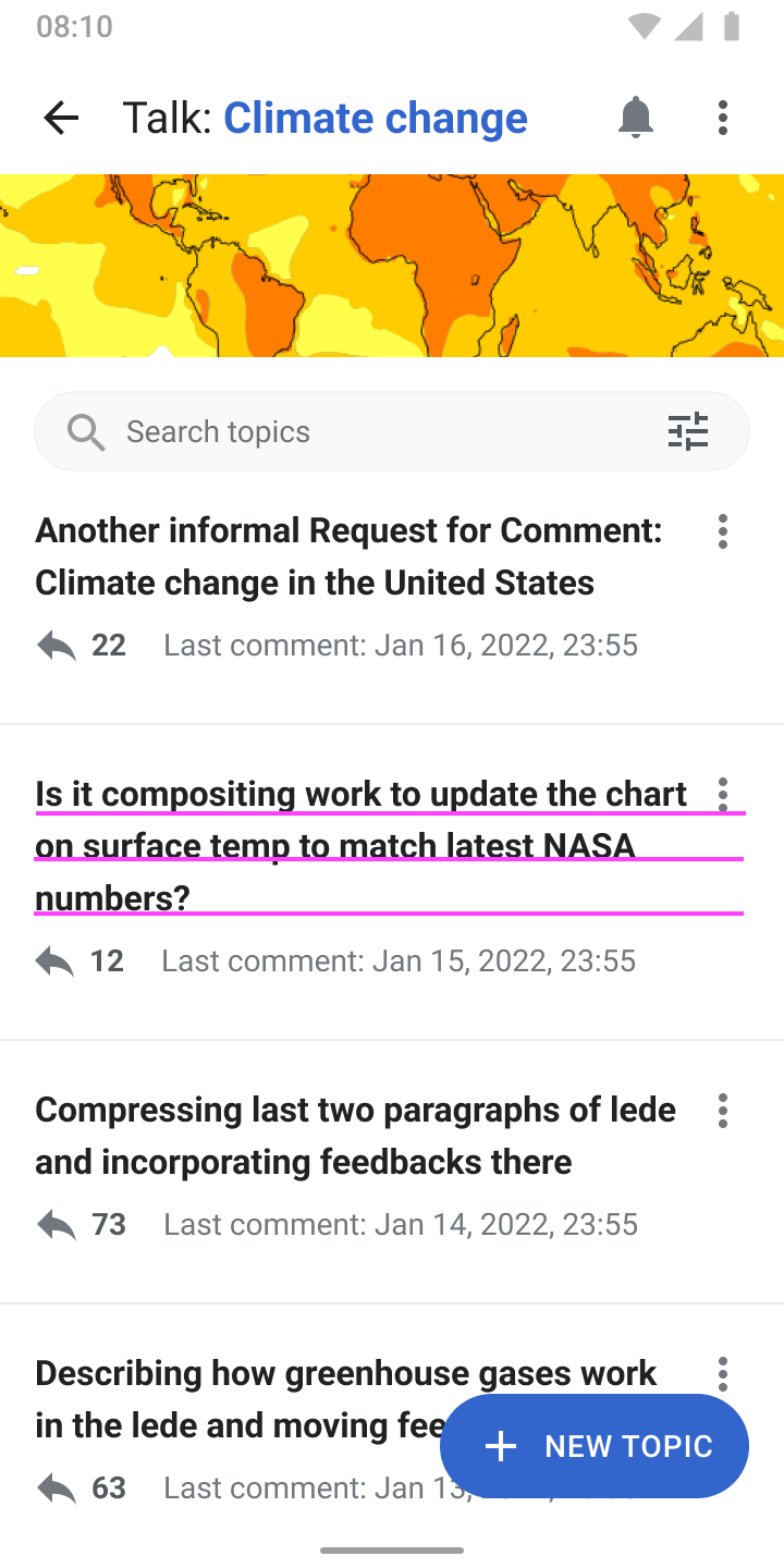
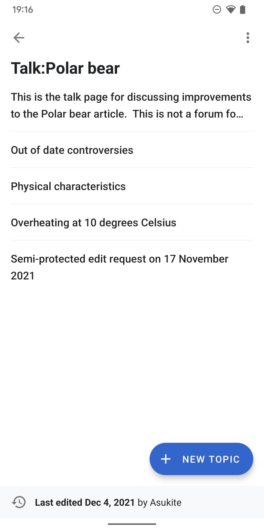
  • The app bar title in the side panel, as well as the full screen icon take users to the full view of the talk page (screen 4)

APK:
https://github.com/wikimedia/apps-android-wikipedia/pull/3464

Event Timeline

There are a very large number of changes, so older changes are hidden. Show Older Changes
scblr renamed this task from Create designs for talk pages side panel to Create designs for talk pages side panel in the article.Jan 12 2022, 10:31 AM
scblr triaged this task as Medium priority.Jan 12 2022, 10:43 AM

Hi @scblr, I would like to claim this ticket, is this ready for dev?

Hi, @scblr, the implementation is completed. Please check the APK in the ticket description.

Screenshot_20220228-171201_Wikipedia Dev.jpg (2×1 px, 435 KB)

@cooltey tried to test it with the apk from the task’s description, but the links in the overflow menu and footer lead to a separate view. This is the preferred behavior but does not allow me to test it (since there’s no button next to the article’s title yet).

Despite a few color updates to the sidepanel (comparison below, details on Figma), the screenshot you posted looks good though!

DesignvsImplementation
Talk pages side panel.png (1×720 px, 211 KB)
Screenshot_20220228-171201_Wikipedia_Dev.jpg (2×1 px, 435 KB)

Hey @cooltey — great work so far!

01) Can the upper area of the side panel have the same height as the app bar? (the grey line sits a bit lower in the same panel). Also same vertical font centering and icon size as in the app bar (if it’s not the same).

Screenshot_20220302-185831 copy.png (2×1 px, 247 KB)
Artboard.png (1×1 px, 415 KB)

02) Tapping a topic in the list leads users to the subject view, which is great. After tapping back from the subject view — the panel should be open again.

Screenshot_20220302-185831 copy 2.png (2×1 px, 244 KB)

03) Mentioned in the previous comment:

Despite a few color updates to the sidepanel (comparison below, details on Figma), the screenshot you posted looks good though!

DesignvsImplementation
Talk pages side panel.png (1×720 px, 211 KB)
Screenshot_20220228-171201_Wikipedia_Dev.jpg (2×1 px, 435 KB)
  • Can we also update the TOC with these designs?
  • The separator lines might need adaptation as well (they’re lighter in the designs)

04) The edit history info at the bottom should take users to the edit history of the talk page — it currently doesn’t do anything

Screenshot_20220302-190419.png (2×1 px, 254 KB)

05) Swipe actions: If the panel is open, the same swipe action as for the TOC (swipe right) should close it.

Hi @scblr, the APK has been updated. Please download the updated APK from the ticket description.

! In T299033#7748242, @scblr wrote:
Hey @cooltey — great work so far!

01) Can the upper area of the side panel have the same height as the app bar? (the grey line sits a bit lower in the same panel). Also same vertical font centering and icon size as in the app bar (if it’s not the same).

Screenshot_20220302-185831 copy.png (2×1 px, 247 KB)
Artboard.png (1×1 px, 415 KB)

Done! And I also make the title also clickable, not sure if that is what you want.

02) Tapping a topic in the list leads users to the subject view, which is great. After tapping back from the subject view — the panel should be open again.

Screenshot_20220302-185831 copy 2.png (2×1 px, 244 KB)

Done.

03) Mentioned in the previous comment:

Despite a few color updates to the sidepanel (comparison below, details on Figma), the screenshot you posted looks good though!

DesignvsImplementation
Talk pages side panel.png (1×720 px, 211 KB)
Screenshot_20220228-171201_Wikipedia_Dev.jpg (2×1 px, 435 KB)

Done!

  • Can we also update the TOC with these designs?

Not sure what kind of design you would like to apply to the current ToC? It would be very helpful if you can provide a mock of it 😉

  • The separator lines might need adaptation as well (they’re lighter in the designs)

Done.

04) The edit history info at the bottom should take users to the edit history of the talk page — it currently doesn’t do anything

Screenshot_20220302-190419.png (2×1 px, 254 KB)

Done.

05) Swipe actions: If the panel is open, the same swipe action as for the TOC (swipe right) should close it.

Done.

everything looks good now — great work @cooltey 👏

ps: the only thing left to check before a release is making sure that the current TOC button doesn’t trigger the talk pages side panel + adding the button next to the article’s title.

Moved to Blocked/Waiting since the mobile-html updates are still under review.

I just reviewed this and think the side panel design, which is reduced to showing the title of the talk page and listing topics, is exactly what it needs to be. Enhanced functionality, like search, amount of replies per topic, and last comment per topic, is available on the detail screen.

As we introduced new sort options with the new design, the one thing I suggest is to adapt the side panel view to the sort option that the user has chosen in the detail view:

Moving this to ready for dev again!

Hi @scblr

Since we have a new talk page design, not sure if you want to sync the design in the side panel instead of the original design.

The screenshot below is the current implementation, in which we share the same component in the side panel and the talk topics list.

Screenshot_20220615-161231_Wikipedia Dev.jpg (2×1 px, 403 KB)

Another question: where should we put the sort button on the side panel?

Per discussion with @scblr

in short, don’t show the three dots per topic, sort option and “last edited” footer in the side panel

Design updates are completed. Please check the APK link from the ticket description, thanks!

@cooltey – the apk in the ticket description seems outdated – I used this one to review:

https://github.com/wikimedia/apps-android-wikipedia/actions/runs/2545553598

and noticed the following things:

01) the edit pencil uses a different color than the talk page bubble. can we streamline it, so the edit pencil also uses color_group_9 ?

Screenshot_20220623-103122.png (2×1 px, 263 KB)
Screenshot_20220623-103135.png (2×1 px, 251 KB)

02) in the apk I tested, the overflow menu is still visible – please hide it

Screenshot_20220623-103201.png (2×1 px, 228 KB)

03) the space below a title, when there are no replies/comments, is not the same as the top margin, could you make sure to make it the same?

Screenshot_20220623-103201.png (2×1 px, 227 KB)

it’s the same on the detail page itself:

Screenshot_20220623-104736.png (2×1 px, 176 KB)

to fine-tune it → what are the current dp values for the top and bottom margin you are using here? thanks!

05) will add comments related to the coffee roll here T310801

Screenshot_20220623-104429.png (2×1 px, 230 KB)


great work so far @cooltey 👏

@cooltey – the apk in the ticket description seems outdated – I used this one to review:

https://github.com/wikimedia/apps-android-wikipedia/actions/runs/2545553598

Sorry forgot to update that. I've updated the link in the description.

and noticed the following things:

01) the edit pencil uses a different color than the talk page bubble. can we streamline it, so the edit pencil also uses color_group_9 ?

This will require creating a ticket for the content transform team to update it since it is controlled by mobile-html.

02) in the apk I tested, the overflow menu is still visible – please hide it

Done.

03) the space below a title, when there are no replies/comments, is not the same as the top margin, could you make sure to make it the same?

it’s the same on the detail page itself:

to fine-tune it → what are the current dp values for the top and bottom margin you are using here? thanks!

It is basically 16dp. But since the overflow menu aligns to the top and bottom of the title, it will require extra space for accessibility.

Here's the actual size of the components

Screenshot_20220623-174040_Wikipedia Dev.jpg (2×1 px, 346 KB)

We can either increase the height of the title view or adjust the size of the overflow menu, which is not recommended.

05) will add comments related to the coffee roll here T310801

Screenshot_20220623-104429.png (2×1 px, 230 KB)

Yes we can do that together.

Hi @scblr

As we discussed on Slack, please take a look at the screenshots of all the possible layout conditions, and also please check out the layout in the side panel as well.

Screenshot_20220627-161620_Wikipedia Dev.jpg (2×1 px, 430 KB)
Screenshot_20220627-161626_Wikipedia Dev.jpg (2×1 px, 370 KB)

The APK has been updated.

Hey @cooltey – the apk in the task’s description doesn’t seem to work correctly; see this video:

https://www.dropbox.com/s/lknf5zjvx3il566/screen-20220613-105828.mp4?dl=0

The two screenshots you posted look good in general, some remarks:

01) The coffee roll text seems to use too much space between lines, please update it to font_group_3, which uses font-size: 14sp; line-height: 21sp; to make it more compact

Screenshot_20220627-161620_Wikipedia_Dev copy.jpg (2×1 px, 498 KB)

(also needs to be applied to the side panel)

02) The space here is imbalanced and too big (which results in making the topics list unnecessary long)

Screenshot_20220627-161620_Wikipedia_Dev.jpg (2×1 px, 550 KB)

Can you tell me what dp (or sp) values you currently use for 1, 2, 3, 4, and 5 – so we can tweak them?

(also needs to be applied to the side panel)

Thanks!

Hi @scblr >

! In T299033#8032181, @scblr wrote:
Hey @cooltey – the apk in the task’s description doesn’t seem to work correctly; see this video:

https://www.dropbox.com/s/lknf5zjvx3il566/screen-20220613-105828.mp4?dl=0

Looks like you have a network connection issue, you may need to restart or turn on/off the WIFI.

The two screenshots you posted look good in general, some remarks:

01) The coffee roll text seems to use too much space between lines, please update it to font_group_3, which uses font-size: 14sp; line-height: 21sp; to make it more compact

Done.

Screenshot_20220628-163234_Wikipedia Dev.jpg (2×1 px, 430 KB)

(also needs to be applied to the side panel)

02) The space here is imbalanced and too big (which results in making the topics list unnecessary long)

Can you tell me what dp (or sp) values you currently use for 1, 2, 3, 4, and 5 – so we can tweak them?

The old version:

1656459580115.jpg (1×870 px, 467 KB)

  1. 12dp
  2. 12dp
  3. 12dp
  4. 8dp
  5. 12dp

New version

Screenshot_20220628-163226_Wikipedia Dev.jpg (2×1 px, 371 KB)
Screenshot_20220628-163234_Wikipedia Dev.jpg (2×1 px, 430 KB)

From #1 to #5, all have the same 8dp. Please let me know if you need other variables for them.

Please download the latest APK in the ticket description. Thanks

This comment was removed by scblr.

Thanks @cooltey – a few more comments on the latest implementation 👇

01)

{F35310508}
New version
From #1 to #5, all have the same 8dp. Please let me know if you need other variables for them.

Thanks for the new values. Can you adapt them from:

  1. 8dp
  2. 8dp
  3. 8dp
  4. 8dp
  5. 8dp

To:

  1. 6dp
  2. 8dp
  3. 8dp
  4. 6dp
  5. 8dp

02)

Please apply title truncation in the side panel only, not in the full view:

Screenshot_20220707-103652.png (2×1 px, 431 KB)
Screenshot_20220707-103837.png (2×1 px, 587 KB)

03)

Please align the subject footer info (amount of replies, last comment) to the top in both the side panel and full talk view – it looks odd when there are multiple lines in the footer:

Screenshot_20220707-111147.png (2×1 px, 539 KB)

04)

Speaking of multiple lines in the subject footer info, I think we should not allow them in the side panel – there are three possible solutions to solve it:

A) Truncate the subject footer (same as the subject title)
B) Don’t show the “Last comment: " text string (only output the date)
C) Choose a shorter way to output date/time, e.g. 04/26/2022, 09:51 PM instead of Apr 26, 2022, 09:51 PM

Or do you have other suggestions to reduce it to one line @cooltey? (e.g. manipulating the side panel width or so?) I can imagine that solution A is the easiest to implement, and acceptable to me.

Thanks @cooltey – a few more comments on the latest implementation 👇

01)

{F35310508}
New version
From #1 to #5, all have the same 8dp. Please let me know if you need other variables for them.

Thanks for the new values. Can you adapt them from:

  1. 8dp
  2. 8dp
  3. 8dp
  4. 8dp
  5. 8dp

Done. I have updated the layout in the last comment date, so please verify the padding of #4 and #5 are correct.

Screenshot_20220718-121551_Wikipedia Dev.jpg (2×1 px, 248 KB)

02)

Please apply title truncation in the side panel only, not in the full view:

03)
Please align the subject footer info (amount of replies, last comment) to the top in both the side panel and full talk view – it looks odd when there are multiple lines in the footer:

Done.

Screenshot_20220718-121320_Wikipedia Dev.jpg (2×1 px, 333 KB)

04)

Speaking of multiple lines in the subject footer info, I think we should not allow them in the side panel – there are three possible solutions to solve it:

A) Truncate the subject footer (same as the subject title)
B) Don’t show the “Last comment: " text string (only output the date)
C) Choose a shorter way to output date/time, e.g. 04/26/2022, 09:51 PM instead of Apr 26, 2022, 09:51 PM

I preferred to remove the "Last comment" and output the current text string, but please see the possible solutions you suggested.

Screenshot_20220718-121634_Wikipedia Dev.jpg (2×1 px, 255 KB)
Screenshot_20220718-121551_Wikipedia Dev.jpg (2×1 px, 248 KB)
Screenshot_20220718-121720_Wikipedia Dev.jpg (2×1 px, 225 KB)
Screenshot_20220718-121353_Wikipedia Dev.jpg (2×1 px, 217 KB)

Please download and test the APK from here: T310801#8066966

@cooltey — mostly looks good, but there are some new issues:

01) Some items are cut off now:

Screenshot_20220722-104659.png (2×1 px, 235 KB)

The text field should grow towards the bottom, not the top 👇

DesignvsImplementation
Talk pages redesign.png (1×720 px, 182 KB)
Screenshot_20220722-105311.png (2×1 px, 196 KB)

The current implementation also leads to inconsistent spacing:

Screenshot_20220722-105846.png (2×1 px, 190 KB)

02) I observed this:

A) When there is no reply icon, the space between title and date is perfect:

Screenshot_20220627-161620_Wikipedia_Dev.jpg (2×1 px, 550 KB)

B) When there is a reply icon, on the other hand, the space between title and date is too big:

Screenshot_20220722-110750.png (2×1 px, 202 KB)

Please ensure it’s always balanced like in A) with the reply icon.


Thanks!

Hi @scblr

Sorry about going back and forth so many times 😓, adjusting the item view layout is pretty tricky since it contains some logic to control the visibility. Please make sure to check the user talk page to see if the changes are correct for you.

(Maybe we can have a real-time syncing on Monday).

@cooltey — mostly looks good, but there are some new issues:

01) Some items are cut off now:

Done

The current implementation also leads to inconsistent spacing:

Done. (Relate to the one above).

One thing I would like to let you know is that if there is only the topic title, the text might not be able to align with the middle of the height since the overflow menu icon has the minimum height of it.

I have tried to make the topic title sit in the middle, but the trade-off will be the overflow icon not aligning with the top of the topic title text.

02) I observed this:

A) When there is no reply icon, the space between title and date is perfect:

Done. Please make sure to check the layout of a user talk page.

Please download the updated APK from the ticket description or from the link below, thanks!
https://github.com/wikimedia/apps-android-wikipedia/pull/3464

Thanks @cooltey – all the previous items seem to fixed!

Sorry about going back and forth so many times 😓

No worries about that, we’re going to get it right soon :)


I spotted these additional things:

01) Can we remove User from the title in the app bar?

Screenshot_20220726-142919 copy.png (2×1 px, 243 KB)

02) Not quite sure why the first topic on this user talk page is outputted as a coffee roll. Do you know why? Thanks for the insights.

Screenshot_20220726-142919.png (2×1 px, 243 KB)
Screenshot_20220726-143352.png (2×1 px, 41 KB)

03) The 'Date published' filter doesn’t work as a toggle. Tapping 'Date published ↑' should change the label to 'Date published ↓' and reverse the order of the list.

https://www.dropbox.com/s/tu8qk5bkr0xrc9t/screen-20220726-142724.mp4?dl=0

Hi @scblr,

All these issues can be fixed in separate PRs (and I'll fix them). Is it possible to move this ticket to the code review if the design tweaks look good to you?

02) Not quite sure why the first topic on this user talk page is outputted as a coffee roll. Do you know why? Thanks for the insights.

This is an issue from the discussiontools API side, and I have created a bug ticket for it.