Page MenuHomePhabricator

Allow users to select two revisions to be sent to diff screen
Closed, ResolvedPublic

Assigned To
Authored By
JTannerWMF
Jan 13 2022, 11:29 PM
Referenced Files
F35015721: Screenshot_20220322_082951.png
Mar 22 2022, 12:37 PM
F35015339: Screenshot_20220322-094053.png
Mar 22 2022, 8:59 AM
F35015347: CleanShot 2022-03-22 at 09.57.26@2x.png
Mar 22 2022, 8:59 AM
F35015349: CleanShot 2022-03-22 at 09.57.52@2x.png
Mar 22 2022, 8:59 AM
F35010982: Pixel 3.png
Mar 18 2022, 11:29 AM
F35009739: image.png
Mar 17 2022, 8:45 AM
F35009733: Screenshot_20220317-093016.png
Mar 17 2022, 8:45 AM
F35009735: image.png
Mar 17 2022, 8:45 AM

Description

Background

As the designs for Edit History are being built there are some technical tasks that can be created without designs, this task serves as one of them.
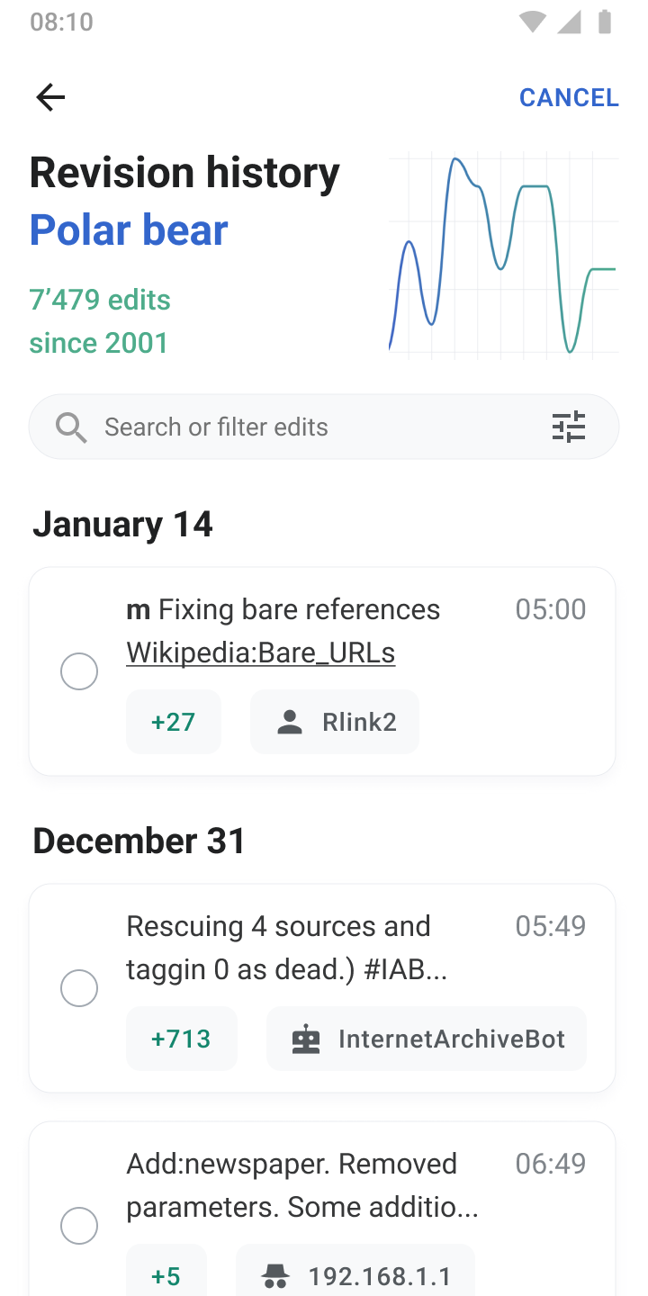
The Task

Implement the ability for users to select two revisions and be sent to a diff screen (the infrastructure for the diff screen already exists via native Watchlists).

User Story

As a Wikipedia Android app user I want to select two revisions listed in Edit History so that I can easily compare two distinct revisions without leaving the app.

Design (Figma)
0102030405060708
Edit history.png (1×720 px, 101 KB)
Edit history-1.png (1×720 px, 91 KB)
Edit history-2.png (1×720 px, 94 KB)
Edit history.png (1×720 px, 148 KB)
Edit history-1.png (1×720 px, 151 KB)
Edit history-2.png (1×720 px, 158 KB)
Edit history-4.png (1×720 px, 151 KB)
Edit history-3.png (1×720 px, 81 KB)

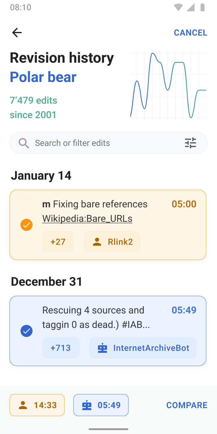
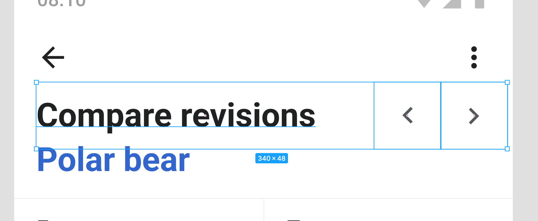
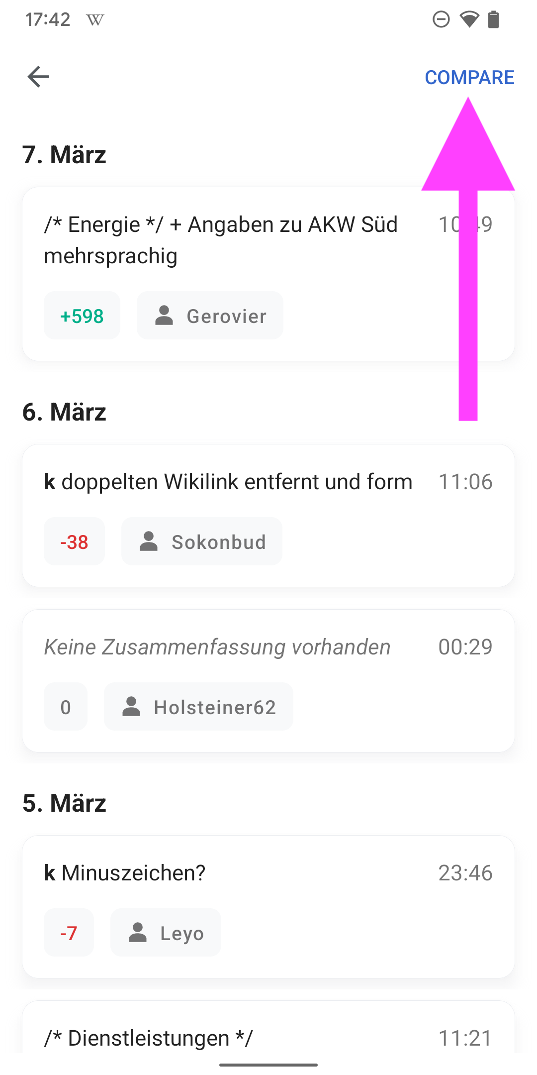
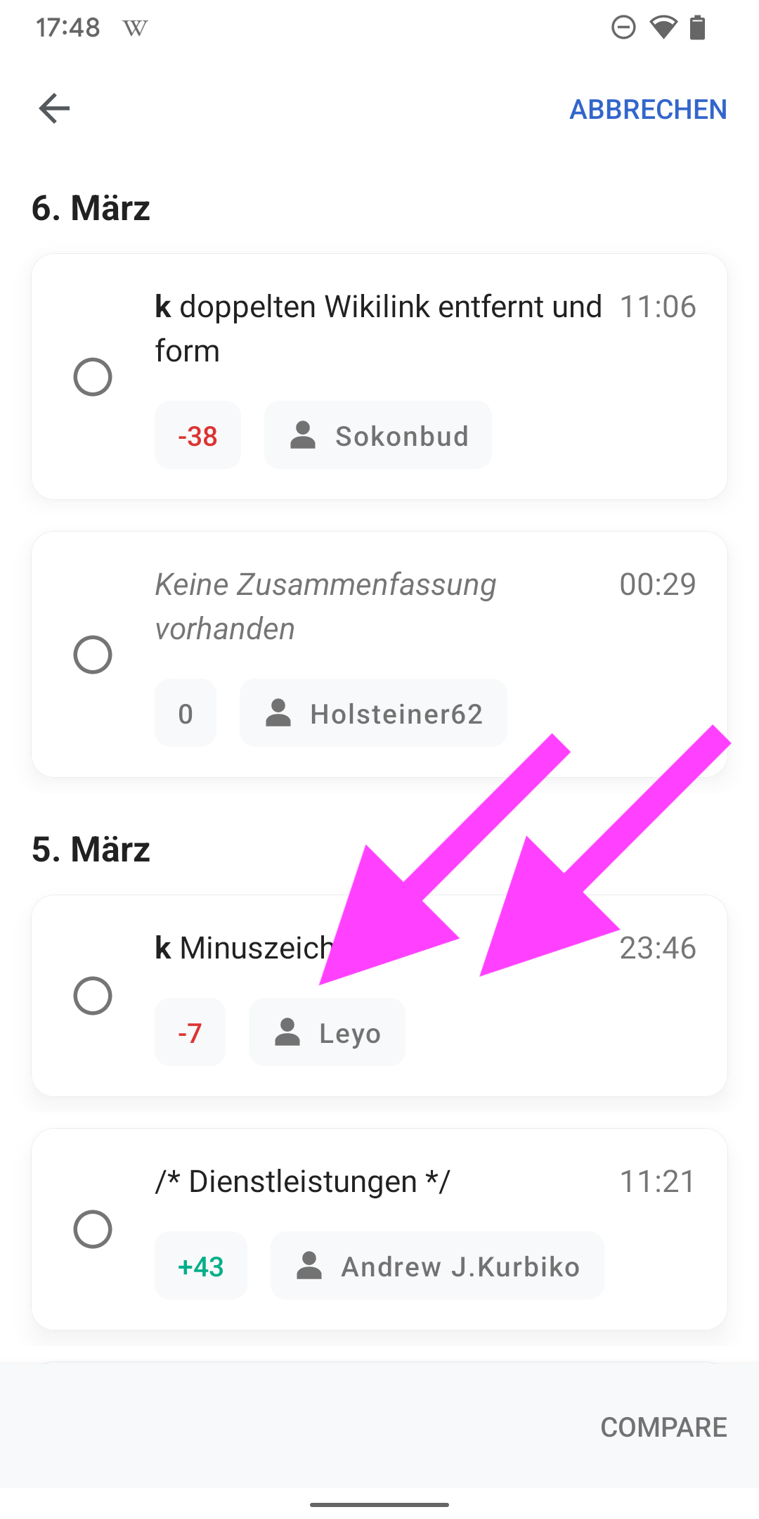
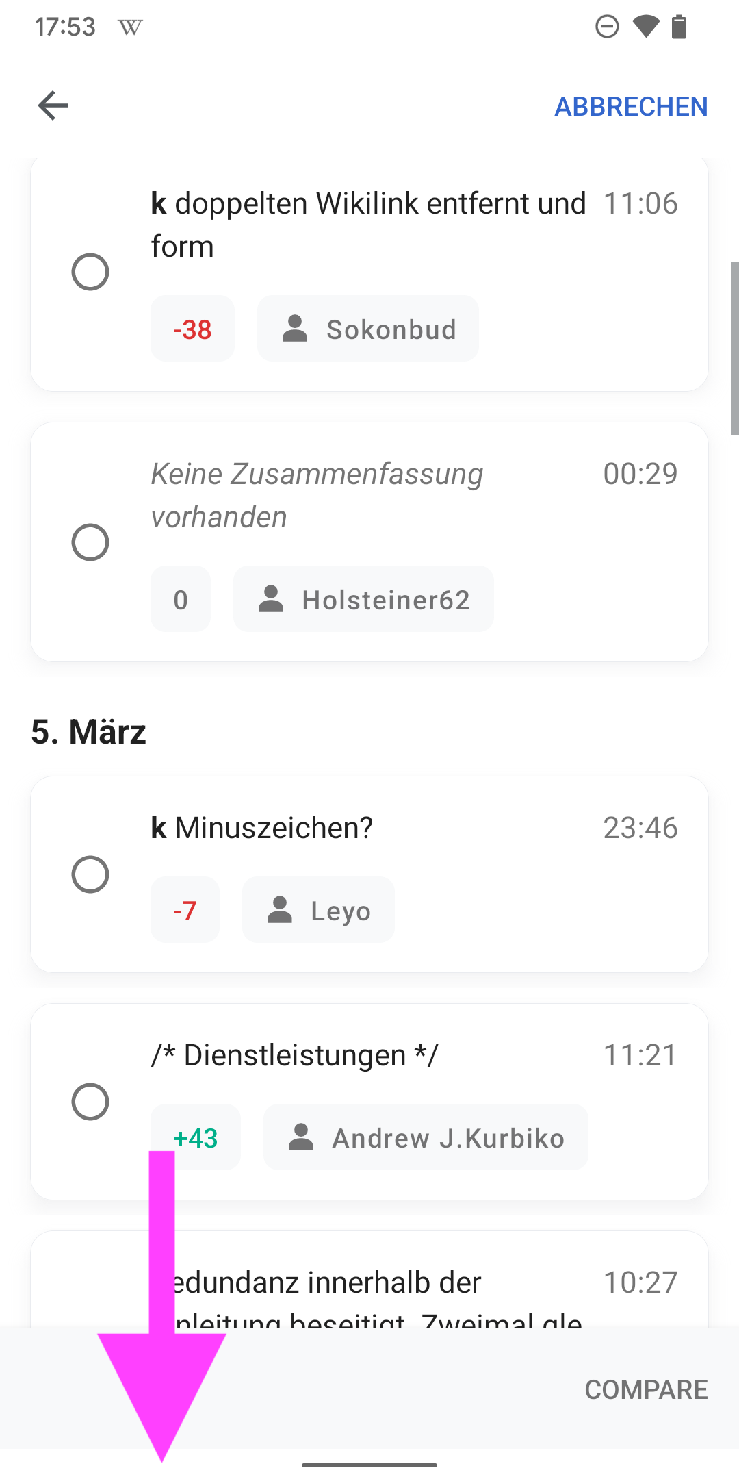
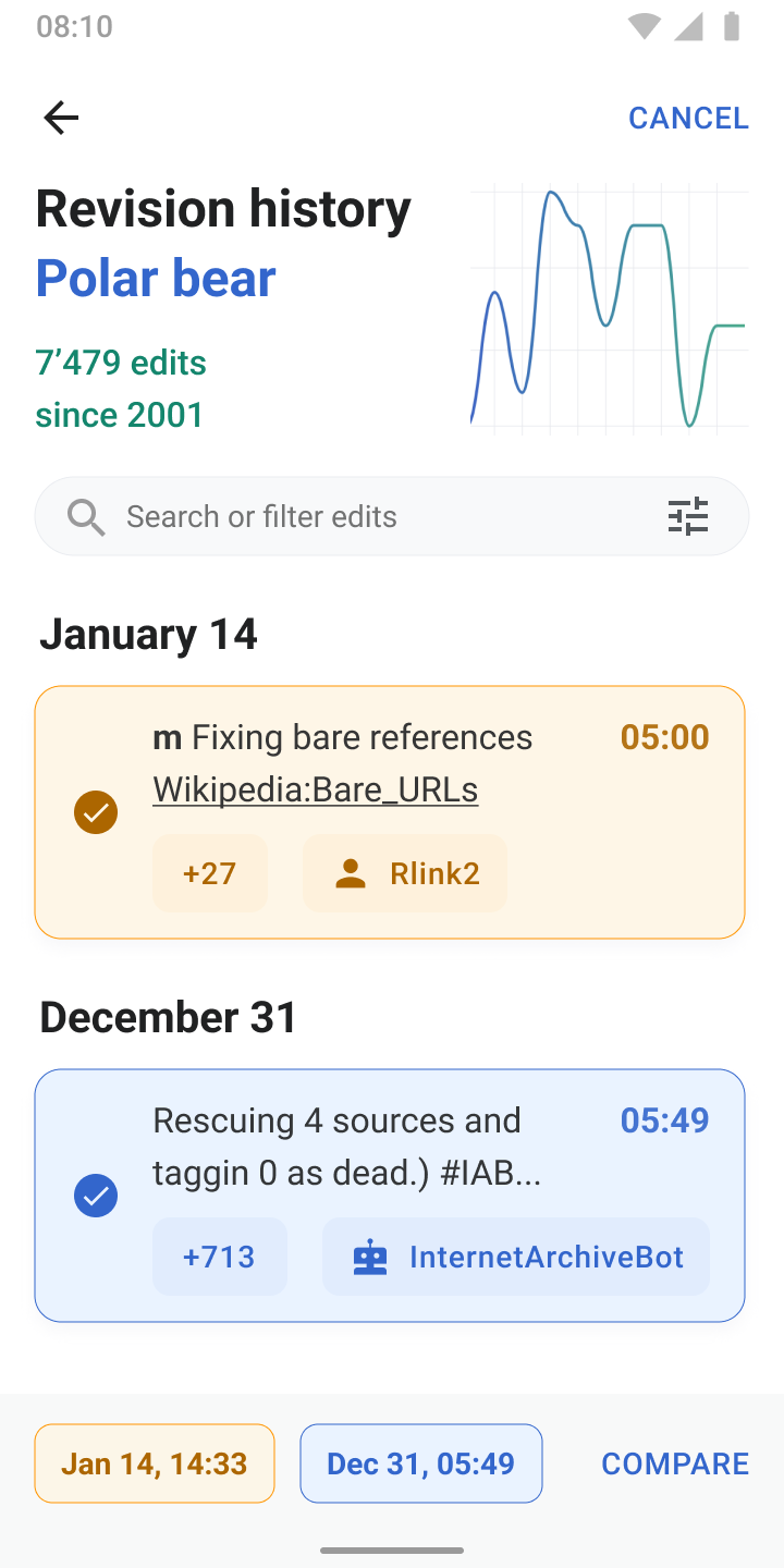
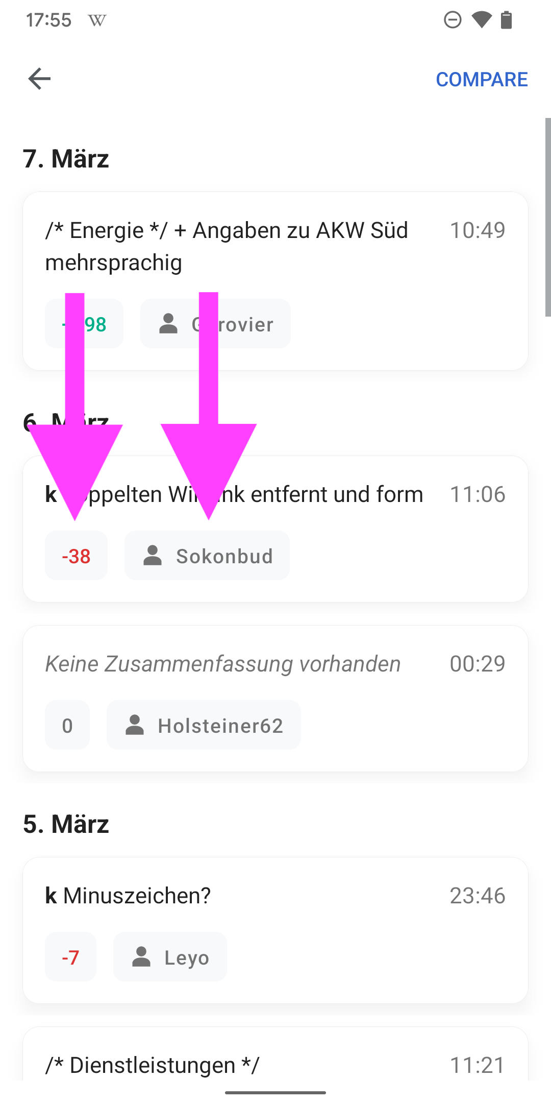
01) Tapping ‘Compare’ at the top right

  • Displays a radio button next to each card in the revision history
  • Indents text in the card

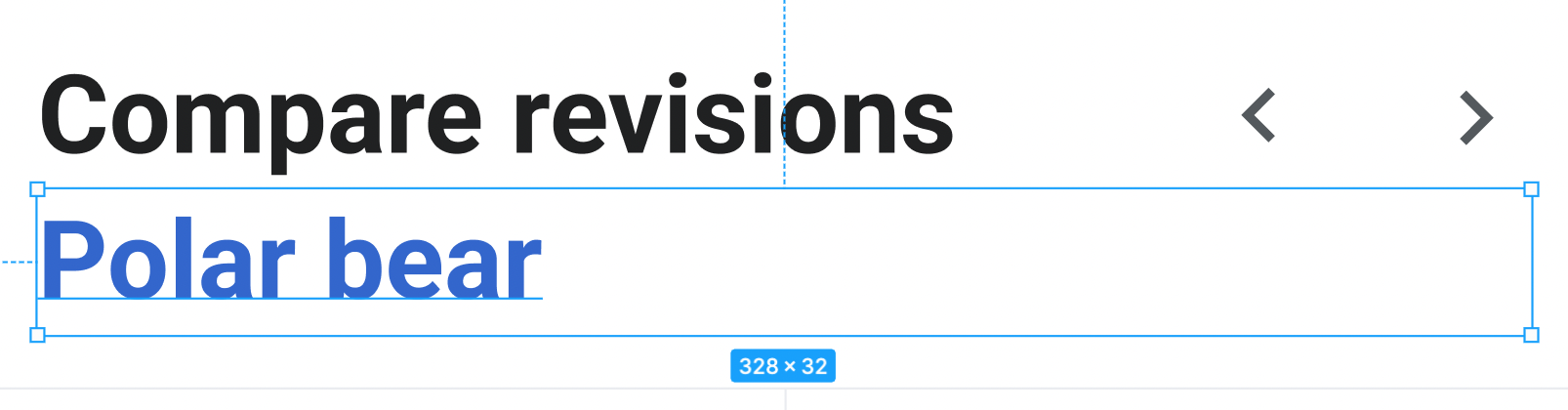
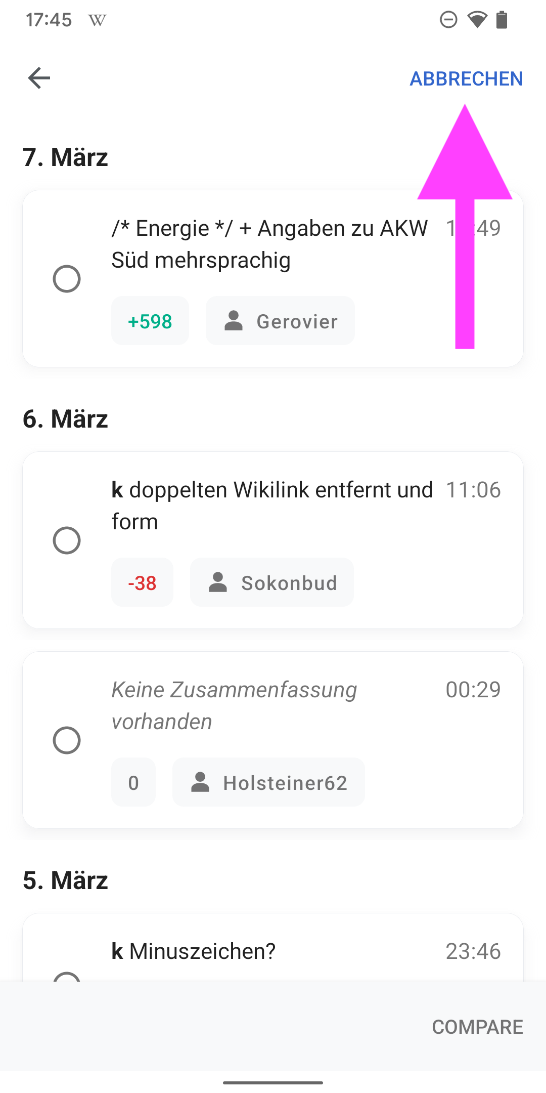
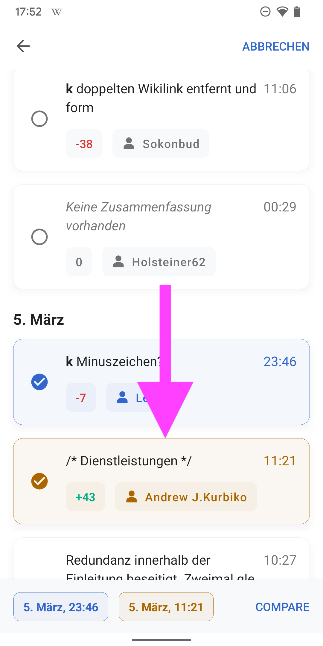
02) Selecting revisions to compare

  • Changes the styles of the card
  • The first item that users select turns yellow (and is displayed first in the footer)
  • The second item that users select turns blue (and is displayed second in the footer)

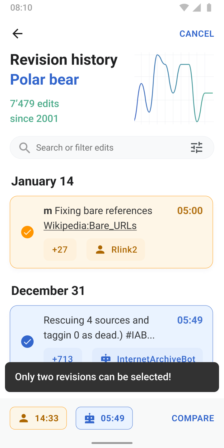
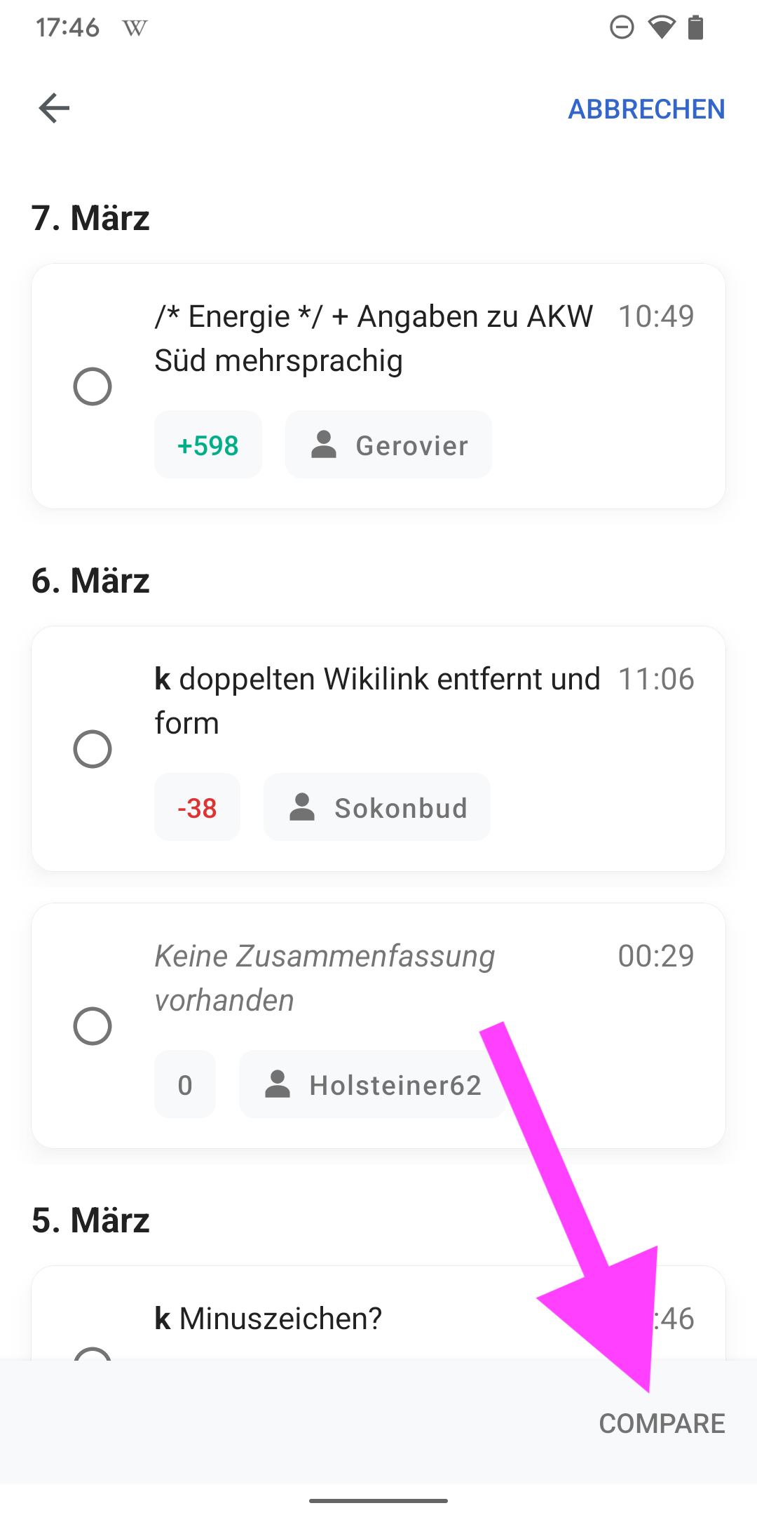
03) When users try to select more than two items, a snackbar appears that informs users that they can only select two items.

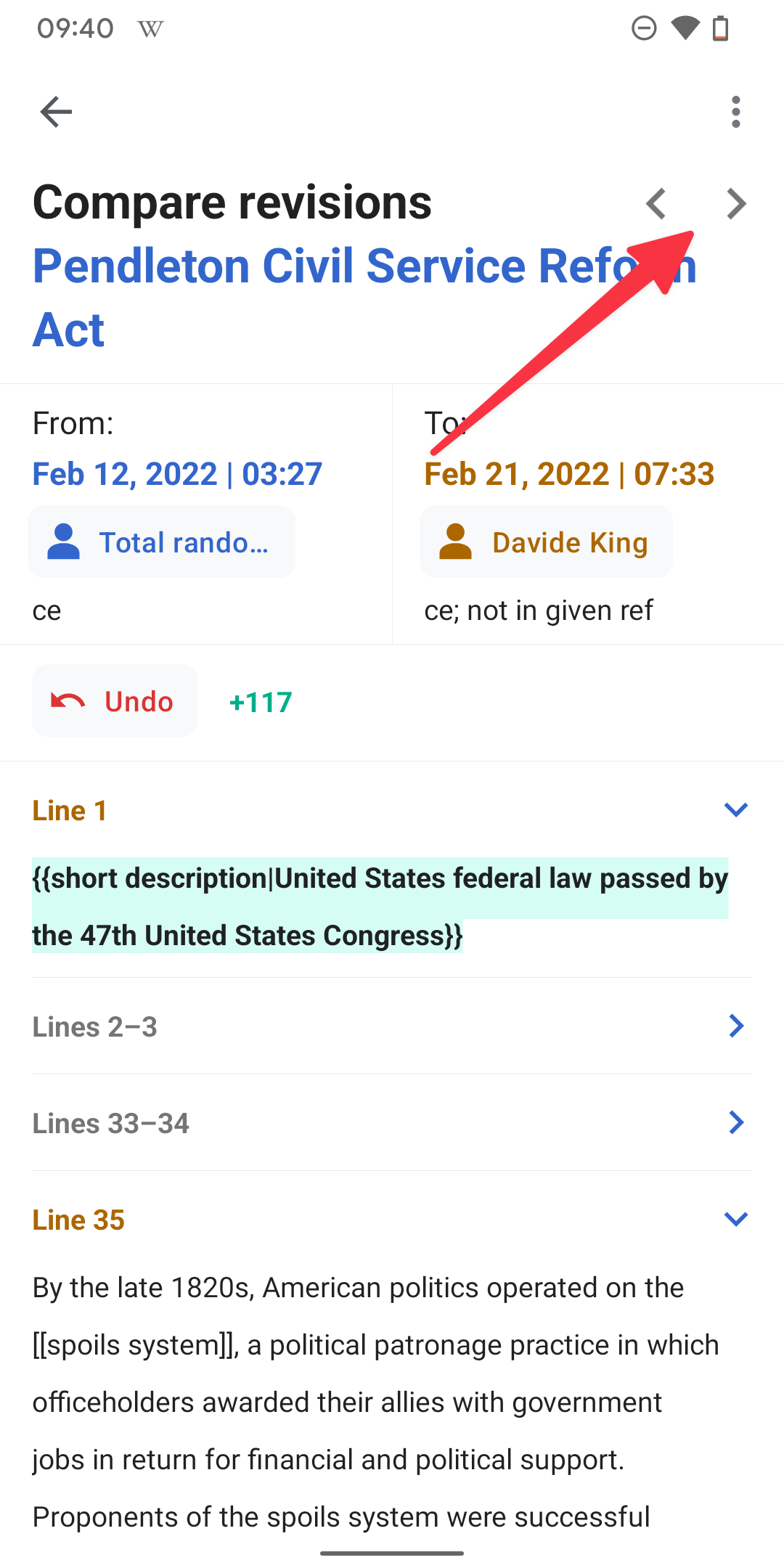
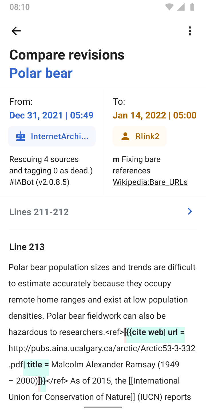
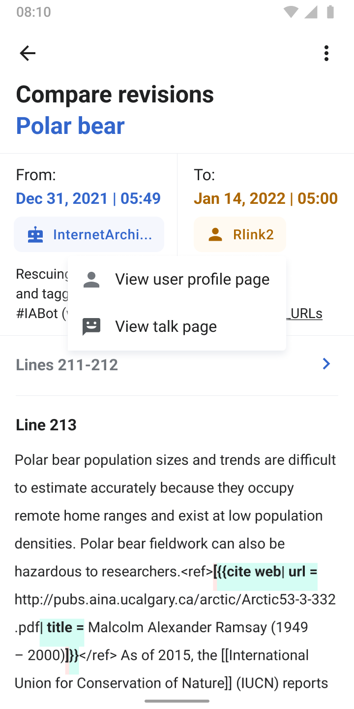
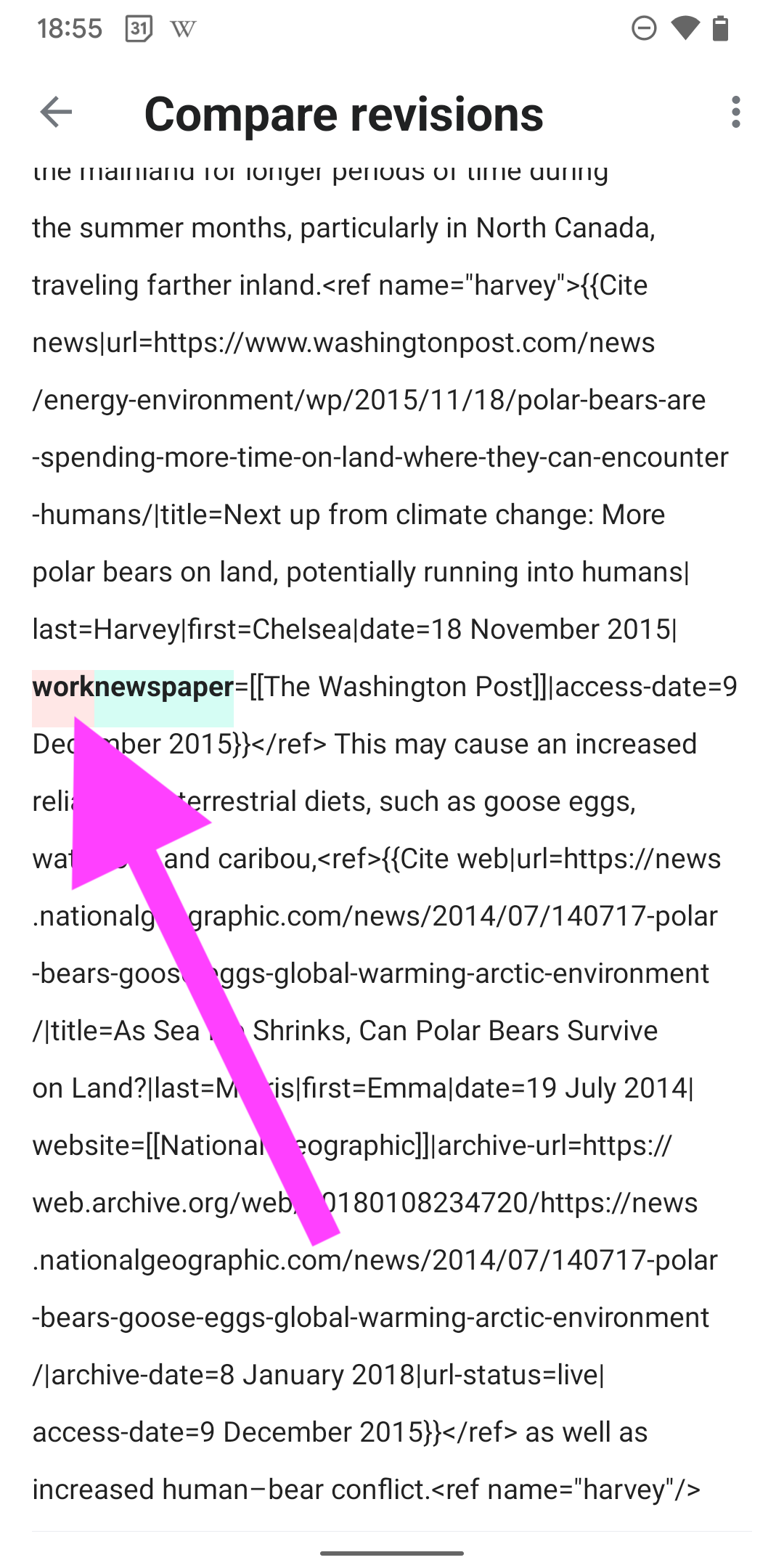
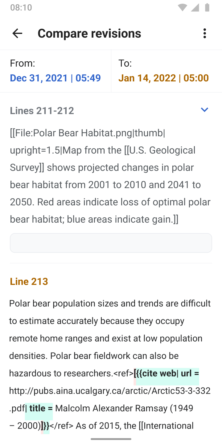
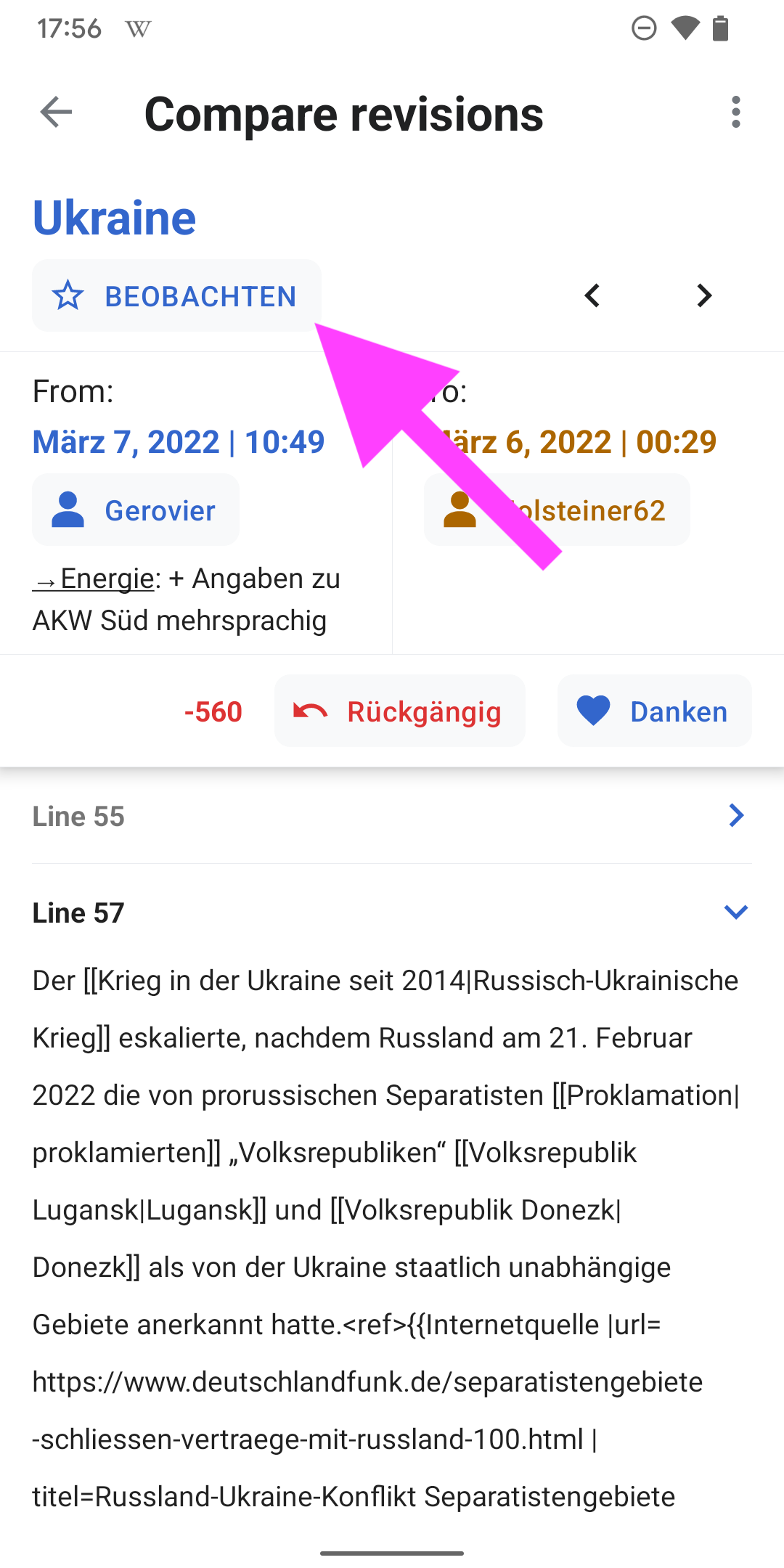
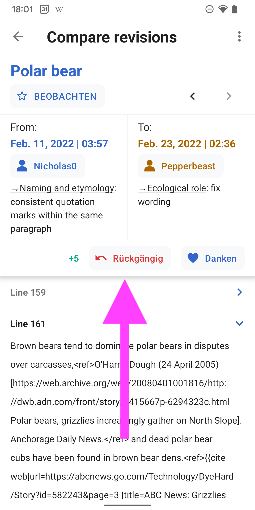
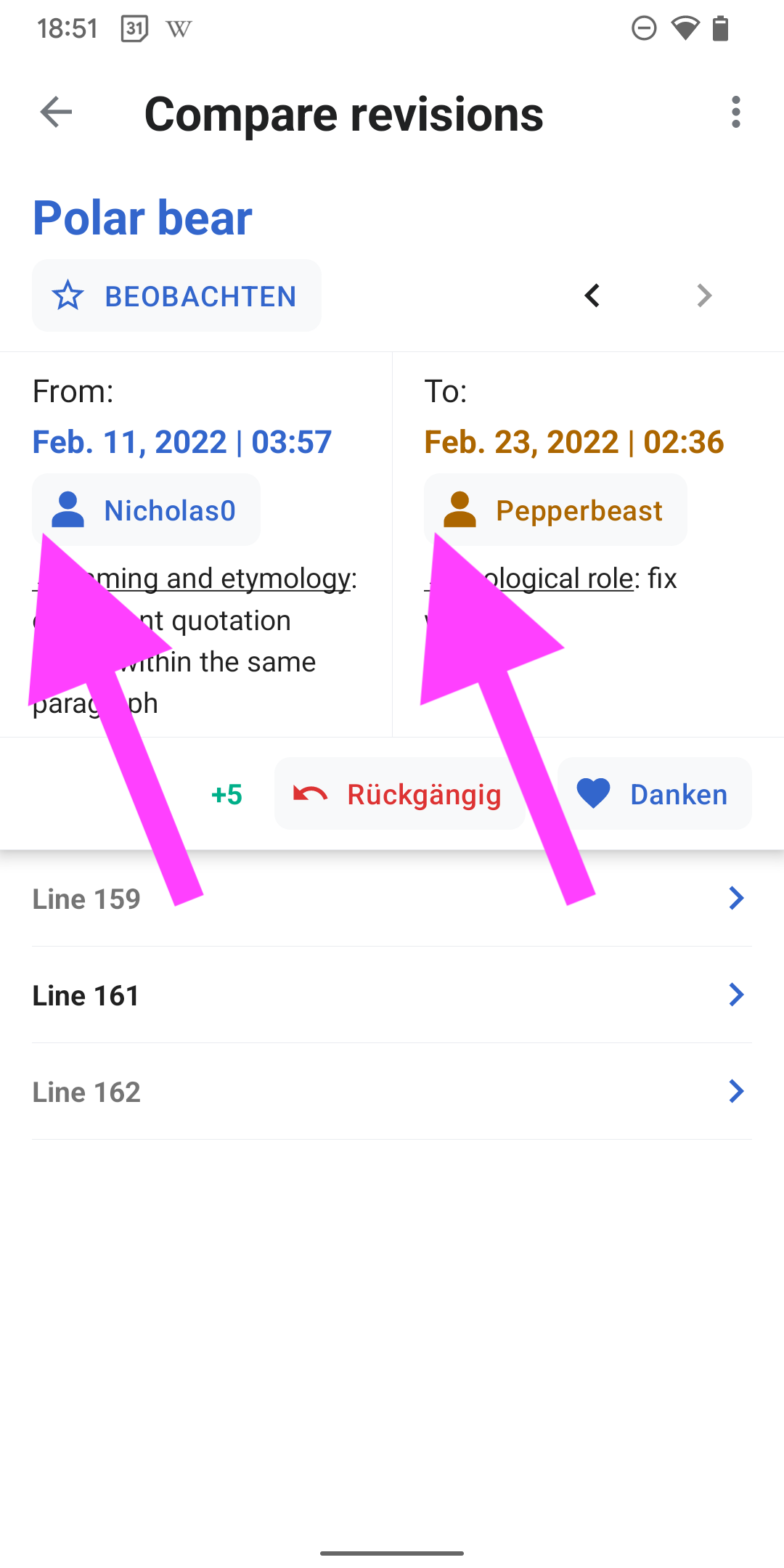
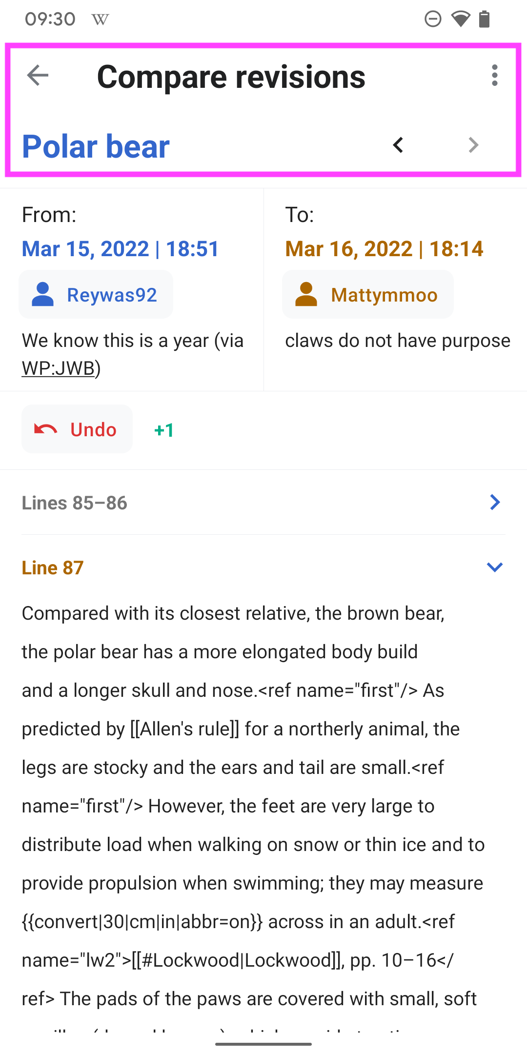
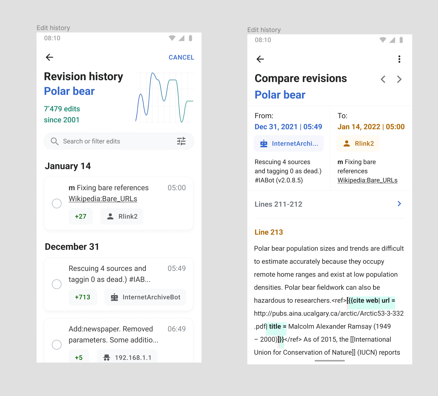
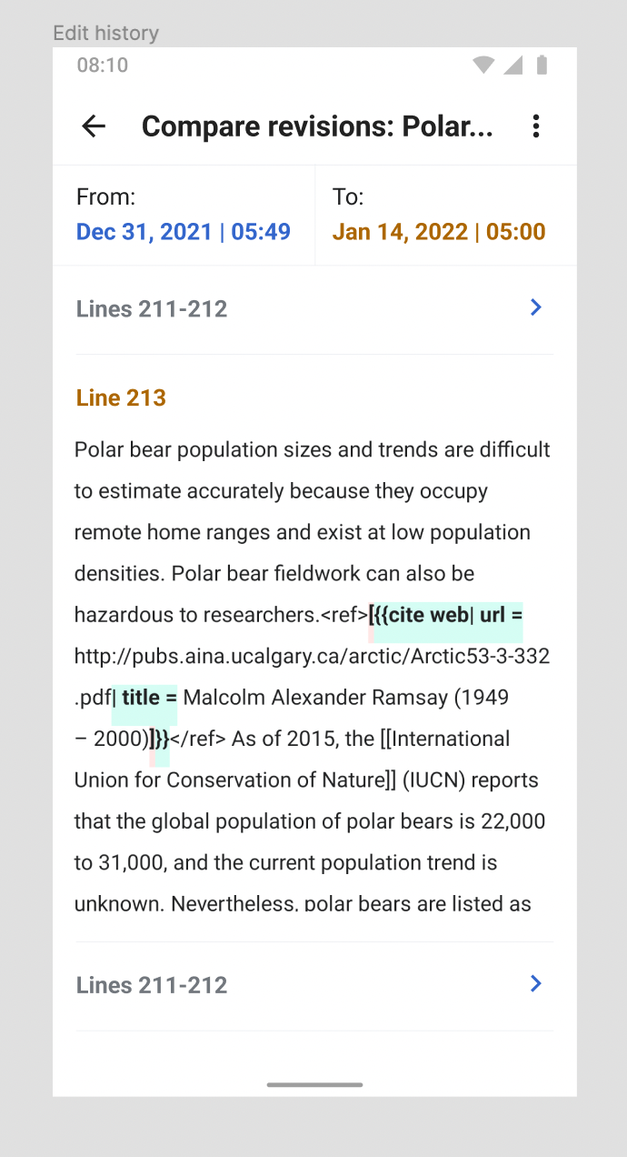
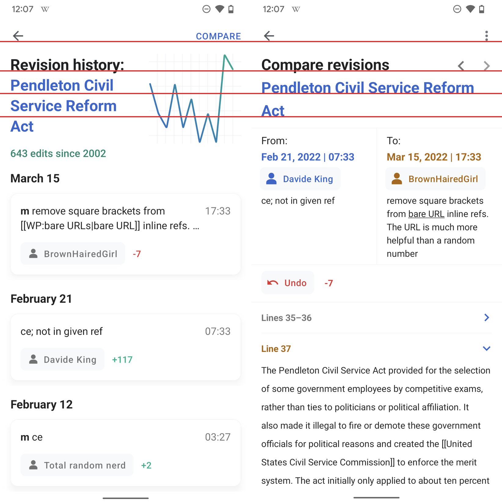
04) This is the revision comparison screen, it consists of:

  • ‘From’ and ‘To’ dates of the selected revision edits
  • The username (truncated on 1 line)
  • The edit summary
  • A diff view that collapses the lines before and after it
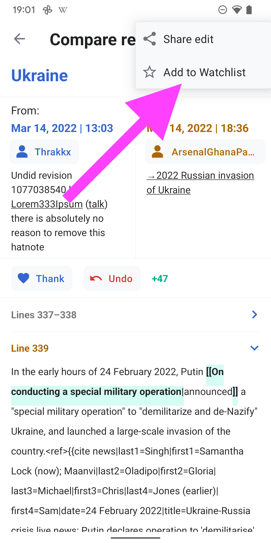
  • The current comparison can be shared via overflow menu at the top right (Share)
  • Please sync with engineers from iOS to achieve the same output
  • Link to this revision comparison

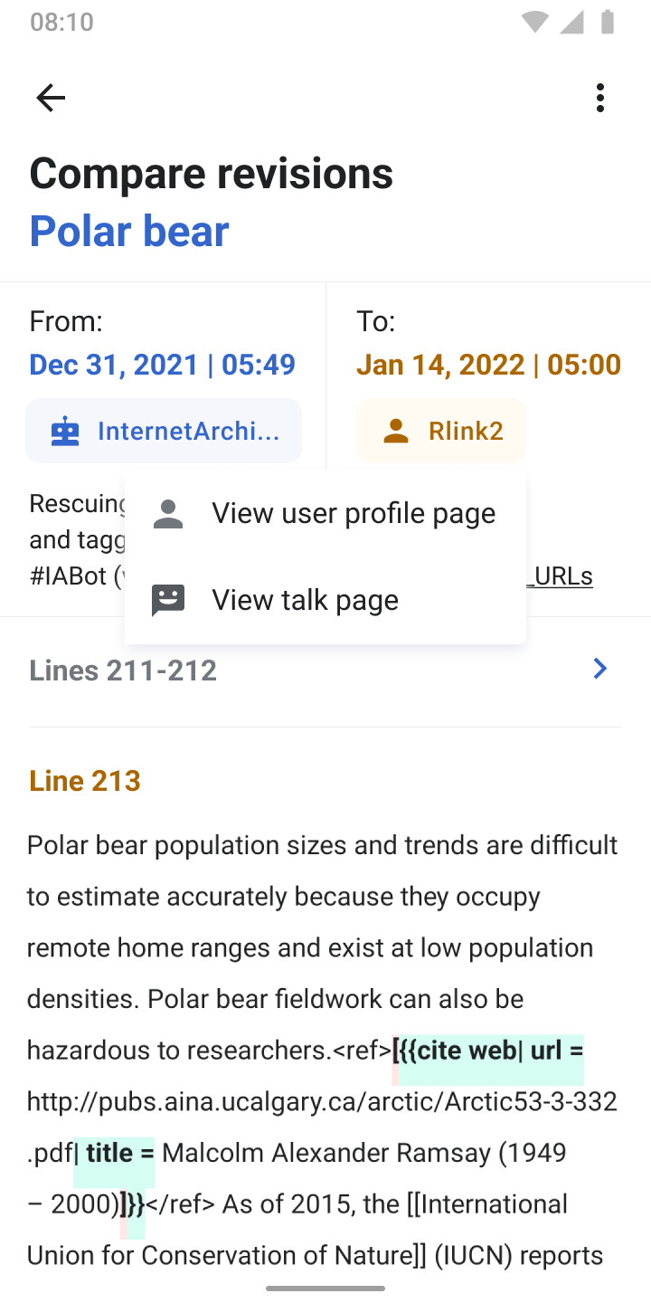
05) Tapping a username shows a menu to select that asks users if they want to visit the user’s profile page or talk page.
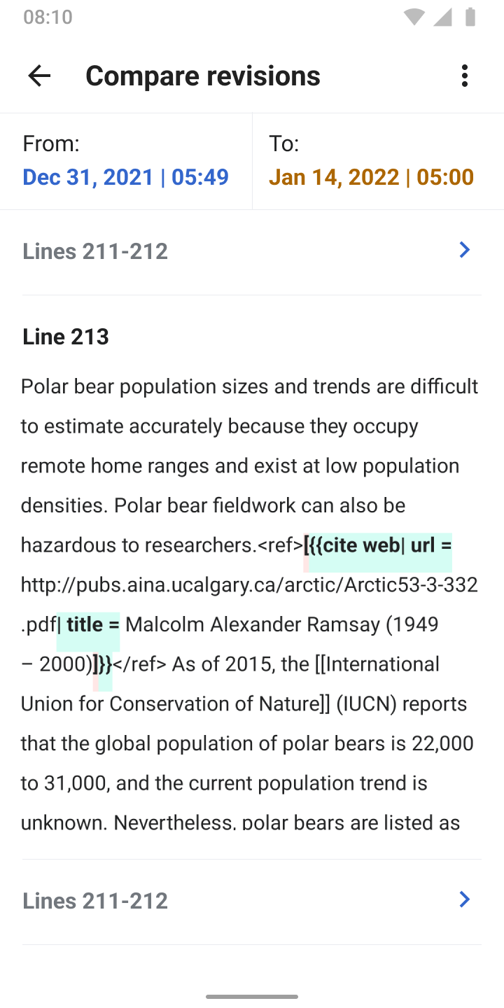
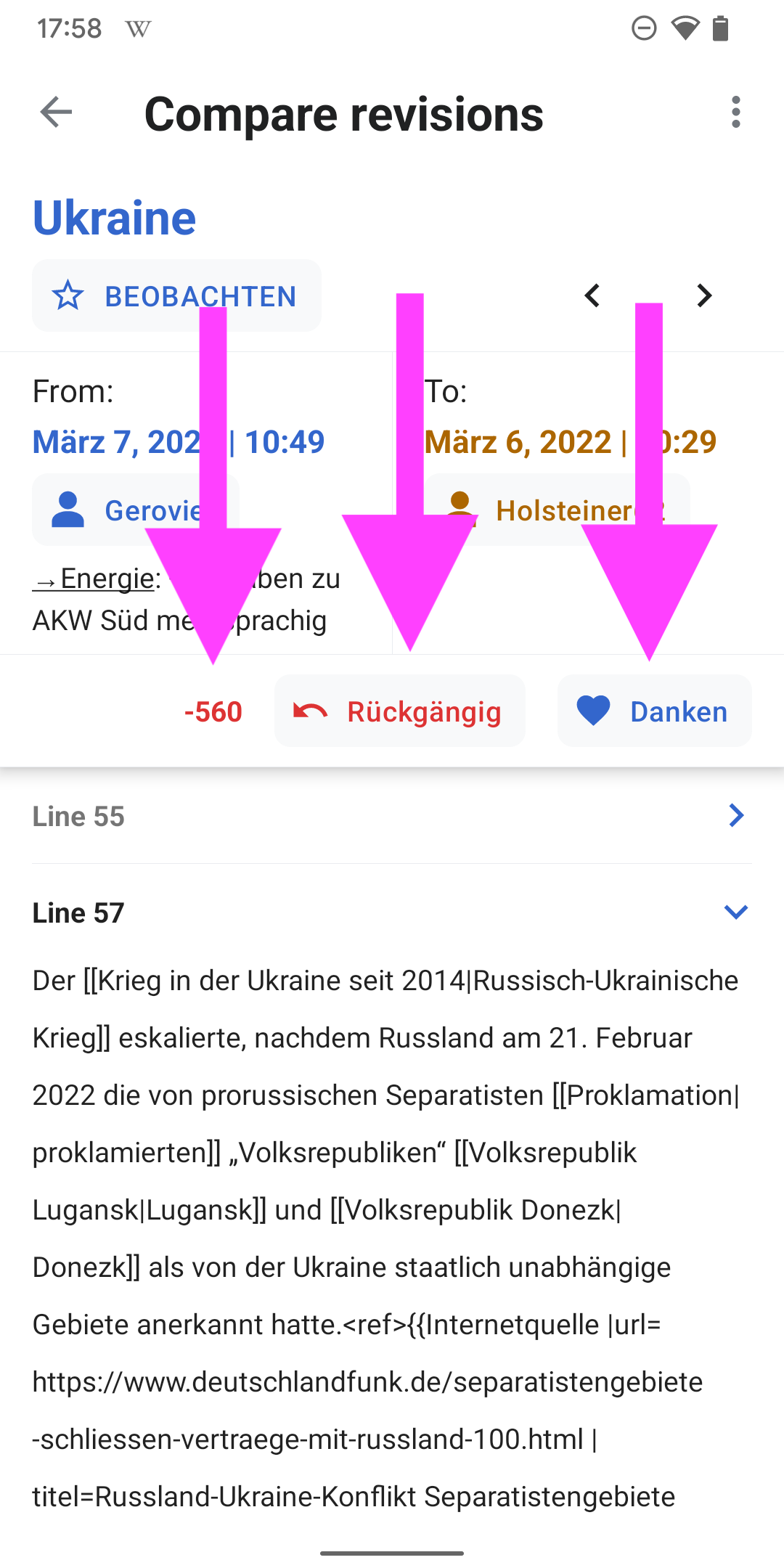
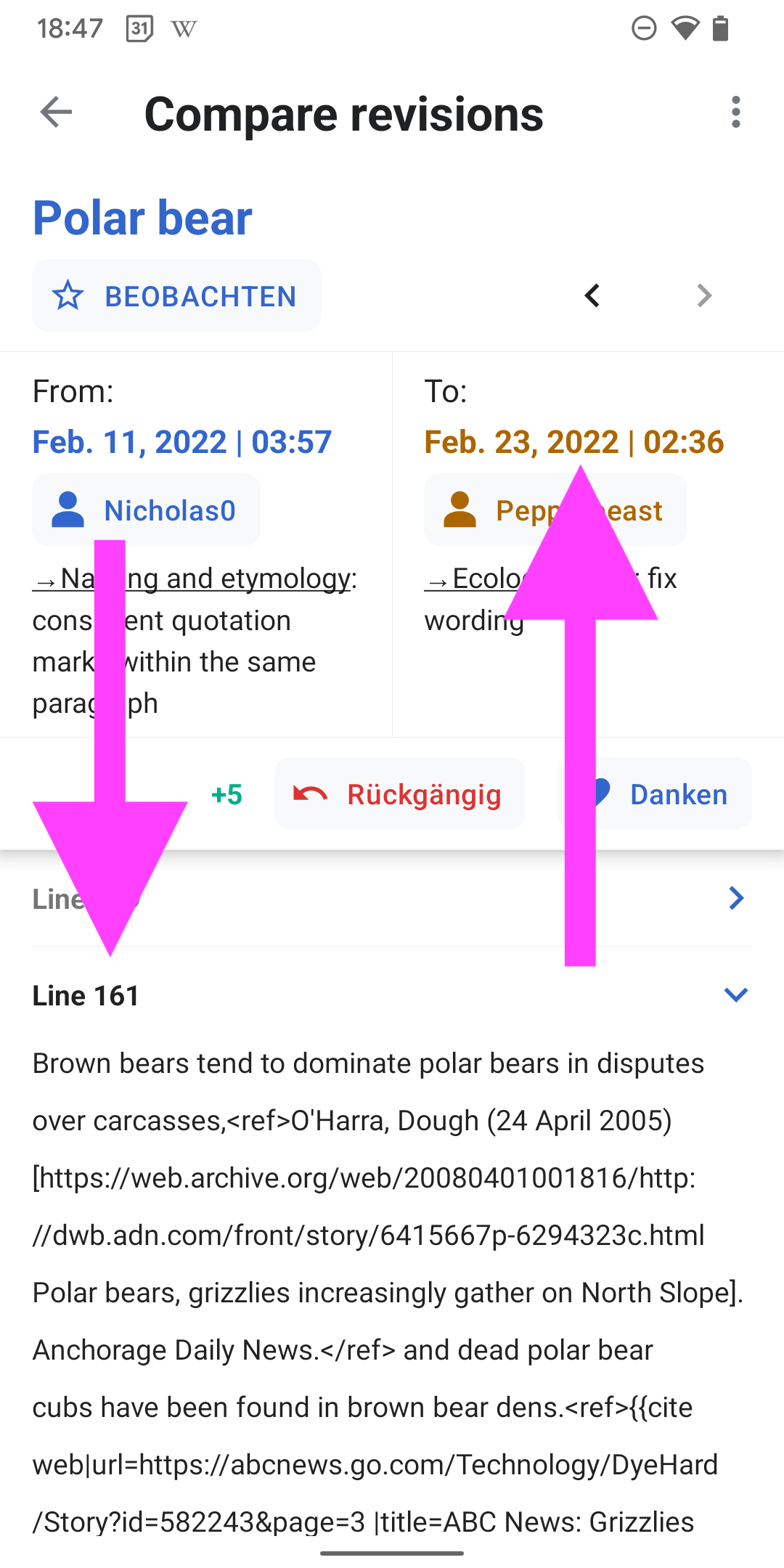
06) On scroll

  • On scroll, the ‘From’ and ‘To’ dates become sticky at the top
  • Also, the ‘Compare revisions’ title moves to the app bar

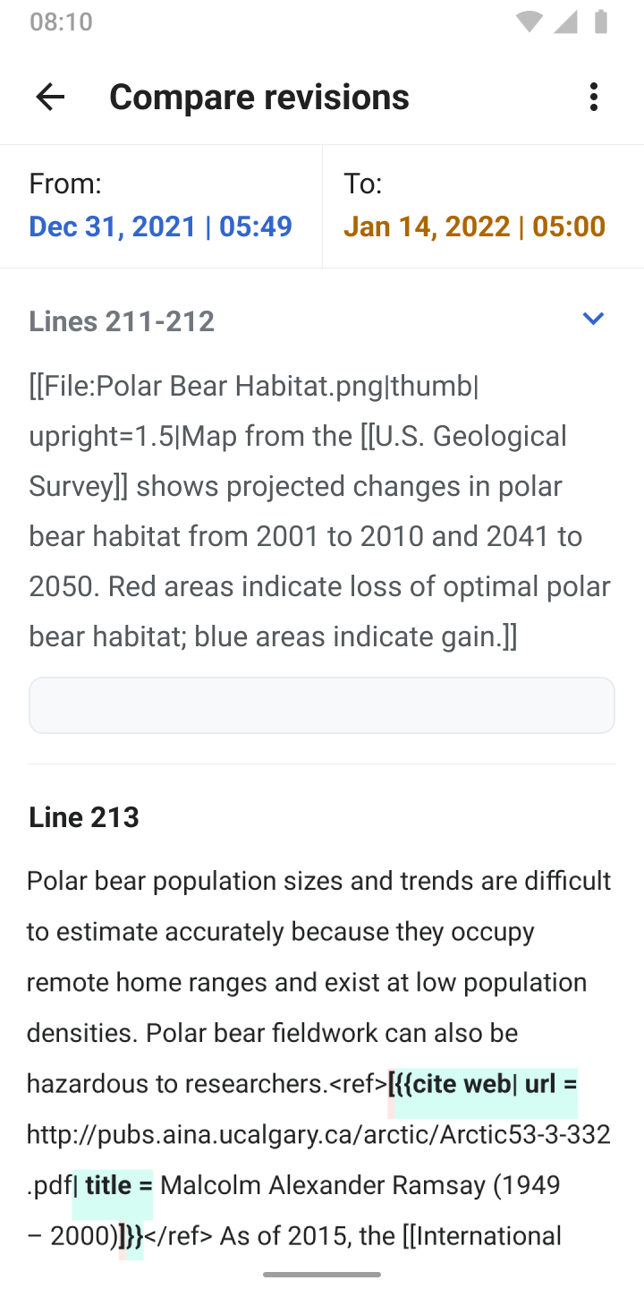
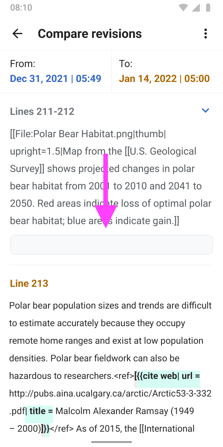
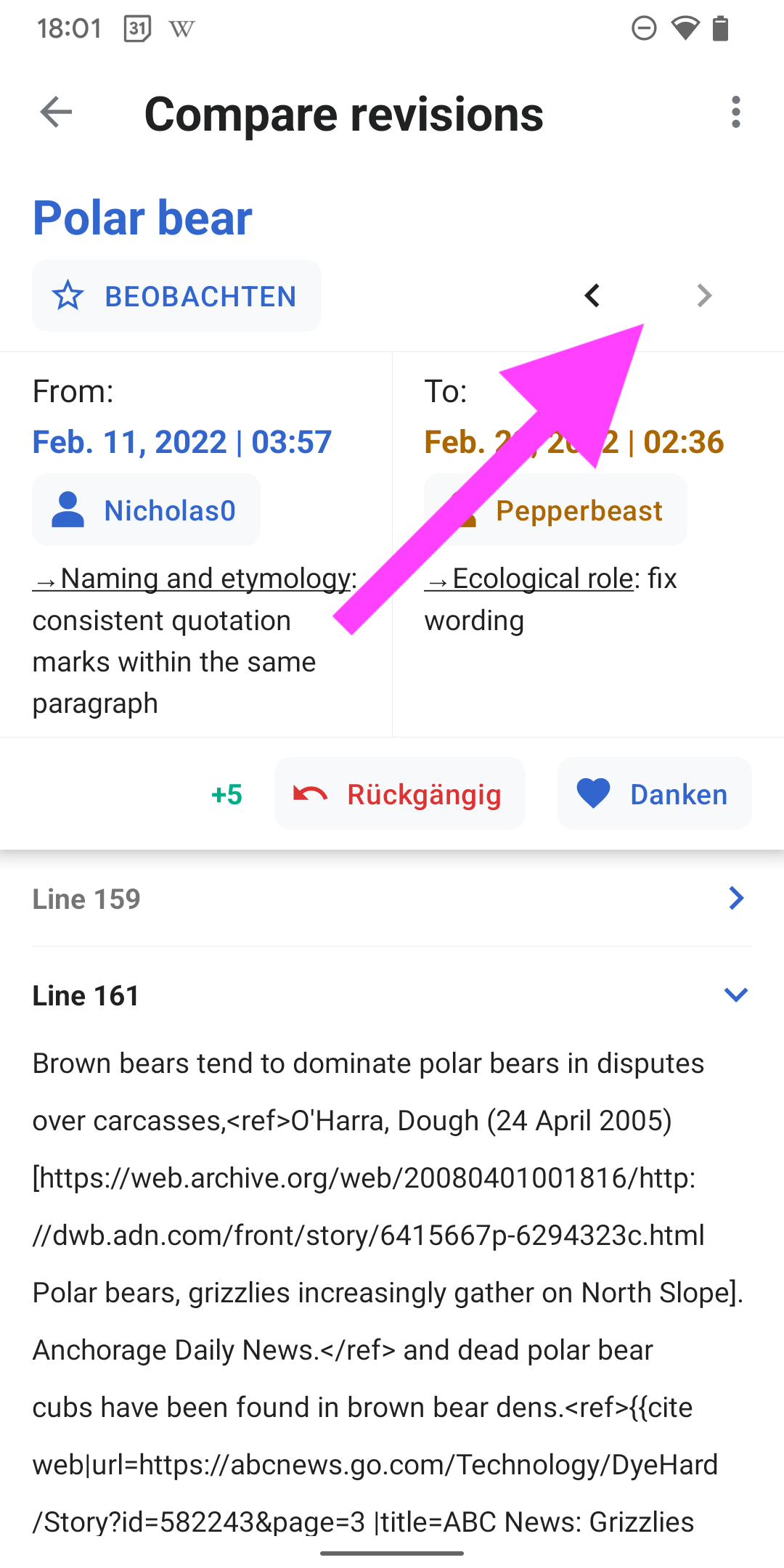
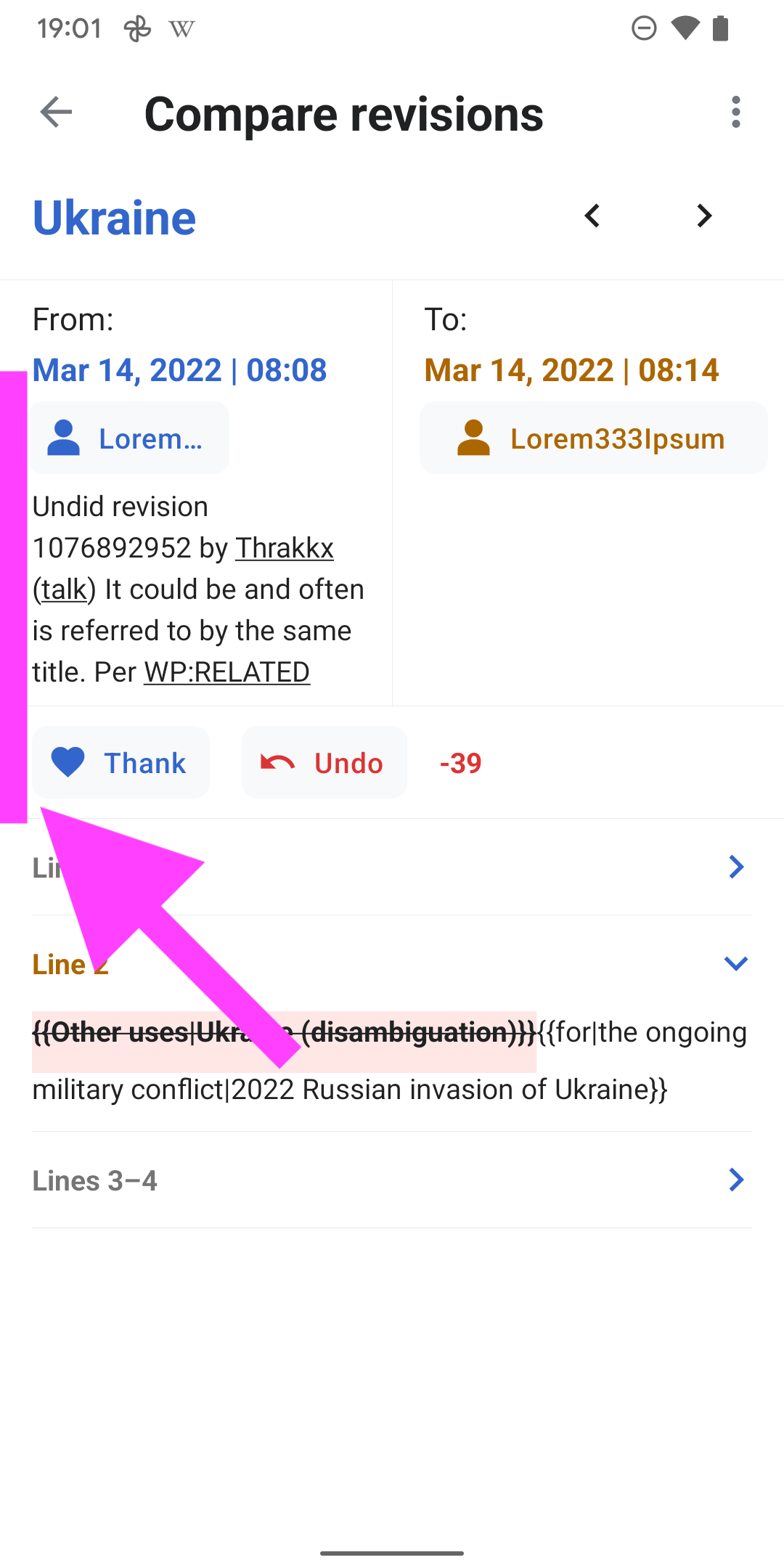
07) The lines before and after the main diff can be expanded by tapping the chevron icon

  • The chevron icon points to the bottom when an item is expanded
  • The diff above also features the treatment of blank lines

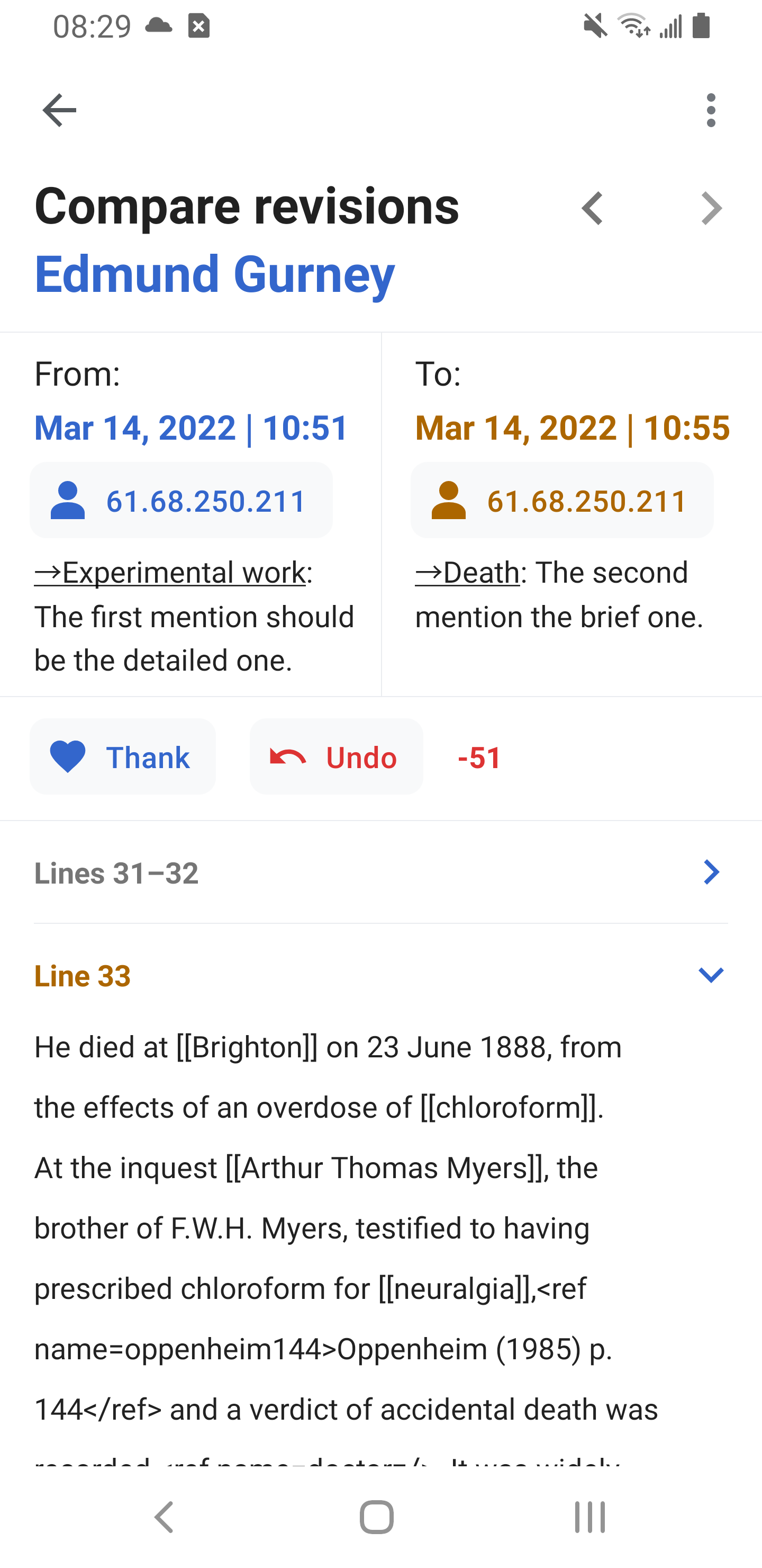
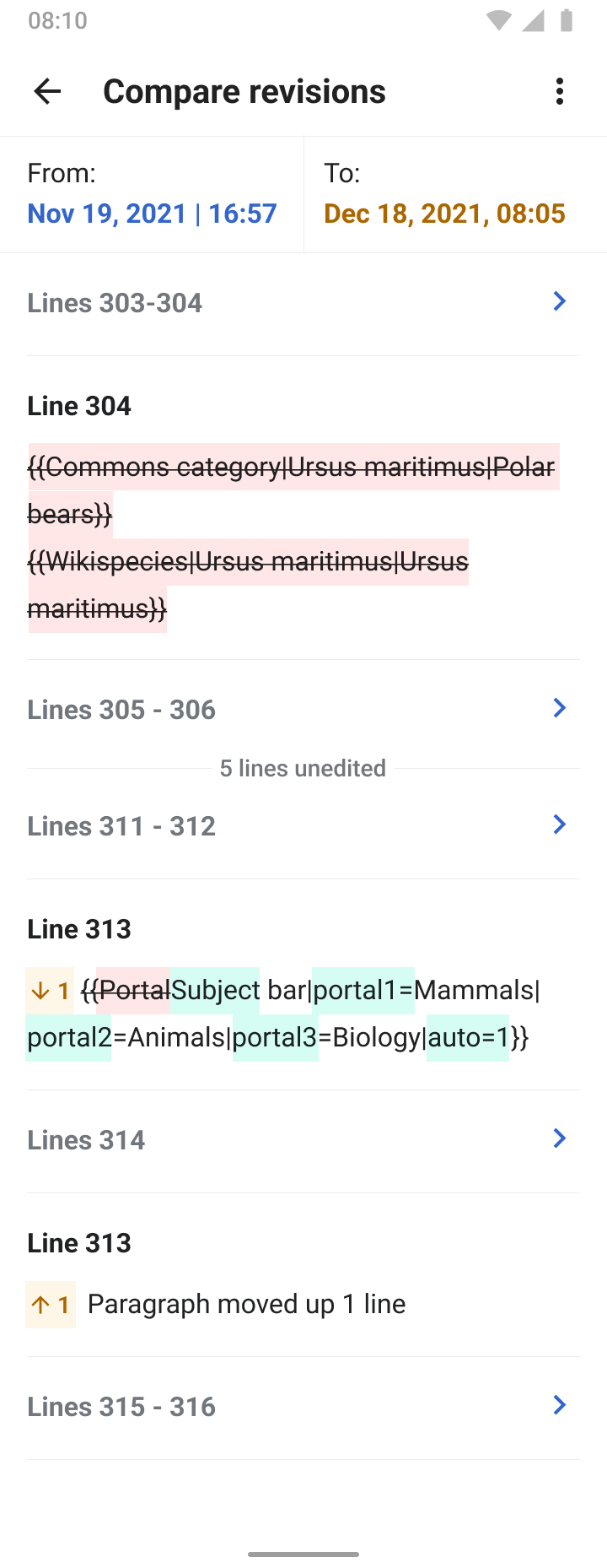
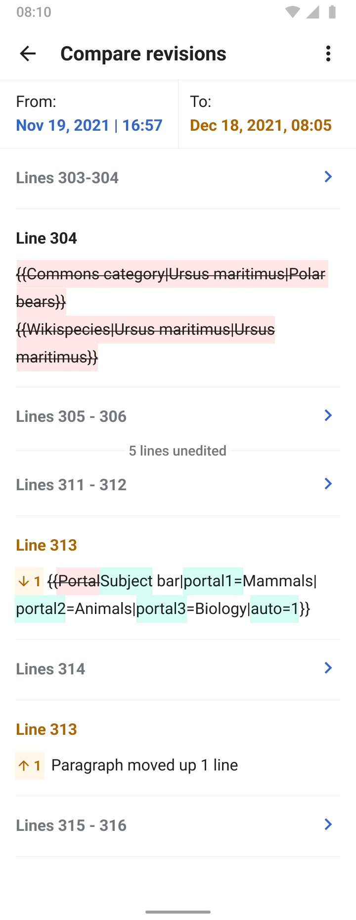
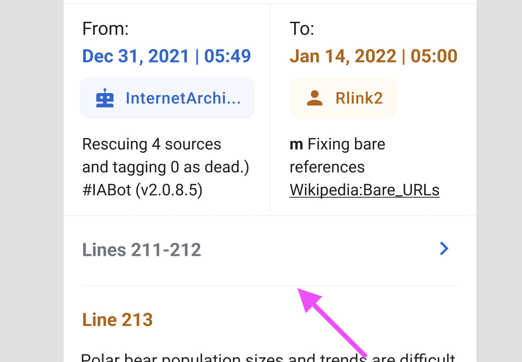
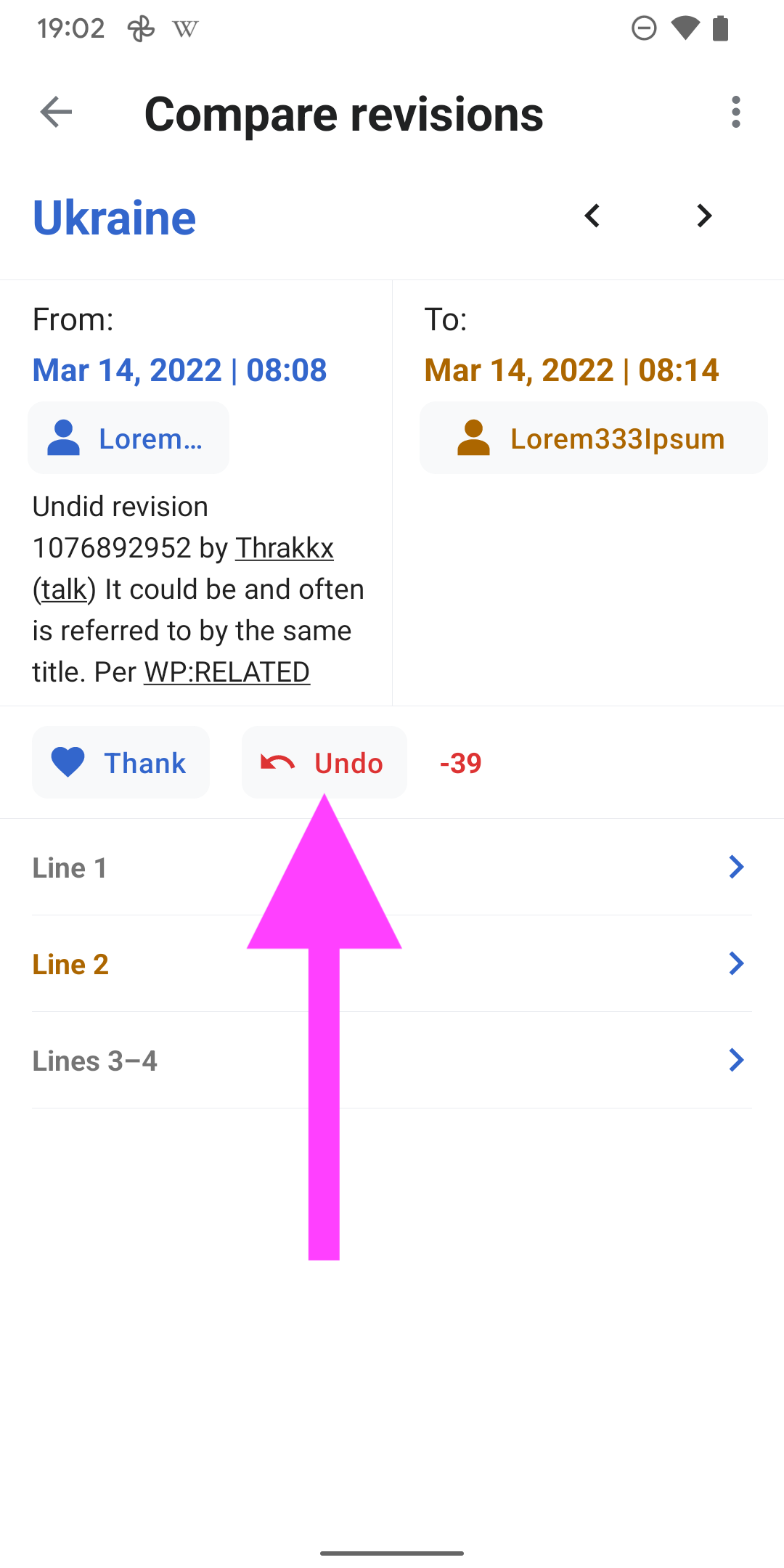
08) Example of a more complex diff 
(Link to this revision). It features:

  • Unedited lines
  • Removals
  • Moved paragraphs
Link to APK

https://github.com/wikimedia/apps-android-wikipedia/actions/runs/1994433968

Event Timeline

@scblr A question about colors:

When selecting two items for comparison, the first item is colored yellow, and the second is colored blue:

Edit history-1.png (1×720 px, 91 KB)

But then in the Compare screen, the "from" item is colored blue, and the "to" item is colored yellow:

Edit history.png (1×720 px, 148 KB)

This seems inconsistent. Can we agree on the same color scheme for both cases?

@Dbrant — wow, this is amazing work! 👏 I’m impressed how good this is working already...


01) Please apply strikethrough formatting for removals.

Screenshot_20220307-185552.png (2×1 px, 312 KB)

02) Once users are scrolling up, the from and to area should be sticky at the top of the screen, like in the designs

Edit history.png (1×720 px, 151 KB)

03) Diff formatting: Empty lines should be indicated like this (see iOS for reference):

Edit history.png (1×720 px, 182 KB)

04) Diff formatting: Moved lines should be indicated like this:

Edit history4.png (1×720 px, 81 KB)

05) Letter spacing (0.5sp) is for the 'COMPARE' link👇

Screenshot_20220307-174205.png (2×1 px, 196 KB)
Screenshot_20220307-174550.png (2×1 px, 191 KB)
Screenshot_20220307-174618.png (2×1 px, 200 KB)
image.png (258×440 px, 44 KB)

Figma →

06) In compare mode, the entire card should become a tap area for the radio selection. Tapping anywhere in the card (+ usernames) should 'enable' the radio button.

Screenshot_20220307-174828.png (2×1 px, 194 KB)

07) Use color_group_62 as the border color for the second item

Screenshot_20220307-175205.png (2×1 px, 216 KB)

08) Can the navbar have the same color as the area above?

ImplementationvsDesign

Screenshot_20220307-175321.png (2×1 px, 199 KB)
| |
Edit history.png (1×720 px, 92 KB)

09) Remove button style from bytes indicator and move it to the right of the username (per discussion in last week’s Product × Design × Engineering call)

Screenshot_20220307-175512.png (2×1 px, 197 KB)

  1. Move watch functionality to the overflow menu for less visual noise (per discussion in last week’s Product × Design × Engineering call)

Screenshot_20220307-175644.png (2×1 px, 233 KB)

  1. Change order of buttons and byte label to the following: Thanks, Undo, Byte indicator and align it to the left of the screen

Screenshot_20220307-175858.png (2×1 px, 234 KB)

  1. Move navigation arrows to the right of the polar bear article title

Screenshot_20220307-180109.png (2×1 px, 251 KB)

  1. Remove shadow here and use the same separator line as in the other places, e.g. below
ImplementationvsDesign
Screenshot_20220307-180109 copy 2.png (2×1 px, 251 KB)
Screenshot 2022-03-07 at 18.08.41.png (1×1 px, 542 KB)
  1. Reuse color of the newer version in the comparison for the the 'Line' indication
ImplementationvsDesign
Screenshot_20220307-184738.png (2×1 px, 250 KB)
Edit history.png (1×720 px, 151 KB)
  1. Now we’re getting into visual design theory 😅. Can we apply a minus margin-left of 2sp for both buttons here to visually perceive them on the same level as the text above it?

Screenshot_20220307-185112.png (2×1 px, 169 KB)

Done:
https://github.com/wikimedia/apps-android-wikipedia/actions/runs/1970247739

01) Please apply strikethrough formatting for removals.

👍

02) Once users are scrolling up, the from and to area should be sticky at the top of the screen, like in the designs

👍

03) Diff formatting: Empty lines should be indicated like this (see iOS for reference):

👍

05) Letter spacing (0.5sp) is for the 'COMPARE' link👇

👍

06) In compare mode, the entire card should become a tap area for the radio selection. Tapping anywhere in the card (+ usernames) should 'enable' the radio button.

👍

07) Use color_group_62 as the border color for the second item

👍

08) Can the navbar have the same color as the area above?

👍

09) Remove button style from bytes indicator and move it to the right of the username (per discussion in last week’s Product × Design × Engineering call)

👍

  1. Move watch functionality to the overflow menu for less visual noise (per discussion in last week’s Product × Design × Engineering call)

👍

  1. Change order of buttons and byte label to the following: Thanks, Undo, Byte indicator and align it to the left of the screen

👍

  1. Move navigation arrows to the right of the polar bear article title

👍

  1. Remove shadow here and use the same separator line as in the other places, e.g. below

👍

  1. Reuse color of the newer version in the comparison for the the 'Line' indication

👍

  1. Now we’re getting into visual design theory 😅. Can we apply a minus margin-left of 2sp for both buttons here to visually perceive them on the same level as the text above it?

👍


04) Diff formatting: Moved lines should be indicated like this:

The desired design for moved lines/paragraphs is extremely complex to accomplish using standard Android components. Let's chat next time regarding possible alternatives.,

Wow @Dbrant — you catched them all 🤩


I spotted two more minor inconsistencies and have one question:

01) Can we change the label from Add to Watchlist to Watch anywhere in the app? (we already changed it in the article overflow menu):

Screenshot_20220314-190109.png (2×1 px, 261 KB)

02) Please apply the same “visual design hack” (minus margin of -2sp) to the thank button so they are aligned

Screenshot_20220314-190147.png (2×1 px, 180 KB)

03) What was the final decision re: the undo button @JTannerWMF @Johan ? Move it to the overflow menu ?

Screenshot_20220314-190207.png (2×1 px, 151 KB)

I mean → the question is: should we put an emphasis on 'Undo' or not? IMO, red is the right choice as it’s a destructive action, see our design system guidelines:

Variants of red indicate errors in components, such as invalid text in a text field. **They also represent destructive actions, such as delete or cancel.**

https://design.wikimedia.org/style-guide/visual-style_colors.html

So the two options we have from a design standpoint are: keep it as is (exposed next to thanks) or move it to the overflow menu. What do you think? Thanks for the feedback.


04) Diff formatting: Moved lines should be indicated like this:

The desired design for moved lines/paragraphs is extremely complex to accomplish using standard Android components. Let's chat next time regarding possible alternatives.,

Ok, let’s talk about alternatives tomorrow.

03) What was the final decision re: the undo button @JTannerWMF @Johan ? Move it to the overflow menu ?

I can't speak to any final decisions, of course, that's Jazmin's decision, but since I was pinged: my preference would be to keep it visible and accessible and not move it to the overflow menu. Deciding whether something needs to be reverted or not is a key reason to look at a diff, and this would simplify that workflow.

01) Can we change the label from Add to Watchlist to Watch anywhere in the app? (we already changed it in the article overflow menu):

👍

02) Please apply the same “visual design hack” (minus margin of -2sp) to the thank button so they are aligned

👍

03) What was the final decision re: the undo button @JTannerWMF @Johan ? Move it to the overflow menu ?

Since the Undo feature is still behind a feature flag, we can move forward with releasing this, and refine the feature as we go along.

This is a masterpiece @Dbrant. Picasso had Mona Lisa, Michelangelo had David, Niki de Saint Phalle had Nana and Dmitry Brant had Revision history on Android. The best work so far! 👏👏👏


I have one last design request:

The upper area feels dense from a visual design standpoint:

Screenshot_20220317-093016.png (2×1 px, 229 KB)

Diffs are hard to understand, especially for newcomers. We need to be careful and deliver information piece by piece so it remains processable.

I suggest to go with the same design from the list view to makes the upper area less busy:

image.png (1×1 px, 912 KB)

@cooltey implemented a way to add the title of the screen to the app bar when scrolling. This makes sure that the entire screen estate is used:

Can we reuse that same design & pattern for the diff detail screen?

Can we reuse that same design & pattern for the diff detail screen?

👍 (in alpha)

looks great @Dbrant – can we use the exact same type definitions (as in the list), they differ slightly in line height:

Pixel 3.png (1×1 px, 606 KB)

thx!

Alignment is perfect now @Dbrant 👍

We might need to increase the tap target size of these buttons to 48 * 48 dp in order to be accessible? (cc @cooltey Accessibility)

Screenshot_20220322-094053.png (2×1 px, 210 KB)

Here’s a draft of how it could be achieved without changing/moving the current type attributes 👇

CleanShot 2022-03-22 at 09.57.26@2x.png (744×1 px, 383 KB)
CleanShot 2022-03-22 at 09.57.52@2x.png (420×1 px, 205 KB)

We might need to increase the tap target size of these buttons to 48 * 48 dp in order to be accessible? (cc @cooltey Accessibility)

I made the buttons exactly how they appeared in Figma, but now they have changed again. Is this the final design?