Page MenuHomePhabricator

Make watchlist / recent changes expand icon more noticeable
Open, Needs TriagePublicFeature

Description

From T74811: Watchlist should show individual uploads to watched files on the Commons:

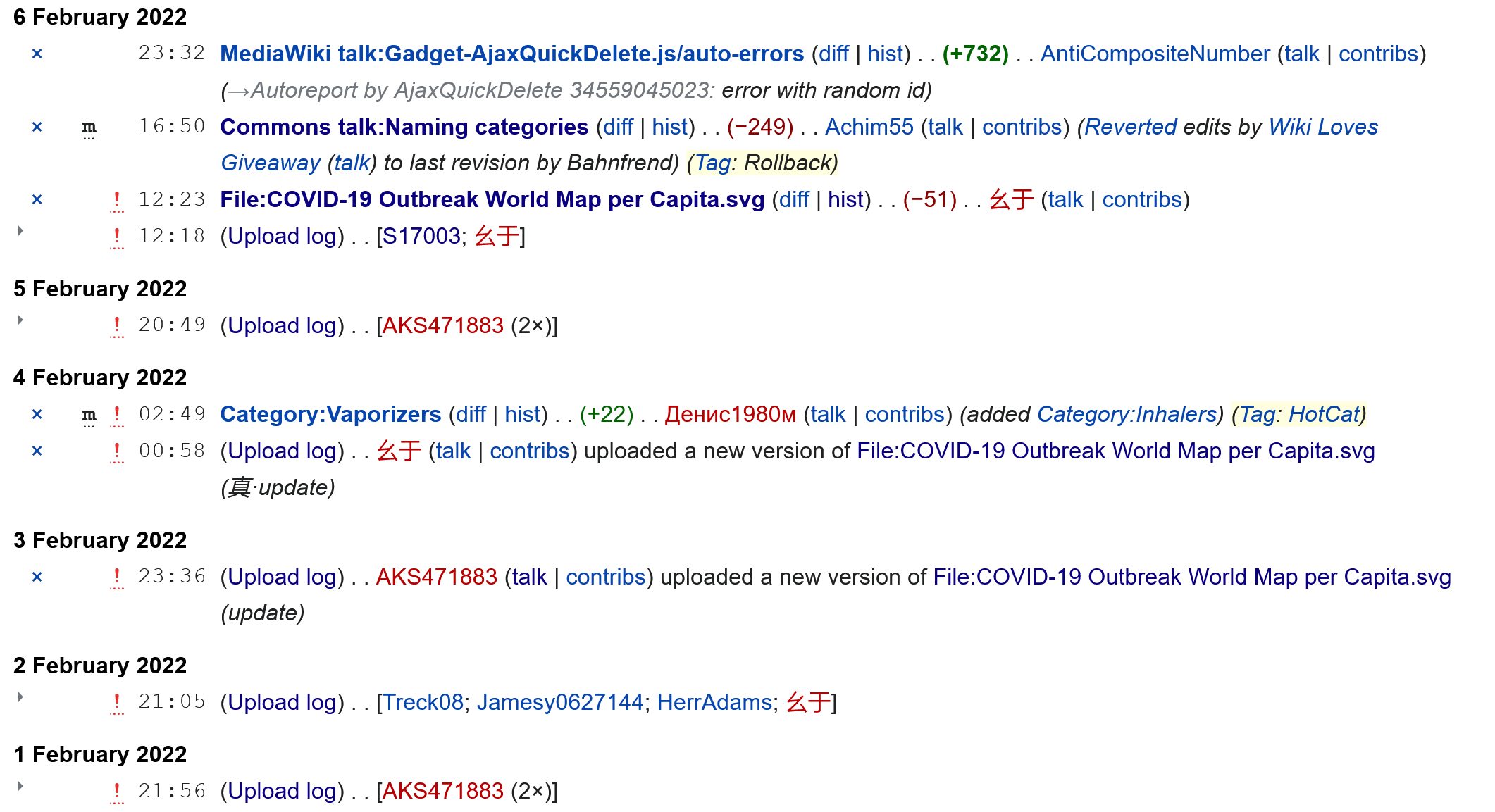
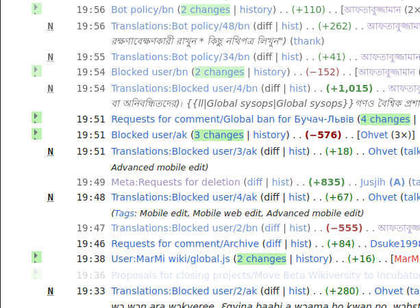
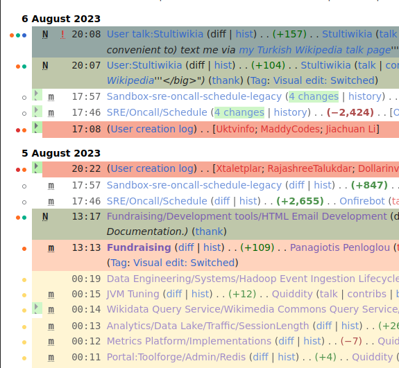
I am embarrassed to say I did not notice the arrowhead expanding the individual uploads here: ...
This function is not listed in the legend box at the top right of my Commons watchlist. I have no idea if this is a new function or not. No one mentioned it in this 8 year old thread previously.
If it has been there all along then maybe many people aren't noticing that tiny arrowhead or what it does. I suggest putting it in the legend.

The expand icon (a small triangle), for showing multiple edits to the same article or multiple log events of same type, is not particularly noticeable. Maybe there are design improvements that could help with that. Or we could just mention it in the legend as suggested (note that whether edits are grouped or not depends on user preferences).

The expand icon is gray. Maybe it should be black. Timeshifter has difficulty with gray text on his light gray monitor screen. Like many people nowadays (and as many eye doctors recommend) he turns down the brightness on his desktop PC monitor. So when the brightness is turned down the screen goes from being bright white to being very slightly gray. Gray text on gray backgrounds is harder to read or notice for many people. Timeshifter has emailed various web sites asking them to use black text instead of gray text.

Event Timeline

Restricted Application added a subscriber: Aklapper. · View Herald Transcript

Thanks Tgr for starting this task. To be clear this upload log is what I am talking about in my Commons watchlist:

  • ! 21:05 (Upload log)‎ [Treck08‎; Jamesy0627144‎; HerrAdams‎; 幺于‎]

This doesn't happen frequently since it is chance whether multiple watchlisted files happen to get new uploads on the same day.

I added this to the description:

  • The user preference is under the "recent changes" tab, and is called "Group changes by page in recent changes and watchlist". That may be better located in the "watchlist" tab. And it may be noticed more if it said something like "Group changes, uploads, and log events by page in recent changes and watchlist."
  • The grouping for the upload log is not for a single file. It may be better to pull that out as a separate preference. Some (Timeshifter) prefer page edits grouped, and upload log events separated in the watchlist.

Should that be in separate task, or should the title of this task be expanded?

I noticed something else. The tiny arrowhead is gray. It should be black. I have difficulty with gray text on my light gray monitor screen. Like many people nowadays (and as many eye doctors recommend) I turn down the brightness on my desktop PC monitor. So it goes from being bright white to being very slightly gray. I have emailed various web sites asking them to use black text instead of gray text.

@Timeshifter: This task is about an icon; it is not about moving around items.

For reproducing discussion and steps taken in a few months/years a screenshot of the status quo would be appreciated.

Here is a screenshot of the relevant part of my watchlist today.

Screenshot 2022-Feb-7. Timeshifter watchlist - Wikimedia Commons.png (1×2 px, 254 KB)

(Adding some notes and examples in case helpful)
I added this CSS to my personal stylesheet a few weeks ago, because it was also frustrating me:

/* More obvious multi-change indicators in Enhanced RC (grouped changes) */
  .mw-enhancedchanges-arrow, .mw-changeslist-groupdiff {
    background: #bbf2b0;
  }

That gives the expand-arrow and the "# changes" a green background:

image.png (450×613 px, 130 KB)

I find it is extra-necessary to add this kind of highlighting when I'm using the built-in "Highlight results" feature extensively, as I do at some wikis, e.g.

image.png (531×575 px, 121 KB)

Adding that green-highlighting (for both elements) makes it a lot easier for me to skim a complex page, without overlooking important details like "6 changes".

Thanks Quiddity. I added the CSS here:
https://commons.wikimedia.org/wiki/User:Timeshifter/vector.css

What CSS file did you add it to? Can you provide the URL?

I am using Vector 2022. Currently, vector.css works for both Vector 2022 and Vector 2010 for me. So I am seeing the green highlighting in the watchlist for both.

Of course, I have this checked in preferences:
"Group changes by page in recent changes and watchlist"

In recent changes tab:
https://commons.wikimedia.org/wiki/Special:Preferences#mw-prefsection-rc

@Timeshifter I keep almost all of my CSS files over here, so that I can use them via the Stylus browser-extension, and toggle them on/off instantly, and experiment with them live: https://github.com/quiddity-wp/wikimedia-style-tweaks/blob/master/quiddity.user.css#L203
I use Vector-2022 on most wikis. (And to be clear, I'm not suggesting this should be the default style for everyone! I'm just sharing what I'm using and why, to potentially help move this task forward. :-) )