Page MenuHomePhabricator

[Design spike] Explore options for one-click language switching
Open, MediumPublic

Assigned To
Authored By
alexhollender_WMF
Feb 15 2022, 3:11 PM
Referenced Files
F35456115: pinable language menu.webm
Aug 15 2022, 4:00 PM
F35456104: Screen Shot 2022-08-13 at 3.57.42 AM.png
Aug 15 2022, 4:00 PM
F35456100: image.png
Aug 15 2022, 4:00 PM
F34982754: Screen Shot 2022-03-07 at 11.19.37 AM.png
Mar 7 2022, 7:21 PM
F34974277: image.png
Mar 3 2022, 10:27 PM
F34974272: image.png
Mar 3 2022, 10:27 PM
F34952478: image.png
Feb 15 2022, 3:11 PM
Tokens
"Love" token, awarded by Amire80.

Description

Description

The previous version of the language switcher has two main elements:

  1. compact language links
  2. ULS menu

image.png (1×1 px, 268 KB)

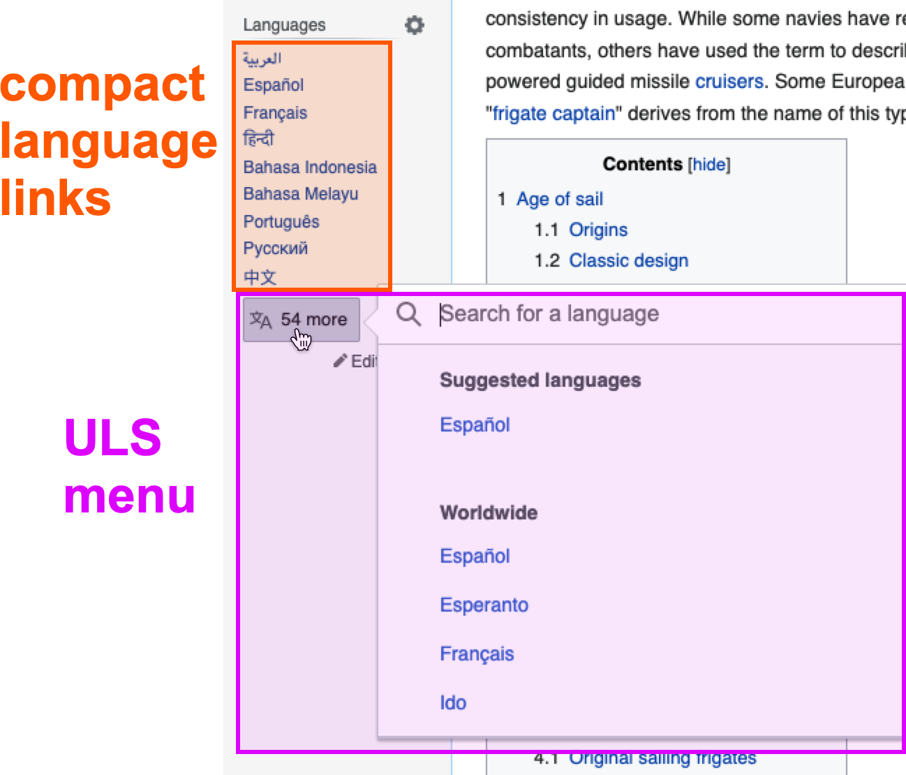
The compact language links allow people to easily switch languages (with a single click). The languages presented in the list are a best guess of which languages the person might want to switch to.

Goal

The purpose of this task is to explore how we might offer similar functionality in new Vector, and to consider in which cases we would want to show these additional links.

Examples:

links next to buttonlanguage toolbar below page titlepinable language menu (prototype)
image.png (1×2 px, 1018 KB)
Screen Shot 2022-08-13 at 3.57.42 AM.png (1×2 px, 1 MB)

Event Timeline

ovasileva triaged this task as Medium priority.Feb 15 2022, 6:10 PM

@ovasileva @Jdlrobson @Pginer-WMF @Amire80 — here is a simple sketch in order to get the conversation going:

image.png (1×2 px, 1014 KB)

Some questions that come to mind:

  • When the links are shown could/should the language button be simplified (e.g. "95 more", remove the icon, etc.)?
  • Should we make the links and the language button feel more like a single element?
    image.png (110×534 px, 9 KB)
  • When will we show the links (e.g. only after you've switched languages once, etc.)?
  • Which links will we show? (this might already be handled by the existing compact language links logic?)
  • Will there be any user preferences that give the ability to configure how this works? Or perhaps the ability to set preferred languages (like the apps have)?
  • Will this only be for logged-in people? If so, why?
  • Should we consider using this space for variant switchers (for wikis that have variants)?

I think, to the extent that time provides, it would be great to have these open questions answered by the language team.

@ovasileva @Jdlrobson @Pginer-WMF @Amire80 — here is a simple sketch in order to get the conversation going:

image.png (1×2 px, 1014 KB)

Some questions that come to mind:

  • When the links are shown could/should the language button be simplified (e.g. "95 more", remove the icon, etc.)?

The number that actually interests me is the total number of languages. As a user, what I don't like about the current sidebar button design is that when I want to know in how many languages is an article available, I have to calculate x + 9 (or x + 7). I'd prefer to just see the total number (including the current language).

I think that this is the number that is useful to most people, but you're welcome to test it properly.

  • Should we make the links and the language button feel more like a single element?
    image.png (110×534 px, 9 KB)

Whatever works best for users, no opinion from me here.

  • When will we show the links (e.g. only after you've switched languages once, etc.)?

Always show some languages if any languages are available. Don't wait for the first click. My hypothesis is that names of languages are the most important discoverability anchor. Not necessarily the word "languages", and certainly not the icon. They will help people who never clicked the languages button find it.

  • Which links will we show? (this might already be handled by the existing compact language links logic?)

Yes, starting from these languages is probably a good idea. I am somewhat concerned that because we have 9 (or 7) in the current sidebar and much fewer (2 or 3) in the upcoming design, this may cause some issues, but that's just a feeling. Actual user testing will show if there are real reasons to be concerned. For now, pick the first X languages you want from ULS's algorithm.

The algorithm is described in English here:
https://www.mediawiki.org/wiki/Universal_Language_Selector/Compact_Language_Links#How_do_you_decide_which_languages_are_shown_to_me_in_the_initial_compact_list?

And in JavaScript here:
https://gerrit.wikimedia.org/r/plugins/gitiles/mediawiki/extensions/UniversalLanguageSelector/+/refs/heads/master/resources/js/ext.uls.compactlinks.js#252

On line 23 you can see that it's set to 9 languages by default. You'll have to do very little modification to get 2 or 3 or whatever number you need.

I do suggest considering making the number of initially shown languages to show responsive and not just hard-coded 2 or 3. Something like this:

  • If there's one other language, easy: show the one.
  • If there are 50 other languages, but you only have room for one on the screen, show one, but make it clear that there are more. (Not just "50 languages", but something extra, like a gradient, an ellipsis, or an explicit "More" label.)
  • If there's room for 5 languages, show 5. But the obvious issue is how to define "room" without making it cluttered. I'd say that around 30% of the corner opposite the heading can be taken by languages, but I trust Real Designers to find the optimal number.

I kind of mentioned it already, but I have to reiterate: It's important to make people understand that there are more languages and not only the two or three that you show initially. Please check this in user testing.ranslatio

Finally, one more thing to consider is the Content Translation / Section Translation entry point.

  • Will there be any user preferences that give the ability to configure how this works? Or perhaps the ability to set preferred languages (like the apps have)?

It's the most frequently asked questions from Wikipedians :)

The answer for the current Compact Language Links code is that every time you click a language, it is added to the top of your priority languages, and that's the way to select the languages you want. It's stored in preferences for logged-in users and in a cookie for anonymous users.

Nevertheless, Wikipedians keep asking about this. I guess that some people prefer a more explicit method to select things, for example a field in Special:Preferences (or maybe something else). I don't think it's really necessary, but I'm not opposed to it either. I'll leave it to the product manager.

  • Will this only be for logged-in people? If so, why?

NO! Almost no one is logged in. It must be discoverable by everyone.

I also want to put another thought in your head: I know that it's specifically not what you're doing here, but nevertheless, how would you make something similar on mobile web?

  • Should we consider using this space for variant switchers (for wikis that have variants)?

It may be a very good idea, but run user testing with users who read and write in such languages. (This must include users are experienced Wikipedians and users who are casual readers who never edit.)

Input from other Language team members (and everyone else) is very welcome.

I think there is a technical concern with displaying the suggested languages, in that we can only determine suggested languages via JavaScript which will result in a visible change in the UI as these get loaded. If this is limited to logged-in users, we may be able to find better ways to do this. I like the idea of allowing explicit personalization to "Always show me links to these languages"

Do anonymous users need one-click language switching?

If so I'd suggest, depending on the why, I imagine it would be more helpful to think of it working more like Google Chrome's translate feature, e.g. a dismissable call to action (Do you want to switch to another language?) then as something that adds clutter to an already noisy part of the UI:

Screen Shot 2022-03-07 at 11.19.37 AM.png (482×2 px, 277 KB)

I think there is a technical concern with displaying the suggested languages, in that we can only determine suggested languages via JavaScript

The current code does a lot in JavaScript, but that's just the current code. Most of it can be done server-side.

Do anonymous users need one-click language switching?

Of course, as I've already written above. They need it much more than the logged-in people, who are naturally more experienced at finding non-obvious things.

If so I'd suggest, depending on the why, I imagine it would be more helpful to think of it working more like Google Chrome's translate feature, e.g. a dismissable call to action (Do you want to switch to another language?) then as something that adds clutter to an already noisy part of the UI:

Screen Shot 2022-03-07 at 11.19.37 AM.png (482×2 px, 277 KB)

Sounds too intrusive and complicated. Alex's earlier suggestions with showing a small number of language names next to the Languages button makes a lot more sense: easy to discover for people who need other languages, and easy to ignore for people who don't. Of course, this should be confirmed by user testing (if it wasn't already).

Also, switching to a wiki page in another language is fundamentally different from machine translation, so their UI doesn't have to be similar.

Here are some points about my general thinking on this:

  • Having direct access to a few languages seems convenient for multilingual people to switch between their frequently used languages (both when reading and editing articles). So I think it makes sense to support unregistered users if it is technically feasible.
  • I think it is ok to have a small number of languages surfaced. Showing two languages already covers all the needs for people interested in 3 languages (the current one, plus two options to switch). Users interested in more languages may still benefit from quickly accessing their top frequent ones, and the language selector will still surface a broader list of suggested languages at the top.
  • The option to access the rest after a small set of languages feels like a natural continuation. Adding more languages directly makes the area more crowded making the access to all languages less obvious.

Regarding specific questions/comments:

I think there is a technical concern with displaying the suggested languages, in that we can only determine suggested languages via JavaScript which will result in a visible change in the UI as these get loaded.

A transition (e.g., fading in) can help in this context. Provided that the number of languages is not large and the space is reserved to prevent the content to reflow, it can feel natural that those suggested languages appear after a second next to the selector (as if they were surfaced out of it). Having popups or dialogs feel more blocking and distracting to me.

This technical limitation may have impact on some of the other questions.

When the links are shown could/should the language button be simplified (e.g. "95 more", remove the icon, etc.)?

Compacting makes sense to make the best use of available space. Keeping the button always the same helps to establish it as a persistent entry point and avoids issues if the direct links appear after the button (then would produce a glitch if the button changes)

Should we make the links and the language button feel more like a single element?

I think there is value to have the main access to languages to be persistent and provide the shortcuts as separate elements. Especially since those will be different on each case, including when you click on one.

When will we show the links (e.g. only after you've switched languages once, etc.)?

I'd be more inclined to show the links anytime because that also helps users to discover content exist in their language, but only if we are very sure those are relevant (more details in next answer).

Which links will we show? (this might already be handled by the existing compact language links logic?)

Since this is a more prominent place I think we may want to surface only the most reliable suggestions from those used by ULS. For users that have not selected languages, those could come from the browser and babel boxes (i.e., criteria 1-3 in this list). We may include geolocation (criteria 4) too if we expect the errors to be understandable by users, but I won't include more speculative criteria (5-7) in this context.

Will there be any user preferences that give the ability to configure how this works? Or perhaps the ability to set preferred languages (like the apps have)?

We need to think on which is the best way to support this. On the one hand it is great that the system can surface the languages you use the most based on your regular use without any configuration effort required. On the other hand, when the system fails, it may be useful to have some way to correct it. For example, following a link to a Wikipedia article in Korean would make Korean to pop up as a suggestion without a clear path on how to remove it. Maybe we can explore both options to configure and options to discard suggestions.

Will this only be for logged-in people? If so, why?

I think quickly switching among your common languages is useful for both readers and editors regardless of their log-in status. I'd consider not supported unregistered users if there is technical limitation that prevents surfacing relevant suggestions for them.

Should we consider using this space for variant switchers (for wikis that have variants)?

I think that variants can be treated as options to suggest. If people switch often between them, they can benefit from having them at hand.

Thanks for the thoughts and discussion so far @Amire80, @Jdlrobson, and @Pginer-WMF. I'm realizing I should have added a bit more context/framing from the web team's perspective.

From our perspective (web team) there is one main reason, and one possible reason, for showing these additional links:

Main reason: to help people who switch languages frequently
Possible reason: if we find out that the new location of the language links results in a decrease of language switching (*reminder: we do not yet know whether or not this is the case, and we likely can't know this until we deploy the new interface to all wikis). Said another way: our goal with showing these links is not to increase the prominence of language switching...we're hoping that moving the language links will already take care of that.

My questions thus far, particularly my questions around who should we show these links to, or in what cases should we show them, are in relation to the main reason above, i.e. how can we determine people are frequent language switchers, and therefore need these additional links. I apologize for not being more clear at the outset. If we find ourselves in a position that we need to consider the other reason, that could be a separate discussion.

The reason why I'm bringing this point up is because the responses from @Pginer-WMF and @Amire80 seem to be: more visibility of language switching is always a better thing. Which makes me want to push back (perhaps similarly to @Jdlrobson's comment) and ask: at what point will we consider language switching links prominent enough? Are we looking to maintain the current level of language switching, increase by x%, etc? I think it would be helpful to have some kind of limit here. Until we have reason to doubt our initial solution, these additional links (again from the perspective of the web team), are meant more as a supplement to be shown in specific cases.

This one is my personal favorite:

image.png (1×2 px, 1018 KB)

Although I'd probably allow for three or four languages and not just two. It should probably be responsive according to screen size.


This is functionally similar, but somehow less elegant, at least to my taste:

Screen Shot 2022-08-13 at 3.57.42 AM.png (1×2 px, 1 MB)

But hey, if user testing shows that it works well for users, then I don't mind.


This one is nice, although a tad complicated to my taste

However, I can easily imagine that many experienced Wikipedians will like it, especially if you also add the option to show the complete list of languages. But again, check it with proper design research.

When will we show the links (e.g. only after you've switched languages once, etc.)?
Which links will we show? (this might already be handled by the existing compact language links logic?)

In both of these cases, I think you need to strongly consider the article topic/content, not just the user's prior behavior. I've said this before, but I get the sense that your approach to language switching is, "let's make it easy for the reader to get to the article in the language in which they are most fluent, and that'll given them the best experience," and that is simply not true. It's not true because articles are not simply translations of the same content (as the language switcher currently erroneously implies), but rather vary dramatically in terms of quality. Usually, the best version for any reader will be the one in the language most closely associated with the topic (e.g. if I'm reading about a building in Vietnam, the Vietnamese translation will probably be best), translated into their native language by their browser.

There are lots of signals you can use to help identify which language has the best version. If an article has GA/FA status in another language, then suggest that language. If it is significantly longer in another language, suggest that language. If its Wikidata item has a value for country or country of citizenship, then suggest the lingua franca of that country. Or if it has language of work or name or language used, then suggest that. If it has a language expansion template, then certainly point to that language.

But these signals also apply in the other direction. For many topics, a reader is already going to arrive at the best version. Our responsibility there is to minimize the suggestion to switch languages, which will at best clutter the interface and at worst will lead to poorer information. To use the example I have previously, if I'm a native Arabic speaker with limited grasp of English arriving at en:Harris Theater (Chicago), am I going to have better access to information if I'm prompted to switch from the 2500-word featured English article to the 150-word Arabic article, or if I stay at the English version and just have my browser translate it? It's clearly the latter, so even in the most optimized scenario, for that page an Arabic speaker will want to stay with the English version. Therefore, the Harris Theater page should not be making a suggestion to switch to any other language, even if the user has shown an interest in Arabic. If the language switcher cannot recognize when it ought to be quieter, it's not serving readers.

When will we show the links (e.g. only after you've switched languages once, etc.)?
Which links will we show? (this might already be handled by the existing compact language links logic?)

In both of these cases, I think you need to strongly consider the article topic/content, not just the user's prior behavior. I've said this before, but I get the sense that your approach to language switching is, "let's make it easy for the reader to get to the article in the language in which they are most fluent, and that'll given them the best experience," and that is simply not true. It's not true because articles are not simply translations of the same content (as the language switcher currently erroneously implies), but rather vary dramatically in terms of quality. Usually, the best version for any reader will be the one in the language most closely associated with the topic (e.g. if I'm reading about a building in Vietnam, the Vietnamese translation will probably be best), translated into their native language by their browser.

The current logic of language selection , already accounts for relevant languages of the article and those in which the article is featured. The usecase you describe is a valid one, but it is not the only one or the most common to optimize the UI just for it. We had several instances of feedback about (a) people confused when the system suggest them a language which is not a language they speak, and (b) complaints about machine translation being applied when it is not edited enough.

This task is about surfacing options that allow users to switch quickly between languages. If there are users doing it all the time, the system surfacing the option that they frequently search for, is aligning with their behaviour. Opening the language menu there is already an initial section of "Suggested languages" at hand that already accounts for more factors such as relevant languages for the content and quality indicators.

Our goal should be to get people the best information on the content. It's not surprising that some are going to be confused by a suggestion to switch to a language they don't speak, since most don't understand that different language versions are not just translations of the same content. But that doesn't mean we should give up and just have them read the inferior version. It means that the interface needs to do a better job of teaching them that the different language versions will differ in quality, and that a particular language is being suggested because it appears to be higher-quality.

I know that there's lots of design philosophy about giving users what they want, but we shouldn't interpret that too narrowly. What readers fundamentally want is access to high-quality, easy-to-understand information. Switching to the version in their native language is what they're doing to try to seek that, but if it's not actually what will help achieve it, we should keep the focus on the fundamental goal.