Why are we doing this?
Differentiating between read and unread messages was reported as difficult by 2 of 5 participants. A participant suggested utilizing a ‘blue dot’ like web to denote read status.
Contributor story
As a contributor, I would like it to be easier for me to tell my read and unread messages apart, especially in dark mode.
Quotes from Diary Study
Honestly, it is quite difficult to determine which notification is marked as read, and which is not, when you did not like to filter unread and read notification in a dark mode. Maybe it is nice to put some blue point as Wikipedia already have on a desktop versions for notifications.
Proposed design solutions
Figma: https://www.figma.com/file/cedgOU5CyOR0UVqtjDOvzE/iOS-Notifications?node-id=2086%3A15698
| Default | Sepia | Dark | Black |
|---|---|---|---|
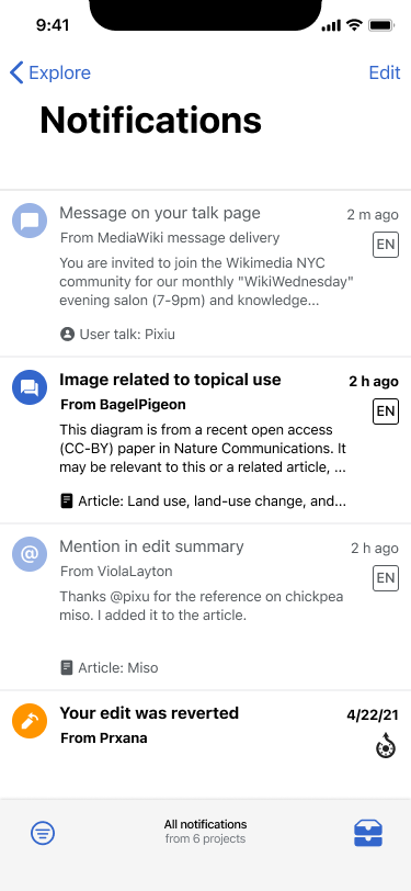 | 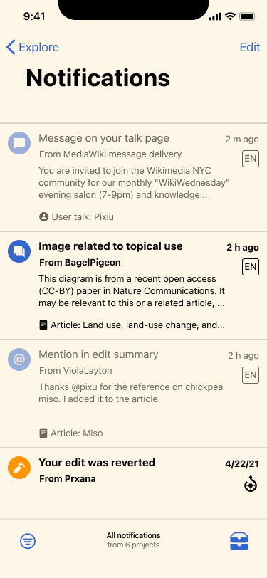 | 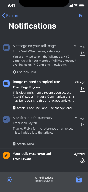 | 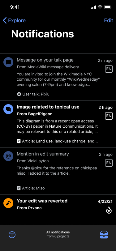 |
Updates
- Unbold all elements in read messages
- All text utilizes Primary text color in unread messages
- Read messages use an opacity of 50% on notification type icons
- List items should use the same colors as defined by theme on Reading lists (HRs, primary background color, etc)