Page MenuHomePhabricator

[Design spike] Visual design for desktop improvements
Closed, ResolvedPublic

Description

Description

This task will contain visual design explorations for the updated Vector interface. Please refer to the parent task for additional context, goals, and constraints (T301780).

Scope

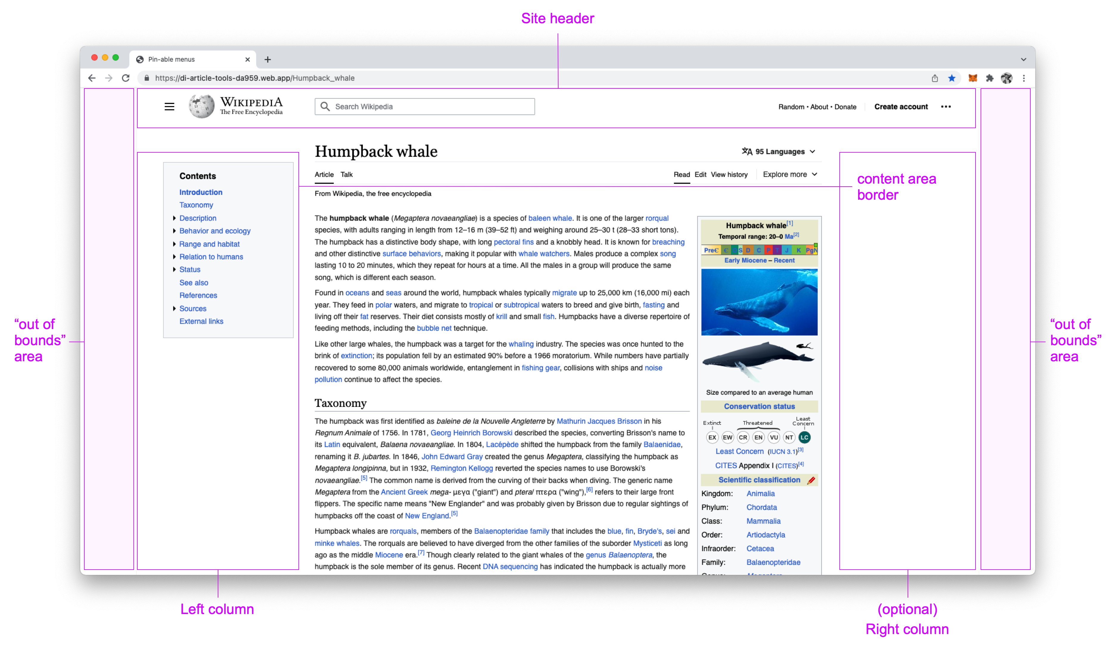
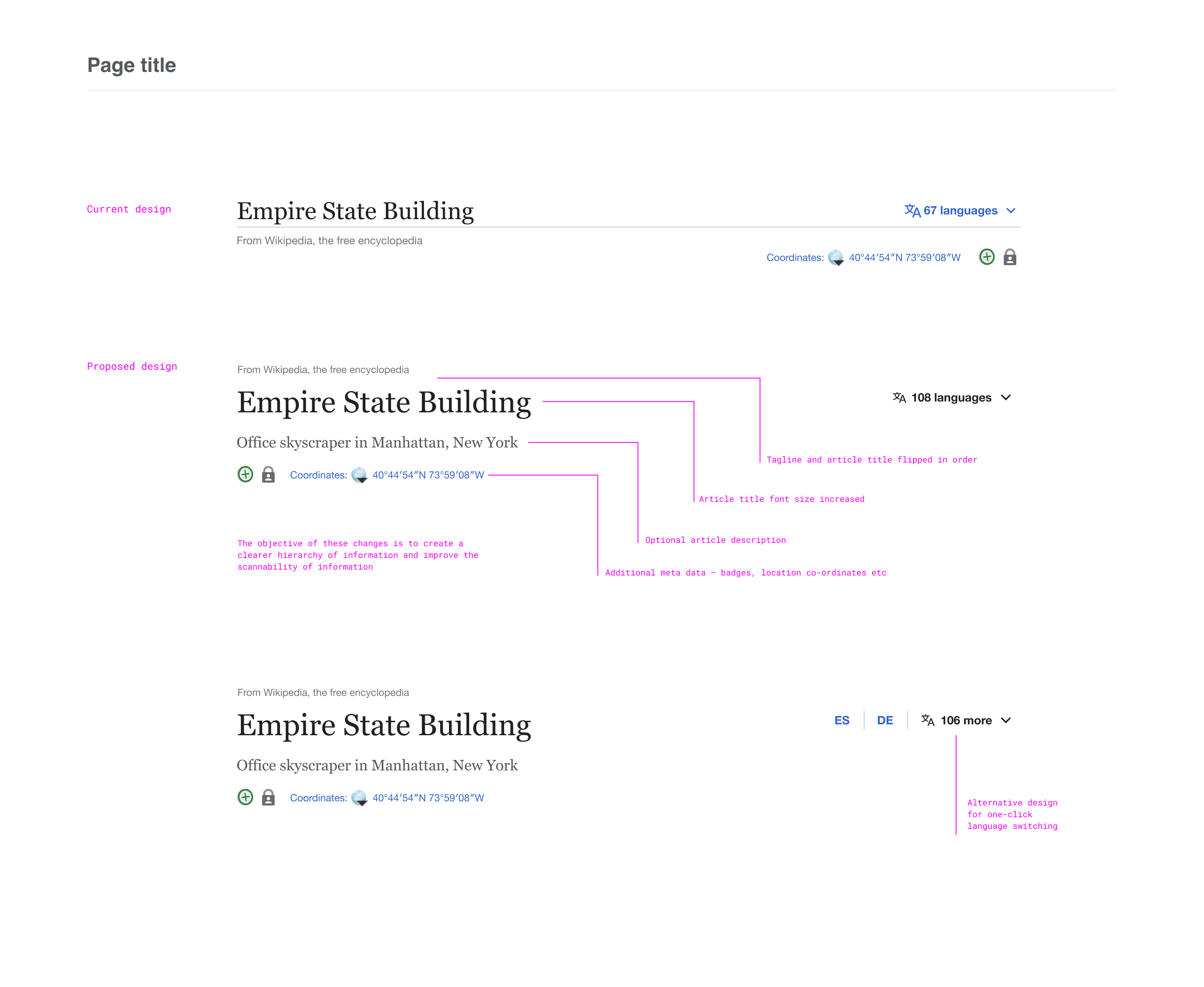
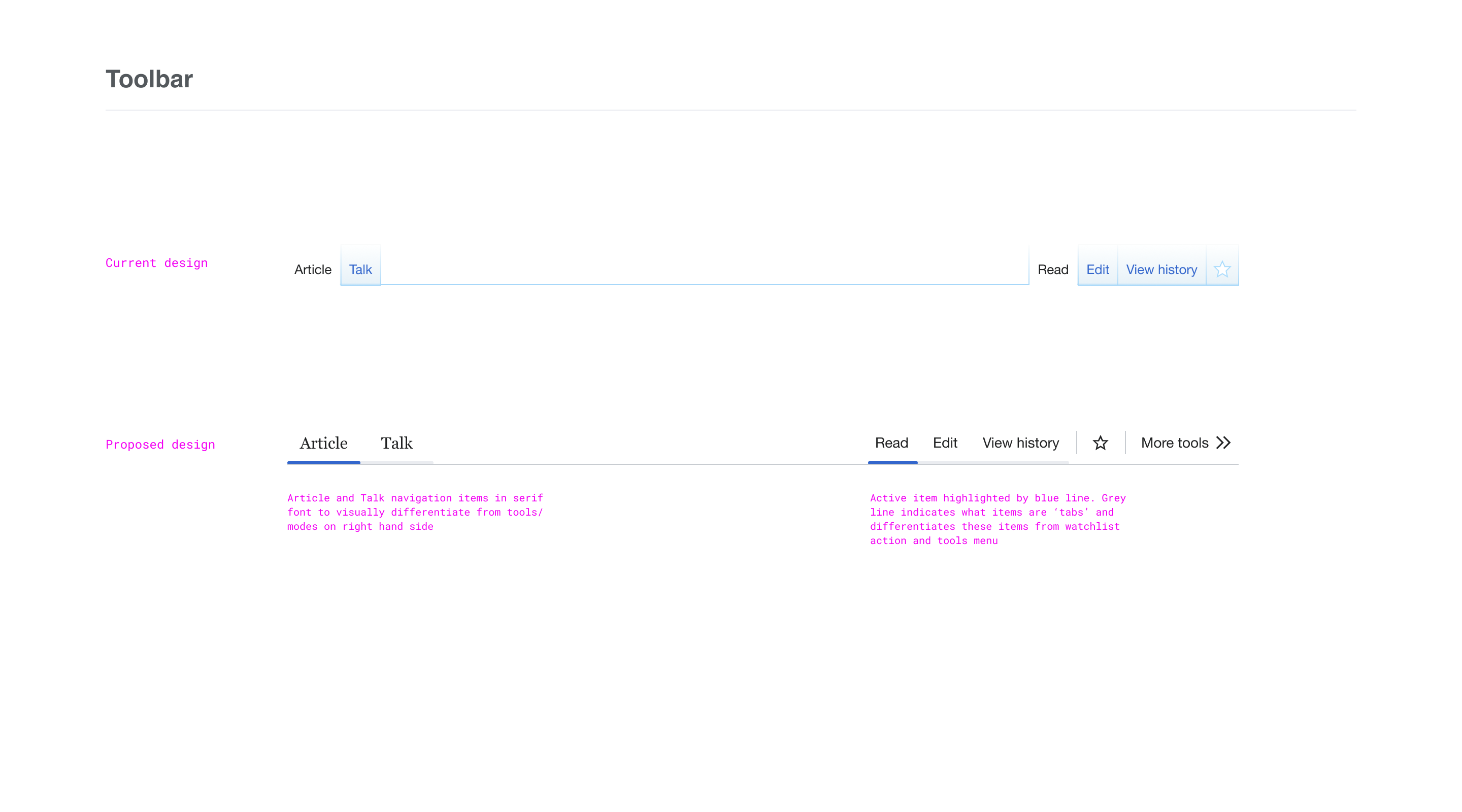
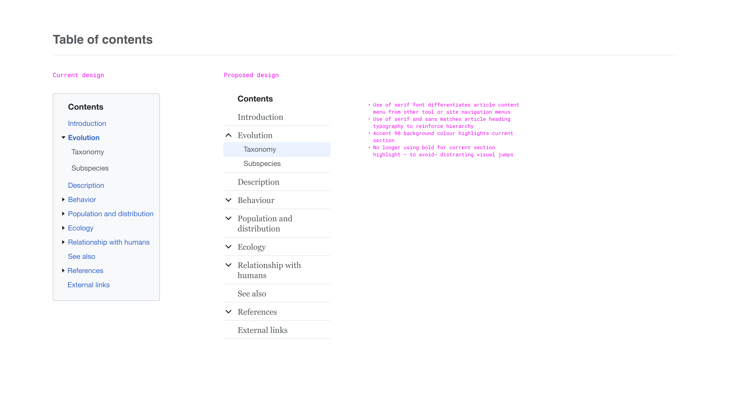
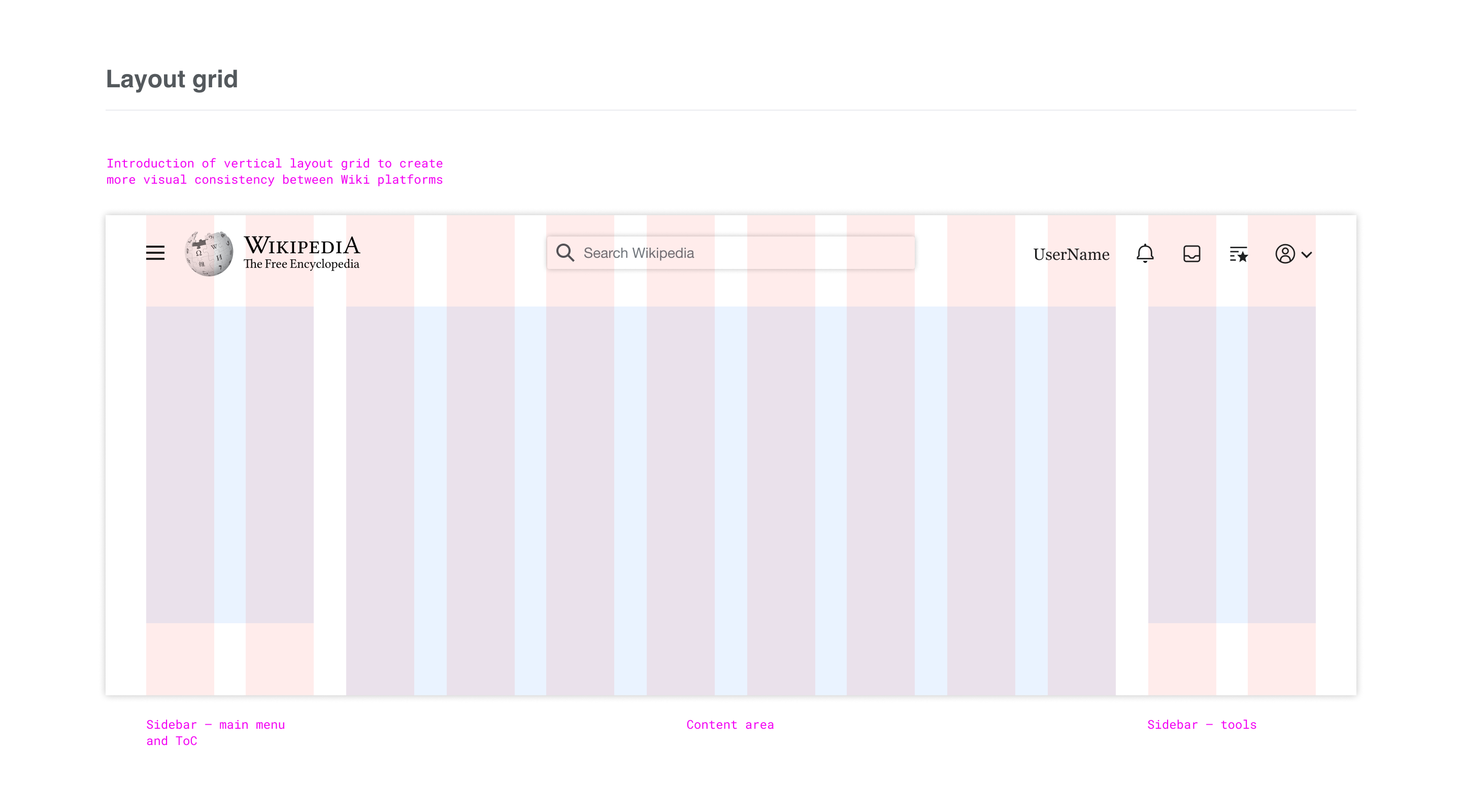
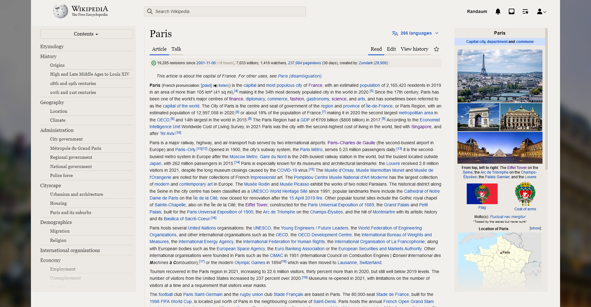
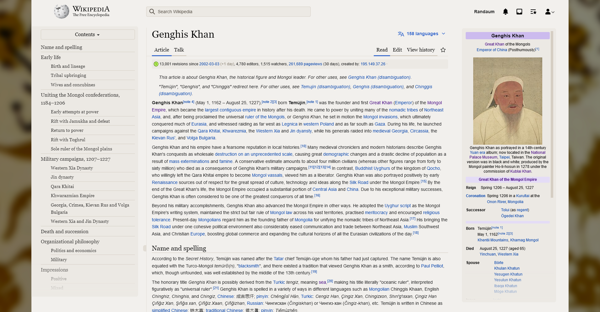
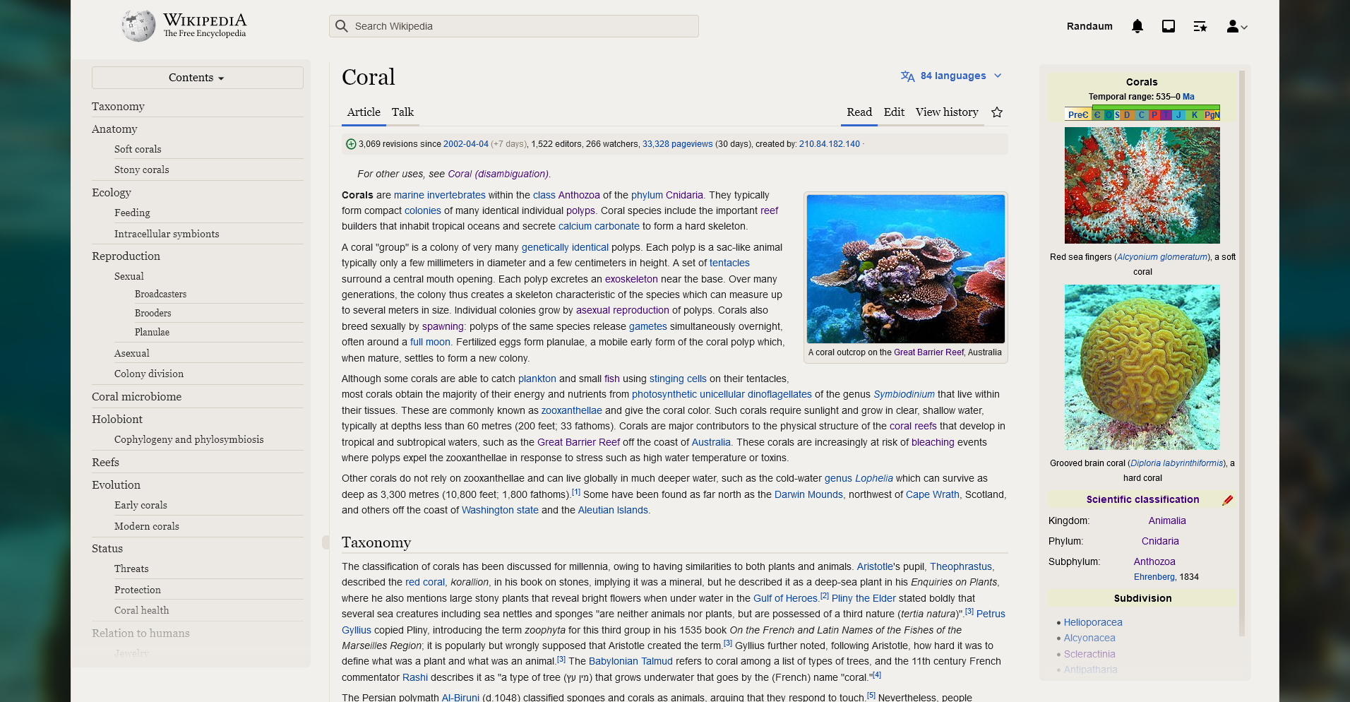
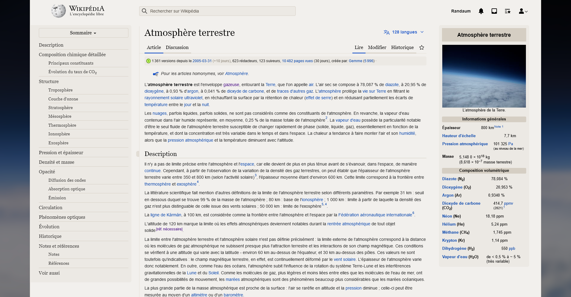
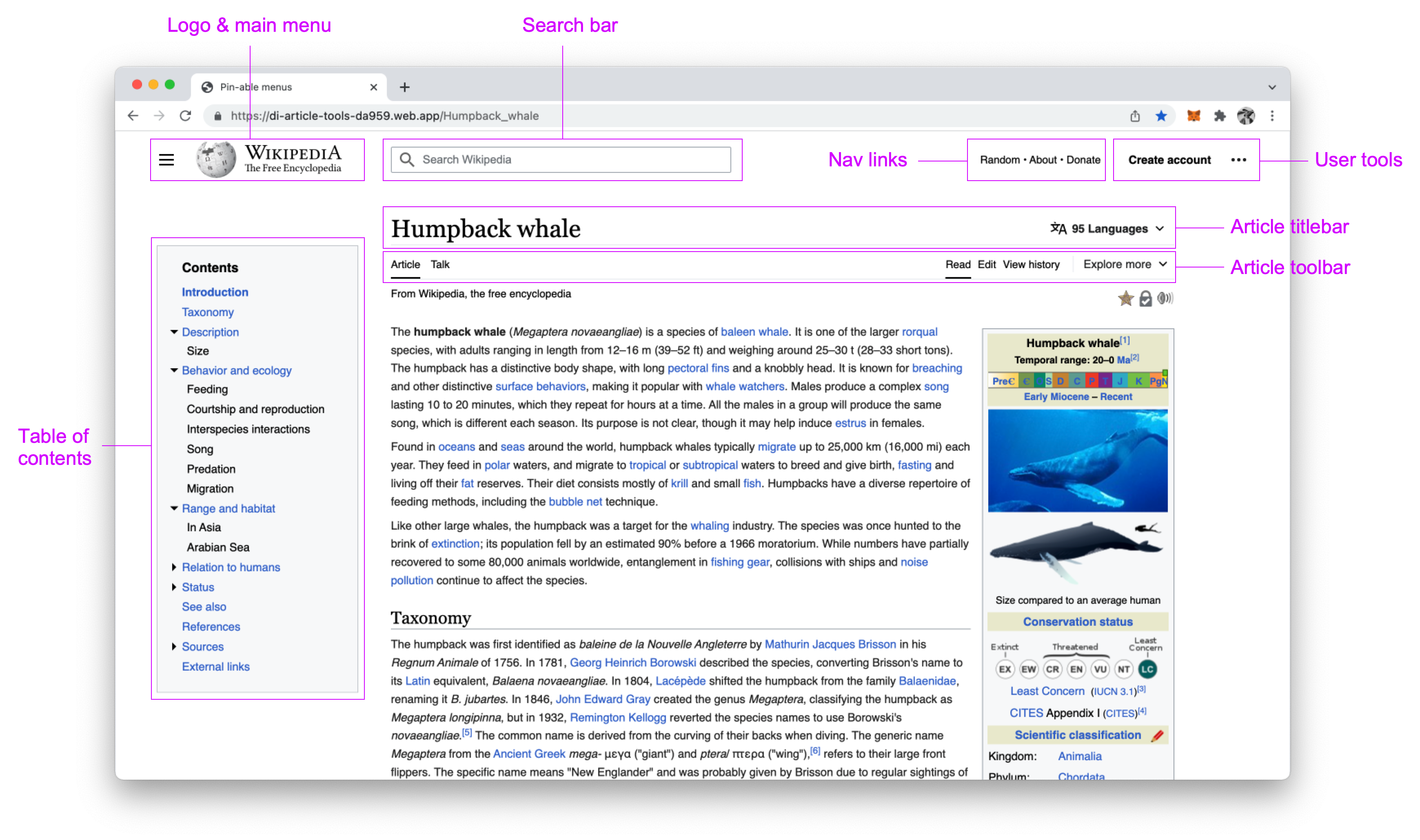
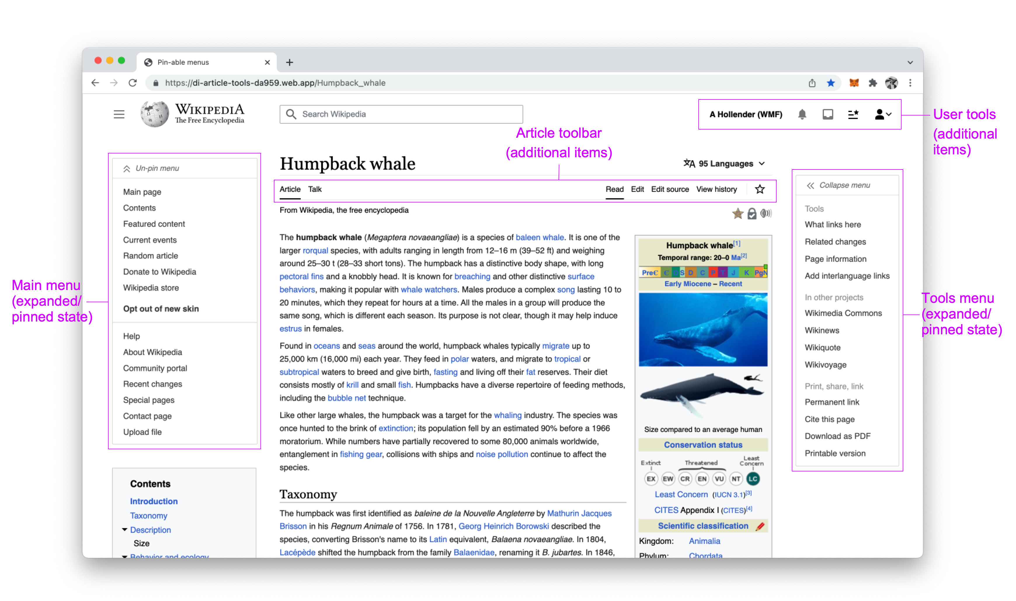
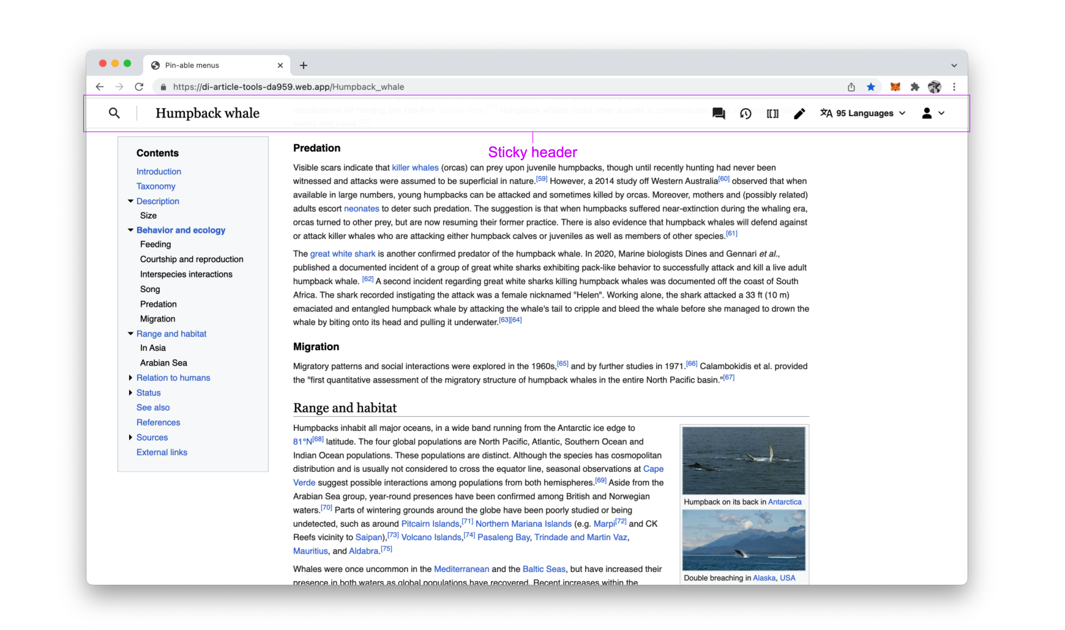
The scope of the visual design changes here, like the scope of the project as a whole, is limited to the container/chrome, and does not include the content itself (e.g. the designs should not modify infoboxes, thumbnail images, section titles, etc.). The diagrams show areas of consideration for visual design refinements.

Logged-out

image.png (2×3 px, 1 MB)

Logged-in (only highlighting items that differ from logged-out)
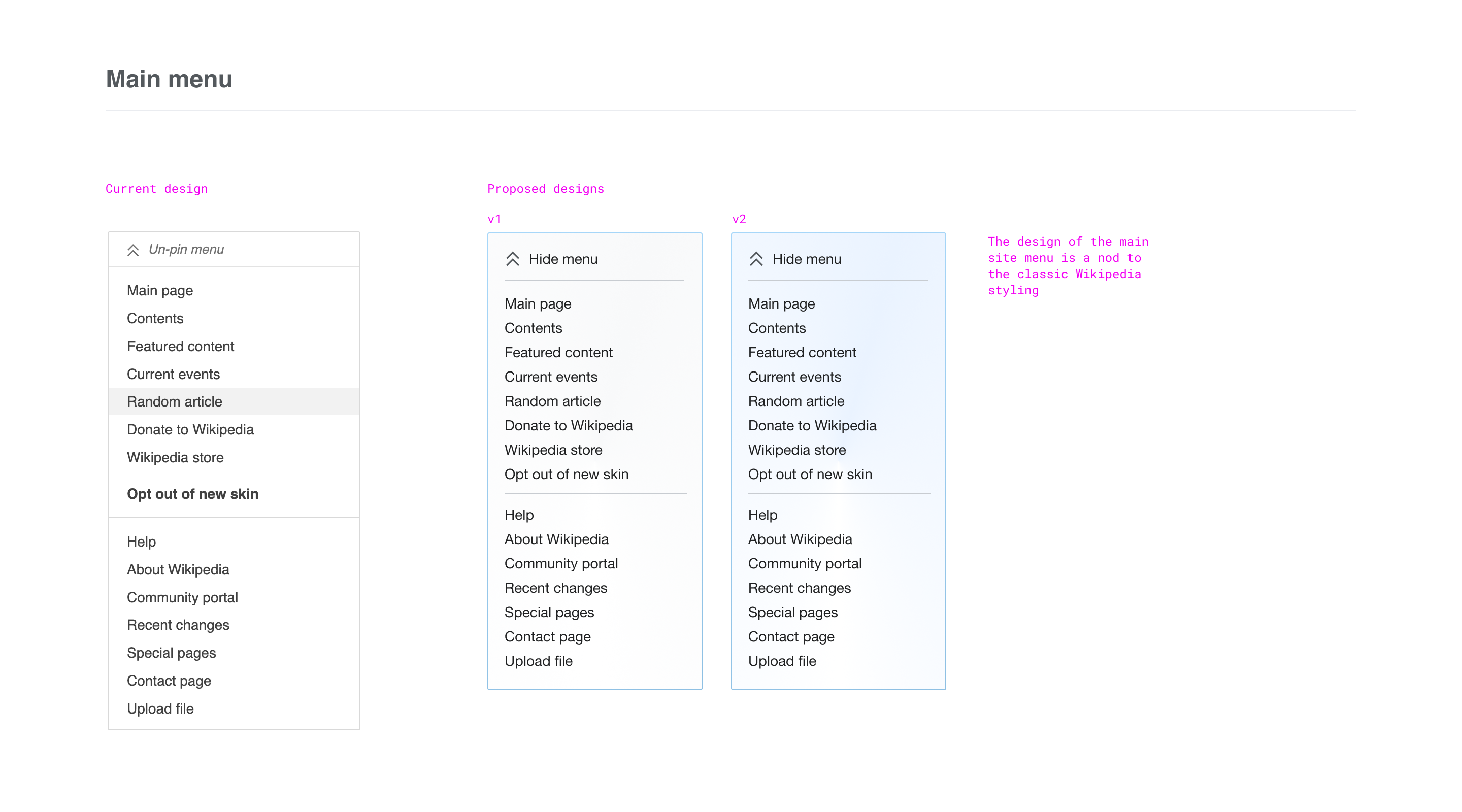
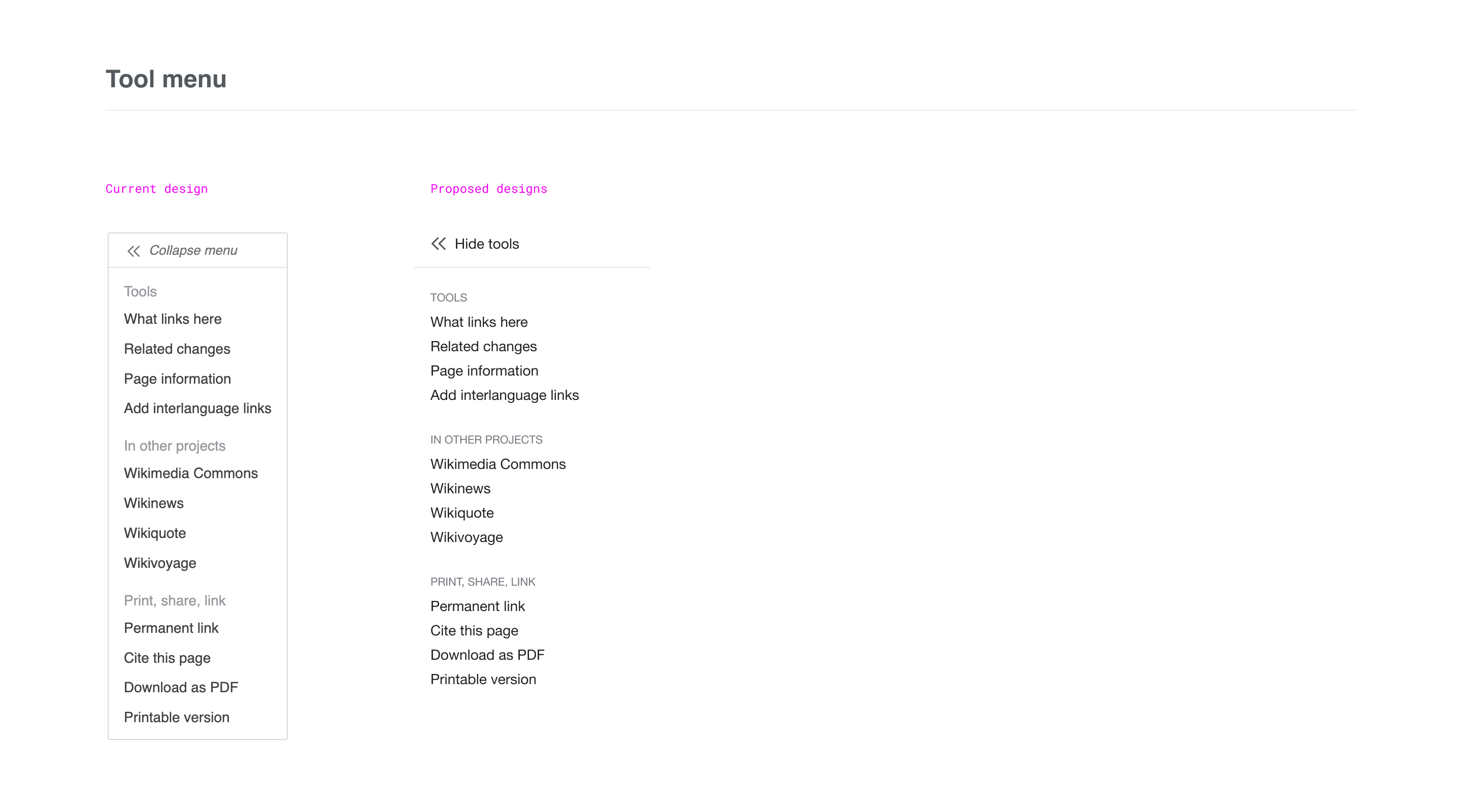
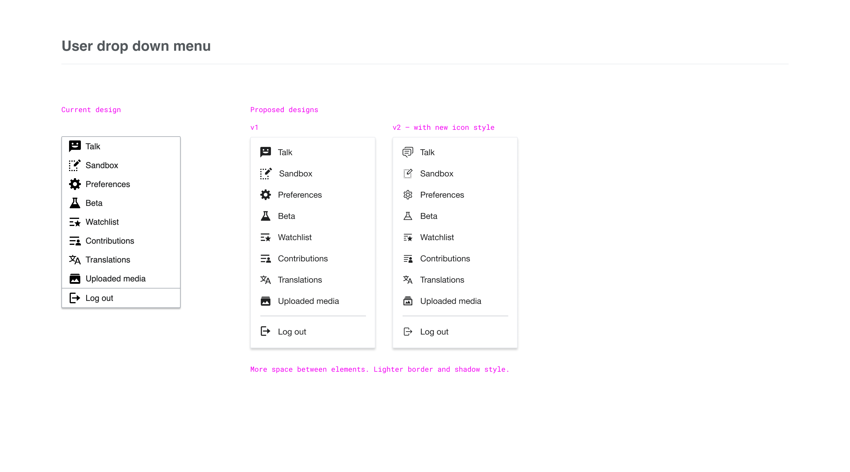
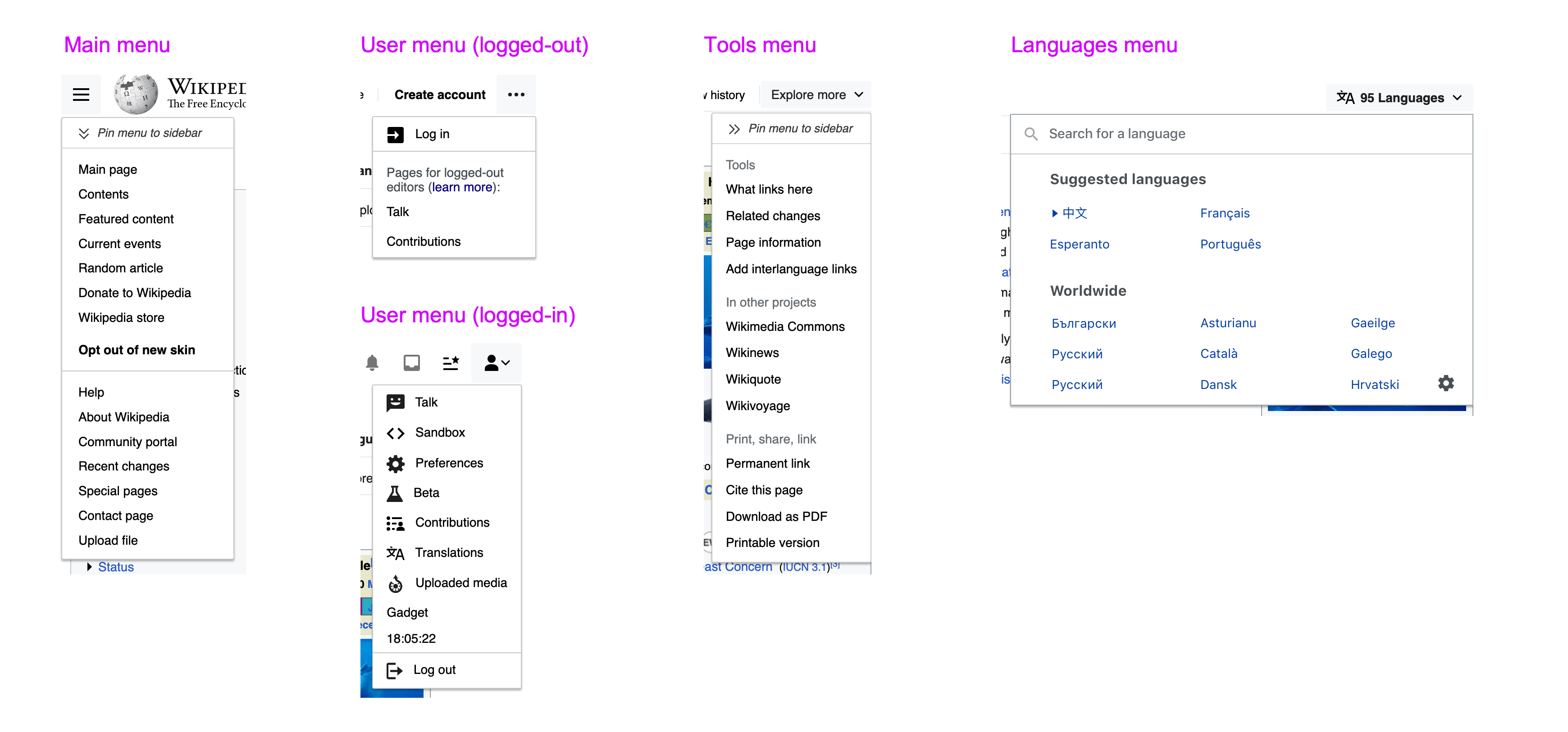
image.png (2×3 px, 1 MB)

image.png (2×3 px, 1 MB)

Dropdown menus

image.png (1×3 px, 488 KB)

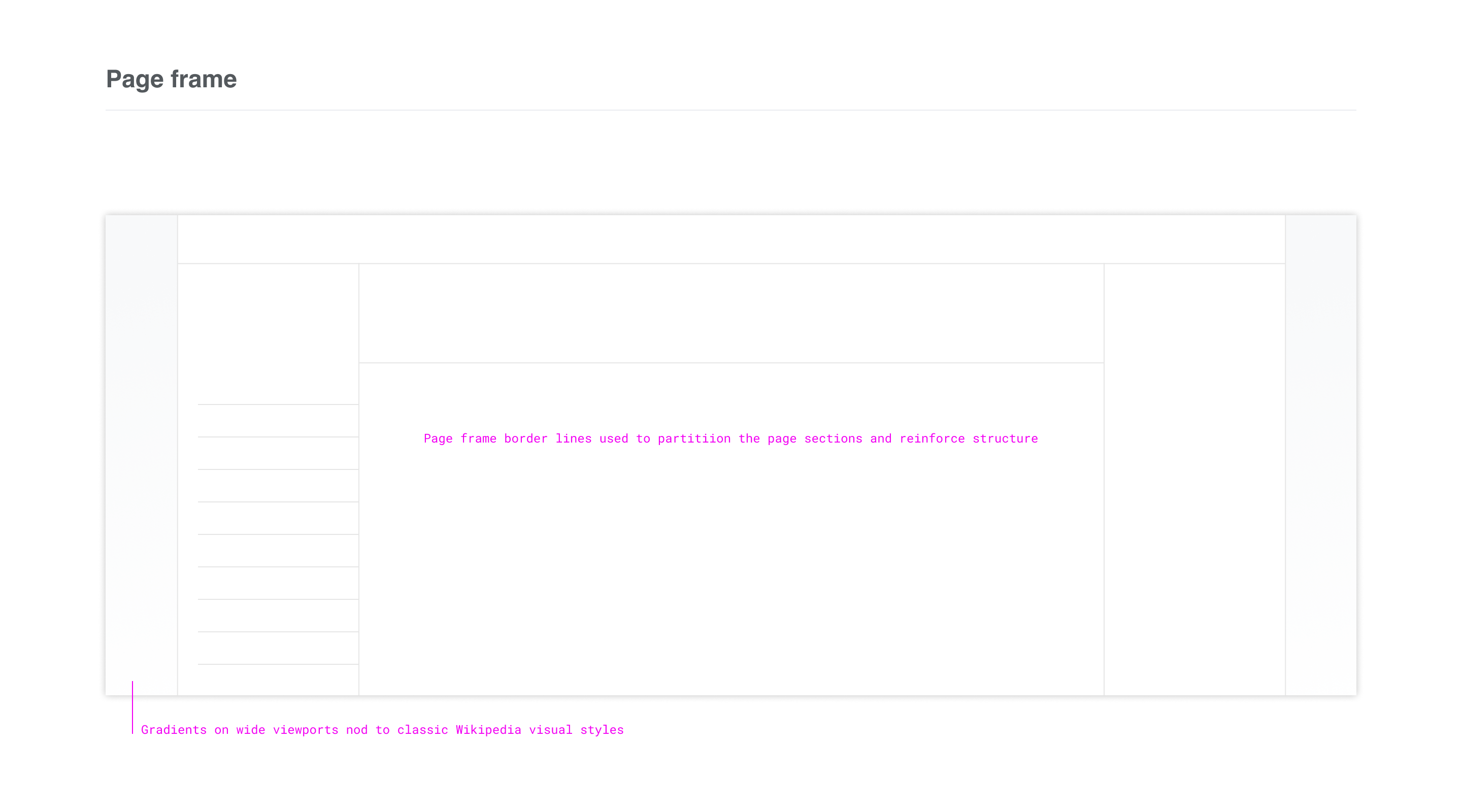
Framing/borders/boundaries

(This is a bit more difficult to highlight/describe than the other elements but will become more clear with various examples/explorations that will be posted. It refers to the way we're outlining/drawing borders around/containing different parts of the interface, which may sometimes be part of the design of those elements themselves, e.g. the table of contents could have a box around it, but may sometimes instead occupy the space in between elements/areas)

image.png (2×3 px, 2 MB)

Event Timeline

alexhollender_WMF raised the priority of this task from Medium to High.Mar 4 2022, 9:35 PM
alexhollender_WMF updated the task description. (Show Details)

@alexhollender_WMF @ovasileva Here are some of my visual design proposals for the elements defined as in-scope. The images are annotated but I’ve briefly described the changes below too, and in most cases the images show the proposed design beside the current one.

Page title

Changes include aligning items left (LTR), moving the tagline above the title, removing the border line and increasing the title size to improve typographic hierarchy on the page. I’ve also included an initial exploration for the one-click language selection.

01_page title.png (2×2 px, 196 KB)

Toolbar

Styling changes to help differentiate the primary Article/Talk items from the actions/modes on the right. I’ve also used a simplified tab design.

02_toolbar.png (1×2 px, 85 KB)

Table of contents

Primarily typographic changes that match the ToC items to the heading styles within the article. New styling suggestion for active item.

03_ToC.png (1×2 px, 143 KB)

Main menu

As the overall site menu I’m proposing that this is styled differently to differentiate it from page related menus.

04_Main menu.png (1×2 px, 618 KB)

Tool menu

Small typographic changes

05_Tool menu.png (1×2 px, 138 KB)

User tools drop down menu

Increased spacing. You’ll notice that this includes an exploration I’m currently doing on the design of our icons to try and reduce the visual weight of them. Note: The icon work is a bigger project and may not be deliverable as part of this work but I’m including it in the visual designs here to show the direction it could go in in the long term.

06_user drop down menu.png (1×2 px, 130 KB)

Page frame

Borders and framing of page and out-of-bounds area.

07_page frame.png (1×2 px, 196 KB)

Layout grid

The underlying column layout grid. This ties in to a bigger piece of work on grids which is documented here

08_layout grid.png (1×2 px, 112 KB)

Bringing all together

An example of the above elements brought together. You can view a Figma prototype here

10_bringing it all together.png (1×2 px, 888 KB)

The full deck including in-progress elements can be viewed here if useful. I appreciate there is a lot to review here so very happy to get together to chat this exploration work over in more detail.

@KieranMcCann two things to consider re: Page title exploration above...I was thinking a bit more about the tagline and the article description yesterday. Both of those elements are currently controlled by editors and are shown/hidden on a per-project basis. For example here are some larger projects that don't show the From Wikipedia... tagline: German, French, Spanish. I think it's important for the design to accommodate those elements, but it might be problematic to have the layout be dependent on it.

Thanks for flagging @alexhollender_WMF. The design should work with either of those elements shown or not. When I’m preparing more mock-ups I’ll be sure to include a variety of combinations of the page title elements.

The explorations I've done thus far have started from the sort of "base" (i.e. unstyled, neutral) version of the interface. At first I was using this as the base version (note the black interface links):

image.png (1×2 px, 1 MB)

however I'm now wondering if this version, with blue interface links, is a more appropriate base / starting point:

image.png (1×2 px, 1 MB)

the reasons why I might consider this a more appropriate base is:

  • links are blue by default
  • links are blue in legacy vector
  • blue links are more simple in the sense that there are fewer styling rules

I still think we should explore options here, it's more of a subtle shift to the default being blue, which then adds a helpful/necessary burden of proof on us to justify any possible shifts from that

starting from the base version of the interface, and considering our goals, I'm curious about the following:

  • would some minimal framing of the interface (i.e. dividing up the areas of the interface) help make it more clear? i'm not really sure how to explain this, but i'm wondering if an interface with clear sections/areas makes it somehow easier for someone to orient themselves initially, and makes it easier to use the interface in an ongoing way?
  • would some minimal framing around the content specifically help make for a more comfortable/welcoming reading experience? similar/maybe the same, would adding some kind of light gray background outside of the content area make for a more comfortable reading experience (people have complained about the large open white spaces being distracting)?
  • would adding some minimal background elements help the interface be more distinctively/recognizably Wikipedia?

here are a few initial explorations (including explorations from myself and @KieranMcCann) that aim to help us evaluate the questions above...

vertical lines (with slight gradients at the ends) on either side of the content:

image.png (1×2 px, 1 MB)

subtle backgrounds on the header:

image.png (1×2 px, 1 MB)

image.png (1×2 px, 1 MB)

subtle background outside of the content area:

image.png (1×2 px, 1 MB)

a "T" shaped divider:

image.png (1×2 px, 1 MB)

double horizontal lines:

image.png (1×2 px, 1 MB)

Hello 👋,

I've been looking at this project on and off for a few months - probably since the end of last year - as I was particularly interested in helping with the UI "re"design. I took the time to get familiar with the goals and limitations of the project itself as well as Wikimedia guidelines in general, and think I'm ready to contribute here.

  • I can help with absolutely anything visual and, since this is exclusively front-end, should be perfectly fine with code.

I had already been playing around with custom css in Stylus - as I often do with UIs I know I'll spend time on - when the project came around and thought that actually improving the interface everyone sees would be nice.
A lot of the changes I have on my end are clearly out of scope for now but they might inspire things for the future so I kept everything as is, not just the relevant parts.

Here's what my Wikipedia looks like:

Screenshot 2022-04-21 at 01-22-06 Paris - Wikipedia.png (994×1 px, 665 KB)

Screenshot 2022-04-21 at 01-22-39 Genghis Khan - Wikipedia.png (994×1 px, 534 KB)

Screenshot 2022-04-21 at 04-09-29 Coral - Wikipedia.png (994×1 px, 785 KB)

Screenshot 2022-04-21 at 03-03-09 Atmosphère terrestre — Wikipédia.png (994×1 px, 312 KB)

Screenshot 2022-04-21 at 18-41-33 Шишкин Иван Иванович — Википедия.png (994×1 px, 1 MB)


Since the edits are on the live version it's only css and a few lines of js to move the dom around, I took some inspiration from @KieranMcCann's explorations when I saw them and modified a few things - that were already pretty similar - accordingly.
The figma doesn't seem to be public so I couldn't really look at it in depth yet but I really like the overall direction, ordered and refined.


@alexhollender_WMF , it's a nice coincidence that you just asked these questions around framing and separation as I think those are the most critical changes I have on my end:

  • The left line makes it a lot easier to follow the article, even more so with added decorations to indicate the sections and their depth
  • Background colors substantially increase readability and maintain attention where it's needed, so much that I find it hard to focus on the text when I switch back to the normal interface

The pure white makes prolonged reading tiresome and is why I started customizing Wikipedia in the first place, an off-white book-like tint is an absolute relief for the eyes.
While I'm only a little familiar with accessibility, the contrast ratio is way above WCAG recommendations and, in this case, seems to be an even better fit than perfect black on white. I've looked and there doesn't seem to be much - if any - research on luminance contrast with regard to reading duration, which is too bad...


Other things such as the rounded corners are details and a matter of taste, I like it here because it lightens the page and contrasts with the heavy and lengthy content.
With the floating infobox, I get back the full width at the top of the article - the actual width being perfect, it's a shame the box makes every introduction too narrow - and also keep a visual connection to the subject on scroll, although there are different ones so it's not that consistent and I'm fully aware this one is a very long shot anyway.
I also completely removed things I never use like the menus, "Random article" being the only link I've probably ever clicked there.


And I think that's it, the design section on the Working with us page is empty so I thought I'd come here directly to share what I've done up till now and hope I'll be able to contribute, thank you 😃