Page MenuHomePhabricator

Choose typographies (Sans Serif and Serif) for designing our text styles in Figma in different languages
Closed, ResolvedPublic

Description

Background/Goal

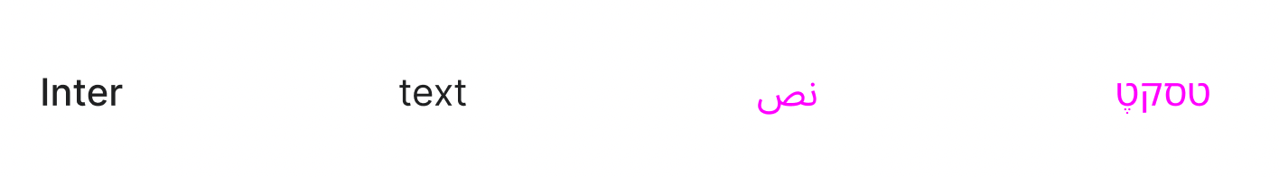
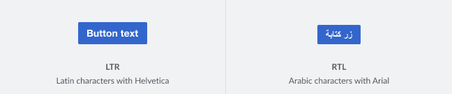
Wikimedia products are available in more than 300 languages. To define our Text Styles we need to find a typeface that works for different language characters to be able to create our components in both LTR and RTL (Arabic, Hebrew) variants without having to create a Text Styles for each language.

LTR-RTL.png (136×648 px, 5 KB)

User stories

  • As a system designer I need to have text styles that allow me to create LTR-RTL component variants.
  • As a designer, I need to have text styles that work with different languages.

Considerations

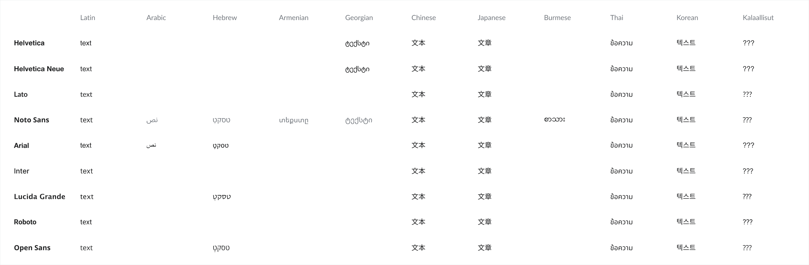
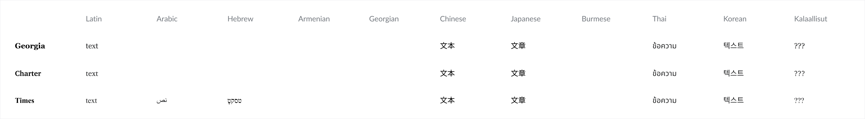
Language characters to consider:

  • Arabic (to create our RTL component variants)
  • Hebrew
  • Armenian
  • Georgian
  • Chinese
  • Japanese
  • Burmese (largest letter boxes of all)
  • Thai
  • Korean
Development considerations
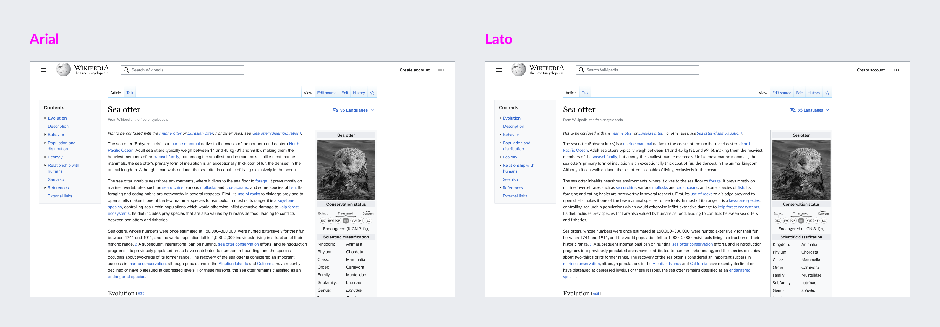
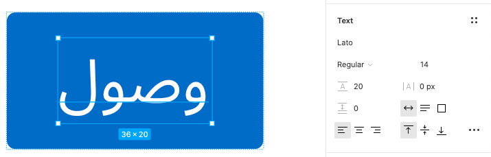
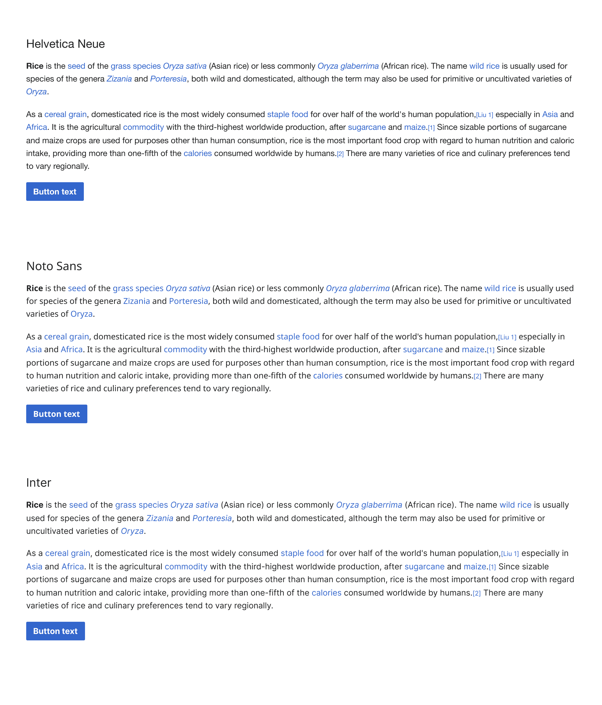
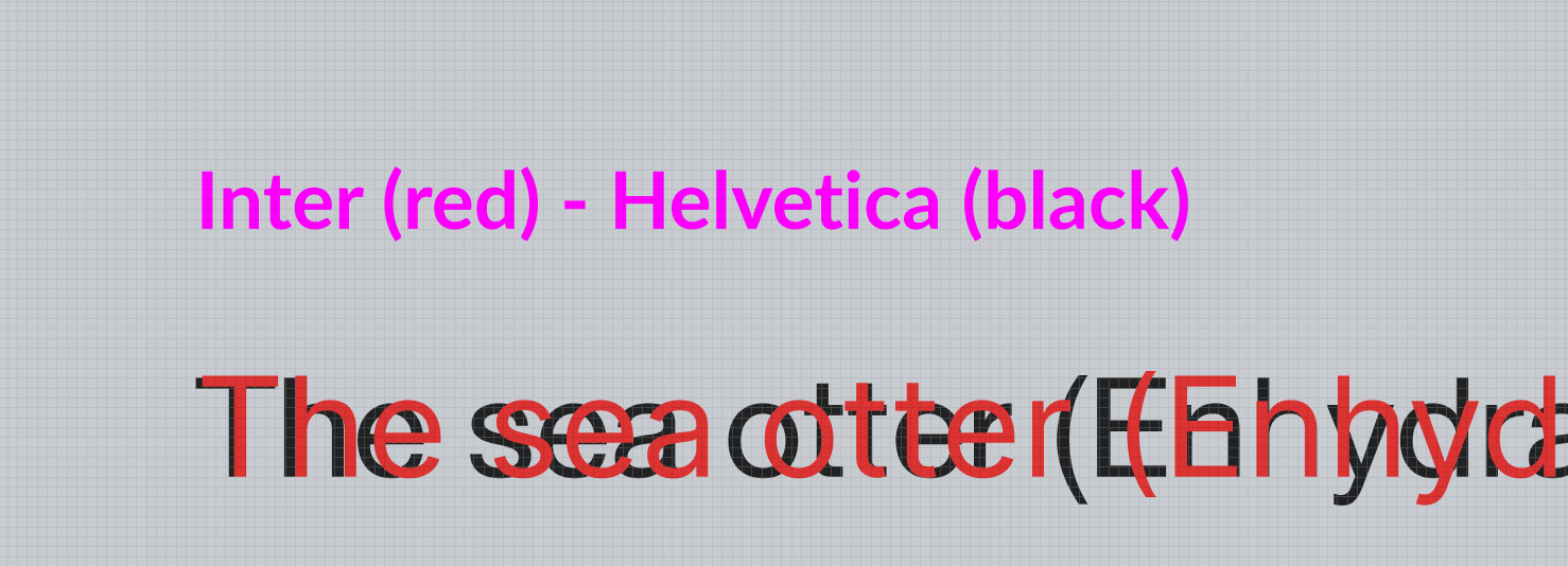
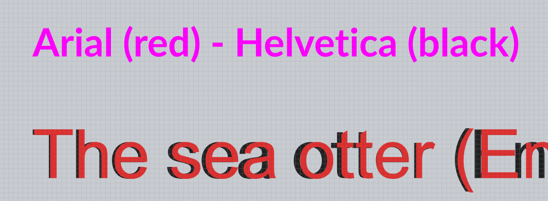
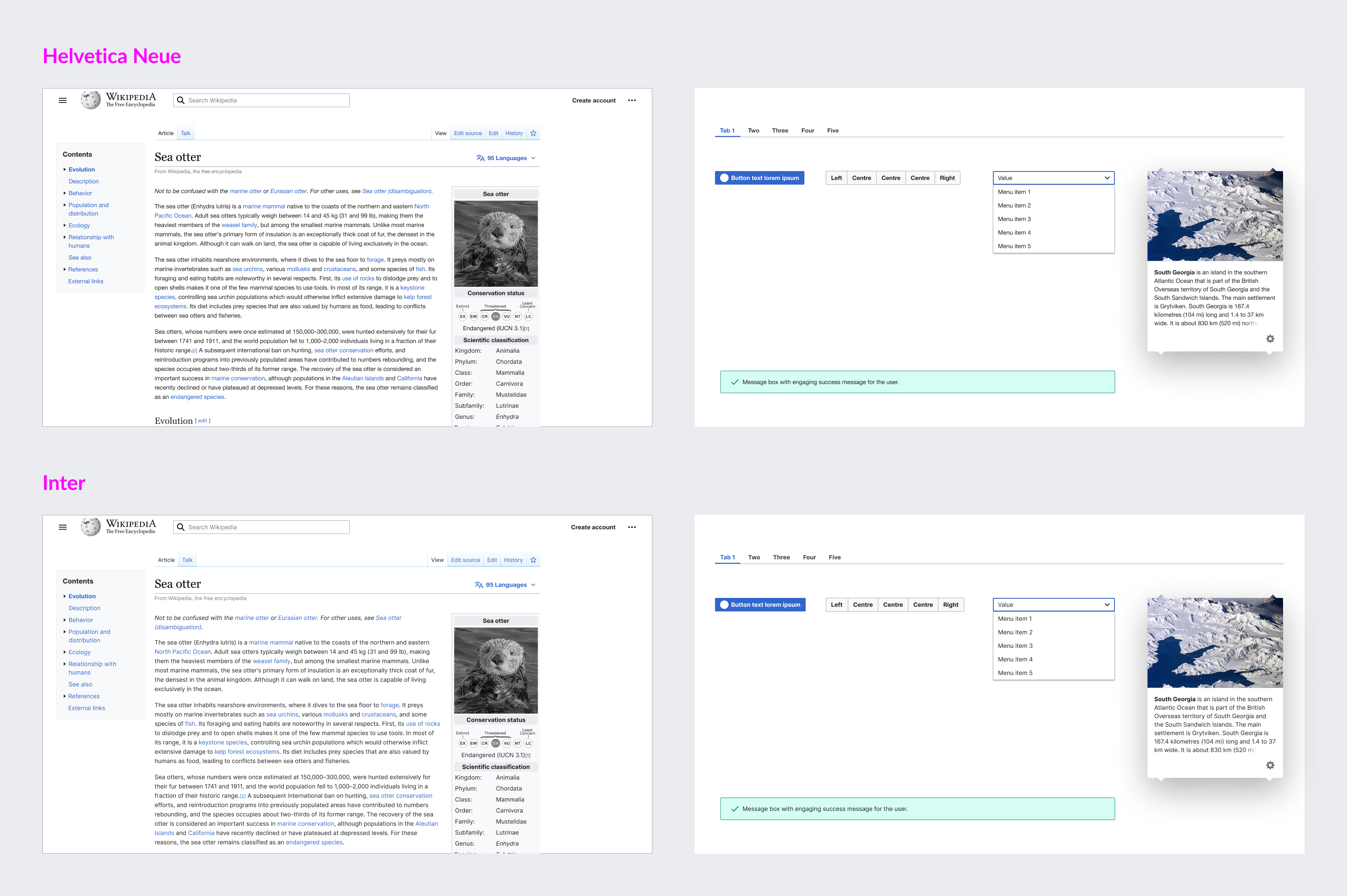
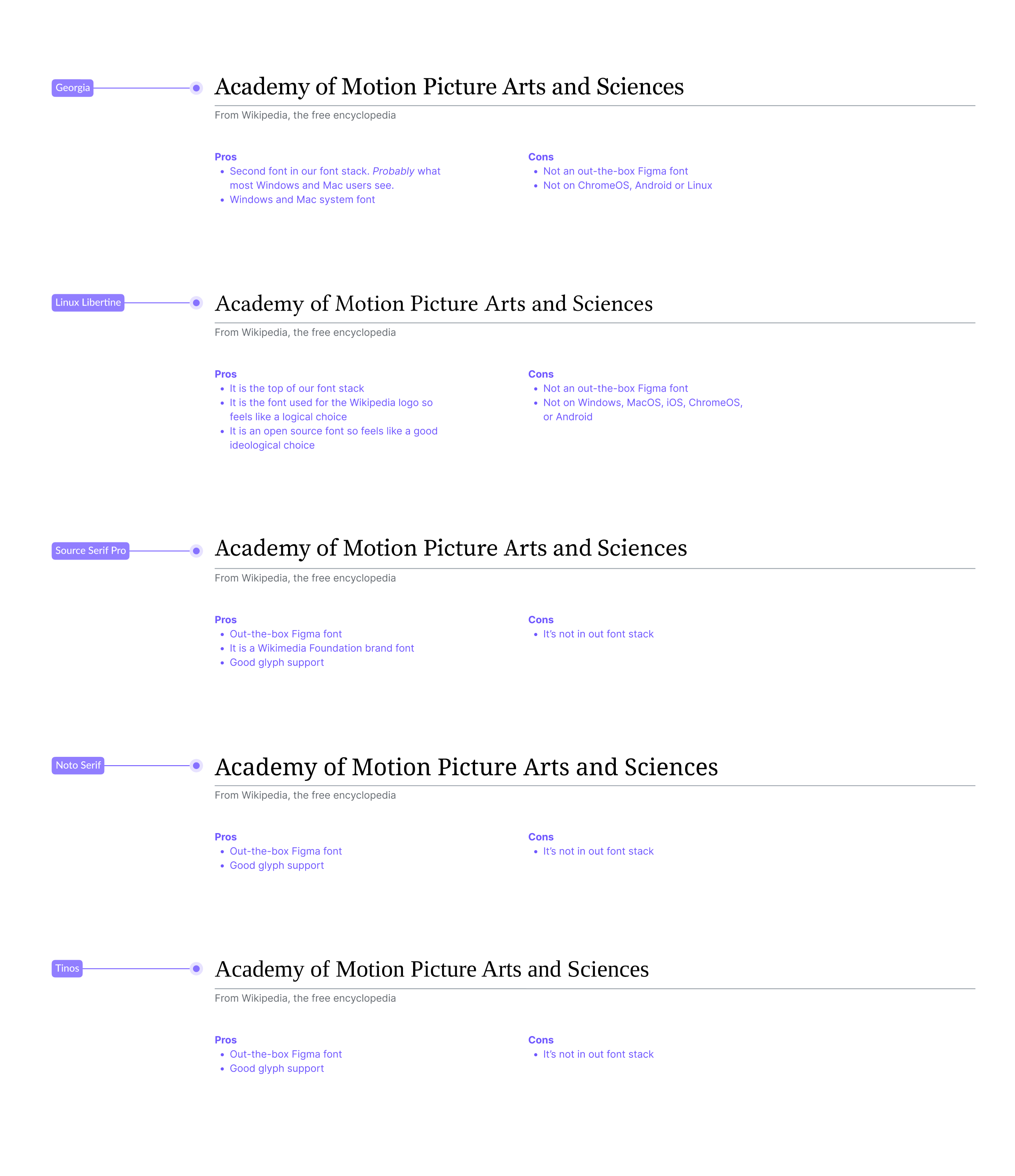
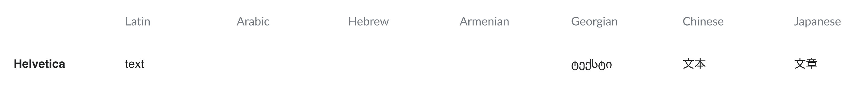
  • System fonts such as Helvetica are available for different languages (Latin, Arabic, etc.)
  • Those same fonts in Figma are not available for all languages

Captura de pantalla 2022-03-10 a las 18.33.57.png (648×1 px, 190 KB)

Captura de pantalla 2022-03-11 a las 10.07.17.png (286×2 px, 191 KB)

Acceptance criteria (or Done)

  • Find a font that works for different languages.
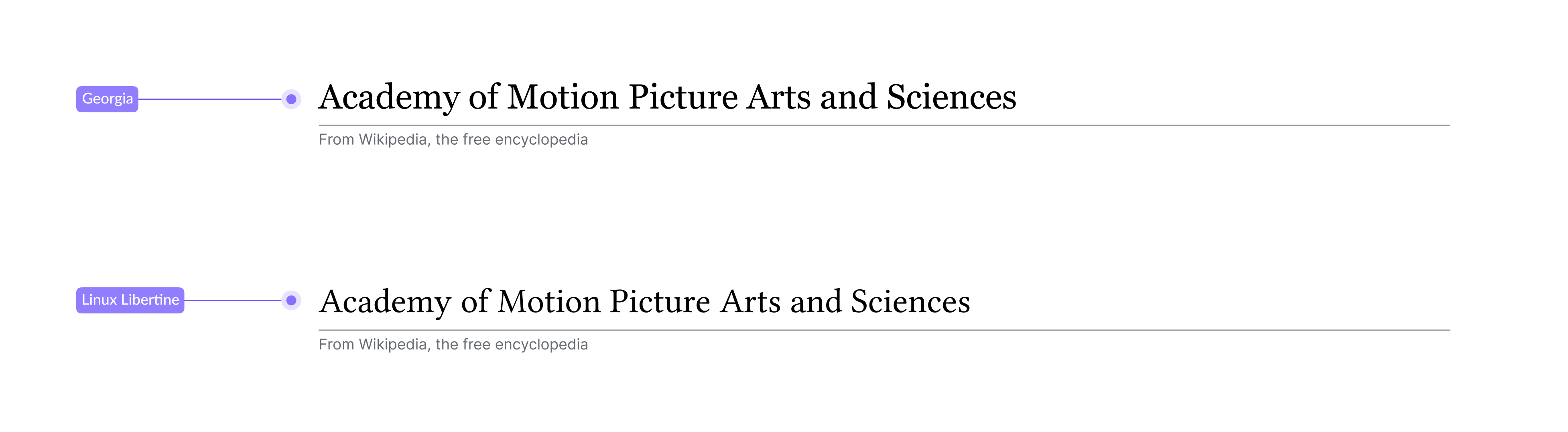
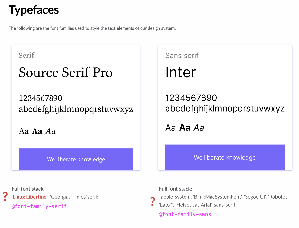
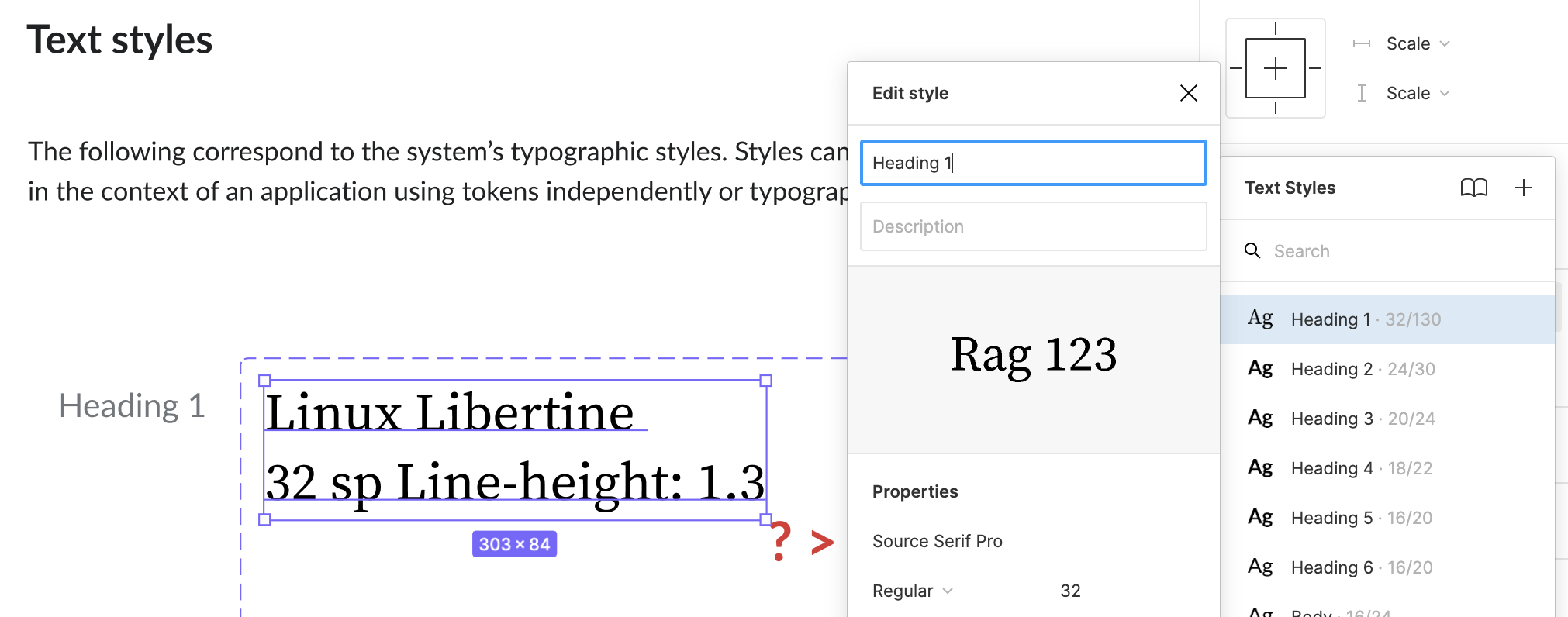
    • Find a Serif font (for Headings). Selected typeface: Source Serif Pro
    • Find a Sans Serif font (for bodies and titles). Selected typeface: Inter
    • Find a Monospace font (for code snippets). Selected typeface: Fira Code
  • Create our Figma text styles available for both LTR-RTL component variants

Notes

As a result of this task, the final stack of design typefaces (Source Serif Pro, Inter and Fira Code) has been documented as part of Codex's Font tokens guidelines.

Here's the initial proposal, collecting the selection criteria for the chosen fonts. And an overview of typefaces' availability per platform on Figma, which supported the selection of fonts that would make Codex design components available and editable across operative systems, beyond internationalization.

There were other criteria (maintaining a neutral look, keeping our design library accessible across platforms) that influenced the selection of the stack. The combination of all requirements, mixed with Figma limitations, left us with a convenient set of typefaces that are, yet, not fully responsive to i18n. We'll have to rely on Figma's usage of Noto Sans as a fallback to display the scripts that our selected typefaces can't cover. This will be documented in our Typography guidelines as part of T331612: Document internationalization limitations of Figma font selection in Typography guidelines.

Related Objects

StatusSubtypeAssignedTask
Duplicate STH
InvalidNone
ResolvedVolker_E
ResolvedNone
Resolvedbmartinezcalvo
ResolvedVolker_E
ResolvedVolker_E
ResolvedVolker_E
ResolvedVolker_E
Resolvedldelench_wmf
ResolvedVolker_E
Resolved EUdoh-WMF
ResolvedSarai-WMDE
Resolved DAbad
Resolved KieranMcCann
OpenNone
ResolvedSarai-WMDE
ResolvedCatrope
OpenNone
Resolvedovasileva
ResolvedBUG REPORTVolker_E
ResolvedVolker_E
ResolvedVolker_E
ResolvedVolker_E
ResolvedVolker_E
ResolvedSarai-WMDE
ResolvedVolker_E
Resolvedbmartinezcalvo
ResolvedCatrope
Resolved DAbad
ResolvedVolker_E

Event Timeline

I'd add Burmese (largest letter boxes of all), Thai, Korean and maybe a rare “outlier” like Kalaallisut to try the extremes of our future choice.

Somehow related task that we should keep in mind when selecting said font: Update fonts on design assets to make Figma files usable across platforms

Hi all,

I send you the proposals I have been working for. I have prepare a table with the possible Fonts and the languages characters we need. You can view the Figma proposal here to compare between languages and fonts.

After analyzing all fonts, I have found the following problems:

  • Any font is available for all characters we need (only Noto Sans has different language characters but you need to load Noto Sans Arabic, Noto Sans Armenian, etc. so you are using different fonts anyway).
  • Only Arial (for Sans-Serif font) and Times New roman (for Serif font) work with RTL languages characters (Arabic, Hebrew) so if we use these fonts we should update the Design Style Guide where it's specified that Lato and Charter are our fonts.

Fonts proposals_Sans-Serif.png (912×2 px, 82 KB)

Fonts proposals_Serif.png (384×2 px, 32 KB)

Possible solutions:

  • Use Lato and prepare our components ONLY with Latin characters (for both LTR and RTL components) like we have in Codex where RTL components text are in English. Lato might not be the best choice for our sans-serif font in the Style guide due to lack of coverage for non-latin scripts.
  • Use Arial and prepare our components with Latin (LTR) and Arabic (RTL) characters

Fonts.png (1×3 px, 409 KB)

NOTE: what we must decide in this task is a font that allows us to create our text styles in Figma for LTR-RTL components. Languages and internationalization will be work in future tasks.
Volker_E renamed this task from Choose a Font that works for different languages to create our Figma text styles to Choose typeface(s) for designing our text styles in Figma in different languages.Mar 13 2022, 1:44 AM
Volker_E updated the task description. (Show Details)
bmartinezcalvo renamed this task from Choose typeface(s) for designing our text styles in Figma in different languages to Choose typographies (Sans Serif and Serif) for designing our text styles in Figma in different languages.Mar 14 2022, 10:10 AM
bmartinezcalvo updated the task description. (Show Details)
Regarding the Sans typeface we could use in Figma:

I think the two suggested options have comparable pros and cons. I like how using a unicode font like Arial would really make our library components look close to what many of our users will end up seeing. Nevertheless, I'd tend towards applying Lato, since it's the first stylistic choice that's part of our sans font stack at the moment.

Using Lato doesn't bring an out-of-the-box solution for designing with non-latin scripts, but the workaround provided by Figma might be good enough: Figma tries to replace unsupported characters (when possible) using the Noto font. This appears to be working nicely, at least for Arabic and Hebrew:

Screenshot 2022-03-17 at 19.05.02.png (229×715 px, 23 KB)

The best part is that the inspect panel and the saved typographic style will keep referring to the font as Lato, which will prevent any confusion.

Regarding the Serif typeface we could use in Figma:

This one's trickier. Apart from the fact that our font stack contradicts the style guide (the first applies Linux Libertine, while the second points at Charter as our serif font), none of these typfaces (and neither the extended alternative Georgia) supports non-latin scripts in Figma (they also don't offer total coverage IRL).

So in this case we'd be in the same situation again: Figma will apply Noto Sans as a fallback. Given the very limited use of serif fonts in our projects (it only applied to h1 headings, afaik), we could create a fallback style in Figma to solve this issue: i.e., select a font that provides support for a number of RTL scripts and us it to create a style such as "heading 1 - fallback".

Thanks for this @bmartinezcalvo!

My preference would be for Arial, for the following reasons:

  • The fact it offers most support for other scripts is a big advantage and being able to create our components in at least some other scripts will make it more likely that people will design and prototype for those regions. The visibility of other scripts in our component library is a major plus for me
  • I also like that it looks closer to what users will experience on the site, as @Sarai-WMDE pointed out. I find Lato has a lot stylistic character, whereas Arial is more neutral and better represents the standard sans-serif UI font stack

I’m actually be keen to remove Lato and Charter from our style guide as we currently use too many fonts across the Foundation (product and brand) and these seem like ones we could easily replace with others we use. I plan to bring this up at a Design Review meeting soon :)

Hi @bmartinezcalvo - thanks for filing this task! Should this perhaps be merged or linked to the T286544: Update fonts on design assets to make Figma files usable across platforms filed by @Pginer-WMF ?
I think there are two other fonts suggested on that task such as Inter and Noto Sans which can be beneficial for other language script coverage aspect.

bmartinezcalvo changed the task status from Open to In Progress.Mar 24 2022, 5:26 PM
bmartinezcalvo reassigned this task from bmartinezcalvo to KieranMcCann.

As mentioned in T286544, using a system font means that our files and components become unusable for designers that use systems without such fonts. For example, using Arial could prevent designers using a Linux computer, a Chromebook or an Android tablet to change any label that uses such font. In my opinion that's a limitation we don't want to introduce if there is an alternative.

As Sarai pointed, Figma tries to replace unsupported characters (when possible) using the Noto font. This means that if we are ok with Noto Arabic as a fallback for Arabic, we can choose for Latin script the font that works the best. Arabic text would get Noto Arabic automatically. So the problem in such case is not that Arabic designers cannot use or edit our components. The problem is whether they see the text in a font that has a different visual style than others. We don't want for text in different scripts to use fonts with a very different visual style, but how important is it to be exactly the same font?

Given the above, I'd recommend choosing a web font that is similar to the common OS defaults and the fallbacks Figma uses for other scripts. In such case, we have options such as Inter or Noto Sans (if we want to use the same font family used as the fallback for extra consistency).

For Serif fonts, this may not be a big issue either. Serif is a very latin-centric concept. The serif style is meaningless in most of the other scripts. So getting Noto as a fallback may work well in most cases.

Thanks for your comments @Pginer-WMF, I hadn’t realised that the use of Arial was an issue on Linux and Android.

@bmartinezcalvo @RHo @Sarai-WMDE @Volker_E @iamjessklein

I did a quick Latin text comparison of Helvetica Neue, Noto Sans and Inter to help assess this visually.

Latin font comparison.png (2×2 px, 370 KB)

My personal opinion is that Noto Sans has a little too much personal character than common OS defaults. So for that reason I think we would be better to choose Inter. My only slight reservation is that it appears optically larger to me than Helvetica Neue that we currently use – though this could perhaps be improved by reducing the letter spacing very slightly (-0.3px) on our text styles?

In terms of RTL script fallbacks this becomes a bit more complex. From doing a quick scan of various Wikipedia languages I noticed that there were some large visual differences where we might not expect them. For instance, on my browser at least, Arabic Wikipedia defaults to Arial whereas Egyptian Arabic (Masri) Wikipedia defaults to Tahoma which creates a very different visual experience. I think if we did a more thorough exploration of script differences we would find more examples like this. I don’t see it being possible to make our component library reflect all these typographic differences across scripts so for that reason I think relying on the Figma fallback of Noto would be the best option.

In terms of serif typography, I agree with @Pginer-WMF’s point that the serif/sans-serif distinction is Latin-centric. That said there are Wikipedia’s in some scripts that use fonts with higher contrast between the thick and thin strokes in order to mirror the use of serif typography on the latin scripts sites. You can see this on the H1s and H2s on Chinese Wikipedia and Greek Wikipedia. However, as most of our UI text is sans, I don’t think this will be a huge issue to use Georgia with the Noto fallback.

So to summarise, my suggestion would be to use Inter for sans, Georgia for serif, and rely on Figma’s Noto fallback for scripts that those fonts don’t support.

@KieranMcCann thank you for your proposal and all the information described above.

After reviewing them I have to say that I love Inter proposal and there are some advantages with using Inter for Figma text styles:

  • Inter is one of the most customizable fonts in Figma and we could customize some aspects of the font such as numbers, specific characters, superscript, etc.
  • I find Inter more readable for long texts than other fonts like Noto Sans or Lato (at least with latin scripts)

Captura de pantalla 2022-03-28 a las 19.46.59.png (1×1 px, 608 KB)

The only thing that worries me with Inter font is that the text characters seem bigger than with Helvetica Neue or Arial. Look this comparison where Inter is painted with red, its characters are bigger, which means that a 14px text size with Inter would equate to a 14.5px text size with Helvetica.

Captura de pantalla 2022-03-28 a las 19.58.25.png (534×1 px, 465 KB)

Captura de pantalla 2022-03-28 a las 19.59.07.png (408×1 px, 297 KB)

Apart form this, Inter looks great when applying it in this real example and components, so I think it's a good option.

Fonts examples.png (2×3 px, 1 MB)

It's really nice to find out that 'Inter' would be your suggestion for sans, @KieranMcCann. Thanks for the research and your elaborate explanation!

I'd like to point out something regarding the serif choice, though. In contrast with our choice for sans (which users will never get to see, unless we update the order of the system's font stack), our serif font pick is quite straightforward: 'Linux Libertine' is the first typeface in our serif stack, which means that this font is displayed by default in Wikis in many languages. It's basically the typeface applied whenever the use of serif for titles is doable (e.g. zh, ru, bn, vi, th, el – he and ar default to sans-serif in production as we know). On that ground, and to avoid confusion (using a different font in Figma and in production) I would encourage us to consider using 'Linux Libertine' instead of 'Georgia' in Figma.

The only issues related to using 'Linux libertine' in Figma are: 1. This typeface is not part of the default Figma font stack, so volunteers willing to contribute would have to install the font in case they need to use the h1 style (we could leave some indication of this and even a download link – also Figma will make this apparent to users); and 2. This typeafce is again not documented in our style guide (which points as 'Charter' as our serif choice, as you know – a typeface that's proven to be more problematic in Figma).

Thanks for your comments @bmartinezcalvo and @Sarai-WMDE :)

I agree that Inter is definitely more spaced and open than either Helvetica Neue or Arial and that it also appears optically slightly larger. Originally I thought we could reduce the letter spacing very slightly in our text styles to deal with this but on reflection I think this would cause more issues when the text falls back to another font to display a script not supported by Inter – the letter spacing would still be applied and would make it look very squashed. That said I still think on-balance that Inter is the best option in terms of neutrality and wide support for Latin, Cyrillic and Greek glyphs. You can read more about its language support here – https://rsms.me/inter/

Thank you for pointing out the serif stack details @Sarai-WMDE. I hadn’t realised ‘Linux Libertine’ was at the top of the stack as I’m so accustomed to seeing Georgia in both our designs and my own browser experience. You make a good argument for using Linux Libertine but I just wanted to summarise the pros and cons and add a few more:

Pros

  • It is the top of our font stack
  • It is the font used for the Wikipedia logo so feels like a logical choice
  • It is an open source font so feels like a good ideological choice

Cons

  • Will require installation by the majority of users
  • It is visibly smaller and lighter than Georgia at the same font size (see comparison below)

Screenshot 2022-03-29 at 11.24.56.png (1×3 px, 165 KB)

Questions

  • Although it is the top of our font stack, what is the serif most latin script users see? I don’t have an answer to this but suspect that more users see Georgia as Linux Libertine isn’t installed on Windows, Mac or Chrome OS.
  • Does this matter? (as we plan to use a sans-serif font that users won’t see anyway)

I’d be keen to know if anyone has any strong opinions on using Linux Libertine over Georgia?

Thanks Kieran, I do have a slight preference of Linux Libertine for the pros you stated, especially as resonance with the Wikipedia logo. I also like the fact it is lighter than Georgia so would consider that a separate "pro" or at least not combined as a con with it being smaller than Georgia.

Thanks @RHo. Yes sorry that was quite a subjective ‘con’ on my part and should really have been more of an observation :)

Regarding Linux Libertine, requiring installation seems an unnecessary barrier to add from my perspective.
Even if it is set as the first in the CSS stack to be used when available, that does not mean that is the font most users see. So the point of making it close to what users experience may not be accurate.

It may be worth considering some of the serif web fonts available in Figma out-of-the-box: Source Serif Pro, Noto Serif, Libre Baskerville, or Tinos can be good alternatives to consider.

I think that the underlying issue is that production code (prioritizing system fonts to avoid downloading of web fonts) and Figma design files (prioritizing web fonts to make designs accessible to anyone) have opposite requirements. If we accept that people using our products will see them with their default fonts of their platform and those will be slightly different from user to user. I think it is ok to have some fonts in our designs that align as much as possible with those users see, but it is not necessary to pick a specific one of one platform if that comes with barriers to access.

Thanks for your comments @Pginer-WMF and I take on your point that requiring font installation for most users is probably an unnecessary barrier, especially when there are other out-of-the box choices for Figma.

I think that the underlying issue is that production code (prioritizing system fonts to avoid downloading of web fonts) and Figma design files (prioritizing web fonts to make designs accessible to anyone) have opposite requirements.

I think this gets to the root of the issue here and the fact that there is no perfect solution.

I’ve outlined all the options, including the additional fonts @Pginer-WMF suggested, with what I see as pros and cons of each. I did look at a few other Figma fonts but decided against including them as I don’t think adding even more choice to the mix is going to be helpful at this point :) I also ruled out Libre Baskerville as it didn’t have the best glyph support.

serif-font-comparison.png (3×2 px, 504 KB)

If we are going to prioritise choosing a font that is available as standard within Figma (which seems sensible) then the choices from these are narrowed down to Source Serif Pro, Noto Serif and Tinos.

My preference would be for Source Serif Pro, for two reasons:

  • the Brand Studio team have chosen it as a Wikimedia Foundation brand font
  • stylistically it looks more like Linux Libertine and Georgia so better reflects what most users will see

So based on that, the recommendation would be to use Inter and Source Serif Pro. Any objections or further comments? @bmartinezcalvo @RHo @Sarai-WMDE @Volker_E @iamjessklein

@KieranMcCann no objections on my part, I think both Inter and Source Serif Pro would work well in our Figma system. Inter is a font with neutral style that we can also customize well in Figma, and I like Source Serif Pro because it's very similar to Georgia and as you comment it's a brand font, so I think it can be a good choice.

One question about the Figma fallback. Therefore, if we use Inter and Source Serif Pro we would use the Figma fallback with Noto for both fonts, right? I mean, Noto would be the font displayed in our components and designs for both Sans and Sans Serif fonts.

Captura de pantalla 2022-04-01 a las 11.16.01.png (196×1 px, 65 KB)

Captura de pantalla 2022-04-01 a las 11.16.17.png (232×2 px, 112 KB)

Thanks @Kieran for exploring the extra options. I also like Source Serif Pro for the serif font, personally preferring the more rounded forms vs Noto Serif and Tinos.
Given that, do you think it is worthwhile looking at using Source Sans Pro vs Inter for the sans serif font option?

Something worth pointing out regarding Source Serif Pro is the fact that this typeface is usable across all platforms in Figma (tested in MacOS, Linux, Windows). Relevant for T286544.

One thing that concerns me, though, would be the lack of correspondence between Figma fonts and the system's CSS values. As you can tell from my past comments, I've been suggesting the use of fonts that are currently part of our font stack. I've done so with the intention of reducing handover friction: if the typefaces used to define the system's typographic styles in Figma matched the value of our design tokens, there won't be any second guessing during inspection, or contradictions in the documentation:

Screenshot 2022-04-01 at 12.20.12.png (940×1 px, 134 KB)
Screenshot 2022-04-01 at 12.42.08.png (796×2 px, 184 KB)

We mentioned several times how the selection of new typefaces would require updating the Style Guide. Now, my question is: do we expect the font choices we make here to be reflected in the current font stack? Are we open to update the values of @font-family-sansand @font-family-serif? Att. @Volker_E
Or do we expect to just document the discrepancy?

Thank you @bmartinezcalvo @RHo @Sarai-WMDE for your comments. To address your points/questions individually:

Fallback fonts

One question about the Figma fallback. Therefore, if we use Inter and Source Serif Pro we would use the Figma fallback with Noto for both fonts, right? I mean, Noto would be the font displayed in our components and designs for both Sans and Sans Serif fonts.

@bmartinezcalvo Yes the fallback for both sans and serif would be Noto. Although this is really dealt with by Figma itself anyway. This is a good article on the subject of Figma fallback.

Source Sans Pro

@RHo I had a look at Source Sans Pro (I agree in principle that would be a good pairing) but it is very small and more condensed looking when compared alongside Helvetica Neue and Inter – see this mock-up showing a comparison of 14pt body copy. It is particularly noticeable on the buttons I think. So my preference would still be for Inter, but curious to know others opinions.

Figma versus Font Stack

@Sarai-WMDE I think this is a question of what we prioritise as there is no perfect solution. So we have to decide which of the following is most important:

  1. using fonts that are part of our font stack, to reduce handover confusion or
  2. using fonts that are available as standard within Figma in order to remove the barrier of people needing to install fonts

Personally I would prioritise the second option and deal with the font discrepancy in documentation. If I’m correct, our font stack should never change so I’m hoping this won’t cause too much confusion and engineers will come to accept this discrepancy – but do say if I’m simplifying this issue too much :)

We mentioned several times how the selection of new typefaces would require updating the Style Guide. Now, my question is: do we expect the font choices we make here to be reflected in the current font stack? Are we open to update the values of @font-family-sansand @font-family-serif? Att. @Volker_E
Or do we expect to just document the discrepancy?

Good question. I don’t know the technical implications or impact of this so I’ll defer to @Volker_E

This all started with finding fonts that work in Figma across our supported languages. In the discussion a number of other topics were raised, like the fonts also have to work across platforms.
One question for me, that needs clearer prioritization is, how close should our fonts in design be to implementation? @Pginer-WMF scratched on that

I think that the underlying issue is that production code (prioritizing system fonts to avoid downloading of web fonts) and Figma design files (prioritizing web fonts to make designs accessible to anyone) have opposite requirements. If we accept that people using our products will see them with their default fonts of their platform and those will be slightly different from user to user. I think it is ok to have some fonts in our designs that align as much as possible with those users see, but it is not necessary to pick a specific one of one platform if that comes with barriers to access.

In the past we went at extra length to have the SVG component images in DSG use sans-serif platform fonts in order to be close to user experience in production.

We mentioned several times how the selection of new typefaces would require updating the Style Guide. Now, my question is: do we expect the font choices we make here to be reflected in the current font stack? Are we open to update the values of @font-family-sansand @font-family-serif? Att. @Volker_E
Or do we expect to just document the discrepancy?

Good question. I don’t know the technical implications or impact of this so I’ll defer to @Volker_E

To the last point, the current font stacks are the platform defaults, we're basically for performance and practicability reasons bound to the current sans-serif or monobook platform stack for uses in our most popular products.
In smaller-scale projects, like DSG, we've got a bit more freedom.

Hi all. Just coming back to this after a while – apologies for the delay.

After weighing it all up I still think – given that there is no perfect solution – that the best choices would be Inter and Source Serif Pro.

Although neither of these fonts are in our font stack, they are visually similar enough to fonts that are. Also, given that none of our font stack fonts are universally installed as operating systems fonts, or within Figma itself, then I think any choice from within that list would be a barrier to some users.

Is everyone happy to go with that decision?

If so, then I guess the question is whether we add Inter and Source Serif Pro to our font stack within the codebase?

To the last point, the current font stacks are the platform defaults, we're basically for performance and practicability reasons bound to the current sans-serif or monobook platform stack for uses in our most popular products.
In smaller-scale projects, like DSG, we've got a bit more freedom.

@Volker_E I wasn’t sure from your comment above if doing so would be a problem in terms of performance?

Hey @KieranMcCann. I have to withdraw my proposal to use fonts from our CSS stack in favor of keeping our design library accessible across platforms (T286544). None of the fonts I was suggesting (Linux Libertine, Helvetica or Arial) are available by default in Figma on Windows (neither on the web nor the desktop apps). To be more specific: from our sans stack, only Roboto and Lato would be eligible, and I agree that both of them (specially the former) have quite a distinctive style in comparison to the common OS defaults.

To add to this, none of the other serif fonts specified in our CSS stack (Georgia, Times New Roman) is available in the mentioned set-up (Figma on Windows). And, in a new turn of events: none of the monospace fonts are available either! So we'll have to find an alternative for this too. So far, I think Fira Code could be a good choice (it seems to be available everywhere, and it's pretty similar looking to Menlo).

I think that Inter and Source Serif Pro are good choices: we'll have to document the discrepancy between code and design choices in order to minimize potential handover friction, but I'm sure we'll find effective ways to do this.

Edit: Here's a table with a summary of the findings

To be more specific: from our sans stack, only Roboto and Lato would be eligible, and I agree that both of them (specially the former) have quite a distinctive style in comparison to the common OS defaults.

If I recall correctly, Lato was added to the stack just to align it with the style guide. So I think it is ok to remove it from the css font stack. We could optionally add the fonts we select. In any case it is more of a symbolic gesture for alignment than making much difference in practice since most people won't have such fonts installed and we are not delivering them as web fonts.

Thanks for exploring this in more detail @Sarai-WMDE! I agree with all your points and also happy with Fira Code as our choice of monospace font.

In that case, and if everyone is happy, I suggest we should proceed with Inter, Source Serif Pro and Fira Code. Maybe we could bring this to the next Design Practice and Systems meetup?

I’m also interested to explore @Pginer-WMF’s suggestion of removing Lato and adding our selected fonts to the font stack for alignment. My understanding is that this shouldn’t affect performance but do correct me if I’m wrong or if there are any other reasons not to do this cc. @Volker_E

After watching the presentation of today's Design Systems & Practice meeting, I think the choices make a lot of sense.
I'd want to see the great comparison table first mentioned in T303587#7924807 as part of the Figma documentation about the choice in a publicly available place.

To be explicit on the issue raised in T286544#7208434, could we have an extra example about how to deal with non-covered scripts in those fonts, for example overruling our choices to “Noto Sans Myanmar” in Burmese?

To the point of the general CSS stacks to be updated, I've raised T309158.

Thanks so much for watching the presentation and for your comment, @Volker_E! 🙏🏻

About making that table public: fine with me, although the findings could really be summarized in a couple of sentences. I was going to add a comment to T305920: Define the system's sans, serif and monospace typefaces, providing the different values for the system's stack and the Figma fonts. I could also add the table there.

To be explicit on the issue raised in T286544#7208434, could we have an extra example about how to deal with non-covered scripts in those fonts, for example overruling our choices to “Noto Sans Myanmar” in Burmese?

We could add an Internationalization section in our Typography guidelines in Figma, and provide a list of languages that don't have a direct fallback in Figma, together with the specific Noto font that renders them. A similar note could also be added in the Style guide if necessary.

To the point of the general CSS stacks to be updated, I've raised T309158.

That's great! Thanks for opening a task to update the Style guide with the new typeface choices. The symbolic gesture to also update the font stacks in order to incorporate the design choice is much appreciated.

We could add an Internationalization section in our Typography guidelines, and provide a list of languages that don't have a direct fallback in Figma, together with the specific Noto font that renders them. A similar note could also be added in the Style guide if necessary.

What do you think about this suggestion, @Volker_E and @bmartinezcalvo? I'd say this task can be considered done, but that documenting our approach would be valuable. If you agree, I can open a separate ticket to reflect that effort.

@Sarai-WMDE Definitely agreed. I'd also update the task description with the high-level agreements (and links) in this task.

We could add an Internationalization section in our Typography guidelines, and provide a list of languages that don't have a direct fallback in Figma, together with the specific Noto font that renders them. A similar note could also be added in the Style guide if necessary.

What do you think about this suggestion, @Volker_E and @bmartinezcalvo? I'd say this task can be considered done, but that documenting our approach would be valuable. If you agree, I can open a separate ticket to reflect that effort.

@Sarai-WMDE I agree, we can work it in a separate task as commented and solve this one.

Sarai-WMDE updated the task description. (Show Details)

@Sarai-WMDE Definitely agreed. I'd also update the task description with the high-level agreements (and links) in this task.

Done

@Sarai-WMDE I agree, we can work it in a separate task as commented and solve this one.

Subtask created: T331612: Document internationalization limitations of Figma font selection in Typography guidelines