Page MenuHomePhabricator

[Bug] X button is displaying outside of the survey boundary/border for small mobile devices
Closed, ResolvedPublic

Assigned To
Authored By
Djackson-ctr
Mar 16 2022, 5:07 PM
Referenced Files
F35032051: image.png
Mar 31 2022, 3:40 PM
F35032039: survey-parts.png
Mar 31 2022, 3:23 PM
F35031570: Screen Shot 2022-03-31 at 10.49.01.png
Mar 31 2022, 8:52 AM
F35031095: image.png
Mar 31 2022, 2:50 AM
F35031093: image.png
Mar 31 2022, 2:50 AM
F35031091: image.png
Mar 31 2022, 2:50 AM
F35030614: image.png
Mar 30 2022, 8:14 PM
F35030338: image.png
Mar 30 2022, 4:51 PM

Description

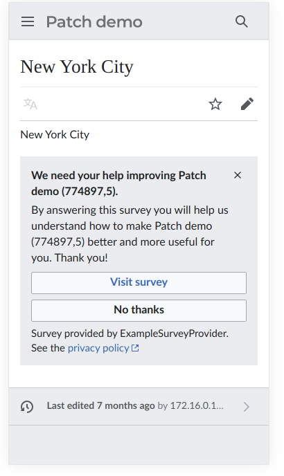
The following defects were discovered when testing ticket T303769 Return {{SERVERNAME}} to GDI Safety Survey question now that it is supported in mw.message


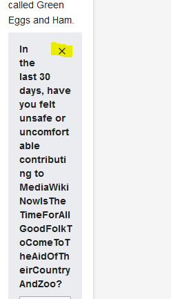
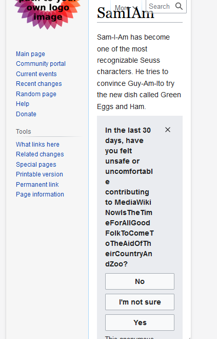
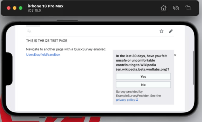
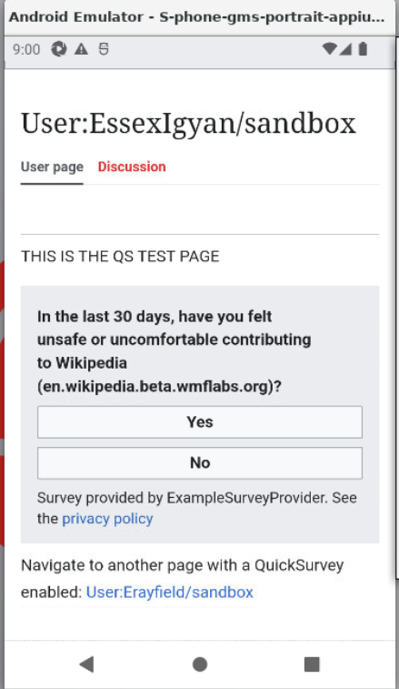
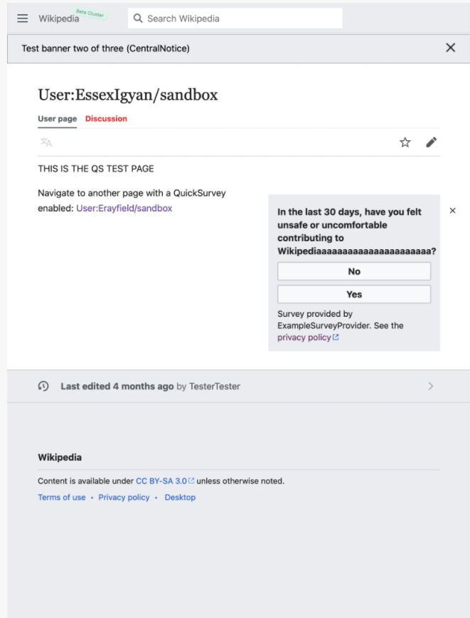
Discovered 2 defects involving mobile devices in which the X (to exit/close the survey) has been pushed outside the boundary/border of the survey or the X is not displaying on the survey:

Steps to reproduce
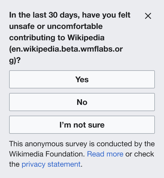
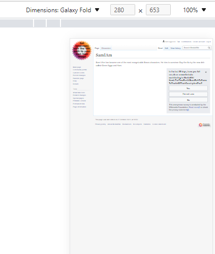
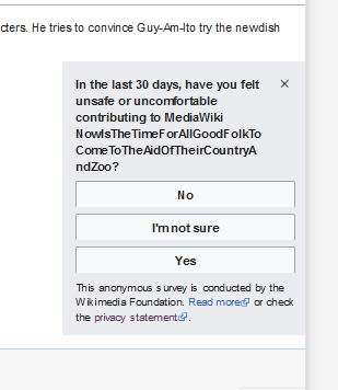
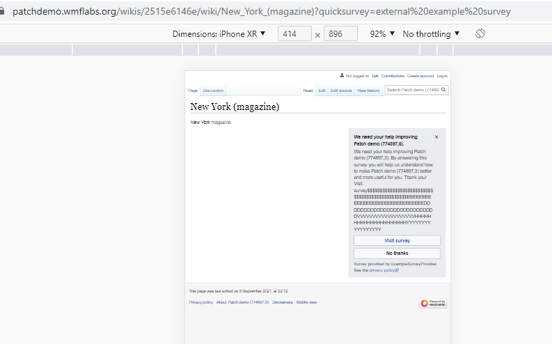
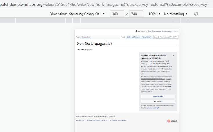
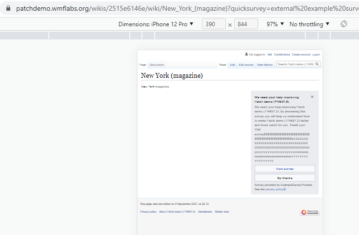
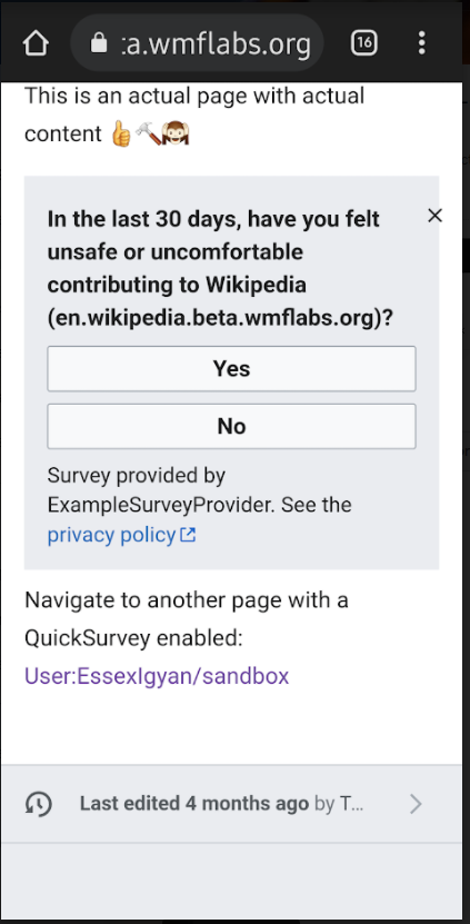
When using a cell phone such as Samsung FE 20 phone with Android Version 12 (Portrait orientation) OR using an Apple iPhone 13 Pro Max with iOS version 15 (Landscape orientation), and then navigating to https://en.wikipedia.beta.wmflabs.org/wiki/User:EssexIgyan/sandbox you will notice the X is pushed outside of the boundary/border of the survey:

image.png (831×423 px, 127 KB)
image.png (474×787 px, 122 KB)


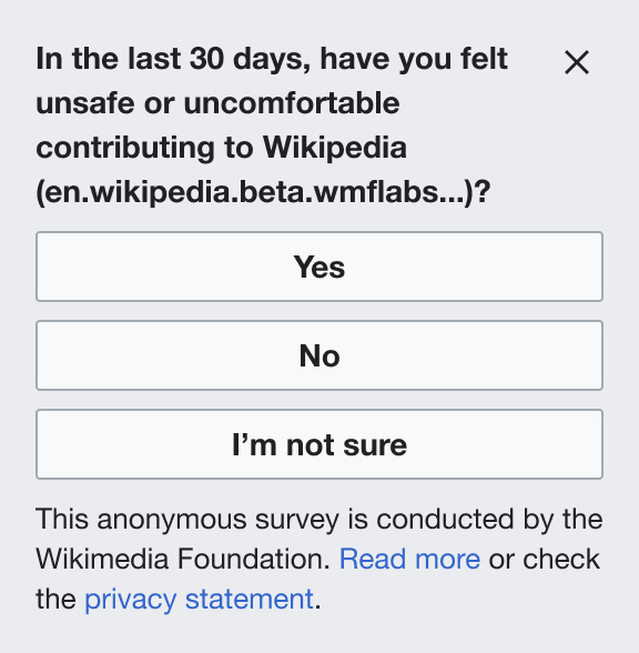
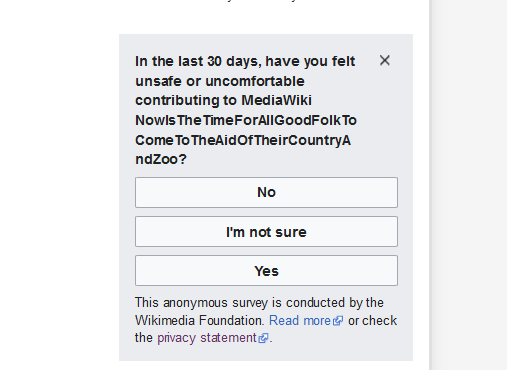
When using an Android version 12 Google API phone emulator (Portrait orientation) the X is not displaying on the survey:

image.png (757×439 px, 159 KB)


Footnote:
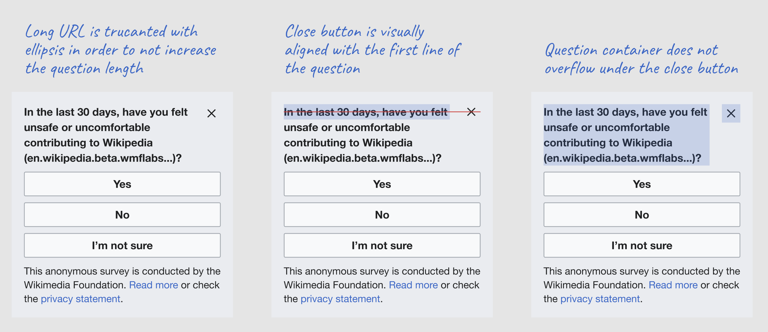
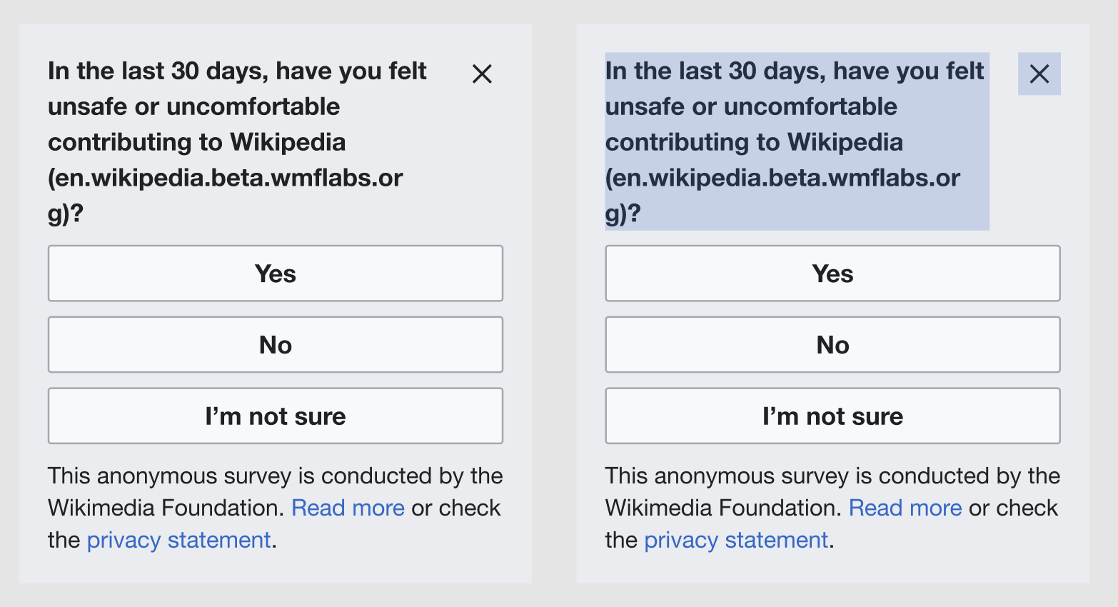
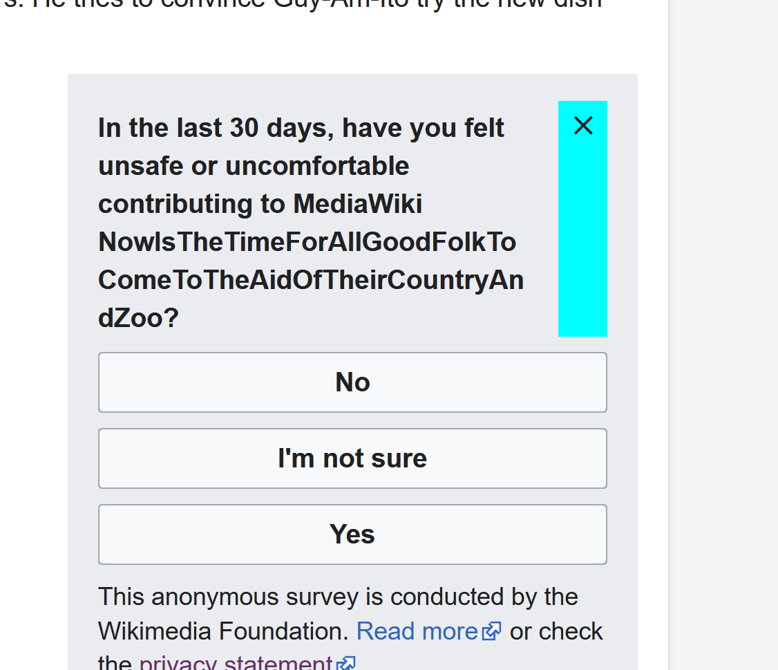
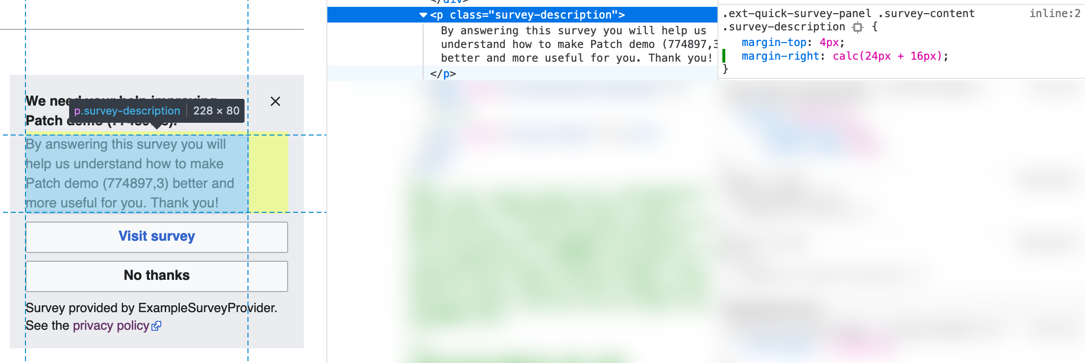
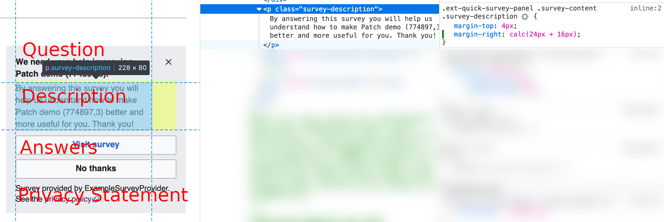
After speaking with @aminalhazwani this defect may be related to the long (non-breaking) text of the servername that pushes the X (close button) out of the boundary/border box of the survey.

image.png (868×661 px, 112 KB)

QA
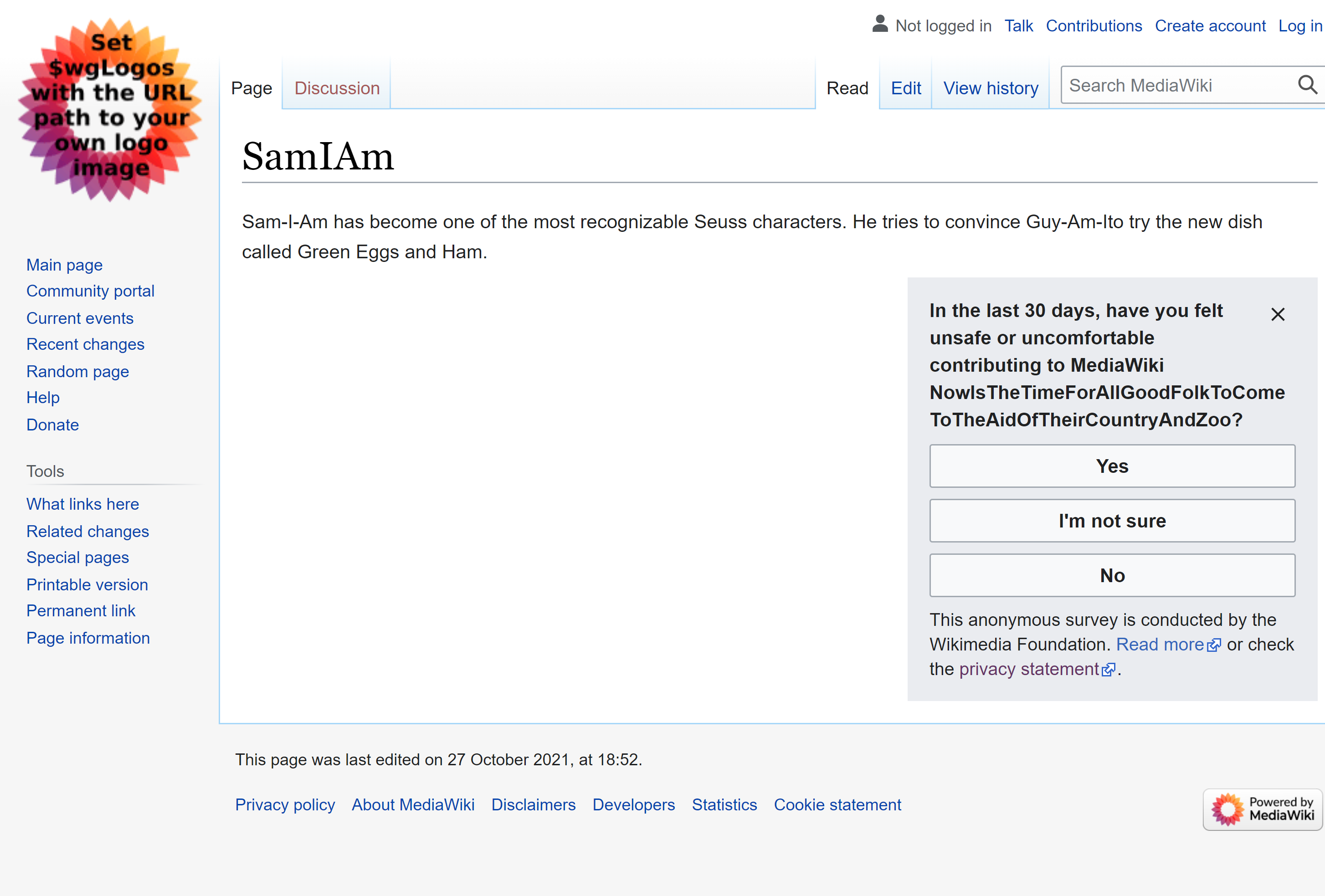
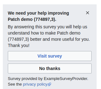
Please check against the following direct link to a problem survey
https://patchdemo.wmflabs.org/wikis/2515e6146e/wiki/New_York_(magazine)?quicksurvey=external%20example%20survey

Event Timeline

Here are some explorations for a potential solution:

  1. Break the URL on a new line (with no hyphens). Maybe with word-break: break-word; thou it would also be interesting to explore other properties like overflow-wrap.
    break-url.jpg (628×576 px, 130 KB)
  1. Decrease the URL font size: we could reduce the URL font size to 13px on a 15px line height in order to fit longer URLs.
    decrease-url.jpg (588×576 px, 128 KB)
  1. Truncate the URL with ellipsis.
    truncate-url.jpg (588×576 px, 128 KB)

Of all the options described above I favor option 3 as it doesn't increase the number of lines (the question is already quite long) and it doesn't introduce any visual difference. Moreover we are using the URL to emphasize to which wiki we are referring to in the question, and the important part to make this clear is at the beginning of the URL, eg. en.wiki..., fr.wiki...,. So it would be a fair compromise to cut the URL ending/domain.

ERayfield changed the task status from Open to In Progress.Mar 22 2022, 6:17 PM
ERayfield claimed this task.

After playing around, and with mucho help from Jason, here are some ideas
280x653

image.png (499×423 px, 23 KB)

larger 280 x 653 - for visibility
127.0.0.1_8080_wiki_SamIAm_quicksurvey=internal%20gdi%20safety%20survey(Galaxy Fold).png (1×2 px, 504 KB)

on side
image.png (240×505 px, 34 KB)

at 150px width

image.png (433×248 px, 10 KB)

what happens in code
Moved the close button to not be located after message, allowed overflow-wrap, changed "ext-quicksurveys-internal-gdi-safety-survey-question" in en.json to ({{SERVERNAME}}) to NowIsTheTimeForAllGoodFolkToComeToTheAidOfTheirCountryAndZoo for testing
close button has been set to be 'in line' with the first string of text, which may add to the issues of display of close button

This seems to work fairly well, from what can be seen from various emulations available to several different browsers.

So, at this point I need some feedback on how things need to look/be

Hi @ERayfield thanks for the updated! Together with Joaquin we opted for the original solution in order to 1) visually align the close button to the first line of the question, see T294894#7488972 and 2) keep the question container separated from the close button container, see T184760#7460765.

Is it possible to truncate the URL with ellipsis? We would prefer to opt for this solution as it keeps the original design and does not increased the visual length of the question. I add a visual to better explain the desired solution. Let me know! Many thanks!

image.png (1×2 px, 292 KB)

Hey @aminalhazwani. sorry about not understanding that the decision had already been made. That being said, are you wanting this for each string that may cause an overflow or wrap (I don't have any ideas what those words would be, but I know there are some really long strings for various languages)?

Thanks @ERayfield, to summarize what we chatted about during RTL I prepared this mockup. We will opt for the break-word/overflow-wrap solution as you suggested, but if it's possible we would keep the close button container separated from the question container, see blue overlay to highlight the difference. This approach will support a stronger visual separation of concerns between the question and the close button in the instances where we would have a long word on the second line that would sit next to the close button, hence making it less visible. This solution should be possible if we keep manage to maintain the original layout that Joaquin developed when we initially implemented the opt out feature T294894#7488972.

image.png (850×1 px, 147 KB)

set to 360x760 cell

image.png (659×423 px, 43 KB)

view enlarged, emulator for Nokia 81104G upright

image.png (356×309 px, 13 KB)

view enlarged emulator for Nokia 81104G side

image.png (370×507 px, 16 KB)

COLOR IS FOR EXAMPLE ONLY - cyan marks the section where the close button ('x') is sitting. If this is correct, I'll remove the color (and other stuff) and push it up.

image.png (969×1 px, 98 KB)

@ERayfield aside from color ;), it looks like just what was asked for to me! I'd go ahead and push it up for @aminalhazwani and the team to review. We could also set up a patch demo for it. @Scardenasmolinar knows how to do this.

I can set up the patch demo as soon as there is a Gerrit patch :)

Great, thanks @ERayfield! Feel free to push this to review. If we are able to set a patch demo it would super useful, thanks again!

Change 774897 had a related patch set uploaded (by EllenR; author: EllenR):

[mediawiki/extensions/QuickSurveys@master] fixed close button for QuickSurvey

https://gerrit.wikimedia.org/r/774897

Test wiki created on Patch demo by SCardenas (WMF) using patch(es) linked to this task:
https://patchdemo.wmflabs.org/wikis/31685c4718/w/

This looks good in mobile, but we have incorrect behavior in desktop. Note question text flowing under the close button.

image.png (286×323 px, 31 KB)

Test wiki created on Patch demo by JSherman (WMF) using patch(es) linked to this task:
https://patchdemo.wmflabs.org/wikis/2515e6146e/w/

Okay, this issue should be resolved now. Note the empty column beneath the x button where the description used to flow:

image.png (688×410 px, 64 KB)

Change 774897 merged by jenkins-bot:

[mediawiki/extensions/QuickSurveys@master] fixed close button for QuickSurvey

https://gerrit.wikimedia.org/r/774897

Using the following PatchDemo URL (https://patchdemo.wmflabs.org/wikis/2515e6146e/wiki/New_York_(magazine)?quicksurvey=external%20example%20survey) I was able to verify the fix via Dev Tools (with Dev Tools available device emulators).

image.png (494×793 px, 46 KB)
image.png (454×734 px, 42 KB)
image.png (483×736 px, 43 KB)

@jsn.sherman I was wondering if we should apply the same survey title properties to the survey description in the scenario where no survey title is defined. What do you think? In the example below I used a calc function only to share what this potential margin should take into account: the margin right of 16px + the icon real estate of 24px.

Screen Shot 2022-03-31 at 10.49.01.png (742×2 px, 461 KB)

@aminalhazwani I'm not sure which part of the survey you are talking about when you say title
I've taken your image and marked up the names of the different survey parts below

survey-parts.png (742×2 px, 358 KB)

Thanks @jsn.sherman, yeah, I meant the survey question (or survey title if we think about the thank you message view that comes once you submit an answer). I was wondering if the spacing properties of the survey question (or survey title) should be reflected in the survey description too whenever the question/title is not defined.

image.png (746×2 px, 177 KB)

@aminalhazwani surveys have to have a question; they should throw a validation error and not display if that is missing. So, we're really talking about the "completed" state with the confirmation message, additional info, and/or privacy policy. In that case, there will always be a confirmation message (which we also call the thank you message).

Perfect, thank you @jsn.sherman for taking the time to share all the additional details, it's very appreciated! And sorry everyone for any potential noise on this ticket, cheers!

Test wiki on Patch demo by JSherman (WMF) using patch(es) linked to this task was deleted:

https://patchdemo.wmflabs.org/wikis/2515e6146e/w/

Test wiki on Patch demo by SCardenas (WMF) using patch(es) linked to this task was deleted:

https://patchdemo.wmflabs.org/wikis/31685c4718/w/