Page MenuHomePhabricator

ToC: visual changes
Closed, ResolvedPublic3 Estimated Story Points

Description

Description

Minor visual changes to the table of contents and main menu.

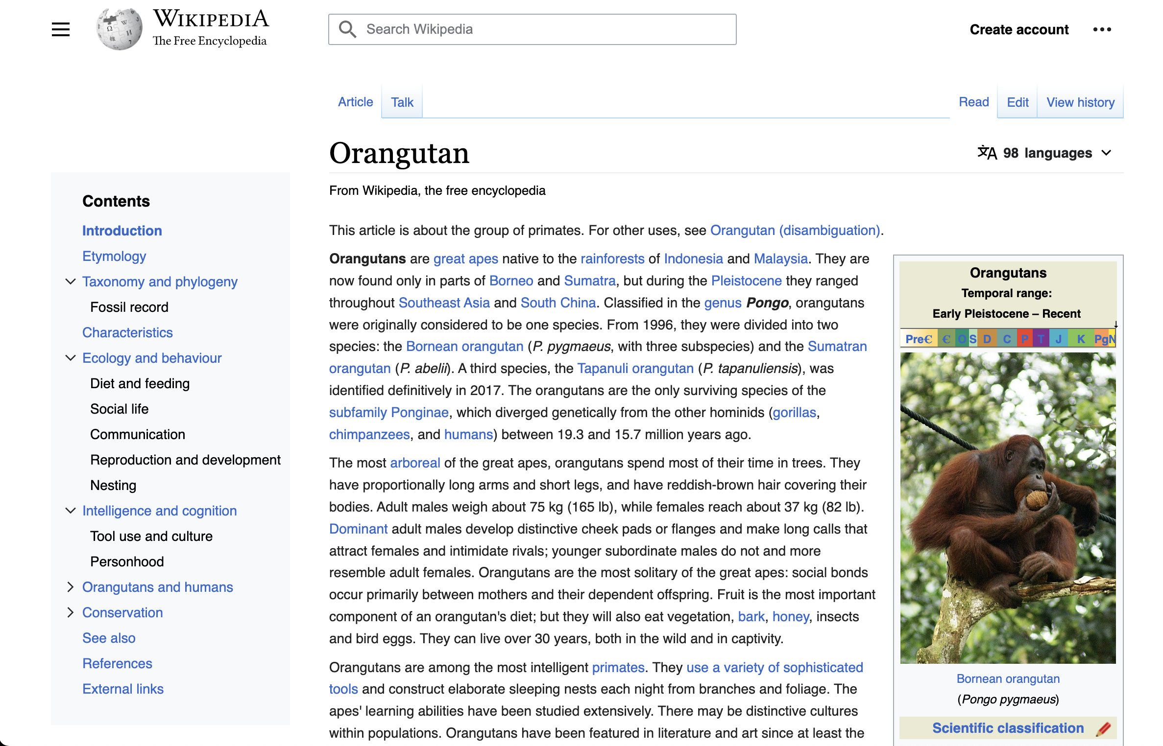
Current: https://en.wikipedia.org/wiki/Finland?useskin=vector-2022&tableofcontents=true
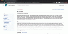
Updated: https://di-toc-with-menu-above.web.app/Tuna

  • Remove border from ToC and main menu
  • Reduce font-size of "Contents" heading to 14px
  • Replace ToC section toggle icons with chevrons

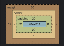
  • The icon should have 5px additional padding to increase the touch area size
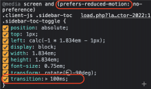
  • add transition: 100ms to section toggle icons, this transition should take into account the prefers-reduced-motion media query
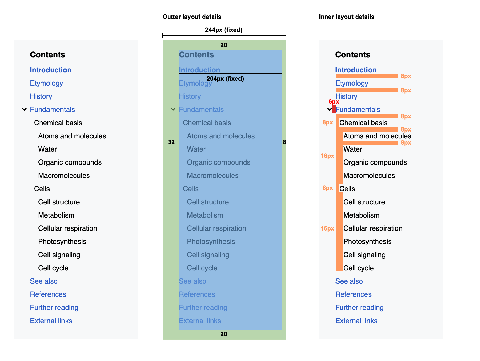
  • Adjust spacing around and between ToC elements
    image.png (1×1 px, 247 KB)

Developer notes

We will use the OOUI arrow icon, the other visual changes seem relatively straightforward

QA Results - Beta

QA Results - Prod

Event Timeline

There are a very large number of changes, so older changes are hidden. Show Older Changes
alexhollender_WMF renamed this task from ToC: Design review to ToC: visual changes.Mar 30 2022, 8:00 PM
alexhollender_WMF updated the task description. (Show Details)

Since the toggle icon is new, I assume we need @Volker_E's help to add the new chevron icon into OOUI and do a release, similar to the watchlist icon. Adding the icon isnt blocking, it can happen alongside dev work.
I also noticed that OOUI already has a very similar chevron/arrow icon, I'm not sure if that matters.

@alexhollender_WMF I was wondering, given our our convo about the small touchsize, what do you think about adding some invisible padding? I.e. Adding 5px padding to the chevron would increase the touch size from 12px to 22px. It still doesn't meet the WCAG requirement, but I'd say its a pretty good improvement and it wouldn't alter any of the visual design.

Isnt this the same icon we use for section collapsing in mobile (rotated)?

I think it's slightly different. The icons in mobile are the "collapse"/"expand" OOUI icons, while the svg in this task is slightly thicker/shorter

bwang removed bwang as the assignee of this task.Apr 4 2022, 9:48 PM
bwang updated the task description. (Show Details)
bwang subscribed.

@bwang @Jdlrobson I just tried out the icon we use in mobile and it works well enough. to keep things simple let's re-use that icon at the smaller size. I've updated the prototype to use the same SVG we use in Minerva (https://di-toc-with-menu-above.web.app/Tuna):

Screen Shot 2022-04-05 at 11.52.06 AM.png (1×2 px, 1 MB)

@bwang adding some padding to the chevron sounds good. keep in mind that the chevron and the section link next to it are separate clickable elements. let me know when I can review that.

bwang removed the point value for this task.
cjming set the point value for this task to 3.

Change 778599 had a related patch set uploaded (by Clare Ming; author: Clare Ming):

[mediawiki/skins/Vector@master] Style fixes for sticky TOC

https://gerrit.wikimedia.org/r/778599

cjming moved this task from Doing to Code Review on the Web-Team-Backlog (Kanbanana-FY-2021-22) board.
cjming subscribed.
Jdlrobson removed Jdlrobson as the assignee of this task.
Jdlrobson claimed this task.

Change 779126 had a related patch set uploaded (by Clare Ming; author: Clare Ming):

[mediawiki/skins/Vector@master] Replace TOC arrow icon

https://gerrit.wikimedia.org/r/779126

Test wiki created on Patch demo by CMing (WMF) using patch(es) linked to this task:
https://patchdemo.wmflabs.org/wikis/7bf0454258/w/

Change 779126 merged by jenkins-bot:

[mediawiki/skins/Vector@master] Replace TOC arrow icon

https://gerrit.wikimedia.org/r/779126

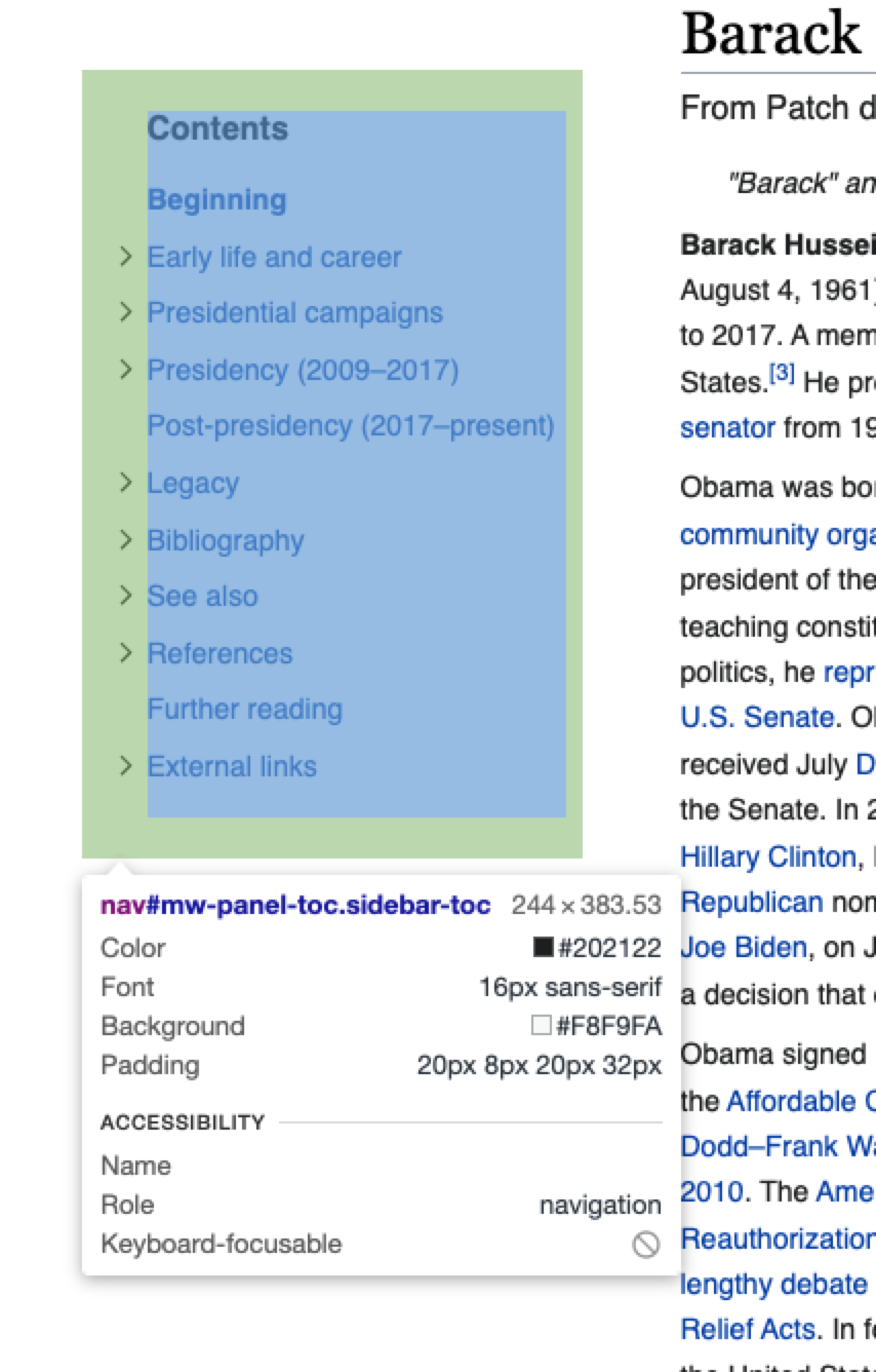
reviewed on https://patchdemo.wmflabs.org/wikis/7bf0454258/wiki/Barack_Obama?useskin=vector-2022&tableofcontents=1

looks awesome 👍 perfectly to spec 😄

image.png (1×854 px, 365 KB)

  • Remove border from ToC and main menu
  • Reduce font-size of "Contents" heading to 16px
  • Replace ToC section toggle icons with chevrons
  • The icon should have 5px additional padding to increase the touch area size
  • add transition: 100ms to section toggle icons, this transition should take into account the prefers-reduced-motion media query
  • Adjust spacing around and between ToC elements

feel free to move to signoff after code review

Test wiki on Patch demo by CMing (WMF) using patch(es) linked to this task was deleted:

https://patchdemo.wmflabs.org/wikis/7bf0454258/w/

Test wiki created on Patch demo by CMing (WMF) using patch(es) linked to this task:
https://patchdemo.wmflabs.org/wikis/1bfd991efc/w/

Test wiki on Patch demo by CMing (WMF) using patch(es) linked to this task was deleted:

https://patchdemo.wmflabs.org/wikis/1bfd991efc/w/

Test wiki created on Patch demo by CMing (WMF) using patch(es) linked to this task:
https://patchdemo.wmflabs.org/wikis/7eb47c98e2/w/

hi @alexhollender_WMF during code review, 2 issues arose around the searchbox thanks to @bwang's eagle eyes:

  1. Although I managed to get the actual input box aligned between clicking in and out of the input, you can see that the magnifying glass icon doesn't align with the searchbox dropdown icons. I'm guessing that the placement of the search icon should match vertically with the search dropdown thumbnails?

If so, this will move the default placement of that magnifying glass icon inside the search input a bit more over to the right so that it doesn't bounce/move between clicking in/out of the searchbox.

Screen Shot 2022-04-12 at 3.57.49 PM.png (1×2 px, 435 KB)

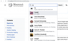
  1. There's a bit of a jump when first clicking into the searchbox input on page load (subsequent clicks in/out don't exhibit this behavior)

searchboxJump.gif (244×480 px, 1000 KB)

I'm not that familiar with how the simple search + Vue search was put together so I'm not sure how to solve this jumpy behavior. You can see the jumpy-ness at https://patchdemo.wmflabs.org/wikis/7eb47c98e2/wiki/Test-TOC?useskin=vector-2022&tableofcontents=1

@bwang suggested to avoid using the autoExpandWidth prop to not have to add any overriding CSS and so that the search icon can be aligned - would this be acceptable?

I'm guessing that the placement of the search icon should match vertically with the search dropdown thumbnails?

If I understand your question correctly, yes. You can see the search spec here: https://phabricator.wikimedia.org/T255603

  1. There's a bit of a jump when first clicking into the searchbox input on page load (subsequent clicks in/out don't exhibit this behavior...@bwang suggested to avoid using the autoExpandWidth prop to not have to add any overriding CSS and so that the search icon can be aligned - would this be acceptable?

Is this a technical question or a design question? I don't have an opinion on how it's fixed, as long as it looks like it did before : )

I don't have an opinion on how it's fixed, as long as it looks like it did before : )

@alexhollender_WMF I just realized that this jumpy behavior is happening on prod -- so these changes should replicate what's currently happening?

searchboxProd.gif (168×480 px, 318 KB)

@alexhollender_WMF I just realized that this jumpy behavior is happening on prod -- so these changes should replicate what's currently happening?

no, it's currently incorrect. I'm not sure when the bug first appeared. You can reference this prototype to see how it's supposed to be , however there are some aspects of it that you won't be able to replicate exactly because of how Vue loads. I suggest moving this into a separate task.

Test wiki on Patch demo by CMing (WMF) using patch(es) linked to this task was deleted:

https://patchdemo.wmflabs.org/wikis/7eb47c98e2/w/

Test wiki created on Patch demo by CMing (WMF) using patch(es) linked to this task:
https://patchdemo.wmflabs.org/wikis/c0e2e484ef/w/

Test wiki created on Patch demo by CMing (WMF) using patch(es) linked to this task:
https://patchdemo.wmflabs.org/wikis/995593dce7/w/

Change 778599 merged by jenkins-bot:

[mediawiki/skins/Vector@master] Layout + visual style changes for sticky TOC

https://gerrit.wikimedia.org/r/778599

Test wiki on Patch demo by CMing (WMF) using patch(es) linked to this task was deleted:

https://patchdemo.wmflabs.org/wikis/995593dce7/w/

Test wiki on Patch demo by CMing (WMF) using patch(es) linked to this task was deleted:

https://patchdemo.wmflabs.org/wikis/c0e2e484ef/w/

@cjming search box situation seems fixed...thanks for everything here

See T305069#7866293 for reports of this work and of the layout changes

Test Result - Beta

Status: ✅ PASS
Environment: beta
OS: macOS Monterey
Browser: Chrome
Device: MBP
Emulated Device:NA

Test Artifact(s):

QA Steps

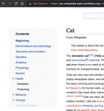
✅ AC1: Remove border from ToC and main menu

Screen Shot 2022-04-20 at 8.42.46 AM.png (1×1 px, 234 KB)

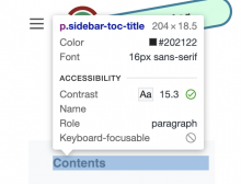
✅ AC2: Reduce font-size of "Contents" heading to 16px
Screen Shot 2022-04-20 at 8.43.54 AM.png (482×630 px, 62 KB)

✅ AC3: Replace ToC section toggle icons with chevrons
see AC1 image
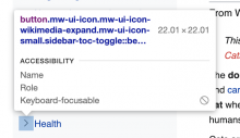
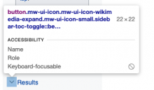
✅ AC4: The icon should have 5px additional padding to increase the touch area size
per T304166#7823224 the padding should increase the size to 22px
Screen Shot 2022-04-20 at 8.46.10 AM.png (414×714 px, 64 KB)

✅ AC5: Add transition: 100ms to section toggle icons, this transition should take into account the prefers-reduced-motion media query
Screen Shot 2022-04-20 at 8.59.07 AM.png (390×658 px, 76 KB)

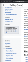
✅ AC6: Adjust spacing around and between ToC elements
Screen Shot 2022-04-20 at 9.02.17 AM.png (312×434 px, 23 KB)

@nray, I wasn't able to verify the inner layout details, but everything else looks good. If you can verify that, and you are good with the validations above then this can move to QA in Prod.

@Edtadros Thank you, Alex confirmed today in standup that the visual regression tests looked fine so I've moved this and T305069 to QA in prod

Test Result - Beta

Status: ✅ PASS
Environment: beta
OS: macOS Monterey
Browser: Chrome
Device: MBP
Emulated Device:NA

Test Artifact(s):

QA Steps

✅ AC1: Remove border from ToC and main menu

Screen Shot 2022-04-20 at 8.42.46 AM.png (1×1 px, 234 KB)

✅ AC2: Reduce font-size of "Contents" heading to 16px
Screen Shot 2022-04-20 at 8.43.54 AM.png (482×630 px, 62 KB)

✅ AC3: Replace ToC section toggle icons with chevrons
see AC1 image
✅ AC4: The icon should have 5px additional padding to increase the touch area size
per T304166#7823224 the padding should increase the size to 22px
Screen Shot 2022-04-20 at 8.46.10 AM.png (414×714 px, 64 KB)

✅ AC5: Add transition: 100ms to section toggle icons, this transition should take into account the prefers-reduced-motion media query
Screen Shot 2022-04-20 at 8.59.07 AM.png (390×658 px, 76 KB)

✅ AC6: Adjust spacing around and between ToC elements
Screen Shot 2022-04-20 at 9.02.17 AM.png (312×434 px, 23 KB)

Test Result - Prod

Status: ✅ PASS
Environment: enwiki
OS: macOS Monterey
Browser: Chrome
Device: MBP
Emulated Device:NA

Test Artifact(s):

QA Steps

✅ AC1: Remove border from ToC and main menu

Screen Shot 2022-05-11 at 7.06.35 AM.png (705×323 px, 116 KB)

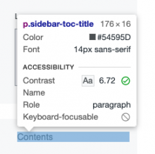
✅ AC2: Reduce font-size of "Contents" heading to 16px
Font size is 14, this is a pass per T304166#7936430
Screen Shot 2022-05-16 at 6.23.57 PM.png (242×243 px, 20 KB)

✅ AC3: Replace ToC section toggle icons with chevrons
see AC1 image
✅ AC4: The icon should have 5px additional padding to increase the touch area size
per T304166#7823224 the padding should increase the size to 22px
Screen Shot 2022-05-16 at 6.25.18 PM.png (200×341 px, 19 KB)

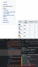
✅ AC5: Add transition: 100ms to section toggle icons, this transition should take into account the prefers-reduced-motion media query
Screen Shot 2022-05-16 at 6.26.46 PM.png (961×559 px, 159 KB)

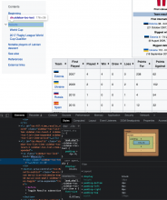
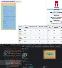
✅ AC6: Adjust spacing around and between ToC elements
Screen Shot 2022-05-16 at 6.29.25 PM.png (993×833 px, 199 KB)

Screen Shot 2022-05-16 at 6.29.08 PM.png (962×886 px, 202 KB)

Test Result - Prod

Status:
Environment: enwiki
OS: macOS Monterey
Browser: Chrome
Device: MBP
Emulated Device:NA

Test Artifact(s):

QA Steps

❌ AC2: Reduce font-size of "Contents" heading to 16px
Font size is 14

Screen Shot 2022-05-16 at 6.23.57 PM.png (242×243 px, 20 KB)

hi @Edtadros -- according to the updated prototype (https://di-toc-with-menu-above.web.app/Tuna) in the task description - "Contents" is 14px. Not sure if this got updated/documented somewhere or not. @alexhollender_WMF do you mind confirming?

hi @Edtadros -- according to the updated prototype (https://di-toc-with-menu-above.web.app/Tuna) in the task description - "Contents" is 14px. Not sure if this got updated/documented somewhere or not. @alexhollender_WMF do you mind confirming?

hey, apologies for the conflicting information. yes, 14px is correct. I will change the task description now. my bad

nray reassigned this task from nray to cjming.