Page MenuHomePhabricator

Reorder left menu sections
Closed, InvalidPublic

Description

Background/Goal

Some of the left menu sections don't have a logical order. For example, "Design Tokens" section should be before "Components" since tokens are always built before components, so in a logical read they should be before them. Also "Icons", "Design Tokens" and "Grids" (when we define the grids) should be in the same "Guidelines" section.

Captura de pantalla 2022-04-04 a las 11.16.54.png (1×1 px, 390 KB)

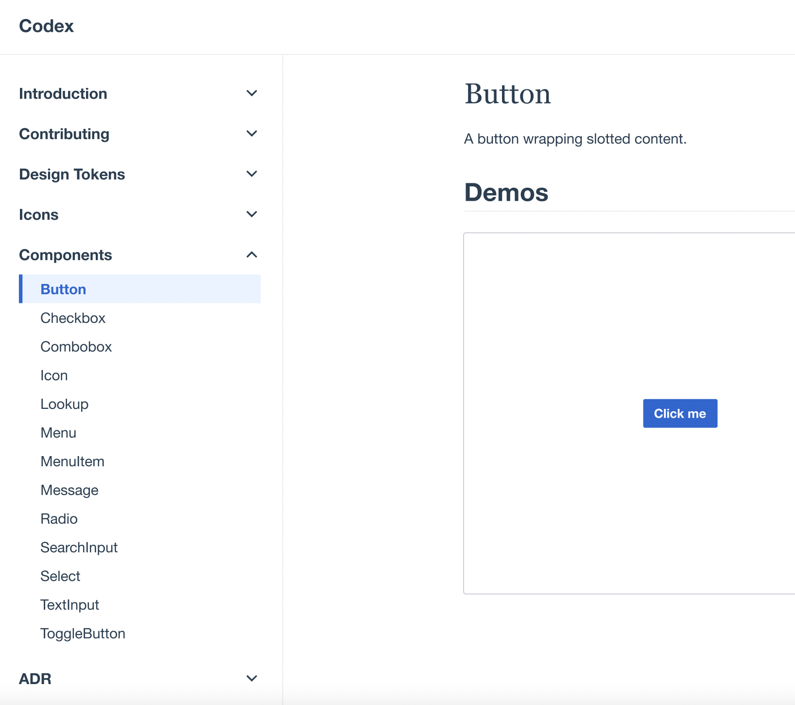
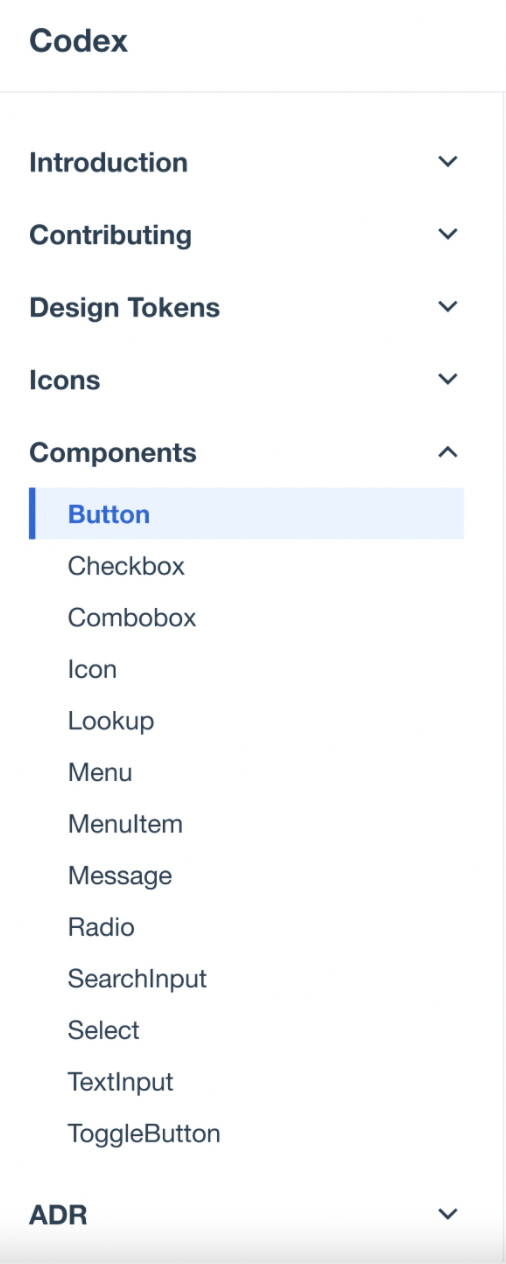
Also left menu sections have many subsections and it's difficult to read all main sections (Introduction, Contributing, Design Tokens, Components...)at the first glance We should add an accordion in each section to show/hide subsections.

Captura de pantalla 2022-04-04 a las 11.22.10.png (1×2 px, 1 MB)

References

Other Design System demos with accordion:

Acceptance criteria (or Done)

  • Reorder left menu sections
    • Add "Design Tokens" section before "Components" (after "Contributing)
    • Create a "Guidelines" section to add there all tokens, icons and grids
  • Add an accordion in each main section of the left menu

Event Timeline

bmartinezcalvo renamed this task from Add "Design Tokens" section before "Components" to Add "Design Tokens" section before "Components" on the left menu.Apr 4 2022, 9:18 AM
bmartinezcalvo created this task.
bmartinezcalvo renamed this task from Add "Design Tokens" section before "Components" on the left menu to Reorder left menu sections.Apr 4 2022, 9:36 AM
bmartinezcalvo updated the task description. (Show Details)
bmartinezcalvo added a subscriber: Sarai-WMDE.

@bmartinezcalvo We originally had the design tokens above components for the reason you outlined in the task description, but decided to move them under components since there are a lot of them and the long list obscures the component documentation, which we exact will be used more often than the design tokens visualizations. We could certainly revisit this decision, or come up with alternate solutions (e.g. collapse the sidebar sections so, for example, the list of design tokens pages doesn't display in the sidebar until you land on the design tokens intro page). In general, the length of the sidebar content is problematic.

Also, with Vitepress, you can have different sidebars depending on the path you're on. We could consider doing something like the GitHub primer site, where they have links in the header for "design" and "build", and each of those sections of the site has its own sidebar.

@bmartinezcalvo We originally had the design tokens above components for the reason you outlined in the task description, but decided to move them under components since there are a lot of them and the long list obscures the component documentation, which we exact will be used more often than the design tokens visualizations. We could certainly revisit this decision, or come up with alternate solutions (e.g. collapse the sidebar sections so, for example, the list of design tokens pages doesn't display in the sidebar until you land on the design tokens intro page). In general, the length of the sidebar content is problematic.

@AnneT I know the length of the sidebar content is too long and problematic, it's the reason why I proposed also in this task to add accordions in each main section to hide/show all subsections. Something like this:

Captura de pantalla 2022-04-05 a las 18.17.58.png (1×1 px, 597 KB)

With this solution we could view all main sidebar sections in the first glance. Also we could decide if we want to have open by default the Components section since it's the most important section as you comment.

In my opinion we don't have to reflect the internal logic of implementation in the navigation. Tokens are important and we talk about the necessity for them to be built and used in several places in the documentation.
Nonetheless I'm convinced the average user of Codex demo page is more interested in the components list than in the tokens. An accordion could maybe help, but would mean an extra click. Something that gets nerve-wrecking fast, if one section is the by far most used (to be evaluated).

@Volker_E I don't think that one more click for accordion would make the user gets stressed, I think an accordion here would order our sections and would give the user more peace of mind, although doing one more click. Also, we could add an accordion in each section and leave the components section opened by default since it's the most important section to view.

Captura de pantalla 2022-04-25 a las 16.01.50.png (1×506 px, 476 KB)

Just to let you know, some small improvement on the sidebar and its grouping have being achieved as part of: https://phabricator.wikimedia.org/T309109

Further conversation needed here to define what is the team agrees to be the way forward

I'm still convinced that most folks are going for Components first, then icons, then tokens. We should orient on our users and not on our architecture.

I'm still convinced that most folks are going for Components first, then icons, then tokens. We should orient on our users and not on our architecture.

I agree with @Volker_E we could orient on our users instead on our architecture.

@bmartinezcalvo We originally had the design tokens above components for the reason you outlined in the task description, but decided to move them under components since there are a lot of them and the long list obscures the component documentation, which we exact will be used more often than the design tokens visualizations. We could certainly revisit this decision, or come up with alternate solutions (e.g. collapse the sidebar sections so, for example, the list of design tokens pages doesn't display in the sidebar until you land on the design tokens intro page). In general, the length of the sidebar content is problematic.

@AnneT I know the length of the sidebar content is too long and problematic, it's the reason why I proposed also in this task to add accordions in each main section to hide/show all subsections. Something like this:

Captura de pantalla 2022-04-05 a las 18.17.58.png (1×1 px, 597 KB)

With this solution we could view all main sidebar sections in the first glance. Also we could decide if we want to have open by default the Components section since it's the most important section as you comment.

About the organization, as I commented here some time ago the organization that seems more logical to me is:

  1. Design Tokens
  2. Icons
  3. Components
  4. Patterns (if we add them in the future)

It' the most logical to me since without tokens and without icons we couldn't create components, for this reason they are organized from small to large.

But, the most important thing we should update in our left menu (apart from organize our sections) is to add an accordion on each section to be able to show/hide the info inside. I think this is one of the most important improvements in our left menu since now the user needs to do scroll to read all the left menu sections and subsections.

With the new documentation structure achieved in T317198: Governance & Guidelines: Update documentation structure in Codex's documentation site we don't need to rely on (human unfriendly) accordion as the sub navigation parts have been split up over several pages. Component grouping is still discussed in T309109: Add groups to Codex docs sidebar.

With the decisions done in T317198, this task's call has been in parts fulfilled, in parts invalid now.