Background/Goal
Code
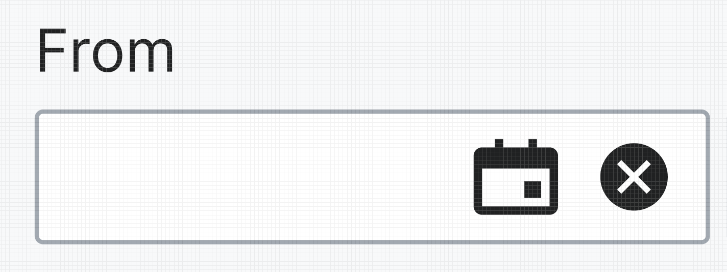
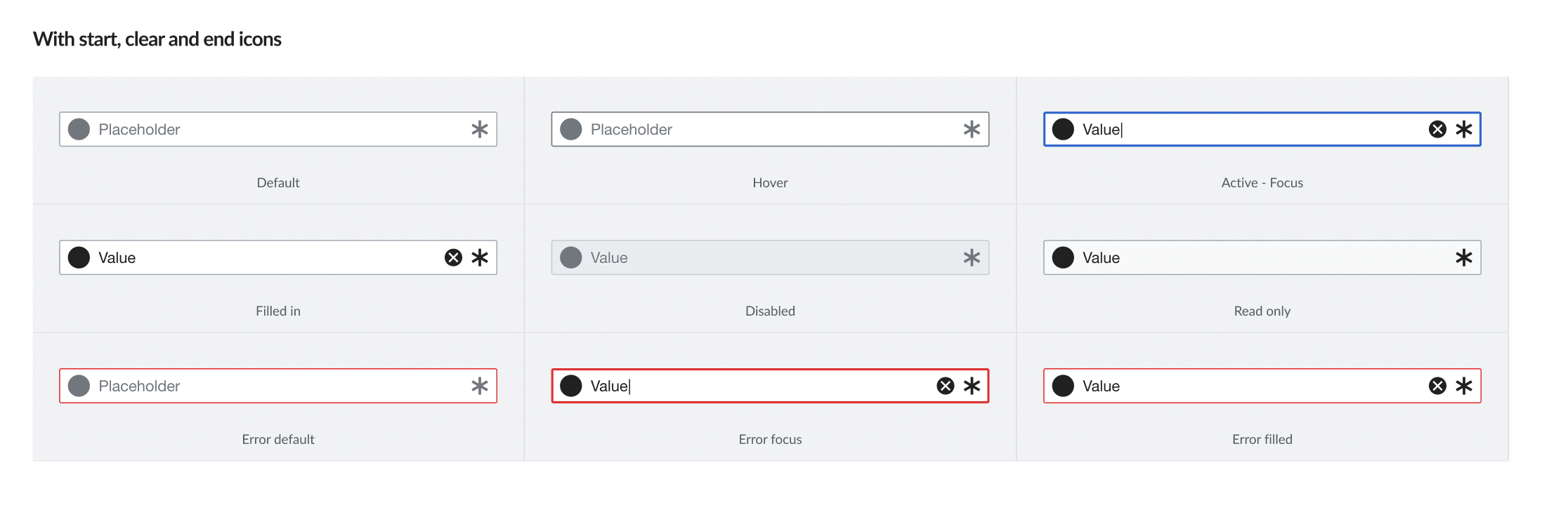
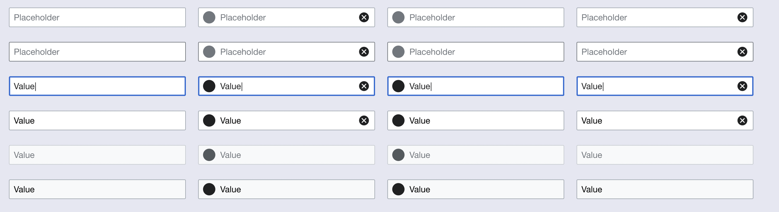
In updated demos easily visible, TextInput endIcon and clearable are currently exchanging each other, not positioned side-by-side.
When clearable is enabled it is on top of endIcon. With current use of endIcon as required indicator, that would mean, the indicator wouldn't be visible any more.
Design
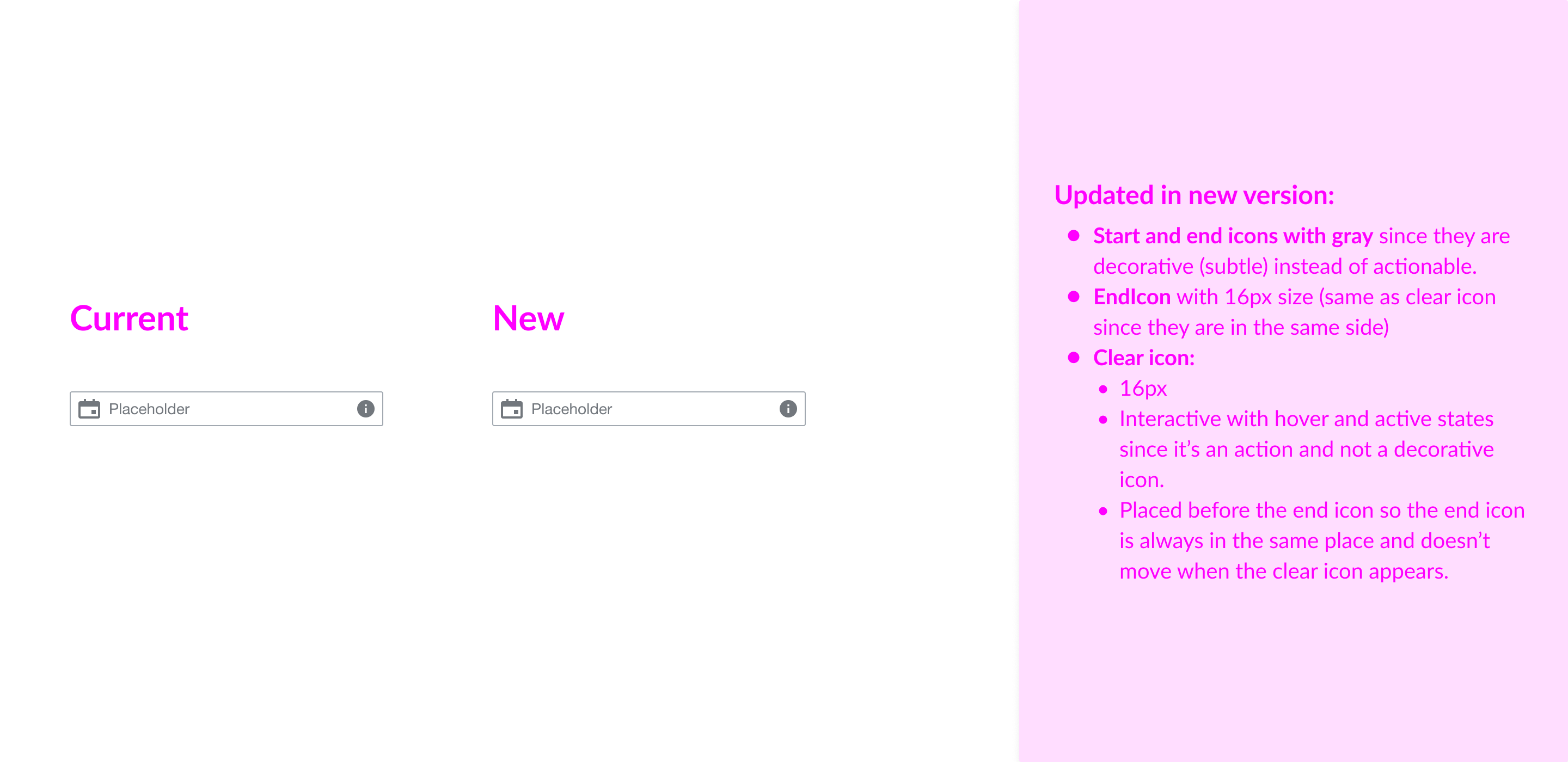
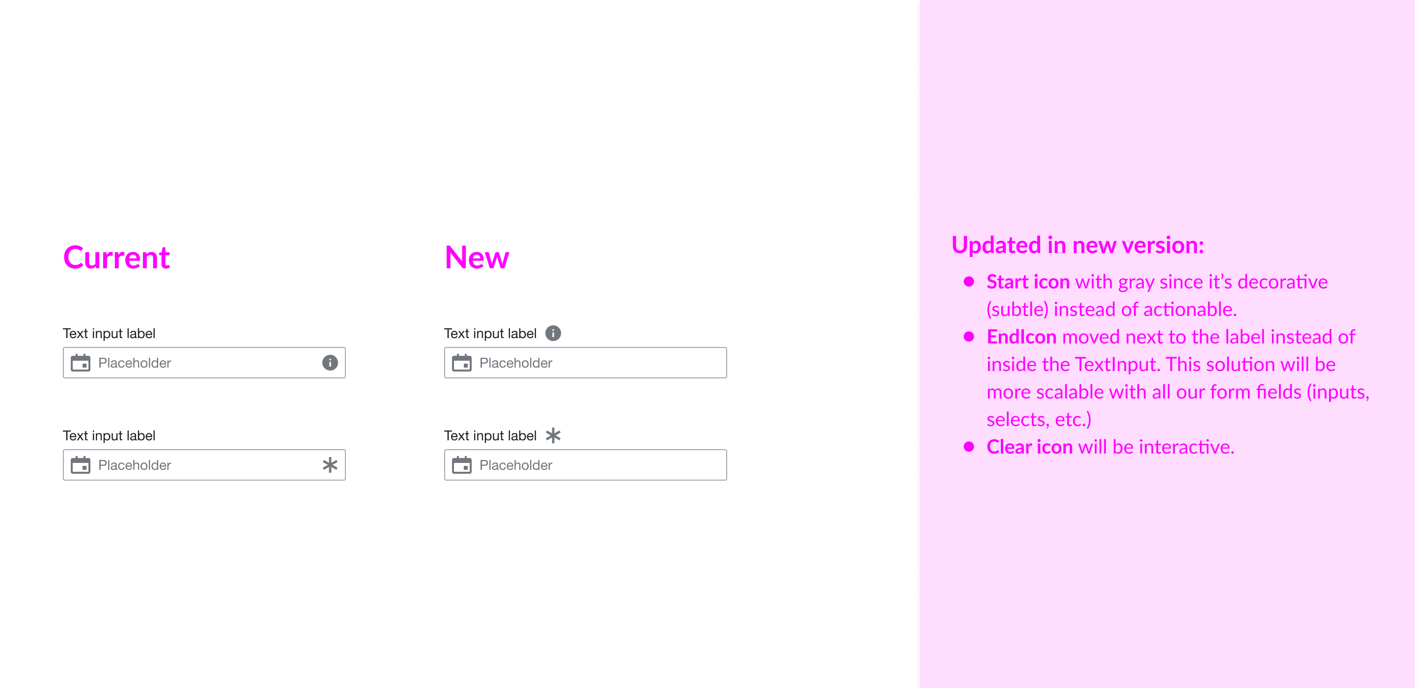
TextInput with endIcon and clearable variant is missing in our Figma library. We have the input with clearable icon (that it's named "With end icon") but we don't have a real end icon and clearable variant. We need to add both endIcon and endIcon clearable.
User stories
- As a user I need the EndIcon visible when the Clear icon is displayed.
- As a designer, I need to have the same TextInput variants from Codex available in the Figma library.
Acceptance criteria (or Done)
Design
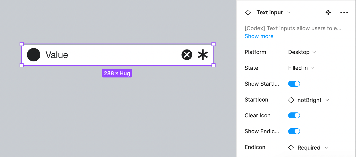
- Update TextInput component in our Codex library so EndIcon and Clear icon are visible if needed at the same time.
Code
- Position clearable before endIcon