Page MenuHomePhabricator

[S] Improve the results layout on special:search page
Closed, ResolvedPublic

Description

Formerly titled: Update of "Search Results" css on Special:Search

Problem
The current special:search page has a lot of information that fights for users attention. The current visual hierarchy does not take into account what design elements should get greater or lesser importance. This can make scanning of information less effective.
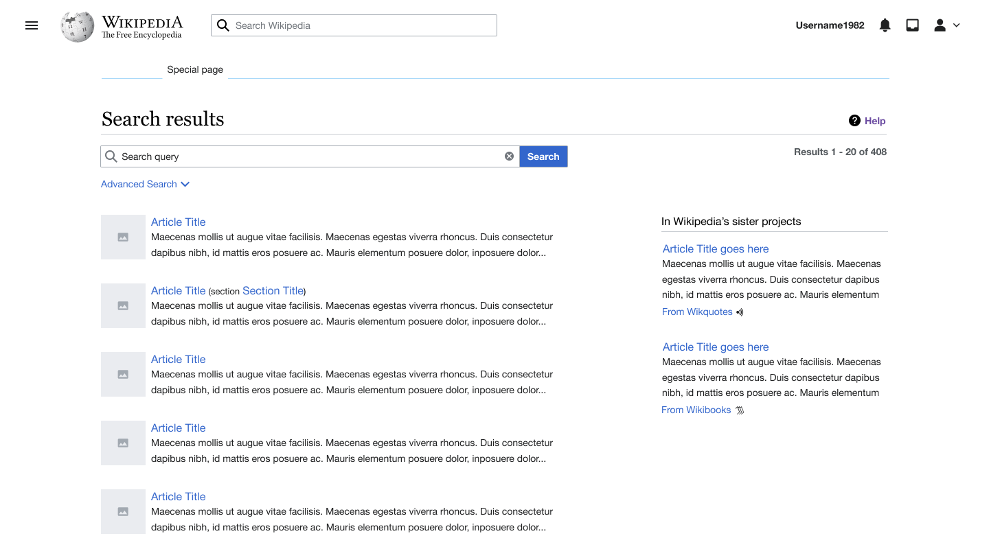
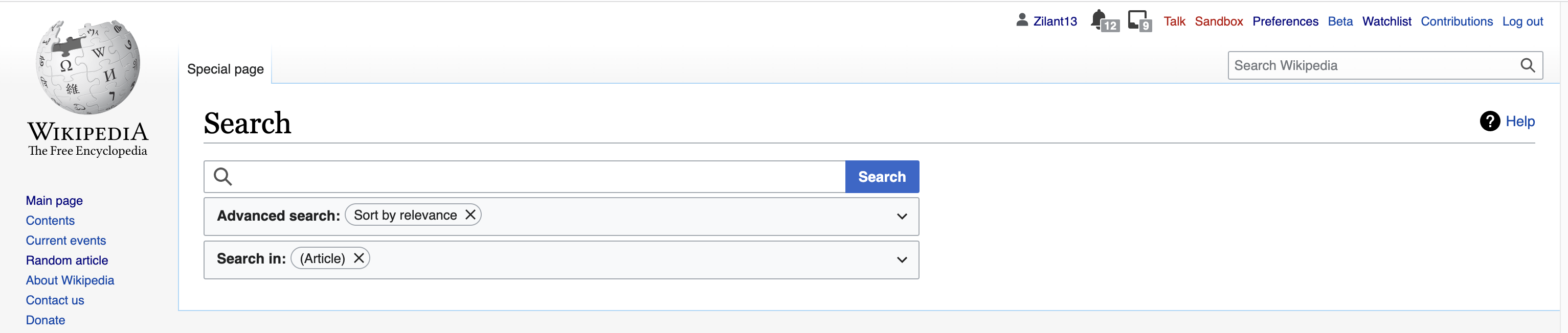
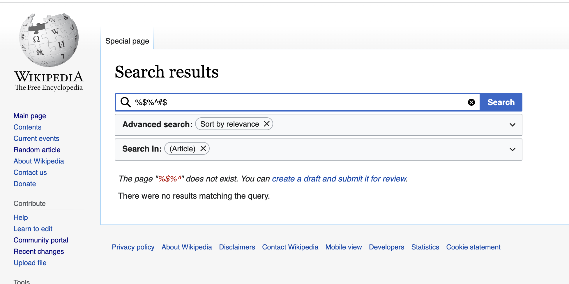
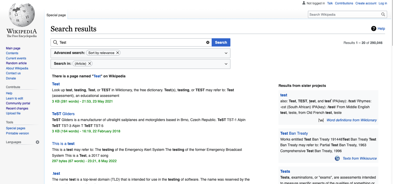
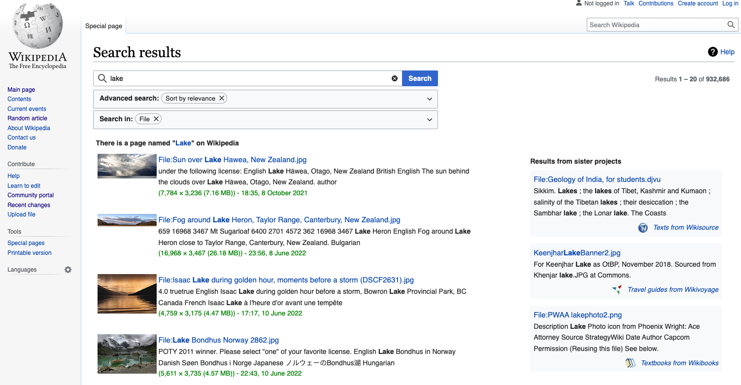
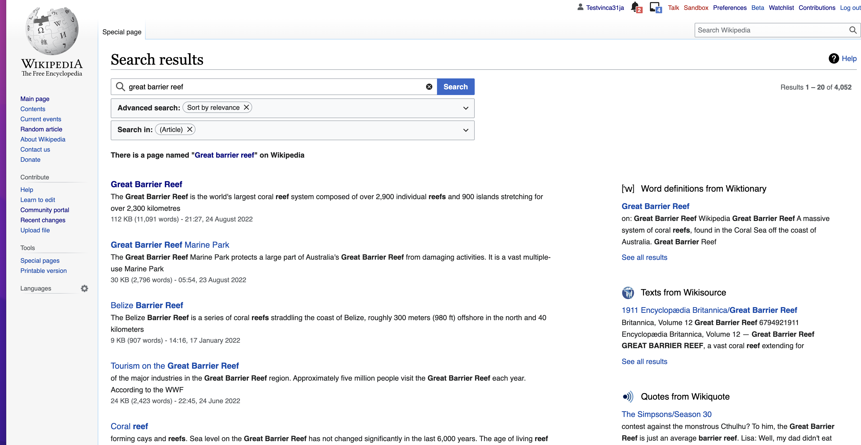
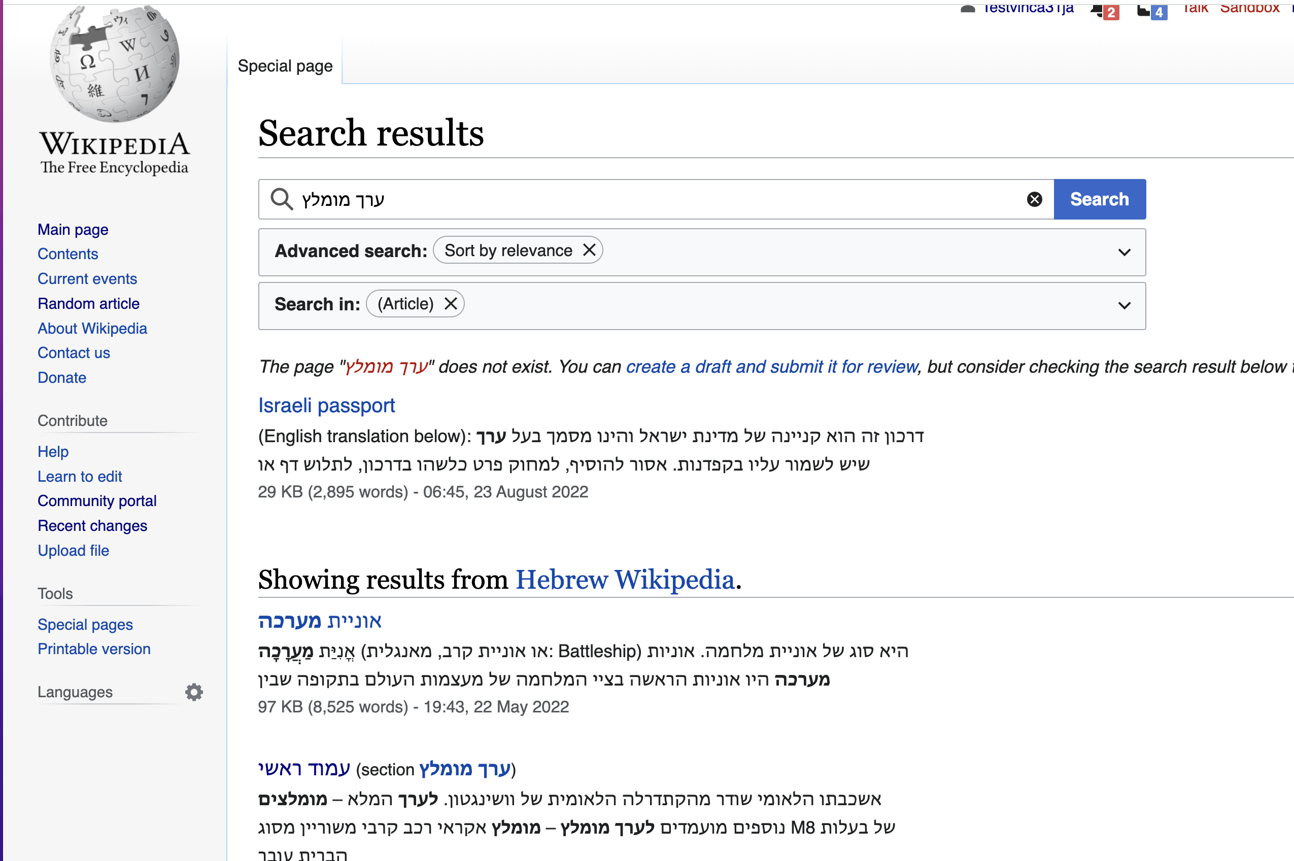
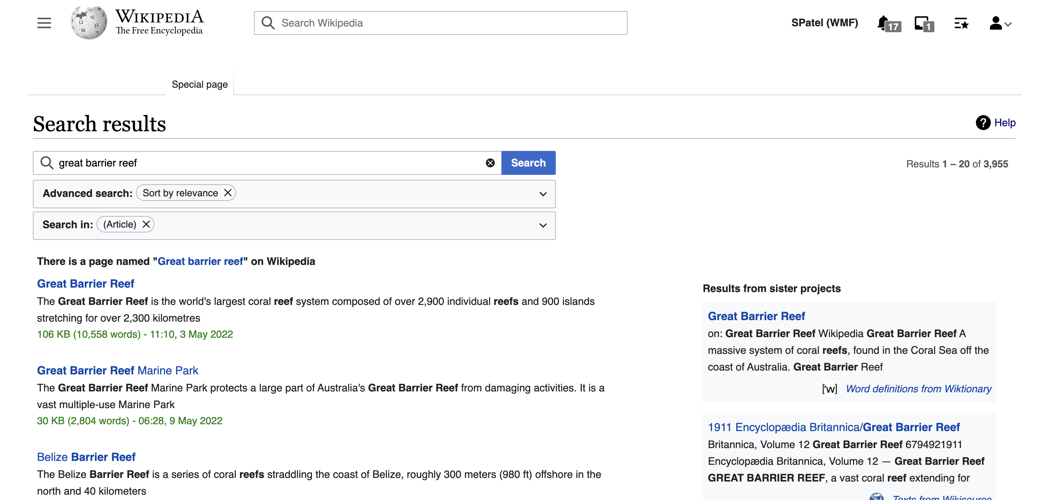
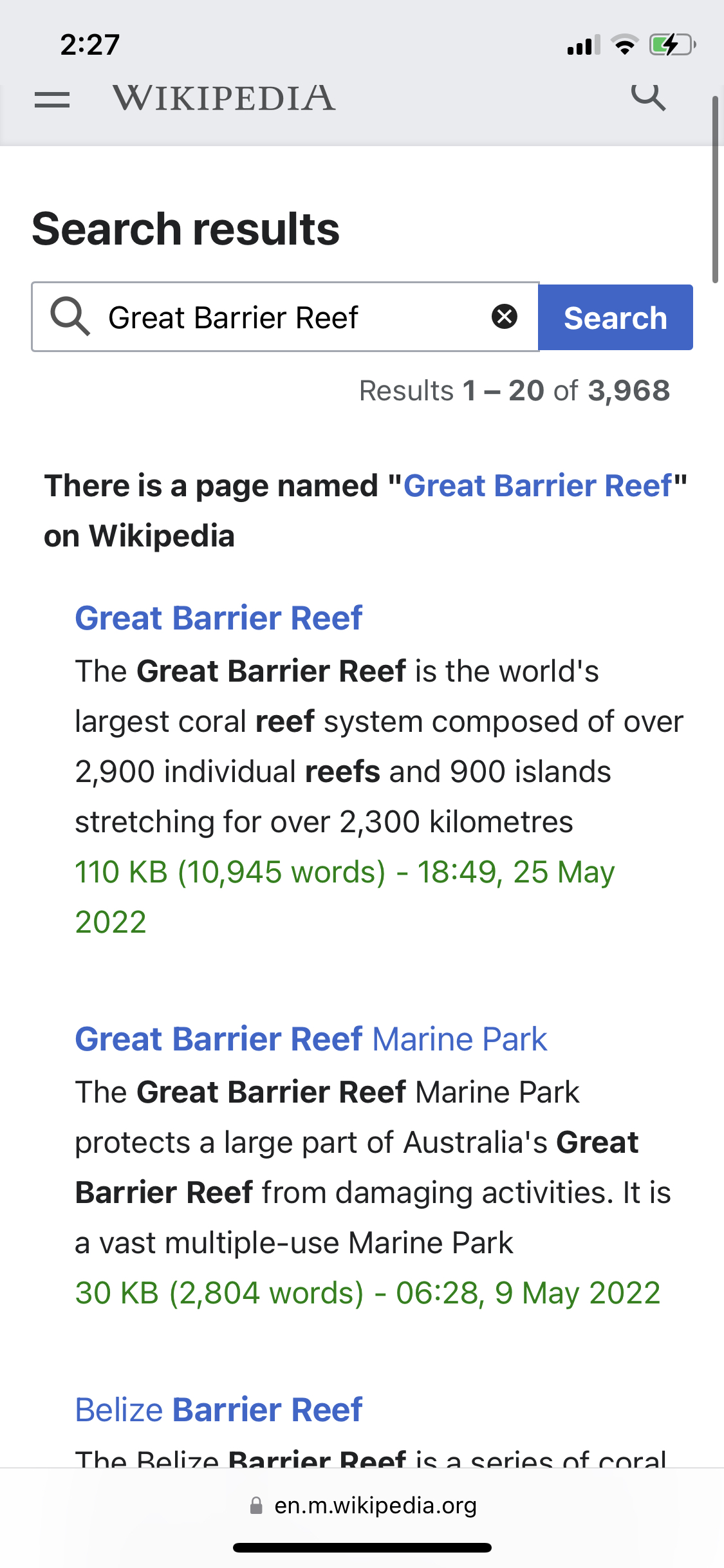
Current page
Desktop

current search.png (1×3 px, 581 KB)
Mobile
mobile.jpeg (2×1 px, 829 KB)

User story
When  I am looking at search results on the Special:Search page … 
… I want to  be able to easily scan the page, 
… so that   I can quickly locate the information I am looking for.
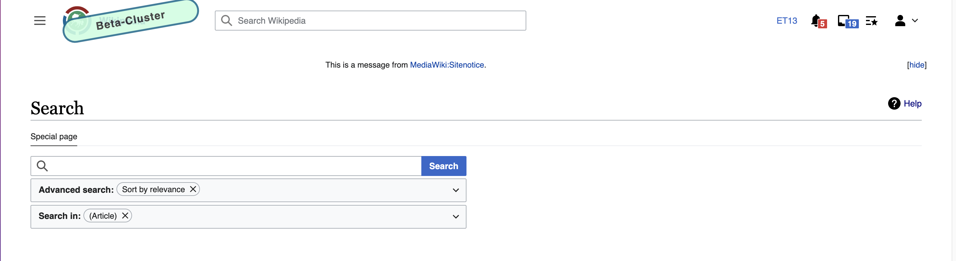
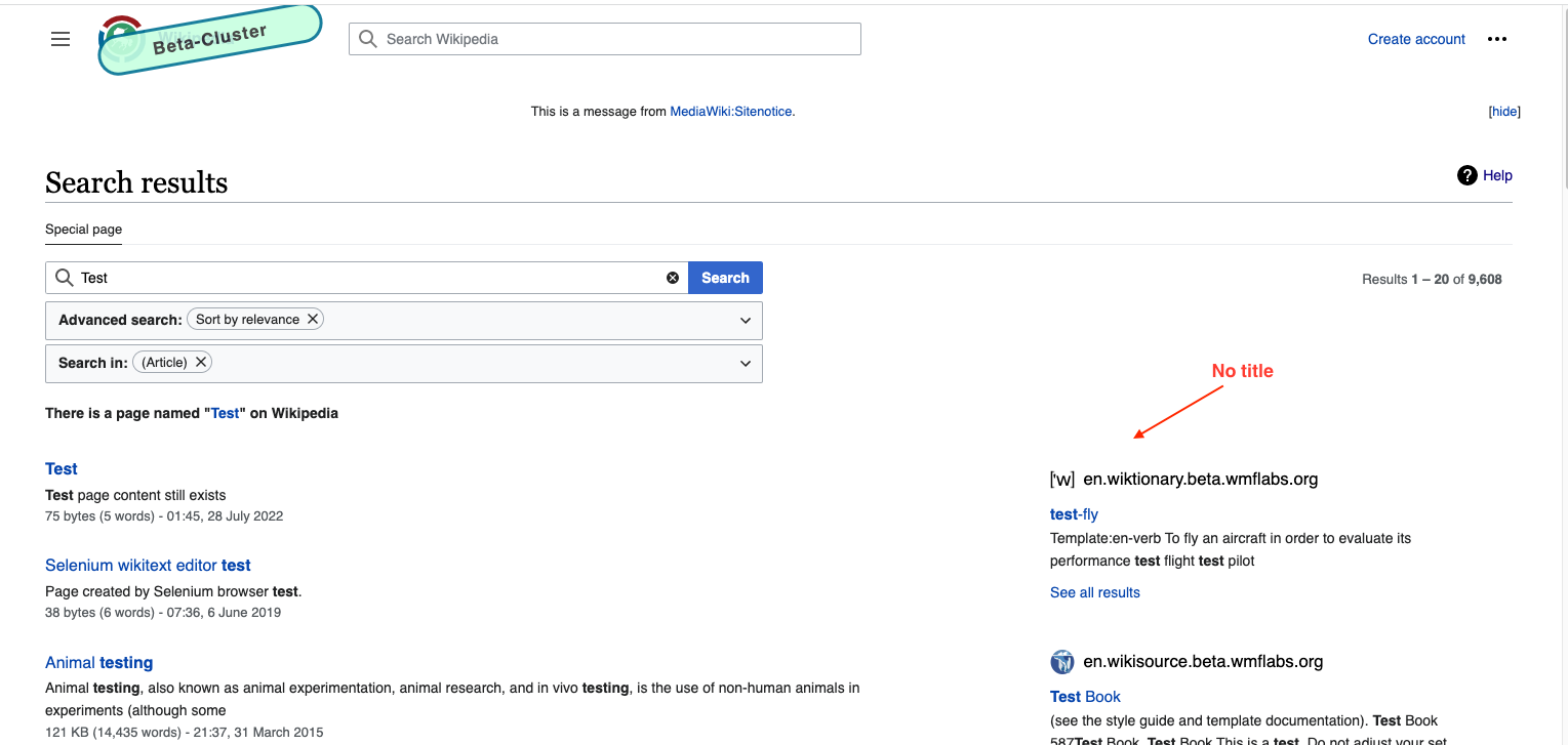
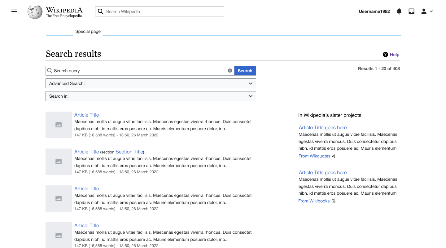
Proposed Design
Link to Desktop specs

New search page.png (800×1 px, 117 KB)

Search page grid.png (1×2 px, 396 KB)

Link to Mobile specs

Special_Search.png (800×360 px, 58 KB)

Mobile grid.png (1×698 px, 218 KB)

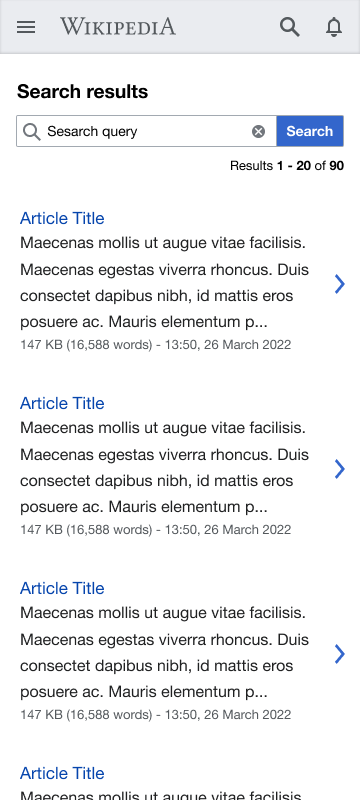
Notes on updated design
Refer to the link to Figma above for detailed specs
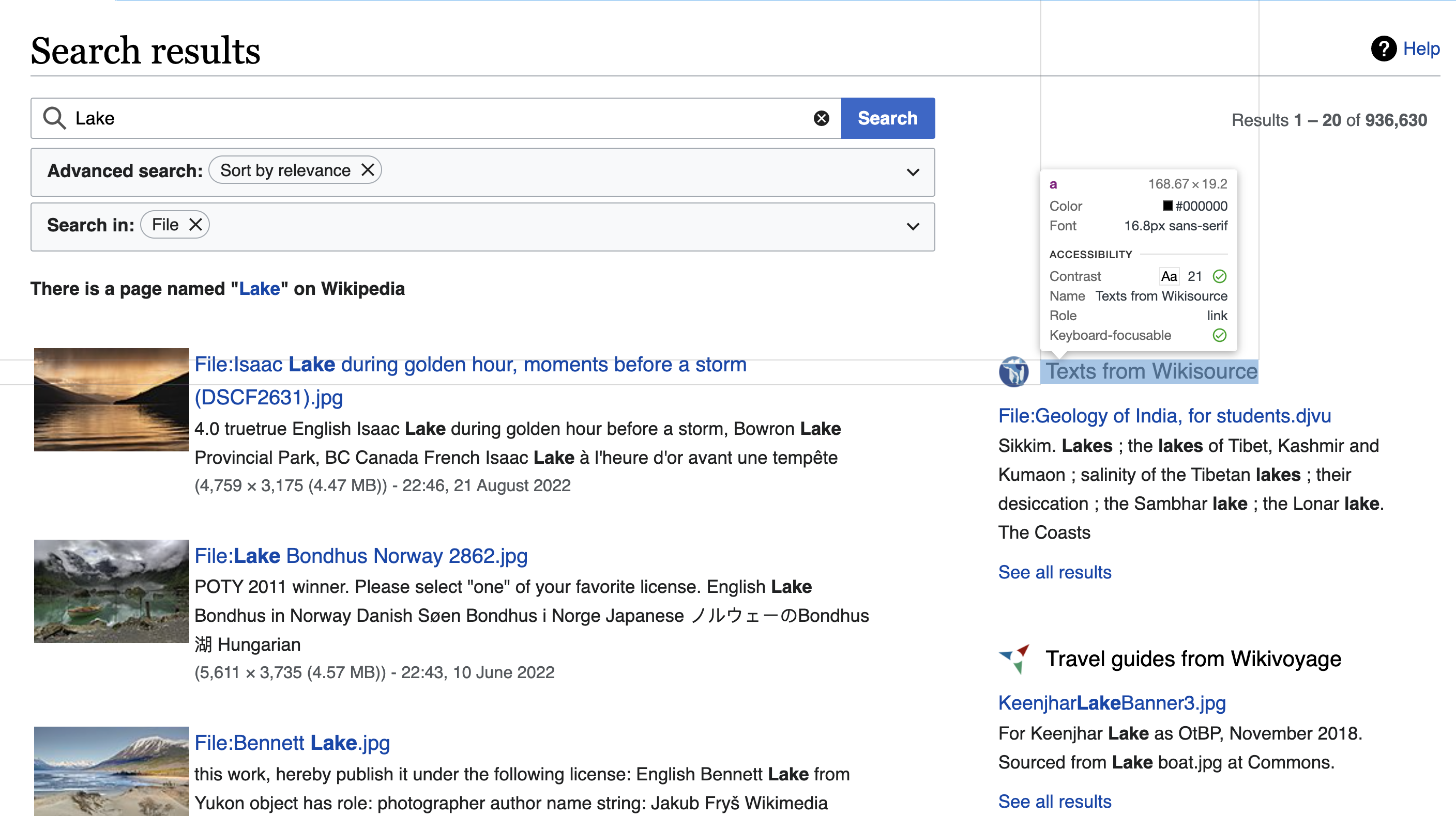
[x ] Improved spacing between all the elements on the page.

  • The font sizes within the results are adjusted to give more hierarchy to the information: Article title > Snippet > Metadata
  • The metadata colour has been changed from green to grey so as to give bring focus more to the content.
  • Ellipses are added at the end of snippets to indicate the omission of words from quoted material and to give user an indication that there is more to explore.

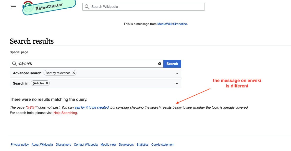
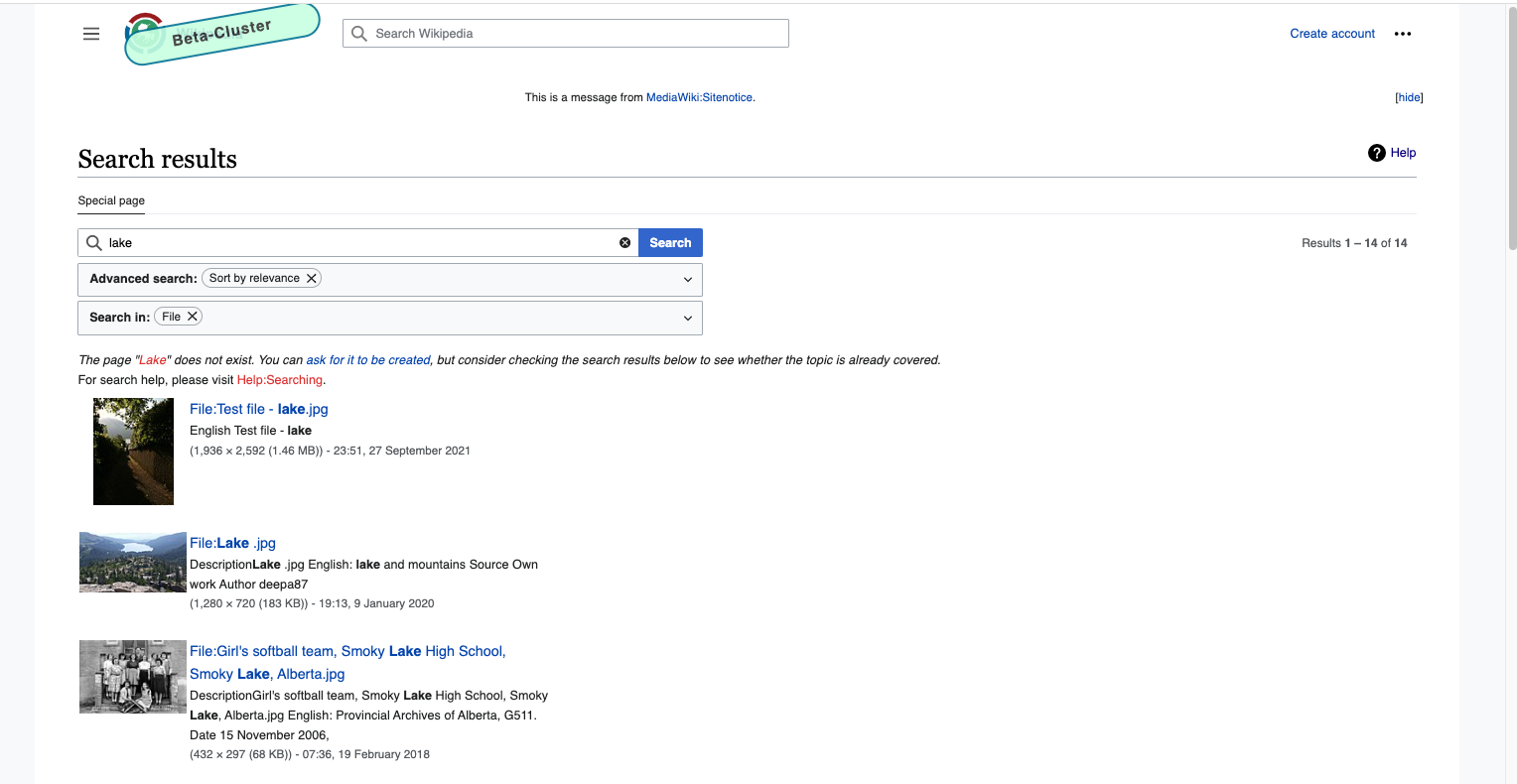
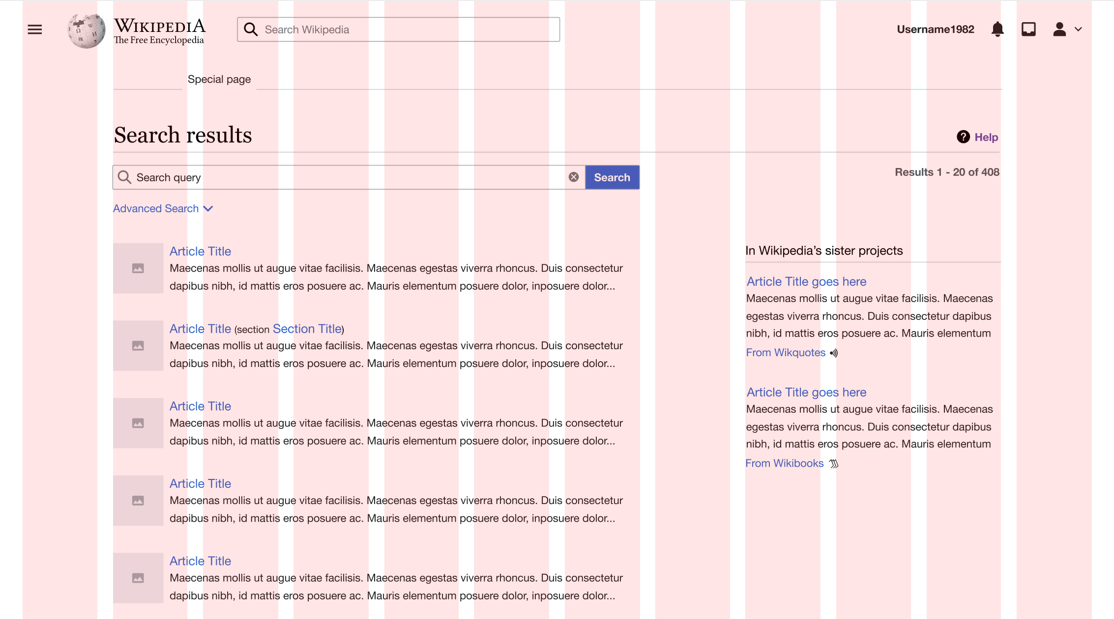
More design changes pending community reviews (Out of scope of this ticket. A new ticket will be created pending community review)

  • In this version of the design advanced search is collapsed by default to bring more focus on the content.
  • Also the metadata has been removed from the main search results and will be available in quick view.

Below is the screen indicating these changes. Both of these updates can further simplify the amount of information on the page and make scanning more efficient.

  • Desktop only: The new layout follows 12 column layout which leaves a fix amount of margin on both sides bringing content more to the centre of the screen and reducing the horizontal width of the page for better reading experience. A more detailed implementation of this will be covered in T312269
  • Desktop only: Realignment of content to make room for thumbnails. Adding thumbnails is out of scope of this ticket but covered in this ticket.

Search page phase 2.png (800×1 px, 114 KB)

Event Timeline

CBogen renamed this task from Update of "Search Results" css on Special:Search to [S] Update of "Search Results" css on Special:Search.May 4 2022, 4:37 PM

Noting that development can begin, but nothing should be merged until we've had the chance to get feedback from the communities (in progress).

Change 790351 had a related patch set uploaded (by Seddon; author: Seddon):

[mediawiki/core@master] WIP Search result left margin tweak.

https://gerrit.wikimedia.org/r/790351

Sneha renamed this task from [S] Update of "Search Results" css on Special:Search to [S] Improve the results layout on special:search page.May 11 2022, 7:21 PM
Sneha updated the task description. (Show Details)
Seddon updated the task description. (Show Details)

Change 790351 merged by jenkins-bot:

[mediawiki/core@master] Search improvements CSS tweaks.

https://gerrit.wikimedia.org/r/790351

Test wiki on Patch demo by Seddon using patch(es) linked to this task was deleted:

https://patchdemo.wmflabs.org/wikis/06aee8df2e/w/

Test wiki on Patch demo by Seddon using patch(es) linked to this task was deleted:

https://patchdemo.wmflabs.org/wikis/dff9e37e9e/w/

Etonkovidova subscribed.

@Sneha - moving for your review. There are some other discrepancies with the mockup (not mentioned in the notes below) re bolded text, i.e. on Special:Search in betalabs the bolded text is not present for the Advance search, Search in , and for the numbers of results in Results. Is it ok to have betalabs not to be consistent with the mockup for the bolded text?

Checked on enwiki betalabs and compared with the current production - enwiki wmf.23.
Desktop

enwiki betalabsenwiki wmf.23
- default search
Screen Shot 2022-08-10 at 6.37.48 PM.png (838×3 px, 157 KB)
- default search
Screen Shot 2022-08-10 at 6.37.39 PM.png (652×3 px, 204 KB)
- no search result The message is different on enwiki wmf.23 - should we match production wiki?
Screen Shot 2022-08-10 at 6.25.20 PM.png (616×1 px, 94 KB)
- no search result
Screen Shot 2022-08-10 at 6.25.53 PM.png (978×1 px, 244 KB)
- search results from article namespace (1) No title for sister projects (2) the space between the message "There is a page named ..." and the first article title needs some adjustment?
Screen Shot 2022-08-10 at 6.51.24 PM.png (727×1 px, 149 KB)
- search results from article namespace
Screen Shot 2022-08-10 at 6.50.51 PM.png (716×1 px, 223 KB)
- search results from file namespace
Screen Shot 2022-08-10 at 7.06.15 PM.png (790×1 px, 191 KB)
- search results from file namespace
Screen Shot 2022-08-10 at 7.06.02 PM.png (781×1 px, 342 KB)

Additionally checked

  • Safari 15
  • Accessibility for Special:Search on enwiki betalabs- !00% (the same as on enwiki wmf.23)
  • mobile - no additional issues were found (will do more testing)

@Etonkovidova my responses to the images you shared in your comment:

Default search:

  • Not sure what discrepancy is present

no search result The message is different on enwiki wmf.23 - should we match production wiki:

  • Messages could be different on different wikis as communities can change them so don't have to match mocks

search results from article namespace:
(1) No title for sister projects

  • There is no title in the new mocks and this will be covered in sister project ticket so this can be ignored

(2) the space between the message "There is a page named ..." and the first article title needs some adjustment?

  • This can be covered in tickets about improving message styling so does not belong here.

search results from file namespace:

  • The width of the text is so different not sure what's going on so we can keep this.

My main feedback for this ticket is the width of the text, columns width and its position on the page does not match the designs. I already had a chat about this with Seddon and so going to wait to review that once that is fixed.

Note for QA: some AC were not complete and those have been moved to T315322. As long as the rest passes QA, this can be closed.

Checked on enwiki wmf.25 - looks according to the specs. I re-checked the test cases in https://phabricator.wikimedia.org/T307463#8144292 and @Sneha's feedback in https://phabricator.wikimedia.org/T307463#8148118 - no additional issues have been found. The screenshots below are for the illustration only:

(1) The exact article match is found:

Screen Shot 2022-08-24 at 5.22.40 PM.png (1×3 px, 845 KB)

(2) The search term is in RTL lang on enwiki - no exact match is found:

Screen Shot 2022-08-24 at 5.10.37 PM.png (1×2 px, 611 KB)

(3) Search in File namespace:

Screen Shot 2022-08-24 at 5.14.27 PM.png (1×2 px, 859 KB)