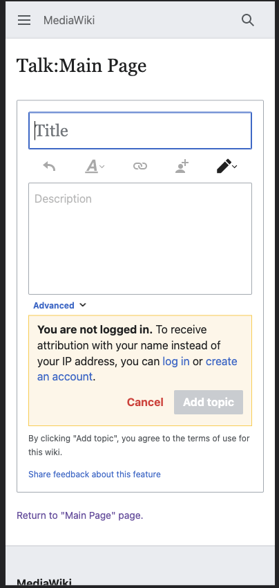
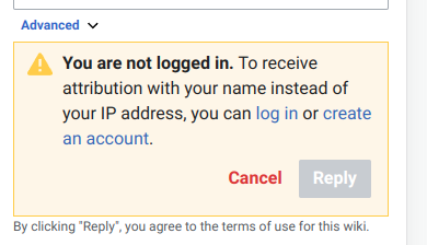
Problem: the icon looks a bit out of place in the warning message
Solution: hide icon in mobile view
| • iamjessklein | |
| May 5 2022, 3:42 PM |
| F35215983: Screenshot 2022-06-07 at 19.09.18.png | |
| Jun 7 2022, 11:21 PM |
| F35203858: image.png | |
| Jun 3 2022, 3:28 PM |
| F35105004: Screen Shot 2022-05-05 at 11.38.43 AM.png | |
| May 5 2022, 3:42 PM |
Problem: the icon looks a bit out of place in the warning message
Solution: hide icon in mobile view
| Subject | Repo | Branch | Lines +/- | |
|---|---|---|---|---|
| Hide icon in anon warning below tablet width | mediawiki/extensions/DiscussionTools | master | +14 -0 |
| Status | Subtype | Assigned | Task | ||
|---|---|---|---|---|---|
| Resolved | None | T278588 Mobile talk page improvements | |||
| Resolved | None | T298055 [RELEASE TICKET] Offer Mobile Usability Improvements and Topic Subscriptions at Partner Wikis | |||
| Resolved | Esanders | T295101 Conduct Design Review of Mobile DiscussionTools | |||
| Resolved | • iamjessklein | T307709 Remove icon from warning message in mobile view |
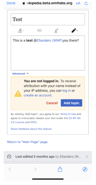
Jess and I also discussed just returning the icon to it's regular size in the top left:
Change 802791 had a related patch set uploaded (by Esanders; author: Esanders):
[mediawiki/extensions/DiscussionTools@master] Hide icon in anon warning below tablet width
Change 802791 merged by jenkins-bot:
[mediawiki/extensions/DiscussionTools@master] Hide icon in anon warning below tablet width