Page MenuHomePhabricator

[Menu] Make menus look adjacent to inputs (Needs discussion)
Open, LowPublic

Description

Background

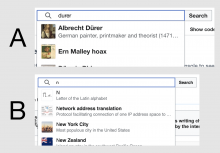
Right now, we have instances in production where the top border of dropdown menus either "covers" (See A) or "is covered" (See B) by the bottom border of the input that triggers them. This makes the menu and its input look separate or connected, respectively.

Screenshot 2022-04-13 at 13.07.10.png (1×1 px, 317 KB)

Goal

We'd like to establish the latter (Option B) as a stylistic pattern, and remove the Menu border that "touches" its trigger. As a consequence, menus will look adjacent to their triggers (instead of overlapped). This will also make sure that the input's border will display an even 2px border when active.

Considerations

  • The changes applied to the menu should be visible in the Select, Lookup, TahS and Combobox components in Codex.
  • WVUI does margin-top: 0; border-top-width: 0;, which could work pretty well for us.

AC:

  • Menus shouldn't overlap with the border of the elements that trigger them
Event Timeline

This task is to match the Readers Web implementation; the style in Codex does not match the one that is in production. This task is to match the input/menu relationship that is in production but is not a launch-blocking requirement for TypeaheadSearch on article pages.

Issues with non-adjacent (Option A):

  • Only makes sense when done across menu triggering components
    • Unlogical from z-index visual metaphor if
    • Means a lot of extra technical effort to get right (extra code, possible z-index issues, possible mouseout situation where menu would disappear on 1px gap)
    • Needs to be retrofitted on all focus outline providing components also the ones in place in OOUI (DropdownWidget, ComboboxWidget, LookupWidget)
      • To be applied consistently we also need to take into account dropdowns opening up to the top. TypeaheadSearch is the exception here, not the rule. When Dropdown is in viewport at bottom, we calculate and show dropdown on top for better usability

New solution will need to take this into account as well, hiding top border is then looking like a mistake:

image.png (492×1 px, 23 KB)

Sarai-WMDE renamed this task from [Menu] Make menus look adjacent to inputs to [Menu] Make menus look adjacent to inputs (Needs discussion).Jun 29 2022, 1:55 PM
Sarai-WMDE updated the task description. (Show Details)

This change in the design approach/implementation of menus (that matches the WVUI implementation of TypeaheadSearch) is also supported by @alexhollender_WMF (see source). Nevertheless, we agreed that the potential change shouldn't be a blocker for release. Pinging @DAbad for visibility.

@Sarai-WMDE do we still intend to consider option B? Or can we decline this task?