Page MenuHomePhabricator

Track and display maps challenge progress
Closed, ResolvedPublic5 Estimated Story Points

Assigned To
Authored By
ECohen_WMDE
May 20 2022, 11:00 AM
Referenced Files
F35189902: image.png
May 30 2022, 11:59 AM
F35189904: image.png
May 30 2022, 11:59 AM
F35189985: image.png
May 30 2022, 11:59 AM
F35189911: image.png
May 30 2022, 11:59 AM
F35189701: Screenshot from 2022-05-30 12-24-18.png
May 30 2022, 10:27 AM
F35176001: Screenshot from 2022-05-25 14-48-35.png
May 25 2022, 12:49 PM
F35176000: Screenshot from 2022-05-25 14-48-16.png
May 25 2022, 12:49 PM
F35175733: Screenshot from 2022-05-25 13-30-02.png
May 25 2022, 11:33 AM
Tokens
"Party Time" token, awarded by JStrodt_WMDE.

Description

Part 1

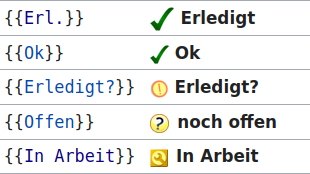
Create a template for tracking, based on existing de.wiki template {{Wertung}}

  • Name the template {{Fortschritt}} with three states: offen, in Arbeit, fertig so that the template works when used as {{Fortschritt|offen}}
  • Each state simply displays an svg, 15x15px
  • Each svg should have alt text. fertig alt = grüner Kreis mit Häkchen, in Arbeit alt = gelber Kreis mit drei Punkten, offen = roter Kreis

Svgs: Red_circle_without_icon.svg, Yellow_circle_with_progress_dots.svg, Green_circle_with_checkmark.svg

Part 2

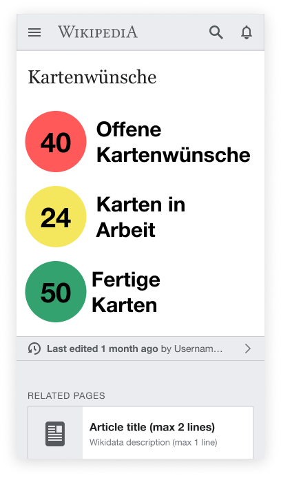
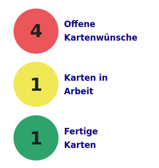
Count templates on article list page and display both at top the page and on the start page (see in progress project page for locations)

  • Count number of templates per status on article list page (excluding those in the example) and display template count for each status in the respective circle --> We moved the example code to a separate page.
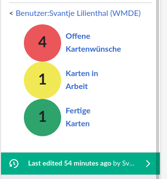
  • Ideally the same display can be put on both the start and article list pages. If this is not possible with the final solution, then please note that in the ticket. --> https://de.wikipedia.org/wiki/Benutzerin:Johanna_Strodt_(WMDE)/Kartensaison
  • The circular text background should change size with the text if user zooms in and out of the page

Mock and specs

Counters.png (89×878 px, 13 KB)
Counters-specs.png (89×878 px, 14 KB)

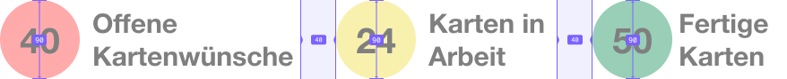
All text should be bold and use system default sans-serif
Numbers should be centered in the middle of the circles both vertically and horizontally
Numbers = 2.5 em
Text = 2 em
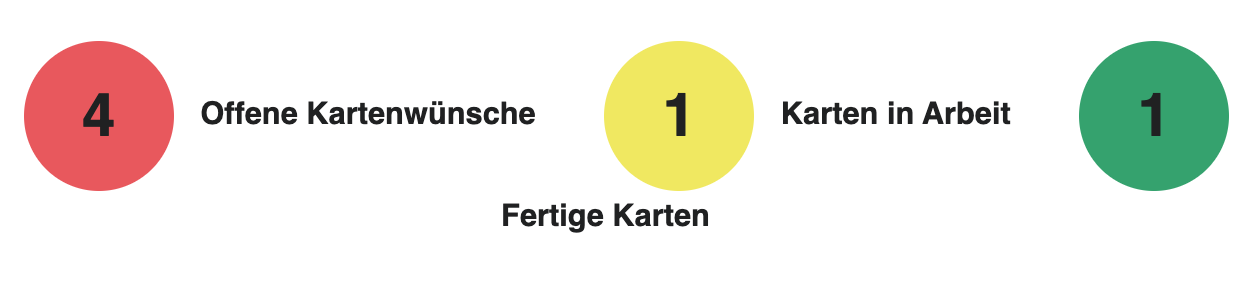
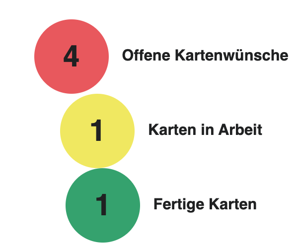
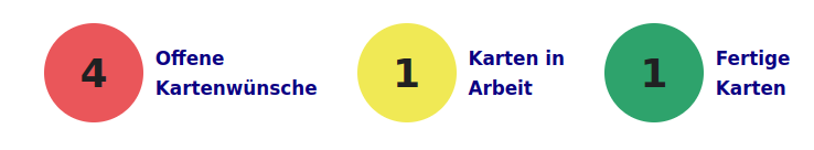
Colors = offen #E8585D, in Arbeit #F0E660, fertig #34A26E

For review

Part 1:

Part 2:

Event Timeline

Looks like status is already taken as a name for a template: https://de.wikipedia.org/wiki/Vorlage:Status

Any suggestions for a different naming @JStrodt_WMDE ?

Maybe "Status Karte" similar to https://de.wikipedia.org/wiki/Vorlage:Status_Sportler?

"Status Karte" makes the template less re-usable for other projects though. Would "Vorlage:Zustand" fit? Or is it weird german?

Good point, @ECohen_WMDE
Zustand is maybe a little bit weird. How about Fortschritt?

@ECohen_WMDE Could you upload the images so we do not get into licence/ownership troubles? :)

lilients_WMDE updated the task description. (Show Details)

Part 1 looks great, @lilients_WMDE!
Is it possible to always add a blank space behind the circle? Right now, if you place the template on the page directly before the text, it looks very crammed.
https://de.wikipedia.org/wiki/Benutzerin:Johanna_Strodt_(WMDE)/Kartensaison/Kartenwünsche#Die_Wunschliste

Is it possible to always add a blank space behind the circle? Right now, if you place the template on the page directly before the text, it looks very crammed. https://de.wikipedia.org/wiki/Benutzerin:Johanna_Strodt_(WMDE)/Kartensaison/Kartenwünsche#Die_Wunschliste

I am not sure how we want this template to be used. We could for example also want users to add only the icon at the end of a sentences. In that case the blank space after the icon might look strange.

We could also think about making it possible to add the name of the wikipage as an (optional) parameter and then automatically add a blank space. Something like this: {{Fortschritt|offen|Artikel}} (Kommentar) ~~~~. Not sure that is necessary though.

The simplest solution would be to add the blank space to the "Kopiervorlage" just the way it is now:

  • {{Fortschritt|offen}} [[Artikel]] (Kommentar) ~~~~

The simplest solution would be to add the blank space to the "Kopiervorlage" just the way it is now:

OK, got it. That seems to be the most sensible approach, IMHO.

As far as I am concerned, you can go ahead and migrate the template from your user page to the real Vorlage: namespace.

lilients_WMDE set the point value for this task to 5.

As far as I am concerned, you can go ahead and migrate the template from your user page to the real Vorlage: namespace.

https://de.wikipedia.org/wiki/Vorlage:Fortschritt

  • Count number of templates per status ...

https://de.wikipedia.org/wiki/Benutzer:Svantje_Lilienthal_(WMDE)/Test

  • Count number of templates ... (excluding those in the example) ...

To prevent the examples from being counted, I would put them (or the actual list) in a separate page. Is that ok @JStrodt_WMDE?

Thanks for making this work on the Kartensaison start page as well! <3

I noticed that the alignment is a bit off at times:

Bildschirmfoto 2022-05-25 um 11.54.29.png (302×1 px, 38 KB)

Bildschirmfoto 2022-05-25 um 11.55.36.png (508×604 px, 38 KB)

Can this be fixed? Pinging @ECohen_WMDE in case their input is needed.

Also, one of the community members who tested the page told me they always want to click on the circles and are always confused that that doesn't work. Is there a simple way to link the circles on the start page to the page /Kartenwünsche?

Bildschirmfoto 2022-05-25 um 11.54.29.png (302×1 px, 38 KB)

Ideally there could be a nonbreaking space between the number circle and the label, so when they stack on smaller screens the two move together as a unit. That would help avoid this problem.

Another critical difference from my mocks and the current display is that the text is on two lines so that it takes up less width. Is this possible to give the text less space, forcing it to wrap?

Lastly, it was definitely an oversight not to show a mobile version. Can they all stack with 20px padding between and all left aligned?

Article.png (694×408 px, 78 KB)

If these suggestions don't work, let me know what the constraints are and I can help adjust the design so that it works responsively.

Thanks for making this work on the Kartensaison start page as well! <3

You are welcome! ❤

I noticed that the alignment is a bit off at times.

T308843#7956029

Good catches! As this is also connected to T308848, maybe @WMDE-Fisch we can look into that together?

Also, one of the community members who tested the page told me they always want to click on the circles and are always confused that that doesn't work. Is there a simple way to link the circles on the start page to the page /Kartenwünsche?

Sure you can simply add a surrounding link. Is that sufficient?

It does change the styling though. It is now styled as a link. Maybe that is ok, because it actually is a link, @ECohen_WMDE? 🤔

Screenshot from 2022-05-25 13-19-18.png (133×1 px, 14 KB)

Sure you can simply add a surrounding link. Is that sufficient?

That looks much better than expected! But I'd also love to hear @ECohen_WMDE's thoughts on that.

I created a subpage that includes an updated version of the circles with the line brakes and I added a link to the description each.

Screenshot from 2022-05-25 14-48-16.png (136×738 px, 15 KB)

Screenshot from 2022-05-25 14-48-35.png (335×318 px, 17 KB)

I created a subpage that includes an updated version of the circles with the line brakes and I added a link to the description each.

Looking good! And yes if they are a link, they should look like links - so that's fine. Do they all link to the same place?

Looking good! And yes if they are a link, they should look like links - so that's fine. Do they all link to the same place?

Nice! Currently, the link at the same place, but we can easily change that, when we have sections for each status later.

Due to user feedback, I moved the new template Fortschritt back to my user name space. We should look for a better place though. Alternatively we could also use these existing templates: Vorlage:Diskussionsbausteine (as suggested by the user).

Screenshot from 2022-05-30 12-24-18.png (174×310 px, 21 KB)

@JStrodt_WMDE & @ECohen_WMDE, what would you prefer?

Tech review:

  • Thanks for including an inline example for each template!
  • The circle template needs some CSS tweaks to be immune to font size and zoom,

at 67% zoom:

image.png (86×200 px, 3 KB)

at 133% zoom:
image.png (94×244 px, 5 KB)

  • Circle should include a default color e.g. gray, to help debug when the user hasn't provided the correct farbe parameter, for example. Default and fallback parameter values usually look like this: {{{farbe|{{{color|#666666}}}}}}
  • Fortschritt circles should probably scale as the page zooms. As an extreme example, I zoom in to 300% to see if the yellow circle has something in it or if my monitor is dirty, and:

image.png (46×158 px, 2 KB)

perhaps this can be sized using an "em" dimension?

  • The search is too strict. For example, search=Fortschritt{{!}}offen will fail against {{Fortschritt | offen. According to these docs, zero or more whitespaces should be matched by %s*.
  • The "ampel" is nicely responsive, but needs a bit of vertical padding:

image.png (360×336 px, 23 KB)

Thanks @awight for the review! 🕶 I adjusted the pages accordingly. ✅

JStrodt_WMDE moved this task from Tech Review to Demo on the WMDE-TechWish-Sprint-2022-05-11 board.

The decision was made to use the existing community icons as tested on https://de.wikipedia.org/wiki/Benutzerin:Johanna_Strodt_(WMDE)/Kartensaison/Kartenwünsche#Test_mit_Diskussionsbausteinen

Assigning the task to @lilients_WMDE to update the counter accordingly.

Closing the ticket since we went live now. If there are new issues we should create a new ticket.