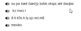
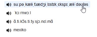
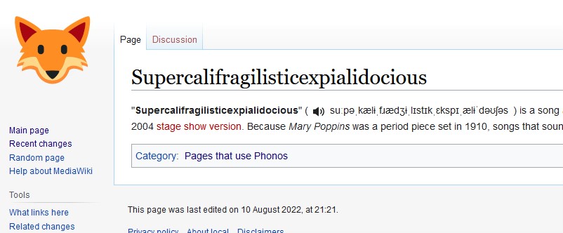
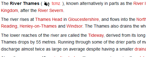
User Story
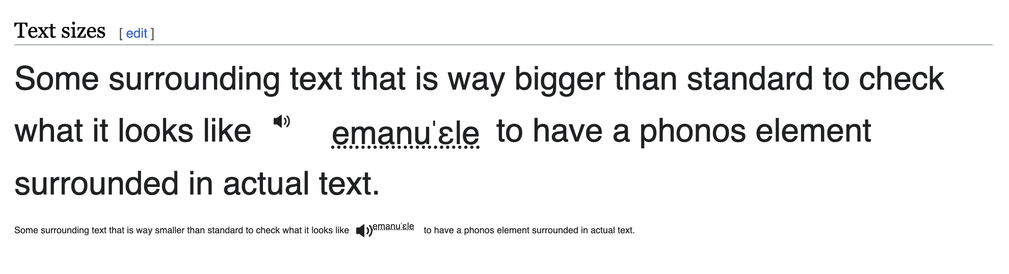
As a reader, I can see a speaker icon next to the IPA markup, that allows me to hear the pronunciation.
Considerations
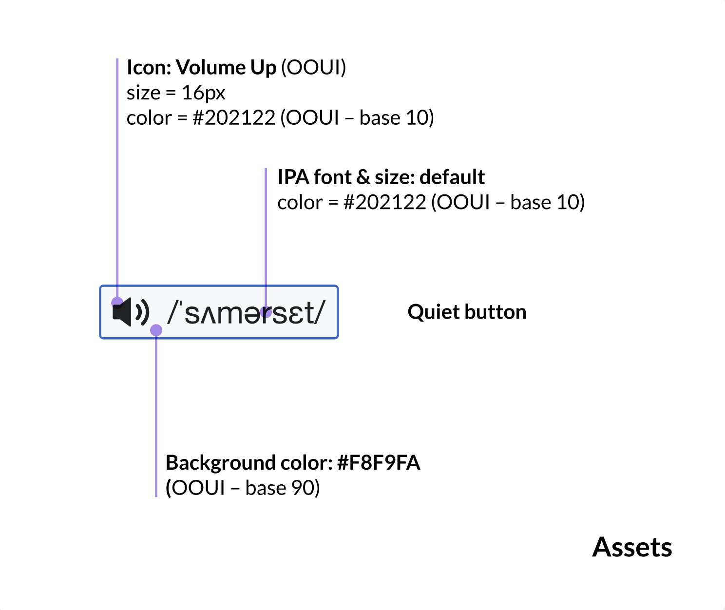
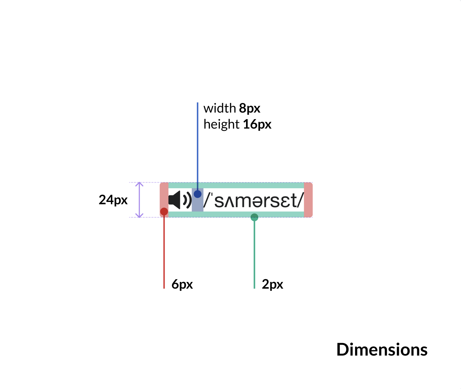
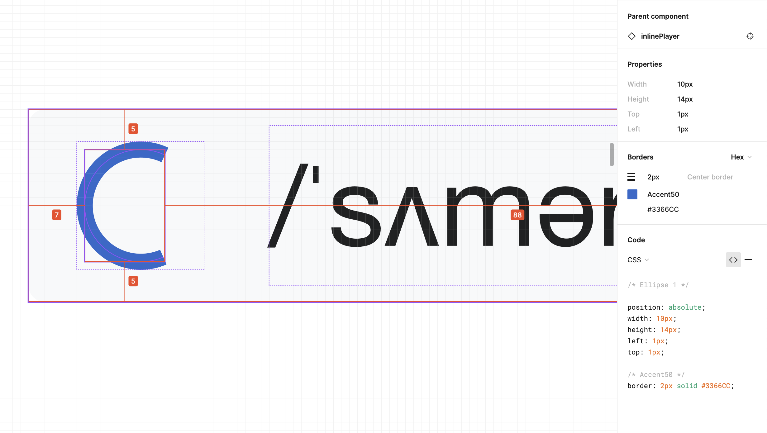
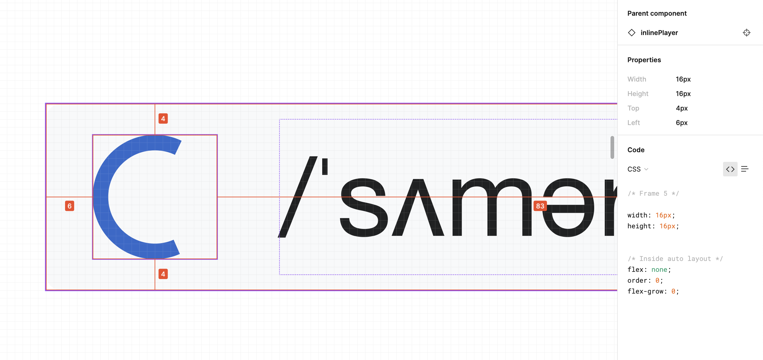
Component Specification
| Assets | Dimensions |
 |  |
Primary States
| State | UI | Description | Status |
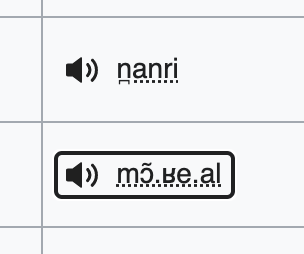
| Default | 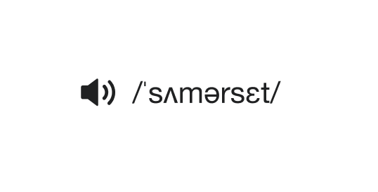 | See specs above. Quiet button-style with a smaller 16px icon to a better fit next to text on the page | |
| Hover |  | Light background on hover (#F8F9F, base90) – similar to “quiet button” OOUI | |
| Active | 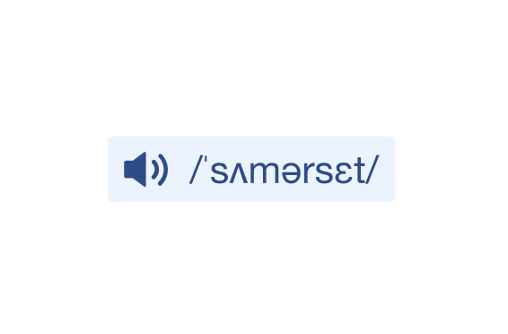 | Quiet button becomes blue: background (#EAF3FF, Accent90) icon+label (#2A4B8D, Accent30) | |
Secondary States
| State | UI | Description | Status |
| Loading | 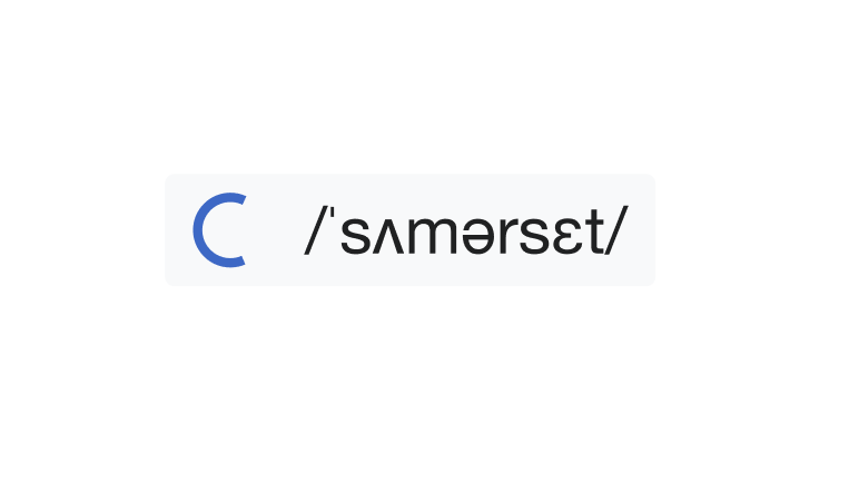 | After 2sec of waiting, circular progress indicator (#3366CC, Accent50) replaces the volume icon to indicate loading | |
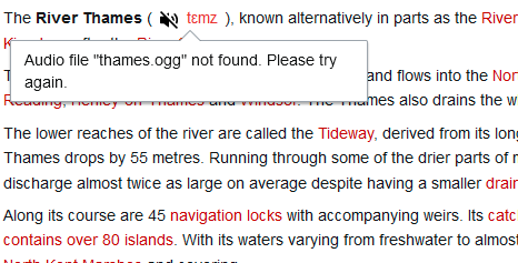
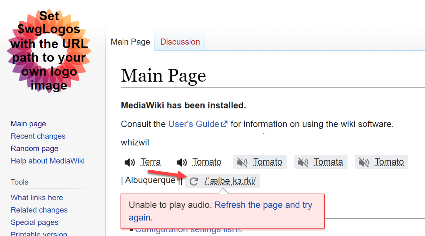
| Error | 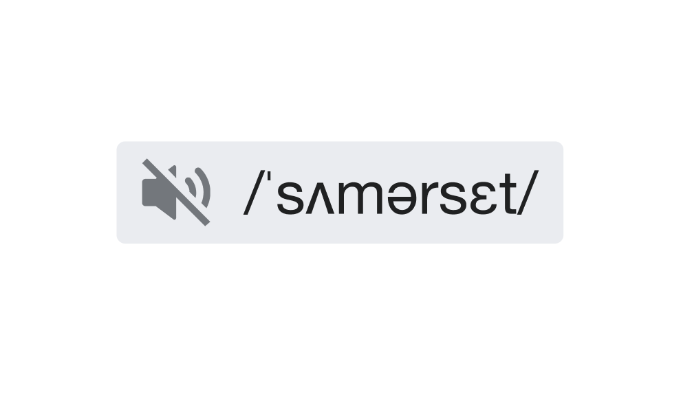 | OOUI VolumeOff icon (#72777D, Base30) on darker background (#EAECF0, Base80) | |
| Error click | 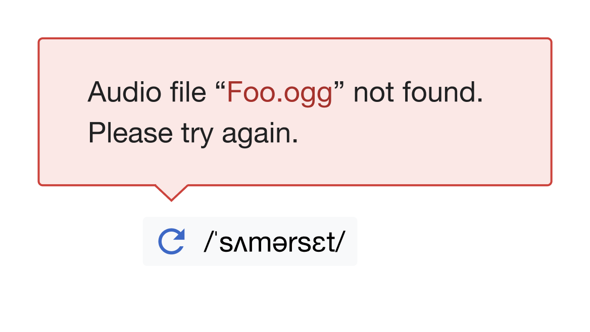 | On click, a popup describes the error and the button becomes Error Reload (see below) | |
| Error Reload | 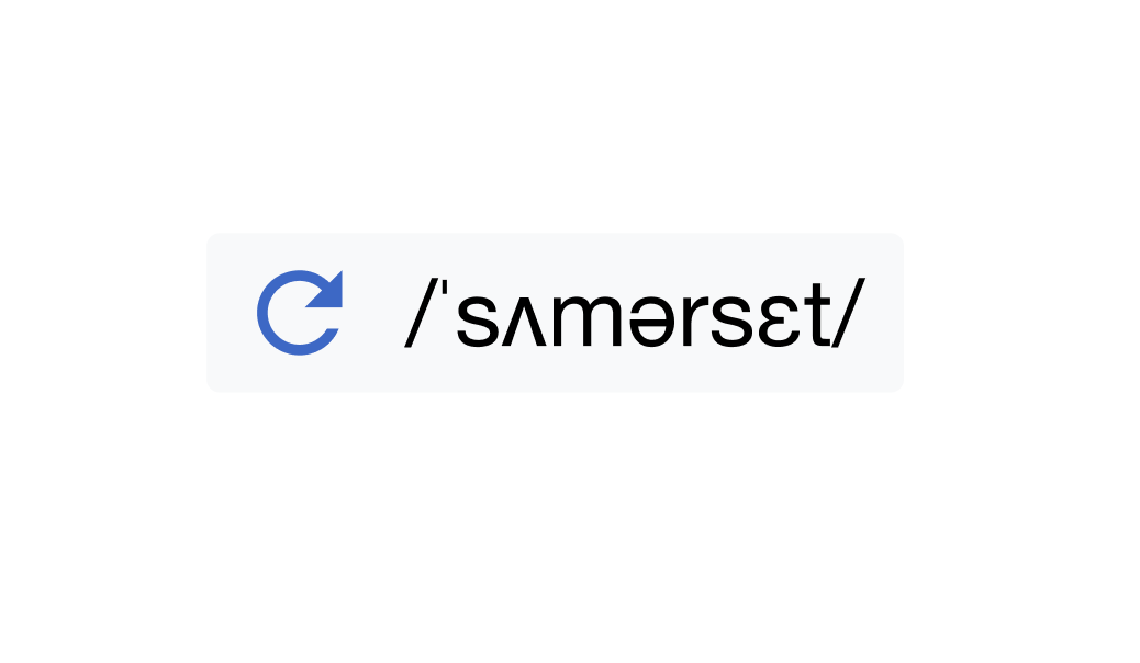 | OOUI Reload icon (#3366CC, Accent50) replaces VolumeOff icon on lighter background (#F8F9F, base90) | |
Resources
Figma Prototype - Slow Connection
Figma Prototype - Multiple IPA notations
Acceptance Criteria
- The icon should be identifiable to a screen reader as an audio player for accessibility (potentially using semantic HTML or using alt text, see https://developer.mozilla.org/en-US/docs/Learn/Accessibility/Multimedia)

