Page MenuHomePhabricator

New message alert appears in a new line instead of the same line as user menu
Closed, DeclinedPublicBUG REPORT

Authored By
sgrabarczuk
Jun 10 2022, 11:13 AM
Referenced Files
F35316197: image.png
Jul 13 2022, 3:30 PM
F35316195: image.png
Jul 13 2022, 3:30 PM
F35244269: Screen Shot 2022-06-15 at 9.20.30 AM.png
Jun 15 2022, 4:20 PM
F35244256: Screen Shot 2022-06-15 at 9.18.14 AM.png
Jun 15 2022, 4:20 PM
F35244231: Screen Shot 2022-06-15 at 9.14.40 AM.png
Jun 15 2022, 4:20 PM
F35244225: Screen Shot 2022-06-15 at 9.14.18 AM.png
Jun 15 2022, 4:20 PM
F35224517: obraz.png
Jun 10 2022, 11:13 AM
F35224497: obraz.png
Jun 10 2022, 11:13 AM

Description

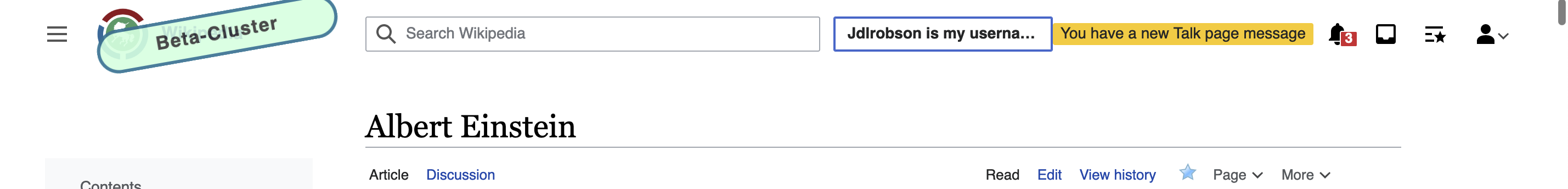
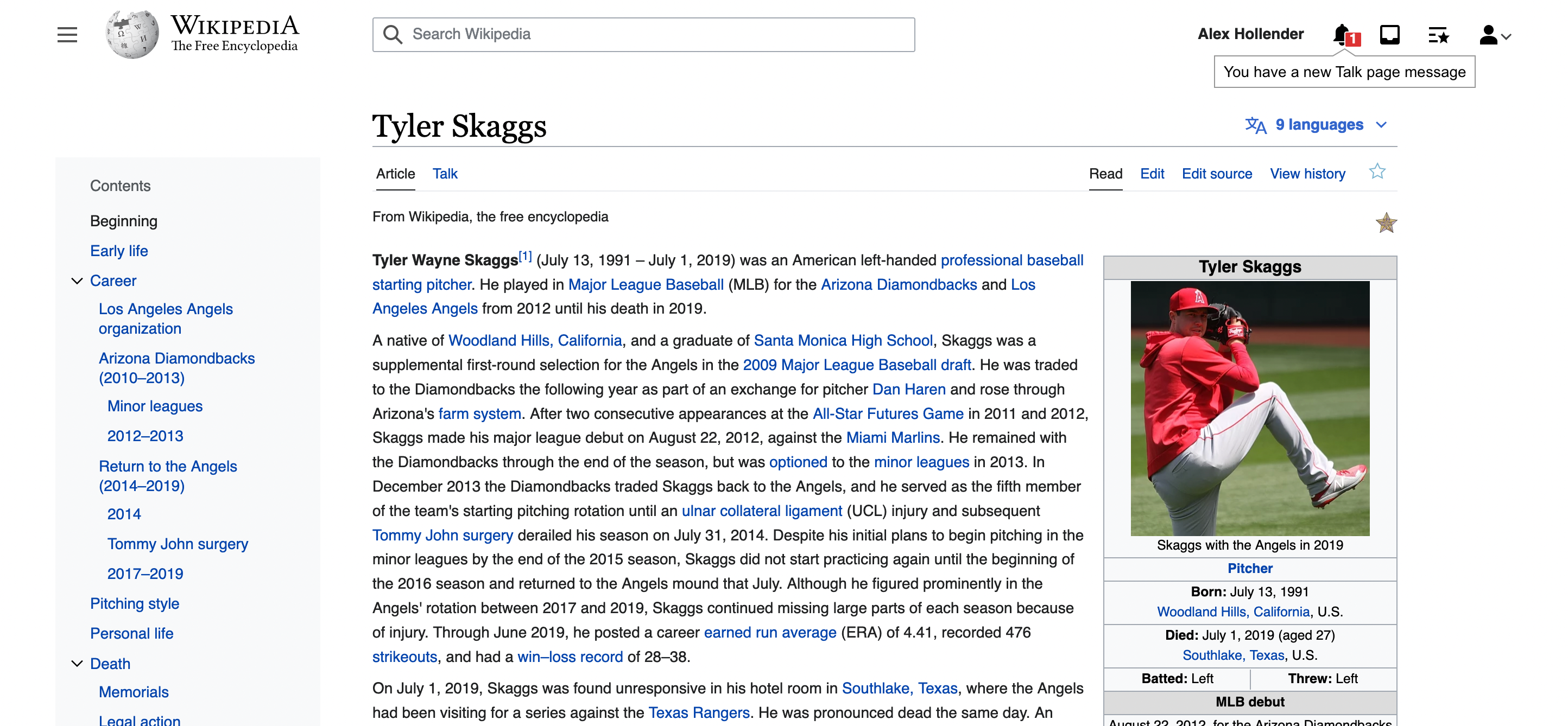
List of steps to reproduce (step by step, including full links if applicable):

  • Log into two accounts
  • Using account X, go to any page but its talk page
  • Using account Y, make an edit to account X's talk page
  • Using account X, refresh the page

What happens?:
The alert with yellow background is displayed in a new line

What should have happened instead?:
The alert with yellow background should be displayed in the same line as user menu

Software version (if not a Wikimedia wiki), browser information, screenshots, other information, etc.:

obraz.png (126×2 px, 24 KB)

obraz.png (106×2 px, 25 KB)

Event Timeline

I think that's intended and based on the design of T284243

That task was about lower resolutions, and here I've shared shots of my 2560px-wide screen. So I presume it's not intended.

I believe this was an intentional side effect of T301583 (possibly related to a lack of consideration for the watchlist icon in T289619). If there are more than 3 buttons in the toolbar (excluding user menu) it drops to a new line. In this case we have username, echo x 2 and watchlist icon. We could change the threshold for when the collapsing kicks in to 4 and/or disable the new line behaviour on "wide desktop" screens.

The possible trade off with changing the collapsing threshold is with long usernames, this will reduce the size of search

Screen Shot 2022-06-15 at 9.14.18 AM.png (344×2 px, 109 KB)

Screen Shot 2022-06-15 at 9.14.40 AM.png (194×2 px, 77 KB)

We also need to be aware that on some wikis the language button is also present.

Screen Shot 2022-06-15 at 9.18.14 AM.png (178×2 px, 72 KB)

... and sometimes the clock gadget.

Screen Shot 2022-06-15 at 9.20.30 AM.png (164×2 px, 72 KB)

Here be dragons

@alexhollender_WMF says this isn't a priority right now, so dropping back to backlog for now.

@Jdlrobson what's the easiest way to handle this from an engineering perspective? I don't feel super strongly about the positioning, so if it adds a lot of complexity we can leave it below the user links.

I'm also wondering if it's worth making it a floating element, as we had once discussed, to avoid the need for the position complexity:

widenarrow
image.png (1×2 px, 1 MB)
image.png (1×1 px, 1 MB)

The status quo is probably the easiest to maintain from an engineering perspective. We don't have a component for fly out's yet, so the proposed design is probably a little tricky (see T311160 which has the same problem)

ok, closing this and opening a new task (T313735) for the floating element/fly out approach which I think is a better solution in the long run