Background
Vector employs both min-width and max-width media queries, both of which are inclusive of the pixel value. Due to this, the styles are prone to breaking on the exact pixel values of our breakpoints (i.e. https://wikimedia.slack.com/archives/G8QAPHCTT/p1654903525144409).
AC
- No visual changes on non-breakpoint viewports
- Layout and styling are consistent on breakpoint viewports
Developer notes
This can be solved by refactoring our CSS to consistently use a single type of media query, or updating our breakpoints to account for that 1px. The easiest solution would be to add new media query variables that take the 1px into account, so that the existing CSS can be fixed with search and replace.
@width-breakpoint-desktop-increment: @width-breakpoint-desktop - 1;
// Active when viewport is 1000px and over
@mediaquery-min-width-desktop: ~'min-width: @{width-breakpoint-desktop}';
// Active when viewport is 999px and under
@mediaquery-max-width-desktop: ~'max-width: @{width-breakpoint-desktop-increment}';
Then @media ( max-width: @width-breakpoint-desktop ) { } becomes @media ( @mediaquery-max-width-desktop ) { }
That said, I think it's a good idea to refactor media queries to use min-width when possible, as that's generally best suited for CSS that targets mobile by default and uses media queries to handle larger viewports. To avoid regressions and to limit the number of needed changes, clean up should ideally be done after the CSS grid is implemented and after our layout styles are simplified (T310010).
QA Steps
Vector uses breakpoints from core so the following viewport widths should be tested:
- 320px
- 720px
- 1000px
- 1200px
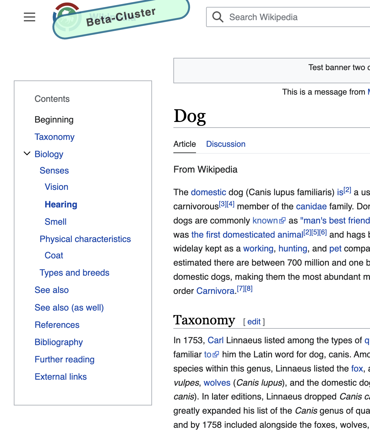
- Visit https://en.wikipedia.beta.wmflabs.org/wiki/Dog
- For each viewport width listed above, resize your browser's viewport to that exact width. Compare what you see at this viewport width with what you see when the viewport width has increased by 1 pixel and decreased by 1 pixel. You shouldn't see anything peculiar that only happens at the in-between viewport width. For example, before work was done on this ticket, the table of contents was losing its background color at exactly 1000px but this was only happening at exactly 1000px and wasn't happening at 999px or 1001px.
For exactly 720px:
- Confirm the more button doesn't show in addition to the edit/watch tabs.
For exactly 1000px:
- Confirm the sticky header displays
- Confirm the table of contents toggle that appears next to the title doesn't show on scroll