Page MenuHomePhabricator

Design and build initial Card component (MVP)
Closed, ResolvedPublic

Description

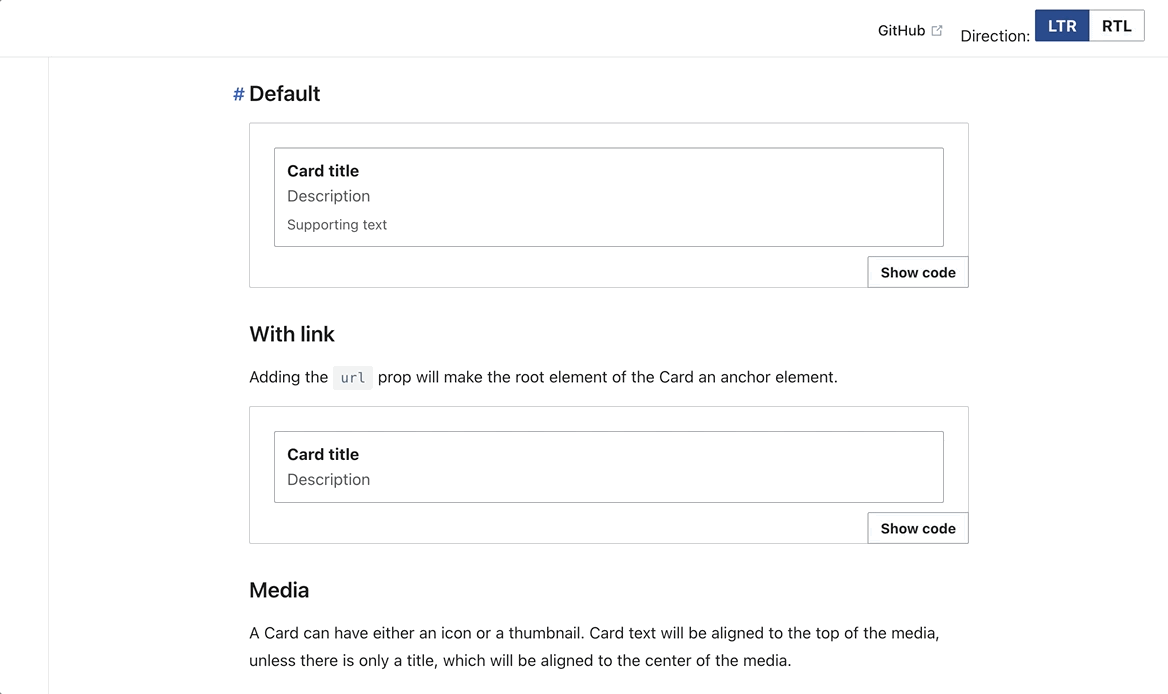
This task defines the minimum viable product (MVP) of the Card component.


Scope

The MVP of the Card component will cover the Nearby pages use case. We will follow up with more subtasks of the epic task to cover the GrowthExperiments use cases.

Design spec

Anatomy

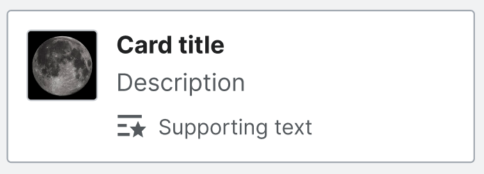
The initial component will include:

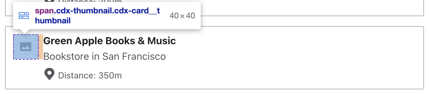
  • Media section at the start of the card. This can either be:
    • An icon
    • A thumbnail or thumbnail placeholder. The placeholder will be shown in 2 cases: 1) When there is a thumbnail image but it has not loaded yet, and 2) when the Card is meant to show a thumbnail (e.g. in a grid with other Cards that have thumbnails) but no image has been provided
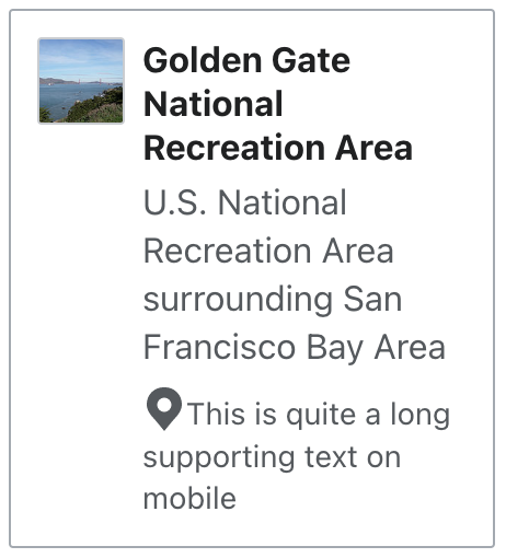
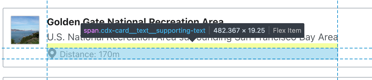
  • Card title
  • Description
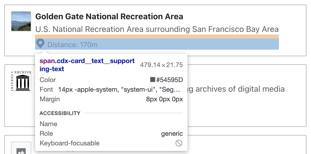
  • Supporting text (a slot, so a variety of content – e.g. links – can be supported)

Style

The initial component will present the following visual features:

  • Outlined: The card will present a gray outline
  • Landscape orientation: The card will present a horizontal layout

image.png (250×696 px, 33 KB)

Sizing

By default, Card's width and height is defined by its content + padding.

Any extra spacing needed to make the card adjust its width in context will be added as white space at the end.
Card users might need to apply a min-height to Cards to make the layout look harmonious. We decided to not make this part of the default configuration of the component for now.
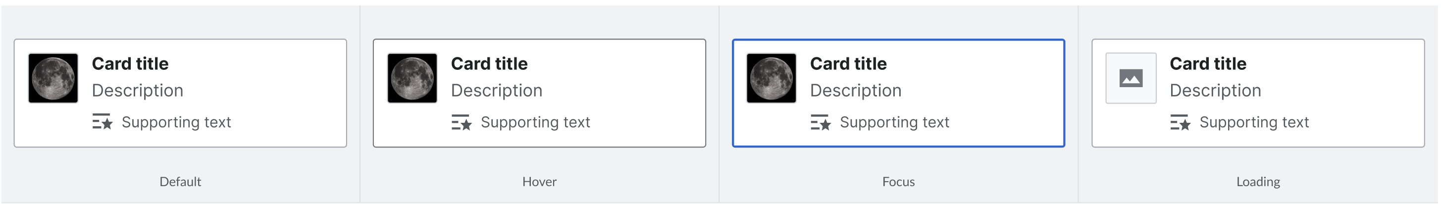
Interaction

The initial component will follow these interaction specifications:

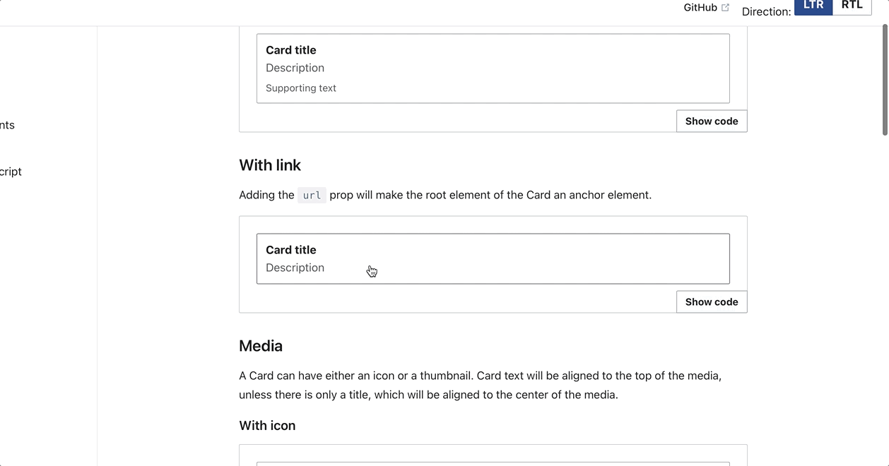
  • Supplying the url prop will make the Card a clickable link. Otherwise, the root element of the Card will be a <span>.
  • States for clickable Cards:
    • Default
    • Hover
    • Focus
  • Loading: As mentioned above, the thumbnail placeholder will display while the image is loading.

image.png (412×2 px, 117 KB)

Documentation

  • Structure: The component will be documented in an individual page called "Card" that will be included in alphabetical order in the structure of Codex's demo site.
  • Content:
    • The Card's demo page will contain a description and essential implementation notes at the top
    • The "Demos" section will feature:
      • A demonstration of each slot
      • A clickable Card with a url prop
      • Media: a Card with an icon, a Card with a thumbnail, and a group of Cards demonstrating the showThumbnail prop's usage
      • A maximum example similar to what's provided in the design spec

Considerations

  • The thumbnail behavior described above is the same as the current implementation of thumbnails in MenuItems. We will create a separate task to extract this behavior from the MenuItem component into a new Thumbnail component, which will be used by MenuItem and Card. Note that there are likely style differences between the two, so the Thumbnail component should only contain basic styles used by both (or these styles should be configurable within Thumbnail)
  • Layout (number of cards and amount of space between them) will be defined by the application
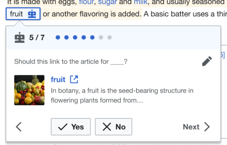
  • Special supporting text style (in the case of NearbyPages, absolutely positioning within the bottom border) will be defined by the application and not covered as a reusable style within Card

Acceptance criteria

This task will pass from the designer to the developer once the Figma spec is created.

  • A Figma spec sheet is created for the component that includes the scope defined here. A link to the Figma spec sheet's MVP version has been added to this task's description.
  • The initial component is implemented in Codex.

Event Timeline

Sarai-WMDE created this task.
Sarai-WMDE updated the task description. (Show Details)
AnneT renamed this task from [WIP] Create Card component's MVP to [WIP] Design and built initial Card component (MVP).Jun 14 2022, 3:43 PM
AnneT removed a project: Epic.
AnneT updated the task description. (Show Details)
Catrope renamed this task from [WIP] Design and built initial Card component (MVP) to [WIP] Design and build initial Card component (MVP).Jun 15 2022, 11:40 PM
AnneT renamed this task from [WIP] Design and build initial Card component (MVP) to Design and build initial Card component (MVP).Jun 27 2022, 8:32 PM
AnneT changed the task status from Open to In Progress.Jun 30 2022, 4:34 PM
AnneT claimed this task.

Change 810070 had a related patch set uploaded (by Anne Tomasevich; author: Anne Tomasevich):

[design/codex@main] [WIP] Card MVP

https://gerrit.wikimedia.org/r/810070

@Sarai-WMDE You can check out the demos I've created so far here. In particular, please take a look at the card group example. Please let me know if you have any initial feedback!

@Sarai-WMDE What do you think about using a slot for the card title vs. a prop? I initially added a slot for it thinking that would enable users to add any kind of markup to the title they wanted, but I'm not sure if that's really necessary. For example, there's no reason to add a link to the title, or an icon, since those things are available for the entire card.

@AnneT Card's already looking great! I noticed just a couple of tiny nitpicky things:

1.Since cards don't have such size restrictions, like MenuItems, I decided to make them a bit more visual by increasing the size of the thumbnail to 48px (or, hopefully 3em, if we decide to follow up on this comment).

2.The thumbnail's right/left margin should be 12px instead of 8px.

Screenshot 2022-07-01 at 10.33.22.png (302×1 px, 57 KB)

3.Regarding the .cdx-card__text__supporting-text <span>:

3.a.Could we vertically align the icon and the text? Supporting text should be too long, so it should almost never wrap, but I believe that we should still apply top alignment to these items just in case, and to be consistent in our icon/text alignment approach.

Screenshot 2022-07-01 at 16.21.52.png (608×1 px, 130 KB)

3.b.Following with that edge case: I think that the change above (in case the solution applied is display:flex; and align-items: flex-start;) will make wrapping lines of supporting text to be vertically aligned with the first line, which I'd recommend to improve legibility

CurrentSuggested
Screenshot 2022-07-01 at 16.29.05.png (510×462 px, 68 KB)
Screenshot 2022-07-01 at 16.52.49.png (498×454 px, 67 KB)

3.c.Lastly, the space between the icon and the supporting text should be 4px (see "Suggested" screenshot above). I can't be sure, but I'd say the margin between them is currently smaller?

Thanks for the huge progress on this component!

@Sarai-WMDE What do you think about using a slot for the card title vs. a prop? I initially added a slot for it thinking that would enable users to add any kind of markup to the title they wanted, but I'm not sure if that's really necessary. For example, there's no reason to add a link to the title, or an icon, since those things are available for the entire card.

Almost forgot to answer! I found just one potential instance of Card that used a link + icon (the "external link" one) in the title. That'd be in the elements used to make inline edit suggestion as part of the Growth's Newcomer's homepage flow:

image 1.png (294×460 px, 55 KB)

When discussing this example, Rita told me that it was important to indicate that the card would open in a new tab. Using the link won't for sure be necessary, but at least the slot would allow the team to include the needed indicator besides the title. So I'd say we can keep the slot.

@Sarai-WMDE thanks for your review! That example of the card with an icon in the title is really helpful; I agree that we should use a slot for the title here.

1.Since cards don't have such size restrictions, like MenuItems, I decided to make them a bit more visual by increasing the size of the thumbnail to 48px (or, hopefully 3em, if we decide to follow up on this comment).

Done, and I added a TODO in the code to reconsider how we're handling this value within the Card component once we figure out how we're going to offer various sizes within the Thumbnail component.

2.The thumbnail's right/left margin should be 12px instead of 8px.

Done!

3.Regarding the .cdx-card__text__supporting-text <span>:

3.a.Could we vertically align the icon and the text? Supporting text should be too long, so it should almost never wrap, but I believe that we should still apply top alignment to these items just in case, and to be consistent in our icon/text alignment approach.

3.b.Following with that edge case: I think that the change above (in case the solution applied is display:flex; and align-items: flex-start;) will make wrapping lines of supporting text to be vertically aligned with the first line, which I'd recommend to improve legibility

3.c.Lastly, the space between the icon and the supporting text should be 4px (see "Suggested" screenshot above). I can't be sure, but I'd say the margin between them is currently smaller?

Ooooo this is a really tough one...all of your suggestions would work perfectly if we were exposing either a slot or a prop specifically for a supporting text icon, but right now we are just offering a single slot for the supporting text that can include an icon if someone wants to add one. It doesn't seem right to add styles that would apply to an icon within the supporting text, because we want to make that slot flexible and not assume too much about what the user is adding. I think we could resolve this in 2 ways:

  1. Add a prop for supportingTextIcon so we could place it exactly where we want it in the template, and add styles knowing that it will be used exactly as we expect. I'm not sure about this; it seems like an overcomplication when it makes more sense for people just to add an icon to the supporting text slot if they want to (and this icon may come at the beginning, end, or middle of the text, so we can't really style it in a way that will always look appropriate)
  2. Consider this another reason to scale icons with font size. If we were doing this, I think we would achieve the look you're going for. Here's an example with the icon size set to 0.875em (17.5 px in this case):

image.png (266×1 px, 68 KB)

This might not be exactly what you were looking for, but I do think it's closer to that ideal, and it's a more natural/expected workflow for the user of the Card component. Let me know what you think; happy to chat about this face to face sometime soon!

I've updated the MVP spec to include both clickable and non-clickable Cards per our discussion with Desiree, and updated the demos section to remove the configurable demo (which isn't very useful) and add more beneficial demos

Moving to code review. As noted in the comments above, we still need to figure out how to handle icons within supporting text, but I don't believe this needs to block code review.

Change 810070 merged by jenkins-bot:

[design/codex@main] Card: Add initial Card component

https://gerrit.wikimedia.org/r/810070

Catrope subscribed.

The initial patch is now merged, moving back to Ready for Dev so that the issue of icons in supporting text can be addressed.

@Sarai-WMDE do you think moving forward with T313318 is enough of a solution for the icon sizing issue in supporting text, or is additional work needed there? If the latter, I would suggest we open a separate task for handling that so that this task can be reviewed and closed.

Sorry for the late reply (again). I think it's perfectly fine to move forward, as it all indicates that that task (T313318) might help us solve the remaining alignment and spacing issues.

Sharing a couple of findings after performing the design sign-off tests:

  • Cards should display a white background color by default (token: background-color-base)
  • Card does not display an active state on click in Safari (tested in v15.5 and 15.3).
  • Card with link does not receive keyboard focus (it's skipped) on Firefox v103 and 102. (This could be covered in an upcoming task to make Card accessible – TBD)

The first fix is required to complete sign-off. The other two might require creating separate tasks to unblock it.

The component's MVP looks and behaves great in all other aspects and contexts. Tested states, visual properties and zoomability in Chrome v103, Firefox v103 and Safari v15.5.

Status update: Design feedback provided after conducting manual tests. See above

Change 823691 had a related patch set uploaded (by Anne Tomasevich; author: Anne Tomasevich):

[design/codex@main] styles, Card: Add background color

https://gerrit.wikimedia.org/r/823691

@Sarai-WMDE Thanks for the feedback! I pushed a patch to add the background color.

  • Card does not display an active state on click in Safari (tested in v15.5 and 15.3).

I looked into this, and it seems like it's because tab navigation is not enabled by default on Safari! I updated this setting locally and was able to focus on the link Card via the tab key:

Screen Shot 2022-08-16 at 1.27.18 PM.png (856×1 px, 177 KB)

Let me know if this works for you, or if there's more to it than that.

  • Card with link does not receive keyboard focus (it's skipped) on Firefox v103 and 102. (This could be covered in an upcoming task to make Card accessible – TBD)

I'm not able to reproduce this on Firefox v103 or 102, maybe we could screenshare sometime to look at it together?

Change 823691 merged by jenkins-bot:

[design/codex@main] styles, Card: Add background color

https://gerrit.wikimedia.org/r/823691

Change 823725 had a related patch set uploaded (by Anne Tomasevich; author: Anne Tomasevich):

[mediawiki/core@master] Update Codex from v0.1.0-alpha.9 to v0.1.0-alpha.10

https://gerrit.wikimedia.org/r/823725

Change 823725 merged by jenkins-bot:

[mediawiki/core@master] Update Codex from v0.1.0-alpha.9 to v0.1.0-alpha.10

https://gerrit.wikimedia.org/r/823725

Thanks so much for adding the background color and for looking into the different issues, @AnneT !

I looked into this, and it seems like it's because tab navigation is not enabled by default on Safari! I updated this setting locally and was able to focus on the link Card via the tab key:

Screen Shot 2022-08-16 at 1.27.18 PM.png (856×1 px, 177 KB)

Let me know if this works for you, or if there's more to it than that.

Yes, tab selection of Card works fine in Safari. The problem in that context is that the card with link does not display an active state on click. Let me add a clip below:

card_Safari.gif (660×1 px, 86 KB)

  • Card with link does not receive keyboard focus (it's skipped) on Firefox v103 and 102. (This could be covered in an upcoming task to make Card accessible – TBD)

I'm not able to reproduce this on Firefox v103 or 102, maybe we could screenshare sometime to look at it together?

Of course! For now, I can share a clip, and also add that tab selection works fine if I enable VoiceOver (I had never noticed an inconsistency like this before!). The focus should move from the 'Show code' toggle button to the clickable Card but, as you can see, it's skipped:

card-firefox.gif (694×1 px, 79 KB)

Yes, tab selection of Card works fine in Safari. The problem in that context is that the card with link does not display an active state on click. Let me add a clip below:

Ah, sorry, I totally got your initial comments mixed up! My bad. We should definitely open a separate bug task for this.

The focus should move from the 'Show code' toggle button to the clickable Card but, as you can see, it's skipped:

Interestingggg...I'm not sure why we're having a different experience, but I agree that handling this as part of accessibility improvements for Card would be great.

Thanks for checking! Then I'll open small bug task for the issue in Safari (here: T315661) + create a separate task to "make the Card component fully accessible", so the MVP task can be unblocked. Signing-off!

Great work, team! Besides the open items already mentioned (and tickets created for), the implementation works well in terms of:

  • Zoomability
  • Icon and thumbnail display
  • Text wrapping
  • Focus states
  • Accessibility for the actionable types

Hi @Sarai-WMDE, were you able to create the ticket for the issue with Firefox accessibility for a clickable card yet?

Thanks for checking, @EUdoh-WMF! I hadn't created a ticket yet because I wasn't sure the issue could be reproduced. But after seeing your comment, I agree that it would be a good idea to document the problem in any case, so here's the ticket: T316861: Clickable Card doesn't receive focus in Firefox.

@Sarai-WMDE Thanks for this!

I can reproduce it at my end on Firefox v104. Now we have these fixes/optimizations documented, I would move this ticket for Product Sign-off and look forward to the tweaks.

ldelench_wmf updated the task description. (Show Details)