Page MenuHomePhabricator

Deployed table of contents (TOC) in sidebar differs from tested version of Desktop Improvements: the line height is too small with font-size 24 in Firefox
Open, Stalled, Needs TriagePublicBUG REPORT

Assigned To
None
Authored By
Prototyperspective
Jun 17 2022, 2:38 PM
Referenced Files
F35500241: fontsize.png
Aug 31 2022, 8:49 AM
F35500214: Screenshot from 2022-08-31 10-25-08.png
Aug 31 2022, 8:30 AM
F35498131: Screen Shot 2022-08-30 at 1.07.23 PM.png
Aug 30 2022, 5:25 PM
F35498125: Screen Shot 2022-08-30 at 1.00.56 PM.png
Aug 30 2022, 5:25 PM
F35498123: Screen Shot 2022-08-30 at 1.01.12 PM.png
Aug 30 2022, 5:25 PM
F35497686: Screen Shot 2022-08-30 at 7.28.25 AM.png
Aug 30 2022, 2:30 PM
F35496804: barelyr.png
Aug 30 2022, 8:16 AM
F35265476: Screen Shot 2022-06-22 at 3.39.20 PM.png
Jun 22 2022, 7:41 PM
Tokens
"Burninate" token, awarded by Prototyperspective.

Description

List of steps to reproduce (step by step, including full links if applicable):

  • Go to a Wikipedia article on English Wikipedia when signed in
  • Scroll and see the TOC on the left

What happens?:
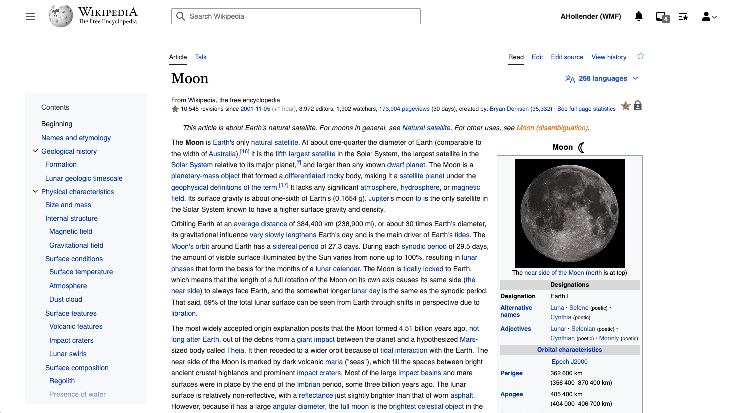
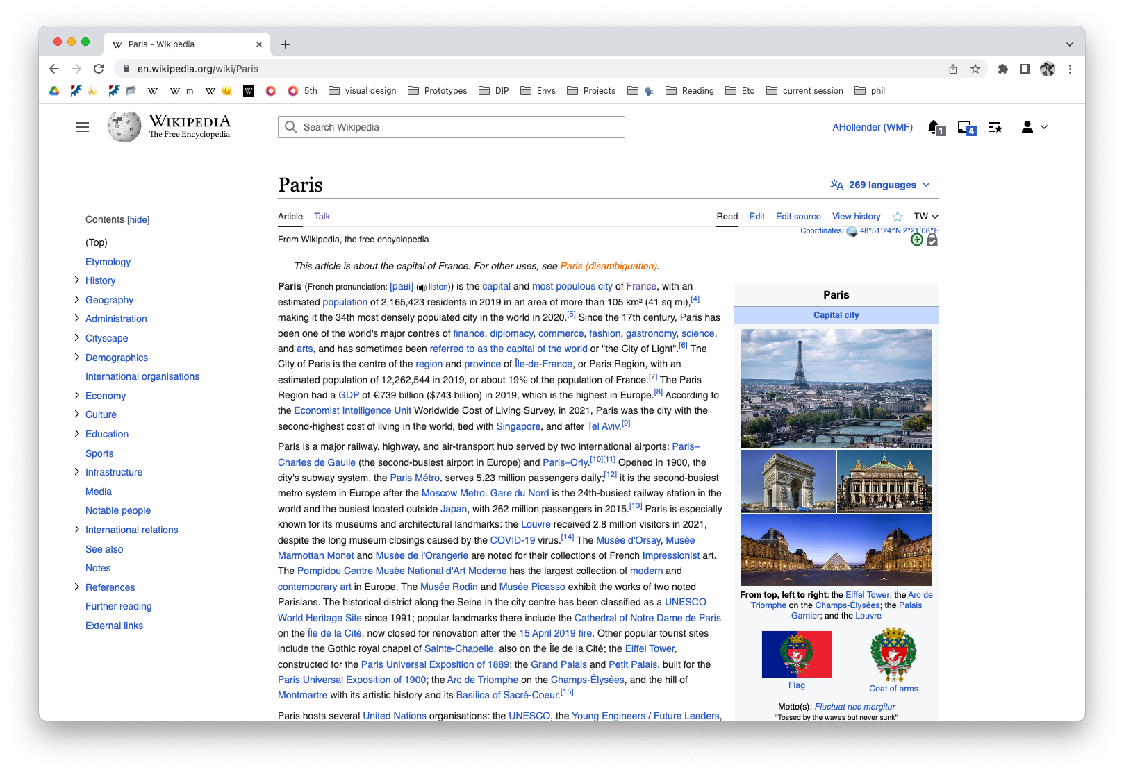
The TOC doesn't look like the TOC that was shown in the Desktop Improvements tests a few months ago at all.

  • The texts are compressed without much space to above and beneath all the lines of text, making it very hard to read; this wasn't the case for the prototype where there's proper space between each line so they are separated and not pinched together (this also applies to the lines of one header, not just the space between headers)
  • The gear-wheel for settings is missing
  • When one scrolls the subheaders don't uncollapse automatically like it was in the prototype

What should have happened instead?:
The TOC at https://en.wikipedia.org/wiki/Moon should be like the TOC https://en-toc.wmcloud.org/wiki/Moon or better. Maybe there already is some bug report about this or the DI change hasn't been made yet. However, if that was the case then why was there recently a change to something looking similar but worse? Screenshots below:

11.png (746×337 px, 43 KB)
22.png (688×343 px, 57 KB)
barelyr.png (1×374 px, 153 KB)

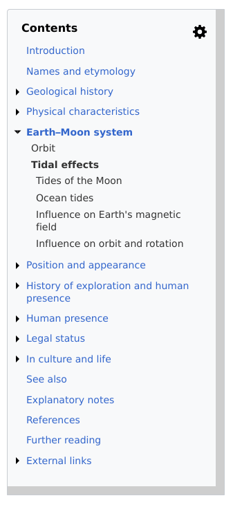
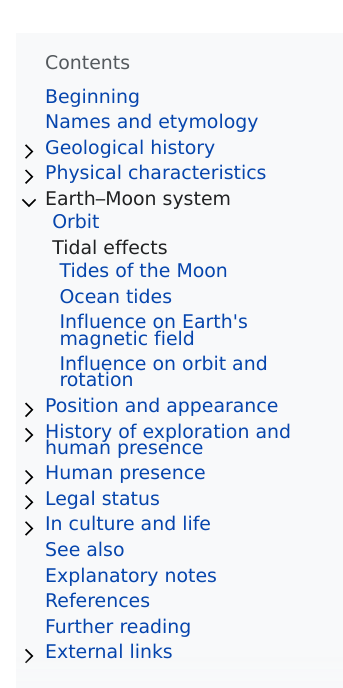
Software version (if not a Wikimedia wiki), browser information, screenshots, other information, etc.:

Firefox

Other issues I noticed with the TOC is that it disappears for the edit preview – this should be solved too but it may be a separate task(?) One thing that definitely would be a separate task is making the top-level headers have a bolder font-weight (and/or larger) than the other headers.

Event Timeline

Aklapper renamed this task from The table of contents (TOC) doesn't look like the tested version of Desktop Improvements to Deployed table of contents (TOC) in sidebar differs from tested version of Desktop Improvements.Jun 19 2022, 1:46 PM
Aklapper removed a project: Design.

Note that the images F35249148 and F35249149 in this ticket are restricted to the task author and cannot be seen by anyone else.

Providing an option to auto expand TOC (like the one in the tested version) would fix T307867 too.

Providing an option to auto expand TOC (like the one in the tested version) would fix T307867 too.

If it's an option, it should be the default (enabled by default). I think in the demo, it also automatically collapsed sections once has finished scrolling through them (only the headers of the current section are shown).

Tagging designer @alexhollender_WMF but it's very very rare for a prototype to look like the end product. The purpose of a prototype is only to express an idea in a tangible form.

@Prototyperspective thanks for your feedback.

The texts are compressed without much space to above and beneath all the lines of text, making it very hard to read; this wasn't the case for the prototype where there's proper space between each line so they are separated and not pinched together (this also applies to the lines of one header, not just the space between headers)

the screenshot you added in the description does not match with what I see in production. I see this:

Screen Shot 2022-06-22 at 3.39.20 PM.png (828×1 px, 431 KB)

The gear-wheel for settings is missing

unfortunately the gear-wheel for settings was only for the purposes of testing different options. in the future we may build out some of those options in production, but we have no current plans to do so.

When one scrolls the subheaders don't uncollapse automatically like it was in the prototype

we heard from many people that they found this behavior distracting. additionally, we reasoned that it's not necessary to uncollapse a section in the TOC when you arrive at that section on the page because you can already explore the sub-sections naturally (i.e. without referring to the TOC)


I'm now realizing that our report should be more detailed. I will go back and update it soon:

https://www.mediawiki.org/wiki/Reading/Web/Desktop_Improvements/Features/Table_of_contents#Prototype_testing_with_editors

Maybe the 3rd screenshot that I just added makes it clearer just how incredibly bad it is. Now that the issue with it overflowing into the article text is fixed, this bug really should get fixed as well.

Moreover, the TOC box is not (horizontally) aligned with the box above it.


@alexhollender_WMF

the screenshot you added in the description does not match with what I see in production.

The browser used is Firefox ESR at 100% zoom.

we heard from many people that they found this behavior distracting. additionally, we reasoned that it's not necessary to uncollapse a section in the TOC when you arrive at that section on the page because you can already explore the sub-sections naturally (i.e. without referring to the TOC)

I very much disagree with that. It depends on how many subsections there are (your point only makes sense if it's 1 or 2). Plus if they uncollapse automatically you can scroll through the entire/part of the page to read all the subsections headers to for example stop at the sections that are of interest to you or search for some content via scrolling-skimming.

This should be the default and if a few people have minor issues with it or it's your subjective personal opinion that it's not useful at all, then please give users options. The TOC used to show all the articles' sections up to a specifiable TOC-level, now they always only show the top level which is a major change with lots of disadvantages and many people that would prefer the former (I'd just uncollapse sections by default and make the shown level an option).

@Prototyperspective: Regarding F35496804, does the tense text also show on https://en.wikipedia.org/wiki/Restoration_ecology?safemode=1&useskin=vector-2022 ? If it does, which browser version, which browser window width, which operating system and version, which font being used (right-click on a ToC entry in Firefox, select "Inspect", select the "Fonts" tab in the "Inspector")?

Also, this ticket seems to mix numerous things (collapsing in ToC; space between lines of text). Again: "it's very very rare for a prototype to look like the end product. The purpose of a prototype is only to express an idea in a tangible form." So this ticket might get declined given its task title.

Yes it does.

If it does, which browser version, which browser window width, which operating system and version, which font being used (right-click on a ToC entry in Firefox, select "Inspect", select the "Fonts" tab in the "Inspector")?

The current Firefox ESR version. I don't have a Fonts tab in Inspector. It has

  • font-family: sans-serif; on html, body
  • font-size: 0.875em; on .sidebar-toc .sidebar-toc-list-item a
  • padding: 4px 0; on .sidebar-toc .sidebar-toc-text
  • list-style: none; (list-style-type: none;) line-height: 18px; on .sidebar-toc .sidebar-toc-list

when inspecting div class="sidebar-toc-text".

Also, this ticket seems to mix numerous things (collapsing in ToC; space between lines of text). Again: "it's very very rare for a prototype to look like the end product. The purpose of a prototype is only to express an idea in a tangible form." So this ticket might get declined given its task title.

Maybe I should add subtasks. Until then or alternatively, this task is only about the worst of the differences: the nearly unreadable small line-heights.

Jdlrobson changed the task status from Open to Stalled.Aug 30 2022, 2:30 PM

I can't replicate the issues with line heights in Firefox ESR 102.2.0.esr. What I see replicates the screenshot that Alex shared.

@Prototyperspective please provide some more detailed information so we can replicate this - perhaps your browser settings, or browser extensions are triggering this since we've eliminated gadgets (safemode) from the cause. You may want to try resetting your browser defaults.

What screen size are you using?
What font size?
Does this happen in an incognito window?
What font settings have you enabled in Firefox?
(here's mine)

Screen Shot 2022-08-30 at 7.28.25 AM.png (970×1 px, 100 KB)

we heard from many people that they found this behavior distracting. additionally, we reasoned that it's not necessary to uncollapse a section in the TOC when you arrive at that section on the page because you can already explore the sub-sections naturally (i.e. without referring to the TOC)

I very much disagree with that. It depends on how many subsections there are (your point only makes sense if it's 1 or 2). Plus if they uncollapse automatically you can scroll through the entire/part of the page to read all the subsections headers to for example stop at the sections that are of interest to you or search for some content via scrolling-skimming.

This should be the default and if a few people have minor issues with it or it's your subjective personal opinion that it's not useful at all, then please give users options. The TOC used to show all the articles' sections up to a specifiable TOC-level, now they always only show the top level which is a major change with lots of disadvantages and many people that would prefer the former (I'd just uncollapse sections by default and make the shown level an option).

I recognize that you have a different opinion here, and I think your preferences make sense based on how you use Wikipedia. There are tradeoffs to both options, so the best we can do is make a decision based on the feedback we've have received from the community, and the WMF design team. The majority of people have a preference for sections to be collapsed, and for them to stay collapsed when you scroll to them (i.e. not automatically expand). To try and illustrate the advantage of this approach, compare these two options:

(a) all sub-sections expanded(b) all sub-sections collapsed
Screen Shot 2022-08-30 at 1.01.12 PM.png (1×1 px, 825 KB)
Screen Shot 2022-08-30 at 1.00.56 PM.png (1×1 px, 817 KB)

Which option allows you to more easily get a sense of the entire contents of the article? As far as I can tell it's option b, where all sub-sections are collapsed. Without scrolling I can see the entire contents of the article at a high level.

Of course many articles do not have so many sub-sections. In cases where all of the sub-sections fit on a screen of average height, we automatically expand them:

article with fewer sub-sections
Screen Shot 2022-08-30 at 1.07.23 PM.png (2×3 px, 2 MB)

In case you are interested, @Quiddity has been writing CSS that adds various customizations to Vector 2022, one of which is automatically expanding all sub-sections in the TOC. You can find that CSS here: https://www.mediawiki.org/wiki/User:Quiddity/Vector-2022-condensed.css#L-73

Also, I just found this prototype where we experimented with an "expand all sub-sections" button: https://di-toc-expand-collapse-all.web.app/Mount_Fuji. Perhaps this is also a good candidate for a gadget.

Given all of that, I'm curious if you understand why we've decided on the configuration we currently have?

I can't replicate the issues with line heights in Firefox ESR 102.2.0.esr. What I see replicates the screenshot that Alex shared.

Strange. I thought more people would have this issue.

What screen size are you using?

I changed the display resolution and it didn't change it.

What font size? [...]
What font settings have you enabled in Firefox?

The default: Default (Bitstream Vera Serif), Size 24, Zoom: Default zoom 100%; "Zoom text only" is unchecked (and zoom is set to 100% at the page)

Does this happen in an incognito window?

Yes (when signed in).

(here's mine)

Screen Shot 2022-08-30 at 7.28.25 AM.png (970×1 px, 100 KB)

The file is set to restricted so I can't see it but of course I believe you and alexholler also posted some screenshots.


I recognize that you have a different opinion here, and I think your preferences make sense based on how you use Wikipedia. There are tradeoffs to both options, so the best we can do is make a decision based on the feedback we've have received from the community, and the WMF design team. The majority of people have a preference for sections to be collapsed, and for them to stay collapsed when you scroll to them (i.e. not automatically expand).

Okay, that is a far better reason than just a few people saying so, it's not a good rationale for making this permanent though. But did the majority of people actually state this preference? I think this was the survey: https://www.mediawiki.org/wiki/Reading/Web/Desktop_Improvements/Third_prototype_testing and there I couldn't find a question about it. Do you have a source to back this up? Maybe some complained about them autoexpanding when scrolling to them but that would have been because that was the default in the prototype, and people may have complained about it not expanding if it didn't. The preference for this probably varies and that's also why I asked about the options so people could change the setting (which setting will be the default could be a matter of later investigations).

Which option allows you to more easily get a sense of the entire contents of the article? As far as I can tell it's option b, where all sub-sections are collapsed. Without scrolling I can see the entire contents of the article at a high level.

Agree. But that's not an argument for them to stay collapsed because it would a) only uncollapse them when scrolling so one can still check all the sections at the top-level before scrolling way down b) only one section gets autocollapsed, not all of them, so this still keeps it easy to see the top-level sections etc.

Of course many articles do not have so many sub-sections. In cases where all of the sub-sections fit on a screen of average height, we automatically expand them:

Interesting. However, before this change the default was that all section are shown up to a specifyable TOC level.

In case you are interested, @Quiddity has been writing CSS that adds various customizations to Vector 2022, one of which is automatically expanding all sub-sections in the TOC. You can find that CSS here: https://www.mediawiki.org/wiki/User:Quiddity/Vector-2022-condensed.css#L-73

Also, I just found this prototype where we experimented with an "expand all sub-sections" button: https://di-toc-expand-collapse-all.web.app/Mount_Fuji. Perhaps this is also a good candidate for a gadget.

Thanks, that's useful. As said earlier, please add options for the TOC. However, "expand all sub-sections" is very different from what I asked about here: expanding only the current section. Moreover, there could/should also be an equivalent to make it expand to the specified TOC level and a maximum TOC level.

Given all of that, I'm curious if you understand why we've decided on the configuration we currently have?

I would if the majority of respondents really favored this which I don't know if it's true and I can't remember a question about the preference from when I participated in some survey about this where the demoed prototype was behaving like described here. Maybe also check how other websites and ebook-readers solve this, I think many or most probably auto-expand the sections of the current section (at least to some level) by default (and for good reasons).

[Font line height in ToC]

I don't have a Fonts tab in Inspector.

@Prototyperspective: There should be; it's within the inspector. I'm interested in size and line height. Here's a screenshot from my machine:

Screenshot from 2022-08-31 10-25-08.png (974×1 px, 318 KB)

Don't have that. But here's how it looks like when I change the Firefox preferences to Font size 16 where it used to be size 24:

fontsize.png (1×286 px, 77 KB)

like in:

(here's mine)

Screen Shot 2022-08-30 at 7.28.25 AM.png (970×1 px, 100 KB)

So the issue seems to occur only with a certain font-size (if it's supposed to look like in my screenshot). I thought the font-size 24 was the default but maybe it isn't or it's only the default for some configuration. Whether or not it's the default doesn't matter much as it should work with all reasonable font-size configs.

Don't have that.

Huh? Which exact Firefox version is that? (As a version number. "Latest" is always ambiguous.)

It is the latest in Debian, 91.13.0esr

Prototyperspective renamed this task from Deployed table of contents (TOC) in sidebar differs from tested version of Desktop Improvements to Deployed table of contents (TOC) in sidebar differs from tested version of Desktop Improvements: the line height is too small with font-size 24 in Firefox.Aug 31 2022, 9:39 AM
Prototyperspective changed the task status from Stalled to Open.

I recognize that you have a different opinion here, and I think your preferences make sense based on how you use Wikipedia. There are tradeoffs to both options, so the best we can do is make a decision based on the feedback we've have received from the community, and the WMF design team. The majority of people have a preference for sections to be collapsed, and for them to stay collapsed when you scroll to them (i.e. not automatically expand).

Okay, that is a far better reason than just a few people saying so, it's not a good rationale for making this permanent though. But did the majority of people actually state this preference? I think this was the survey: https://www.mediawiki.org/wiki/Reading/Web/Desktop_Improvements/Third_prototype_testing and there I couldn't find a question about it. Do you have a source to back this up? Maybe some complained about them autoexpanding when scrolling to them but that would have been because that was the default in the prototype, and people may have complained about it not expanding if it didn't. The preference for this probably varies and that's also why I asked about the options so people could change the setting (which setting will be the default could be a matter of later investigations).

My apologies for the delay here. I looked back at my notes and found two things:

  • A survey we ran with WMF staff. We asked people to install a browser extension that gave them the new TOC, with access to the various settings. After two weeks we sent a survey which asked for general feedback. The relevant feedback we received was:
    • Positive
      • "Yes! I thought the auto-expand on scroll feature was perfect – I think it added a significant benefit to readability/discoverability and would prefer that to be the default UX."
    • Negative
      • "I felt distracted by the version that expands while I am reading."
      • "My current reading method is to scroll through the page. The ToC version that expands while reading therefore feels distracting, as too much is going on in parallel on the page."
      • "The animation & bolding as I scroll is distracting and annoying - please add an option to turn this off."
  • Meeting notes from a WMF design review meeting, with the following conclusions:
    • To respect logged-out people who prefer reduced motion, if we decide to include the feature to automatically expand a section's sub-sections within the TOC it should be off by default, and allowed to be turned on via some kind of cookie preference
    • Many sections within Wikipedia articles are no long enough to warrant automatically expanding their sub-sections within the TOC (because you can already see all, or most, of the sub-sections once you've scrolled to the parent section)
    • Given we don't know what percentage of people actively reference the TOC while reading articles, it seems potentially quite distracting to continuously be expanding and collapsing sections on the page as you scroll to past them. We have already heard several complaints from people that simply bolding the active section title is distracting to them, and this type of animation seems significantly more noticeable/distracting.

In general, when it comes to automatic animations, I think we should give more weight to the potential of distraction than we do to the potential of functional enhancement. Additionally, the way the TOC currently works is that if you click on a section (which I think is a stronger indication that you are interested in that section than scrolling to it or past it), its sub-sections expand. I think this is a reasonable starting point for sort of pro-actively displaying the sub-sections. I also think, given the possible capabilities (and also some of the new constraints) of the table of contents, it deserves its own set of preferences. This is not something we've been able to agree on as a team, because each setting/preference we introduce comes with additional maintenance complexity. So thus far we've instead tried to do our best to find sensible defaults.

The problem still exists with 102.3.0esr. The TOC is not readable, this should be fixed asap, albeit I don't know how many users are affected.

we decide to include the feature to automatically expand a section's sub-sections within the TOC it should be off by default, and allowed to be turned on via some kind of cookie preference

That sounds good enough if the option is easily findable and togglable. You could run a larger survey at a later point and/or explore other options (such as only auto-expanding headers during scrolling in articles with a very long TOC and an easily togglable option that is enabled by default).

Jdlrobson changed the task status from Open to Stalled.Feb 15 2023, 12:12 AM

@alexhollender is there anything actionable here? The conversation is hard for me to follow so perhaps we could create some new tickets with next steps?

@Prototyperspective a lot of updates have been made to the table of contents since you filed this task. Most notably the table of contents is now wider, and soon will be able to to take up more vertical space (T319315: [Table of contents] Increase max-height of TOC). Several other table of contents tasks we will be working on soon:

Given the updates we've made, and the upcoming work, do you feel it would be appropriate to resolve this task? If not, please let us know what specific concerns you still have. Thanks so much!