Description
See parent task for general information.
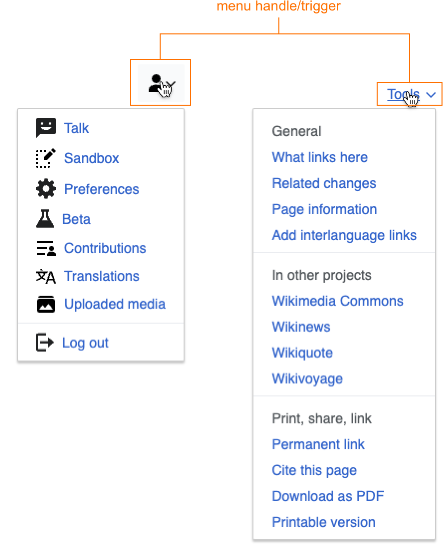
Navigational menus usually consist of two parts: 1) the menu handle/trigger (i.e. the thing you click on to open the menu), 2) the menu links/items (i.e. the things inside of the menu). This task is specifically about the styling of the menu handle/trigger.
Native HTML references
The menu handle/trigger is a kind of button. Unfortunately there is no clear default styling for such an element in HTML (HTML provides a <select> menu, but no such navigational menu). Two HTML elements that function similarly to menu handle/triggers are:
- the summary element which is part of the details tag. This is an element that you click on in order to reveal additional information, much like a menu handle/trigger.
- input element, such as a checkbox or radio. These are clickable elements that function more as toggles rather than typical buttons.
By default the summary element looks like this:

Presumably the arrow next to the text indicates both that the element is clickable, and that when clicked it will reveal additional information.
Menu handles/triggers in Wikimedia interfaces
Currently there are a few different types of handles/triggers for our navigational menus:
| dropdowns | icon button | quiet button | normal button (?) | input |
 |  |  | can't find a navigational menu w/ a normal button, but here is a select menu with one 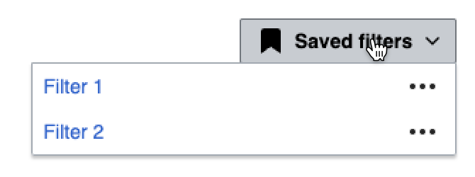 |  |
Challenge
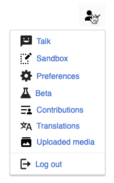
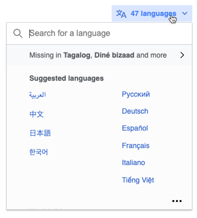
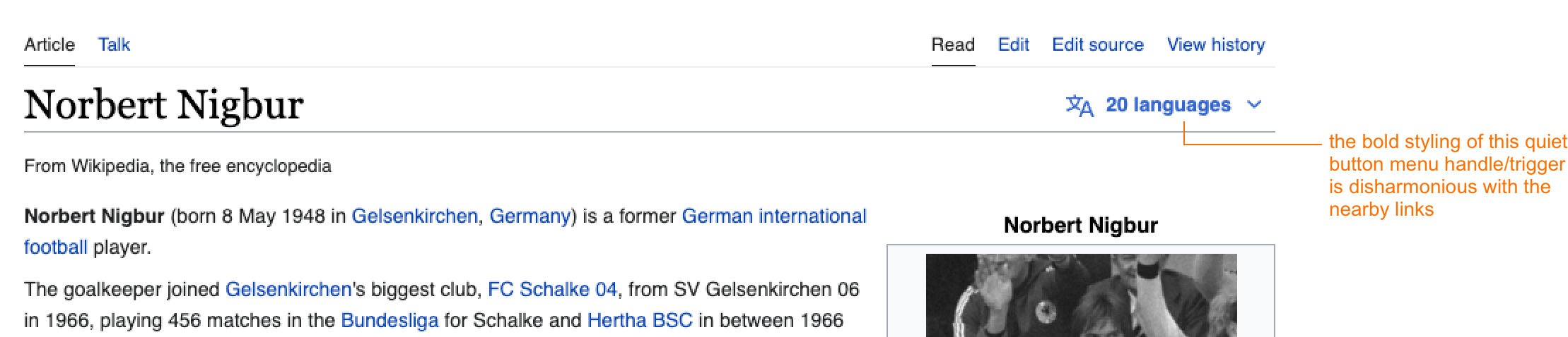
I think what's currently implemented in production works well when menu handles/triggers are icon buttons, normal buttons, or inputs. I think the challenge comes when menu handles/triggers are quiet buttons (which I think will be the most common case, in addition to icon buttons). Why is this a challenge? Because quiet buttons are styled very similarly to links, and in the case where there is a quiet button as a menu handle/trigger located next to other links, there is visual disharmony between the two very similar, yet slightly differently styled, elements. For example:
For comparison:
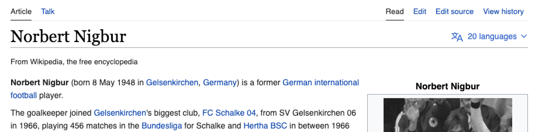 |  |
Proposal
- If the handle/trigger is a quiet button, the label should always include a ⌄ icon to indicate that it is clickable, and is a menu handle/trigger.
- If the handle/trigger is a quiet button the label should be styled as font-weight: normal so that it is visually harmonious with surrounding link elements.
- In order to achieve this in a systematic way we could either a) decide that all quiet buttons have font-weight: normal styling (which I think is a good choice, though recognize it's a bigger decision), or b) create a new component, or a variant of the quiet button component, for menu handle/triggers