Page MenuHomePhabricator

Preview gives no indication that it is out of date
Open, LowPublic3 Estimated Story Points

Description

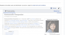
When I start typing in the wikitext area, display the following toolbar:

Screen Shot 2022-07-27 at 08.01.44.png (950×1 px, 453 KB)

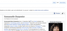
While the Preview reloads, keep the following toolbar as well as the current interaction:

Screen Shot 2022-07-27 at 08.05.27.png (752×1 px, 355 KB)

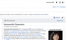
When the Preview reloads, DISABLE or hide the toolbar:

Screen Shot 2022-07-27 at 08.07.15.png (734×1 px, 402 KB)

When I begin typing anew, display the toolbar once again:
Screen Shot 2022-07-27 at 08.01.44.png (950×1 px, 453 KB)

Event Timeline

@nayoub let's connect on this based on what you found in Plwiki user calls

Note: During Sprint Planning Dom raised the UX concern that folks can be typing for a good amount of their experience with the "Realtime preview" pane open. This would mean that there is a loading screen for a significant portion of the time-- which could/could not be startling.

To-do: Decide on the best UX for this (Natalia and @nayoub)

I envision an asterisk is shown perhaps where the Reload button is (I thought there was an OOUI icon for this but I guess not...). Conceptually an asterisk is indicator of unsaved changes, like when editing a file in a text editor (usually you'll see an asterisk in the filename or something). Or, we could instead use a slight opacity over the whole preview area. We certainly shouldn't show the loading bar because until the user stops typing, there's nothing actually loading. I think the important is to not obscure the content too much (it's possible the editor is looking at the preview area for reference as they're typing), and also not to confuse the "dirty" state with the loading state.

You might be thinking of the required indicator.

I like both your ideas, although the icon slightly more than the opacity. I'm not sure if two levels of opacity would be that easily distinguished.

Another thing could be to make the blue bouncing snake appear straight away, but be full width and not bouncing until loading starts.

@Samwilson and @Esanders updated acceptance criteria and Nico is about to add the assets!

When the Preview reloads, DISABLE or hide the toolbar:

Would showing/hiding the toolbar result it a lot of distracting vertical movement of the content?

The banner could appear over the content, perhaps? Otherwise, I agree that it'd be too much up and down bouncing (slightly more than every two seconds by default, for fast pages).

Yes, you're right it might be a bit too bouncy. It'll be better with the banner over the preview then.

@Samwilson I also really liked your blue not bouncing snake idea, I think it'd be visually really nice – although not sure how explicit as a feedback loop it'd be for users to indicate that the content is out of date

@nayoub we met as a team and we talked about the banner being intrusive on the content if it's over it, people may be expecting to look at what is hiding under the content. and real estate on the page is already constrained.

I think i'm ok with the risk of not fixing this issue this time around (prior to release with Group 0 and Group 1) next week and seeing what feedback we get from those users. If it's not startling for users, maybe we don't need to design for this tension of typing and output not matching.

JWheeler-WMF moved this task from Up Next (May 6-17) to Backlog on the Community-Tech board.
JWheeler-WMF subscribed.

Moving to backlog as this has hung around for quite some time without any action