NOTE: Please do not comment on this ticket unless you are assisting with the resolution of this issue. This ticket is being worked on but comments not related to fixing it only serve to slow us down.
List of steps to reproduce (step by step, REMI
including full links if applicable):
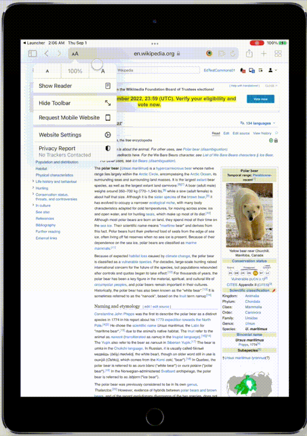
- Load the site in an iPad
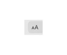
- Using the font-size toggle ( ) Set font-size to 300%

What happens?:

What should have happened instead?:
The font-size should scale.
Developer notes
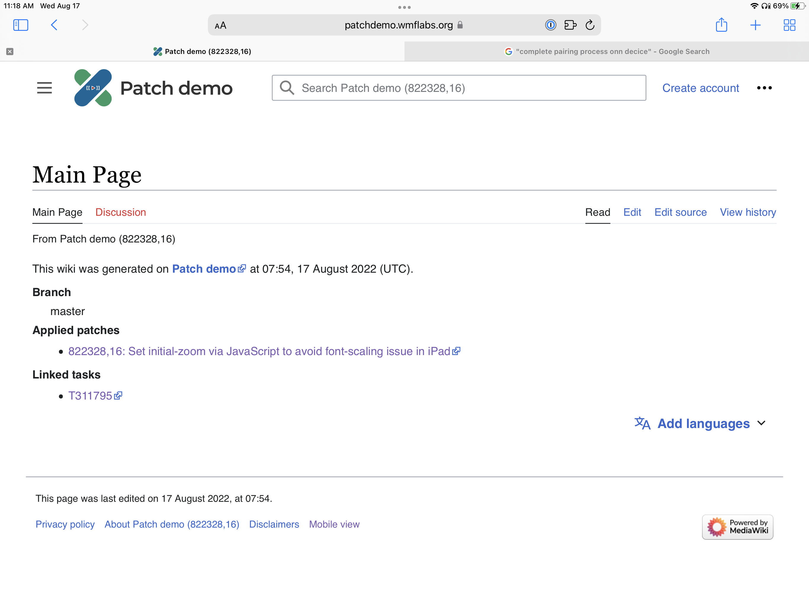
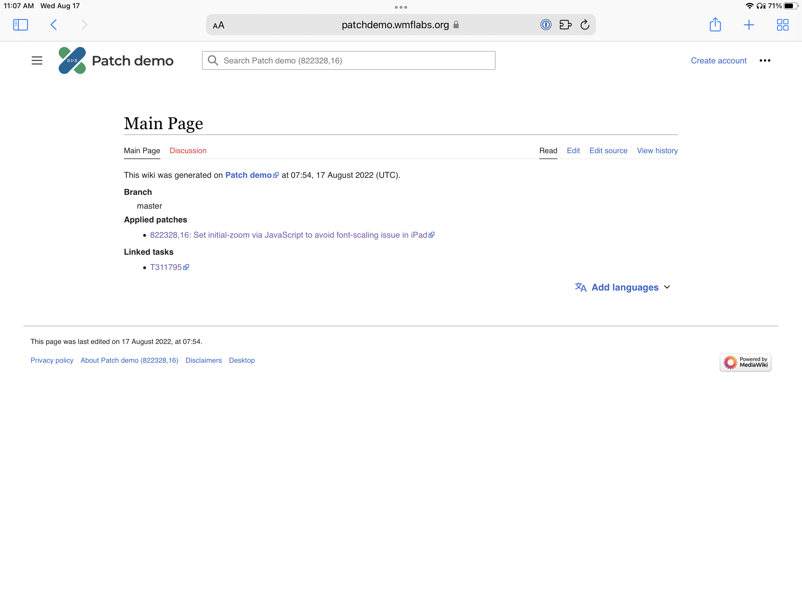
Adding initial-scale=1.0 to the viewport definition may fix this. Please test.
On browserstack
Can be replicated in:
- iPad 9th 15
- iPad Pro 12.9 2021 14
Cannot be replicated in:
- iPad Mini 2021
QA Results - Beta
| AC | Status | Details |
|---|---|---|
| 1 | ✅ | T311795#8183339 |
QA Results - Prod
| AC | Status | Details |
|---|---|---|
| 1 | ✅ | T311795#8204980 |