Page MenuHomePhabricator

Allow users to easily add images from the editor of the Wikipedia Android app
Closed, ResolvedPublic

Assigned To
Authored By
JTannerWMF
Jul 5 2022, 12:35 PM
Referenced Files
F35483712: Screenshot_20220822-115740.png
Aug 22 2022, 9:59 AM
F35483713: Screenshot_20220822-115727.png
Aug 22 2022, 9:59 AM
F35479450: Screenshot_20220818-160640.png
Aug 19 2022, 3:49 PM
F35479447: Screenshot_20220819-173624.png
Aug 19 2022, 3:49 PM
F35473353: Screenshot_20220818-160640.png
Aug 18 2022, 2:11 PM
F35473351: Screenshot_20220818-160506.png
Aug 18 2022, 2:11 PM
F35473308: Implementation vs Design Spacing.png
Aug 18 2022, 2:11 PM
F35473213: Screenshot_20220818-155425 copy.png
Aug 18 2022, 2:11 PM

Description

Background

During the Android offsite 2022, we conducted usability testing and discovered how challenging it is for people to add images in articles using the Android app. Functionality for adding images into articles could exist based on our APIs, and we have a frame of reference from the iOS app.

Must haves

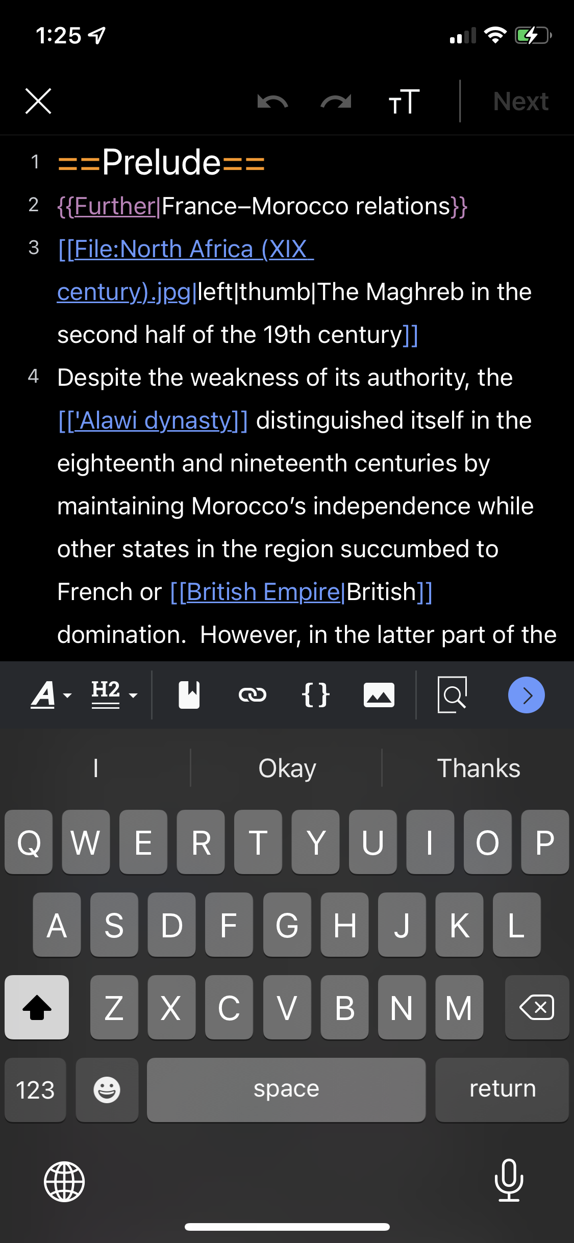
  • Image icon in editor toolbar using material design to let users now they can add an image into the article section selected in wikitext
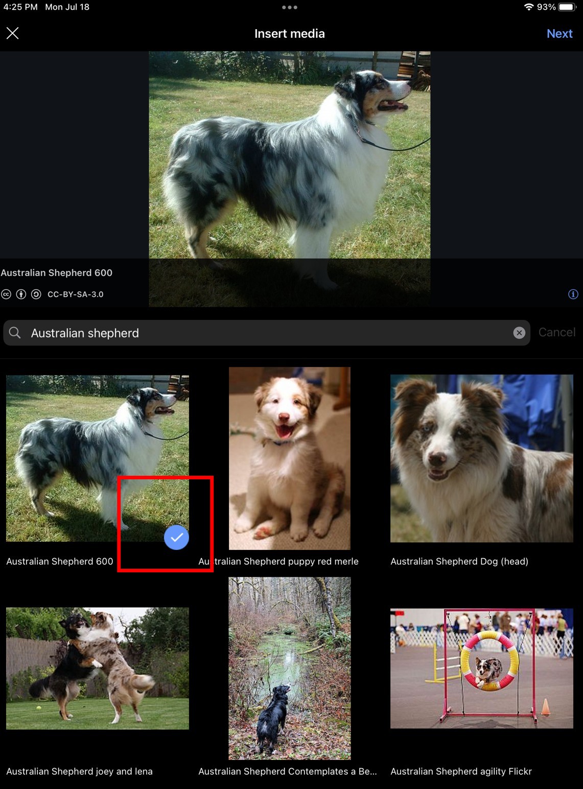
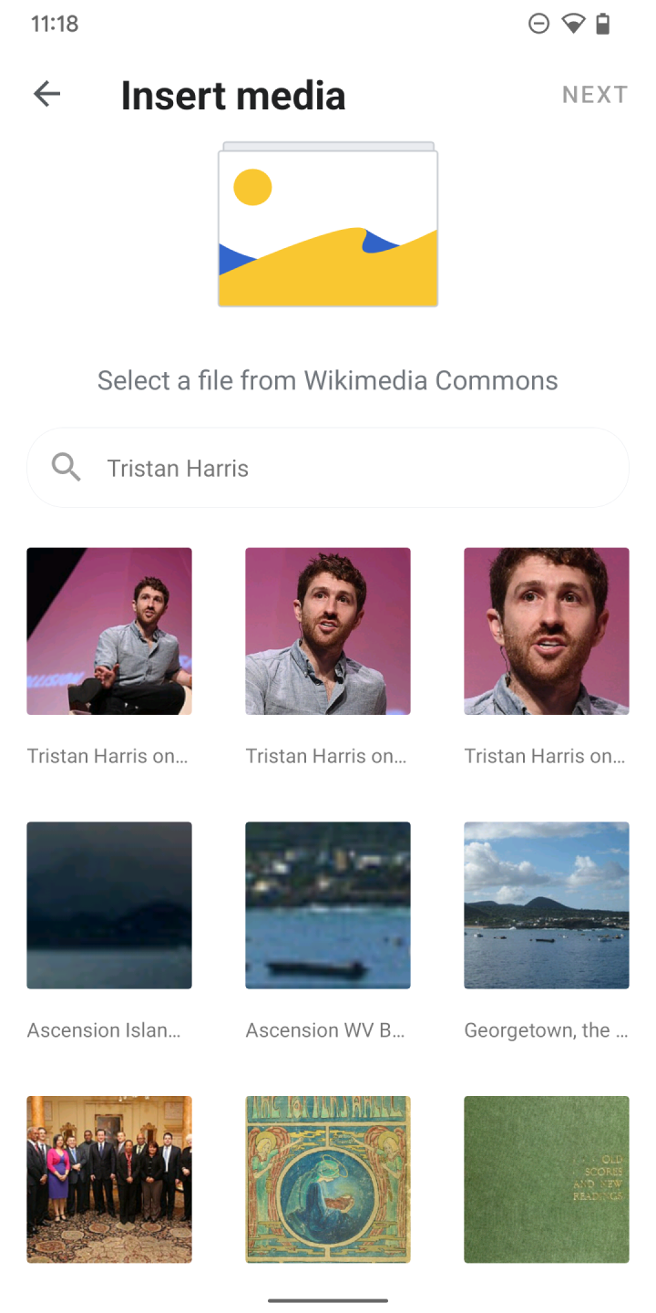
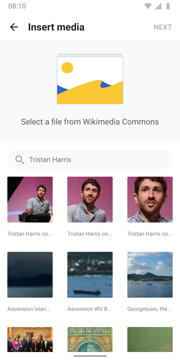
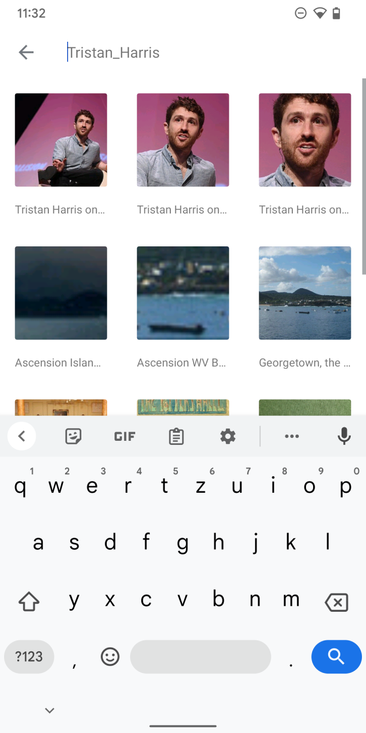
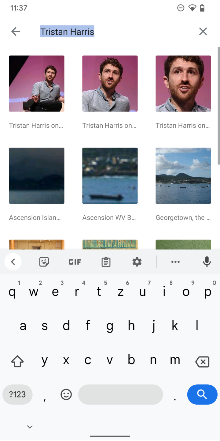
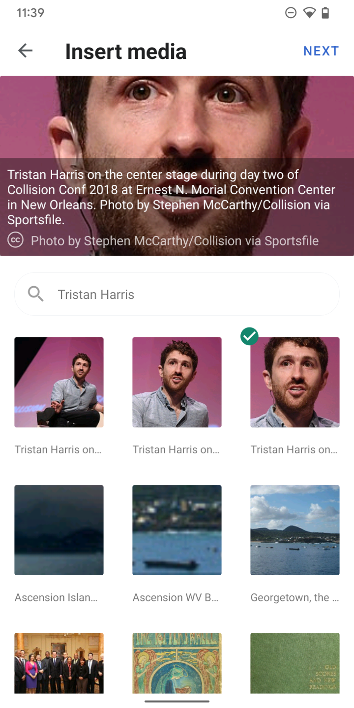
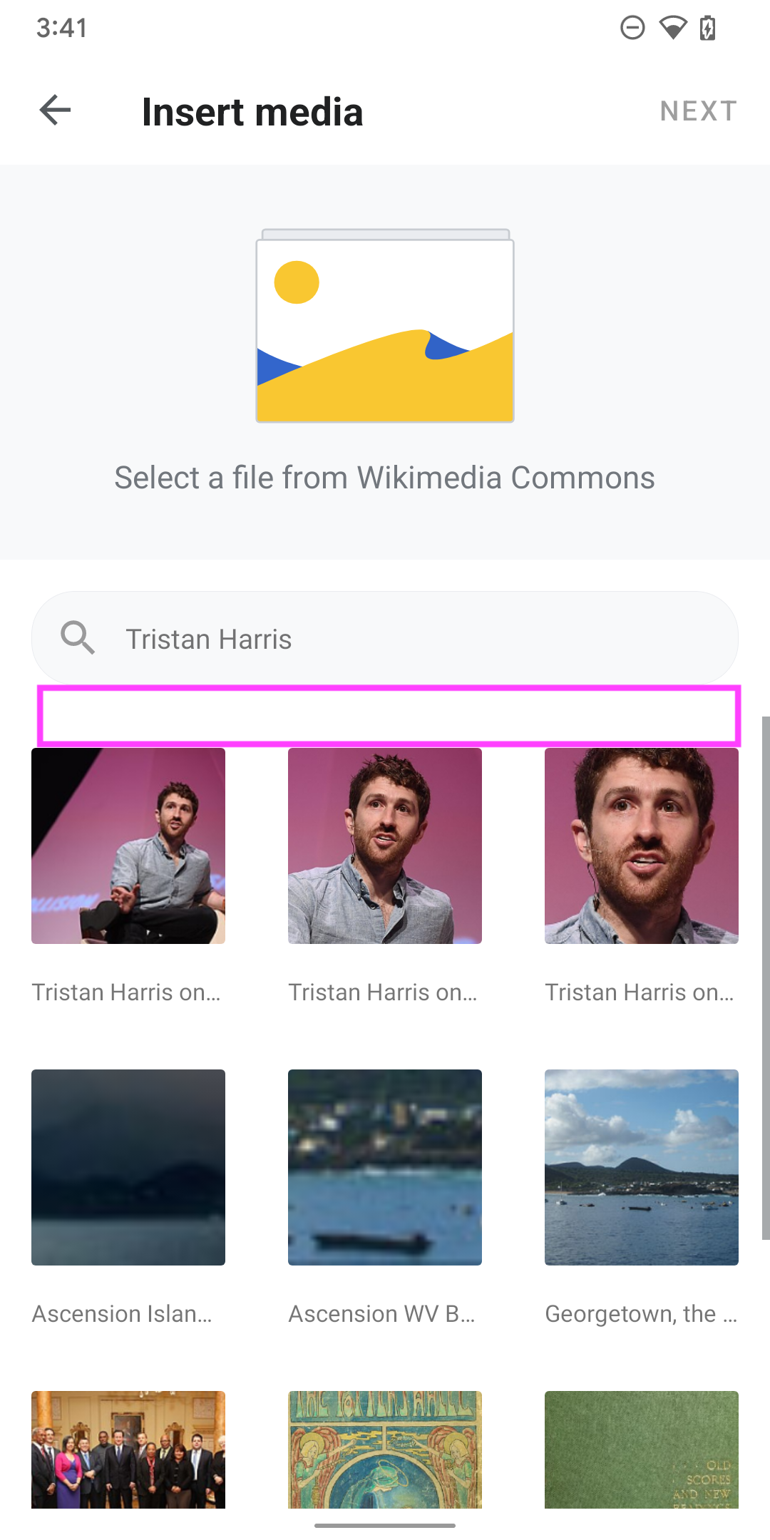
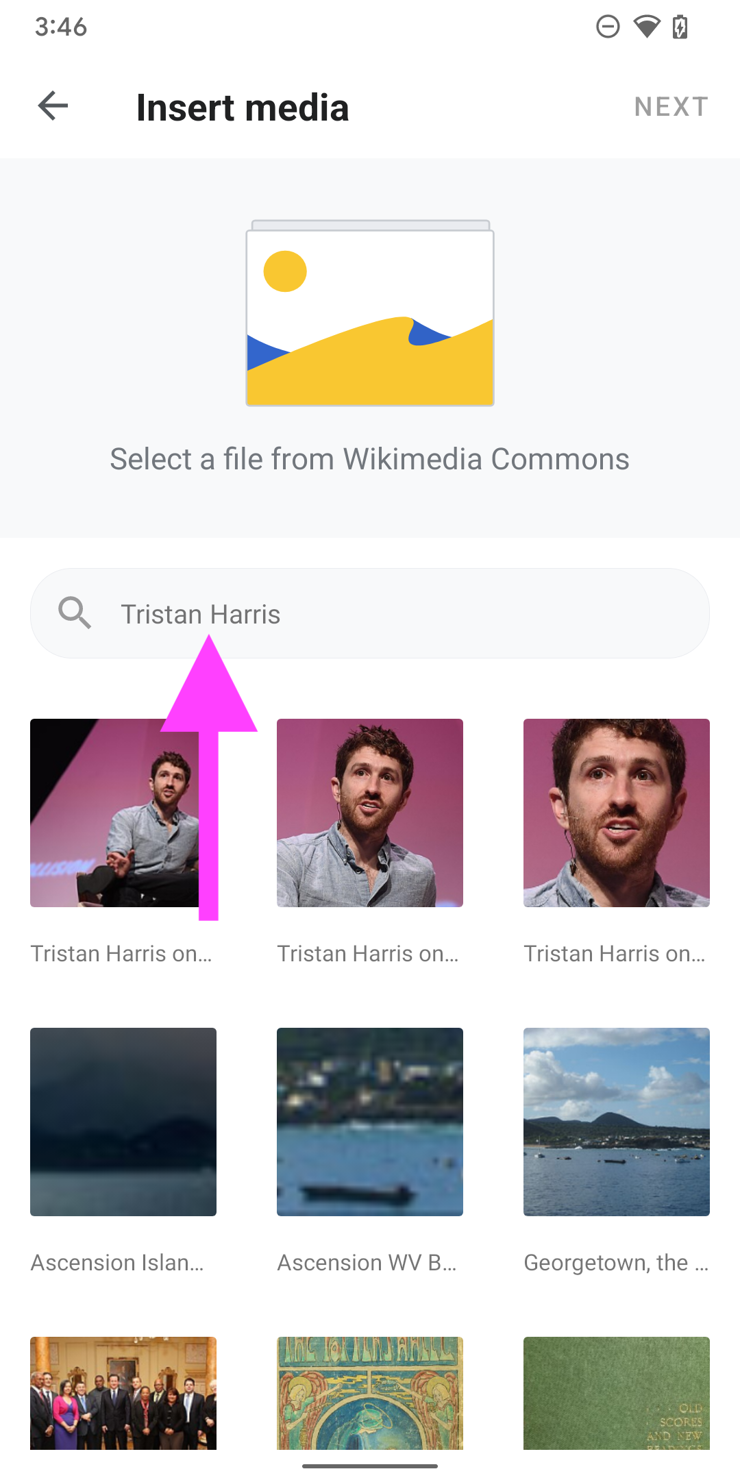
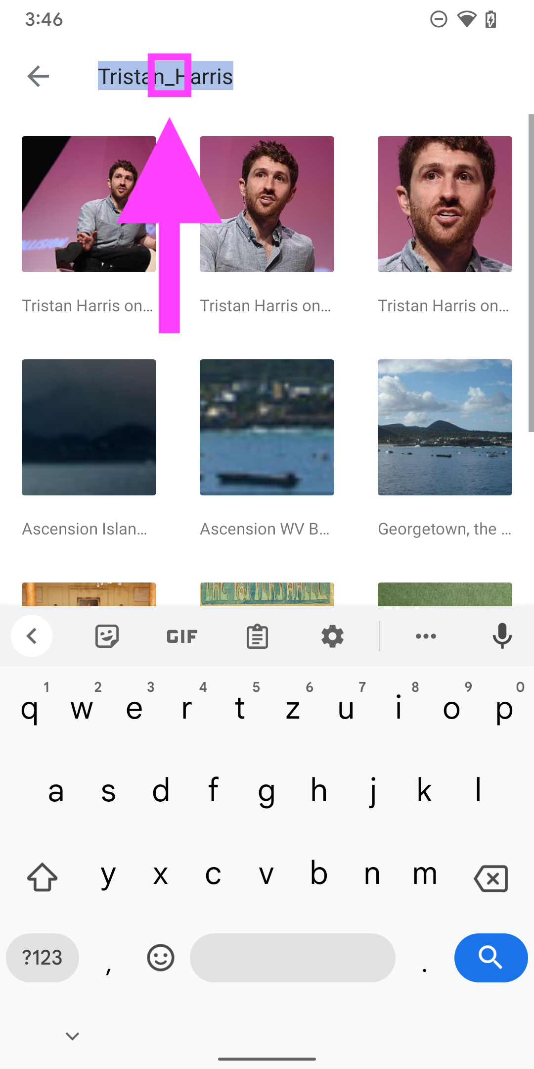
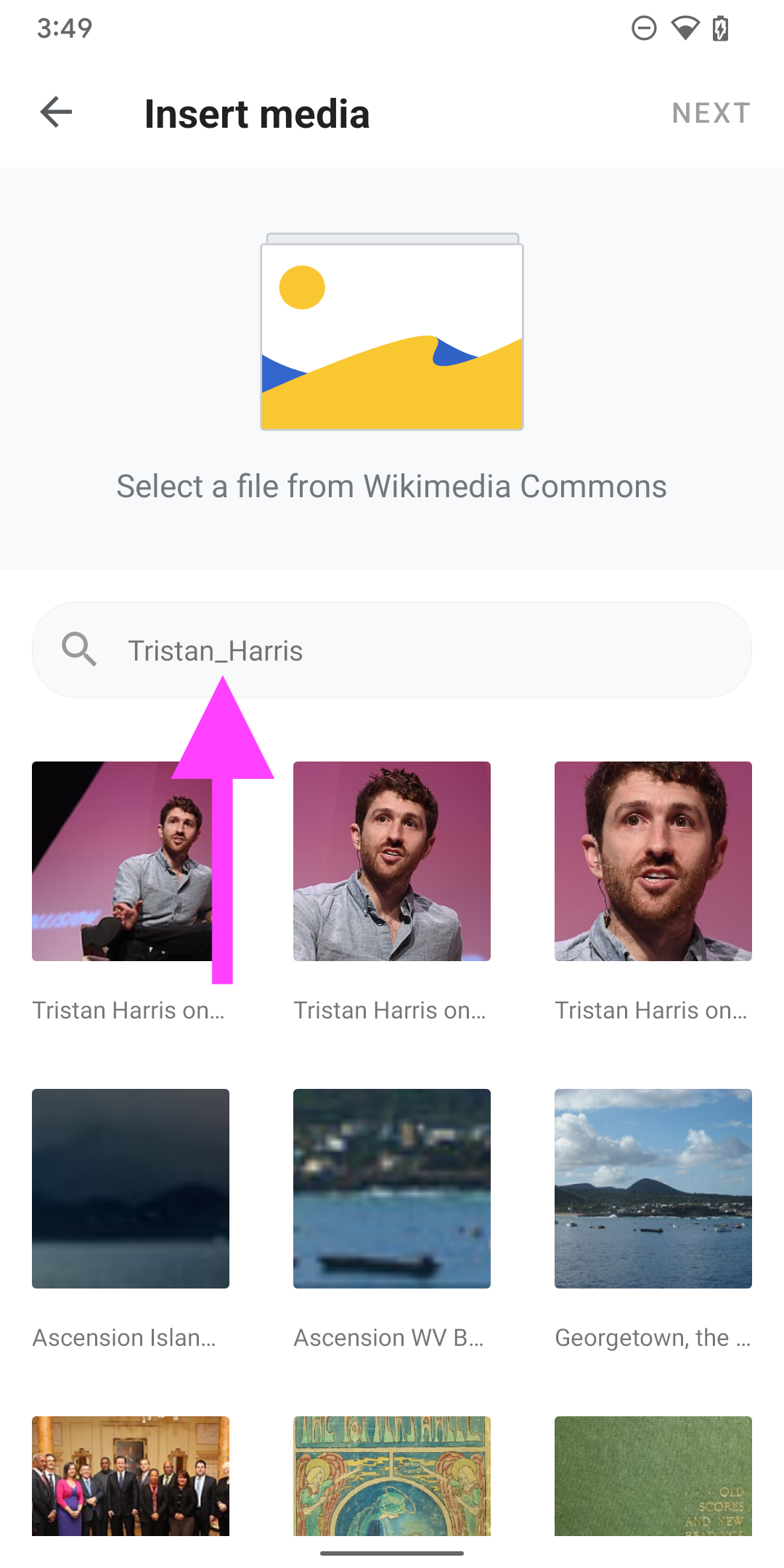
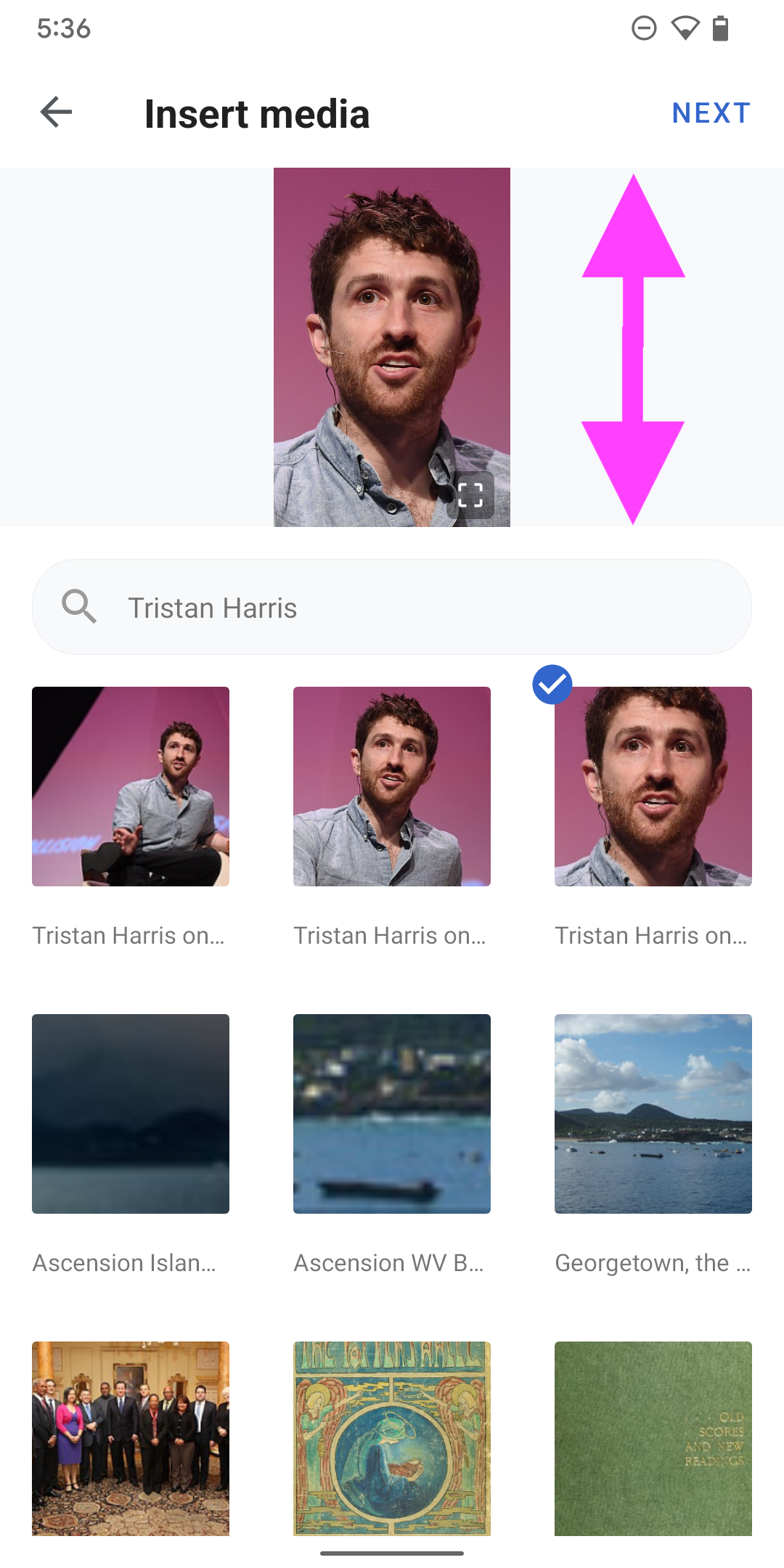
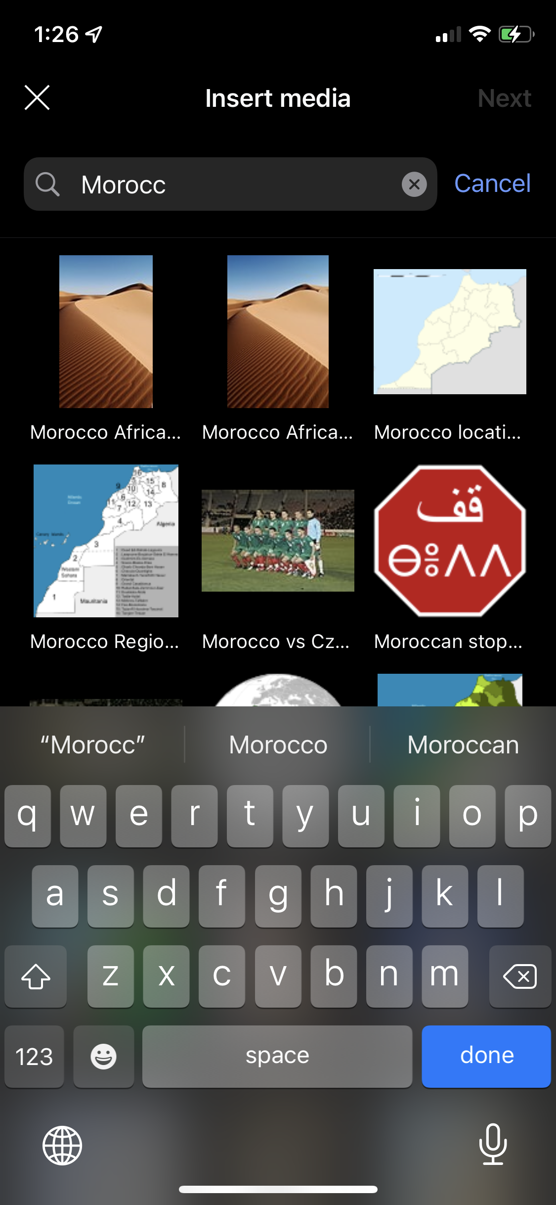
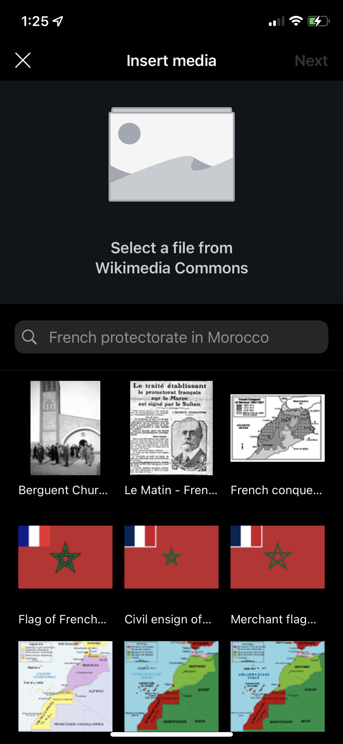
  • Pull up interface that enables users to search commons to add an image
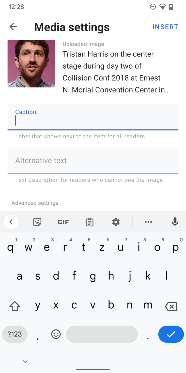
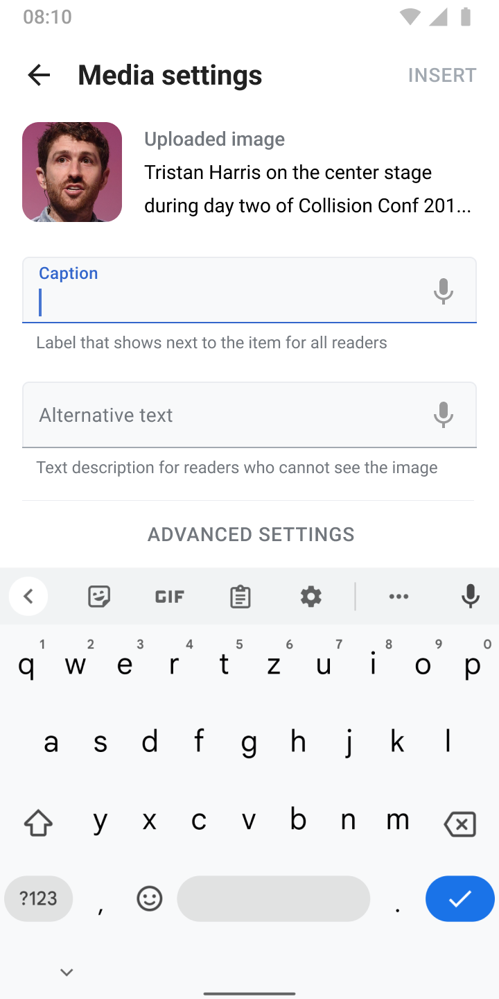
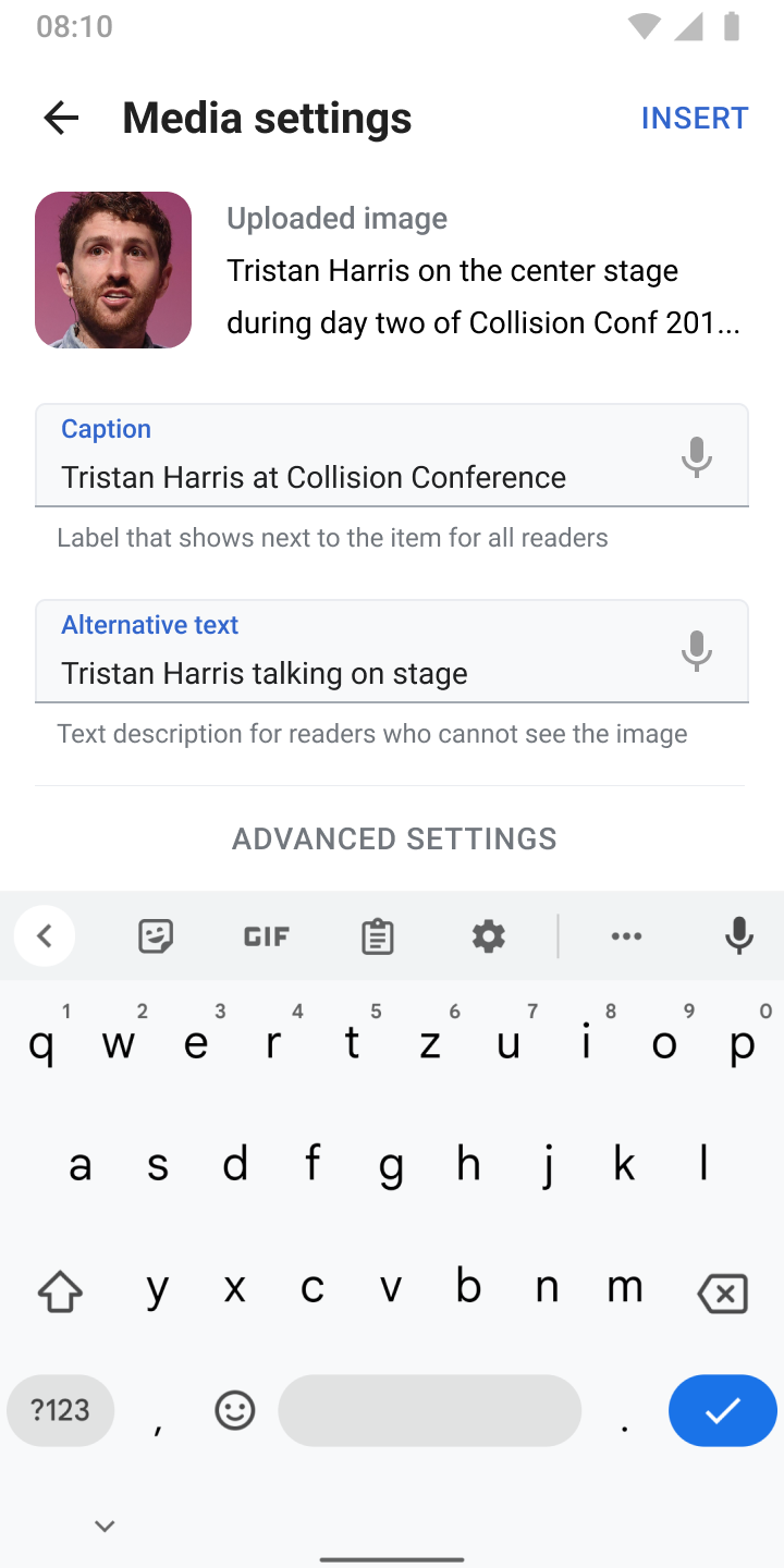
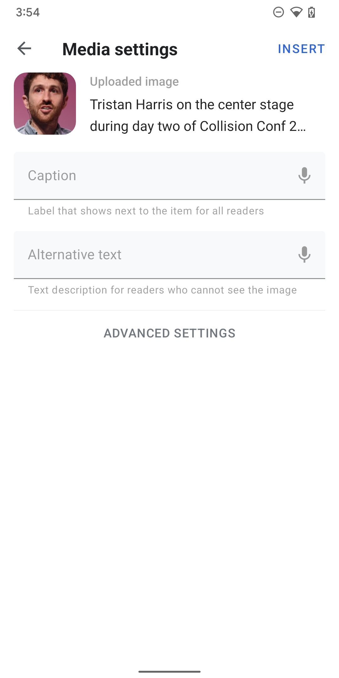
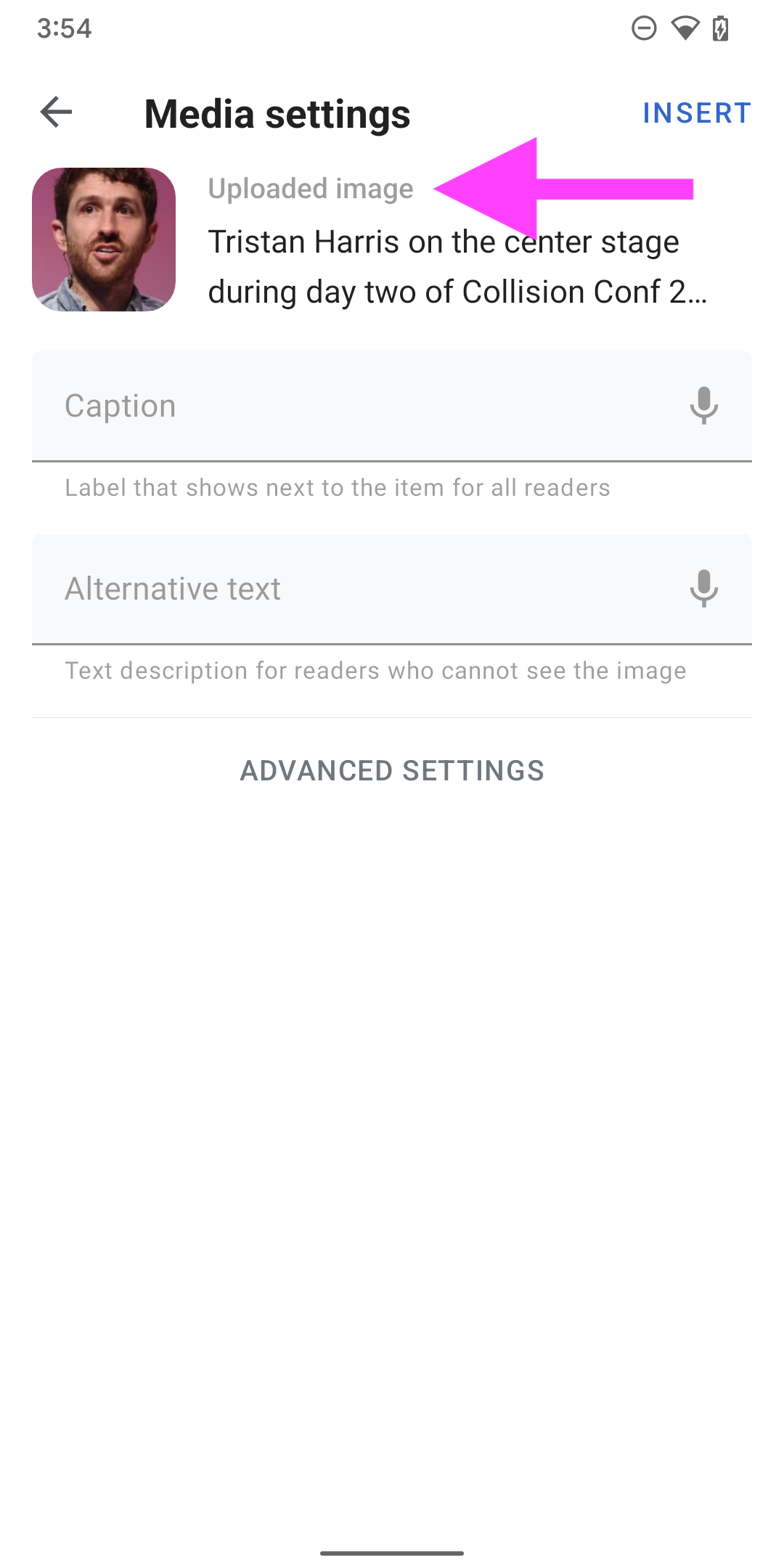
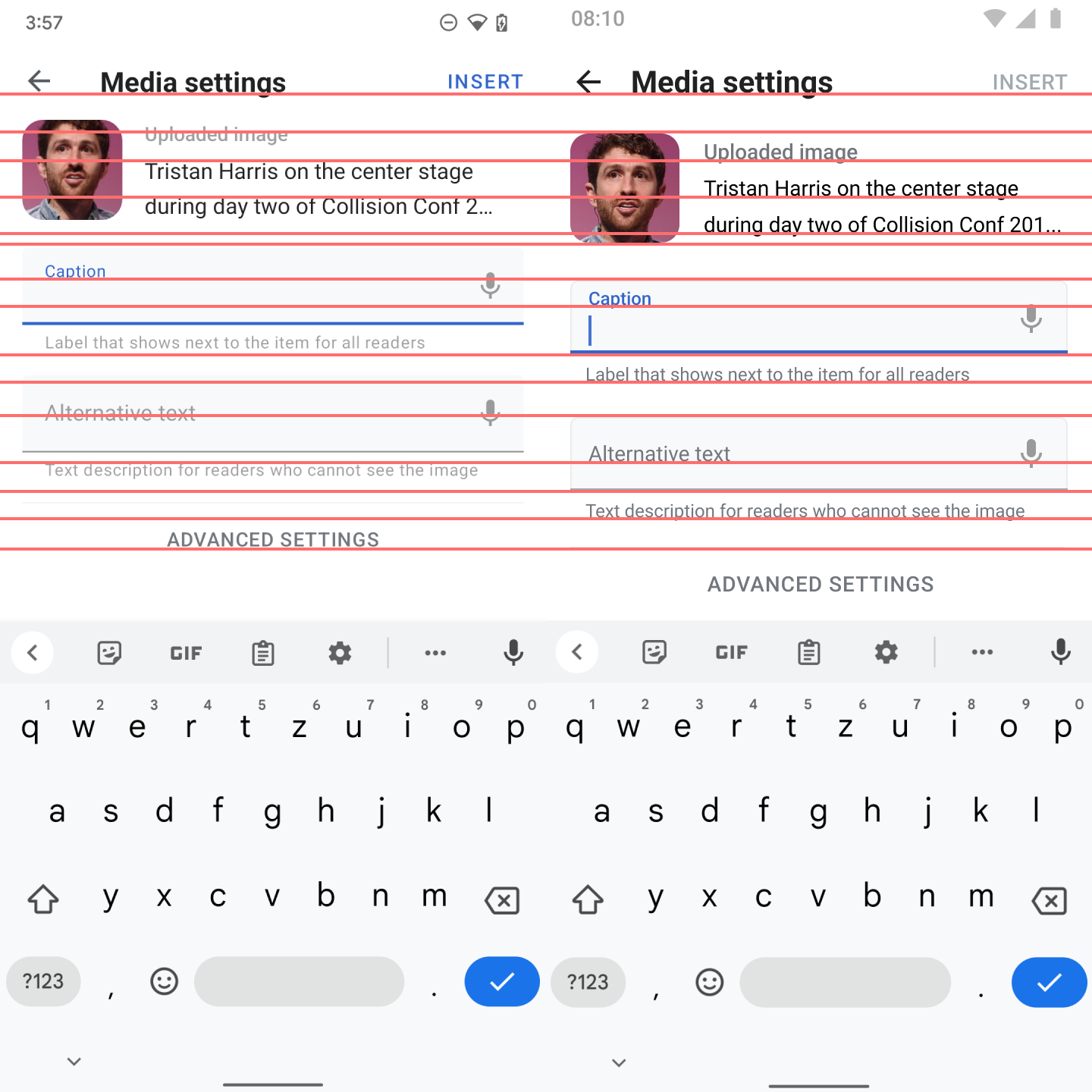
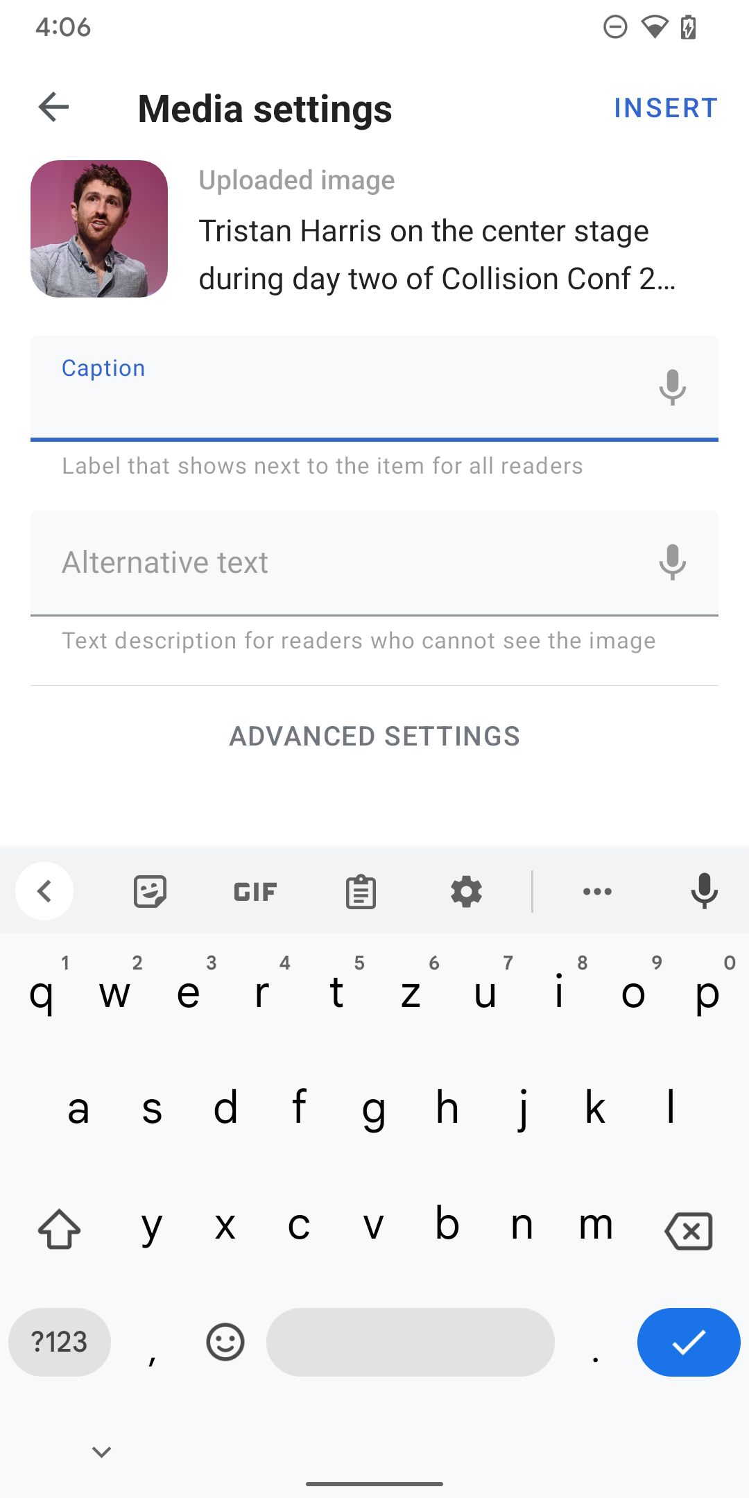
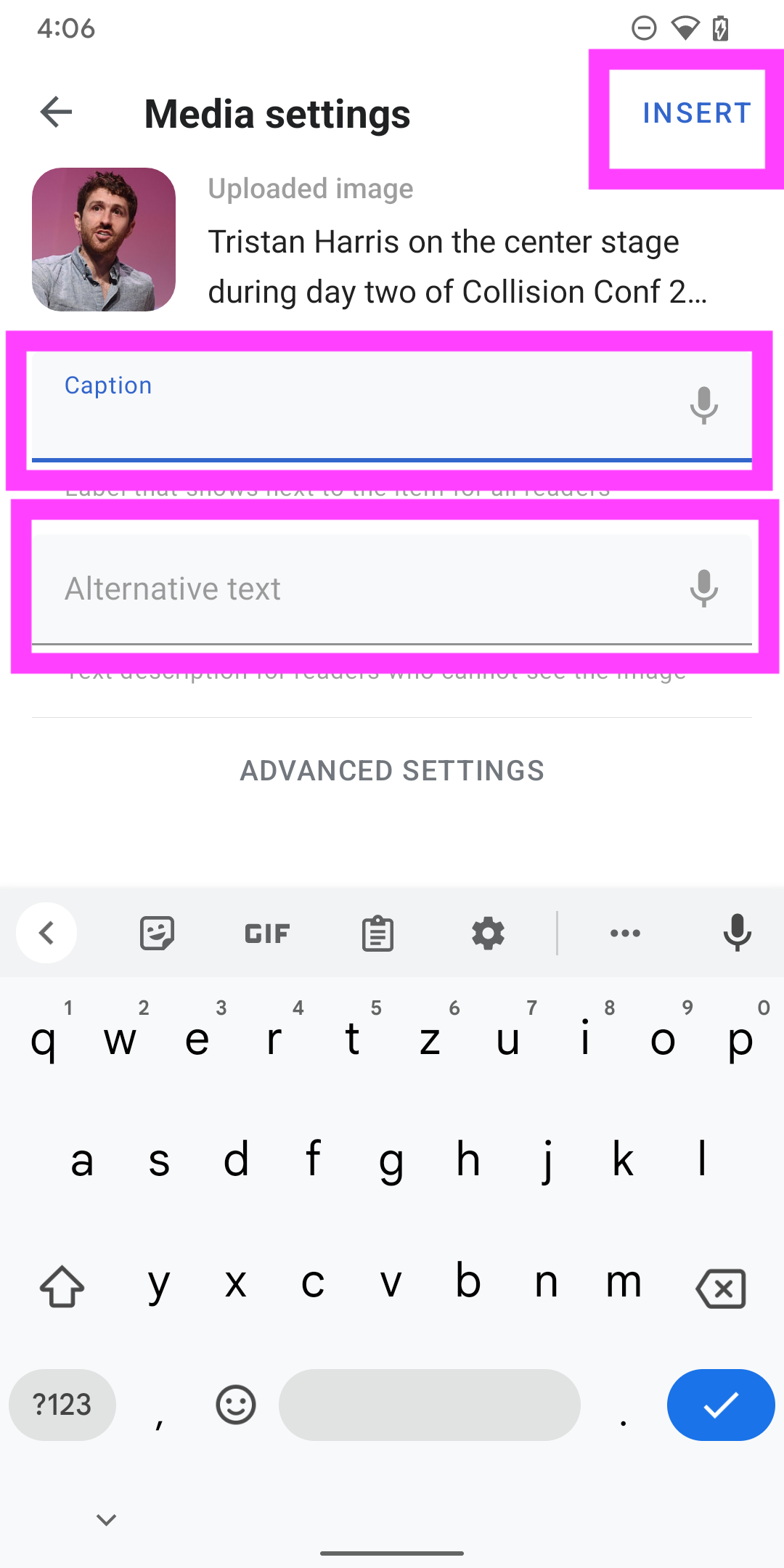
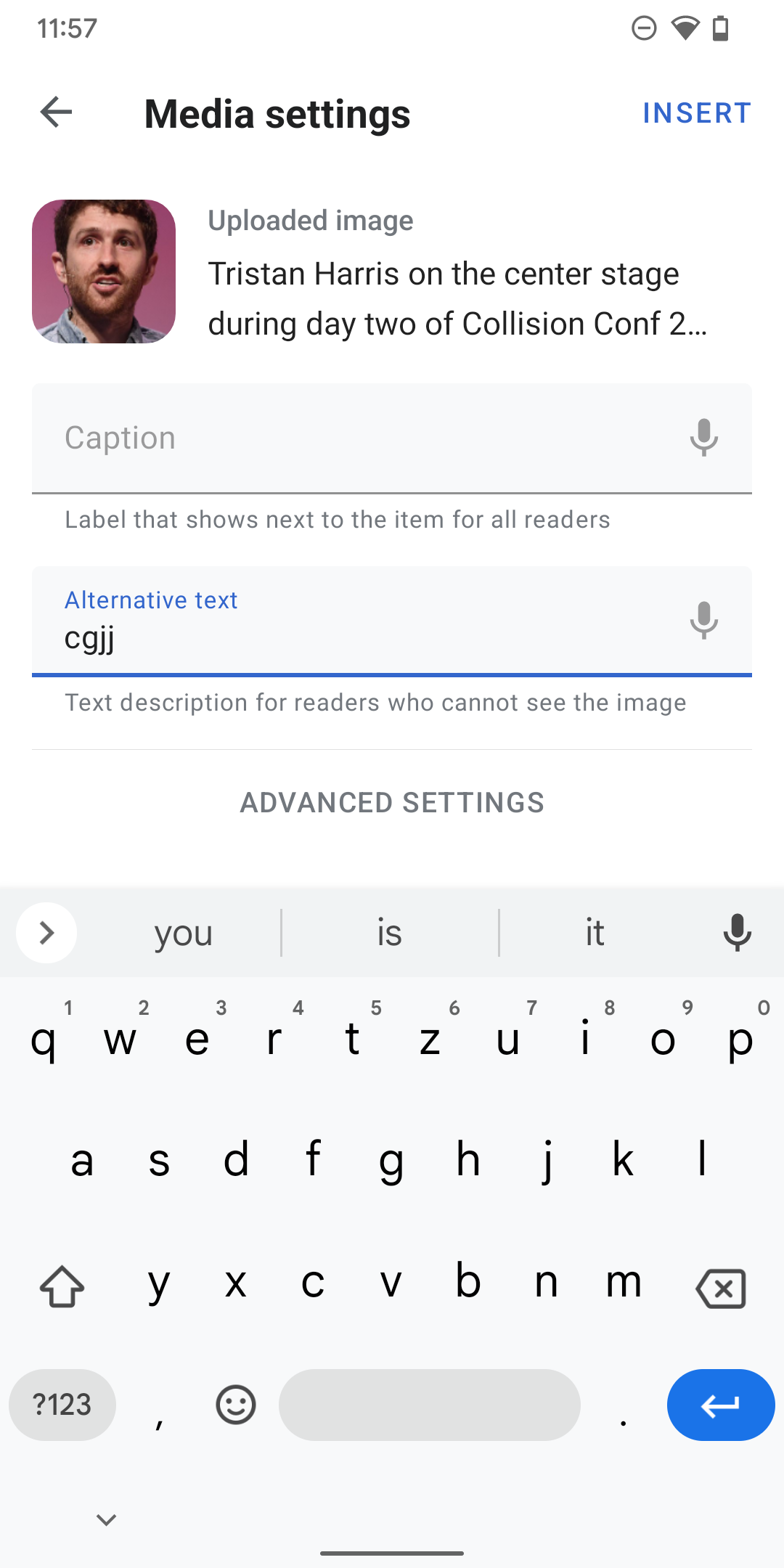
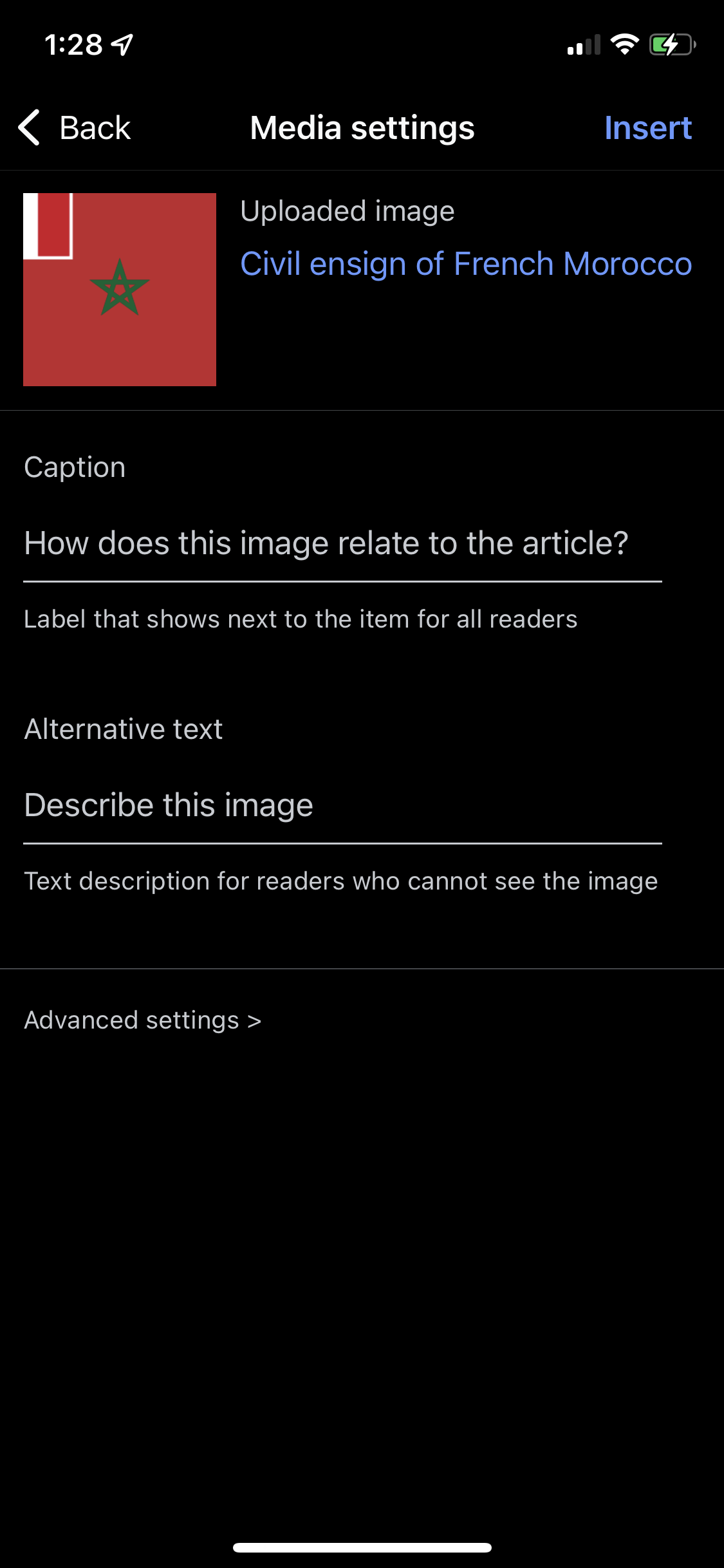
  • An option for a caption and alternative text
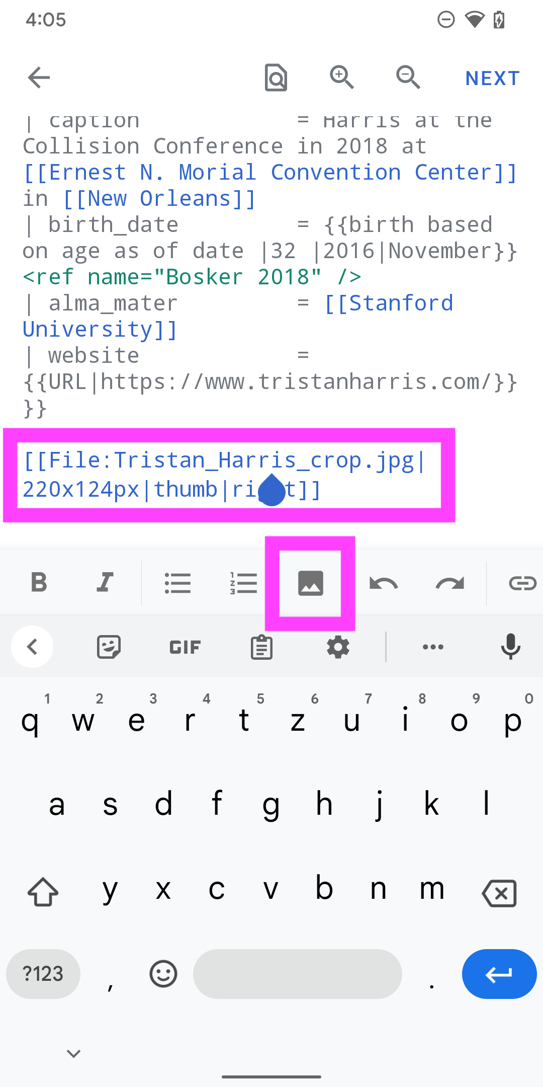
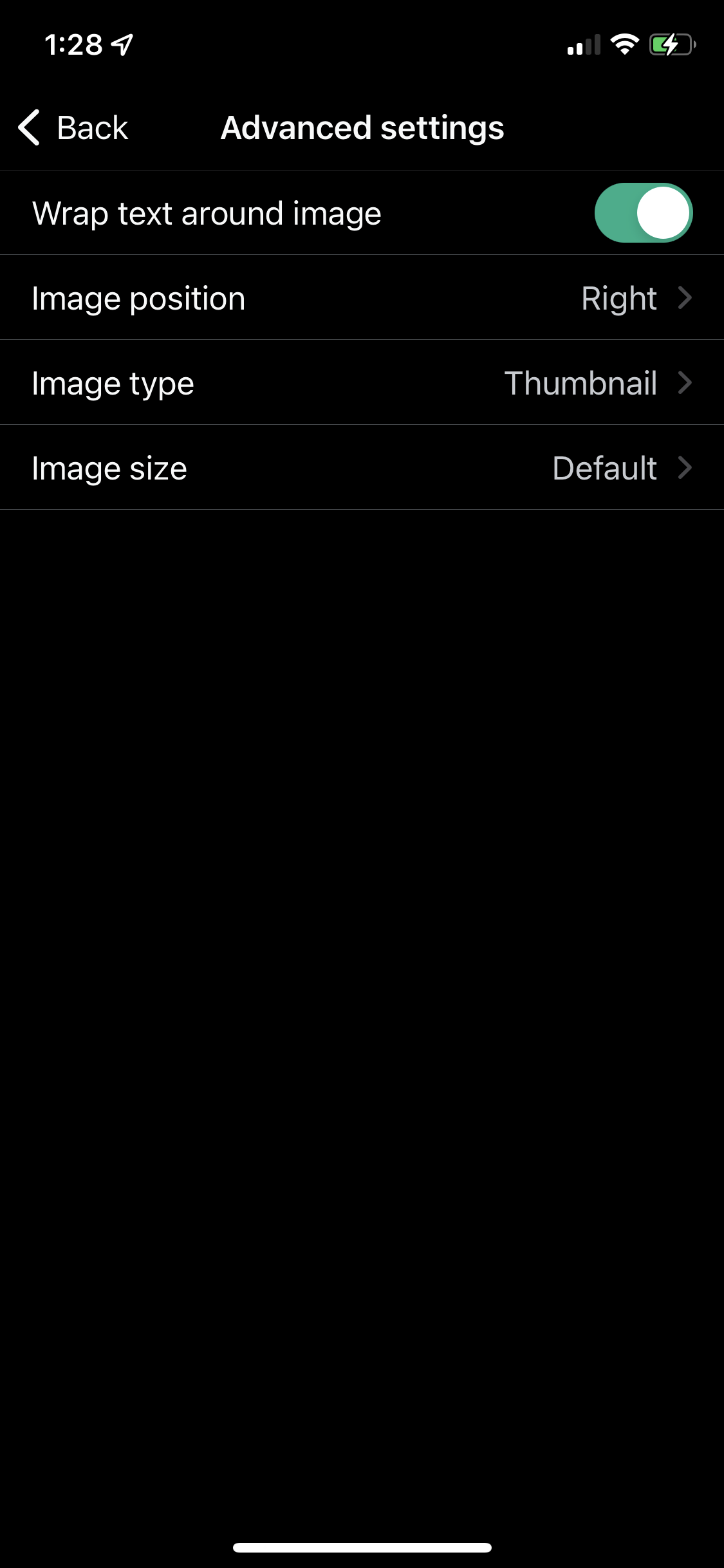
  • Advanced settings for image size, type, position and wrapping
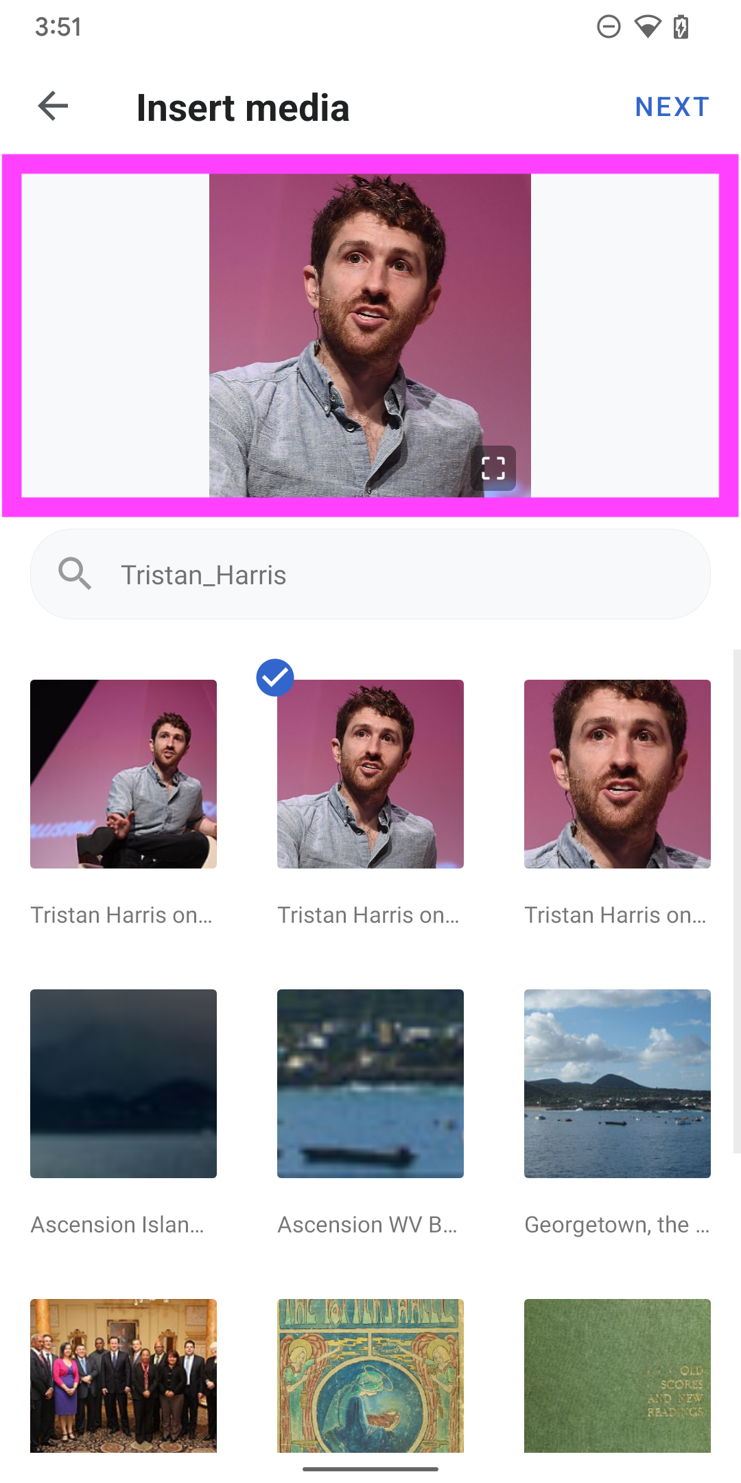
  • Preview of inserted image before publish

User Stories

As an editor on Wikipedia Android app, I want to easily add images into articles from Wikipedia commons and preview the addition, so that I can improve the quality of edits, without using wikitext or opening Commons in a separate app or web browser.

Design Guidance
Please ensure there is parity with the iOS app:

IMG_3704.PNG (2×1 px, 2 MB)

IMG_3703.PNG (2×1 px, 1 MB)

IMG_3702.PNG (2×1 px, 845 KB)

IMG_3706.PNG (2×1 px, 223 KB)

IMG_3705.PNG (2×1 px, 272 KB)

Test Instructions

  • Check feature in RTL and LTR languages going all the way through to publishing
  • Compare feature to iOS and Web functionality to share if gaps are present

APK: https://github.com/wikimedia/apps-android-wikipedia/pull/3490/checks

Event Timeline

JTannerWMF created this task.

Just checked this, together with @Dbrant – we think this task is ready for dev.

Hi @scblr, I have two design questions:

insertmedia_1.jpg (1×1 px, 348 KB)

#1 What should we use to indicate the "selected" item in the app? Should we have a proper design that matches the Android OS?

insertmedia_2.jpg (550×1 px, 129 KB)

#2 Where should we put the image icon on the toolbar? The order of icons in the Android app is quite different.

insertmedia_1.jpg (1×1 px, 348 KB)

#1 What should we use to indicate the "selected" item in the app? Should we have a proper design that matches the Android OS?

Per discussion on Slack, Google Photos is a good inspiration for this. Feel free to suggest a way to achieve this and LMK if you need more design guidance.

insertmedia_2.jpg (550×1 px, 129 KB)

#2 Where should we put the image icon on the toolbar? The order of icons in the Android app is quite different.

After the <ul> and <ol> icons for now.


Also, can you replace the 'Template' icon and string with this icon:

https://commons.wikimedia.org/wiki/OOUI_icons#code

And the 'reference' icon and string with this one:

https://commons.wikimedia.org/wiki/OOUI_icons#reference

This will make it consistent with the Web and iOS.

Hi @SNowick_WMF

Please check whether we should track the wikitext keyboard actions using the breadcrumb schema. The wikitext keyboard includes functions like insert media, insert a link, bolden text...etc.

@cooltey Thanks, yes I think we should track these events. If the breadcrumb event names clearly indicate each step we can use that, otherwise we will need a glossary of event name meaning for the data we track.
We will mainly want a count of attempted image or link adds and successful image or link adds to verify engagement with this new feature.

Hi @scblr

The implementation is completed, please download the APK from the ticket description.

@cooltey – this is AMAZING! 👏 You did a great job at “translating” iOS to Android!

I fined tuned the designs a bit in this Figma file 🎨, and here are the suggested changes:


01) Update the design of this view:

ImplementationDesign
Implementation.png (1×720 px, 572 KB)
Design.png (1×720 px, 457 KB)
  • Update app title bar font-size to 20sp (font_group_6)
  • Adapted the margins between the app bar title and a placeholder image
  • Using a 16:9 image ratio and a background color for the canvas behind the illustration
  • Change the illustration in dark and black mode to this one (from tagging images)
  • Reuse the search component from the Explore feed/Notifications/Talk pages

02) After tapping the search bar on the previous screen

ImplementationDesign
Implementation2.png (1×720 px, 398 KB)
Design2.png (1×720 px, 399 KB)
  • Make sure to use the same placeholder text in the input field (in this example Tristan Harris instead of Tristan_Harris)
  • Make sure that the search term is highlighted to convey what is happening to users better

03) Upload flow and behavior

ImplementationDesignCommons file page
Implementation.png (1×720 px, 839 KB)
Design.png (1×720 px, 664 KB)
Design #2.png (1×720 px, 1 MB)
  • Make sure the canvas for the image (16:9), always remains the same size (this pattern derives from adding images, remember?), and the images adapt to it. In this example, a portrait image adapts to the size of the canvas
  • Remove the image description overlay from the image (we will show that in the next screen, see 04)
  • Add pinch-to-zoom functionality and a zoom button/icon to the image. Tapping the zoom icon/button takes users to the native Commons file detail page.
  • Change the green tick color to color_group_3

04) Adding an image caption + alternative text

ImplementationDesignDesign (filled)
Implementation3.png (1×720 px, 175 KB)
Design3.png (1×720 px, 132 KB)
Design #2.png (1×720 px, 139 KB)
  • Add a tap target to the image and text: it should pop up the file’s bottom sheet, like in the Suggested edits image captions workflow
  • Update app title bar font-size to 20sp (font_group_6)
  • Change image size to 72 x 72
  • Change font-size of Uploaded image label to Medium 14sp and 21sp line height (font-group-3) [that’s the same font-size as the image description below it]
  • Please confirm the text field components on this screen are using our default component
  • Change style of Advanced settings

Hi @scblr

@cooltey – this is AMAZING! 👏 You did a great job at “translating” iOS to Android!

😄


01) Update the design of this view:

  • Update app title bar font-size to 20sp (font_group_6)
  • Adapted the margins between the app bar title and a placeholder image
  • Using a 16:9 image ratio and a background color for the canvas behind the illustration
  • Change the illustration in dark and black mode to this one (from tagging images)
  • Reuse the search component from the Explore feed/Notifications/Talk pages

Done

02) After tapping the search bar on the previous screen

  • Make sure to use the same placeholder text in the input field (in this example Tristan Harris instead of Tristan_Harris)
  • Make sure that the search term is highlighted to convey what is happening to users better

Done

03) Upload flow and behavior

ImplementationDesignCommons file page
Implementation.png (1×720 px, 839 KB)
Design.png (1×720 px, 664 KB)
Design #2.png (1×720 px, 1 MB)
  • Make sure the canvas for the image (16:9), always remains the same size (this pattern derives from adding images, remember?), and the images adapt to it. In this example, a portrait image adapts to the size of the canvas
  • Remove the image description overlay from the image (we will show that in the next screen, see 04)
  • Add pinch-to-zoom functionality and a zoom button/icon to the image. Tapping the zoom icon/button takes users to the native Commons file detail page.
  • Change the green tick color to color_group_3

Done.

However, the pinch-to-zoom may not be very useful in this case, since the image sticks to the top of the screen, and it will be slightly difficult to zoom in.

Also, due to the "foldable" toolbar title on the screen, the touch event may be conflicted. I recommend not enabling the pinch-to-zoom for the selected image.

04) Adding an image caption + alternative text

  • Add a tap target to the image and text: it should pop up the file’s bottom sheet, like in the Suggested edits image captions workflow
  • Update app title bar font-size to 20sp (font_group_6)
  • Change image size to 72 x 72
  • Change font-size of Uploaded image label to Medium 14sp and 21sp line height (font-group-3) [that’s the same font-size as the image description below it]
  • Please confirm the text field components on this screen are using our default component
  • Change style of Advanced settings

Done

These are great updates @cooltey – we’re close!

1) Adjust this gap to the same as above the search input field (for visual balance)

Screenshot_20220818-154136.png (2×1 px, 1004 KB)

2) When tapping the search field with a search term that consists of two text strings, an underline (_) between strings is added. Please use the exact text string as in the search. Tapping back copies the underline _ to the previous screen.

Screenshot_20220818-154643.png (2×1 px, 994 KB)
Screenshot_20220818-154650.png (2×1 px, 822 KB)
Screenshot_20220818-154924.png (2×1 px, 995 KB)

3) Tapping this area should take users to the Commons file page.

Screenshot_20220818-155129.png (2×1 px, 1 MB)
Design #2.png (1×720 px, 1 MB)

(And I think we should keep the pinch-to-zoom gesture, it works ok IMO)

4) Please enable the Caption input field when arriving on this page

ImplementationvsDesign
Screenshot_20220818-155425.png (2×1 px, 136 KB)
Design3.png (1×720 px, 132 KB)

5) Change label color to color_group_11

Screenshot_20220818-155425 copy.png (2×1 px, 195 KB)

6) Please make sure to apply similar spacing and sizes (e.g. thumbnail image: is it 72dp * 72dp?) from the designs on Figma.

Implementation vs. Design:

Implementation vs Design Spacing.png (1×1 px, 257 KB)

7) Can we detect if the “cursor” is within image markup? Tapping the image would lead to image #2 below, and the text label could say UPDATE instead of INSERT

Screenshot_20220818-160506.png (2×1 px, 223 KB)
Screenshot_20220818-160640.png (2×1 px, 188 KB)

Hi @scblr

1) Adjust this gap to the same as above the search input field (for visual balance)

Done.

2) When tapping the search field with a search term that consists of two text strings, an underline (_) between strings is added. Please use the exact text string as in the search. Tapping back copies the underline _ to the previous screen.

Done.

3) Tapping this area should take users to the Commons file page.

Done.

(And I think we should keep the pinch-to-zoom gesture, it works ok IMO)

Looks like if we make the entire view clickable, the image will not be able to support the pinch-to-zoom feature.

4) Please enable the Caption input field when arriving on this page

Done.

5) Change label color to color_group_11

Done.

6) Please make sure to apply similar spacing and sizes (e.g. thumbnail image: is it 72dp * 72dp?) from the designs on Figma.

Implementation vs. Design:

Done. The thumbnail image size is 72dp*72dp. Based on the different dpi of each device, the actual visual size may be different.

7) Can we detect if the “cursor” is within image markup? Tapping the image would lead to image #2 below, and the text label could say UPDATE instead of INSERT

This is possible. But can we create a sub ticket for this advanced feature since this change requires extra time to complete?

Great work @cooltey and almost ready for the next column 👏


1) I noticed that the initial state with the placeholder image and the image-preview state canvas have different heights, which causes the interface to jump – see this video:

https://www.dropbox.com/s/ilchqfqixr40tmg/screen-20220819-173708.mp4?dl=0

Please change it to always use the height of the image-preview state:

Screenshot_20220819-173624.png (2×1 px, 1 MB)

2) Please de-emphasize the INSERT button when no caption and alternative text has been added. It should still be clickable at any time, but we want to encourage people to add image captions and alternative text (for accessibility reasons)

Screenshot_20220818-160640.png (2×1 px, 242 KB)

3)

@scblr: Can we detect if the “cursor” is within image markup? Tapping the image would lead to image #2 below, and the text label could say UPDATE instead of INSERT

Screenshot_20220818-160506.png (2×1 px, 223 KB)
Screenshot_20220818-160640.png (2×1 px, 188 KB)

@cooltey: This is possible. But can we create a sub ticket for this advanced feature since this change requires extra time to complete?

Task created: T315680

Hi @scblr

Great work @cooltey and almost ready for the next column 👏


1) I noticed that the initial state with the placeholder image and the image-preview state canvas have different heights, which causes the interface to jump – see this video:

https://www.dropbox.com/s/ilchqfqixr40tmg/screen-20220819-173708.mp4?dl=0

Please change it to always use the height of the image-preview state:

Done.

2) Please de-emphasize the INSERT button when no caption and alternative text has been added. It should still be clickable at any time, but we want to encourage people to add image captions and alternative text (for accessibility reasons)

Done.

3)

@scblr: Can we detect if the “cursor” is within image markup? Tapping the image would lead to image #2 below, and the text label could say UPDATE instead of INSERT

Screenshot_20220818-160506.png (2×1 px, 223 KB)
Screenshot_20220818-160640.png (2×1 px, 188 KB)

@cooltey: This is possible. But can we create a sub ticket for this advanced feature since this change requires extra time to complete?

Task created: T315680

Thanks!

2) Please de-emphasize the INSERT button when no caption and alternative text has been added. It should still be clickable at any time, but we want to encourage people to add image captions and alternative text (for accessibility reasons)

Done.

@cooltey – minor thing before moving it to the next column → can we emphasize INSERT (turn blue) when both input fields contain text. Currently, INSERT turns blue when one of the two inputs has been filled out. thanks!

Screenshot_20220822-115727.png (2×1 px, 191 KB)
Screenshot_20220822-115740.png (2×1 px, 189 KB)

@scblr

@cooltey – minor thing before moving it to the next column → can we emphasize INSERT (turn blue) when both input fields contain text. Currently, INSERT turns blue when one of the two inputs has been filled out. thanks!

Done.

ABorbaWMF subscribed.

Generally looks good on 2.7.50420-alpha-2022-09-21

Found this small issue - T318738