Page MenuHomePhabricator

Revisit placement of "Subscribe" / "Unsubscribe" within Topic Containers (desktop)
Closed, ResolvedPublic

Description

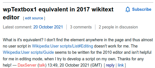
In T310914#8030385, @DLynch noted how the current placement of the Subscribe / Unsubscribe affordances within desktop Topic Containers looks a bit off.

This task involves the work with reviewing the initial implementation (T310914) and deciding what – if anything – we'll do to address the Observations documented below.

Observations

IDObservationScreenshot
1.Subscribe affordance's distance from section heading looks a bit off
Screen Shot 2022-07-08 at 12.22.12 PM.png (888×1 px, 270 KB)

Mockup(s)

If we decide to adjust where the Subscribe affordance is shown within the Topic Containers on desktop, then this section will contain mockup(s) showing where the the Subscribe affordance should be moved to.

Open questions

  • 1. What – if any – adjustments will we make to where the Subscribe affordance is shown within the Topic Containers on desktop?

Done

  • Answers to all Open questions are documented
  • Mockup(s) are included in the Mockup(s) section above and implemented

Event Timeline

Change 815712 had a related patch set uploaded (by Esanders; author: Esanders):

[mediawiki/extensions/DiscussionTools@master] Move subscribe button up on desktop

https://gerrit.wikimedia.org/r/815712

Test wiki created on Patch demo by ESanders (WMF) using patch(es) linked to this task:
https://patchdemo.wmflabs.org/wikis/286c9d8649/w

This doesn’t look nice IMO.

Screenshot 2022-07-20 at 18-18-12 Talk DiscussionTools - Patch demo (815712,1).png (74×602 px, 9 KB)

Maybe put the headline before the subscribe link in the DOM and float both? It would cause the same behavior when the headline is shorter than one line, and push it to the next line if it’s longer than that. Since there’s no that big white space anyway if the headline reaches the right margin, I hope it won’t embarrass @DLynch either. I thought about something along the lines

<h2 class="ext-discussiontools-init-section">
	<div style="float:left">
		<span class="mw-headline">...</span>
		<span class="mw-editsection">...</span>
	</div>
	<span class="ext-discussiontools-init-section-subscribeButton" style="float:right">...</span>
	<div class="ext-discussiontools-init-section-bar" style="clear:left">...</div>
</h2>

This doesn’t look nice IMO.

Screenshot 2022-07-20 at 18-18-12 Talk DiscussionTools - Patch demo (815712,1).png (74×602 px, 9 KB)

I think all that's missing here is a left margin on the subscribe button and a tweak to the vertical alignment:

image.png (239×546 px, 56 KB)

Change 815712 merged by jenkins-bot:

[mediawiki/extensions/DiscussionTools@master] Move subscribe button up on desktop

https://gerrit.wikimedia.org/r/815712

While I think what @Esanders implemented aligns with what @nayoub had in mind, I'm assigning this over to Nico to verify this to be true.

Thanks @ppelberg! Yes this looks good to me, we'll have to see in a later stage if & how to homogenize with other parts of the UI as reflected in T313872.

Thanks @ppelberg! Yes this looks good to me, we'll have to see in a later stage if & how to homogenize with other parts of the UI as reflected in T313872.

Excellent. Thank you for confirming, @nayoub.

Test wiki on Patch demo by ESanders (WMF) using patch(es) linked to this task was deleted:

https://patchdemo.wmflabs.org/wikis/286c9d8649/w/