Page MenuHomePhabricator

Show central notice at full width after grid work
Closed, ResolvedPublic3 Estimated Story Points

Description

Background

Now that we've switched the order of the title and tabs T311773: [Layout] Deploy title/tab order everywhere (Make it so that the title should always be above tabs), we would like to continue to making the central notice banners full-width to allow for more customization by communities and internally

Acceptance criteria

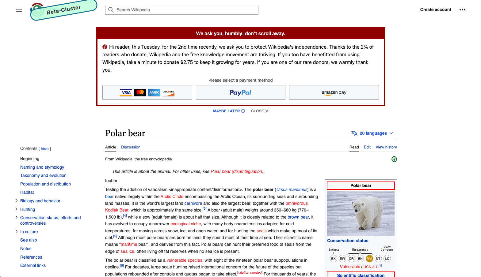
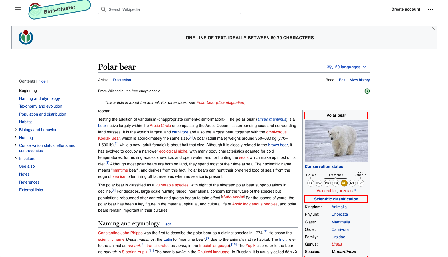
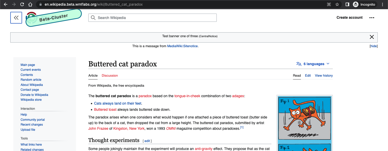
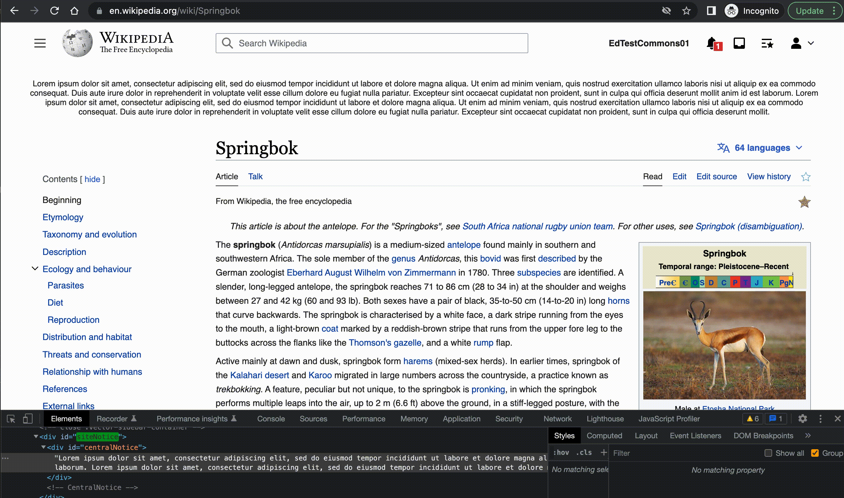
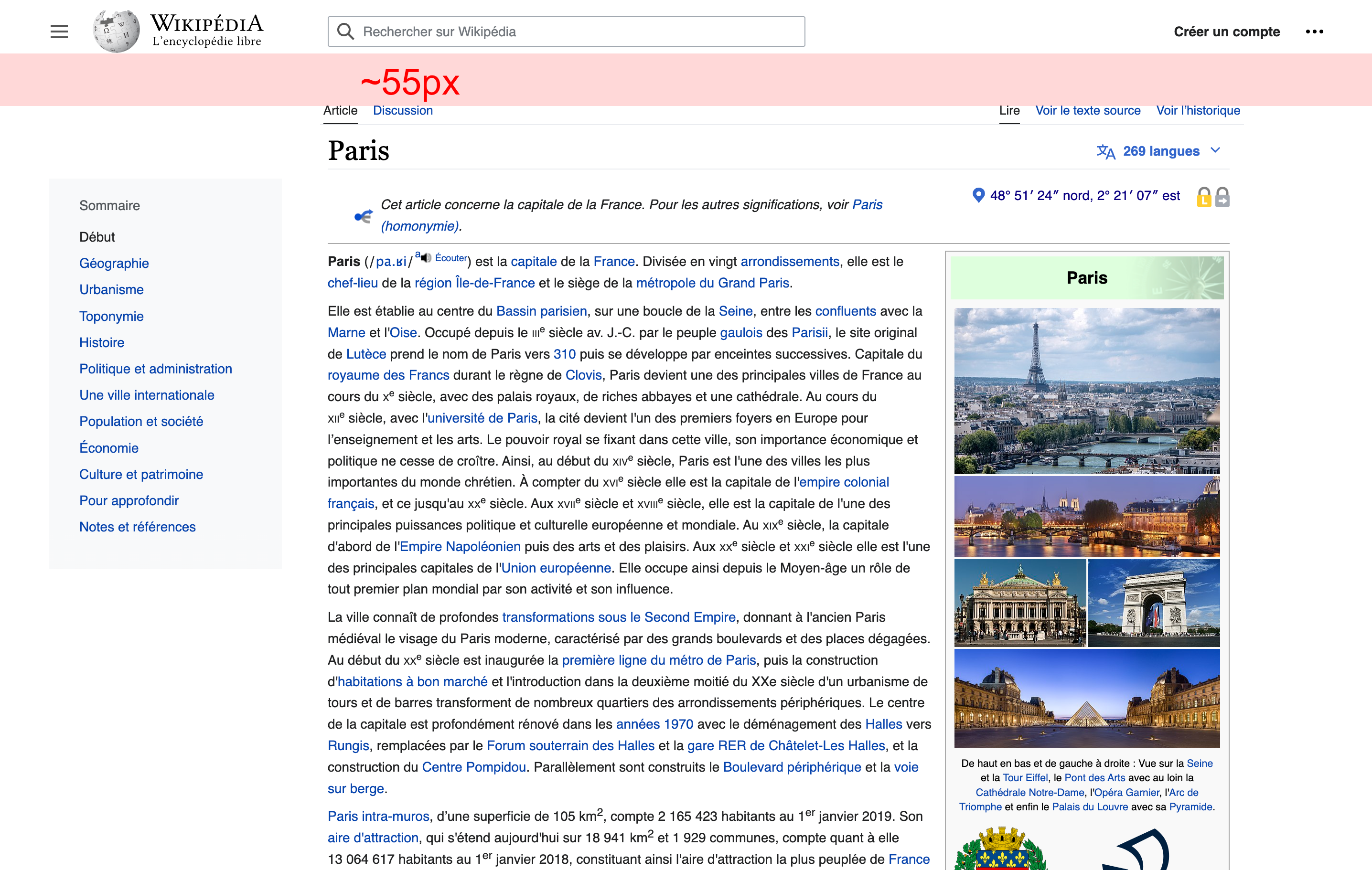
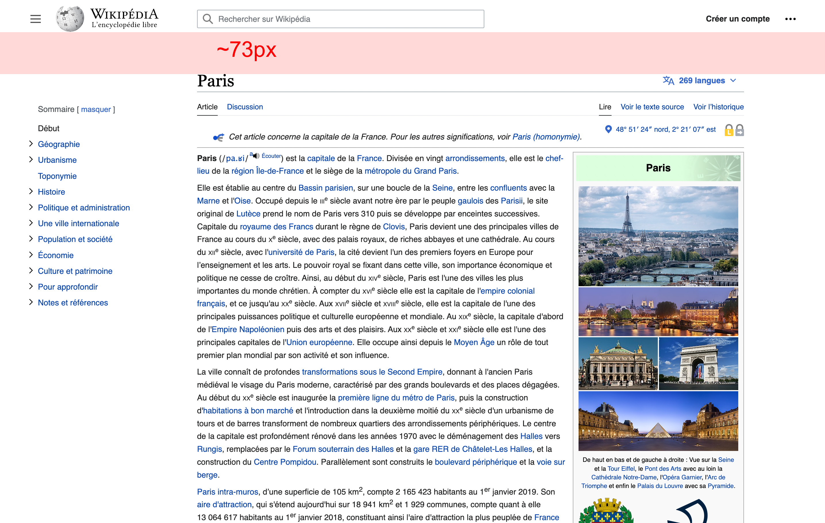
  • Ensure central notice banners appear in full screen when available
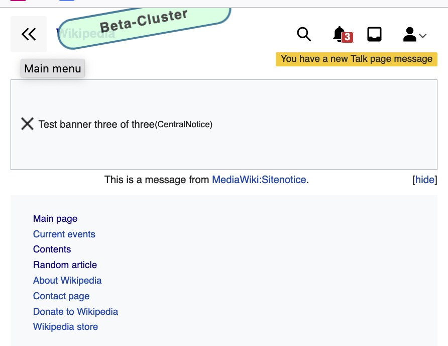
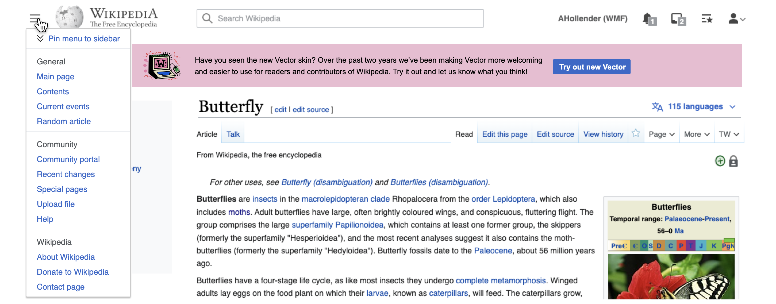
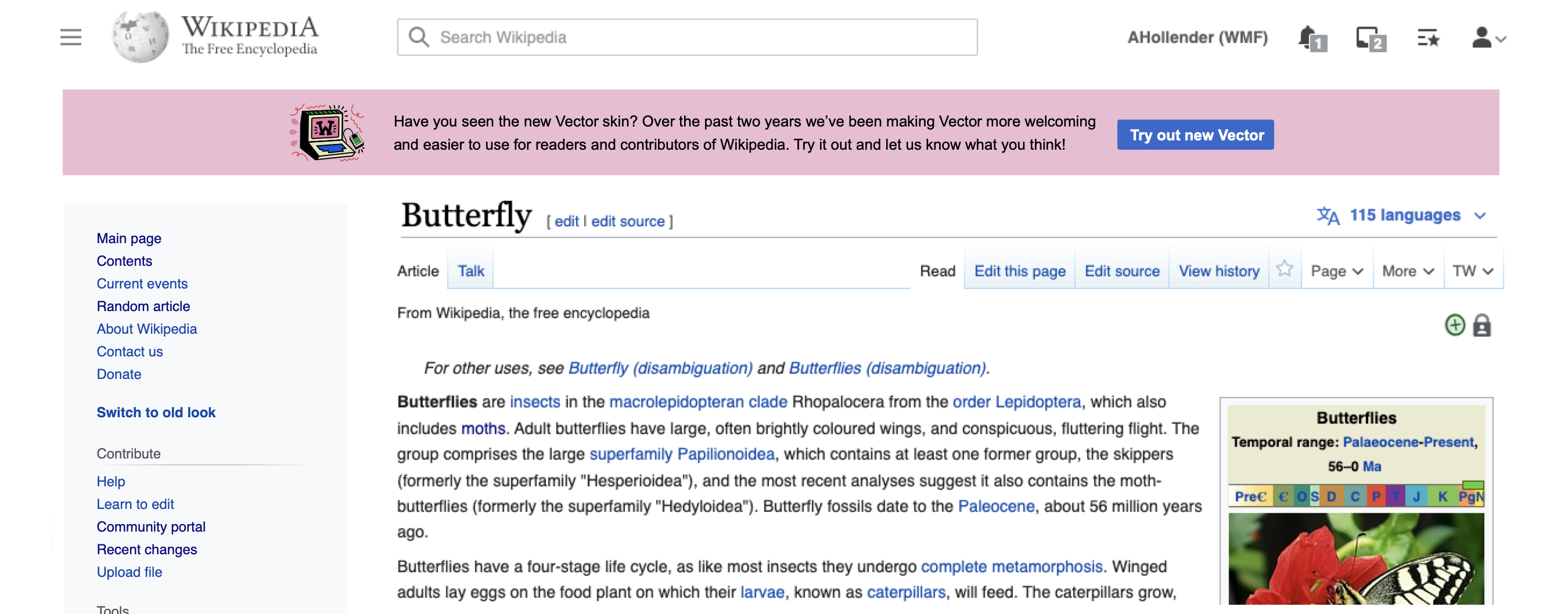
floating menu overlaps bannerpinned menu is below banner
image.png (1×2 px, 1 MB)

QA Results - Beta

ACStatusDetails
1T312749#8126501

QA Results - Prod

ACStatusDetails
1T312749#8135704

Event Timeline

Could we have some mocks here for narrow screens with sidebar open and close? On narrow screens the banner will present problems for discovering the show/hide behaviour of the menu as the menu is no longer connected to the menu

Screen Shot 2022-07-11 at 9.09.13 AM.png (688×892 px, 90 KB)

Would it make sense to do the floating menu before making this change to avoid that?

@Jdlrobson I'm fine with the collapse button being a bit disconnected from the menu at narrow screens with a banner there, given that we're eventually going to update the menu

I think this should be relatively straightforward. we'd need to add a new grid row under the header which can collapse to 0 height. We'll have to be careful around margins with notice and without given we use row-gap. Since there is no special behaviour based on sidebar looks like we won't need special casing here.

bwang removed bwang as the assignee of this task.Jul 25 2022, 8:43 PM
bwang subscribed.

@bwang is there a related patch for this ticket?

Change 816833 had a related patch set uploaded (by Bernard Wang; author: Bernard Wang):

[mediawiki/skins/Vector@master] Make site banner full width in grid layout

https://gerrit.wikimedia.org/r/816833

cjming moved this task from Code Review to QA on the Web-Team-Backlog (Kanbanana-2022-23-Q1) board.

Change 816833 merged by jenkins-bot:

[mediawiki/skins/Vector@master] Make site banner full width in grid layout

https://gerrit.wikimedia.org/r/816833

@Pcoombe - This should now be ready for testing from the fundraising side as well

Thanks @ovasileva. Looks okay to me on beta. When do you expect this will be rolling out to production?

Thanks @ovasileva. Looks okay to me on beta. When do you expect this will be rolling out to production?

@Pcoombe - we're testing in beta this week and expecting it to roll out on this week's train. Let us know if there's any concerns with that/overlap with any campaigns and we can postpone.

Thanks @ovasileva, on this week's train is fine.

We are launching some fundraising banners on Hebrew and Portuguese Wikipedias today, but I'm going to include some javascript which hacks them to always use the existing position. This will give us a bit more time to decide if there's any changes we want to make before adopting the full-width position.

thanks @Pcoombe


for reference here is how the banners are being displayed:

fundraising bannercommunity banner
Screen Shot 2022-08-02 at 11.19.55 AM.png (905×1 px, 336 KB)
Screen Shot 2022-08-02 at 11.19.43 AM.png (903×1 px, 373 KB)

Test Result - Beta

Status: ✅ PASS
Environment: beta
OS: macOS Monterey
Browser: Chrome
Device: MBP
Emulated Device:NA

Test Artifact(s):

QA Steps

✅ AC1: Central Notice should appear full width

Screen Shot 2022-08-02 at 4.36.57 PM.png (589×1 px, 229 KB)

Screen Shot 2022-08-02 at 4.37.11 PM.png (589×1 px, 241 KB)

I don't know if it is related, but the sitenotice is now shown in the left side, instead of the top: https://eu.wikipedia.org/wiki/Berezi:Estatistikak

Edtadros subscribed.

Test Result - Prod

Status: ✅ PASS
Environment: enwiki
OS: macOS Monterey
Browser: Chrome
Device: MBP
Emulated Device:NA

Test Artifact(s):

QA Steps

✅ AC1: Central Notice should appear full width

Screen Recording 2022-08-06 at 5.34.45 PM.mov.gif (1×2 px, 1 MB)

I don't know if it is related, but the sitenotice is now shown in the left side, instead of the top: https://eu.wikipedia.org/wiki/Berezi:Estatistikak

hey, can you add a screenshot? I'm not sure I understand this one.

It was solved in some hours, so I thought someone managed to do it. Or, it could be a cache thing instead. Sorry for not notifying here the change.

Sounds good, thanks for double-checking @Theklan. I think we can go ahead and resolve this one

I noticed a spacing issue introduced by this fix, because we moved the site notice into the grid container, we are seeing extra spacing between the header and title when the site notice is empty. Currently it's 48px when it should be 24px. The spacing is correct when the site notice is defined and has content. Unsure how we didn't pick this up with pixel.

My suggestion to fix this is to move both the header and the site notice out of the grid container, which would remove grid row gap from the equation and simply our spacing. More technical details.

I can confirm that space is double what it should be. @bwang could you please open a ticket for this?

yea I had also seen this and was going to file a task. in case it's helpful:

June 17, via wayback machineAugust 18
image.png (1×2 px, 1 MB)
image.png (1×2 px, 2 MB)

I don't know if this is related, or it is another extra spacing issue, but I have noticed it today, so it may be recent.

If you go to a category without subcategories (https://eu.wikipedia.org/wiki/Kategoria:Euskal_Herriko_kondairak), there is a huge gap in the top. Inspecting the code, there is a <p> there with height but not width.