Page MenuHomePhabricator

Unreadable preview with time signature in Android App
Closed, ResolvedPublicBUG REPORT

Description

Steps to replicate the issue (include links if applicable):

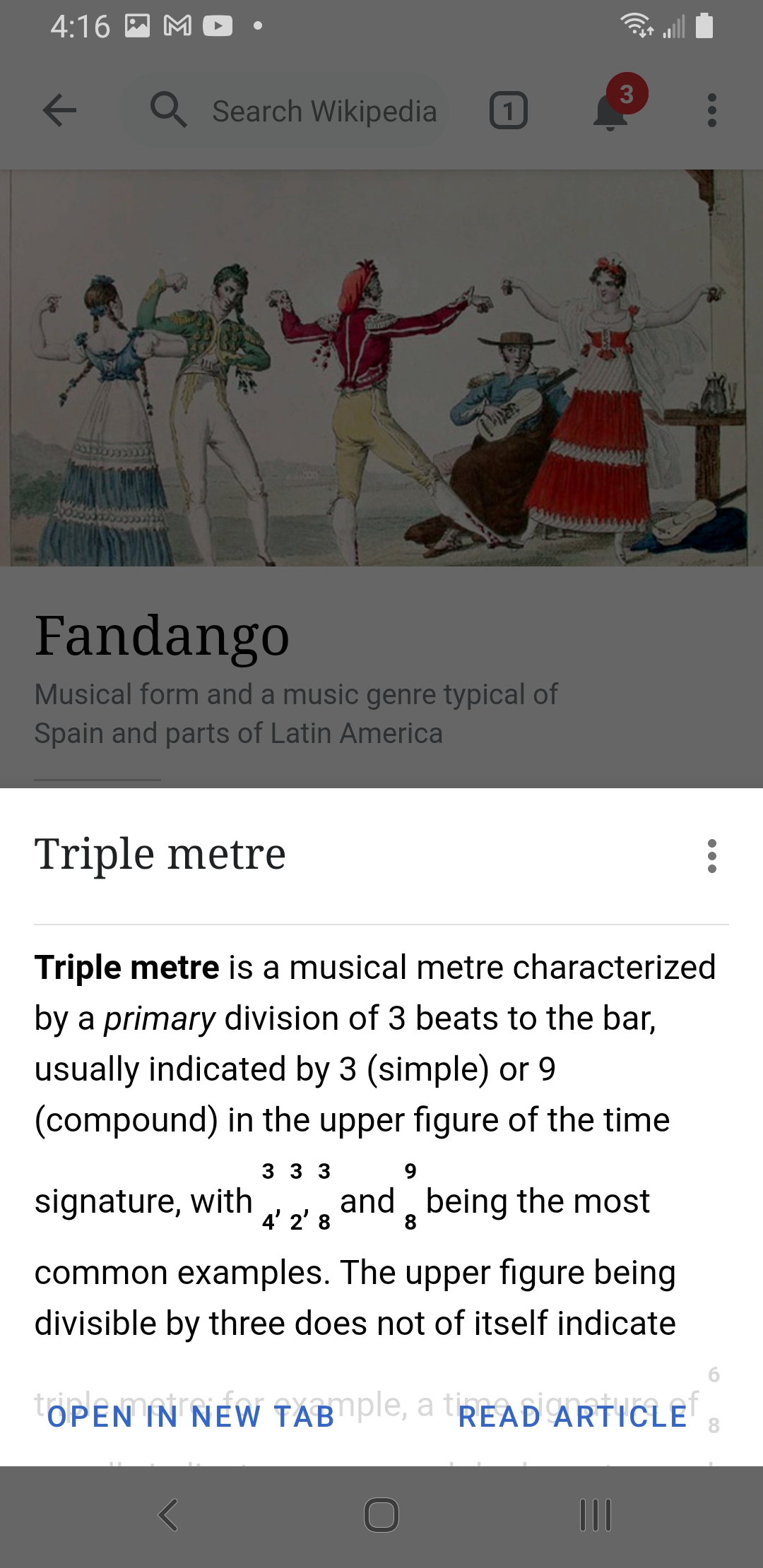
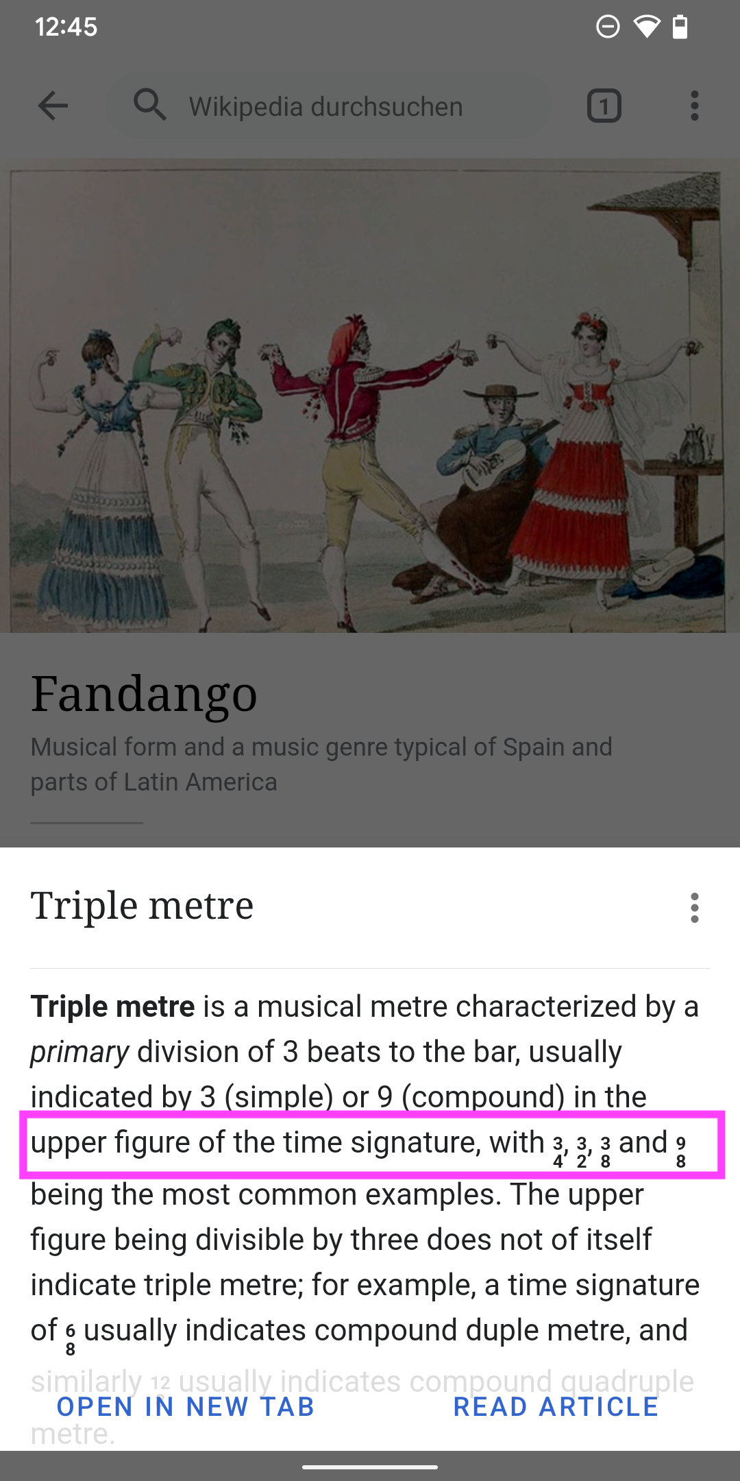
  • Start to read article "Fandango" in Android Wikipedia App
  • Click on link text "triple meter"

What happens?:
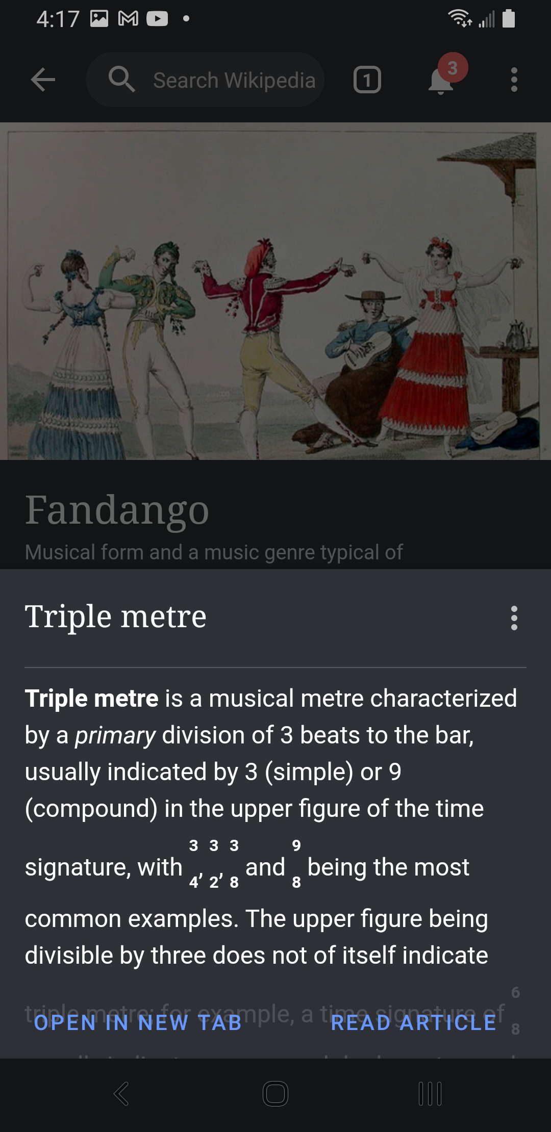
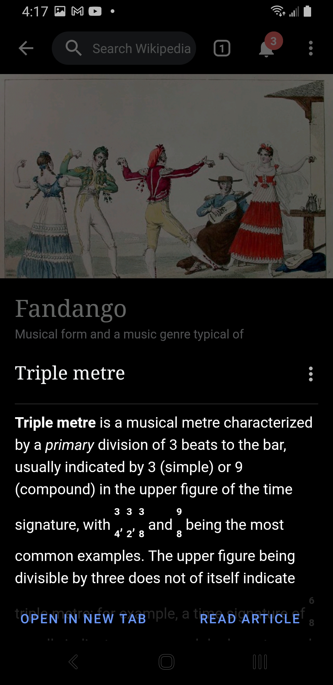
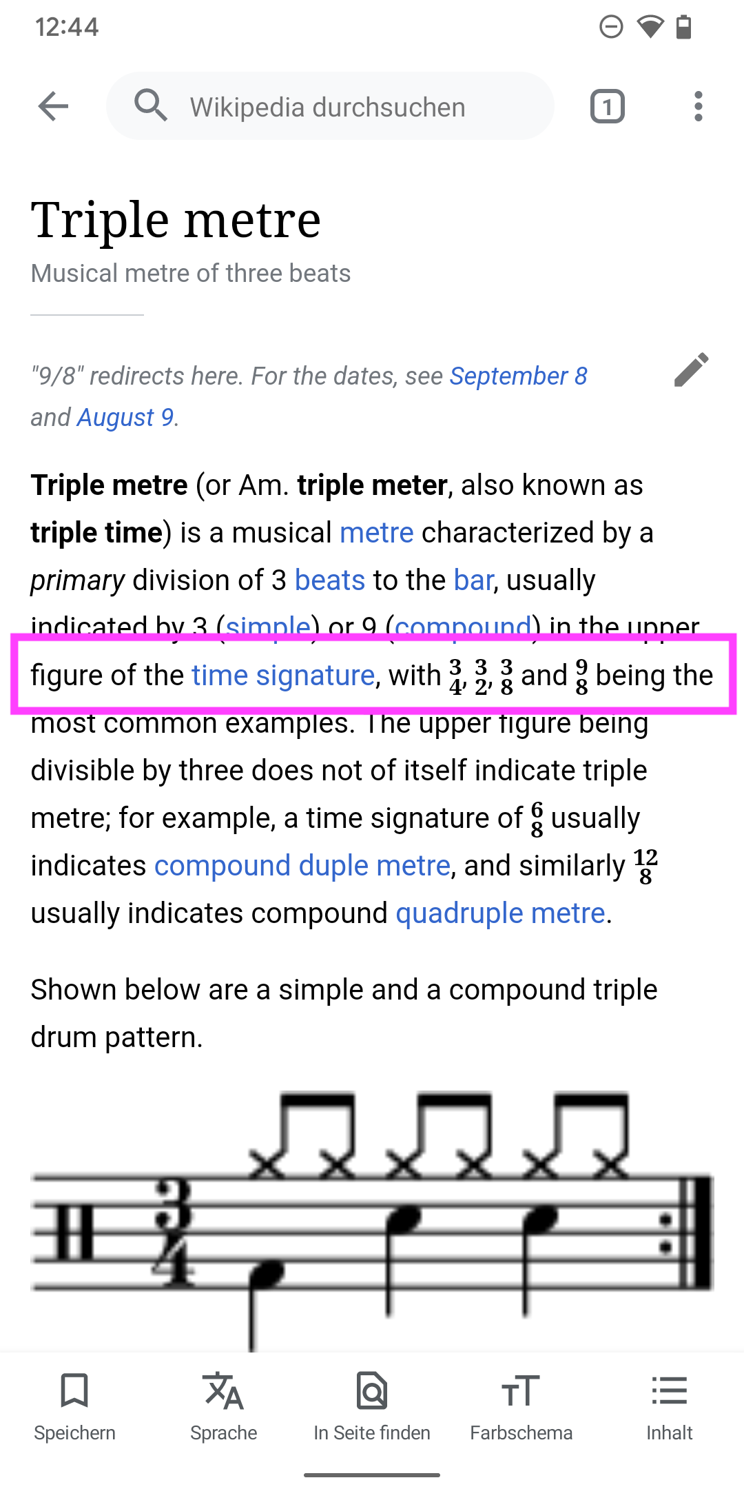
It brings up preview of "Triple metre" article with unreadable text where musical time signatures occur. The first one should be something like "3/4" but instead is superscript 3 <newline> subscript 4.

What should have happened instead?:
The preview text should not have a line break but instead something readable like 3/4 or a 3 over a division line over a 4.

Software version (skip for WMF-hosted wikis like Wikipedia):
unknown how to get App version; it's current as of report. The articles are from en.wikipedia

Other information (browser name/version, screenshots, etc.):

Event Timeline

Restricted Application added a subscriber: Aklapper. · View Herald Transcript
LGoto triaged this task as Low priority.Aug 1 2022, 4:06 PM
LGoto moved this task from Needs Triage to Bug Backlog on the Wikipedia-Android-App-Backlog board.
LGoto removed a project: Android Design.

Thanks for filing this, we can't work on it at this time but when we have capacity will revisit it.

By checking the page/summary API and here is the output:

<p><b>Triple metre</b> is a musical metre characterized by a <i>primary</i> division of 3 beats to the bar, usually indicated by 3 (simple) or 9 (compound) in the upper figure of the time signature, with <span class=\"music-symbol\" style=\"font-family:Arial Unicode MS, Lucida Sans Unicode\"><span><span style=\"display:inline-block;vertical-align:-0.4em;font-size:80%;text-align:center\"><sup><b>3</b></sup><br /><sub><b>4</b></sub></span></span></span>, <span class=\"music-symbol\" style=\"font-family:Arial Unicode MS, Lucida Sans Unicode\"><span><span style=\"display:inline-block;vertical-align:-0.4em;font-size:80%;text-align:center\"><sup><b>3</b></sup><br /><sub><b>2</b></sub></span></span></span>, <span class=\"music-symbol\" style=\"font-family:Arial Unicode MS, Lucida Sans Unicode\"><span><span style=\"display:inline-block;vertical-align:-0.4em;font-size:80%;text-align:center\"><sup><b>3</b></sup><br /><sub><b>8</b></sub></span></span></span> and <span class=\"music-symbol\" style=\"font-family:Arial Unicode MS, Lucida Sans Unicode\"><span><span style=\"display:inline-block;vertical-align:-0.4em;font-size:80%;text-align:center\"><sup><b>9</b></sup><br /><sub><b>8</b></sub></span></span></span> being the most common examples. The upper figure being divisible by three does not of itself indicate triple metre; for example, a time signature of <span class=\"music-symbol\" style=\"font-family:Arial Unicode MS, Lucida Sans Unicode\"><span><span style=\"display:inline-block;vertical-align:-0.4em;font-size:80%;text-align:center\"><sup><b>6</b></sup><br /><sub><b>8</b></sub></span></span></span> usually indicates compound duple metre, and similarly <span class=\"music-symbol\" style=\"font-family:Arial Unicode MS, Lucida Sans Unicode\"><span><span style=\"display:inline-block;vertical-align:-0.4em;font-size:80%;text-align:center\"><sup><b>12</b></sup><br /><sub><b>8</b></sub></span></span></span> usually indicates compound quadruple metre.</p>

The page summary contains lots of inline CSS styles in order to present the music symbols. If we really want to show the full version of the HTML content, we should use WebView in the preview dialog for this edge case.

What do you think about this solution? @JTannerWMF

we should use WebView in the preview dialog for this edge case.

What about dark mode?

we should use WebView in the preview dialog for this edge case.

What about dark mode?

I created an experimental PR that implements WebView with some hard-coded CSS styles.

Screenshot_20220902-161702_Wikipedia Dev.jpg (2×1 px, 734 KB)
Screenshot_20220902-161711_Wikipedia Dev.jpg (2×1 px, 701 KB)
Screenshot_20220902-161720_Wikipedia Dev.jpg (2×1 px, 684 KB)
Screenshot_20220902-161648_Wikipedia Dev.jpg (2×1 px, 652 KB)

@scblr @JTannerWMF
Here's the APK for test: https://github.com/wikimedia/apps-android-wikipedia/pull/3565

this is a great enhancement @cooltey – is there any way to move the numbers closer together vertically (like in-article)? for comparison:

Preview
Screenshot_20220905-195501.png (2×1 px, 367 KB)
vsArticle
Screenshot_20220905-195512.png (2×1 px, 322 KB)

this is a great enhancement @cooltey – is there any way to move the numbers closer together vertically (like in-article)? for comparison:

Preview
Screenshot_20220905-195501.png (2×1 px, 367 KB)
vsArticle
Screenshot_20220905-195512.png (2×1 px, 322 KB)

@scblr Done.

I have applied CSS styles URL to the WebView in order to present the proper style of the content.

Screenshot_20220902-161648_Wikipedia Dev.jpg (2×1 px, 652 KB)

This is better @cooltey – I’m wondering if they can be vertically aligned with the text a tad more as they sit a bit low? See the comparison below:

ArticlevsPreview
Screenshot_20220907-124451.png (2×1 px, 319 KB)
Screenshot_20220907-124511.png (2×1 px, 1 MB)

Thanks for looking into it!

Hi @scblr

I tried to include more CSS styles or HTML class for the WebView but it didn't help.

The possible way to solve the issue might be actually setting up a formal HTML format with proper MediaWiki page class in the WebView, but I would not recommend it since it is a simple preview dialog with a very limited summary.

Will you agree to leave it as it is?

thanks for the clarifications @cooltey – it’s accessible now, so I guess we’re good!