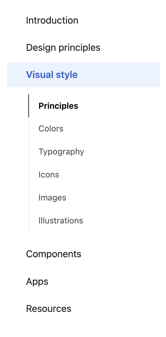
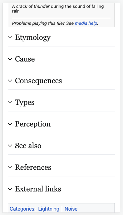
Page MenuHomePhabricator

[Visual refinements] Change direction of TOC section arrows
Closed, DeclinedPublic

Description

Description

In order to be consistent with Minerva/mobile, and to be consistent with the dropdown menus, we should change the direction of the TOC section arrows so that:

  • when a section is collapsed the arrow points down
  • when a section is expanded the arrow points up
beforeafter

Prototype

https://di-collapsible-menus.web.app/Up_(2009_film)

Context on decision

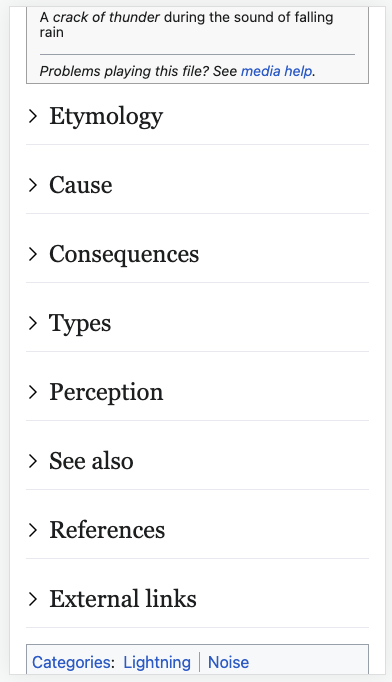
As far as I can tell if there is an original/traditional pattern for this interaction, it is for the arrow to point right when the section is collapsed, and to point down when the section is open. For example:

details HTML tagmacOSgmail
Screen Shot 2022-08-01 at 5.04.10 PM.png (324×861 px, 30 KB)
mac OS.png (307×260 px, 12 KB)
Screen Shot 2022-08-01 at 5.01.59 PM.png (195×255 px, 13 KB)

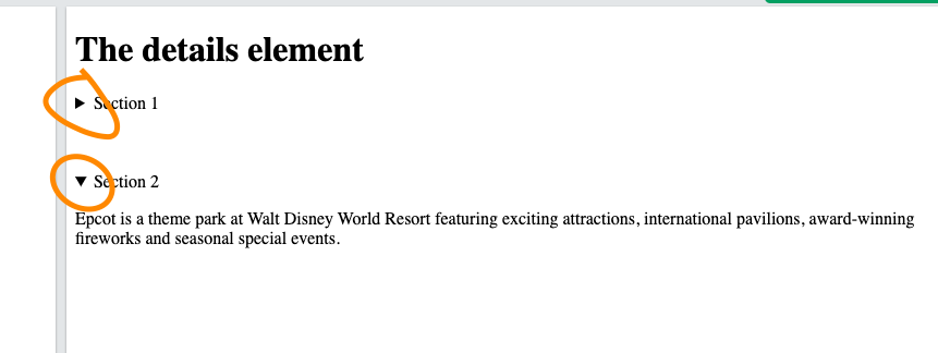
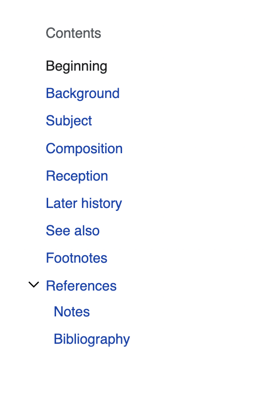
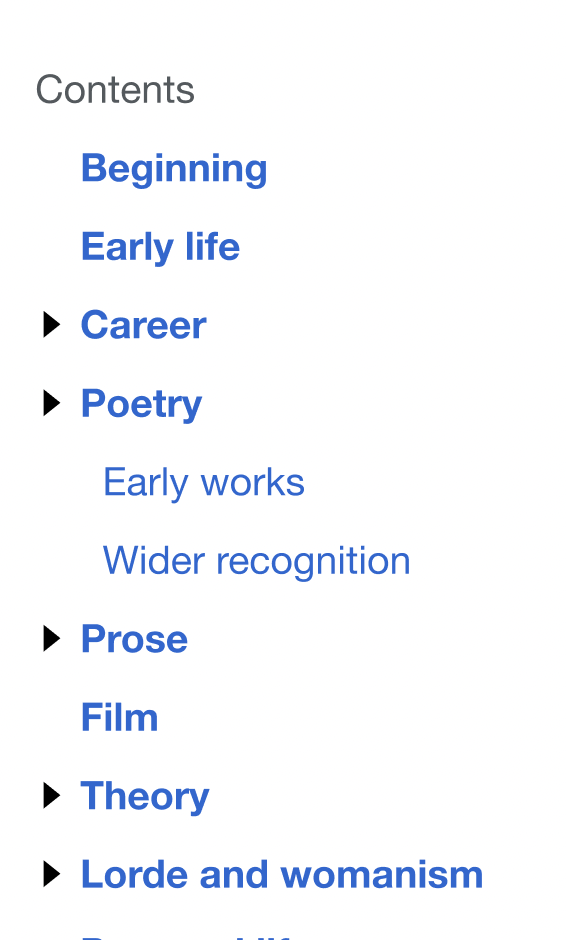
However on mobile web we use a different approach, which I think works better within the specific context, and works just as well in general. Here is a comparison of the traditional pattern and the approach we use:

traditional patterndown & up pattern
all collapsedcollapsed & expandedall collapsedcollapsed & expanded
Screen Shot 2022-08-01 at 5.34.40 PM.png (682×392 px, 48 KB)
Screen Shot 2022-08-01 at 5.35.07 PM.png (681×391 px, 101 KB)
Screen Shot 2022-08-01 at 5.34.07 PM.png (685×394 px, 48 KB)
Screen Shot 2022-08-01 at 5.34.15 PM.png (689×397 px, 102 KB)

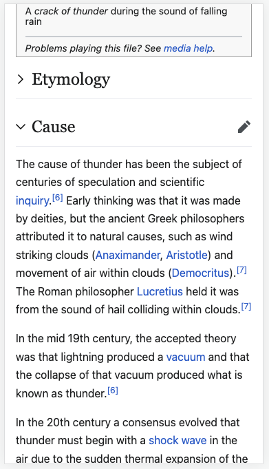
When looking at the screenshots above, I find that in the second "all collapsed" image (where the arrows are pointing down) I get this intuitive sense of what will happen when I tap on them: they will expand down inline, revealing more content. I don't get that sense intuitively with the first "all collapsed" image, where the arrows are pointing right (instead it almost feels like maybe I will be sent to another page?). I'm not sure how personal this feeling is, and/or if it's related to touch vs. mouse interactions (?).

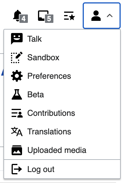
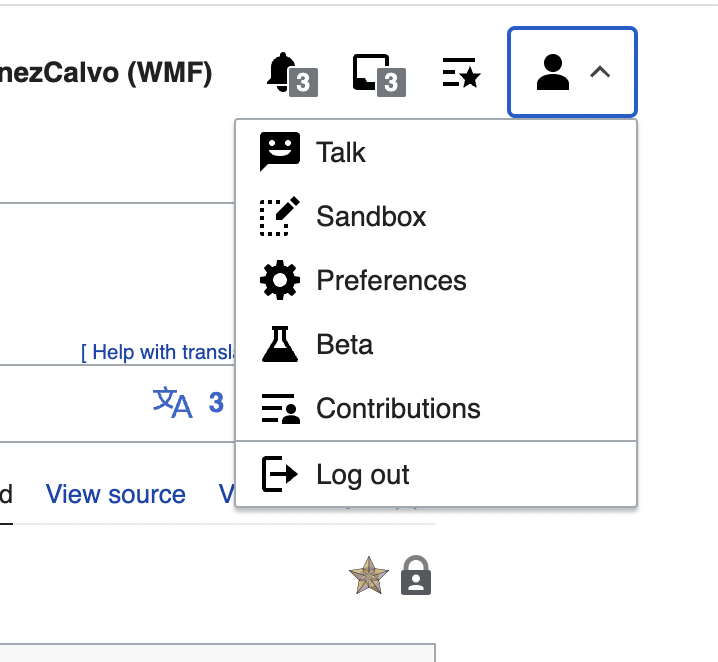
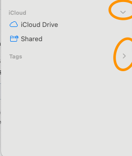
Another aspect to consider here is how we use arrow indicators pointing down on dropdown menu handles, for example:

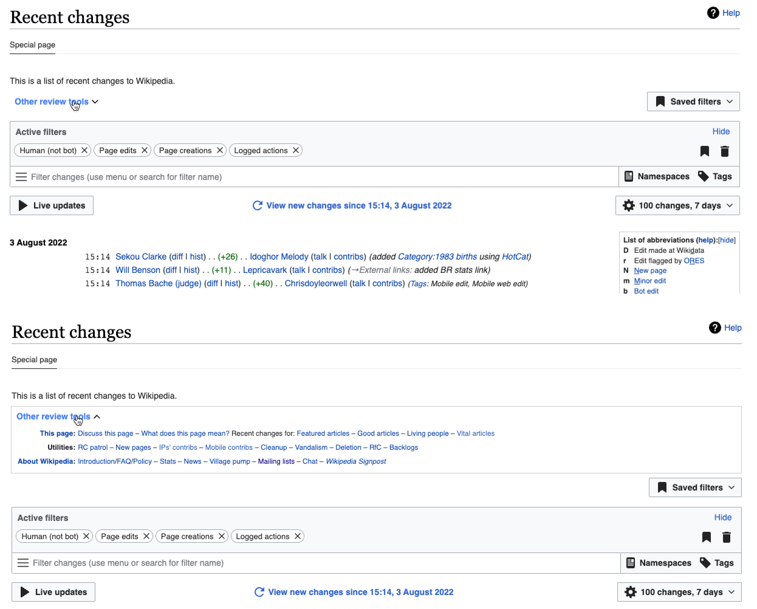
example from Recent changes interface
Screen Shot 2022-08-01 at 5.40.17 PM.png (149×307 px, 15 KB)

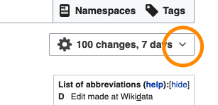
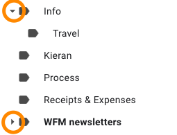
This approach again feels right to me intuitively, and is something that I've found elsewhere for similar interactions:

example from Gmail

We have even started to explore bringing these interactions even closer together, by flipping the direction of the arrow on the dropdown handles when the dropdown is open:

dropdown handle arrow flipping

In conclusion:

  • the down & up pattern makes us consistent with Minerva/mobile
  • the down & up pattern seems to work just as good as the traditional pattern in general
  • we can repeat the down & up pattern with menu handles in order to reinforce it

Event Timeline

@bmartinezcalvo @Sarai-WMDE @Volker_E as far as I know we don't have an established approach here (please let me know if we do). If we indeed do not have an established pattern, and this topic ends up being something you all focus on at some point in the future, please see the "Context on decision" section above.

Hey Alex! Thanks for collecting all this valuable information and moving forward with a consolidated approach. The DST hasn't established a pattern for collapse/expand arrow behavior in different contexts yet, that's right. We'll observe the information included in the "Context on decision" when tackling the definition of the Accordion component (as part of our collaboration with Abstract Wikipedia). Hopefully, global recommendations will be derived from this task.

We have even started to explore bringing these interactions even closer together, by flipping the direction of the arrow on the dropdown handles when the dropdown is open.

Just for the record, when we approached this problem in the context of the Select component, we finally decided not to flip the handle arrow icon for the reasons stated in this comment. This should be factored in and kept in mind during our exploration.

Also from me thanks for collecting these examples.
The main difference that I see, and it's visible in the screenshots above, is the > indicator is most often used in a tree like structure, when there's a parent - child logical hierarchy. The children then get expanded while being indented.
While on mobile web it's about one section to be expanded and collapsed.

In comparison we also use other metaphors for the parent child hierarchy, for example on the Design Style Guide.

image.png (1×556 px, 58 KB)

The difference is, that it's not dynamically expandable/collapsible and therefore can just live with indentation without other indicators.

ok thanks @Sarai-WMDE & @Volker_E

The main difference that I see, and it's visible in the screenshots above, is the > indicator is most often used in a tree like structure, when there's a parent - child logical hierarchy. The children then get expanded while being indented.

ok, would you prefer that we leave it as is then? I'm fine with either option...

I couldn't put my finger on it and was trying to avoid making decisions on the fly. But after reflecting on Volker's comment, I think that it makes sense to keep applying the original pattern (side arrow while collapsed, down arrow while expanded) to the tree like structure, instead of emulating the section expansion pattern. (Curiously, this distinction is also made in the example from Gmail). We'll later see which of the patterns better suits the mentioned accordion component.

On a separate note, we should still try to solve the inconsistency between dropdown elements:

Screenshot 2022-08-02 at 20.49.49.png (632×424 px, 42 KB)

Do we agree to avoid flipping the indicator, or does this need further discussion? Although this is a common pattern (the arrow indicates the current function of the trigger). We previously decided to keep a static dropdown arrow in the context of the system (e.g. with the Select component) to mainly avoid grabbing the users' attention when their focus should be in the new context: the menu. Also, because dropdown menus are impermanent: they close on select or on click anywhere else, so a closing indicator might not be essential in this context.

thanks for following up @Sarai-WMDE. we will leave the arrows as they are currently. I've marked this task as Declined.


regarding the menu handles and arrow flipping: I am fine to go either way on this. I would push back on the points as follows:

avoid grabbing the users' attention when their focus should be in the new context: the menu

  • I don't think this is a valid concern. I don't think there is competition between the focus on the menu (a much larger element, newly appearing), and the arrow flipping. Furthermore, if we think this is a real issue, are we going to stop flipping the arrow on the mobile section headings, and other elements such as this accordion on Recent changes? And if not, can we clearly articulate why these are being treated differently?
    image.png (2×2 px, 326 KB)
  • Rather than being a distraction, from another perspective the arrow flipping might be seen as useful feedback of the interaction — I've clicked something, and the menu label is showing me that I can click it again to reverse what has just happened (note: I agree, as you see lower down, that this is not essential).

The icons shouldn't change on a button/button like interface element on click for better user orientation.

  • I'm not sure I understand this point.

The icon change from down to up icon is only awkwardly transitioned, due to its graphical attributes it'd never be a smooth transition

  • As seen on mobile, I don't think this needs a transition. I don't think it looks awkward on mobile (or Gmail, etc.)

Also, because dropdown menus are impermanent: they close on select or on click anywhere else, so a closing indicator might not be essential in this context.

I agree that they are not an essential clue/context regarding how to interact with the menu

On a higher level: I like the consistency of elements that toggle the display of other elements (menu handles, section headers on mobile, the accordion from Recent changes shown above) having the down pointing arrow next to them — we're doing good there. If we are going to flip the arrow in some contexts (e.g. section headers on mobile), I think it could make sense to carry this decision through to all such elements. I can't yet find a good reason why we should do this in some places, and not in others (such has menu handles).

Please let me know how you would like to proceed. It is easy for us to remove that code.

Sorry for the delay in answer here. I know this task is declined now but I add my thoughts on it.

To define the behaviors of the arrows I think we need to differentiate between different components/elements in the system, in which the arrows will behave differently:

1. Select component:

In this component we decided not to rotate the arrow when the menu is displayed since in some cases the menu appears from bottom and the rotated arrow here would be weird.

Captura de Pantalla 2022-08-04 a las 10.02.36.png (388×1 px, 378 KB)

2. Triggers:

They are built with dropdwon-buttons and they rotate the arrow when the menu is displayed. We need to analyze this case to decide if we want to apply the same behavior as in the select component.

Captura de Pantalla 2022-08-04 a las 10.04.24.png (662×718 px, 195 KB)

3. Accordions:

We need to define this component and as @Sarai-WMDE commented it's possible that we define it with the collaboration with @aminalhazwani for Abstract Wikipedia (Amin, I ping you here for context if you need to understand the arrow behavior in other components if you finally define the accordion). In accordions the common behavior is to use + - or to display and collapse the info hidden in the accordion.

4. Menus with info trees:

Here as @Volker_E commented the most common behavior is to use the side arrow when the menu it's collapsed and the arrow down when the subsections in the menu are displayed (current behavior in our menus).

Captura de Pantalla 2022-08-04 a las 10.13.36.png (798×548 px, 163 KB)

Although we've decided to continue with the same behavior of arrows in this left menu (which seems logical to me being the most common behavior in this type of info trees) we could improve some things:

  1. We could discuss about the arrow icon. What if we use another icon bigger or solid to highlight the action of opening and closing the tree?
  2. I think level1 and level2 in the menu should be more contrasted, not only indenting the level2 but also differentiating both levels with different text weights.

Captura de Pantalla 2022-08-04 a las 10.41.16.png (940×566 px, 199 KB)

Hey @alexhollender_WMF! Here to share a decision on behalf of the DS team: dropdown triggers (Select, ButtonDropdown) should use fixed handle icons.

The main reason is, after all, simplicity: unlike the fixed tree structures and accordions, dropdown elements can be used in a variety of contexts and positions in a layout, and are not immune to scroll. In some scenarios (e.g. based on the user's scroll position), it might be necessary to flip the vertical direction of menus (open them upwards) in order to keep them above the fold. Keeping the indicator uniformly pointing down will save us the need to implement extra (potentially distracting) transitions to cover all the scenarios (e.g. changing the orientation of the handle icon based on the mentioned scroll position instead of on a user action). From a system perspective, this is a more fitting standard solution at the moment.

@Sarai-WMDE @bmartinezcalvo sounds good, and thanks so much for going the extra distance to articulate this reasoning — it's super clear and concrete:

dropdown elements can be used in a variety of contexts and positions in a layout, and are not immune to scroll. In some scenarios (e.g. based on the user's scroll position), it might be necessary to flip the vertical direction of menus (open them upwards) in order to keep them in above the fold. Keeping the indicator uniformly pointing down will save us the need to implement extra (potentially distracting) transitions to cover all the scenarios (e.g. changing the orientation of the handle icon based on the mentioned scroll position instead of on a user action).

I've created T314669: [Visual refinements] Do not flip arrows on menu handles to revert the flipping of the arrows.

That's awesome to hear! Thanks so much for creating the task, Alex 🙏🏻