Page MenuHomePhabricator

[Visual refinement] Improve alignment of icon buttons in header, page content & stickyheader
Closed, ResolvedPublic3 Estimated Story Points

Description

Background

Spacing from .mw-content-container and .mw-body is responsible for aligning the main content with the icons buttons in the header. However, the existing spacing styles never aligned them precisely, and also introduces a lot of CSS complexity in the collapsed TOC and grid code. This task is for improving the alignment between the header icons and the main content while simplify our CSS to be more reliable to debug and work with.

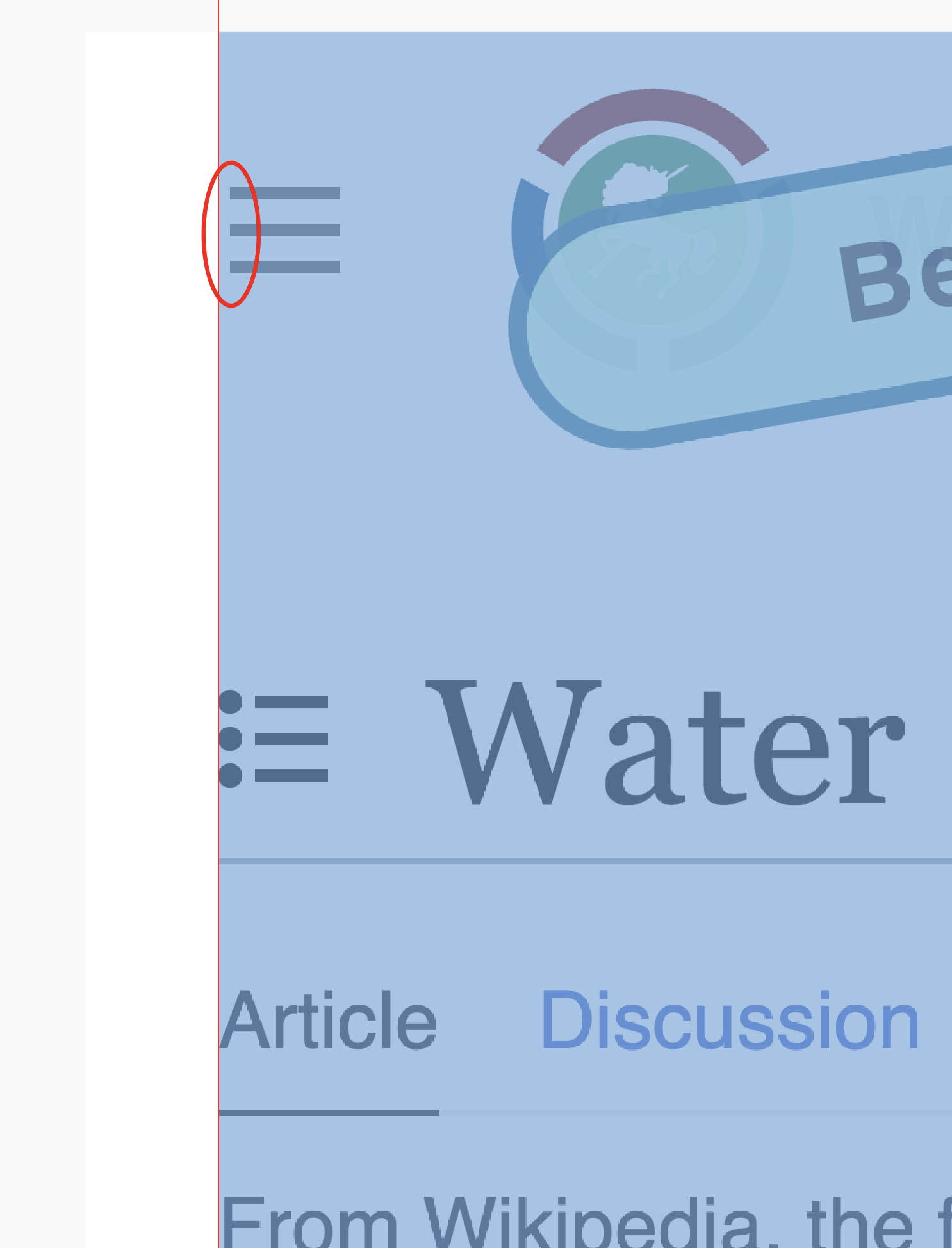
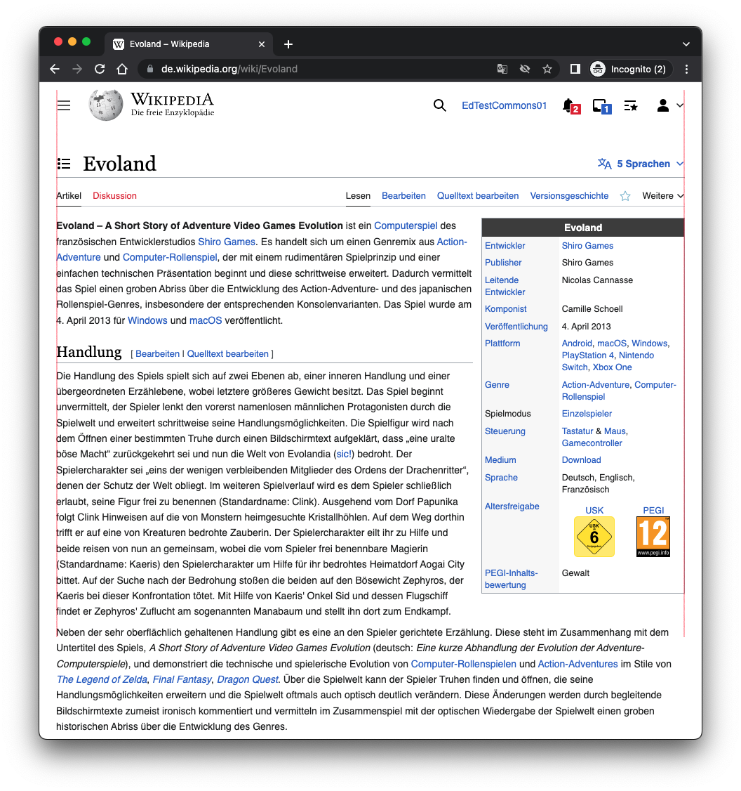
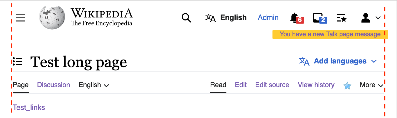
Before (note the alignment):
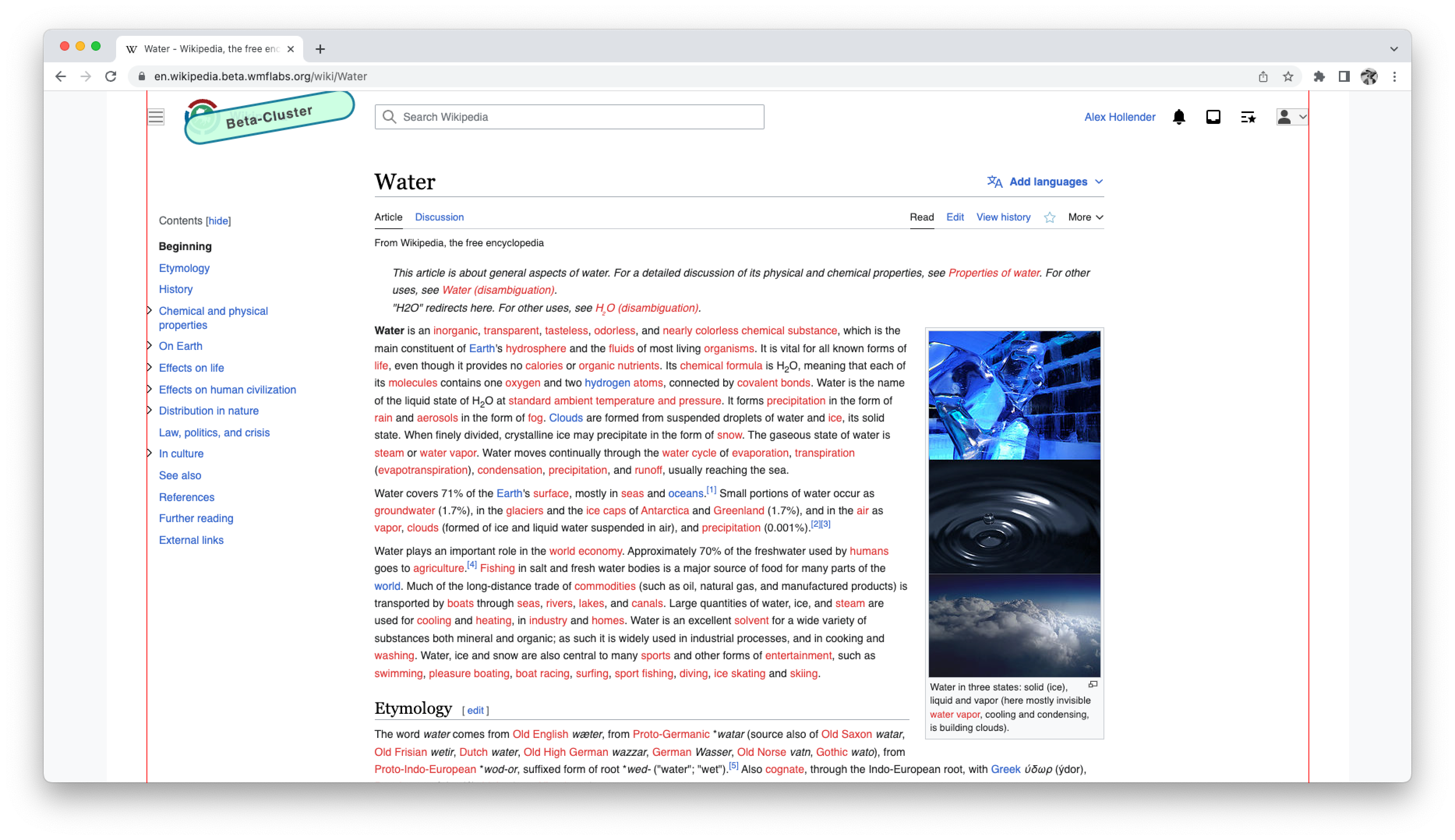
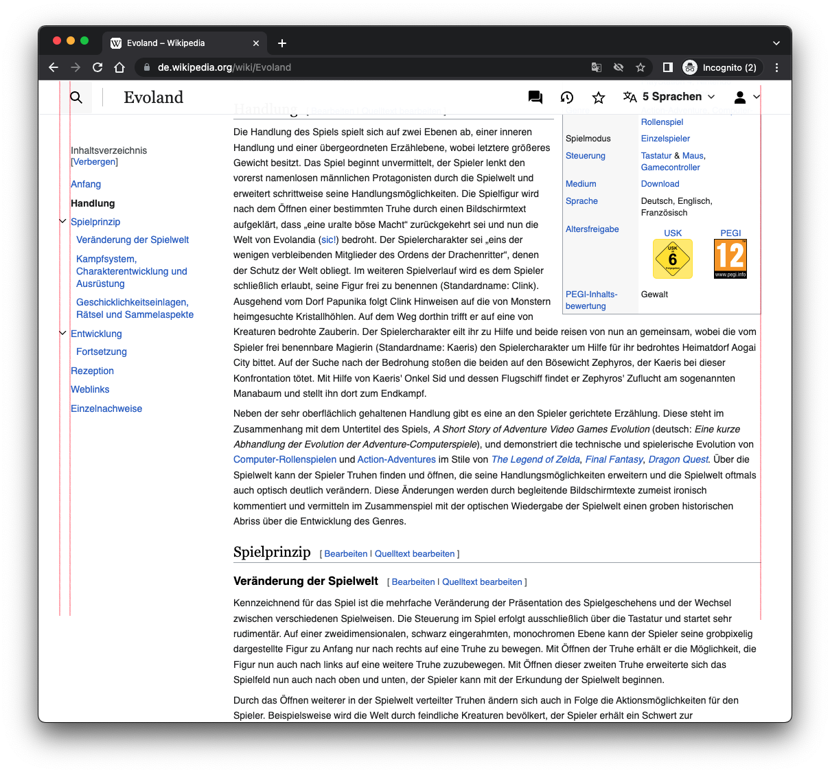
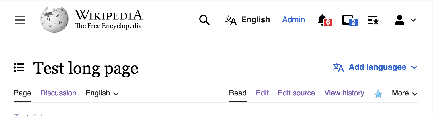
Screen Shot 2022-08-23 at 2.41.25 PM.png (450×1 px, 91 KB)

After:
Screen Shot 2022-08-23 at 2.44.57 PM.png (406×1 px, 82 KB)

Noticed while working on T314579, and related to T315615.

AC

  • Main menu button and user menu dropdown button in header is aligned with rest of page content on smaller viewports (roughly below 1100px, specifically before and after the transition to tablet viewports)
  • Sticky header spacing matches header, i.e. main menu button in header is aligned with the search button in the sticky header, and user menu button in header is aligned with user menu button in sticky header
  • Collapsed TOC styles are cleaned up
  • Grid styles are cleaned up

Expected visual changes

  • Below 1000px should see changes in the main menu button and user dropdown button, the content should remain the same
  • Above 1000px should see changes to the right spacing of the page titlebar and toolbar on pages with TOC

Developer notes

Originally mw-body had a consistent left and right padding of 0.5em. Combined with the left and right paddings on mw-page-container, these styles provided adequate spacing for the page content on the left and right. However, the left padding on mw-body caused problems when we introduced the grid, so it was removed and placed on mw-content-container instead. This quick fix caused the spacing to behave differently across viewports. This leads to more code complexity and fragility in our CSS, especially for the collapsed TOC menu which relies on absolute positioning.

We can improve the alignment and reduce CSS complexity with the following steps:

  • Remove left and right padding from mw-body and .mw-content-container
  • Add the left and right padding from mw-body and .mw-content-container to mw-page-container, ensuring the total spacing at the end remains the same
  • Add -0.75em left and right margins to mw-header below tablet viewports to ensure alignment between header icons and content

QA Results - Prod

ACStatusDetails
1T315261#8246962

Event Timeline

bwang updated the task description. (Show Details)
bwang renamed this task from Improve horizontal spacing and alignment to be more consistent and reduce CSS complexity to Make page container spacing more consistent and align icon buttons in header.Aug 29 2022, 4:22 PM
bwang renamed this task from Make page container spacing more consistent and align icon buttons in header to Improve alignment of icon buttons in header and `mw-content-container`.Aug 29 2022, 4:38 PM
bwang updated the task description. (Show Details)
bwang renamed this task from Improve alignment of icon buttons in header and `mw-content-container` to Improve alignment of icon buttons in header and page content.Aug 29 2022, 4:44 PM
bwang updated the task description. (Show Details)
bwang renamed this task from Improve alignment of icon buttons in header and page content to [Visual refinement] Improve alignment of icon buttons in header and page content.Aug 29 2022, 4:52 PM
bwang updated the task description. (Show Details)
ovasileva raised the priority of this task from Medium to High.Aug 30 2022, 5:32 PM
LGoto set the point value for this task to 3.Aug 30 2022, 5:45 PM

Change 829039 had a related patch set uploaded (by Bernard Wang; author: Bernard Wang):

[mediawiki/skins/Vector@master] Align header icon buttons and main content

https://gerrit.wikimedia.org/r/829039

Test wiki created on Patch demo by BWang (WMF) using patch(es) linked to this task:
https://patchdemo.wmflabs.org/wikis/3cfdd499d6/w

@alexhollender_WMF
Here's the patchdemo and screenshots of the change:
Tablet viewport: Original vs New
Desktop viewport: Original vs New

I also checked the sticky header styles per @Jdrewniak's suggestion, and I realized that the sticky header's horizontal padding (25px) is actually slightly less than the main header (32px or 40px depending on viewport). Should they be the same? And if so do you want to file a new task or should I just handle it within this task?

bwang removed bwang as the assignee of this task.Sep 1 2022, 6:36 PM

@bwang awesome, the patchdemo looks great.

re: sticky header, yes the padding should match. i'm fine with either this task or a new one, up to you.

awesome work with this stuff : )

Change 829220 had a related patch set uploaded (by Bernard Wang; author: Bernard Wang):

[mediawiki/skins/Vector@master] Follow-up: Align sticky header with header

https://gerrit.wikimedia.org/r/829220

Change 829242 had a related patch set uploaded (by Bernard Wang; author: Bernard Wang):

[mediawiki/skins/Vector@master] Align language button

https://gerrit.wikimedia.org/r/829242

Change 829039 merged by jenkins-bot:

[mediawiki/skins/Vector@master] Align header icon buttons and main content

https://gerrit.wikimedia.org/r/829039

@alexhollender_WMF Similar to T315615, this can also be tested in beta cluster

bwang renamed this task from [Visual refinement] Improve alignment of icon buttons in header and page content to [Visual refinement] Improve alignment of icon buttons in header, page content & stickyheader.Sep 8 2022, 5:08 PM
bwang updated the task description. (Show Details)

mostly looking good. one small thing, already discussed with @bwang — slight misalignment due to 10px (vs. 12px) of padding around the TOC icon:

Screen Shot 2022-09-08 at 2.53.11 PM.png (1×1 px, 182 KB)

Change 829220 merged by jenkins-bot:

[mediawiki/skins/Vector@master] Follow-up: Align sticky header with header and update collapsed TOC in page title padding

https://gerrit.wikimedia.org/r/829220

Edtadros subscribed.

Test Result - Prod

Status: ✅ PASS
Environment: dewiki
OS: macOS Monterey
Browser: Chrome
Device: MBP
Emulated Device:NA

Test Artifact(s):

QA Steps

✅ AC1: Main menu button and user menu dropdown button in header is aligned with rest of page content on smaller viewports (roughly below 1100px, specifically before and after the transition to tablet viewports)

Screen Shot 2022-09-19 at 4.59.03 PM.png (1×1 px, 498 KB)

Screen Shot 2022-09-19 at 5.03.25 PM.png (1×1 px, 484 KB)

✅ AC2: Sticky header spacing matches header, i.e. main menu button in header is aligned with the search button in the sticky header, and user menu button in header is aligned with user menu button in sticky header

Screen Shot 2022-09-19 at 5.01.56 PM.png (1×1 px, 511 KB)

Edtadros updated the task description. (Show Details)

Alright, looking good. Resolving this!

Test wiki on Patch demo by BWang (WMF) using patch(es) linked to this task was deleted:

https://patchdemo.wmflabs.org/wikis/3cfdd499d6/w/