Author: richard.tollerton
Description:
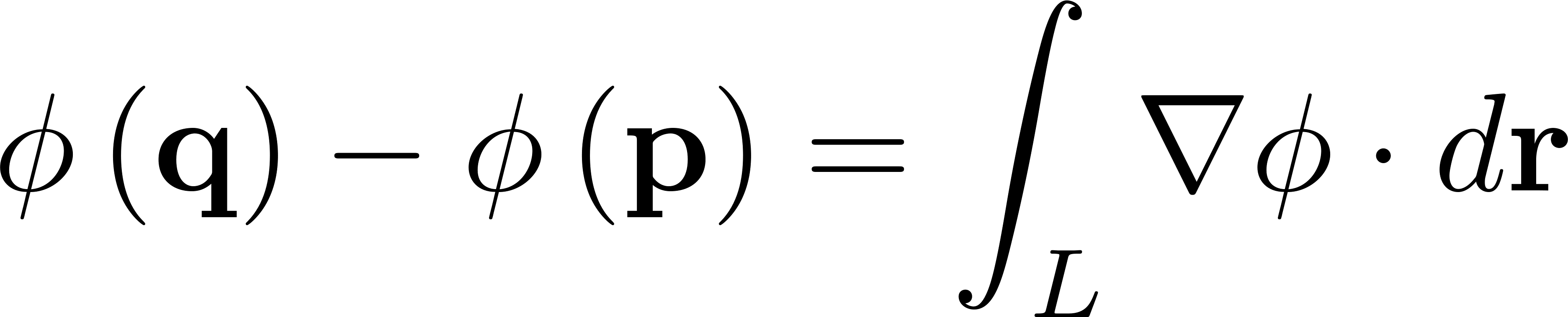
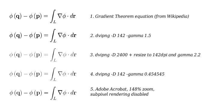
Comparison of four renderings of the Gradient Theorem, http://en.wikipedia.org/wiki/Gradient_theorem
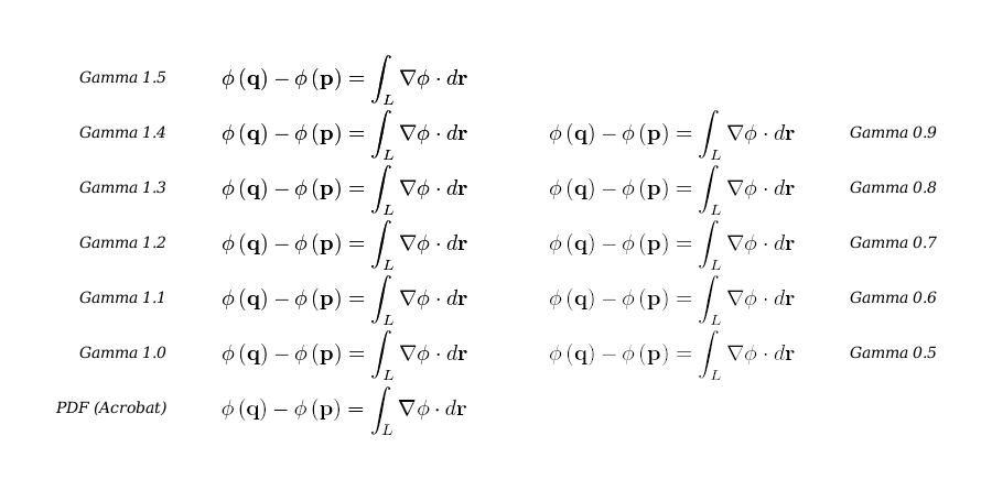
Web images are invariably stored in a gamma-compressed format. If the wrong
gamma compression is applied to antialiased text, then in addition to the text
appearing too light/dark, other distortions may be apparent.
The dvipng command line in render.ml specifies --gamma 1.5. This causes an
*extreme* darkening of the rendered equation, but also causes several other
visual artifacts (enumerated below). The "ideal" gamma setting to use is
0.454545 (1/2.2), as referenced by the sRGB standard. Of course, that also
generates far lighter text, and that too must be taken into account. (I suppose
having an excessively dark gamma may aid readability on smartphones that resize
everything.)
The attached image contains four different renderings of the same equation,
available at http://en.wikipedia.org/wiki/Gradient_theorem:
- Straight-up copy of the png as downloaded from wikipedia. Ostensibly, this image came from texvc.
- Attempted reproduction of 1) using "dvipng -D 142 -T tight --strict --gamma 1.5". This appears to be a fairly good reproduction.
- "Ideal" rendered output: dvipng is run at 2400dpi (!), resized down to 142dpi in ImageMagick, and then gamma-compressed. Steps: a) dvipng -D 2400 -T tight --strict b) ImageMagick convert -depth 16 -define filter:filter=Box -resize 226x49 -gamma 2.2 -depth 8 (resize geometry chosen to shrink image size by 2400/142=16.9x)
- Reproduction of 3) using dvipng -D 142 -T tight --strict --gamma 0.454545. This looks very close to 3).
Comparing text samples 1 and 2 ("gamma 1.5") vs 3 and 4 ("gamma 0.45") on my LCD
displays, I observe the following:
- Obviously, gamma 1.5 output is darker.
- The bold symbols q, p, r are of comparable weight at both gamma 1.5 and 0.45, while all the other symbols are much lighter at gamma 0.45. This makes it substantially easier to perceive the boldness of these symbols at gamma 0.45.
- Notice in gamma 1.5, the integral sign is visibly jagged down its center, even when viewing it from a distance. Similarly, the parentheses appear "chunky". These appear much smoother at gamma 0.45.
I would opine that, at the very least, developers make the gamma setting a
configurable option. But beyond that... have developers given any thought
towards lowering the gamma setting from 1.5?
Version: unspecified
Severity: minor
attachment mathcomp.png ignored as obsolete