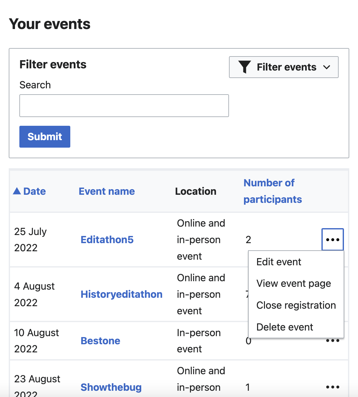
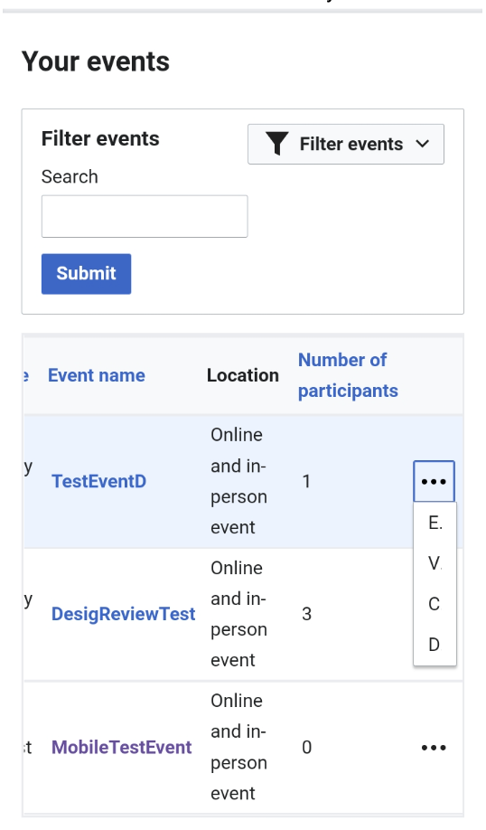
Acceptance Criteria:
- Fix the event list so that it shows the full dropdown titles (instead of just first letter)
Visual example of current behavior to fix:
| ifried | |
| Aug 17 2022, 10:00 PM |
| F35495456: Screen Shot 2022-08-29 at 5.57.21 PM.png | |
| Aug 29 2022, 9:58 PM |
| F35490074: en.MP4-16D8993E-1127-4AA0-B759-9BD2DE2C74D0.gif | |
| Aug 25 2022, 6:47 PM |
| F35490073: ar.MP4-E39507C9-A2AE-4CE4-A84D-91E96A02234A.gif | |
| Aug 25 2022, 6:47 PM |
| F35470690: Screen Shot 2022-08-17 at 6.27.21 PM.png | |
| Aug 17 2022, 10:27 PM |
Acceptance Criteria:
Visual example of current behavior to fix:
@gonyeahialam Hello! Can you add more details to this ticket so it is ready for development? Specifically, the acceptance criteria should state what the change should be, so please add in details on the expected behavior. Thank you!
OOUI is responsible for this behaviour (that is, limiting the width of the menu), and I'm not sure if it's a bug or intended behaviour. One thing we could do is expand the menu on the other side (left, in a LTR context). As an example, compare the following in the demo:
@gonyeahialam What do you think?
Change 824521 had a related patch set uploaded (by Daimona Eaytoy; author: Daimona Eaytoy):
[mediawiki/extensions/CampaignEvents@master] Expand kebab menu on MyEvents to the other side for mobile support
Change 824521 merged by jenkins-bot:
[mediawiki/extensions/CampaignEvents@master] Expand kebab menu on MyEvents to the other side for mobile support
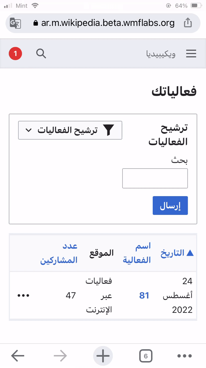
ar betacluster:
en betacluster:
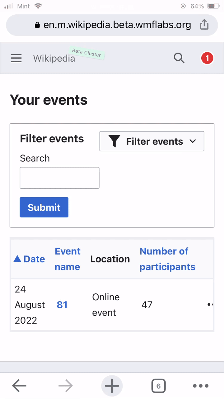
event list is showing the full dropdown titles now 👍. moving this to design sign off
one note for @gonyeahialam and @Daimona - on english betacluster, there is a horizontal scroll (see gif). I'm not sure if there is a way around this because there is a lot of information to display in a small space, but calling it out here in case either of you have thoughts on it.
Yeah, unfortunately I think there's not much we can do about it as long as it uses a table.
@vaughnwalters Thank you for the recordings; they are so helpful!
As for the horizontal scroll, I agree that it's not ideal behavior for the user experience. However, if this is something that we cannot do much about as long as we use tables, we can keep the existing behavior for now and re-assess in the future, if we receive feedback on the need to improve the experience.
I have also tested this on mobile view (see screenshot example) and it looks good. I'm marking this as Done.