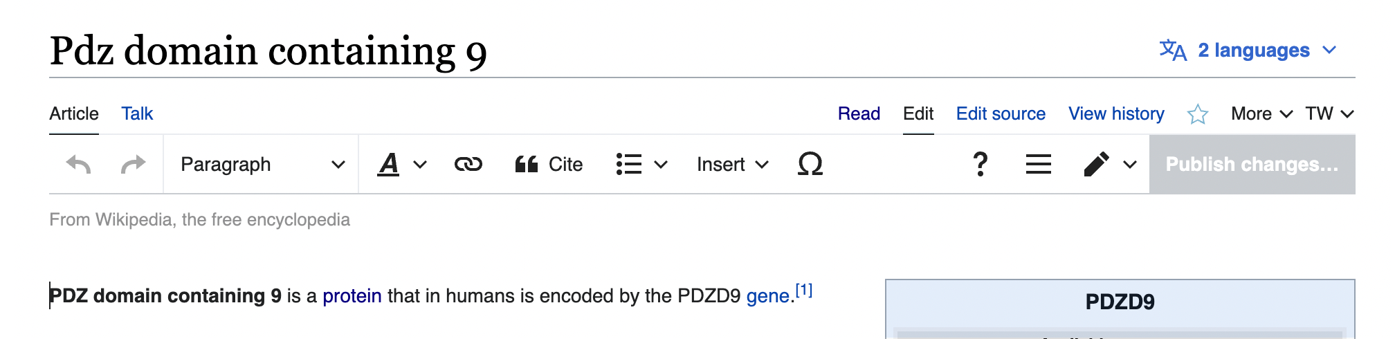
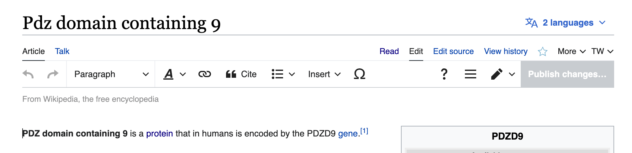
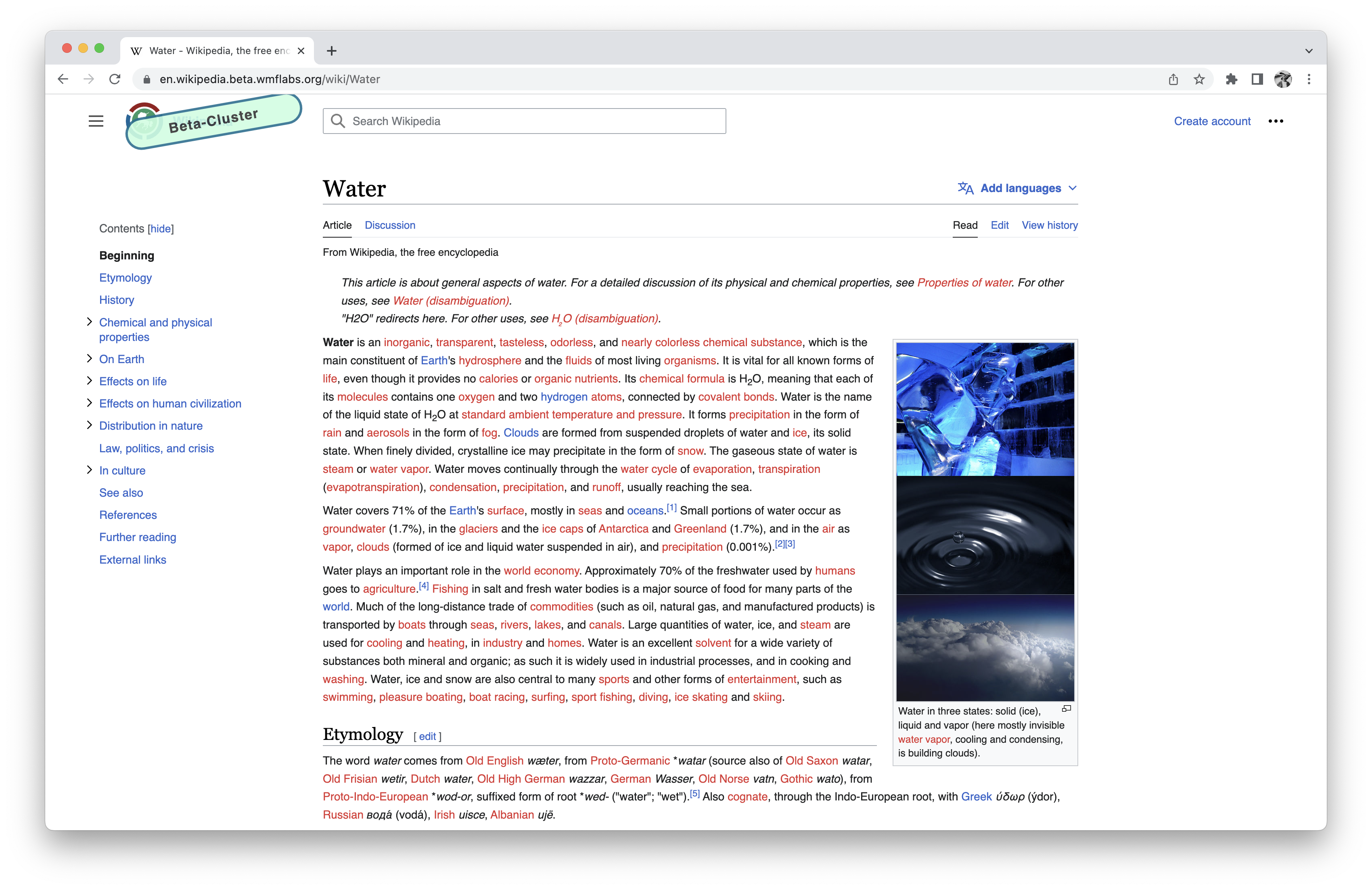
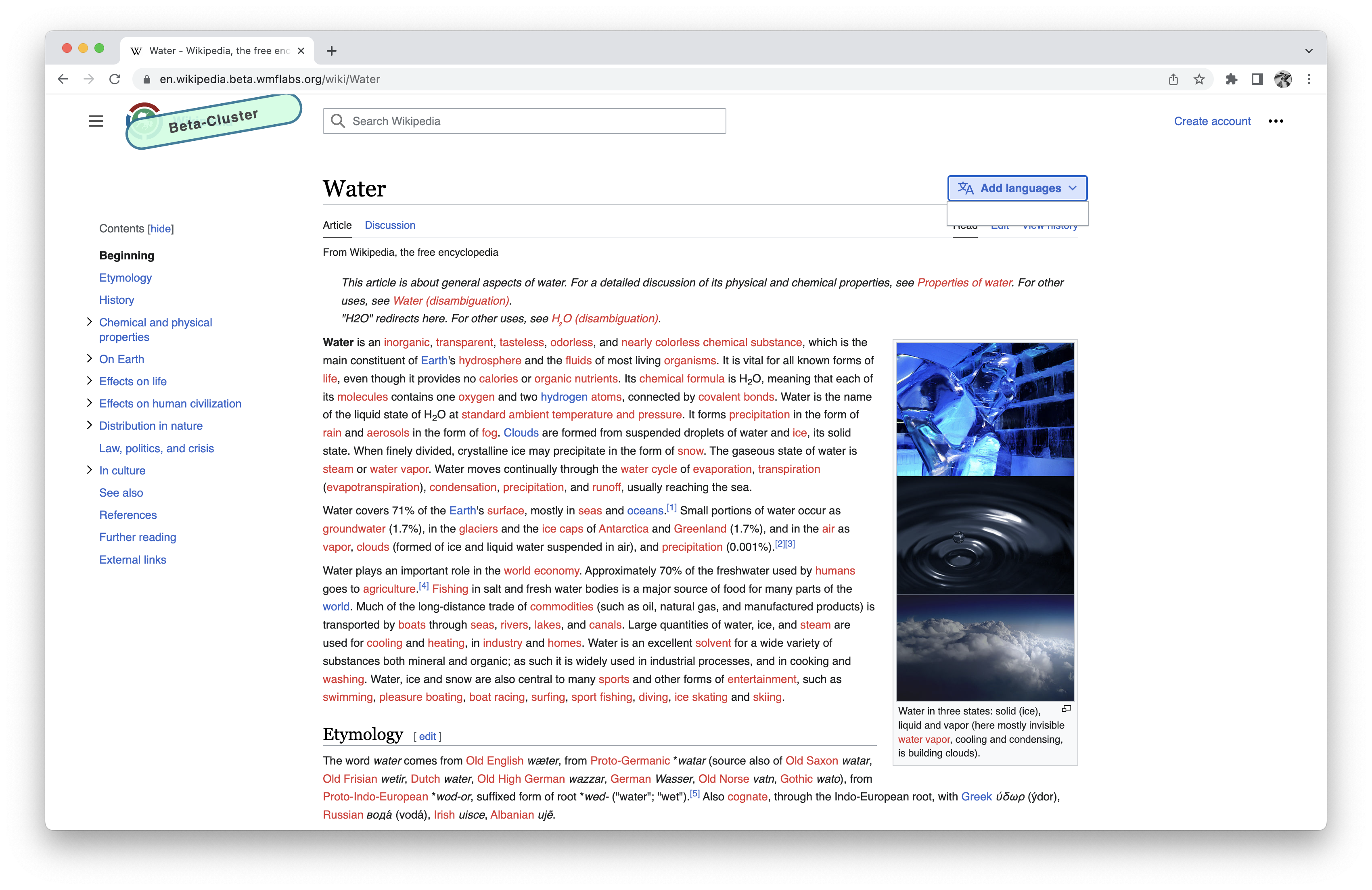
Page MenuHomePhabricator

[Visual refinements] Align language button with edge of page header
Closed, ResolvedPublic2 Estimated Story Points

Description

Description

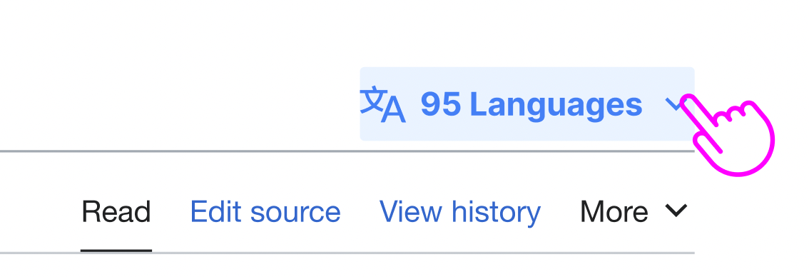
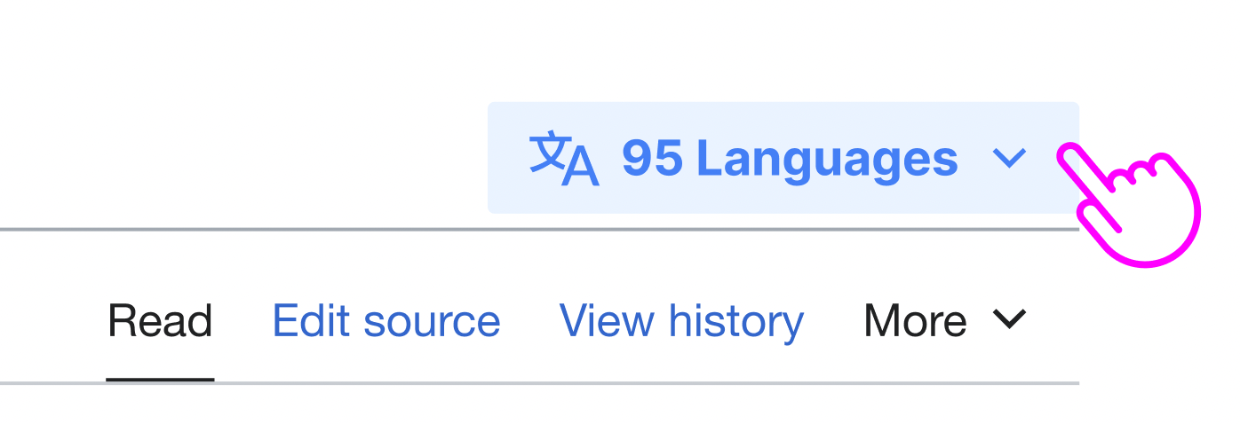
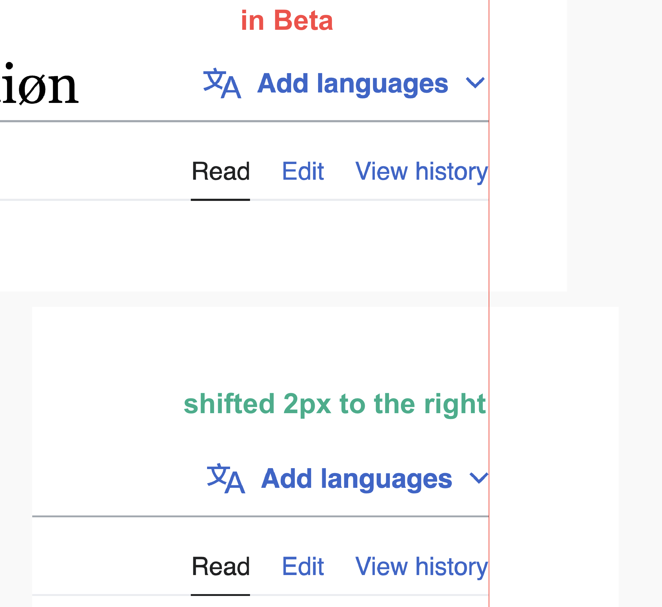
For quiet buttons that are at the edge of a toolbar we (usually?) align their non-hover state area with the edge of the toolbar. The language button in the page header needs to be adjusted to follow this pattern:
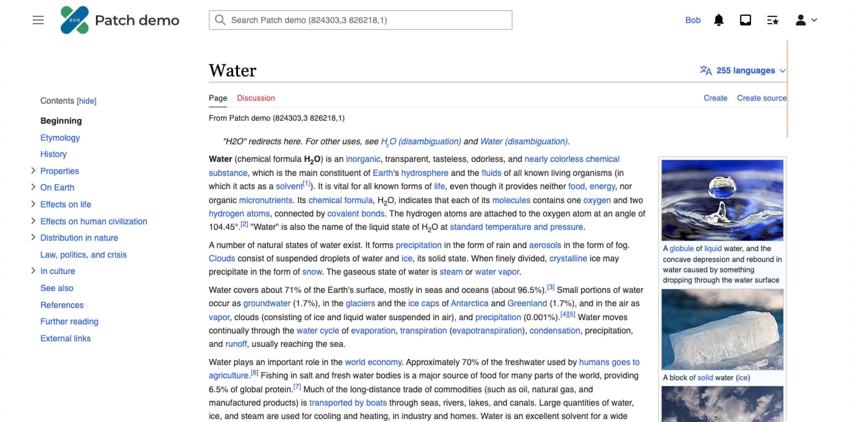
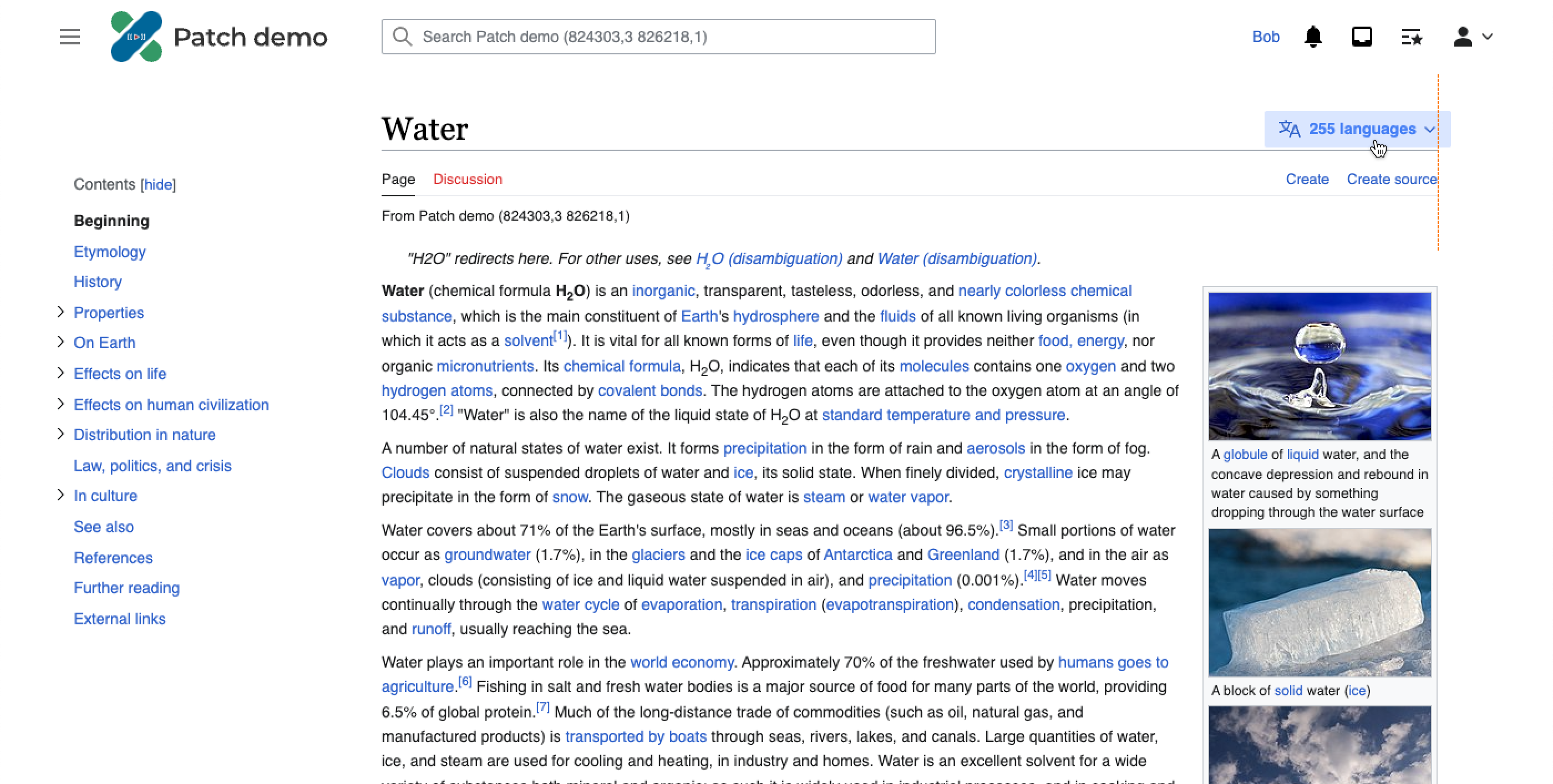
currentcorrect
image.png (1×3 px, 1 MB)

To-do

  • Shift the language button 12px towards the edge of the header, so that it is horizontally aligned with the edge of the header
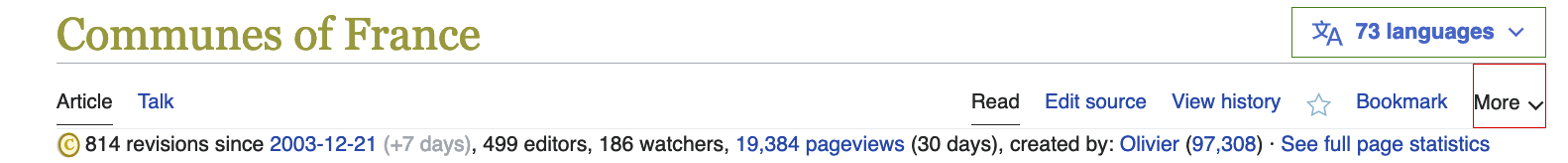
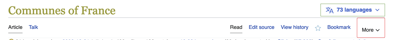
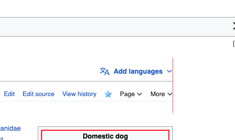
Examples

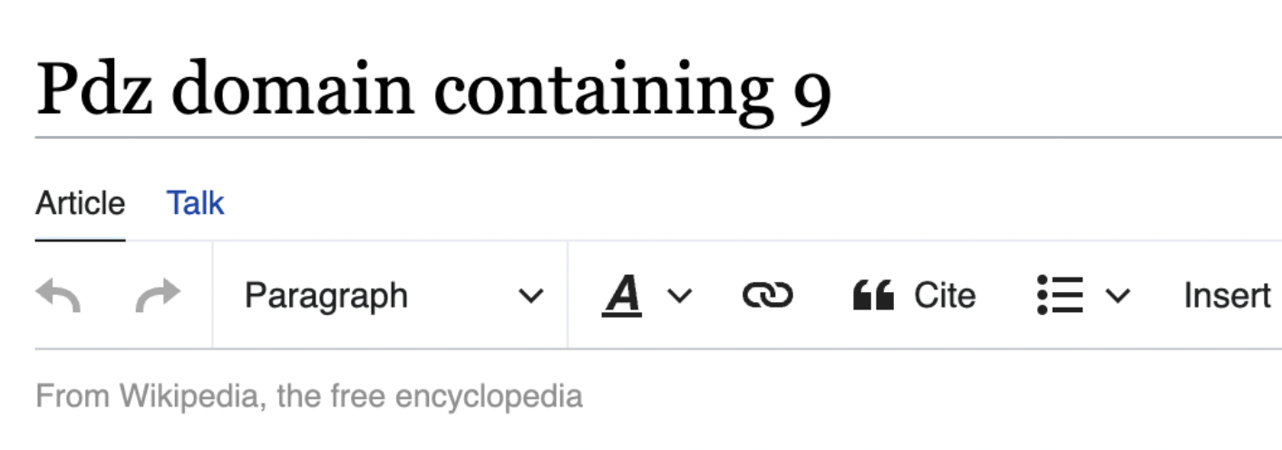
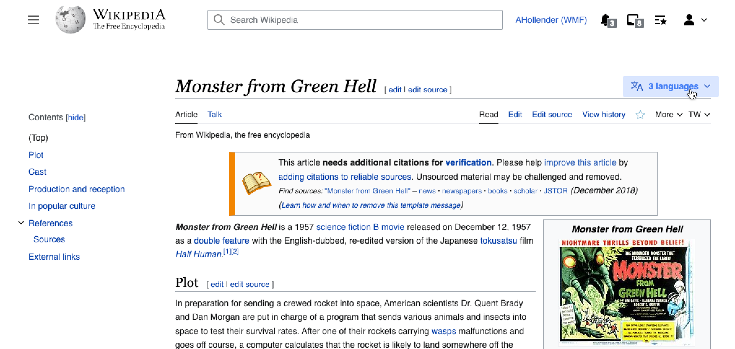
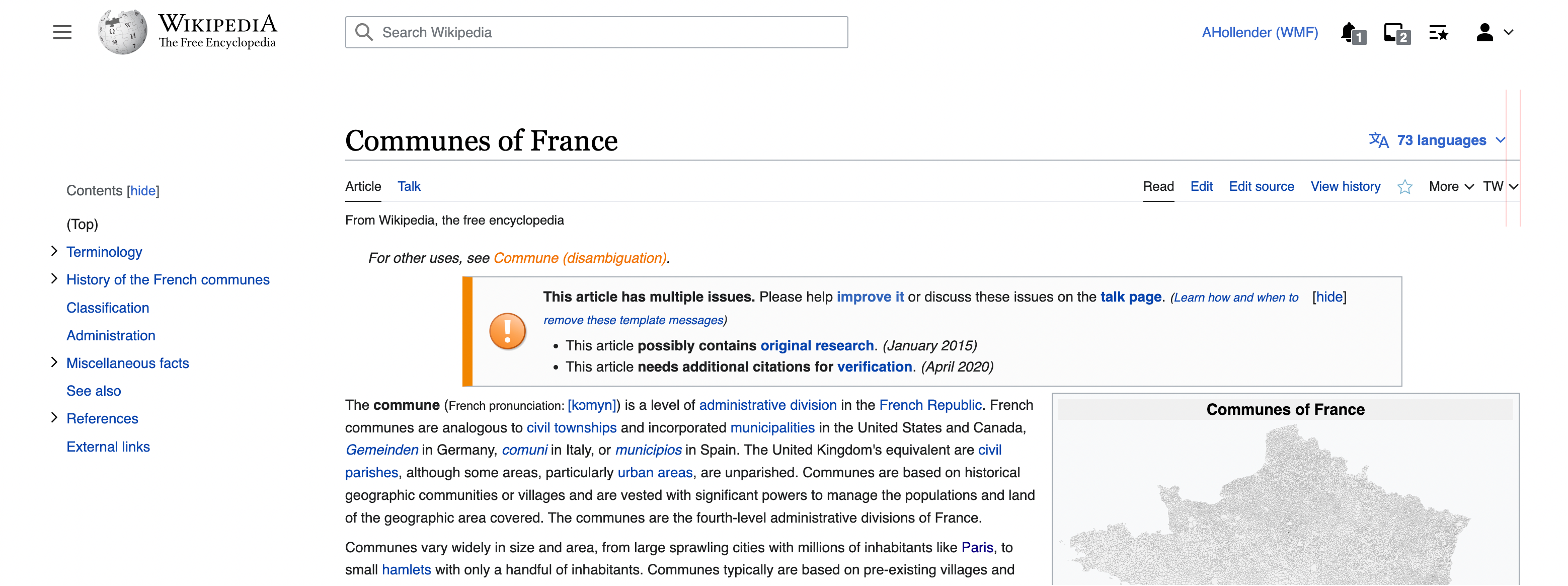
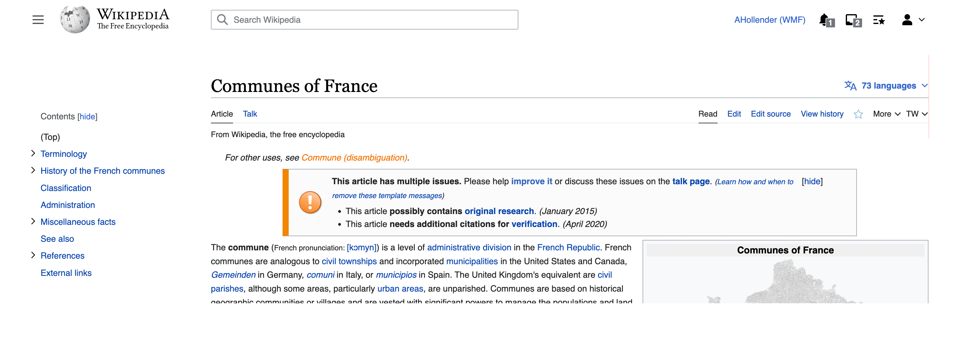
Examples of places we do this:

Screen Shot 2022-08-18 at 4.35.16 PM.png (286×2 px, 175 KB)
Screen Shot 2022-08-18 at 4.34.34 PM.png (1×2 px, 703 KB)
Screen Shot 2022-08-18 at 4.47.56 PM.png (472×1 px, 294 KB)

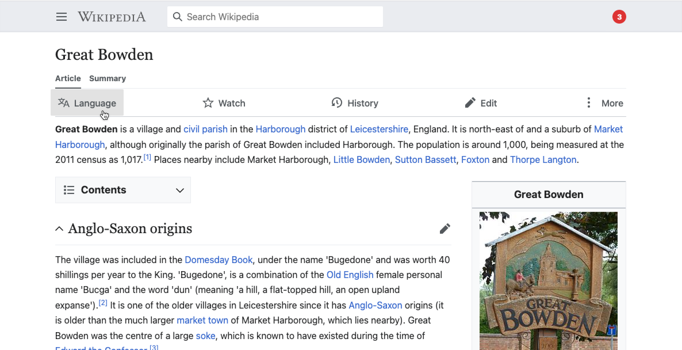
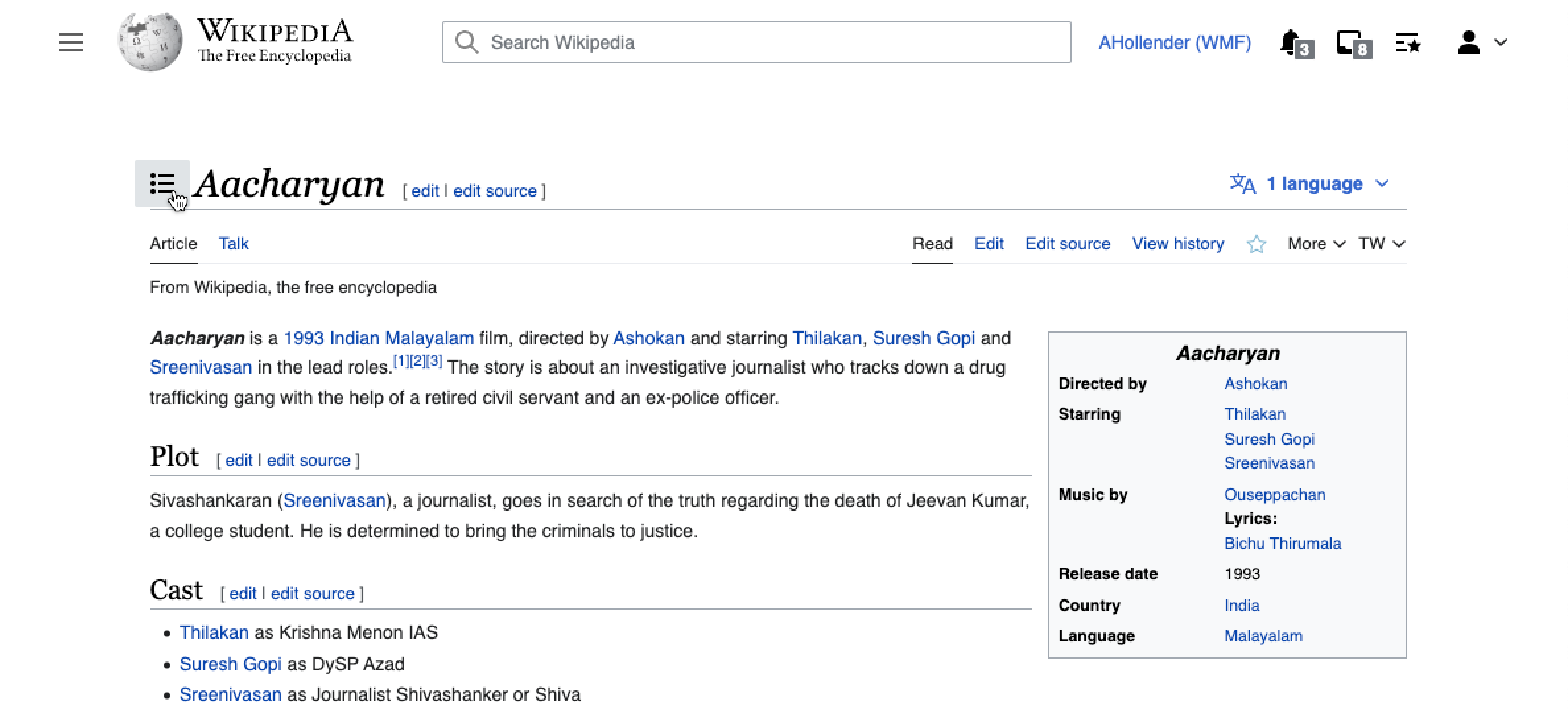
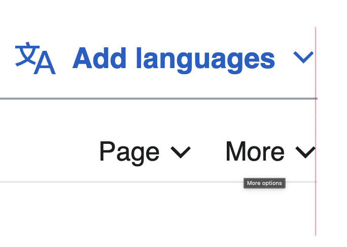
Examples of places we do not do this:

Screen Shot 2022-08-18 at 4.40.15 PM.png (506×1 px, 107 KB)

Event Timeline

@Volker_E @bmartinezcalvo @Sarai-WMDE do we have any style guide guidance on this topic? here is an example from VE where it's aligned differently than the way described in the task, and then how it would look if we aligned it the other way:

currentdifferent
image.png (490×2 px, 211 KB)
image.png (490×2 px, 85 KB)

(I don't think we have too many of these toolbars, so maybe not much DS priority here)

alexhollender_WMF renamed this task from Align language button with edge of page header to [Visual refinements] Align language button with edge of page header.Aug 19 2022, 2:12 PM

(Ignoring the TW as that's a gadget.)

Shift the language button ~13px towards the edge of the header, so that it is horizontally aligned with the edge of the header

I don't recommend this...

#right-navigation has a margin right rule (margin-right: -8px;) the "More" and languages elements themselves do align:

Screen Shot 2022-08-22 at 8.37.49 AM.png (164×1 px, 62 KB)

However the arrows don't as more is not a button. However it might make sense to make it a button given our plans in T234990 ?
Screen Shot 2022-08-22 at 8.39.20 AM.png (162×1 px, 37 KB)

If we align the language button with the right edge (to be aligned with the more options dropdown icon) then the button wouldn't have margins and the hover state would be like this:

Captura de Pantalla 2022-08-22 a las 15.48.23.png (388×1 px, 135 KB)

If we want to align the language button arrow with the more options one, then I would use a right border with the same padding in the Article Toolbar instead deleting the paddings of the language button.

Captura de Pantalla 2022-08-22 a las 15.47.32.png (478×1 px, 189 KB)

@alexhollender_WMF same for these arrow buttons in the toolbar, we shouldn't delete the paddings since they are part of the button and the button need to be hovered with a background color added, so the icon would be glued to the button edge.

Captura de Pantalla 2022-08-22 a las 15.51.36.png (496×1 px, 278 KB)

@bmartinezcalvo thanks for your feedback. To clarify: the buttons would still have their padding, however the padding would extend outside the edge of the toolbar. For example:

Minerva (currently in production)Vector 2022 (in production)Vector 2022 (proposed)
image.png (1×2 px, 395 KB)
(darkened hover bg to make it more clear)
image.png (1×2 px, 187 KB)
(darkened hover bg to make it more clear)
image.png (1×2 px, 359 KB)

my reasoning is: most of the time the buttons will not be hovered, so it makes sense to have the best alignment of them in their non-hovered state. This lets us avoid the sort of jagged-edge approach we currently have:

image.png (910×2 px, 184 KB)

Change 824303 had a related patch set uploaded (by Jdlrobson; author: Jdlrobson):

[mediawiki/skins/Vector@master] [WIP] Visual enhancements: Icons

https://gerrit.wikimedia.org/r/824303

@alexhollender_WMF the fundamental issue here is the language button is described as a button/icon and the dropdown button for the more/TW menu is not. We can easily align these without having to worry about changing anything regarding button/icons implementations themselves. Please give me a few more days to put a patchdemo together.

Test wiki created on Patch demo by Jdlrobson using patch(es) linked to this task:
https://patchdemo.wmflabs.org/wikis/dcb2317c72/w

Okay moving to blocked then, as still need to work out what to do about T314323

I chatted to Alex and we can do this by changing the position of the language button, there is no need to make any changes to the individual component. The fix is currently in https://gerrit.wikimedia.org/r/c/824303 but could easily be pulled out into a separate patch.

Jdlrobson removed a project: Patch-For-Review.

The change needed here is essentially: https://gerrit.wikimedia.org/r/c/mediawiki/skins/Vector/+/824303/3/resources/skins.vector.styles/components/LanguageButton.less
perhaps the magic 12px could be revised as a variable.

We use @icon-padding-md in a few places for the exact same purpose of aligning icon buttons, but oddly it's defined in ems (0.75em). Perhaps we can reuse that variable and update it to be px? .mw-ui-button uses px values for padding anyway, I believe the only reason why it could be em is because the legacy .mw-ui-icon-element uses ems.

Change 829242 had a related patch set uploaded (by Bernard Wang; author: Bernard Wang):

[mediawiki/skins/Vector@master] Align language button

https://gerrit.wikimedia.org/r/829242

Change 829242 merged by jenkins-bot:

[mediawiki/skins/Vector@master] Align language button

https://gerrit.wikimedia.org/r/829242

This can be tested in beta cluster. Move to needs more work or sign off as appropriate.

This can be tested in beta cluster. Move to needs more work or sign off as appropriate.

Since we're flagging this patch as a potential source of regressions, if it passes design review, I think we should move it to QA on beta cluster with a specific focus on testing for regressions

QA steps:

  • ensure the right edge of the language switching button (when not being hovered) is aligned with the right edge of the border underneath the titlebar
    image.png (1×3 px, 1 MB)
Edtadros subscribed.

Test Result - Beta

Status:
Environment: beta
OS: macOS Monterey
Browser: Chrome
Device: MBP
Emulated Device:NA

Test Artifact(s):

QA Steps

❓ AC1: ensure the right edge of the language switching button (when not being hovered) is aligned with the right edge of the border underneath the titlebar
@alexhollender_WMF, here's what I was referring to in standup: You might have to zoom in to see.

Screen Shot 2022-09-08 at 9.58.07 AM.png (287×480 px, 17 KB)

When I increased the font size (to keep everything crisp) here is what I see.

Screen Shot 2022-09-08 at 9.53.04 AM.png (486×684 px, 34 KB)

It's a very tiny difference, not sure if that is acceptable or not.

whoops, good catch @Edtadros, looks like this isn't quite aligned yet:

Screen Shot 2022-09-08 at 1.11.39 PM.png (1×2 px, 229 KB)

Change 830955 had a related patch set uploaded (by Jdlrobson; author: Bernard Wang):

[mediawiki/skins/Vector@wmf/1.39.0-wmf.28] EXPECTED VISUAL CHANGES IN origin/wmf/1.39.0-wmf.28

https://gerrit.wikimedia.org/r/830955

whoops, good catch @Edtadros, looks like this isn't quite aligned yet:

Screen Shot 2022-09-08 at 1.11.39 PM.png (1×2 px, 229 KB)

I believe this is due to the same transparent border issue I mentioned to you the other day. If the 1-2 pixel difference is worth fixing, I'd prefer it to be done globally, as technically every button that is offset right now has the same issue. I don't mind doing that as part of this task or a new one. @alexhollender_WMF What do you think?

whoops, good catch @Edtadros, looks like this isn't quite aligned yet:

I believe this is due to the same transparent border issue I mentioned to you the other day. If the 1-2 pixel difference is worth fixing, I'd prefer it to be done globally, as technically every button that is offset right now has the same issue. I don't mind doing that as part of this task or a new one. @alexhollender_WMF What do you think?

gotcha, thanks for clarifying. that makes sense. moving this to signoff.

@bwang the 1px border offset doesn't really bother me. Out of curiosity, is there a straightforward, systematic way to fix this?

@alexhollender_WMF Yep it easy, just be updating a CSS variable from 12px to 13px. This would result in many visual changes though which is why I suggested another task. Probably would also be impacted by T314323 too.

ovasileva claimed this task.

Test wiki on Patch demo by Jdlrobson using patch(es) linked to this task was deleted:

https://patchdemo.wmflabs.org/wikis/dcb2317c72/w/