Page MenuHomePhabricator

Subscribe button is misaligned
Open, Needs TriagePublic

Description

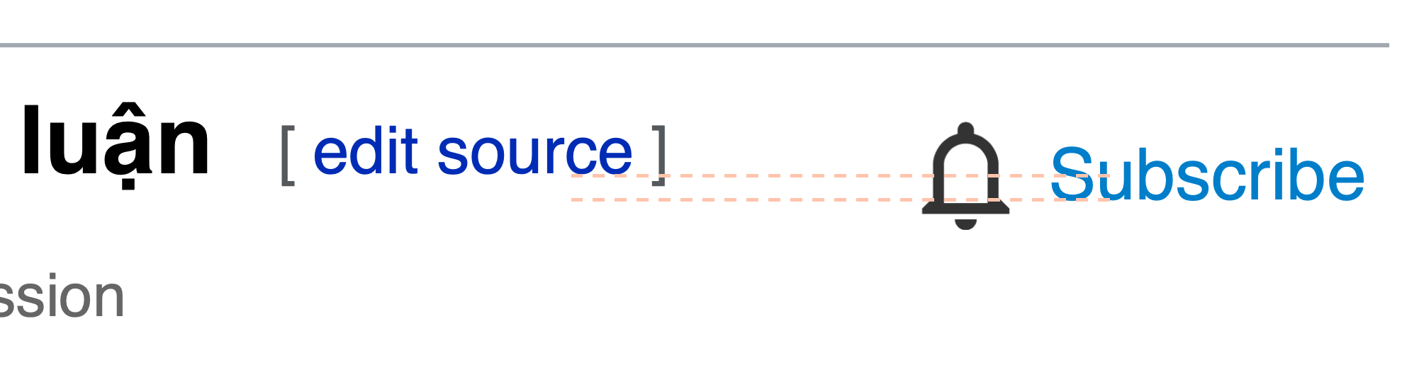
This is somewhat similar to T311539: Gadget to move [edit] link does not align with [subscribe] link in Discussion Tools, except that it does not involve a gadget. The [edit source] and [subscribe] buttons are not aligned. The Subscribe button is higher.

Screen Shot 2022-08-24 at 11.26.40 AM.png (306×1 px, 59 KB)

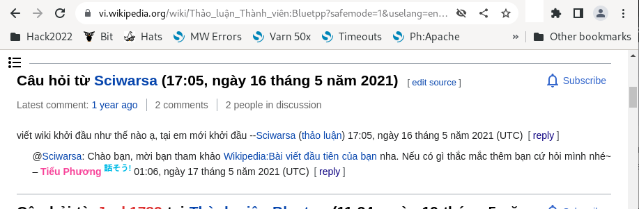
(This screenshot was made from https://vi.wikipedia.org/wiki/Th%E1%BA%A3o_lu%E1%BA%ADn_Th%C3%A0nh_vi%C3%AAn:Bluetpp?safemode=1 in Chrome. Pale orange lines mark the baselines for the two labels.)

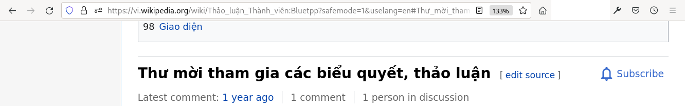
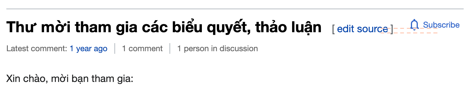
The same problem can be seen in Chrome, Firefox, and Safari. The same problem is seen in Vector and Vector 2022. A different problem appears in Monobook. The alignment is the other way around, and the colors are weird:

Screen Shot 2022-08-24 at 11.36.18 AM.png (526×2 px, 62 KB)

Event Timeline

I can neither reproduce in Chromium 104 (Vector 2022) nor Firefox 104 (old Vector) on Linux. What does the HTML/CSS show in the browser's Developer tools?

Screenshot from 2022-08-24 20-53-48.png (301×917 px, 69 KB)

Screenshot from 2022-08-24 20-52-20.png (206×1 px, 41 KB)

@Aklapper Need to enable the Discussion tools beta feature in preferences.


The button text baseline indeed isn't aligned with the heading and section edit link text baseline. I think no one thought that they are supposed to be.

It ended up this way as a result of T312674.

If you align the text baseline, the icon will look misaligned instead.

matmarex renamed this task from Subscribe button is misaligned at viwiki to Subscribe button is misaligned.Aug 25 2022, 4:57 PM