This is a follow-up to T307125
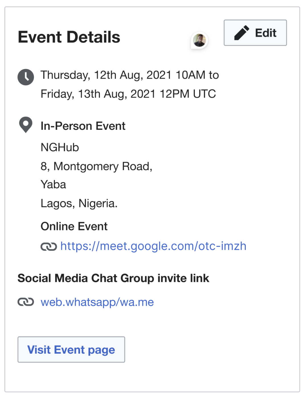
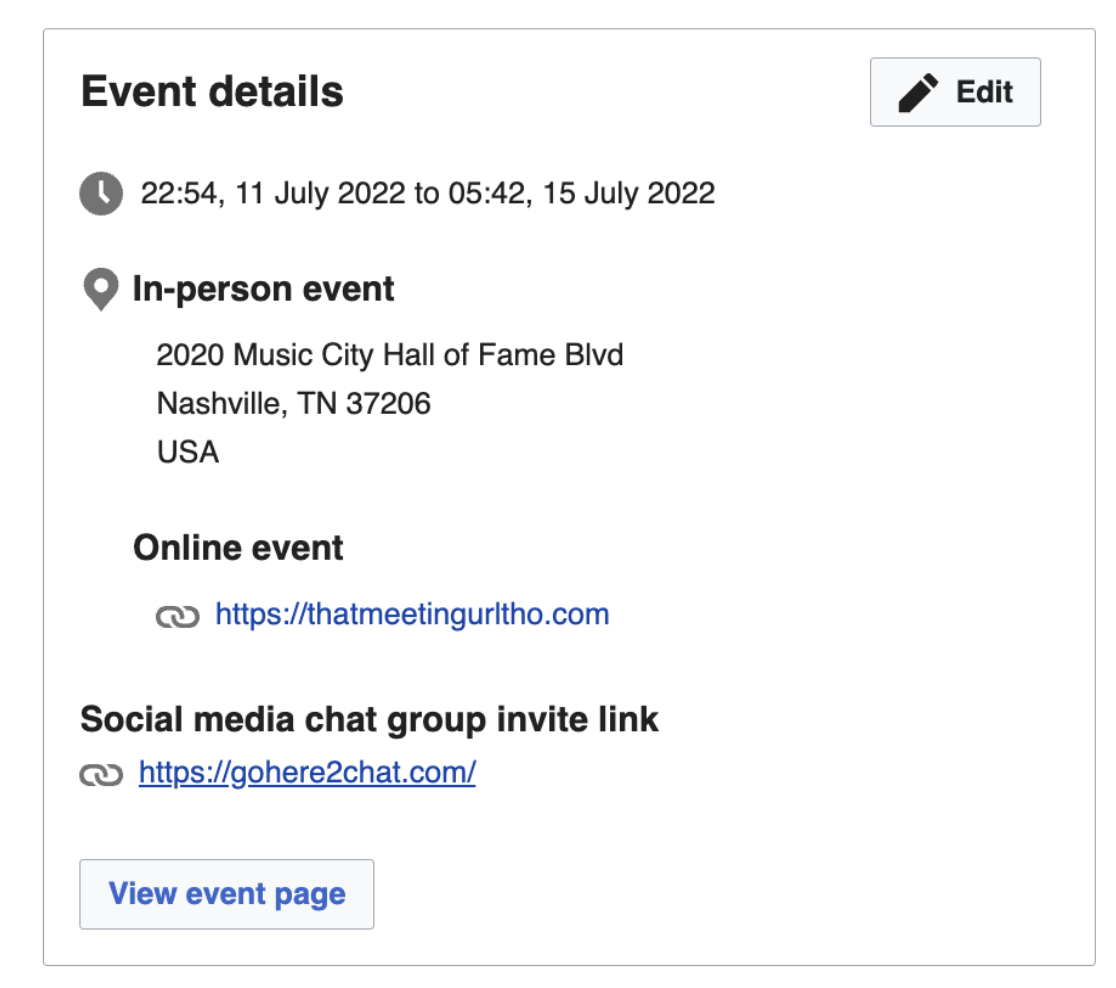
In-Person Event and Online Event need to have a lower font weight and less padding between them, to differentiate it from the section that is currently Social media chat group invite link -- what are the recommended font weight and padding?
comp:
build:
Text in comp is Visit event page, but in the build it is View event page
and View event page button has an icon in the picture of the comp that is on this ticket below the AC, but not in the figma file - I am not sure which is correct, so tagging in @gonyeahialam:
comp:

build:

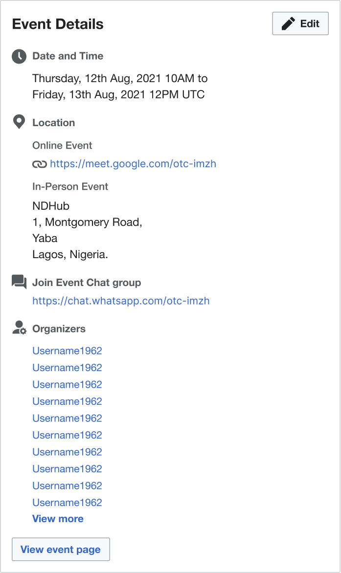
View Figma file for design specifications