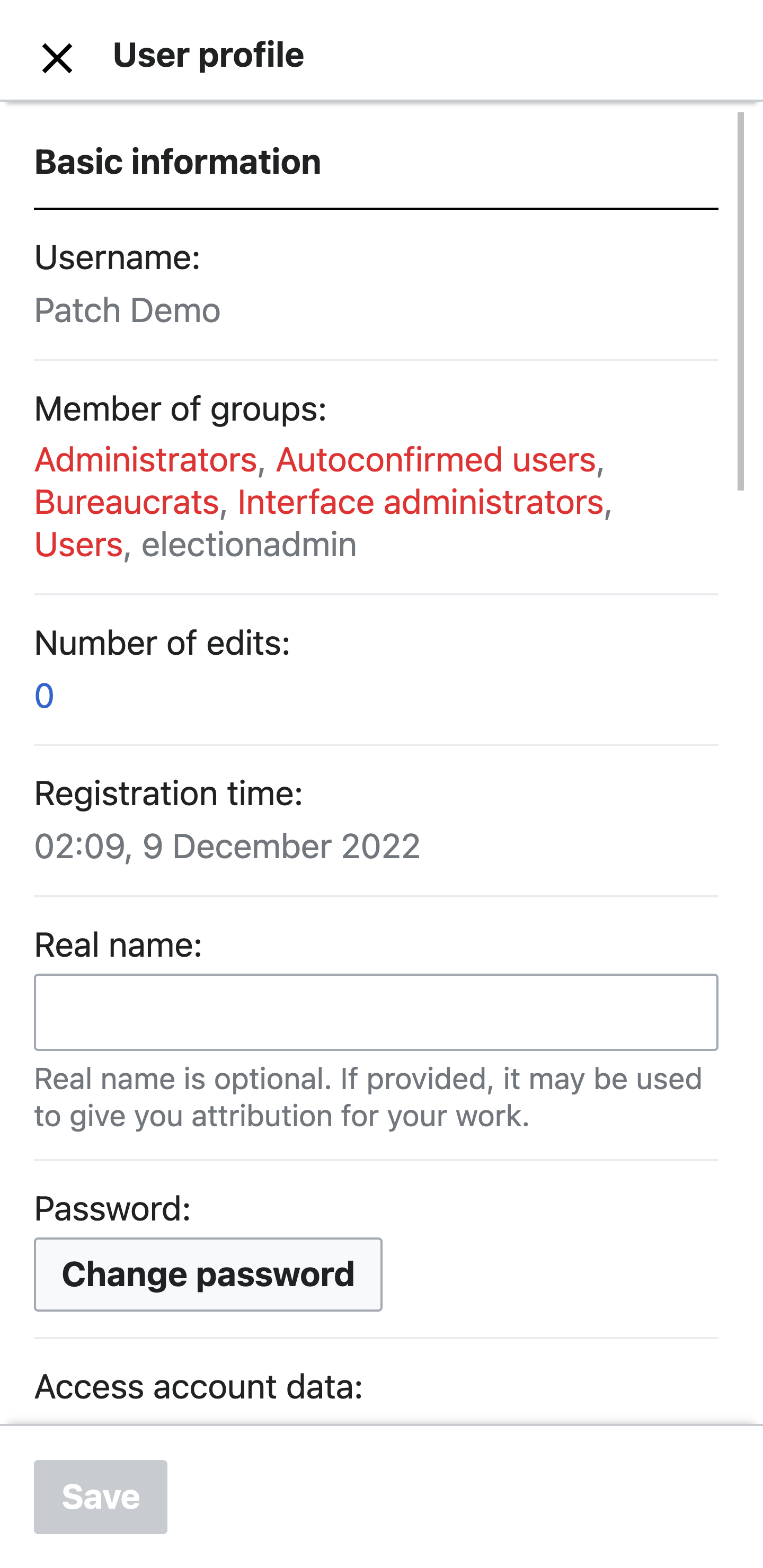
In addition to updating the design of the main menu selector of Preferences we also want to update the submenus.
User Story
As a mobile-first Wikimedia contributor, I want to change my account preferences from my mobile device, so that I can customise my editing experience.
Design specs
Full image (PDF) detailing changes and specifications https://commons.wikimedia.org/wiki/File:Desing-specs-mobile-web-preferences.pdf. Note that some changes in this document are beyond the scope of this task, particularly specific-setting modals and the on/off toggle.
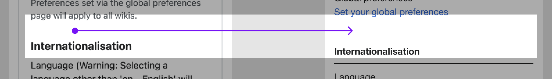
Section titles get a border bottom for stronger separation
In order to enable editors to easily scan the content of a page a solid black border will signify the beginning of each settings section.

Tech Note
- Ideally, we want to use CSS/JS to target the sections needing a border bottom etc. We should be careful to use selectors that are limited in scope to the mobile experience (mobile.js) and (resources/src/mediawiki.special.preferences.styles.ooui.less).
- Since the actual factory used to create the default layout lives deep in core and is used by desktop, we want as much as possible to limit our change to CSS/JS.
Labels loose the colon “:” at the end
The colon is needed as a separator when the content is displayed on the same line. In this instance, we're going to rely on the line break to create a clear distinction between the label and the call to action (or text) below.

Tech Note
- The colon (:) lives in the translation files so this seems more of a content change (translation) rather than a programatic one.
- We also need to identify if there are any guidelines surrounding the use of the colon ( : ) as a need rather than a want.
- We could programmatically remove the colon ( : ) using a regular expression replace on all labels.
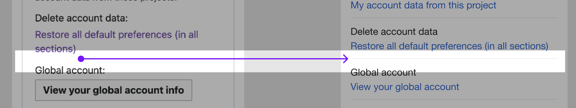
Buttons become links: T324586
Links stay as links
As above.
Tech Note
- Logic used to change buttons to links should not impact already existing links. They should stay the same, which is essentially a NOOP in this case.
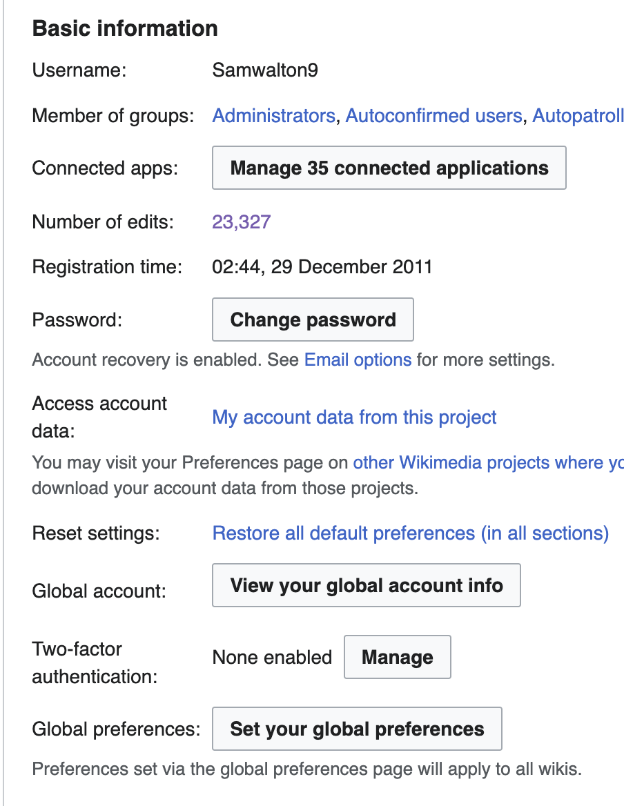
Information (non-interactive) texts are set to grey
For content and is non-interactive, and only informational, we can de-prioritize it by setting the text color to grey.

This should be done for the following information:
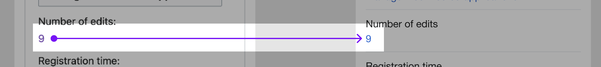
- Username
- Registration time
- Email confirmation (when confirmed)
Tech Note
- At first glance this looks like a change that can be applied and limited in CSS scope to the labels mentioned above. Ideally we would add some logic to our mobile.js file where all the other mobile magic is happening.
Options are separated by a grey line
To emphasize the distinction between an option and another we will add a grey separator line. These separators, together with the section separators, will give a stronger structure to the content of the page, hence improving the scan-ability of the content.
Sections are more distant from each other
To improve the scan-ability, and to enable editors to quickly scroll the page, and find the section that they need, we will increase the space between each main section.
Tech Note
- At first glance this looks like a change that can be applied and limited in CSS/JS scope to the sections mentioned above. Ideally we would add some logic to our mobile.js file and corresponding CSS file.
- We can add padding and a border-bottom of 1px to the appropriate section using CSS/JS.
Technical information
TBD
Testing and QA steps
- Log in to a Wikipedia account
- Navigate to the sidebar and select Settings
- Turn on Advanced mode
- Click 'Open preferences' in Settings
- Select each menu item and check that the designs above have been met for each
- Please also verify that the desktop (non-mobile) experience remains unchanged.
Acceptance Criteria
- All design elements above have been met in every preferences section used in production MediaWiki
- The functionality of Preferences on mobile and desktop have not changed