Page MenuHomePhabricator

Improve user experience with when section is considered active
Open, MediumPublic

Assigned To
Authored By
Jack_who_built_the_house
Sep 19 2022, 5:51 PM
Referenced Files
F35696120: image.png
Nov 2 2022, 11:14 AM
F35696090: image.png
Nov 2 2022, 11:14 AM
F35696036: image.png
Nov 2 2022, 11:14 AM
F35696047: image.png
Nov 2 2022, 11:14 AM
F35696026: image.png
Nov 2 2022, 11:14 AM
F35526032: image.png
Sep 20 2022, 3:36 PM
F35526030: image.png
Sep 20 2022, 3:36 PM
F35523775: image.png
Sep 20 2022, 3:36 PM

Description

Quoting @alexhollender_WMF in T317661,

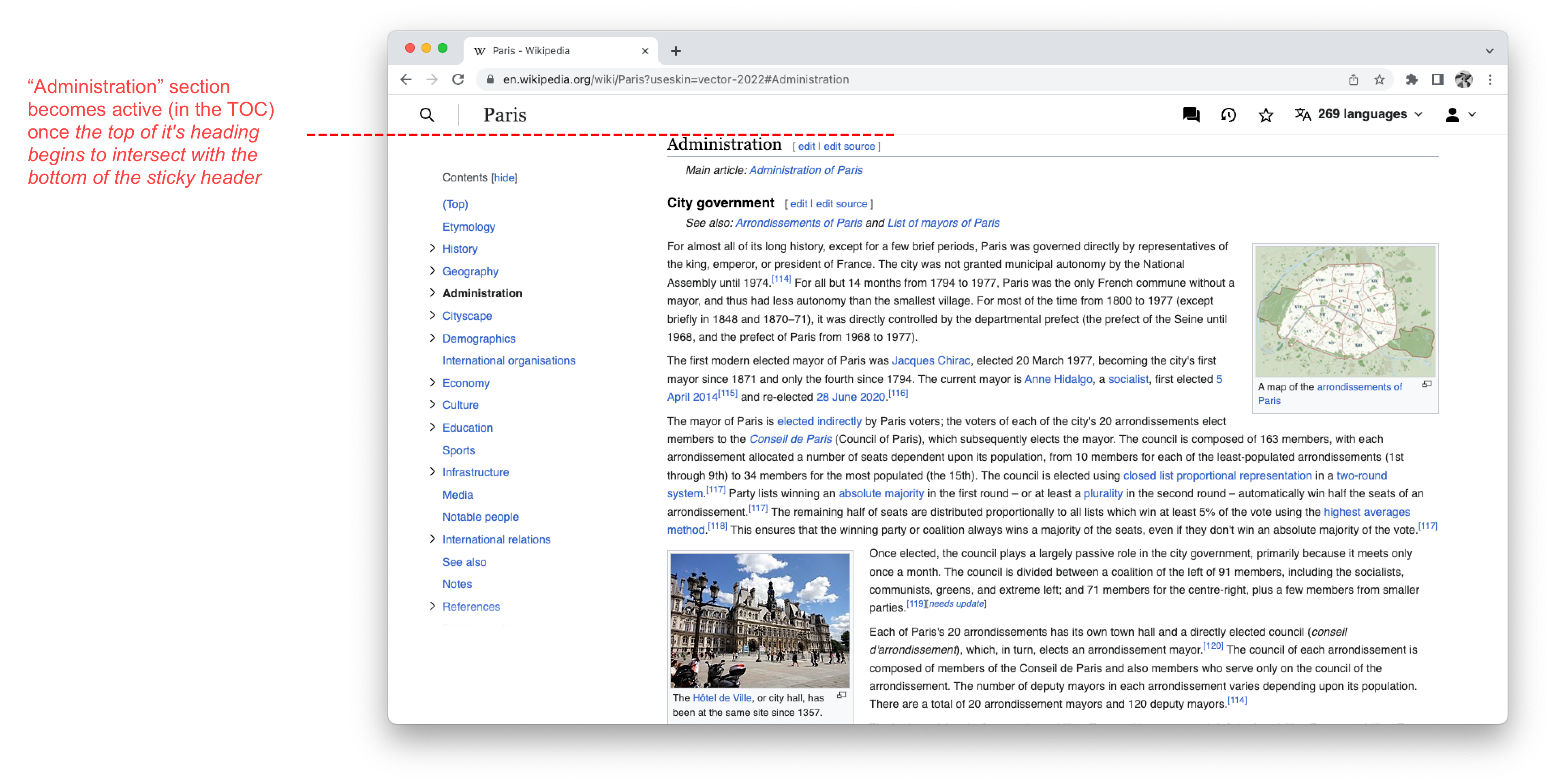
Currently a section is considered active (and therefore bolded in the table of contents) once the top of it's heading begins to intersect with the top of the viewport (or the bottom of the sticky header).

image.png (1×3 px, 908 KB)

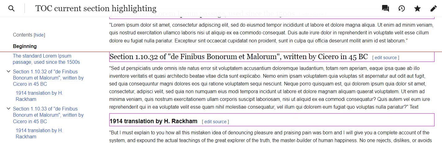
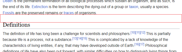
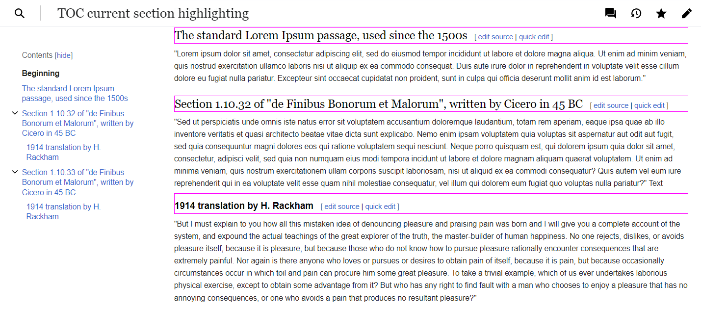
Since the heading top—viewport top relative position doesn't necessarily imply which section is the first visible on the page, this can result in a mismatch between the user's subjective perception of which section is "current" and the highlighted section. This is a prime example:
image.png (736×1 px, 498 KB)

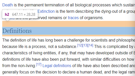
The whitespace between the sections here subjectively belongs to the "Definitions" section, but technically, since the heading top starts a section, it's a part of the lead section.

I assume there are two possible ways to solve this problem:

  1. Use a fixed threshold for distance between the top of the viewport and the top of the heading. When the distance is lower than the threshold, the section is assumed active. This solution is proposed in T317661 (100px is proposed as a threshold).
  2. Use a more refined calculation that could require additional sources of data (other than Intersection Observer API which is used under the hood).

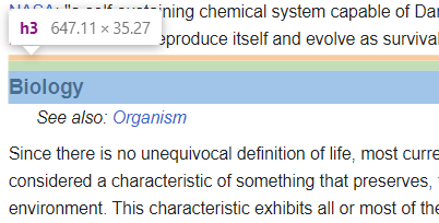
The first solution doesn't take into account heading margins which may vary substantially based on the section level and the skin. For instance, <h2> and <h3> in Vector have different padding-margin values and structure (only padding is considered part of an element). Hence a fixed threshold will work differently for them (the threshold is counted from blue/green areas, leaving out orange ones):

image.png (298×532 px, 40 KB)
image.png (204×402 px, 18 KB)

These are the actual boxes used by Intersection Observer API to calculate intersections:

image.png (630×1 px, 134 KB)

Another question is,

  1. should the first actually visible section be considered active (so that only whitespace is excluded from the top section),
  2. or should we make an assumption about what should be the "right" correspondence between what the user sees on the page and which section is highlighted as active. This may mean we will consider a section active once the last line of the previous section stops being fully visible, or something like that.

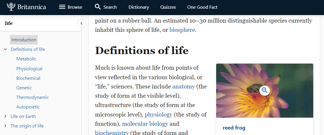
Britannica, for instance, uses a fixed threshold, although practically the "section step" only happens when the last line stops being fully visible:

chrome_QTJsSco2Am.gif (467×1 px, 3 MB)

Event Timeline

@Jack_who_built_the_house I think I'm still a little confused by your proposal, and what this task is.

We have to pick a point on the screen that we assume people are looking at, and when a section first touches that point we consider it active. You can think of it as when the bottom of the previous section is no longer touching that point, but it's the same thing (just said differently).

Also, I'm not sure why we would include the padding/margin around the title? What is that helping with? That is invisible to the person as they are reading the page.

Also, to try to clarify again, regardless of whether or not we use the padding/margin, we still need a fixed point on the screen that serves as the intersection threshold.

We have to pick a point on the screen that we assume people are looking at, and when a section first touches that point we consider it active. You can think of it as when the bottom of the previous section is no longer touching that point, but it's the same thing (just said differently).

You're kind of jumping to a solution here without grasping the alternatives. As I outlined in the task, there are two approaches to when to consider a section active:

  1. should the first actually visible section be considered active (so that only whitespace is excluded from the top section),
  2. or should we make an assumption about what should be the "right" correspondence between what the user sees on the page and which section is highlighted as active.

"Assuming" something is only one possible solution, and I argue not a good one. UIs should be predictable, which is why we need to avoid assuming things too much, especially when they are fundamentally unknowable like the user's light of sight. As I said in T317661#8244084, trying to guess where the user's light of sight is is a fundamentally flawed task. And cases like this clearly demonstrate it:

image.png (950×1 px, 191 KB)

It's also quite telling that there's now a discussion in T317661 on "Where do people look on the page, center or top". Exactly to avoid such discussions, it is preferrable to have UIs that do not assume things about the unknowable and just behave predictably.

  • "Treat the first visible section as active" is a predictable behavior.
  • "Treat the first section with at least one line visible as active" is a predictable behavior; Britannica uses it.
  • "Treat the section that is at the center or somewhere closer to the top of the screen as active" is not a predictable behavior, since all the user will grasp is that there is some point on the screen where the highlight makes a step. But in every single occasion that connection will be vague (the user won't count pixels to the top of the viewport or try to calculate its center). This is the kind of thing that so many people get annoyed by in UIs – that computers try to predict where they look, what they want, and so on (but that's a different conversation).

Also, I'm not sure why we would include the padding/margin around the title? What is that helping with? That is invisible to the person as they are reading the page.

Take this screenshot:

image.png (630×1 px, 134 KB)

As you can see, <h3> headings have a big padding and a small margin. <h2>s, on other hand, have a big margin and no padding. As a result, the 100px threshold would leave a different portion of the first visible section on the page. A 4-line chunk of a section followed by <h3> and a 3-line chunk of a section followed by <h2>:

image.png (462×1 px, 106 KB)
image.png (468×1 px, 112 KB)

But 3 or 4 lines obsiously won't mean much if the threshold is big (which I argue against – see a good demonstration why in T317661#8246217).

I think I kind of understand now why you didn't see what I mean about margins and paddings. You're thinking in terms of the line of sight (that corresponds to a fixed point on the screen), while I'm thinking in terms of what the user sees in general (for example, which is the first visible section).

@Jack_who_built_the_house hmm, I'm still a bit confused and wonder if we're overcomplicating things here. Are you trying to say that people will have an easier time understanding what's happening if the intersection threshold is the top of the screen (because that's more "predictable"), versus a different point (like the middle of the screen, or 100px down from the top)? I think it's just as easy for people to understand: whenever a section's heading gets close to the top of the screen, that section is considered active. And even if it was more predictable to use the top of the screen, the idea behind the original task is that using the top of the screen doesn't match up with people's experience, because they are not looking at the very top of the screen while they are scrolling. If you want to understand it as trading off "predictability" for a solution that hopefully better matches up with people's experience, I think that's an okay understanding (and a fine tradeoff in this case).

Also, to clarify, when you say "Treat the first visible section as active", by "first" do you mean the one that's closest to the top of the screen?

Sorry, I'm quite busy now.

Are you trying to say that people will have an easier time understanding what's happening if the intersection threshold is the top of the screen (because that's more "predictable")

If you're asking whether I suggest to just leave everything as it is—of course no, I thought I made it clear in multiple comments.

You can look at the way I did it in Convenient-Discussions:

  1. Open a browser in the Incognito mode (so that no unnecessary user settings are set)
  2. Open https://en.wikipedia.org/wiki/Talk:Life?useskin=vector
  3. In the console, run mw.loader.load('https://commons.wikimedia.org/w/index.php?title=User:Jack_who_built_the_house/convenientDiscussions.js&action=raw&ctype=text/javascript');

So, as compared to the current behavior in Vector 2022, here the whitespace between sections is included in the lower section (as opposed to the upper, as it is in Vector 2022). Whitespace is this area:

image.png (220×773 px, 30 KB)

Also, to clarify, when you say "Treat the first visible section as active", by "first" do you mean the one that's closest to the top of the screen?

Here, the first visible section is "Definitions":

image.png (149×772 px, 17 KB)

(While Vector 2022 treats the section above "Definitions" as active.)

Here, the first visible section is the section above "Definitions", because the last line of the previous section is visible:

image.png (173×777 px, 21 KB)

As I said, this is not the only possible solution. By Britannica's solution, if the top of the viewport is in the outlined area, the "Definitions" section would still be considered active:

image.png (192×775 px, 25 KB)

The last line is not fully visible anyway, so we can safely assume the user is not reading it.

Actually, I came across an interesting alternative solution recently. devopedia.org website doesn't shy away from highlighting as active all sections that are currently in the viewport, e.g. https://devopedia.org/linux:

image.png (855×1 px, 121 KB)

3 sections are visible; all of them are highlighted in the TOC.

@Jack_who_built_the_house I'm unfortunately still not able to understand how what you are suggesting is different from what we're planning to do in T317661. After we do that work the whitespace above a section will be part of that section from the perspective of the active section highlighting (which seems to be the main thing you're concerned about, though to be honest I'm still a bit confused by your suggestions). As far as I can tell it would make sense to close this task as a duplicate of that one, but feel free to leave it open if that feels more appropriate to you.

I'm confused by your confusion. You're proposing the most straightforward and, may I say, sloppy solution, and when I try my best to describe the problem in general form and go into details you're "not able to understand" 🙄

Can you provide some examples of websites doing what is suggested in T317661? Has this solution been discussed thoroughly within WMF? From my point of view, T317661 is introducing a UX antipattern under the guise of catering to user experience. Sorry. (I've explained why in multiple comments, but basically any connection is lost between what the user sees in the content area and which section is highlighted as active. "whenever a section's heading gets close to the top of the screen" is a vague criterion; users will misjudge often and get annoyed.)

Meanwhile, another possible solution:

(the TOC is on the right). The active section is switched as soon as, while scrolling down, the section stops being fully visible and there is a section below it in the viewport.
✅ Predictable
❌ Can take time for the user to figure out the logic

An example of my solution:

(Here, sections are wrapped into a <section> element unlike sections in MediaWiki, so it's easier from the technical POV.)

I don't even know what we're talking about anymore. Any website that has a table of contents with highlighted sections does a variation of T317661. Maybe you're caught up on whether the padding comes from the heading element itself, or is a fixed offset, but it's all the same from the experience of the person using it.

ovasileva triaged this task as Medium priority.Dec 4 2023, 5:24 PM
ovasileva moved this task from Not ready to estimate to Groomed on the Web-Team-Backlog board.