Page MenuHomePhabricator

🟩 Implement Frontend part of Contact page
Closed, ResolvedPublic5 Estimated Story Points

Description

See parent ticket for product details.

We should protect this with a captcha. See ui/src/components/Cards/CreateAccount.vue:171 for inspiration as to how this is currently done for the CreateAccount workflow.

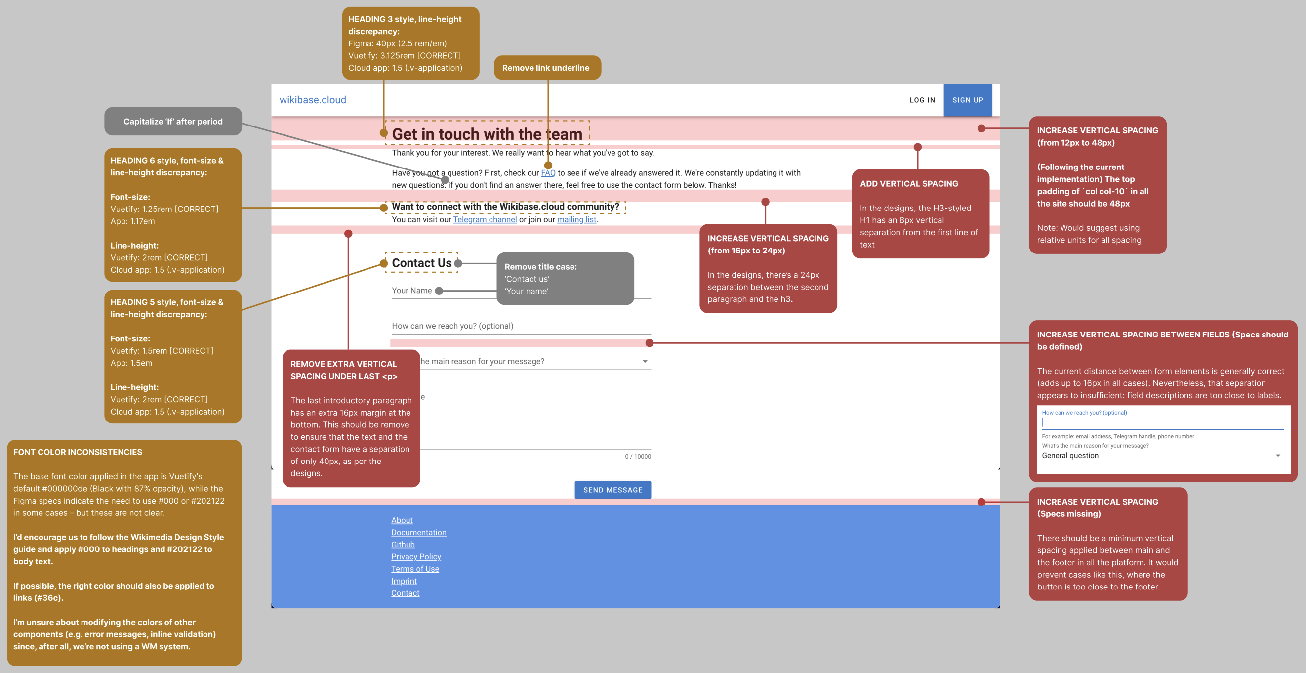
Of course this UI will need to make a call to the backend API. This will need to look like a POST request to /contact/sendMessage with a JSON object with the following keys.

keys
name
contactDetails
subject
message
recaptcha

each of which should be a string. The response should be expected to be a 200 in the event of success. 401 in the event of the recaptcha token being rejected, and 400 in the event of a missing required key (name, subject, message or token) or one of the strings being excessively long (to be defined by the API not hard coded in the client).

where subject is one of:

general-question
feature-request
report-a-problem
give-feedback
other

These different cases should be demonstrated by creating mock backends representing this situation in https://github.com/wbstack/ui/blob/main/src/backend/mocks/default_handlers.js

Event Timeline

Evelien_WMDE set the point value for this task to 5.Sep 28 2022, 12:30 PM

Thanks for sharing @Rosalie_WMDE ! Here are my remarks:

  1. "How can we reach you" field - I would love to change the persistent hint to a[[ https://vuetifyjs.com/en/components/text-fields/#hint | normal hint ]].
  1. "your name" field - should have validation. when the user tries to submit the message without having filled it in, it should change state and let the user know that this field is required to proceed. Copy for error message can be This field is required (check forgot password for example in production)
  1. The snackbar seems to be inserting itself into the page content by moving the footer down. My assumption was that the snackbar floats above the content, like a floating action button. Please let me know if that's not the case and if it is more effort to make it float, then i will specify a specific location for it.
  1. Also regarding the snackbar: I think between the main copy, and the "CLOSE" button need to be more padding. When I inspect the vuetify component, it seems to me like the text and button each have their own padding (16+8). Our snackbar only had button padding, which makes the copy appear quite close to the button.
Deniz_WMDE renamed this task from Implement Frontend part of Contact page to 🟩 Implement Frontend part of Contact page.Nov 29 2022, 11:16 AM

@dang @Tarrow i've added the snackbar error state in the figma file. Let me know if you have any questions!

dang removed dang as the assignee of this task.Nov 29 2022, 3:18 PM
dang moved this task from Doing to In Review on the Wikibase Cloud (WB Cloud Sprint 10) board.
dang subscribed.

Cool; so looking at the implementation of this the key for the recaptcha token was recaptcha rather than token as specified in the task description. This is exactly what we talked about in the task breakdown but maybe we can coordinate with @Deniz_WMDE to also change the agreement for the backend ticket

@Charlie_WMDE just wanted to check if we should actually use color error rather than red-darken-2 ?

Hey everyone,

i just finished the verification and noticed a few things of which one is indirectly in the ACs but was not specified in the mock, so this would be a call for @Evelien_WMDE whether we want to still add that or not.

we have an AC stating The Subject line should always contain [Reason for message] which sounds like that dropdown should not be left empty. There are two solutions to this. Either include a validation (my preferred way) or make "General question" the default selection (probably easier but will probably result in some people not bothering to select the more correct reason).

Other than that I noticed some issues with the width which i outlined in figma where it says verification.

There are 3 separate issues:

  1. The max width of the entire content is exceeded
  2. The max width of the input fields is exceeded
  3. The min width is exceeded (it gets too small)

Other than that it looks great!

@dang feel free to add the character limit to the message field if you like. It's not strictly necessary because there is a validation that is activated when the limit is reached, but there's also no downside to adding it and i feel like it would make you happy :)

dang removed dang as the assignee of this task.Dec 9 2022, 10:48 AM
dang moved this task from Doing to In Review on the Wikibase Cloud (WB Cloud Sprint 11) board.

moving this to stalled as it is waiting for backend deployment

we have an AC stating The Subject line should always contain [Reason for message] which sounds like that dropdown should not be left empty. There are two solutions to this. Either include a validation (my preferred way) or make "General question" the default selection (probably easier but will probably result in some people not bothering to select the more correct reason).

The ideal would be indeed to trigger inline validation (see screenshot below) when users try to submit the form without providing the required information. I do get inline/FE validation when I interact with the forms only to leave them empty again, but only get a generic error when I try to submit the form (not sure if this is due to the fact that I'm checking the Netlify mock). So, I'm unsure of whether this has been sorted out.

Screenshot 2022-12-21 at 12.39.30.png (170×1 px, 15 KB)

Other than that I noticed some issues with the width which i outlined in figma where it says verification.

There are 3 separate issues:

  1. The max width of the entire content is exceeded
  2. The max width of the input fields is exceeded
  3. The min width is exceeded (it gets too small)
  1. (&3) Max and min widths were applied to the page content, following the verification specs in Figma. Nevertheless, said values seem to not be consistent throughout the platform. I'd encourage defining specs for the different page views of the application, and setting consistent spacing (e.g. page margins, main to footer spacing) and sizing (e.g. min and max content) values for a set of predefined breakpoints.
  1. The specified max-width was correctly applied to the inputs.

Other visual inconsistencies between the designs and the current implementation were found as a result of conducting a quick, further verification. You can find said visual issues annotated in Figma.
The majority of the improvements have to do with increasing or decreasing layout spacing between elements to follow the original specs (if available – see red annotations) or with the typographic styles (font-sizes, line-heights, colors) not being aligned with Vuetify styles/Figma specs (yellow annotations). Pinging @Charlie_WMDE for visibility.

Screenshot 2022-12-21 at 13.39.54.png (1×2 px, 488 KB)

Evelien_WMDE claimed this task.