Acceptance Criteria
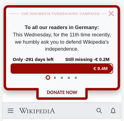
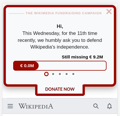
- The banners are based on the control banner of last year's mobile-en-02.
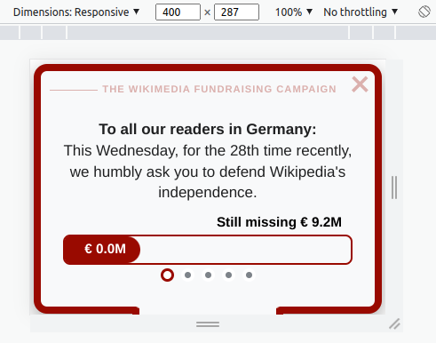
- Both banners display the campaign progress bar.
- Both banners include the campaign parameters file.
- Both banners display the campaign day sentence.
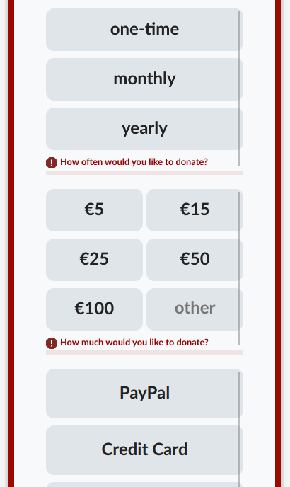
- None of the two banners show the address type form fields.
- Screenshots of the banners are uploaded to Shutterbug.
- Variant banner:
- The headline "To all our readers in Germany," is changed to "Hi,".
Banner Copy
| Element | Copy |
|---|---|
| Slide #1 | Our donation target: n million euros |
| Slide #2 headline | To all our readers in Germany:/Hi, |
| Slide #2 paragraph | This { currentDayName } we humbly ask you to defend Wikipedia's independence. { campaignDaySentence }` |
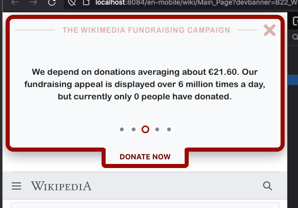
| Slide #3 | 99% of our readers don't give; they simply look the other way. We depend on donations averaging about € 22.66. |
| Slide #4 | { visitorsVsDonorsSentence } If you donate just € 5, Wikipedia could keep thriving for years. |
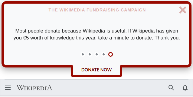
| Slide #5 | Most people donate because Wikipedia is useful. If Wikipedia has given you € 5 worth of knowledge this year, take a minute to donate. Thank you. |
| Expanded banner headline | To all our readers in Germany:/Hi, |
| Expanded banner paragraph | This { currentDayName } we humbly ask you to defend Wikipedia's independence. { campaignDaySentence } 99% of our readers don't give; they simply look the other way. We depend on donations averaging about € 22.66. { visitorsVsDonorsSentence } If you donate just € 5, Wikipedia could keep thriving for years. Most people donate because Wikipedia is useful. If Wikipedia has given you € 5 worth of knowledge this year, take a minute to donate. Thank you. |