Problem
Search Preview panel has variety of information some of which needs API calls and other processing that could lead to longer than expected load times. If not handled gracefully it can result in a jarring experience and lack of visibility on whether the content is fully loaded or not.
Goal
The goal of this ticket is to define how we want to load content in the search preview so that:
- the content does not jump around while loading i.e. the user experience of loading content is smooth.
- there is a visual indication that content is still loading
Solution
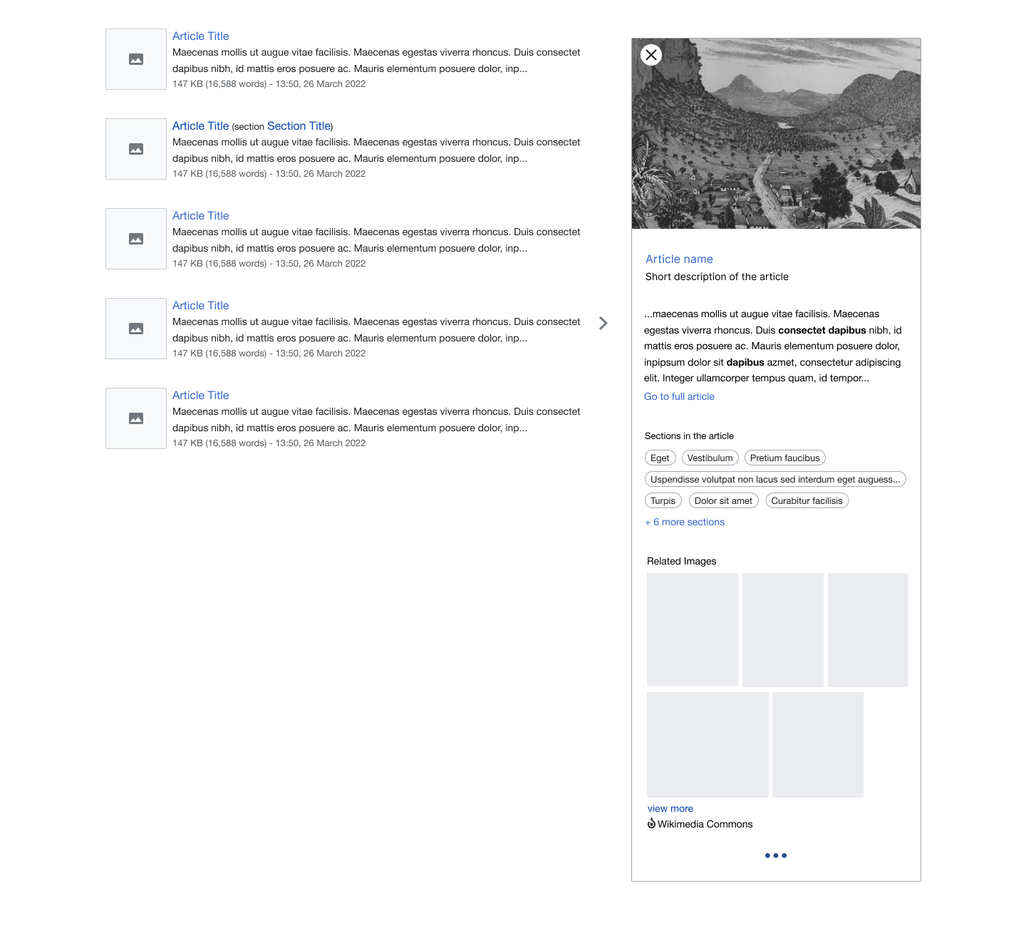
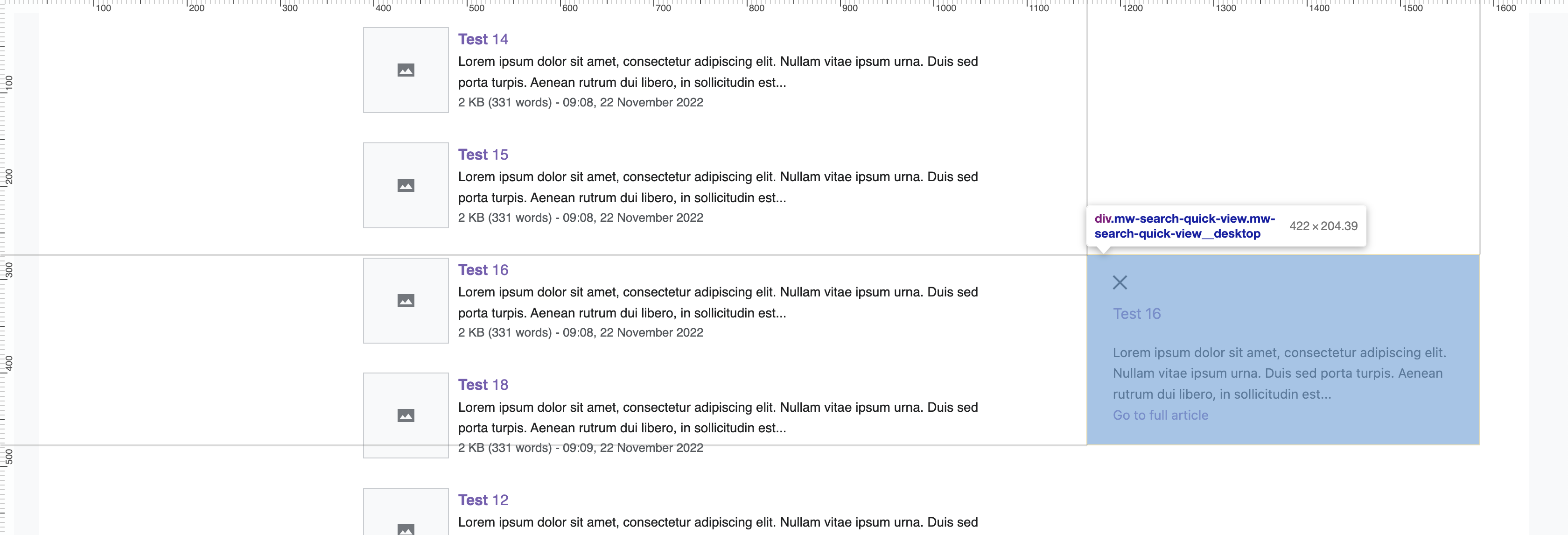
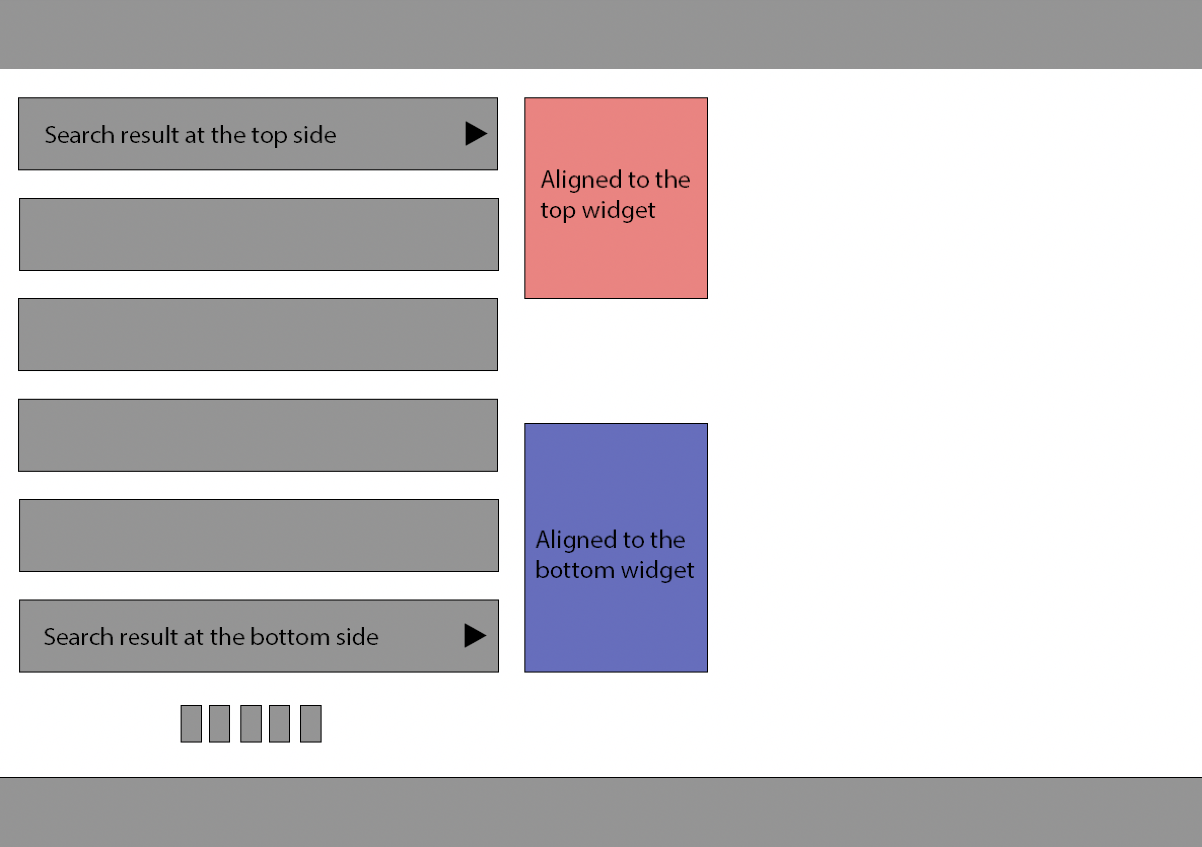
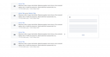
- Have a default skeleton for search preview panel that can be shown while the basic content is loading. The number and position of grey lines are the same no matter the language or content (since we don't know the number of lines ahead of time).
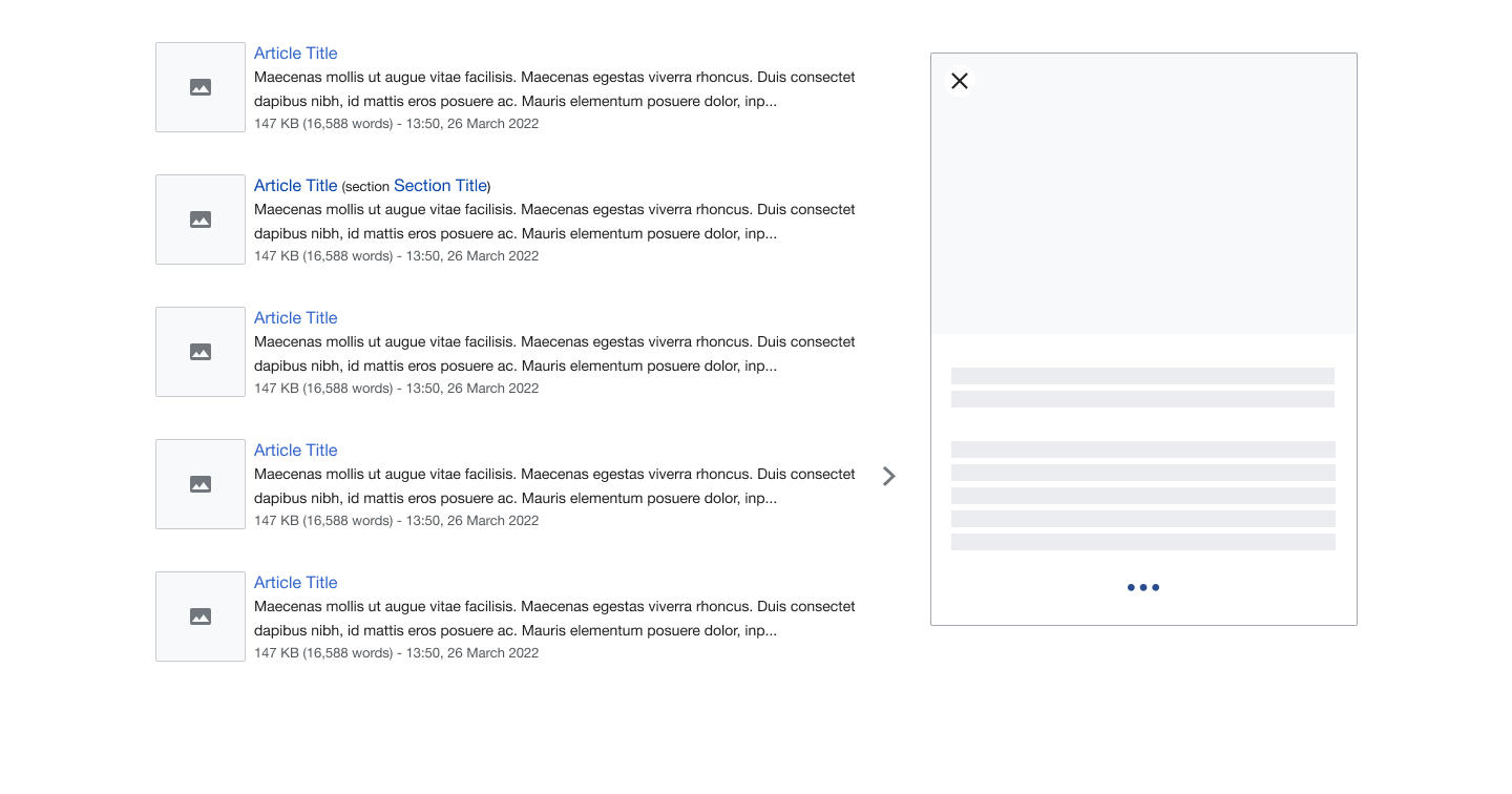

- Show the loading indicator at the bottom of the panel while the content is loading. The indicator disappears after all content is loaded.
- For animation look at dot.pulse animation on this link.
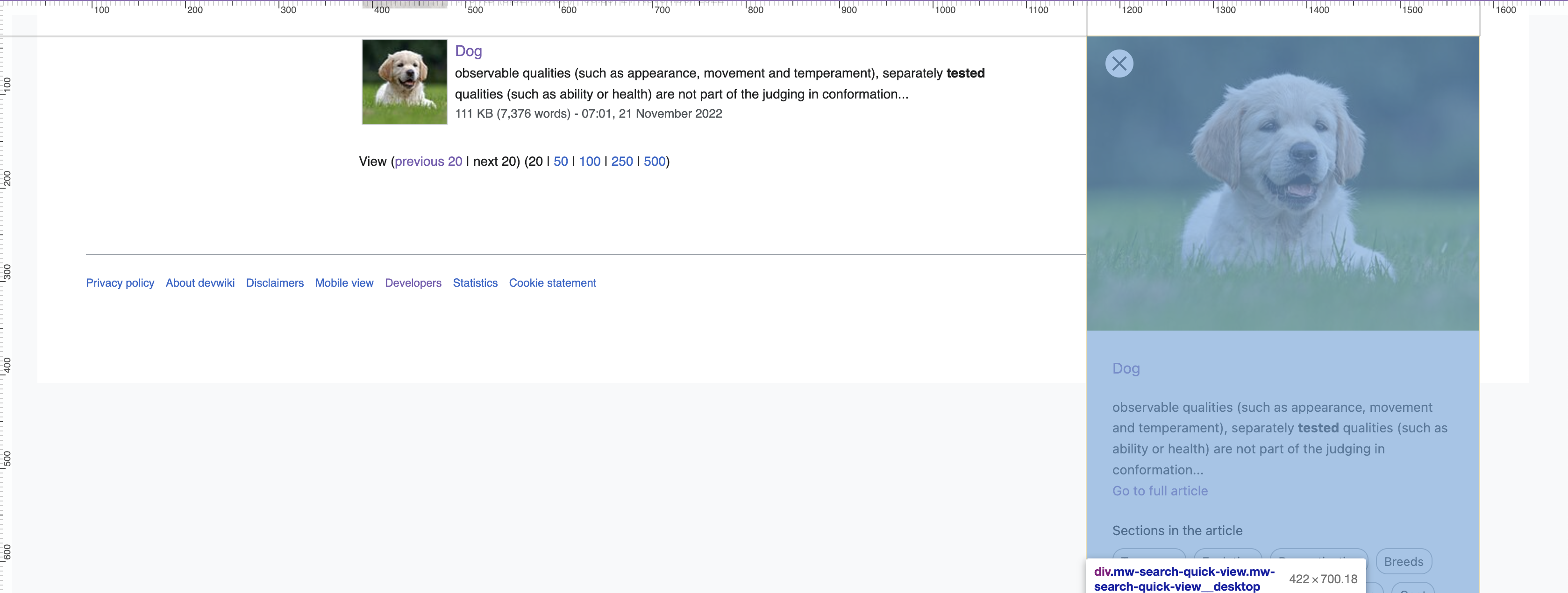
- Position the panel as high as possible on the screen with arrow still pointing to the lower half of the panel.
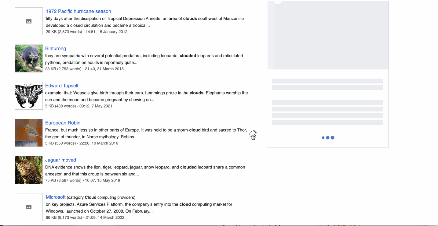
- Example
- Example
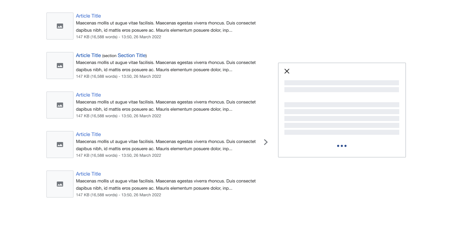
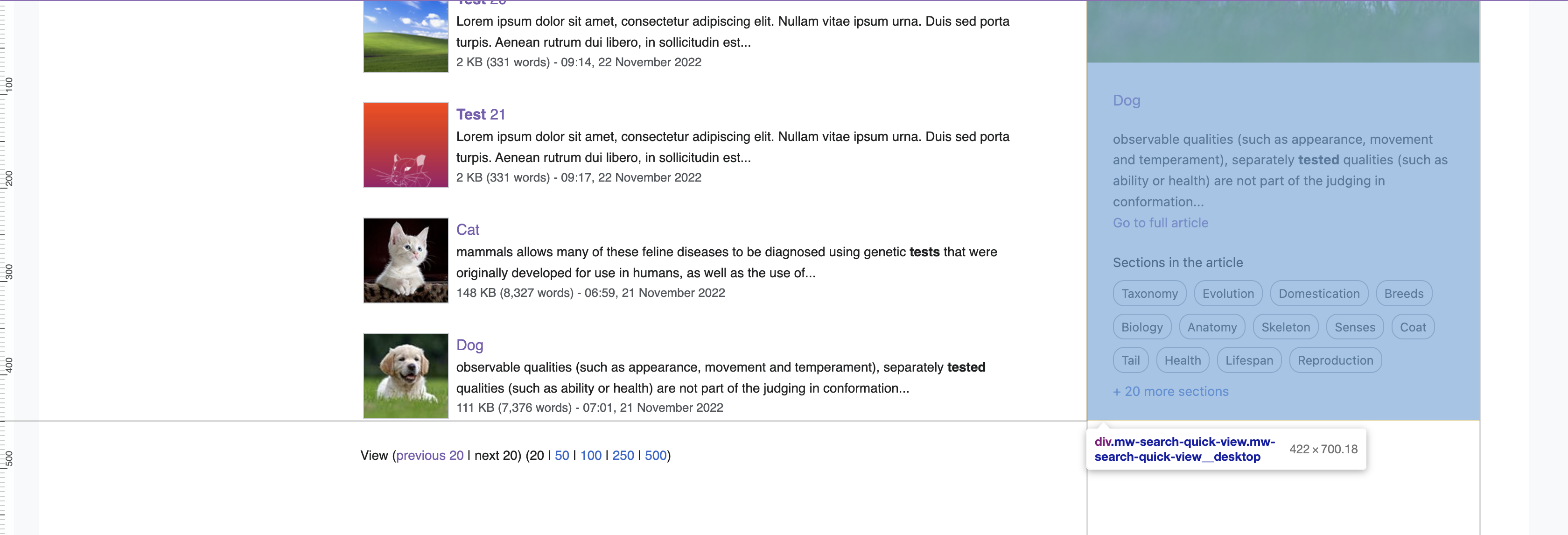
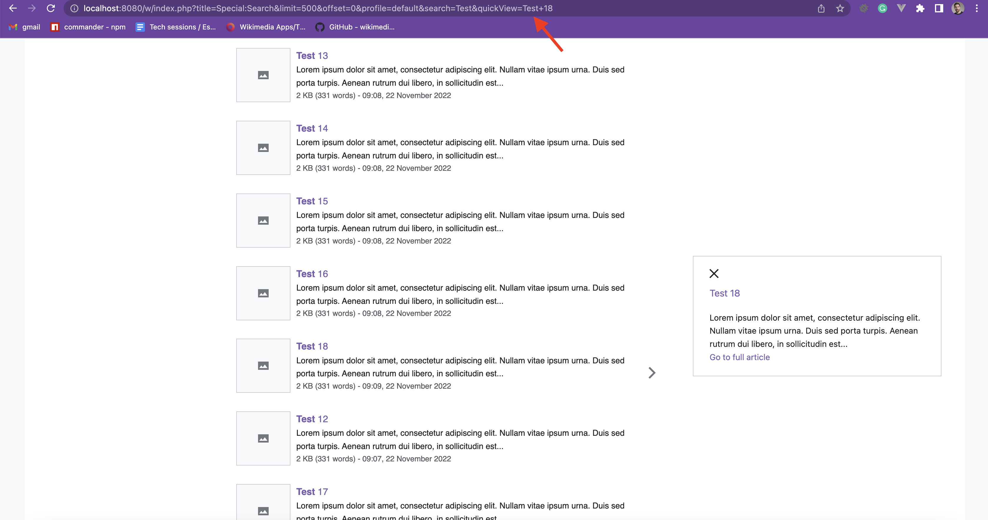
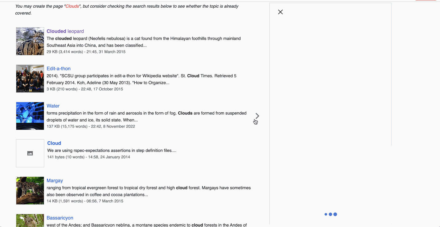
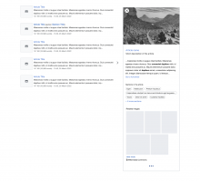
- As new content loads expand the panel at the bottom. Do not move the position of the panel when new content is loading. This allows for content that is already loaded to not jump around.
- Example
- Example
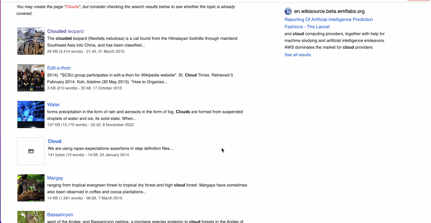
- The loading indicator will shift down until all content is loaded (as shown in the image above and below example.)
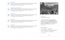
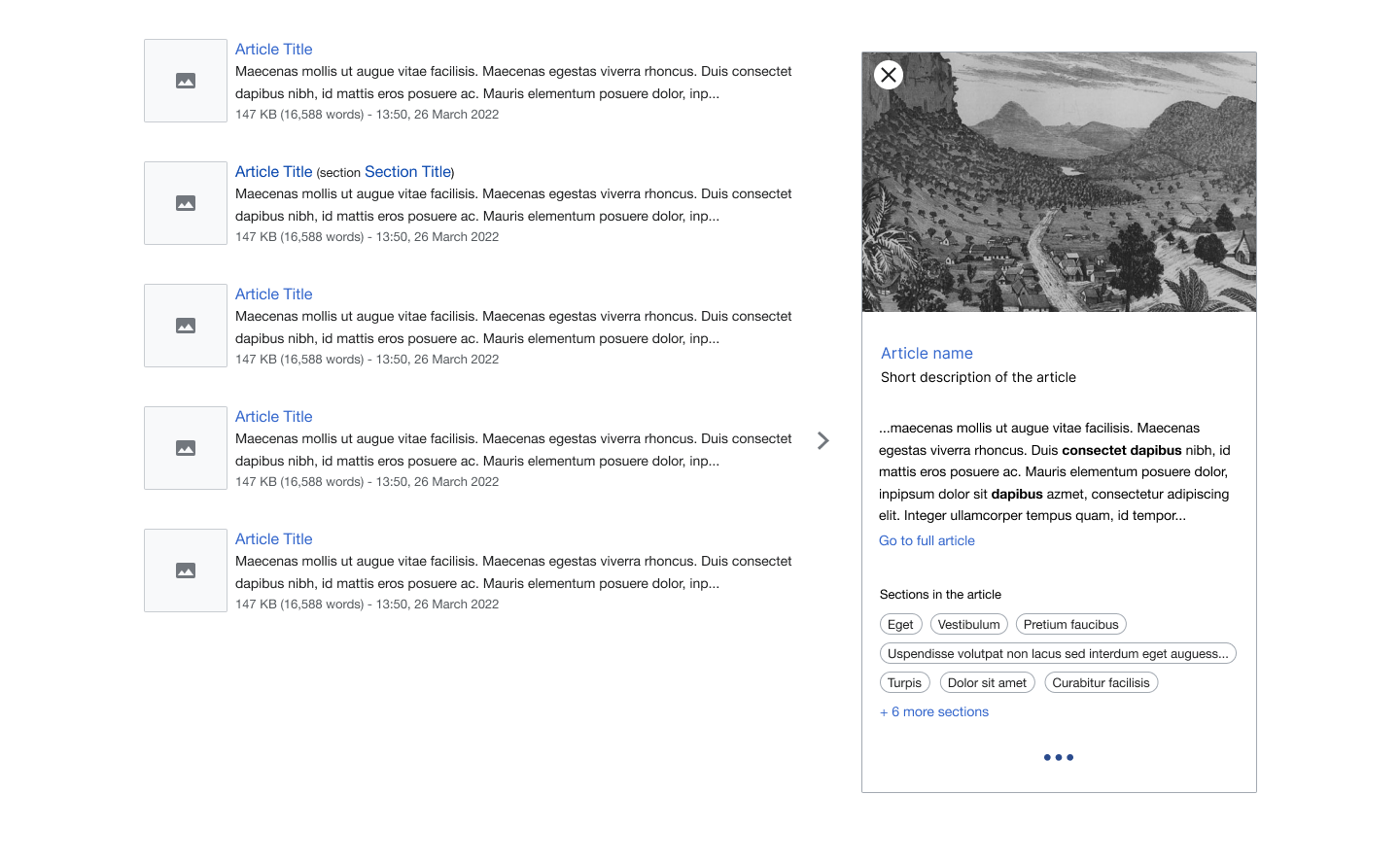
- Commons widget skeleton will show appropriate image dimension while the images are loading. Link to specs in Figma.
- Example
- Example