What is the problem?
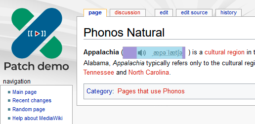
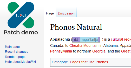
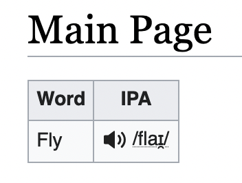
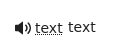
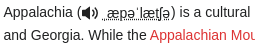
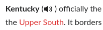
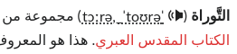
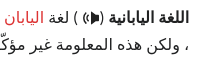
As IPA is often included inline in articles and often surrounded by parentheses, we should consider how much whitespace we need to surround the Phonos element by to make it look natural in the article.
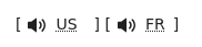
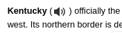
| Skin | Example | CSS of the containing span |
| Vector 2010 | 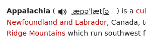 | 113.383x22 margin-right: 8px |
| Vector 2022 | 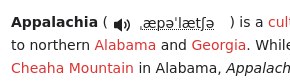 | 113.383x22 margin-right: 8px |
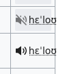
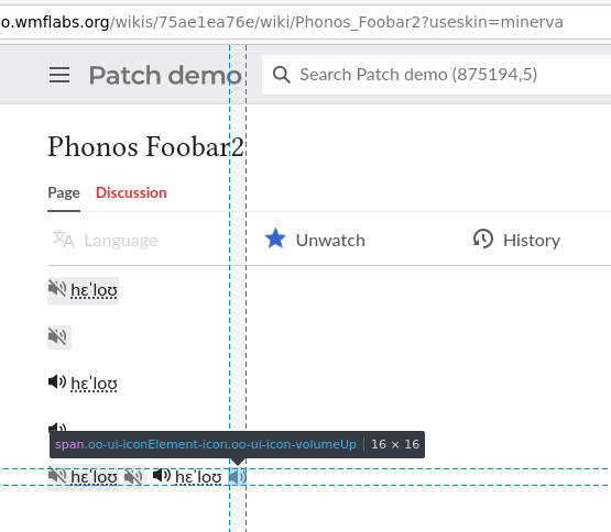
| Minerva | 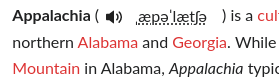 | 114.933x24.85 margin-right: 8px |
| MonoBook | 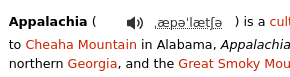 | 131.583x23.8167 margin-right: 6.35px |
| Timeless | 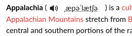 | 109.583x23.7167 margin-right: 8px |
(Screenshot and CSS numbers taken on Firefox 102).
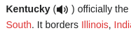
Notice in particular that on MonoBook the Phonos element increases the height of the entire line it is on.
Steps to reproduce problem
- Look at https://patchdemo.wmflabs.org/wikis/34377c5aff/wiki/Phonos_Natural?useskin=<skin> with different values of <skin> (vector, vector-2022, minerva, monobook, timeless)
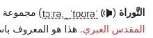
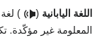
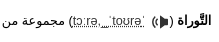
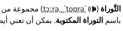
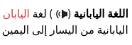
- Also consider RTL languages as well (e.g. uselang=ar)
Environment
Operating system: Debian Bullseye
Browser: Firefox 102
Wiki(s): Phonos 0.1.0 (a768954) 19:18, 6 October 2022
Acceptance Criteria
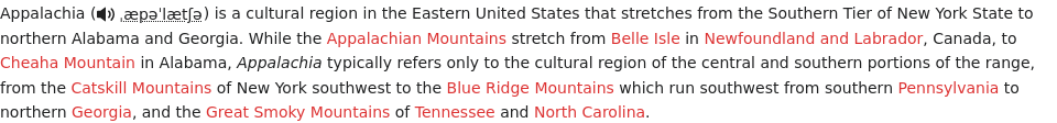
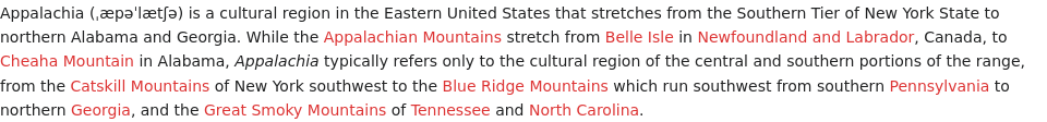
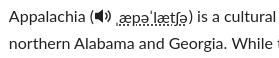
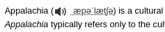
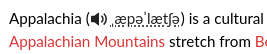
- We don't want any padding around the parenthesis; the appearance should be the same as in Production, and identical across all skins. See e.g. https://en.wikipedia.org/wiki/Appalachia