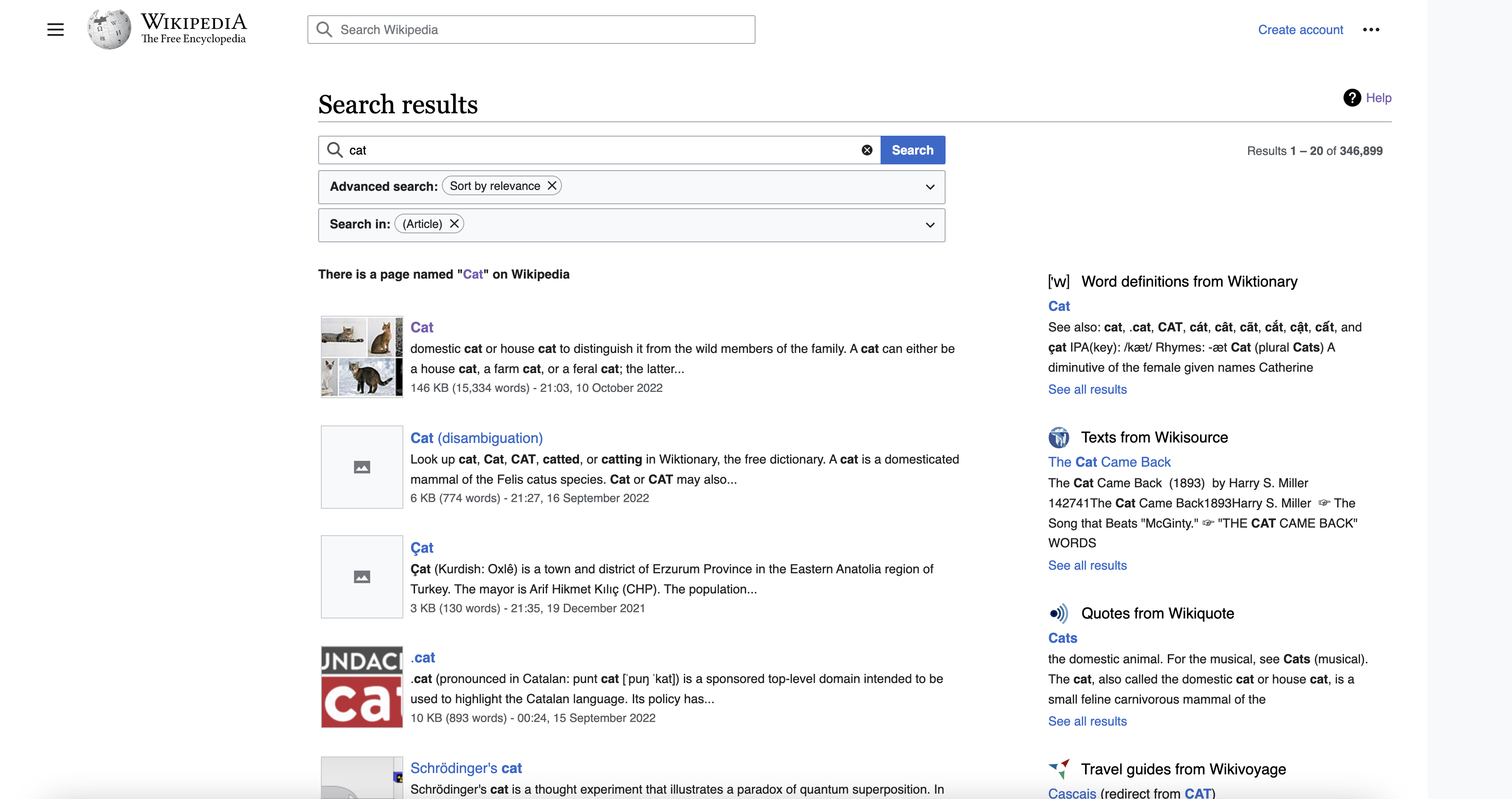
Page MenuHomePhabricator

[M] Update the special:search layout for Vector 2022 to use full screen width
Closed, DuplicatePublic

Assigned To
Authored By
Sneha
Oct 11 2022, 9:37 PM
Referenced Files
F35597116: newvector-800.png
Oct 18 2022, 7:37 PM
F35597115: oldvector-800.png
Oct 18 2022, 7:37 PM
F35596451: newvector-2048.png
Oct 18 2022, 12:15 PM
F35596441: newvector-1440.png
Oct 18 2022, 12:15 PM
F35596439: newvector-1280.png
Oct 18 2022, 12:15 PM
F35596437: newvector-1024.png
Oct 18 2022, 12:15 PM
F35596449: oldvector-2048.png
Oct 18 2022, 12:15 PM
F35596435: oldvector-1440.png
Oct 18 2022, 12:15 PM

Description

Problem:
The current two column design (search results + sister project results) of the search results page does not fit well into grid system across wikipedia.

  • The current grid system (similar to article layout) results in very narrow columns and not enough space to show contents of search preview. It may also results in less results on the page above the fold which some of the community members gave feedback on.
  • If we leave it as is (current implementation) the content seems off centred resulting in previews to be shown on the far right and is very different from rest of the pages on wikipedia.

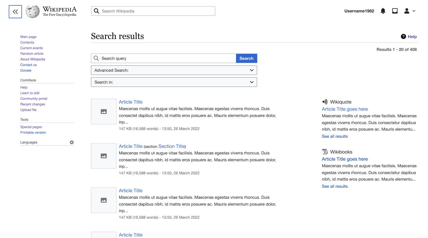
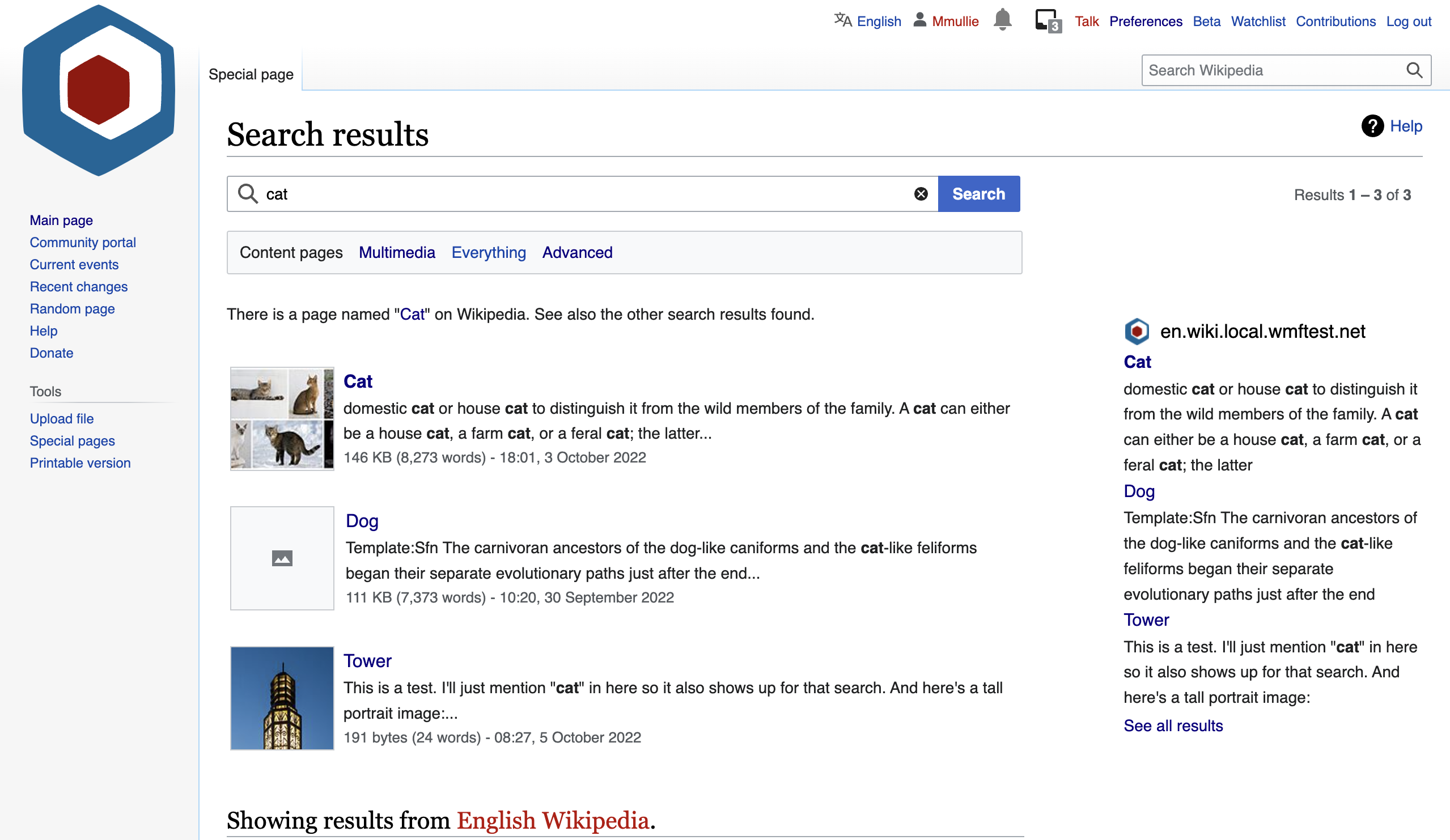
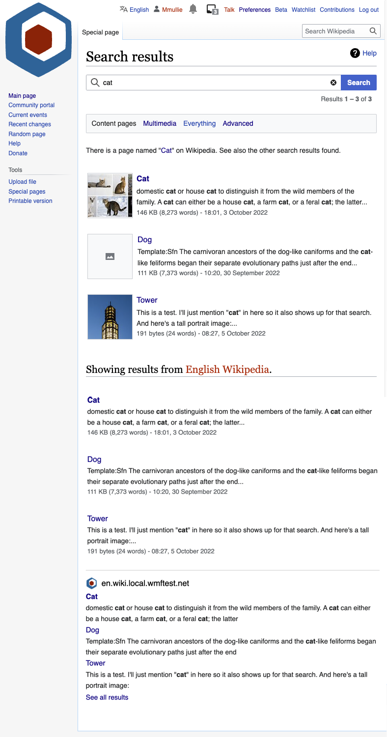
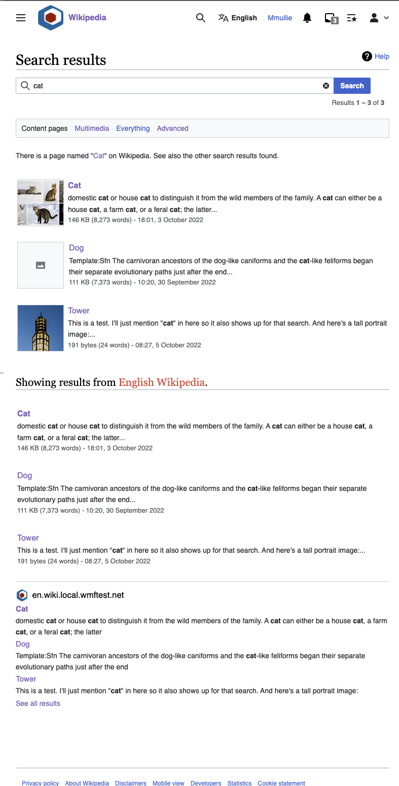
Current implementation:
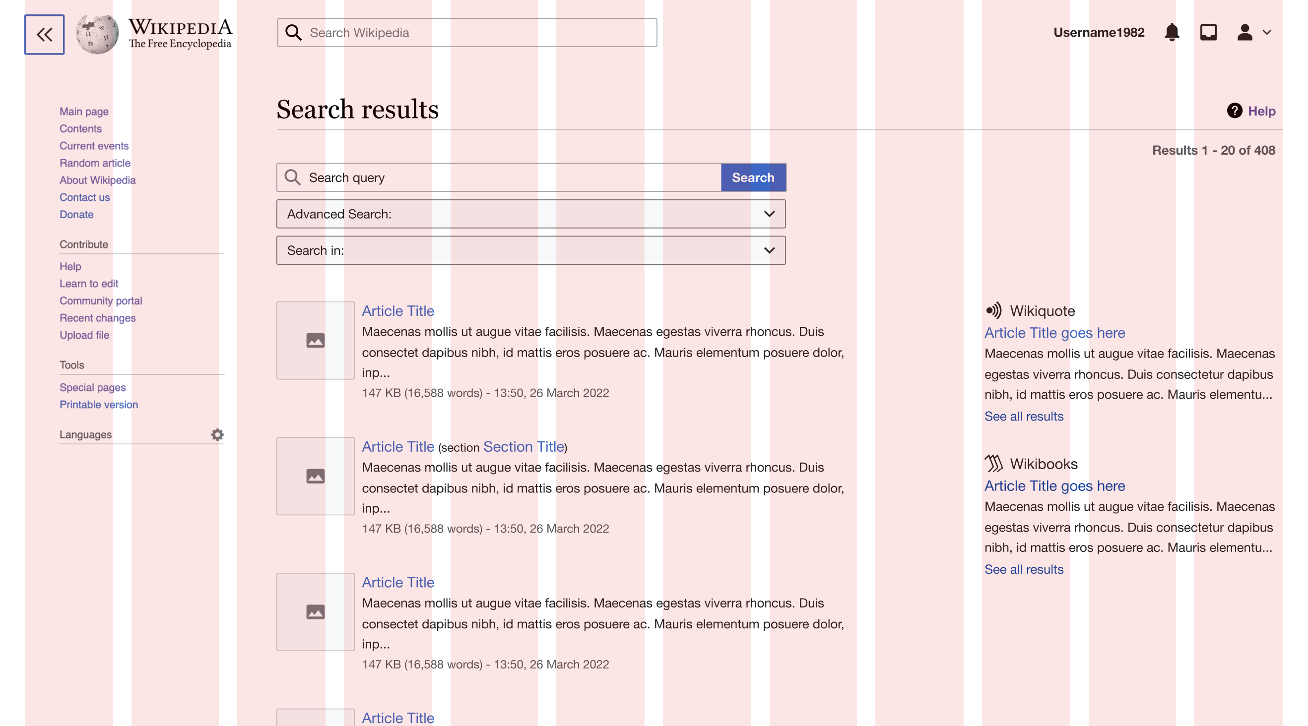
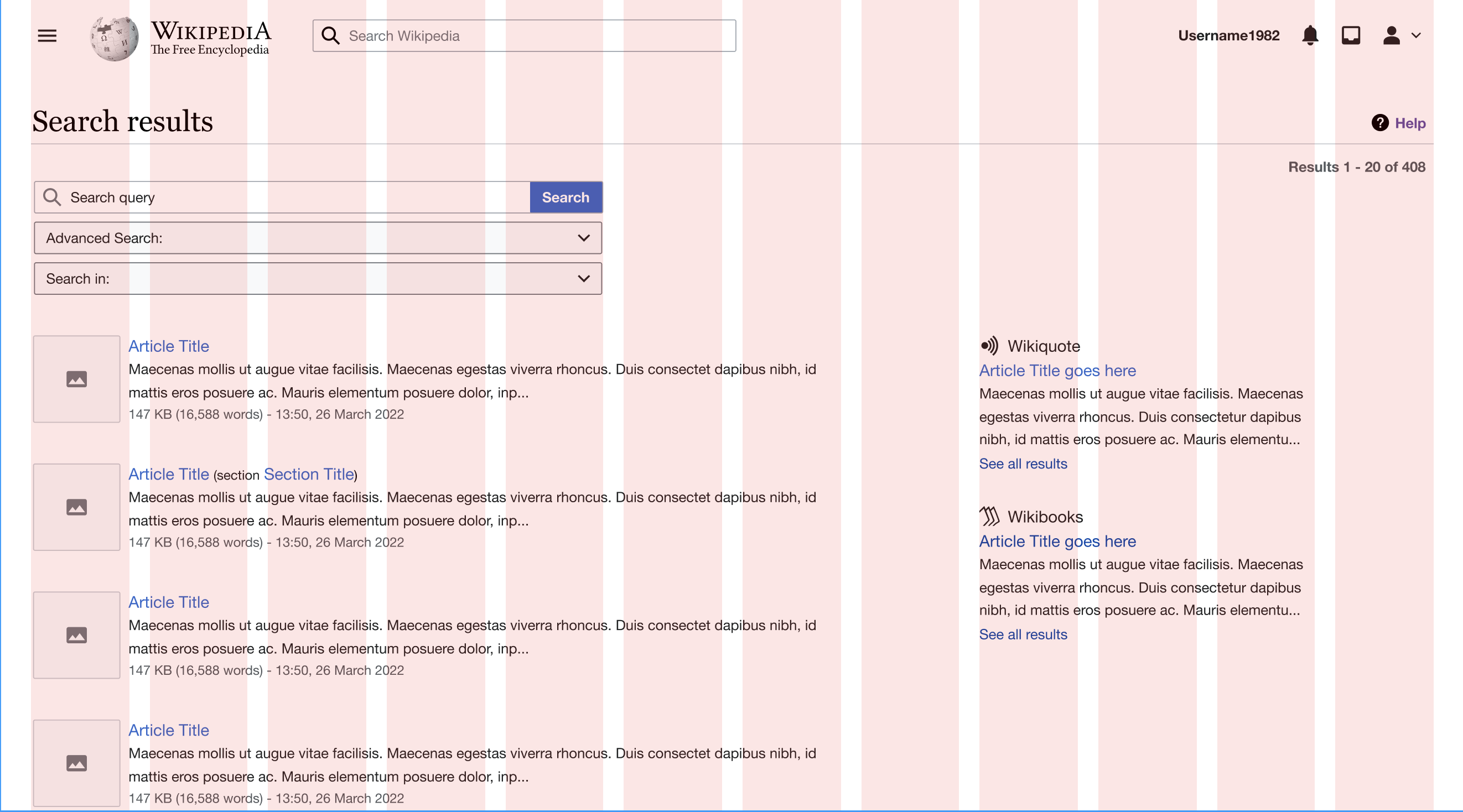
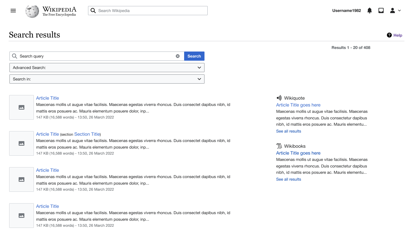
search page.png (1×3 px, 748 KB)

Solution:
Make special:search page use the full width of the page as it previously did with some refinements. See Figma for spacing information.

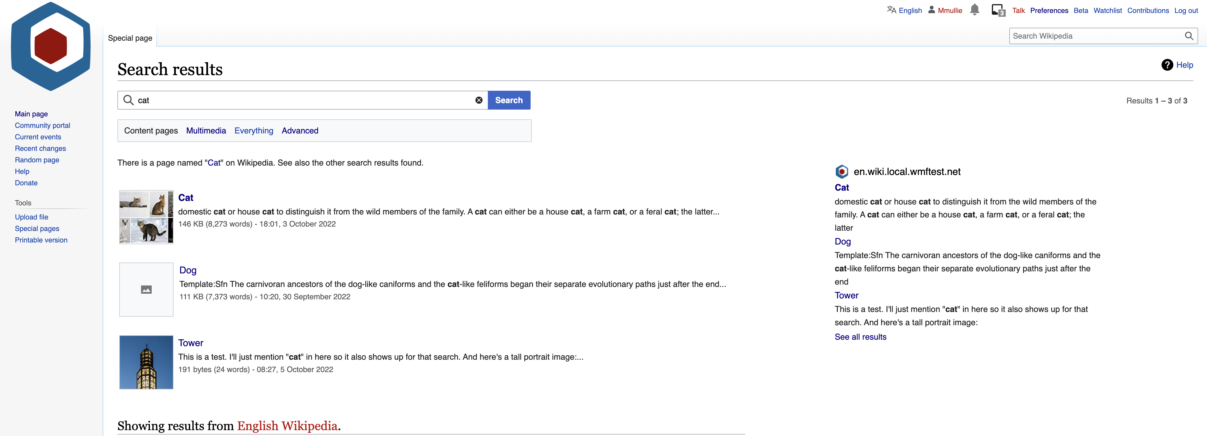
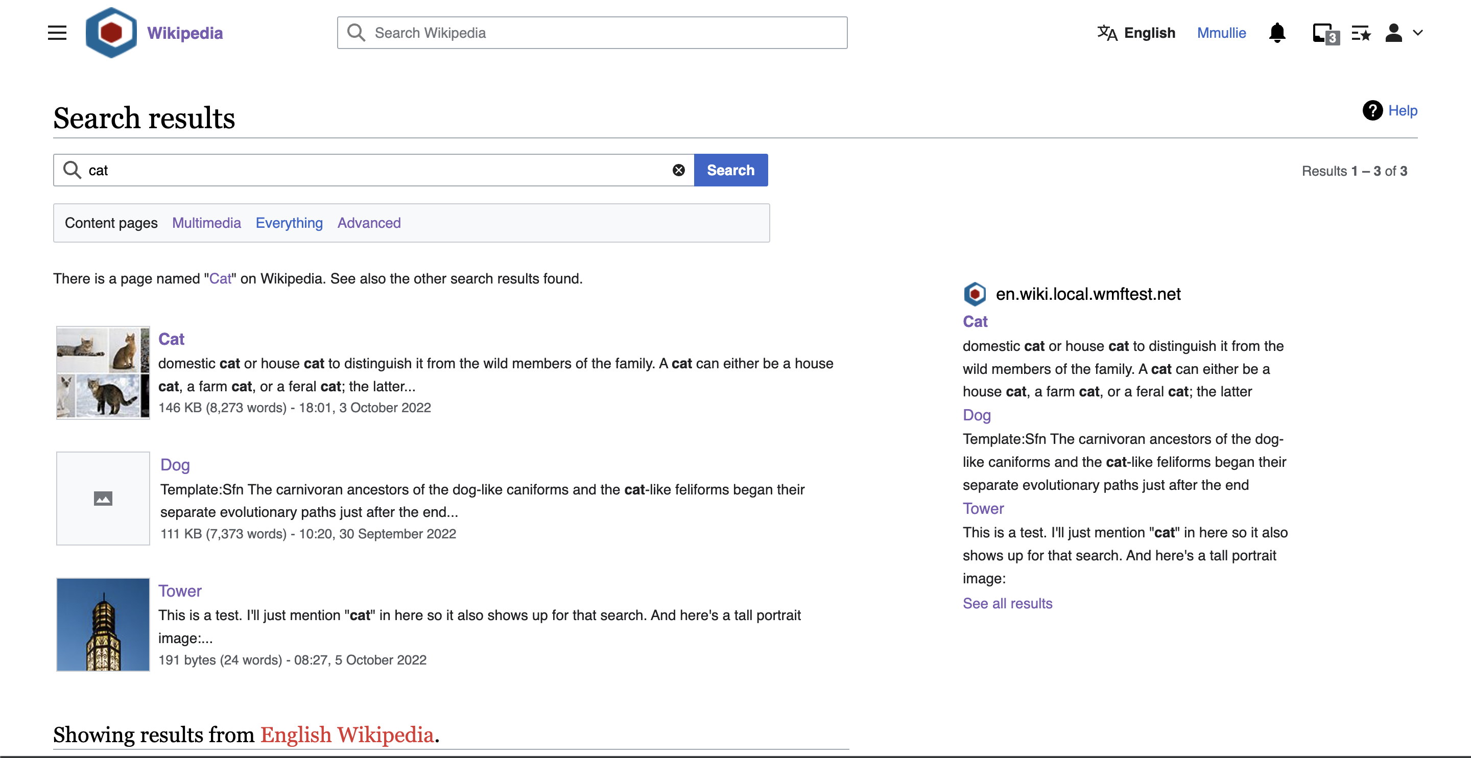
Wireframe for when menu is closed

Special_Search (38).png (800×1 px, 116 KB)

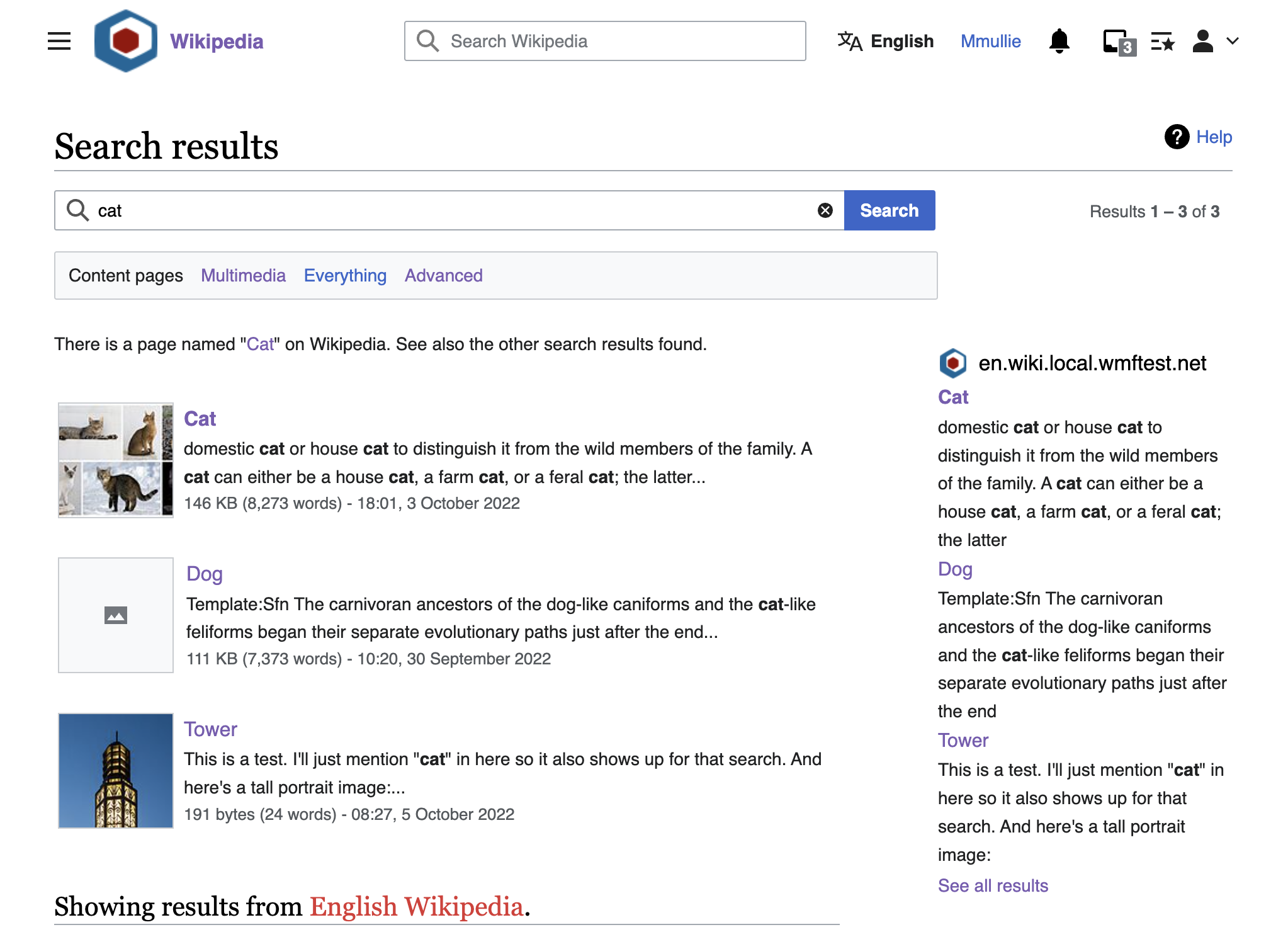
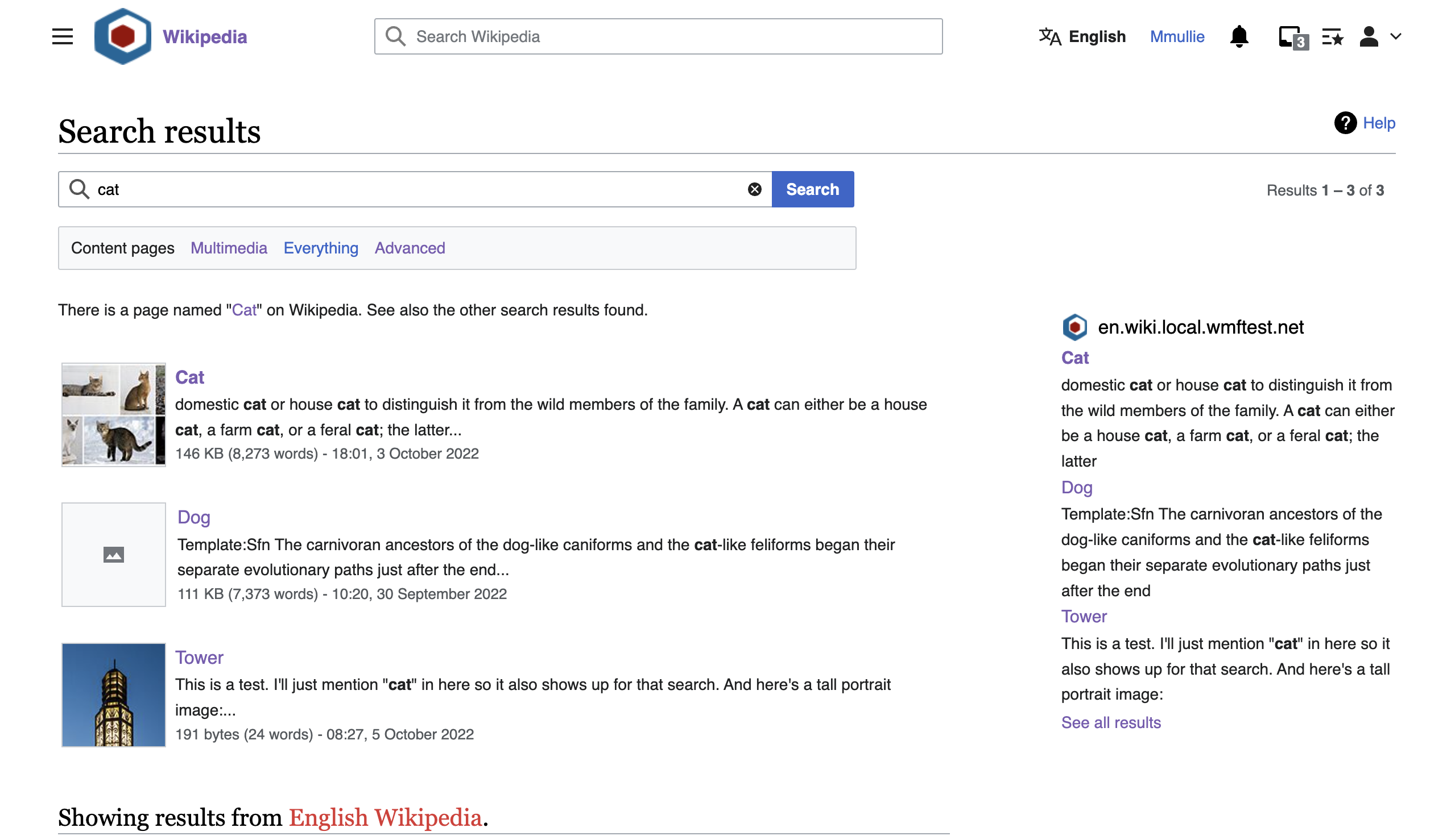
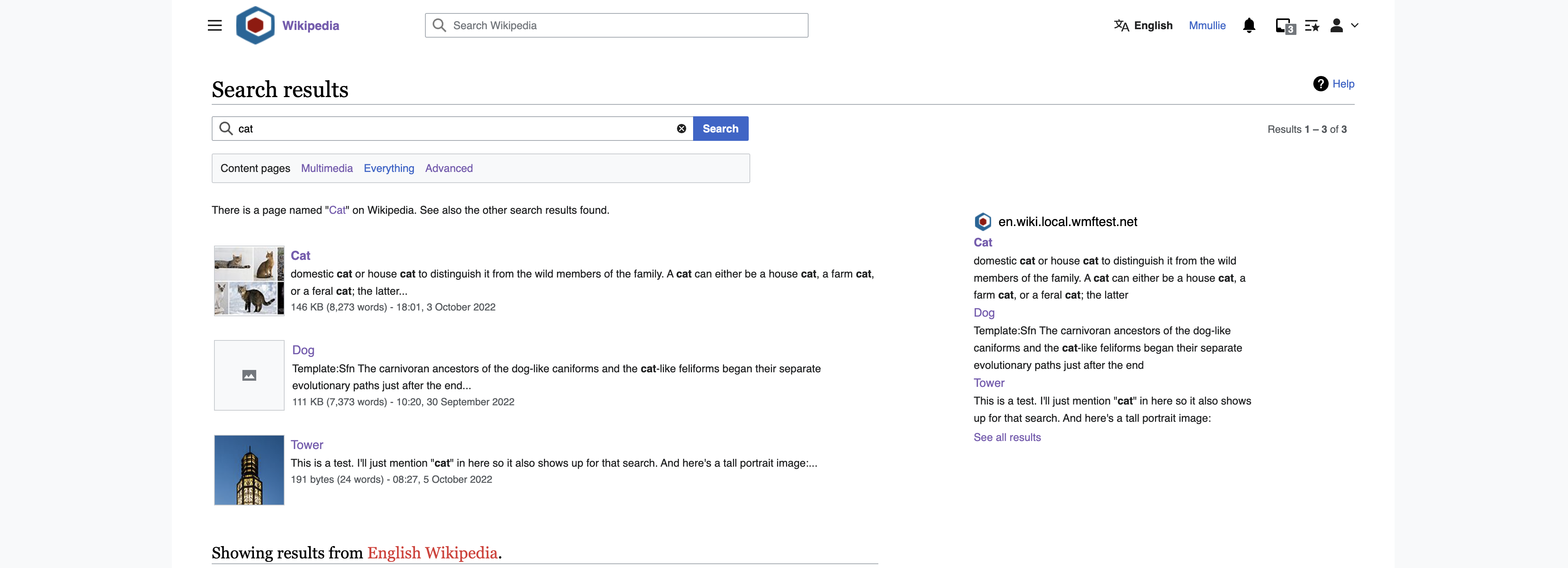
Wireframe for when menu is open

Special_Search (39).png (800×1 px, 133 KB)

Event Timeline

Sneha updated the task description. (Show Details)
CBogen renamed this task from Update the special:search layout for Vector 2022 to use full screen width to [M] Update the special:search layout for Vector 2022 to use full screen width.Oct 12 2022, 3:45 PM

Change 843485 had a related patch set uploaded (by Matthias Mullie; author: Matthias Mullie):

[mediawiki/core@master] Make search results page widths more consistent

https://gerrit.wikimedia.org/r/843485

Above patch will make sure Special:Search contents appear on the left in new-vector.

Note (@Sneha), however, that some of the ticket description seems to clash with T320639, where it was decided that the search results width should uniformly be 50em:

  • the wireframe shows search results at wider than 50em (they used to allow to expand up to 60% of the screen if interwiki widget is present)
  • "It may also results in less results on the page above the fold which some of the community members gave feedback on." -> well, on wide screens, where 60% could exceed 50em, there might now be even fewer results above the fold
    • Note, however, that in most languages, the slight difference in width isn't going to affect height at all; they are usually still going to be 2 lines of snippet, in both cases.

See screenshots in T320639#8321046 for what things are going to look like if we go with new-vector content on the left (this ticket) + 50em search results width (T320639)
If we feel like we need to reconsider/change the 50em width, please update T320639.

Also: the "menu closed" wireframe seems to have the stuff on the right ("results X-Y of Z" & interwiki widgets) not properly aligned to the right hand side of the page.
Right now, these are simply right-aligned - do we not want that anymore?
If not: how exactly should they position themselves between the search results & the page's edge? How far are search results allowed to be stretched in width (if at all), how far from that do we want to interwiki widgets, and how wide can those be? (and how, if at all, do these things change if the screen gets smaller?)

@matthiasmullie

It seems what we decided was minimum 50 mm because 38 mm was too narrow. However I thought we would still allow it go beyond 50mm (i.e. 60%) if there was lot of space to the right.

I think there are few issues with what I see in the screenshots in T320639#8321046

  1. On wide screen the spacing between columns is a lot. This is how I was trying to address that. See screenshots below. Is something like this feasible?

with menu.png (1×2 px, 513 KB)
without menu.png (1×2 px, 467 KB)

  1. On tablets everything is too narrow. For tablets I think we would need to have the breakpoint sooner than what it is currently as its getting too narrow and with preview the experience won't be great. When it gets too narrow (which we can define) it should switch to mobile previews. But perhaps that is not part of this ticket and can be discussed separately.

well, on wide screens, where 60% could exceed 50em, there might now be even fewer results above the fold

Re: above, I am not sure how having it wider than 50em result in fewer results above the fold? Shouldn't widening give us more rows above the fold?

It seems what we decided was minimum 50 mm because 38 mm was too narrow. However I thought we would still allow it go beyond 50mm (i.e. 60%) if there was lot of space to the right.

Alright; sounds like I misinterpreted that other task and it was in fact "minimum of 50em"!
Following that, if there is insufficient space for 50em search results + 30% interwiki widget + some whitespace, we would have to drop the interwiki widget, since the search results are not allowed to shrink?
(FYI: 50em search results + 30% widget + 5% whitespace equals about 945px; add about 200px of old-vector left navbar, and this means we won't have interwiki results on screens smaller than 1280px wide; according to this, that's about 12%)

I would suggest we not set a strict minimum size (of 50em), but rely on the breakpoints to alter behaviors instead; those provide more flexibility to style elements in different ways in different circumstances.

I think there are few issues with what I see in the screenshots in T320639#8321046

  1. On wide screen the spacing between columns is a lot. This is how I was trying to address that. See screenshots below. Is something like this feasible?

with menu.png (1×2 px, 513 KB)
without menu.png (1×2 px, 467 KB)

Following that grid to a tee isn't really possible. We can't really consider the skin chrome (e.g. that left navbar in old-vector) from within the content area.
Anyway, that detail probably doesn't matter too much; I think we can get close enough (esp. for new-vector, where such side chrome is missing)

What I'm seeing here is basically:

  • on smaller screens, show 8/12 of content, 1/12 whitespace, 3/12 interwiki results;
  • on wider screens, show 7/12 of content, 1/12 whitespace, 3/12 interwiki results, 1/12 whitespace.
  1. On tablets everything is too narrow. For tablets I think we would need to have the breakpoint sooner than what it is currently as its getting too narrow and with preview the experience won't be great. When it gets too narrow (which we can define) it should switch to mobile previews. But perhaps that is not part of this ticket and can be discussed separately.

We currently start showing interwiki results on the side at 720px screen width (tablet breakpoint). Let's move this up to 1000px (desktop breakpoint).
On screens smaller than 1000px, the interwiki widget will now appear below the search results; on 1000px-and-wider screens, they'll be on the right.

Also, tablets usually get the mobile skin by default anyway!

well, on wide screens, where 60% could exceed 50em, there might now be even fewer results above the fold

Re: above, I am not sure how having it wider than 50em result in fewer results above the fold? Shouldn't widening give us more rows above the fold?

The height of a search result is defined by:

  • the height of the thumbnail (if present)
  • the height of the title + snippet + metadata

The height of the title & metadata won't change if the width changes (except for excessively long titles)
The snippet (in most latin languages) is usually 2 lines (the second line often up to about 3/4 of the width) at 50em.
In order for the snippet to reduce in height, we would need all of the snippet content to fit in one line. That usually isn't reached until about 80em. And then there still needs to be enough room to show the interwiki widget. That width will never be reached on the vast majority of screens is a width that'll never be reached, so the only effect that "making it wider" will have is that the first line of the snipper gets longer, the second line gets shorter, but will usually still be there.
And even if the snippet does get shorter, we still have the thumbnail, which roughly matches the height of title + 2 lines of snippet + metadata.
We can make the search results wider, but it won't affect their height.

It will affect their height compared to the 38em currently on old-vector (which usually causes 3 lines of snippet). Not compared to 50em (where we usually have 2)
(also see screenshots below for illustration)


Recap of above:
I think these changes will get us quite close to the behaviour I believe you're after:

  • don't show interwiki results on the side on screens smaller than desktop breakpoint (1000px)
  • on screens wider than 1000px, we'll have 8/12 search results, 1/12 white space, 3/12 interwiki widget
    • note: at the very minimum (1000px), the search results will be smaller than 50em (more like ~45em)
    • note: if no interwiki widget, search results still won't grow wider than 8/12
  • on screens wider than 1440px, we'll have 7/12 search results, 1/12 white space, 3/12 interwiki widget, 1/12 whitespace

Here's what that looks like in common screen resolutions:

1024px wide1280px wide1440px wide2048 wide
old vector
oldvector-1024.png (1×2 px, 557 KB)
oldvector-1280.png (1×2 px, 601 KB)
oldvector-1440.png (1×2 px, 628 KB)
oldvector-2048.png (1×4 px, 652 KB)
new vector
newvector-1024.png (1×2 px, 534 KB)
newvector-1280.png (1×2 px, 547 KB)
newvector-1440.png (1×2 px, 569 KB)
newvector-2048.png (1×4 px, 626 KB)

Does this look about right?

Ok yes agree with using breakpoints to alter the size of the column instead of a set minimum. Better responsive design. Also agree with updating the breakpoint and not showing sister projects on the right when the screen is smaller than 1000px which will bring the interwiki links to the bottom like on mobile. And I am assuming the search preview will also be mobile UI and not desktop UI? Can you share how it looks below 1000 px just want to check the approximate spacing around it.

Also we don't want the width to be too wide in order to have more content above the fold because 1) longer widths may not make that much of a difference in the amount of content you see on the screen because like you said height is defined by a combination of things not just snippet. 2) If the width is too wide its not the best for reading. The screenshots you shared above achieves a good balance with what we can do right now. The extra wide case is the odd one but like you said its uncommon. It all looks good to me.

On screens lower than 1000px, the search results & interwiki results are displayed at full width, below one another. Like so:

oldvector-800.png (1×788 px, 311 KB)
newvector-800.png (1×787 px, 251 KB)

And I am assuming the search preview will also be mobile UI and not desktop UI?

I was also wondering about that one :D
Since <1000px is considered too narrow to display additional stuff on the side, we can't have quickview there.
But the mobile implementation is rather specific to a very different environment (mobile skin, usually much narrower still, touch controlled, ...) and this has the potential to drastically complicate things (for very little gain; these small screens tend to be tablets and will usually get the mobile view, where we will already have an implementation)
Perhaps we should consider simply not having quickview on non-mobile small screens - at least not initially?

Hmm I am looking at this table and it seems like if people use their tablets in landscape they are less likely to have a scenario where its too narrow to show second column. I wonder if we can do something in the UI (if it becomes too narrow and users are using in portrait) to recommend using landscape for preview instead of completely hiding it.

Should we move this breakpoint discussion to this responsive layout ticket T312269? So that it can be separated from this one.

It's a bit hard to disentangle and treat them all in isolation:

  • moving Special:Search results to the left (this ticket) in new-vector will result in even more whitespace on the right, and even more inconsistency between interwiki/no-interwiki widget cases (the difference between 50em & 60% becomes larger as more width becomes available)
  • making the search results width more consistent (T320639) also can't really be done without immediately addressing the position of the interwiki widget (and SearchVue) as well

I'm going to update T312269: Responsive layouts for special:search page to reflect our discussion here, and close both this (T320577: [M] Update the special:search layout for Vector 2022 to use full screen width) and the other (T320639: [M] Fix/Update search result widths on Special:Search) tickets as duplicate of T312269: Responsive layouts for special:search page.

And then I'll open 2 new tickets:

  • one to update SearchVue, getting its positioning to match the new (flexible) position of the interwiki results (if available on the right)
  • one to discuss potential solutions for screens <1000px, where there is no room for interwiki results (and SearchVue) on the right
    • this one can probably be addressed in a later milestone (or perhaps not at all), given that this may be only a small population

Does that make sense?