The suggested edits difficulty label doesn't look correct if the user scales the browser zoom.
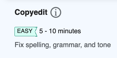
90%:
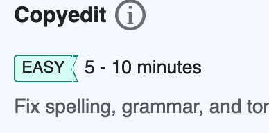
110%:
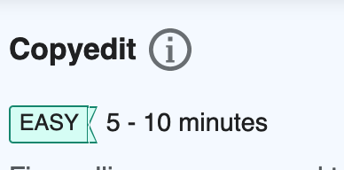
120%:
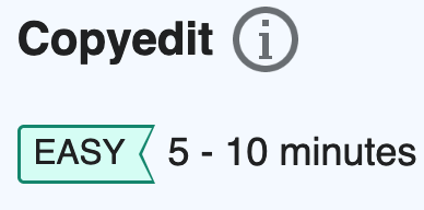
130%:
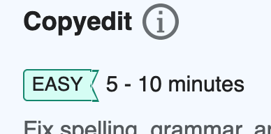
150% (this one is OK):
Acceptance Criteria
- Should be able to scale the browser zoom to various levels and see the difficulty label scale correctly
- ....
Completion checklist
Functionality
- The patches have been code reviewed and merged
- The task passes its acceptance criteria
Engineering
- There are existing and passing unit/integration tests
- Tests for every involved patch should pass
- Coverage for every involved project should have improved or stayed the same
Design & QA
- If the task is UX/Design related: it must be reviewed and approved by the UX/Design team
- Must be reviewed and approved by Quality Assurance.
Documentation
- Related and updated documentation done where necessary
- Internal technical changes: internal repository documentation must be updated (README.md, JSDoc, PHPDoc)
- Infrastructure technical changes: technical changes that reflect on environment, infrastructure, endpoints or any other area of interest for technical contributors should be reflected on Extension:GrowthExperiments or Extension:GrowthExperiments/Technical documentation pages.