Page MenuHomePhabricator

Gallery unnecessary margins and paddings
Closed, InvalidPublicFeature

Description

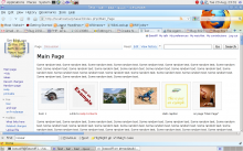
The <gallery> has unnecessary margins and paddings in a few different places. Also an unnecessary border. These cause the galleries to look strange when everything lines up nicely on the left except galleries. It also causes a gallery to take up more space than is needed. In addition, one line captions often wrap when they don't need to.

Line 771 in skins/common/shared.css and line 249 in skins/common/commonPrint.css:

ul.gallery {
margin: 2px;
padding: 2px;
display: block;
}

Should be changed to this:

ul.gallery {
margin: 2px;
padding: 2px;
margin-left: 0px;
padding-left: 0px;
display: block;
}

Line 789 in skins/common/shared.css and line 267 in skins/common/commonPrint.css:

li.gallerybox div.thumb {
text-align: center;
border: 1px solid #ccc;
margin: 2px;
}

Should be changed to this:

li.gallerybox div.thumb {
text-align: center;
border: 1px solid #ccc;
margin: 0px;
}

And finally, there's some extra space being taken up by an invisible border. On line 762 in skins/common/shared.css and line 239 in skins/common/commonPrint.css:

li.gallerybox {
vertical-align: top;
background-color: #f9f9f9;
border: solid 2px white;
display: -moz-inline-box;
}

Should be changed to this:

li.gallerybox {
vertical-align: top;
background-color: #f9f9f9;
display: -moz-inline-box;
}

Also, excessive margins and padding for the text captions can be fixed. On line 795 in skins/common/shared.css and line 273 in skins/common/commonPrint.css this:

div.gallerytext {
overflow: hidden;
font-size: 94%;
padding: 2px 4px;
word-wrap: break-word;
}

Should be changed to this:

div.gallerytext {
overflow: hidden;
font-size: 94%;
padding: 2px 2px;
word-wrap: break-word;
}


Version: 1.17.x
Severity: enhancement
See Also:
https://bugzilla.wikimedia.org/show_bug.cgi?id=65451

Details

Reference
bz30270

Event Timeline

bzimport raised the priority of this task from to Low.Nov 21 2014, 11:56 PM
bzimport set Reference to bz30270.
bzimport added a subscriber: Unknown Object (MLST).

In what way are these unnecessary? What's the difference in rendering? Is this consistent across different browsers?

They just space things out unnecessarily. I can't think of a reason why they would be necessary, and that's why they're unnecessary.

I haven't thoroughly tested all browsers, but I see no tricks in this CSS that would lead me to believe they are compatibility hacks. They have pretty consistent effects on all browsers as far as I know. The only thing I'm changing is padding and margins. I don't touch anything else.

If you need a screenshot of the effects, I suppose I could make them. You can see here how the gallery does not line up with the left edges of other things on the wiki page (text, images, various boxes, etc):

http://www.mediawiki.org/wiki/Help:Images#Gallery_syntax

Also notice that caption text does not line up with left edge of each gallery image. My changes remove all that extra margin and padding so everything lines up, and caption text is not packed any tighter than necessary. I see no reason why the text should not extend to the left and right edges of each image, and the gallery as a whole should not extend to the left and right edges of the usable wiki page space.

The gallery is the only thing that has this extra padding and margins, as far as I know. It's unnecessary, inconsistent, and causes misalignment of the gallery, and premature wrapping of caption text.

I'm sure whoever put all that in originally thought that it looked better. In some cases, I agree that it does, but all other cases, it doesn't.

It looks like my edited code was mostly just me changing margins and padding to 0px. In actuality, I think those lines could be removed completely for the same effect, and slightly less bandwidth usage from the CSS files.

john wrote:

If you don't mind we would appreciate a screenshot to compare to, thanks :-)

You can see it in action here:

http://www.coincompendium.com/wiki/index.php/CC1308090139386366

user: Demo
pass: dedauw

If I remember correctly, the image caption "Put a short description here" was wrapping unnecessarily with the unnecessary margins and padding. And, it lines up on the left correctly. Otherwise, it looks identical. It really is a minor change, with no unexpected behavior expected :)

That seems to eliminate all padding, including any padding within the gray background area between the edge of the background and the start of the text; this doesn't look very good to me.

The existing padding gives a little space between the edge of the gray background and the start of the text, which looks good to me; I'd be inclined to keep it.

I don't think the gray background, or any of the paddings and margins that support it, are good for anything other than taking up space. I think they should all go, immediately. They serve no purpose, but cause problems.

I agree with Brion. Aesthetically that is not pleasing to me. What problems does the padding cause exactly?

However, I must admit the css on the current gallery's (at least how they are on mediawiki.org currently as viewed on firefox 3.5. Don't know if its changed on trunk) isn't exactly great. I'm really not a fan of the 2px margin on li.gallerybox div.thumb, and the div.gallerybox has a width slightly bigger than the thumb which causes the grey background to overflow the border which looks ugly imo. I also feel there should be more padding on the left and right of div.gallerytext and that div should definitely not be displayed if there is no caption (I'm assuming the padding stops it from collapsing to nothing). Having grey background overflow the slightly darker grey border really does not look good.

Cheers.

Well, if you can figure out how to make the mess work all the time for everyone, while still being aesthetically pleasing, I will be impressed :) I think it's a lot of unnecessary work for very little gain. I do agree that SOMETIMES it looks better, but I don't think it's worth the trouble. It's messy, and is very easy to cut out and be done with it.

I didn't touch the gray background. In fact, until Brion pointed it out, I didn't even notice it. I'm using 3 different monitors too, in 3 different locations. One of them is mobile, in all sorts of different lighting conditions you can imagine. Even 1 problem from such a subtle "aesthetic" is more than it's worth, I think.

The gallery would probably still look OK without it. In fact, it could probably be paired down even more and still look good. All we're trying to do is present 2 bits of info (image, caption) in 1 context (gallery of other images and captions). I don't think there's going to be any art awards for this :)

Well, if you can figure out how to make the mess work all the time for
everyone, while still being aesthetically pleasing, I will be impressed :)

Just for clarification, what is the problem being reported here that stops galleries from "work[ing] all the time for everyone"? The only thing being reported here as far as I can tell is aesthetic issues which don't exactly stop things from working. (I'm slightly confused)

Oh, sorry, I forgot to mention that.

Basically, we have one aesthetic solution creating 2 new problems. 1 of the problems is aesthetic, and the other is pragmatic(?). The aesthetic one is that the gallery doesn't line up on the left with other elements on a page. The pragmatic one (is that the right word?) is that captions wrap prematurely. I suppose that's aesthetic as well as pragmatic.

My suggestion was to sacrifice the 1 aesthetic solution in order to solve the two new problems that it causes. I don't think much is being sacrificed, because the 2 new problems are more noticeable than the improvement that caused them, for a net loss.

Removing the extra "pretty" margins and paddings will prevent premature wrapping, and allow the gallery to have the same left edge as all other page elements.

Created attachment 8966
A screenshot of how galleries look on vanilla trunk (1.19) install.

I'm attaching a screenshot of what galleries currently look like on trunk so that we are all talking about the same thing since they look mildly different than they do on mw.org - I'll attach another one with fastgoldfish's proposed changes for comparison.

After looking at this more, I can kind of see it both ways. It could look good having the gallery indented from the main body of text (like it is currently), but I think it should be indented perhaps slightly more to make it obvious its indented. It could also look good to be on the same line as the text. The only thing I really don't like is the margin on the captions of the individual photos. I've only tested on firefox 3.5, but on that browser it appears the captions have a left margin of 4px, where the actual photo is 3px from the containing element.

Attached:

GalleryCurrent.png (800×1 px, 316 KB)

Created attachment 8967
Gallery with GoldFish's proposed css changes.

Here's a screenie with GoldFish's css.

Personally I'd reduce the left margin on the div.gallerytext even further so it lines up with the border on the picture (I've already said that though). I also probably wouldn't reduce the whitespace between the different images of the gallery quite as much. whitespace is beautiful.

Getting back to the premature word wrapping. I'm not really seeing any noticeable pre-mature word wrapping. Additionally, how much more room would this give for captions - 4px maybe? That's not even a single letter.

attachment GalleryGoldfish.png ignored as obsolete

Thanks for the photos!

I agree about the whitespace: We're making a "gallery", which implies some effort at aesthetics.

There's not quite enough space between the images on my edits, and they would look a bit nicer with more space. I'm not opposed to leaving them narrow though, just to get this done. It doesn't look terrible that way, and it has a practical advantage of providing more images per row, with less wrapping (which is very ugly). Plus, it's expedient.

Hmm, when I think about how ugly it is to have 1 image wrapped and hanging out of place, the narrow spacing stops seeming unattractive. I don't think they should be spaced out more unless the spacing can be dynamic, to minimize wrapping. That's much uglier than the beauty of whitespace, for a net loss.

About caption wrapping: Don't forget how small this space is to begin with. 4px may not sound like much (on each side, iirc?), but it's a significant percentage of the available space. And, being one pixel too short for a single letter will not affect just one letter - it will cause a whole word to wrap, OR MORE, if it's a hyphenated word like a name or something.

Just imagine having a wiki page of university faculty, each with long names like "Chandrasekhar". Or maybe concatenated names for images of scientific subjects like "An Einstein–Podolsky–Rosen paradox". It would be much nicer if those captions didn't need to wrap until absolutely necessary. Otherwise, you end up with very little on some lines, and lot on others, which makes it look odd.

Imagine the last example looking something like this:

An
Einstein–Podolsky–Rosen
paradox

Or this:

An
Einstein–Podolsky–
Rosen
paradox

It starts to get difficult to read at that point, and causes the entire gallery bottom borders to descend just to accommodate perhaps only one image that word wraps unnecessarily. Keep in mind that some languages can have very long words, like Finnish and German. Others have short words, but sometimes more of them, like Spanish or Chinese (where word wrapping would be less of a problem).

In addition to language, it also depends on font size. In something as small and delicate as the MediaWiki gallery, we can't really afford to be wasteful. The beauty comes mostly from the content images anyway, so I think we ought to lean towards letting that dominate, without intruding too much with our own aesthetics.

I guess that should be 3 new problems caused by unnecessary spacing, due to me forgetting to include the issue of premature gallery wrapping, in comment 11.

sumanah wrote:

badon, would you be interested in submitting your proposed change directly into our Git repository using https://www.mediawiki.org/wiki/Developer_access ?

Also adding "design" keyword.

badon:
Would you be interested in using Developer access

https://www.mediawiki.org/wiki/Developer_access

to submit this as a Git branch directly into Gerrit:

https://www.mediawiki.org/wiki/Git/Tutorial

? Putting your branch in Git makes it easier for us to review it quickly. Thanks!

[Removing patch keywords as there is no patch, but some CSS code.]

(In reply to comment #2)

The gallery is the only thing that has this extra padding and margins, as far
as I know. It's unnecessary, inconsistent, and causes misalignment of the
gallery, and premature wrapping of caption text.

I'd love to see specific testcases / examples for these problems, so it is easier to compare, plus it is possible to actually see these problems (I am currently not even convinced if this is a valid bug report, but only because I cannot see the issue myself with the current code).
The screenshots (thanks!) in comment 12 and comment 13 don't expose the problems listed above.

Created attachment 15430
A screenshot of how galleries look with GoldFish's proposed css changes.

Attached:

after.png (800×1 px, 382 KB)

Is there a patch implementing the change visible in these screenshots?

Aklapper changed the subtype of this task from "Task" to "Feature Request".Feb 4 2022, 11:00 AM

Unclear what is being requested, and the proposed patch has been lost to the sands of time.