Page MenuHomePhabricator

Graph comparing annual budgets is skewed to our disadvantage
Open, Needs TriagePublicBUG REPORT

Description

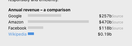
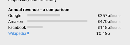
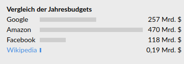
I looked at https://spenden.wikimedia.de/use-of-funds and it made me wonder. That graph doesn't look correct. The tiny blue bar looks like it's worth about 1–2% of the longest bar. That would be something like 5 Mrd. But the number says 0.19 Mrd.

Screenshot from 2022-11-09 10-40-43.png (132×375 px, 9 KB)

That makes us look more greedy than we are.

Turns out you have a hard-coded min-width: 3px in your code: https://gitlab.com/fun-tech/fundraising-app-frontend/-/blob/main/src/scss/use_of_funds/CompanyBudgets.scss#L60. This might have been done to make the graph look more pleasing, but it also makes it factually wrong. Should be min-width: 1px.

Event Timeline

Hi Thiemo, thank you for your input on that, and yes we also wished we could show the people better in this section how small we are compared to the giants.
In this case, 3px is a visibility compromise.
The decision from the product management / UX side for this was that the bar should still be visible for people with slightly impaired vision as well. 1px also could be mistaken for an "I" (by slightly confused users, maybe).
That's why 3px is the minimum width for this and we rely on people reading the actual numbers.

I'm afraid this doesn't work well because the numbers are hard to compare as well. "118 Mrd." vs. "0,19 Mrd" looks like … 1/10th? Yea, must be 1/10th because the graph makes it look exactly like that.

I don't want to be ridiculous, but seriously, this is just wrong. Better remove the bars when you don't believe people can understand them. Either people understand it – in which case it must be correct. Or people don't understand it – in which case it doesn't matter if the bars are there in the first place.

We are meant to represent Wikipedia, a medium of facts and knowledge.

Any progress here? It's still wrong on the live site.

We should get UX involved, they would know more than us about the best way to do this.

For comparison here's what the bar would look like at 10%, so it's safe to say the current version is a lot closer to the real figure than that.

Screenshot 2023-01-09 at 15.17.12.png (159×455 px, 17 KB)

@Erdinc_Ciftci_WMDE Hey Erdi, can you take a look at this and see what you think? Thanks!

I wrote "1/10th of 118 Mrd.", which would look like this:

1_10h.png (159×455 px, 22 KB)

Screenshot 2023-01-09 at 16.17.56.png (1×1 px, 55 KB)
Hey @AbbanWMDE thanks for pinging me!

I've read the discussion, it doesn't seems possible to visualize the exact value in the current form and make it visible as it comes down to almost 1 in 1000 percent. I've quickly explored visually how it would look in 1:1 form.

So I guess we have options of removing this if it creates a problem, or exploring new ideas of visualizing. I'm not sure if I can make this decision though so @AbbanWMDE and maybe @kai.nissen if you like to make this a design task and help it define I can work on some ideas? Since I've already worked on the top donation bar in that page before.

So that's what I have for now and if you have further tasks or questions I can do my best to help!